In this article:
- The 10 Most Breathtaking Fall Color Palettes
- Why Fall Color Palettes Are Design Gold
- Modern Applications for Timeless Autumn Hues
- The Psychology Behind Our Love for Autumn Colors
- Bringing Fall Palettes Into Different Design Contexts
- Seasonal Marketing That Goes Beyond October
- Technical Considerations for Fall Color Implementation
- The Future of Autumn-Inspired Design
- Conclusion: Embracing the Warmth of Autumn Design
As the leaves begin to turn and the air grows crisp, I find myself completely captivated by the rich, warm hues that autumn brings. There’s something magical about fall colors—those deep burgundies, golden yellows, and earthy browns that make everything feel cozy and inviting. As a designer, I’ve always believed that fall offers some of the most inspiring color combinations nature has to offer, and I’m excited to share my favorite autumn palettes that will bring warmth and sophistication to your next project.
The 10 Most Breathtaking Fall Color Palettes
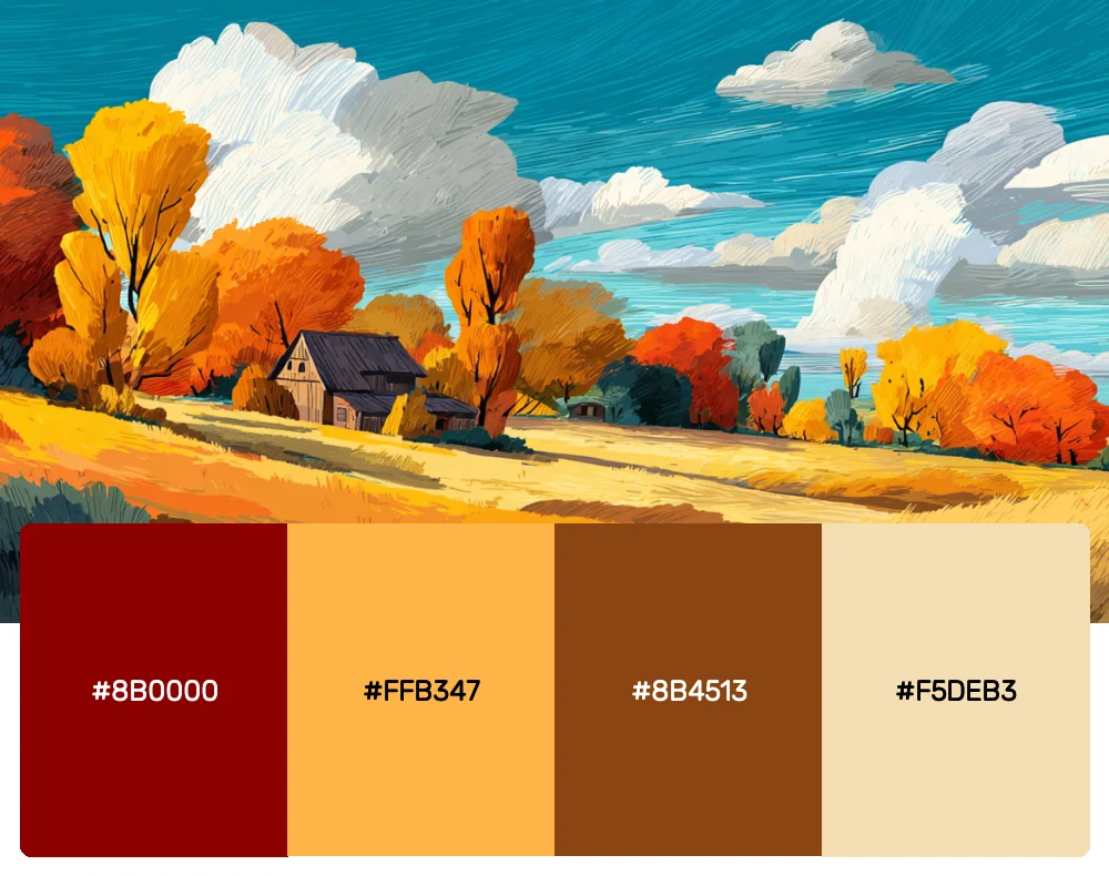
1. Maple Harvest
This palette captures the essence of a New England autumn, with colors that mirror the changing maple leaves outside my studio window. The deep crimson pairs beautifully with golden amber, while the rich brown grounds the entire combination. I love using this palette for branding projects that need to convey warmth and tradition.
-
 #8B0000


-
#FFB347
-
#8B4513
-
#F5DEB3
Download this color palette
 735×1102
Pinterest image

 2160×3840
Vertical wallpaper

 900×900
Square

 3840×2160
4K Wallpaper

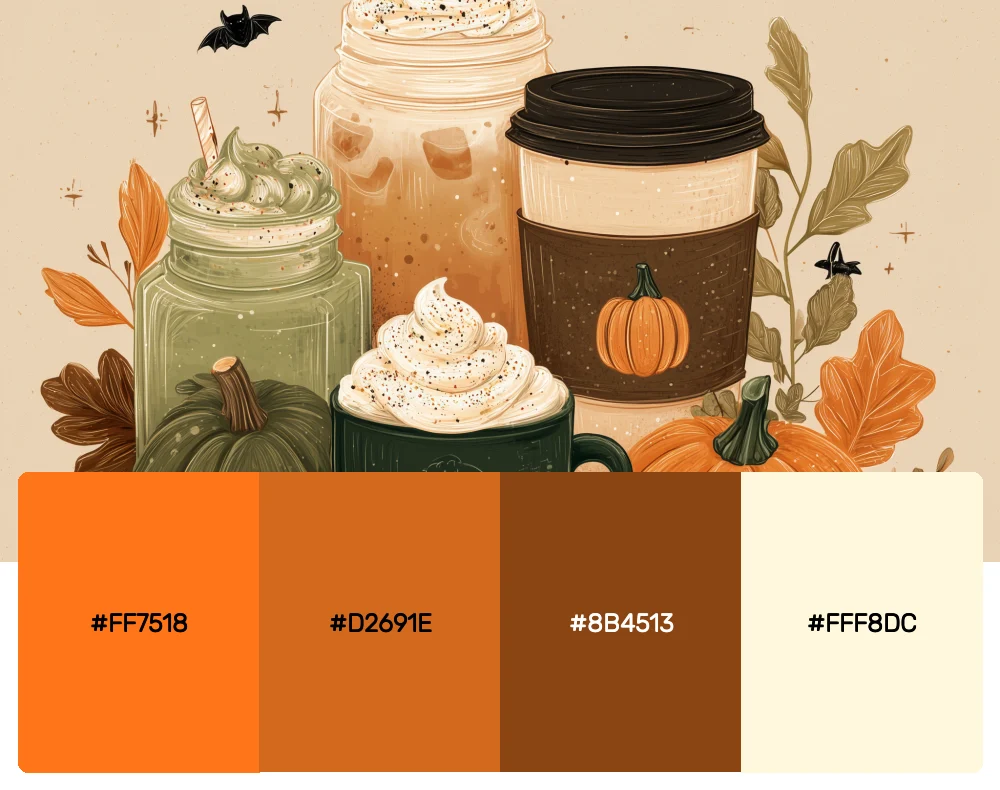
2. Pumpkin Spice Dreams
Nothing says fall quite like the warm, inviting tones of your favorite autumn latte. This palette brings together the perfect blend of orange, cinnamon, and cream that makes you want to curl up with a blanket and a good book. I find it works wonderfully for cozy interior spaces or seasonal marketing campaigns.
-
#FF7518
-
#D2691E
-
#8B4513
-
#FFF8DC
Download this color palette
 735×1102
Pinterest image

 2160×3840
Vertical wallpaper

 900×900
Square

 3840×2160
4K Wallpaper

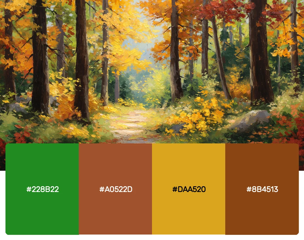
3. Forest Floor
Inspired by woodland walks and the carpet of fallen leaves beneath towering trees, this earthy palette combines deep forest greens with rich browns and hints of golden yellow. It’s my go-to choice when I want to create designs that feel grounded and connected to nature.
-
#228B22
-
#A0522D
-
#DAA520
-
#8B4513
Download this color palette
 735×1102
Pinterest image
 2160×3840
Vertical wallpaper

 900×900
Square

 3840×2160
4K Wallpaper


Get 300+ Fonts for FREE
Enter your email to download our 100% free "Font Lover's Bundle". For commercial & personal use. No royalties. No fees. No attribution. 100% free to use anywhere.
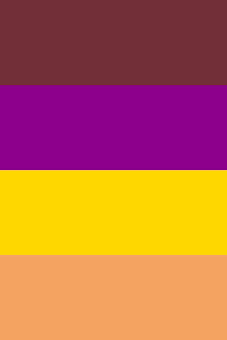
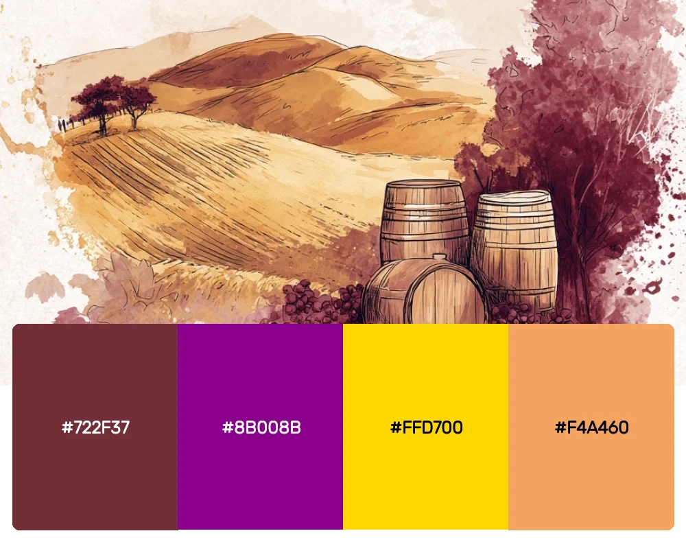
4. Sunset Vineyard
This sophisticated palette draws from the warm glow of autumn sunsets over rolling vineyards. The deep plum and burgundy create a sense of elegance, while the golden accents add just the right amount of brightness. I often recommend this combination for luxury brands or upscale restaurant designs.
-
#722F37
-
#8B008B
-
#FFD700
-
#F4A460
Download this color palette
 735×1102
Pinterest image
 2160×3840
Vertical wallpaper

 900×900
Square

 3840×2160
4K Wallpaper

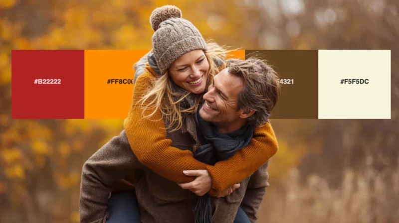
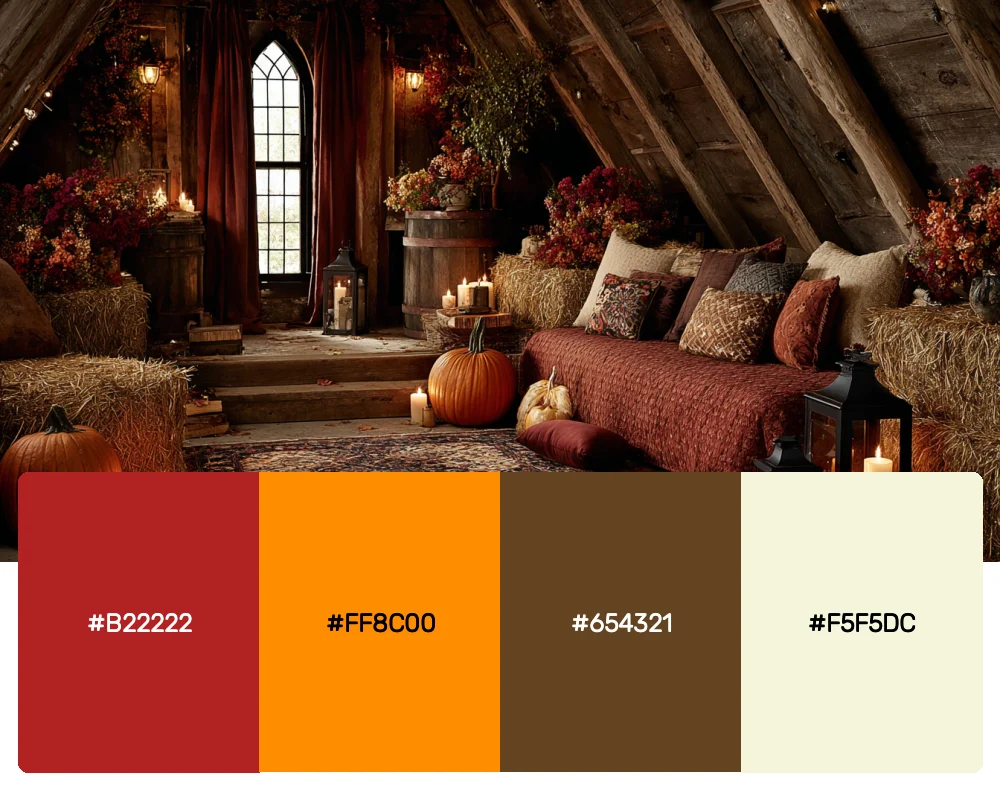
5. Cozy Cabin Retreat
There’s nothing quite like the feeling of a rustic mountain cabin in fall, and this palette captures that perfectly. The warm rust and burnt orange evoke crackling fireplaces, while the deep brown and cream bring to mind weathered wood and soft wool blankets.
-
#B22222
-
#FF8C00
-
#654321
-
#F5F5DC
Download this color palette
 735×1102
Pinterest image

 2160×3840
Vertical wallpaper

 900×900
Square

 3840×2160
4K Wallpaper

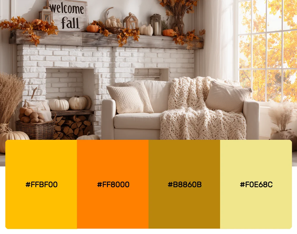
6. Amber Glow
This golden-focused palette reminds me of late afternoon sunlight filtering through autumn leaves. It’s warm, optimistic, and incredibly versatile. I love using these honeyed tones for projects that need to feel approachable yet sophisticated.
-
#FFBF00
-
#FF8000
-
#B8860B
-
#F0E68C
Download this color palette
 735×1102
Pinterest image

 2160×3840
Vertical wallpaper

 900×900
Square

 3840×2160
4K Wallpaper

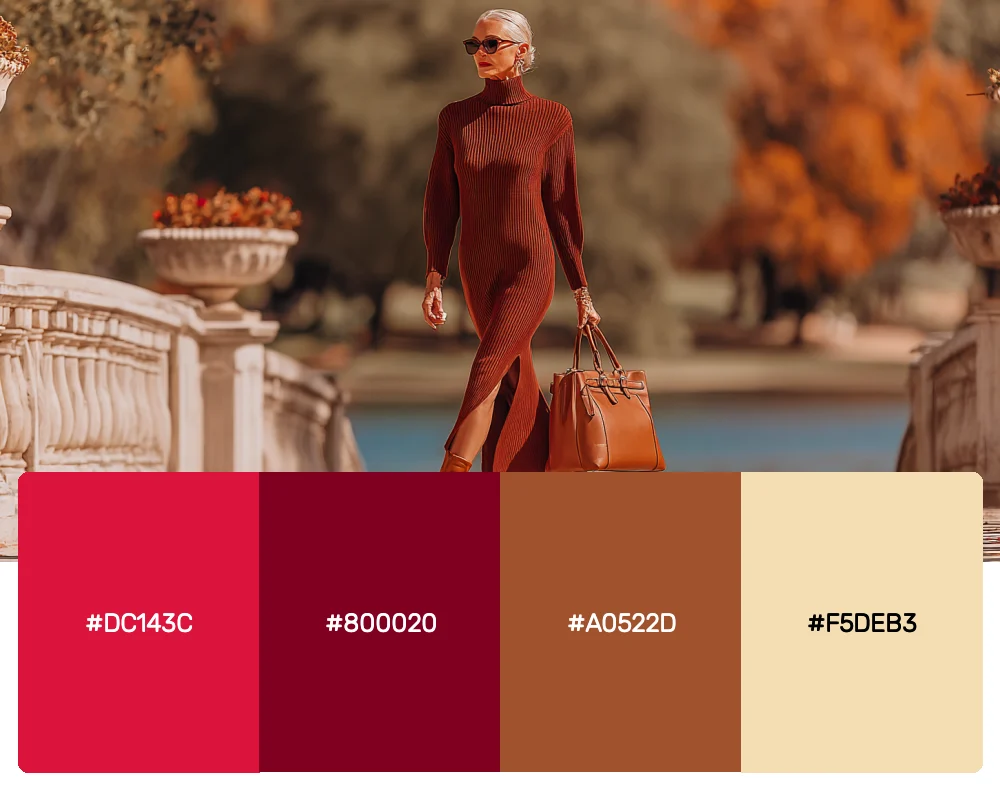
7. Cranberry Bog
Inspired by the deep, jewel-toned berries of autumn, this rich palette combines burgundy and deep red with earthy undertones. It’s bold without being overwhelming, and I find it works beautifully for brands that want to convey both warmth and sophistication.
-
#DC143C
-
#800020
-
#A0522D
-
#F5DEB3
Download this color palette
 735×1102
Pinterest image

 2160×3840
Vertical wallpaper

 900×900
Square

 3840×2160
4K Wallpaper

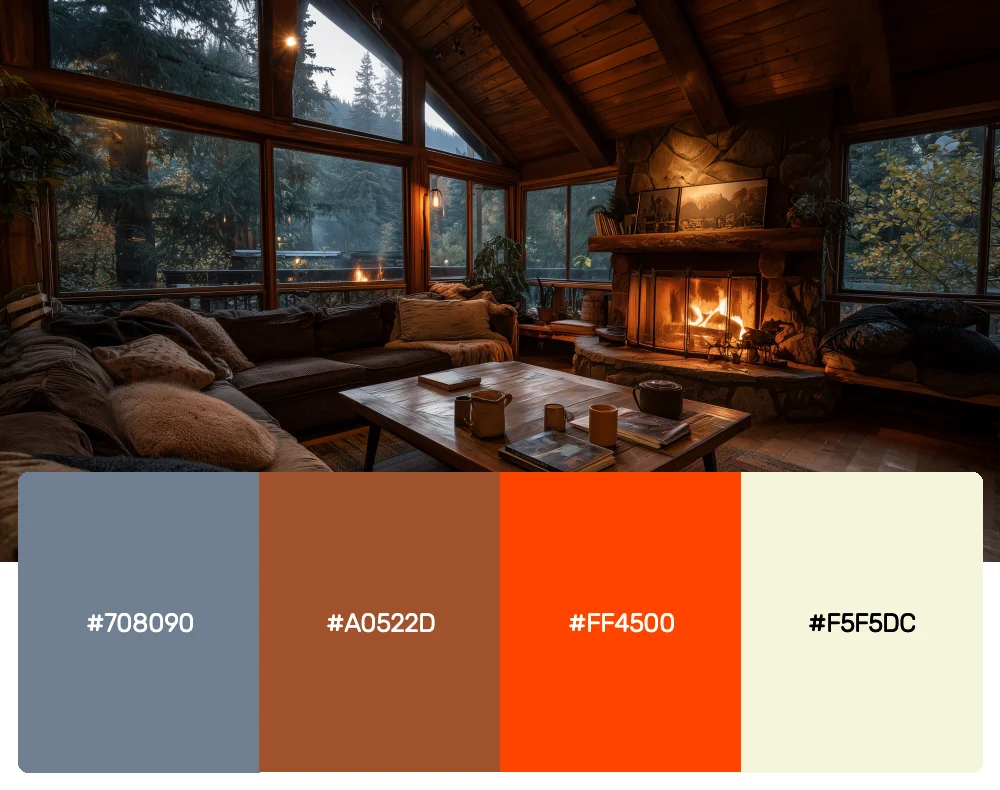
8. Smoky Mountains
This muted palette captures the misty, ethereal quality of autumn in the mountains. The soft grays and browns are punctuated by touches of burnt orange, creating a sophisticated combination that feels both modern and timeless.
-
#708090
-
#A0522D
-
#FF4500
-
#F5F5DC
Download this color palette
 735×1102
Pinterest image

 2160×3840
Vertical wallpaper

 900×900
Square

 3840×2160
4K Wallpaper

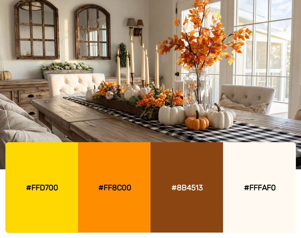
9. Harvest Moon
Drawing inspiration from the full autumn moon rising over golden fields, this palette combines warm yellows and oranges with deep browns and soft creams. It’s perfect for creating designs that feel both festive and elegant.
-
#FFD700
-
#FF8C00
-
#8B4513
-
#FFFAF0
Download this color palette
 735×1102
Pinterest image

 2160×3840
Vertical wallpaper

 900×900
Square

 3840×2160
4K Wallpaper

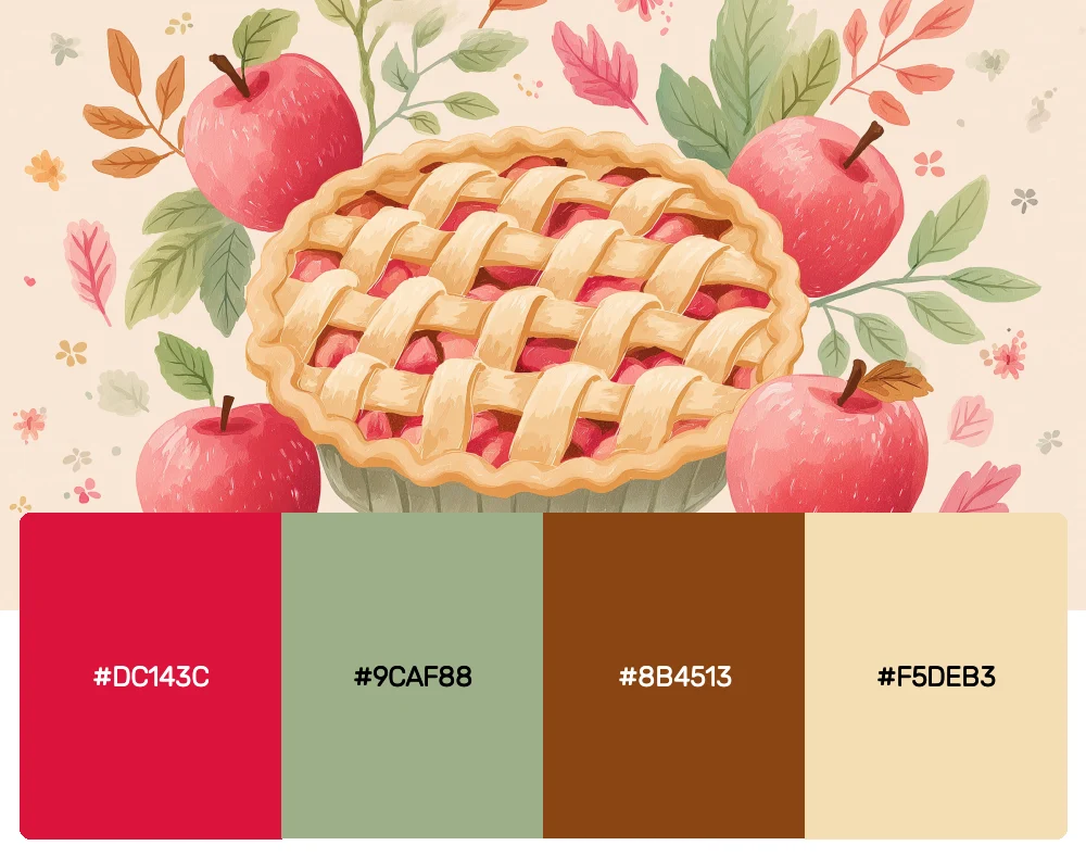
10. Apple Orchard
This fresh take on fall colors combines the crisp reds and greens of apple picking season. The bright red apple hues are balanced by sage greens and warm browns, creating a palette that feels both seasonal and unexpectedly fresh.
-
#DC143C
-
#9CAF88
-
#8B4513
-
#F5DEB3
Download this color palette
 735×1102
Pinterest image

 2160×3840
Vertical wallpaper

 900×900
Square

 3840×2160
4K Wallpaper

Why Fall Color Palettes Are Design Gold
Before we dive deeper into using these palettes, let me share why I believe fall colors are among the most powerful tools in a designer’s arsenal. Autumn represents transition, comfort, and harvest—themes that resonate deeply with people on an emotional level. These colors tap into our psychological associations with warmth, security, and abundance.
From a design perspective, fall palettes offer incredible versatility. They can be rustic or sophisticated, bold or subtle, traditional or contemporary. The key is understanding how to balance the warm, saturated tones with the right neutrals and accent colors to achieve your desired mood.
Modern Applications for Timeless Autumn Hues
The beauty of fall color palettes lies in their ability to feel both classic and contemporary. Here’s how I approach incorporating these seasonal hues into modern design work:
Create Depth with Layering
Fall colors are naturally rich and complex, which makes them perfect for creating visual depth. I love layering different tones from the same palette—perhaps using a deep burgundy as a base with lighter coral and cream accents. This technique works especially well in interior design and packaging.
Balance Warmth with Cool Neutrals
While fall palettes are inherently warm, introducing cool neutrals like soft grays or whites can prevent them from feeling overwhelming. This balance is crucial when designing for digital applications where screen fatigue is a concern.
Embrace Texture and Pattern
Fall colors practically beg to be paired with rich textures. Whether it’s the grain of weathered wood, the softness of wool, or the glossy finish of autumn leaves, these palettes come alive when combined with tactile elements.
Use Strategic Color Blocking
Taking a cue from the bold patterns found in autumn leaves, I often use fall colors in geometric or organic shapes that create visual interest without overwhelming the viewer.
The Psychology Behind Our Love for Autumn Colors
As someone who’s spent years studying color theory and its impact on human behavior, I’m fascinated by our collective draw to fall palettes. These colors trigger powerful psychological responses that go beyond simple aesthetic preference.
The warm reds and oranges stimulate feelings of energy and excitement while remaining more approachable than their brighter summer counterparts. The browns and golds evoke stability and reliability—qualities that become especially important as we transition into the more introspective winter months. Even the deeper purples and burgundies suggest luxury and sophistication without the coldness often associated with darker hues.
Bringing Fall Palettes Into Different Design Contexts
Brand Identity and Logo Design
Fall color palettes work exceptionally well for brands that want to convey warmth, reliability, and premium quality. I’ve used autumn-inspired combinations for everything from artisanal food companies to luxury real estate firms. The key is choosing the right balance of colors to match your brand’s personality.
Interior Design and Architecture
In interior spaces, fall colors create immediate warmth and intimacy. I love using these palettes in dining rooms and living spaces where you want people to feel comfortable and welcome. The trick is to vary the saturation levels—use the deepest colors as accents and build up from neutral bases.
Digital Design and User Experience
While it might seem counterintuitive to use such warm, rich colors in digital design, fall palettes can create memorable and engaging user experiences. I often use autumn colors for call-to-action buttons or to highlight important content, as they naturally draw the eye without being jarring.
Packaging and Product Design
Fall colors are incredibly effective in packaging design, especially for products that want to convey quality and craftsmanship. The rich, saturated tones photograph beautifully and create shelf appeal that’s hard to ignore.
Seasonal Marketing That Goes Beyond October
One mistake I see many designers make is limiting fall color palettes to obvious autumn applications. These rich, warm hues can be incredibly effective year-round when used thoughtfully. A deep burgundy and gold combination can feel luxurious in any season, while forest greens and browns create a sense of natural authenticity that transcends seasonal trends.
The key is understanding which aspects of fall colors create their appeal—the warmth, the richness, the connection to nature—and leveraging those qualities regardless of the calendar.
Technical Considerations for Fall Color Implementation
When working with fall color palettes, there are several technical aspects I always keep in mind:
Print vs. Digital: Fall colors can appear quite different in print versus digital applications. Always test your palette across different media to ensure consistency.
Accessibility: Some fall color combinations can present contrast challenges for users with visual impairments. Always check your palette against WCAG guidelines, especially when using darker browns and deep reds.
Cultural Considerations: While fall colors are generally well-received in Western contexts, be mindful of cultural associations when designing for global audiences.
The Future of Autumn-Inspired Design
As we move forward in design, I see fall color palettes evolving to incorporate more sustainable and nature-connected themes. The growing emphasis on environmental consciousness makes these earth-toned palettes more relevant than ever. I predict we’ll see more sophisticated applications that combine traditional autumn hues with unexpected accents and modern color theory.
Conclusion: Embracing the Warmth of Autumn Design
Working with fall color palettes has taught me that the most powerful design tools are often those that connect with our deepest emotional associations. These autumn-inspired combinations don’t just look beautiful—they make people feel something. Whether you’re designing a cozy coffee shop interior, a luxury brand identity, or a digital experience that needs to stand out, fall colors offer a richness and depth that’s hard to achieve with any other palette.
The secret to successfully using fall colors in modern design is understanding that they’re not just seasonal—they’re emotional. They represent comfort, abundance, transition, and beauty in change. When you approach these palettes with that understanding, you’ll find they can transform any project into something that resonates on a deeper level.
So as you consider your next design project, don’t overlook the power of autumn’s palette. Whether you choose the bold warmth of Maple Harvest or the sophisticated depth of Sunset Vineyard, these colors will bring a richness and authenticity to your work that clients and audiences will feel long before they consciously understand why.
Remember, the best designs are those that make people feel at home, and there’s nothing quite like fall colors to create that sense of warmth and belonging. Happy designing!