In this article:
- The 10 Most Captivating Brown Color Palettes
- Why Brown Is the Unsung Hero of Color Palettes
- Mastering Brown Color Palettes in Your Designs
- The Psychology Behind Brown in Design
- Adapting Brown Palettes Across Design Disciplines
- Common Brown Palette Mistakes (And How to Avoid Them)
- Conclusion: Embracing the Sophisticated Simplicity of Brown
Brown might not be the flashiest color in the spectrum, but as a designer who’s worked with countless color combinations over the years, I can tell you that brown is having a major moment. There’s something deeply satisfying about working with these rich, earthy tones that feel both timeless and incredibly contemporary. If you’re ready to embrace the sophisticated warmth that brown brings to design, you’re in for a treat.
I’ve curated 10 stunning brown color palettes that will transform your design projects and bring that perfect balance of comfort and elegance that only brown can deliver.
The 10 Most Captivating Brown Color Palettes
1. Deep Forest Foundation
-
 #7C3F00


-
#633200
-
#562B00
-
#492201
-
#3E1C00
Download this color palette
 735×1102
Pinterest image

 2160×3840
Vertical wallpaper
 900×900
Square
 3840×2160
4K Wallpaper

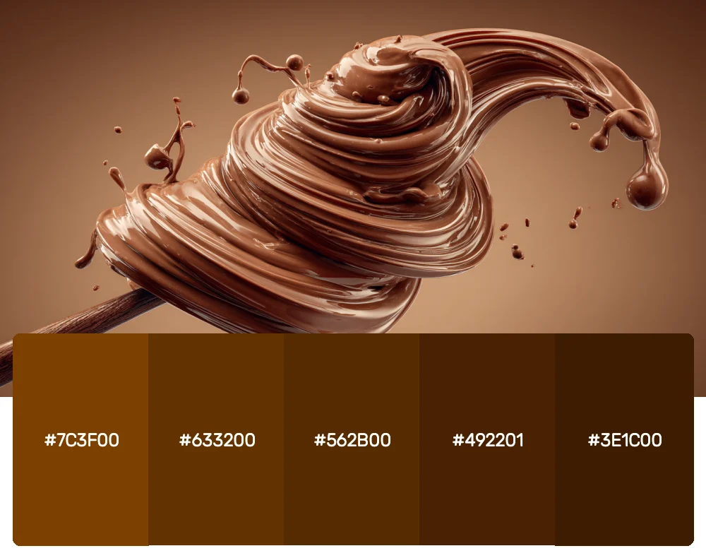
This rich, gradient palette moves from medium chocolate to deep espresso, creating a sophisticated monochromatic foundation. I find myself reaching for this combination when I need to establish trust and reliability in a brand. The progression from lighter to darker creates natural hierarchy and depth in any design.
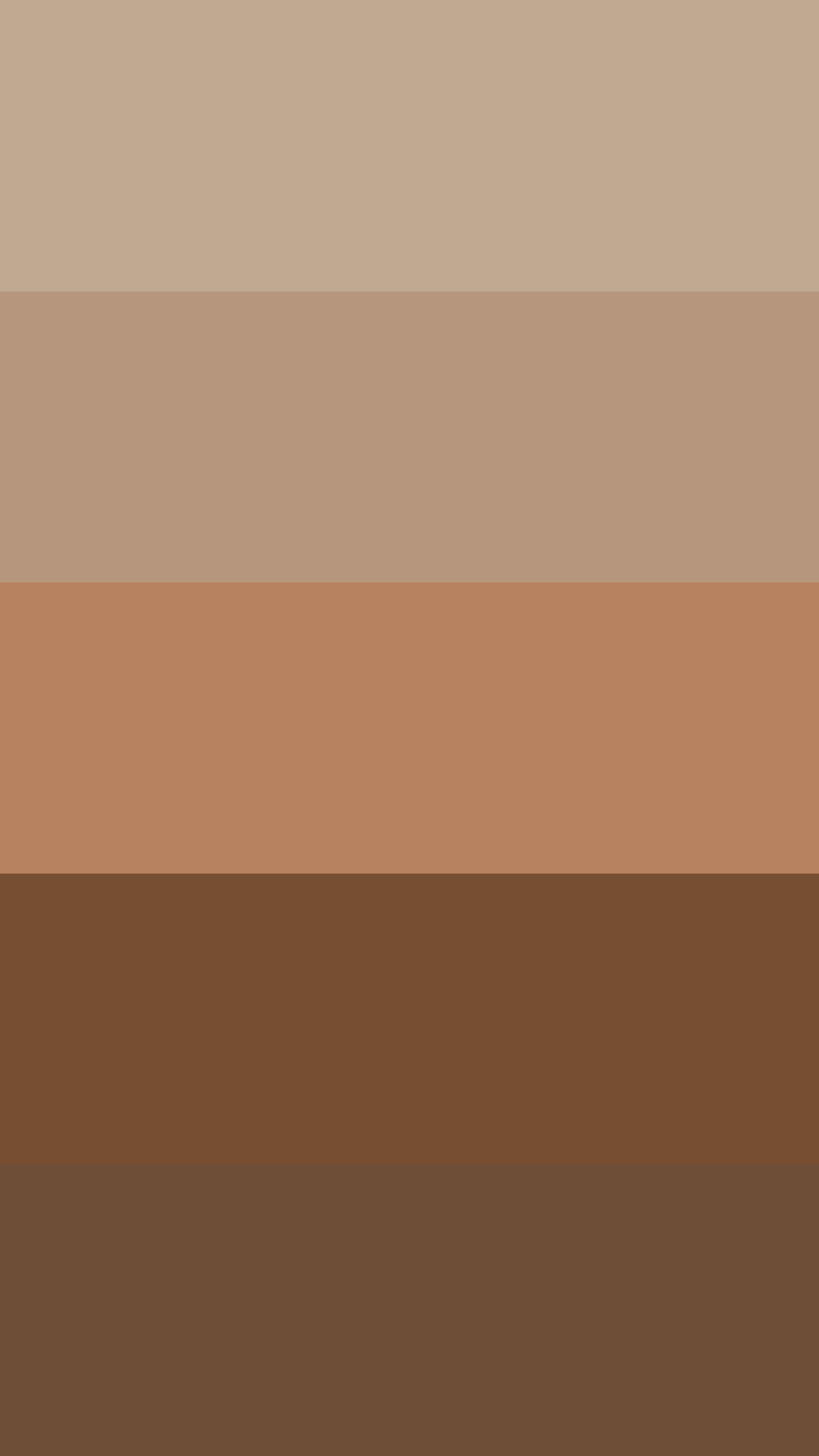
2. Latte & Cream Dreams
-
#C0A891
-
#B6977D
-
#B7825F
-
#774E32
-
#6F4E37
Download this color palette
 735×1102
Pinterest image

 2160×3840
Vertical wallpaper
 900×900
Square

 3840×2160
4K Wallpaper
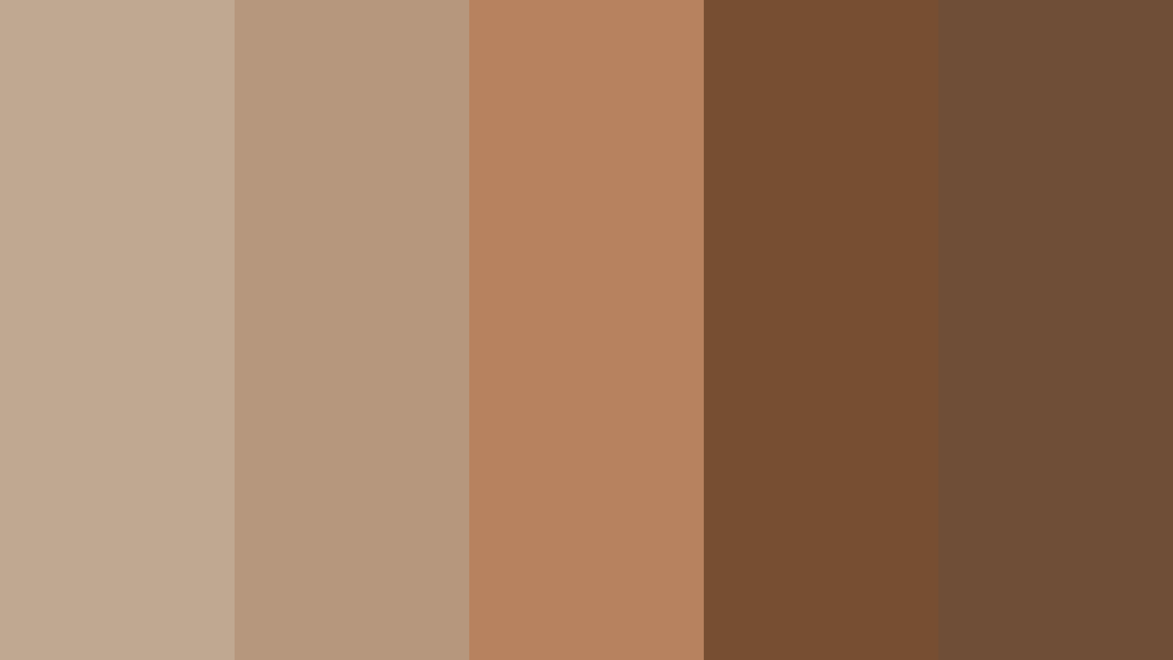
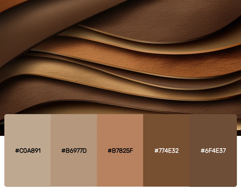
Nothing says cozy sophistication quite like this warm, café-inspired palette. The creamy tones at the top flow beautifully into rich coffee browns, making it perfect for lifestyle brands, interior design projects, or any work that needs to feel approachable yet refined.
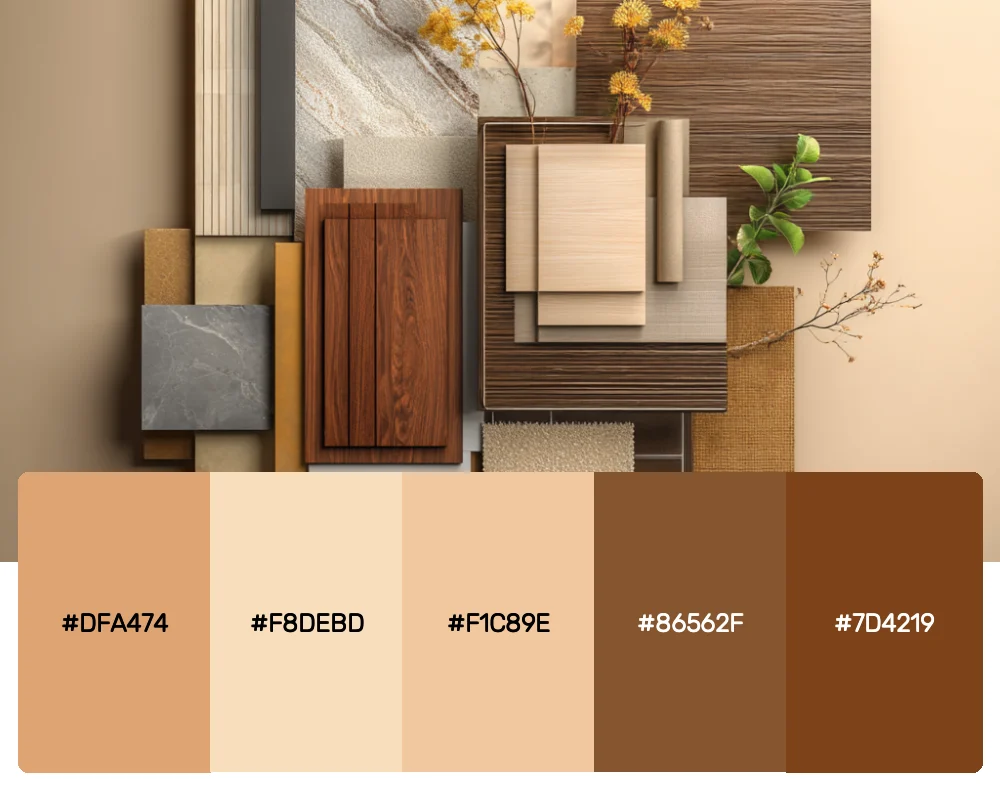
3. Artisan Wood Collection
-
#DFA474
-
#F8DEBD
-
#F1C89E
-
#86562F
-
#7D4219
Download this color palette
 735×1102
Pinterest image

 2160×3840
Vertical wallpaper

 900×900
Square

 3840×2160
4K Wallpaper


Get 300+ Fonts for FREE
Enter your email to download our 100% free "Font Lover's Bundle". For commercial & personal use. No royalties. No fees. No attribution. 100% free to use anywhere.
Inspired by the natural beauty of different wood grains, this palette captures everything from blonde birch to deep walnut. I love using these tones for brands that want to emphasize craftsmanship, sustainability, or natural materials. The variety gives you incredible flexibility while maintaining perfect harmony.
4. Woodland Whispers
-
#102820
-
#4C6444
-
#CABA9C
-
#8A6240
-
#4D2D18
Download this color palette
 735×1102
Pinterest image

 2160×3840
Vertical wallpaper

 900×900
Square

 3840×2160
4K Wallpaper

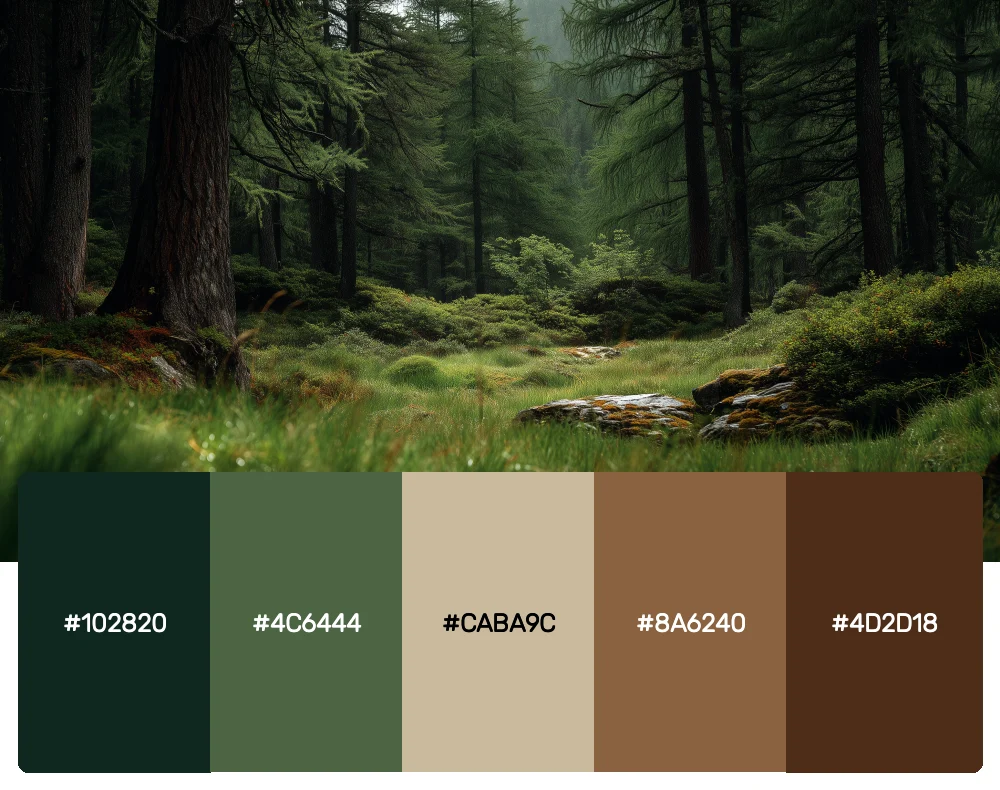
When brown meets forest green, magic happens. This palette balances the warmth of brown with the freshness of deep greens, creating something that feels both grounded and alive. It’s become my go-to for outdoor brands or any project that needs to feel connected to nature.
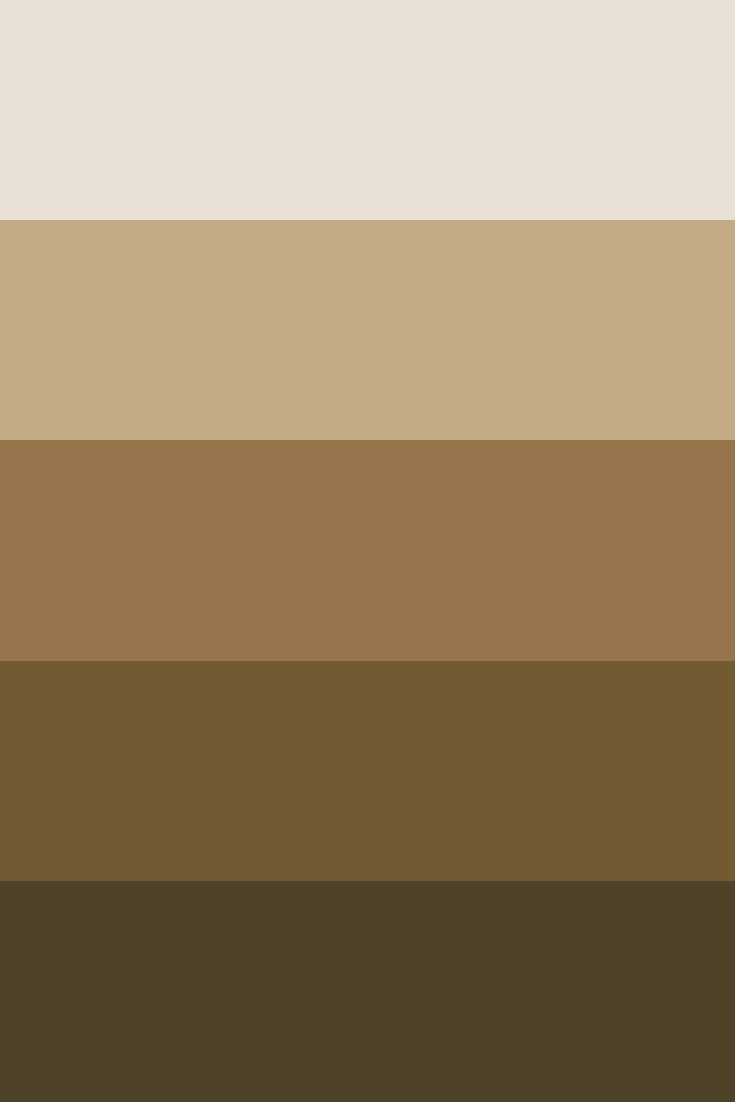
5. Desert Stone Symphony
-
#E9E0D6
-
#C2AB85
-
#98744C
-
#725A32
-
#4E4328
Download this color palette
 735×1102
Pinterest image
 2160×3840
Vertical wallpaper

 900×900
Square

 3840×2160
4K Wallpaper
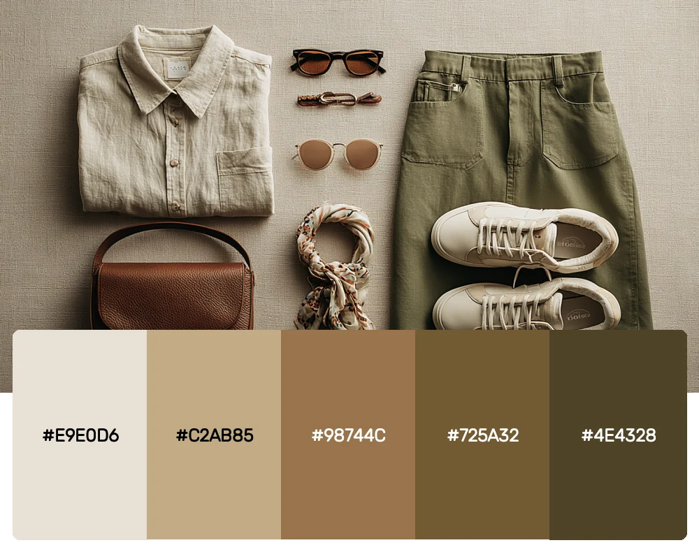
Inspired by the layered beauty of desert landscapes, this palette moves from soft sand to deep earth. The neutral beginning makes it incredibly versatile, while the darker tones add the weight and substance that brown does so well. Perfect for creating designs that feel both modern and timeless.
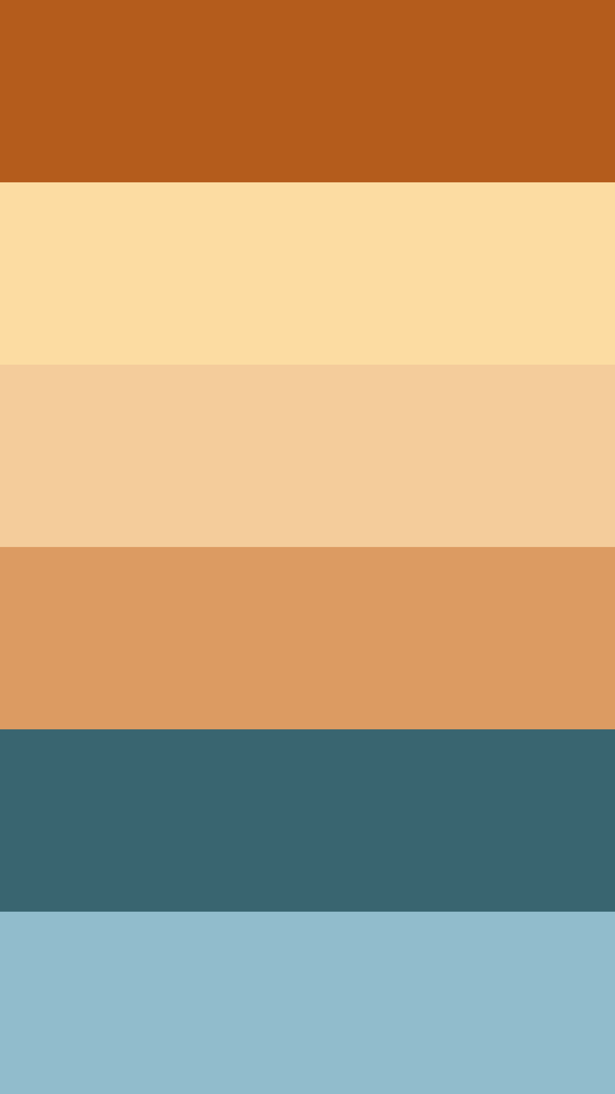
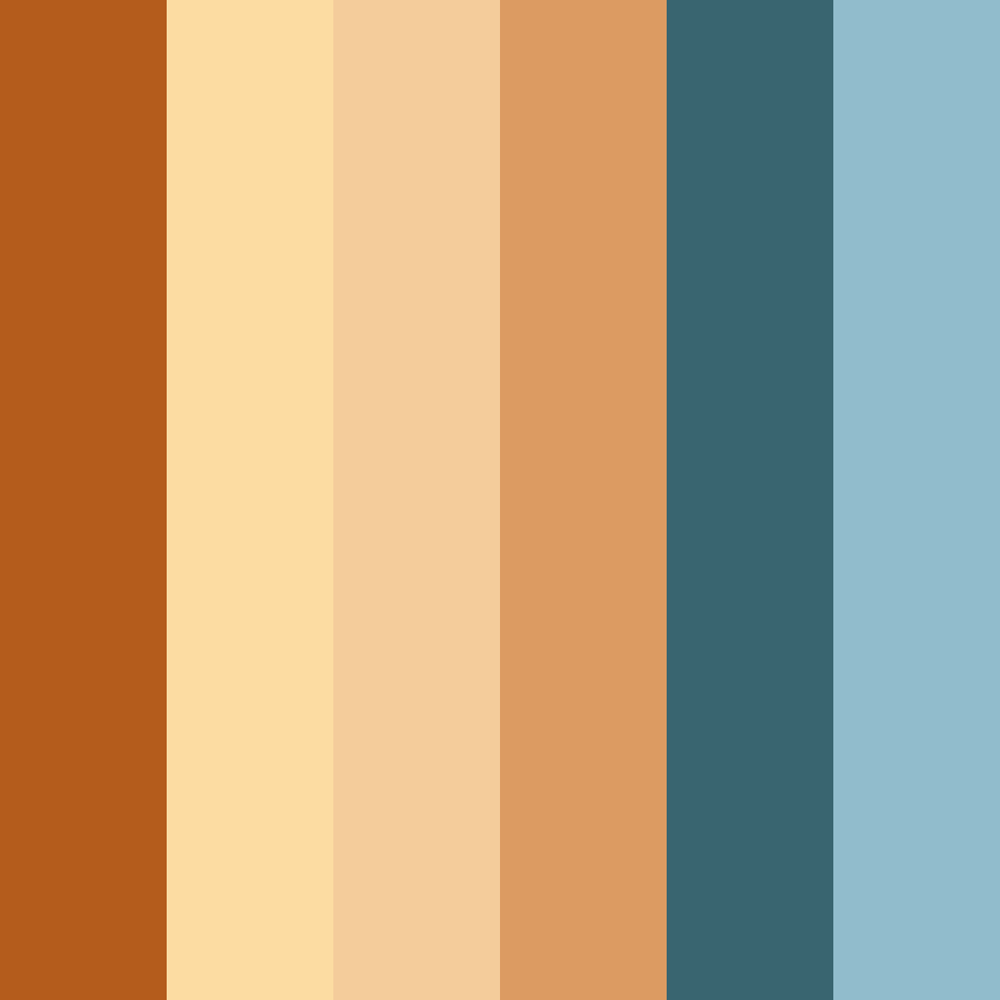
6. Autumn Harvest Glow
-
#B45C1C
-
#FCDCA2
-
#F4CC9B
-
#DC9B62
-
#396570
-
#91BCCC
Download this color palette
 735×1102
Pinterest image

 2160×3840
Vertical wallpaper
 900×900
Square
 3840×2160
4K Wallpaper

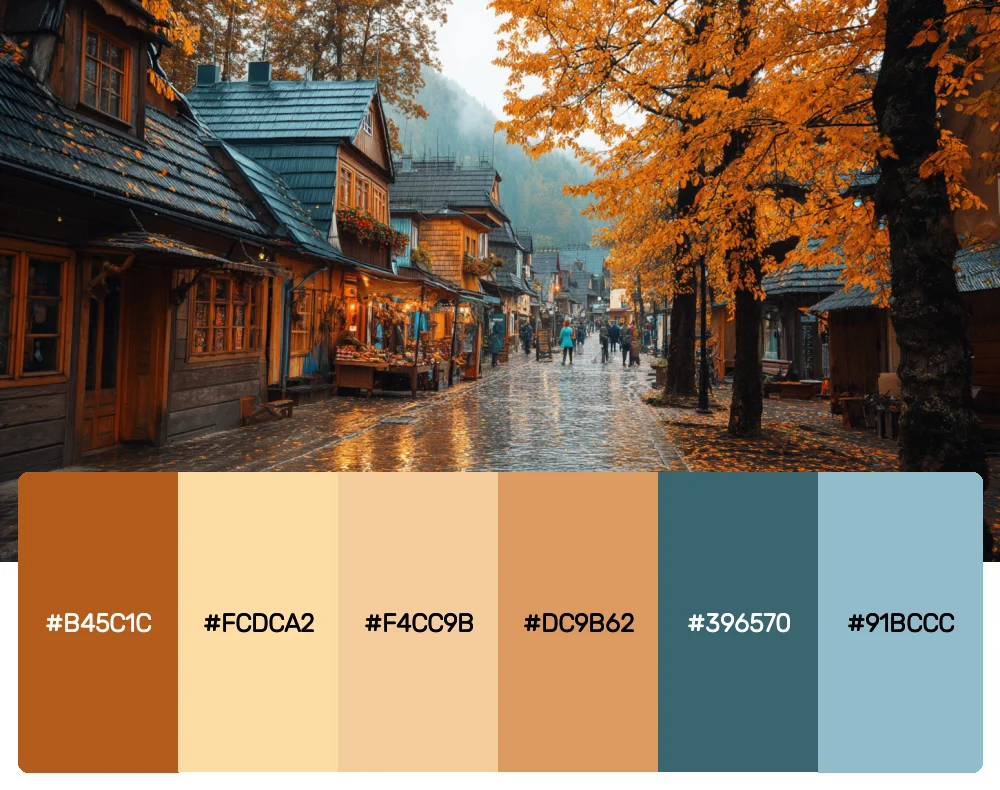
This warm, golden-brown palette captures the essence of fall without being seasonal. The bright cream tones lift the entire combination, while the rich browns keep it grounded. I find it works beautifully for food brands, artisanal products, or any design that needs to feel warm and inviting.
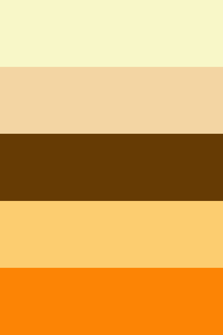
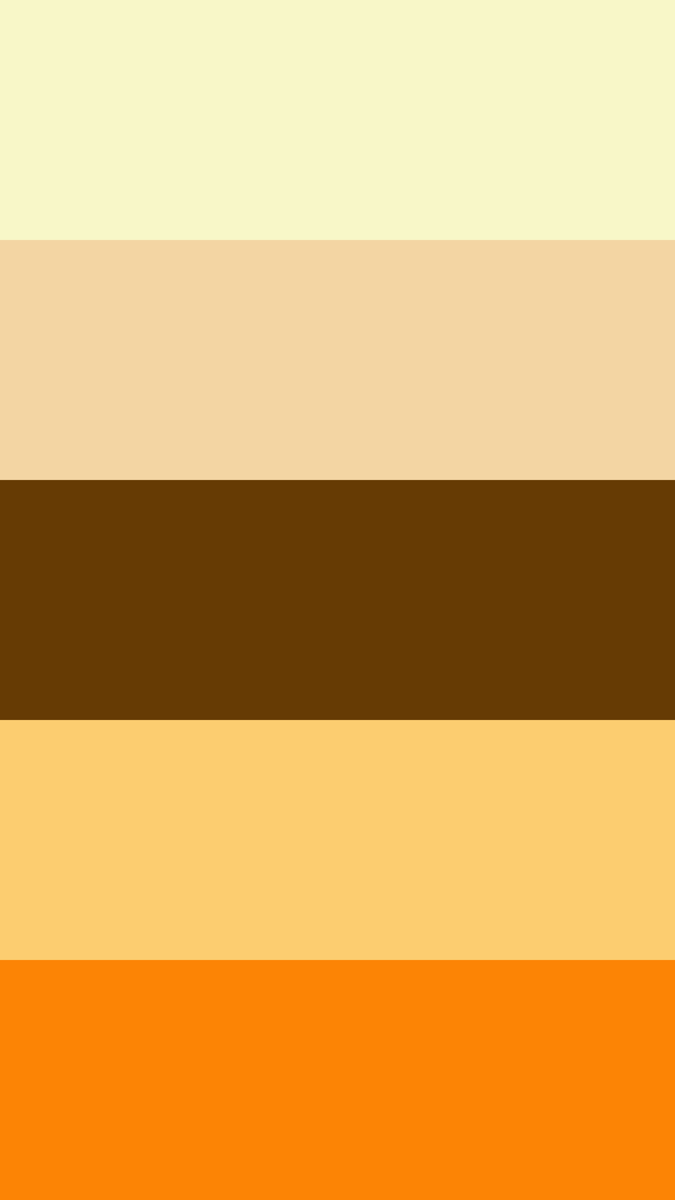
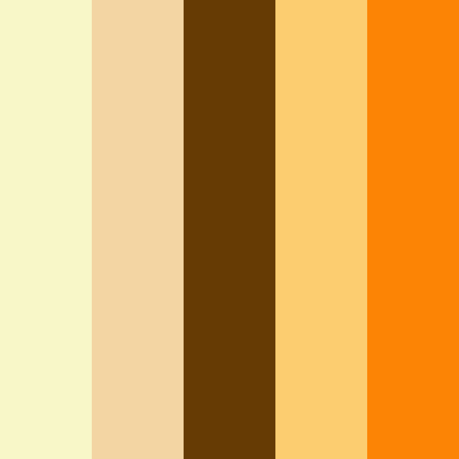
7. Honeyed Amber Flow
-
#F8F7C8
-
#F3D5A3
-
#663B04
-
#FCCD70
-
#FC8405
Download this color palette
 735×1102
Pinterest image
 2160×3840
Vertical wallpaper
 900×900
Square
 3840×2160
4K Wallpaper

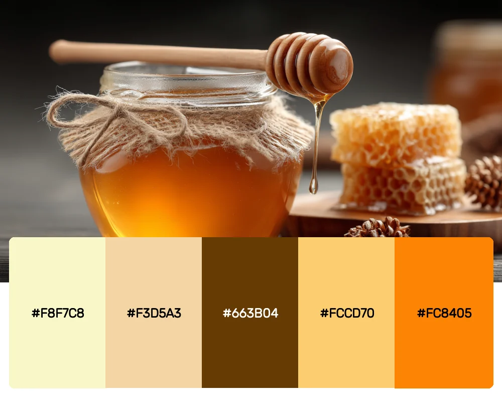
Starting with the palest cream and flowing into deep amber, this palette has an almost luminous quality. The contrast between the light beginning and the rich, dark accent creates drama while maintaining warmth. It’s perfect for luxury brands or designs that need to feel both elegant and approachable.
8. Minimalist Earth
-
#836539
-
#3D2B1F
-
#0F3B57
-
#A3BFCF
-
#F5F5F5
Download this color palette
 735×1102
Pinterest image

 2160×3840
Vertical wallpaper

 900×900
Square

 3840×2160
4K Wallpaper

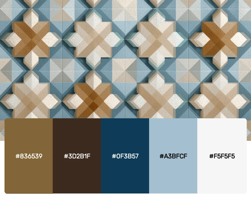
Sometimes less is more. This refined palette combines classic brown tones with a sophisticated blue accent and clean neutrals. I love using this combination for corporate work or any project that needs to feel professional yet warm.
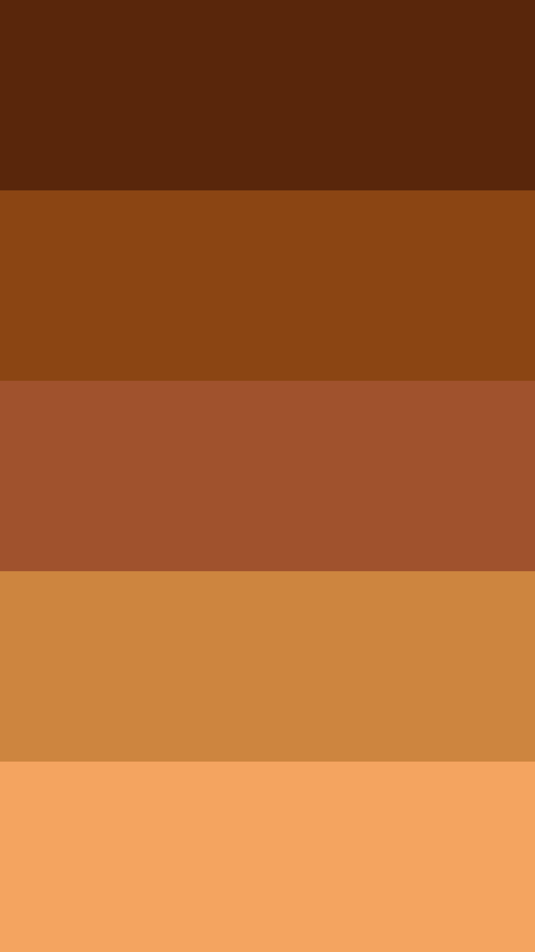
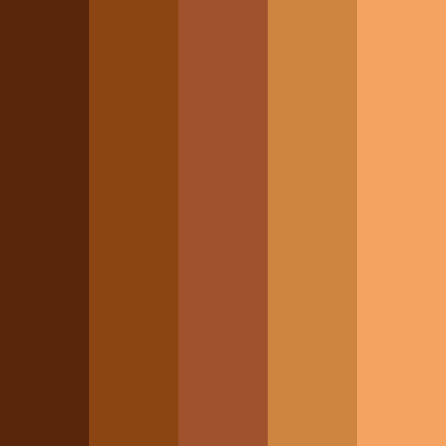
9. Rich Mahogany Essence
-
#59260B
-
#8B4513
-
#A0522D
-
#CD853F
-
#F4A460
Download this color palette
 735×1102
Pinterest image

 2160×3840
Vertical wallpaper
 900×900
Square
 3840×2160
4K Wallpaper

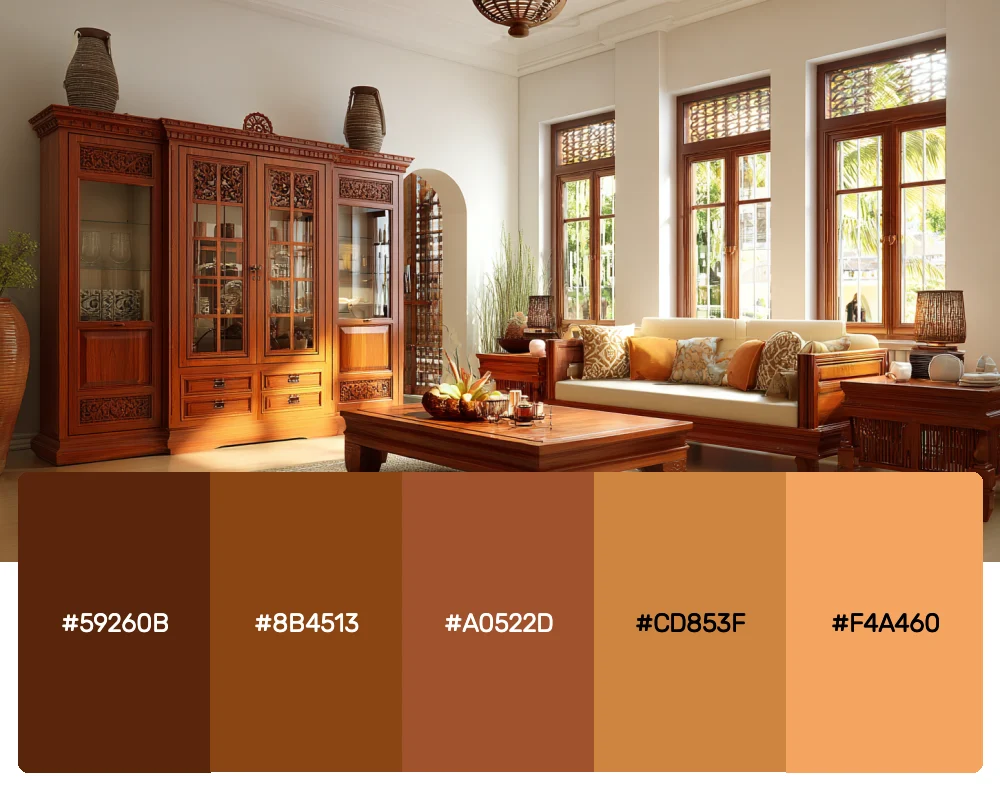
Deep, luxurious, and undeniably elegant, this palette is all about rich brown in its most sophisticated form. The progression from deep mahogany to sandy brown creates incredible depth, making it perfect for premium brands or designs that need to convey quality and craftsmanship.
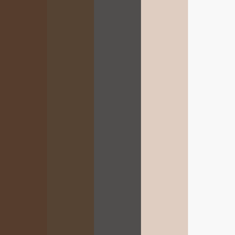
10. Modern Neutral Balance
-
#563D2D
-
#554333
-
#504E4D
-
#DFCDC1
-
#F8F8F8
Download this color palette
 735×1102
Pinterest image

 2160×3840
Vertical wallpaper

 900×900
Square
 3840×2160
4K Wallpaper

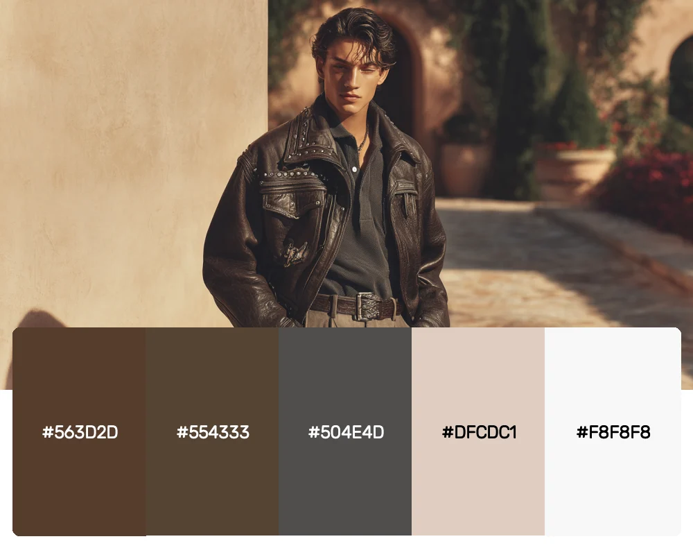
This contemporary palette shows how brown can work beautifully in modern, minimalist designs. The subtle shift from brown to gray creates a sophisticated neutral foundation that’s anything but boring. It’s become essential for my clean, contemporary projects.
Why Brown Is the Unsung Hero of Color Palettes
Before we dive deeper into how to use these palettes, let’s appreciate why brown deserves more respect in the design world. Brown is the color of earth, wood, leather, and chocolate – all things that make us feel grounded and comfortable. It’s inherently trustworthy and stable, which is why it works so well for brands that want to establish credibility.
In a world of bright, attention-grabbing colors, brown offers something different: sophistication without shouting, warmth without overwhelming, and depth without drama. As a designer, I’ve noticed that brown has this unique ability to make other colors look more expensive and refined.
Mastering Brown Color Palettes in Your Designs
Working with brown might seem straightforward, but there are some key strategies I’ve learned that can make the difference between muddy and magnificent:
Start with the Right Brown
Not all browns are created equal. Warm browns have red or yellow undertones and feel cozy and inviting. Cool browns lean toward gray and feel more modern and sophisticated. Choose your base brown based on the feeling you want to create.
Layer Your Textures
Brown comes alive when you play with different textures. Think about the difference between smooth leather, rough bark, and soft suede – all brown, but each with its own personality. Use this in your designs by varying the finish, pattern, or material quality of your brown elements.
Balance Light and Dark
Brown palettes can easily become too heavy if you don’t balance them with lighter elements. I always include at least one light neutral in my brown palettes to give the eye a place to rest and to keep the overall feel from becoming too dense.
Add Strategic Accents
While brown is beautiful on its own, it really shines when paired with the right accent colors. Deep blues create a classic, trustworthy combination. Warm oranges and golds enhance brown’s cozy qualities. Even small touches of bright green can make brown feel fresh and contemporary.
The Psychology Behind Brown in Design
Understanding why brown affects us the way it does can help you use it more strategically in your work. Brown is associated with reliability, honesty, and down-to-earth qualities. It’s the color of home, comfort, and security. This makes it perfect for brands that want to establish trust or create a sense of belonging.
In interior design, brown creates spaces that feel lived-in and welcoming. In fashion, it’s timeless and versatile. In branding, it suggests authenticity and craftsmanship. The key is understanding these associations and using them intentionally.
Adapting Brown Palettes Across Design Disciplines
One of the things I love most about brown is how well it translates across different types of design work:
Brand Identity
Brown excels in branding for companies that want to emphasize quality, tradition, or natural products. Coffee shops, artisanal food brands, outdoor gear companies, and luxury leather goods all benefit from brown’s inherent associations with quality and authenticity.
Interior Spaces
In interior design, brown creates environments that feel both sophisticated and comfortable. The key is layering different shades and textures to create visual interest. A room done entirely in one shade of brown feels flat, but a space that incorporates multiple brown tones with varying textures feels rich and inviting.
Digital Design
Brown might seem challenging for web design, but it can create incredibly memorable and unique digital experiences. The trick is using brown as a foundation color paired with crisp whites and strategic accent colors. Brown backgrounds can make content feel more premium and less corporate.
Print Design
Brown has a natural elegance in print that’s hard to replicate on screen. It photographs beautifully and has a timeless quality that makes printed materials feel more substantial and important. I often use brown for invitations, packaging, and other printed pieces that need to feel special.
Common Brown Palette Mistakes (And How to Avoid Them)
Over the years, I’ve seen designers make a few common mistakes when working with brown. Here’s how to avoid them:
Going Too Monochromatic
While brown-on-brown can be sophisticated, it can also be boring. Make sure you’re including enough contrast and variety in your palette to keep things interesting.
Forgetting About Warmth vs. Coolness
Mixing warm and cool browns without intention can create a muddy, unpleasant effect. Be deliberate about whether you’re working with warm or cool undertones.
Neglecting the Power of White Space
Brown can be visually heavy, so don’t forget to give your designs room to breathe with adequate white space or lighter elements.
Conclusion: Embracing the Sophisticated Simplicity of Brown
These 10 brown color palettes represent just the beginning of what’s possible when you embrace this wonderfully versatile color family. Brown offers something that many other colors can’t: the perfect balance of sophistication and approachability, of contemporary style and timeless appeal.
Whether you’re designing a cozy coffee shop brand, a luxury leather goods website, or a modern living space, these brown palettes provide the foundation for work that feels both current and enduring. The key is to approach brown not as a boring default, but as a rich, complex color family full of possibilities.
So go ahead and get your hands dirty with these earthy, sophisticated palettes. Your designs will thank you for the depth, warmth, and understated elegance that only brown can provide. Remember, great design isn’t always about being the loudest voice in the room – sometimes it’s about being the most trustworthy one.
Happy designing!