In this article:
- The 10 Most Inviting Warm Color Palettes
- Why Warm Colors Work So Well
- Making Warm Palettes Work in Modern Design
- Warm Palettes Across Different Applications
- The Cultural Context of Warmth
- Seasonal Considerations
- Bringing It All Together
There’s nothing quite like the embracing quality of warm colors to make a design feel inviting and alive. As someone who’s spent years working with color, I can tell you that warm palettes have this incredible ability to create instant emotional connection – they draw people in, make them feel comfortable, and add that special touch of energy that cooler tones just can’t match.
Whether you’re designing a brand identity that needs to feel approachable, creating an interior space that welcomes guests, or crafting digital experiences that feel human and engaging, warm color palettes are your secret weapon. I’ve curated eight of my favorite warm color combinations that never fail to bring projects to life.
The 10 Most Inviting Warm Color Palettes
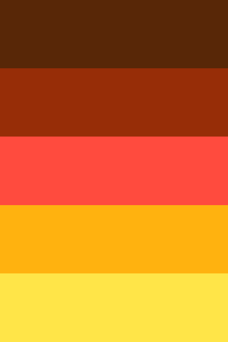
1. Fireplace Embers
This palette captures the deep, glowing warmth of a crackling fire, moving from the darkest burnt wood tones through bright flames to golden sparks. There’s something primal and comforting about these colors that instantly makes any space feel like home.
-
 #582707


-
#972D07
-
#FF4B3E
-
#FFB20F
-
#FFE548
Download this color palette
 735×1102
Pinterest image
 2160×3840
Vertical wallpaper

 900×900
Square

 3840×2160
4K Wallpaper

I love how this combination builds intensity from the rich chocolate browns through vibrant reds to sunny yellows. It’s perfect for brands that want to convey both reliability and energy.
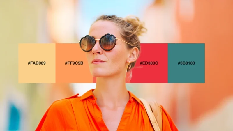
2. Sunset Adobe
Inspired by southwestern architecture bathed in golden hour light, this palette brings together warm earth tones with vibrant coral and cooling sage. It’s sophisticated warmth with just the right amount of contrast.
-
#FAD089
-
#FF9C5B
-
#F5634A
-
#ED303C
-
#3B8183
Download this color palette
 735×1102
Pinterest image

 2160×3840
Vertical wallpaper

 900×900
Square

 3840×2160
4K Wallpaper

The unexpected teal at the end grounds this palette beautifully, preventing it from becoming too intense while adding depth and sophistication. Perfect for luxury brands with a natural, artisanal feel.
3. Sunset Glow
This palette captures those magical golden hour moments when the sky transforms into a canvas of warm brilliance. I find myself reaching for these colors whenever I want to create something that feels optimistic and energizing.

Get 300+ Fonts for FREE
Enter your email to download our 100% free "Font Lover's Bundle". For commercial & personal use. No royalties. No fees. No attribution. 100% free to use anywhere.
-
#FF6B35
-
#F7931E
-
#FFD23F
-
#FFF8E7
Download this color palette
 735×1102
Pinterest image

 2160×3840
Vertical wallpaper

 900×900
Square

 3840×2160
4K Wallpaper

The interplay between the deep coral and bright amber creates movement, while the cream base keeps everything grounded. Perfect for brands that want to convey warmth and reliability.
4. Autumn Harvest
Nothing says cozy quite like the rich, earthy tones of fall foliage. This palette brings together the deep warmth of changing leaves with the golden light of shorter days.
-
#8B4513
-
#CD853F
-
#DAA520
-
#F4E4BC
Download this color palette
 735×1102
Pinterest image

 2160×3840
Vertical wallpaper

 900×900
Square

 3840×2160
4K Wallpaper

I love using this combination for projects that need to feel established and trustworthy. There’s something about these colors that speaks to tradition and quality.
5. Desert Bloom
Inspired by the surprising bursts of color found in arid landscapes, this palette combines the warmth of sun-baked earth with vibrant desert flowers.
-
#E07A5F
-
#F2CC8F
-
#81B29A
-
#F4F3EE
Download this color palette
 735×1102
Pinterest image

 2160×3840
Vertical wallpaper

 900×900
Square

 3840×2160
4K Wallpaper

The sage green might seem like an unexpected addition, but it perfectly balances the intensity of the coral and creates a sophisticated warmth that’s both modern and timeless.
6. Campfire Stories
This palette evokes those perfect evenings around a crackling fire, when conversation flows as freely as the warm light dancing across faces.
-
#D2691E
-
#CD5C5C
-
#F4A460
-
#FDF5E6
Download this color palette
 735×1102
Pinterest image

 2160×3840
Vertical wallpaper

 900×900
Square

 3840×2160
4K Wallpaper

These colors work beautifully together because they share that flickering, organic quality of firelight. I often recommend this palette for hospitality brands or any project that wants to feel welcoming and communal.
7. Spiced Chai
Drawing inspiration from aromatic spices and comfort drinks, this palette brings together the warmth of cinnamon, cardamom, and rich cream.
-
#A0522D
-
#DEB887
-
#F5DEB3
-
#FFFAF0
Download this color palette
 735×1102
Pinterest image

 2160×3840
Vertical wallpaper

 900×900
Square

 3840×2160
4K Wallpaper

There’s something incredibly soothing about these colors. They remind me of cozy cafes and intimate conversations, making them perfect for brands in the wellness or food space.
8. Coral Reef
This vibrant palette captures the living warmth of tropical waters, where coral formations create stunning displays of natural color.
-
#FF7F7F
-
#FFB347
-
#FFCCCB
-
#FFF5EE
Download this color palette
 735×1102
Pinterest image

 2160×3840
Vertical wallpaper

 900×900
Square

 3840×2160
4K Wallpaper

The soft peachy tones create depth while maintaining that cheerful, energetic feeling. I love using this palette for brands targeting younger audiences or projects that need to feel fresh and lively.
9. Terracotta Dreams
Inspired by Mediterranean architecture and handcrafted pottery, this palette brings together earthy reds with warm neutrals that feel both ancient and contemporary.
-
#CD853F
-
#A0522D
-
#DEB887
-
#F5F5DC
Download this color palette
 735×1102
Pinterest image

 2160×3840
Vertical wallpaper

 900×900
Square

 3840×2160
4K Wallpaper

These colors have been beloved by cultures around the world for centuries, and there’s good reason for that enduring appeal. They create spaces and designs that feel both sophisticated and approachable.
10. Golden Hour
This palette captures that perfect moment when everything is bathed in warm, golden light – when ordinary scenes become magical and every color seems to glow from within.
-
#FFD700
-
#FFA500
-
#FF8C00
-
#FFFACD
Download this color palette
 735×1102
Pinterest image

 2160×3840
Vertical wallpaper

 900×900
Square

 3840×2160
4K Wallpaper

I find these colors work exceptionally well for luxury brands or any project that wants to convey premium quality and elegance without feeling cold or distant.

Why Warm Colors Work So Well
Before diving deeper into how to use these palettes, it’s worth understanding why warm colors have such powerful psychological effects. Warm colors – reds, oranges, yellows, and their variations – literally make us feel warmer. They increase our heart rate slightly, create feelings of energy and excitement, and make spaces feel more intimate and cozy.
From a design perspective, warm colors advance visually, meaning they appear to come forward in a composition. This makes them excellent for creating focal points and drawing attention. They’re also associated with comfort, friendliness, and approachability – qualities that most brands and spaces want to embody.
As a designer, I’ve noticed that warm palettes tend to make people linger longer, whether that’s on a website, in a store, or in a room. There’s something inherently inviting about these colors that makes people want to stay and explore.

Making Warm Palettes Work in Modern Design
The challenge with warm color palettes is that they can sometimes feel overwhelming or dated if not handled carefully. Here’s how I approach using them in contemporary projects:
Start with restraint. You don’t need to use every color in a palette at full saturation. Often, using one or two colors as the primary focus and letting others play supporting roles creates more sophisticated results.
Consider your lighting. Warm colors can look dramatically different under various lighting conditions. Always test your palette in the actual environment where it will be seen, whether that’s on different screens or under different types of artificial lighting.
Balance temperature. While these are warm palettes, introducing small amounts of cooler tones can create visual interest and prevent the overall feeling from becoming too intense. Notice how several of my palettes include sage greens or cool creams.
Think about texture. Warm colors often work beautifully with textural elements. Consider how these colors might look on different materials – matte versus glossy finishes, rough versus smooth textures.
Use white space strategically. Warm colors can feel crowded if not given room to breathe. Generous white space or neutral backgrounds help warm colors feel more sophisticated and less overwhelming.
Warm Palettes Across Different Applications
The beauty of warm color palettes lies in their versatility. I’ve successfully used variations of these combinations across virtually every type of design project.
In branding, warm palettes work exceptionally well for companies in food service, hospitality, wellness, education, and family-oriented businesses. They convey approachability and trustworthiness while still feeling energetic and modern.
For interior spaces, these palettes create environments where people naturally want to gather and connect. I particularly love using warm colors in dining areas, living rooms, and any space designed for conversation and relaxation.
In digital design, warm palettes can make websites and apps feel more human and less sterile. They’re especially effective for call-to-action buttons, as warm colors naturally draw the eye and encourage interaction.
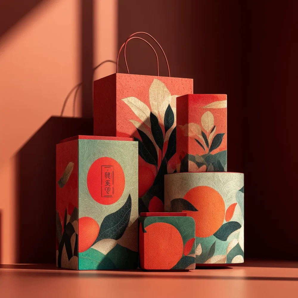
For packaging and product design, warm colors suggest quality, craftsmanship, and attention to detail. They’re particularly effective for artisanal products, gourmet foods, and premium lifestyle brands.

The Cultural Context of Warmth
It’s fascinating to consider how different cultures have embraced warm colors throughout history. From the ochres and umbers used in cave paintings to the vibrant oranges and reds found in Indian textiles, warm colors have always been associated with life, energy, and celebration.
In contemporary design, we’re seeing a renewed appreciation for these earthy, warm tones as people seek more authentic, human-centered experiences. After years of cool, minimalist aesthetics dominating design trends, there’s a growing hunger for color palettes that feel more emotionally resonant and personally meaningful.
This shift isn’t just aesthetic – it reflects deeper cultural changes toward valuing comfort, community, and authentic connection over stark perfection.
Seasonal Considerations
While warm colors work year-round, they do have natural seasonal associations that can be leveraged strategically. The autumn-inspired palettes feel most natural during fall months, while the coral and sunset palettes align beautifully with summer energy.
However, I’ve found that using warm colors counter-seasonally can create particularly memorable impressions. A warm, cozy palette during winter months can provide welcome relief from the cold, while warm colors in spring can feel fresh and optimistic.
Bringing It All Together
Working with warm color palettes is ultimately about understanding the emotional response you want to create. These colors have the power to make people feel welcomed, energized, and comfortable – but they require thoughtful application to achieve their full potential.
Whether you choose the earthy sophistication of Terracotta Dreams or the vibrant energy of Coral Reef, remember that the most successful warm palettes are those that feel intentional and balanced. Don’t be afraid to experiment, but always consider how your color choices serve the overall goals of your project.
The world needs more warmth – in our interactions, our spaces, and our visual experiences. These eight palettes offer you the tools to bring that warmth into your design work, creating experiences that don’t just look good, but feel good too.
So go ahead, embrace the warmth. Let these colors bring life and energy to your next project, and watch as they transform not just the visual impact, but the emotional resonance of your work. After all, great design isn’t just about what we see – it’s about how it makes us feel.