In this article:
As designers, we’re always looking for ways to inject a bit more personality into our work—something that feels real, a little imperfect, and unmistakably human. And in 2026, pencil fonts are having a major moment, reintroducing that sketched, hand-drawn feel that polished digital type just can’t match.
Pencil fonts do exactly what you’d expect—they recreate the soft, uneven strokes of graphite on paper. That subtle texture and inconsistency is what gives them their charm, instantly making designs feel more relaxed, approachable, and alive. Let’s get those creative tools sharpened and dive in.
The Most Expressive Pencil Fonts of 2026
Not all pencil fonts are created equal. Some capture the light, sketchy quality of a 2H pencil, while others embody the bold, rich texture of a 6B. Here’s my curated list of the most expressive pencil fonts that are making waves in 2026:
Street Graphite
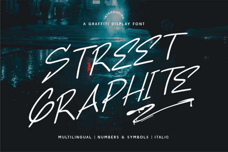
Street Graphite is a tagging graffiti font that captures the raw energy of street art. Its spray paint-inspired design makes it perfect for urban-themed projects, music album covers, or any design that aims to convey a rebellious, edgy vibe. This font can add authenticity to designs inspired by street culture.
Wondeur
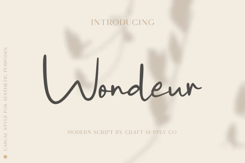
Wondeur is a modern script font that combines elegance with a contemporary twist. Its flowing lines and subtle imperfections create a chic, handwritten appearance. This font is perfect for fashion brands, beauty products, or any design that requires a touch of sophistication and personal flair.
SA Yesenin
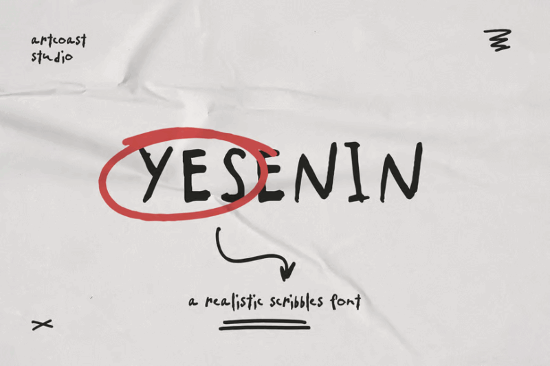
SA Yesenin is a realistic scribbles font that combines sans-serif structure with handwritten flair. This versatile typeface offers a unique blend of readability and artistic expression. It’s ideal for creating designs that require a balance between professionalism and creativity, such as magazine layouts or modern branding projects.
Audys
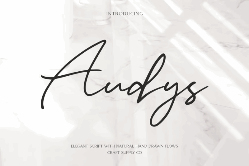
Audys is an elegant script font that exudes sophistication and grace. Its refined curves and smooth connections make it ideal for high-end branding, wedding stationery, or luxury product packaging. This font can elevate designs by adding a touch of class and timeless beauty.

Get 300+ Fonts for FREE
Enter your email to download our 100% free "Font Lover's Bundle". For commercial & personal use. No royalties. No fees. No attribution. 100% free to use anywhere.
Chalk Times
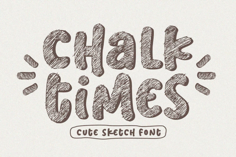
Chalk Times is a comprehensive sketch font family that mimics the appearance of chalk writing. Offering sans-serif, serif, script, and decorative styles, it’s perfect for education-related designs, menu boards, or any project requiring a schoolhouse aesthetic. The included symbols enhance its versatility for creating cohesive chalk-style designs.
Handodle
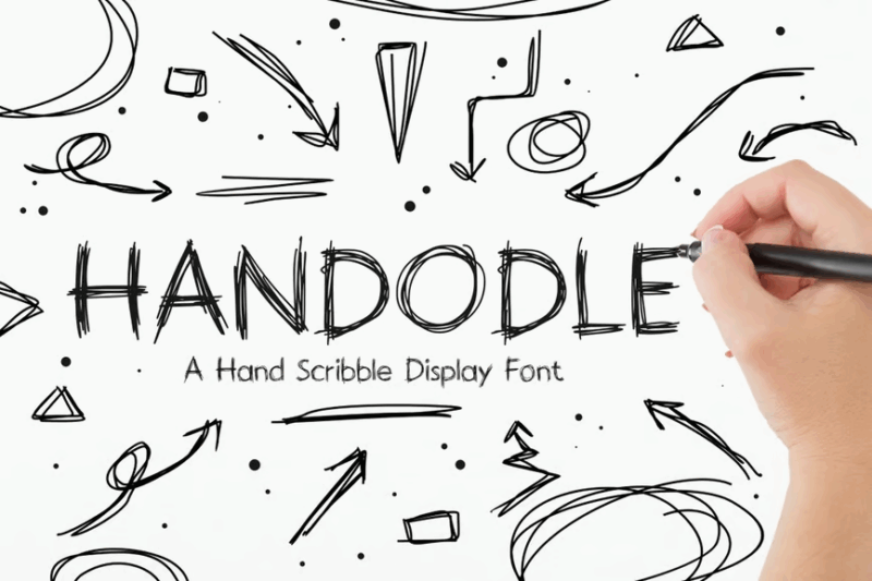
Handodle is a hand-scribbled display font that brings a unique, artistic flair to designs. Its expressive character makes it ideal for creating distinctive logotypes, headlines, or artistic compositions. This font can help brands stand out by adding a touch of creativity and personality to their visual identity.
Sketchy
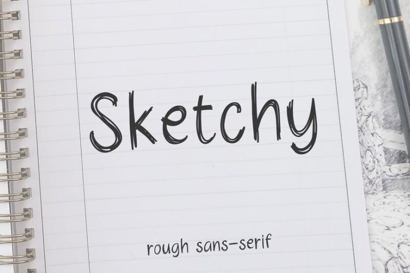
Sketchy is a rough sketch font that captures the essence of hand-drawn designs. Its imperfect lines and natural variations make it perfect for projects requiring a raw, artistic feel. This sans-serif typeface is ideal for creating a casual, approachable aesthetic in various design applications.
Letter Sketch
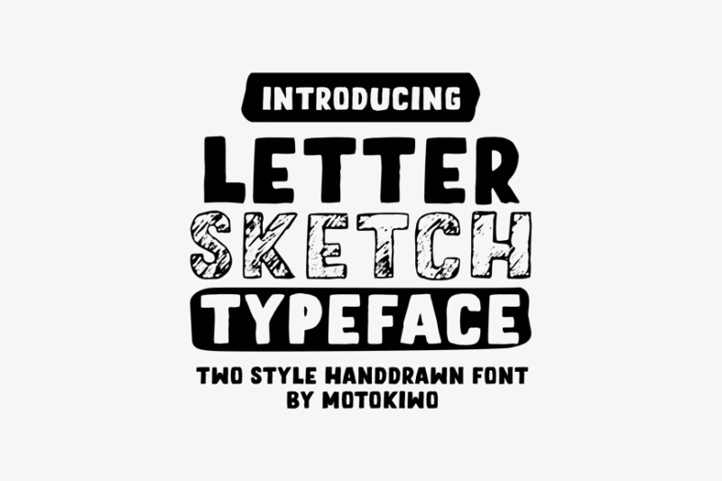
Letter Sketch is a handdrawn typeface that combines script, handwritten, and sans-serif styles. Its versatility makes it suitable for a wide range of design applications, from logo design to editorial layouts. The font’s hand-lettered quality adds a personal touch to designs, making them feel more authentic and approachable.
Rimstone Laroe
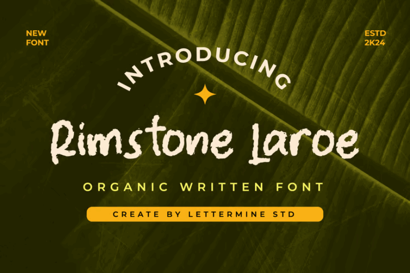
Rimstone Laroe is a pencil monoline font with an organic, flowing quality. Its script and handwritten style make it perfect for creating elegant, natural-looking designs. This typeface is well-suited for projects that require a delicate touch, such as wedding invitations, beauty product packaging, or sophisticated branding materials.
Sketching Universe
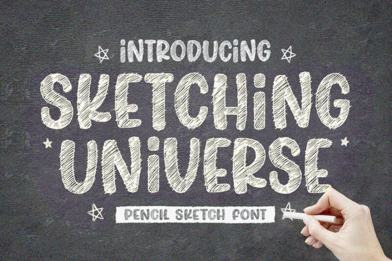
Sketching Universe is a versatile pencil sketch font family that includes serif, sans-serif, script, and handwritten styles. This comprehensive set offers designers a wide range of options for creating authentic hand-drawn looks. The inclusion of symbols and decorative elements makes it a powerful tool for diverse design projects.
Handwritten Font for Quotes
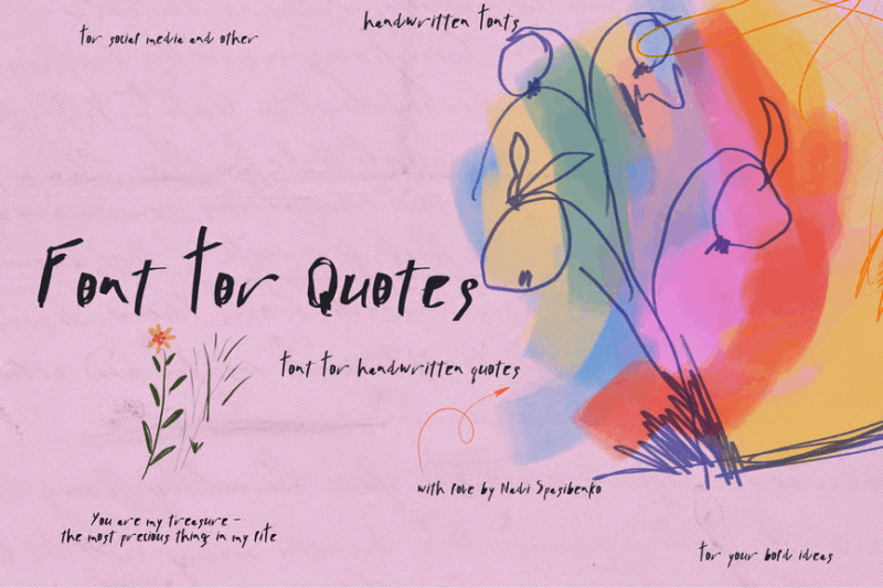
This handwritten font is specifically designed for creating impactful quotes and statements. Its natural flow and authentic appearance make it perfect for social media graphics, inspirational posters, or any design that features prominently displayed text. The font’s personality helps to emphasize the emotional impact of the words it conveys.
Scribble Font
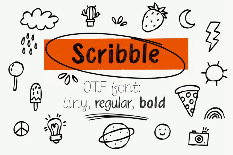
Scribble Font is a playful, doodle-style typeface that brings a sense of spontaneity to designs. Its casual, energetic appearance makes it ideal for youth-oriented brands, creative projects, or any design that aims to convey a sense of fun and informality. This font can help inject personality into otherwise conventional layouts.
Penhead
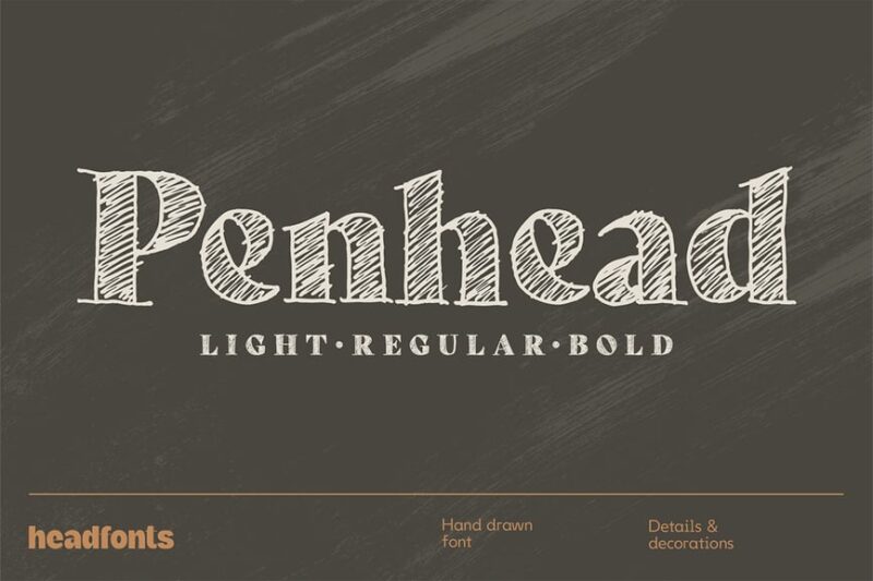
Penhead is a serif pencil sketch font that exudes a loose, organic feel. Its decorative nature makes it suitable for headlines, posters, and branding projects that require a handcrafted touch. The font’s imperfections add character and authenticity to designs, making them stand out in a digital world.
The Best Pencil
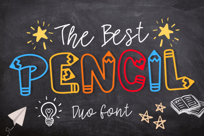
The Best Pencil is a script and handwritten font that captures the essence of natural pencil strokes. Its decorative quality makes it perfect for creating handwritten-style designs with a touch of authenticity. This font is ideal for projects that require a personal, artistic touch, such as invitations, packaging, or brand identities.
Washington Ink Pen
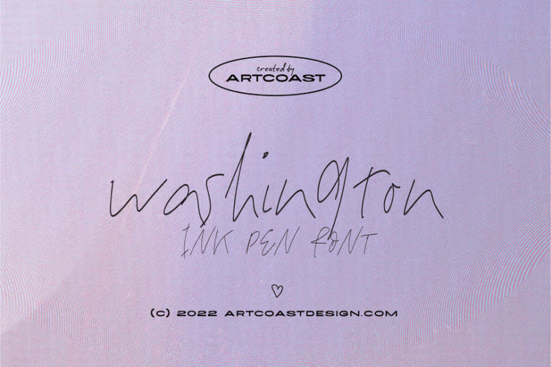
Washington Ink Pen is a handwritten font that mimics the flow of ink on paper. Its natural variations and subtle imperfections create an authentic signature-like appearance. This font is ideal for creating personalized designs, such as hand-signed documents, custom stationery, or brand elements that require a personal touch
Crayole
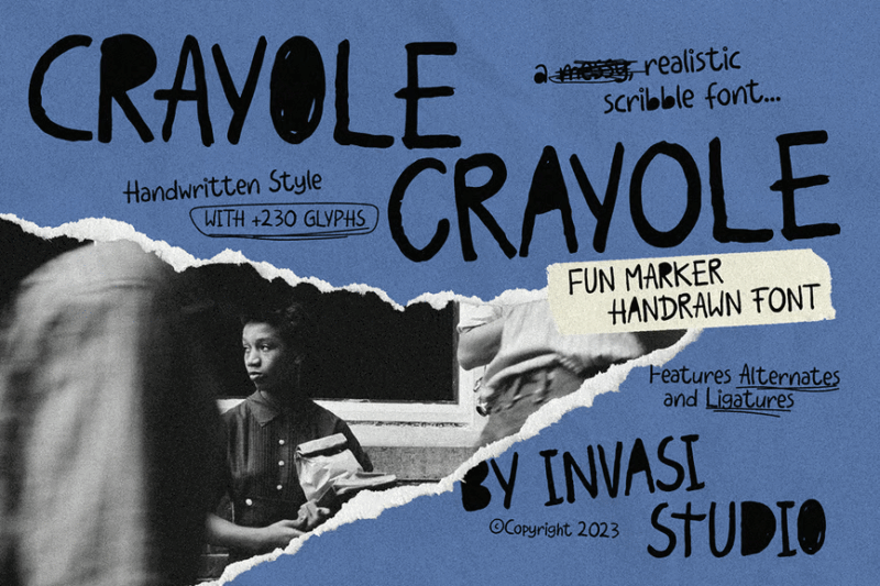
Crayole is a playful, scribble-style handwritten font that brings a touch of whimsy to any design. Its carefree appearance makes it perfect for children’s products, casual branding, or any project that aims to convey a sense of fun and spontaneity. The font’s unique character can help designs stand out in a crowded marketplace.
What Makes a Font Look “Pencil-Written”?
What exactly gives pencil fonts their distinctive, handcrafted feel? Several key characteristics work together to create that authentic pencil-on-paper look:
Natural Texture and Grain
Real pencil marks have a distinctive texture—graphite particles catch on the tiny ridges of paper, creating areas of heavier and lighter deposit. Great pencil fonts replicate this texture, with subtle variations in opacity and slight graininess along the edges of letterforms.
Inconsistent Pressure
When writing with a pencil, natural hand movements create variations in pressure, resulting in lines that range from light and wispy to bold and defined. Quality pencil fonts incorporate these pressure changes into their design, giving each character a dynamic, organic appearance.
Slight Wobble and Imperfection
Unlike mechanical digital fonts, handwritten pencil letters rarely sit perfectly on the baseline or maintain exact proportions. The best pencil fonts embrace these imperfections with slight variations in character height, subtle baseline shifts, and natural inconsistencies in letter shapes.
Realistic Stroke Endings
Pencil marks have characteristic beginnings and endings—tapering where the pencil first touches or lifts from the paper, sometimes with tiny “hooks” where the direction changes quickly. Authentic pencil fonts pay careful attention to these details, creating convincing stroke terminals.
Overlapping Strokes
In real pencil writing, strokes often overlap as the hand moves across the page, creating slightly darker areas where lines cross. Thoughtfully designed pencil fonts incorporate these natural overlaps, particularly in script styles or in letters with crossing elements like ‘t’ and ‘f’.
These elements combine to create the warmth and authenticity that make pencil fonts so appealing. When selecting a pencil font, look for these characteristics to ensure you’re getting a truly convincing handcrafted look.
Conclusion
In a world where so much design feels polished to perfection, pencil fonts offer a refreshing reminder that imperfection is often what makes something truly memorable. They bring back the human touch—the subtle inconsistencies, the texture, the feeling that something was made by hand rather than machine.
Whether you’re crafting a bold, expressive headline or adding a quiet, personal detail to a brand, pencil fonts give you a way to break out of the digital mold. They invite viewers in, soften the overall tone, and create an immediate sense of authenticity that’s hard to replicate any other way.
As you experiment with the fonts in this list, don’t be afraid to lean into their quirks. Let the rough edges show. Embrace the variation. Because at the end of the day, great design isn’t about perfection—it’s about connection. And few tools connect quite like the simple, familiar stroke of a pencil.