In this article:
- The Heavy-Duty Construction Fonts Making Their Mark in 2026
- What Makes Construction Fonts Feel So Sturdy and Reliable?
- Where Construction Fonts Shine Brightest
- When to Avoid Construction Fonts
- How to Choose the Perfect Construction Font
- Powerful Alternatives to Construction Fonts
- Common Construction Font Questions
- Building a Strong Foundation with Construction Typography
Hard hats, steel beams, and… typography? You bet! When it comes to construction and industrial design projects, the right font can be the difference between a design that feels rock-solid and one that crumbles under scrutiny.
Construction fonts aren’t just about looking tough (though they absolutely nail that aesthetic). They’re about conveying strength, reliability, and that no-nonsense attitude that screams “we get the job done.” Whether you’re designing for a construction company, industrial equipment manufacturer, or just want to add some serious muscle to your next project, these fonts are built to last.
In this comprehensive guide, we’ll explore the blueprint for choosing the perfect construction font, dive into what makes these typefaces feel so durable, and showcase the most impressive construction fonts that are making waves in 2026. So grab your hard hat – we’re about to break ground on some seriously powerful typography!
The Heavy-Duty Construction Fonts Making Their Mark in 2026
Not all fonts are cut out for the construction site. These powerhouse typefaces have been stress-tested and proven to handle the toughest design jobs. Here are my top picks for construction fonts that really know how to build impact:
Under Construction – 3D Color SVG Font
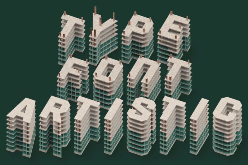
This eye-catching construction font brings depth and dimension to your design projects. Perfect for architects and real estate professionals, its 3D color SVG format ensures crisp rendering across various applications, making it an ideal choice for construction-related branding and signage.
Peligro Stencil
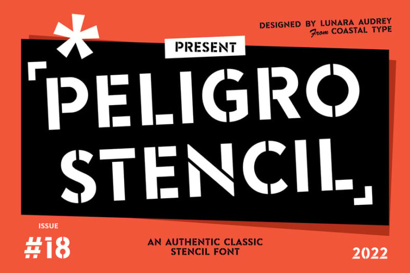
Peligro Stencil is a bold sans-serif font that embodies the rugged essence of construction sites. Its stencil design makes it an excellent choice for safety signage, construction company logos, and other applications where a strong, industrial aesthetic is desired in the building industry.
Architect Pro – A Technical Handwriting Font
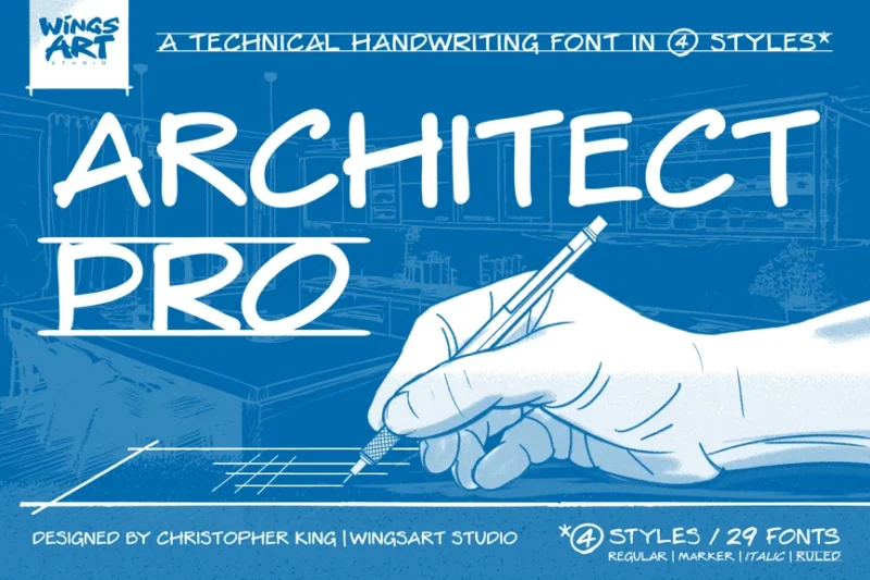
Architect Pro mimics the precise handwriting often found in technical drawings and blueprints. This professional font is perfect for adding a personal touch to construction documents, architectural sketches, and design presentations, giving them an authentic, hand-drawn feel.

Get 300+ Fonts for FREE
Enter your email to download our 100% free "Font Lover's Bundle". For commercial & personal use. No royalties. No fees. No attribution. 100% free to use anywhere.
Under Construction 3D Color Font
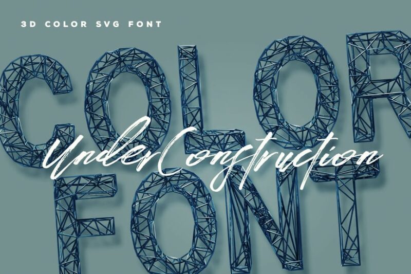
This vibrant 3D color font captures the essence of construction and architectural design. Its bold, dimensional appearance makes it an excellent choice for headers, signage, and branding in the building industry, adding a modern and dynamic touch to construction-related visual communications.
Stencil Autobahn SVG bitmap font
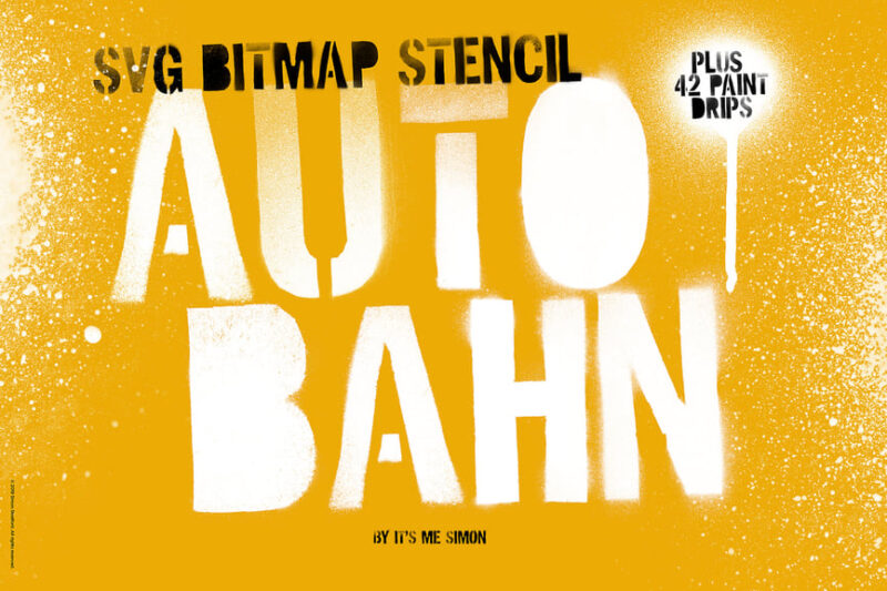
Stencil Autobahn combines the rugged appeal of stencil fonts with a touch of grunge, making it ideal for construction-related designs. This versatile SVG bitmap font works well for industrial signage, equipment labeling, and branding materials in the building and infrastructure sectors.
Bob
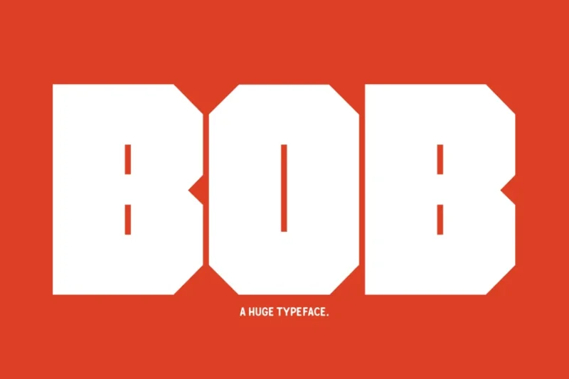
Bob is a thick, slab-style sans-serif font that exudes strength and stability – qualities essential in the construction industry. Its bold character makes it perfect for headlines, logos, and signage in building projects, conveying a sense of reliability and robustness.
Forged Fence
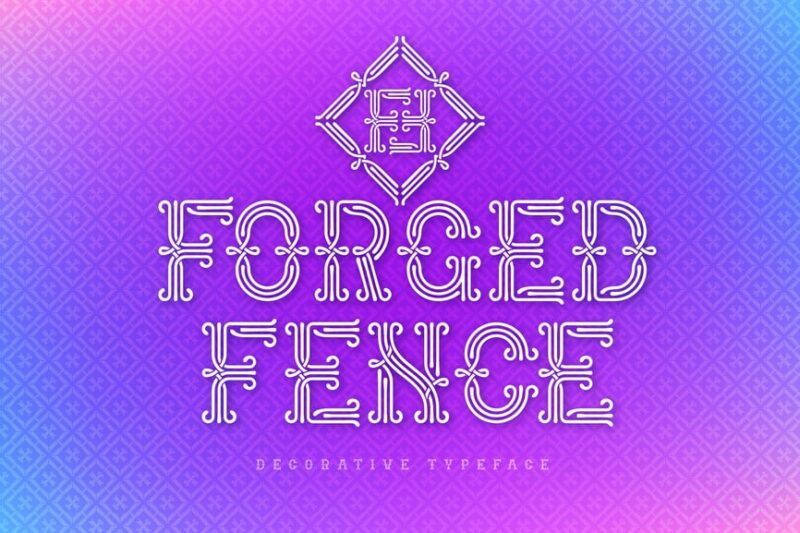
Forged Fence is a decorative font with a vintage flair, reminiscent of classic construction and architectural typography. Its unique design makes it suitable for creating standout headers or logos for construction firms, especially those specializing in restoration or period-specific building projects.
Blockhead Typeface|Bold Geometric Font
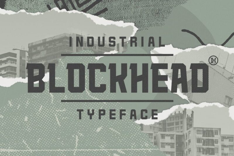
Blockhead is a bold, geometric sans-serif font that embodies the structured nature of construction and architecture. Its strong lines and shapes make it an excellent choice for construction company logos, project signage, and other applications where a modern, industrial aesthetic is desired.
Sketchup – Sketch Display Slab
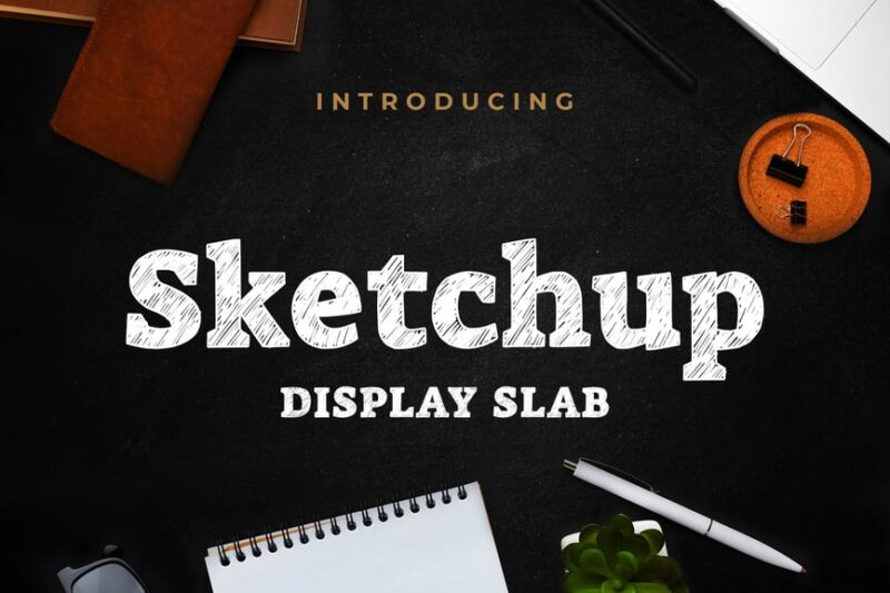
Sketchup is a unique serif font that combines a hand-drawn feel with the solidity of a slab typeface. This construction-friendly font is perfect for architectural firms and building companies looking to add a creative, yet professional touch to their branding and presentations.
Qalited Rough
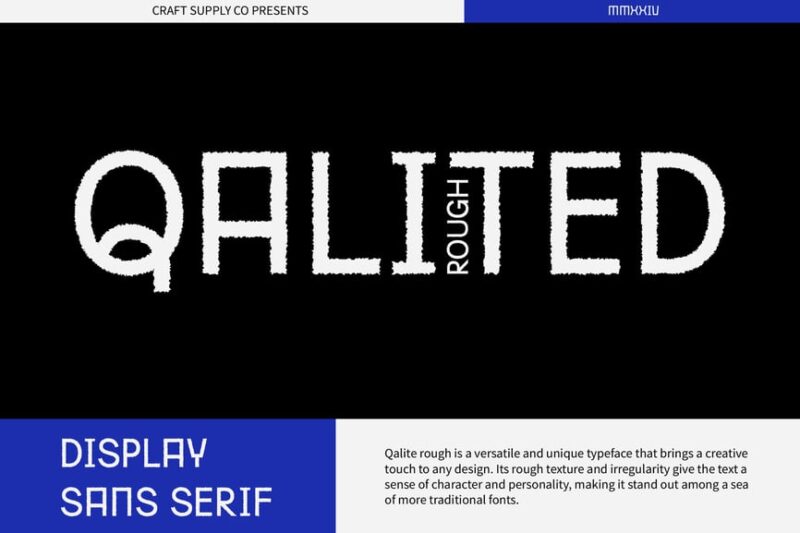
Qalited Rough is a sans-serif font with a weathered texture, ideal for construction-related designs. Its rugged appearance makes it suitable for outdoor signage, equipment branding, and marketing materials in the building industry, adding an authentic, worn-in feel to your projects.
Typehead Typeface|Industrial Stencil Font
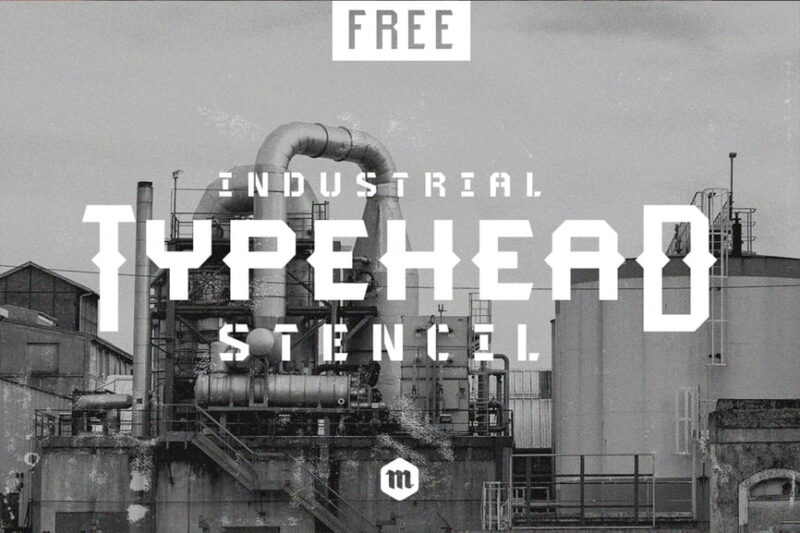
Typehead is an industrial stencil font that captures the essence of construction sites and manufacturing. This bold, sans-serif typeface is perfect for safety signage, equipment labeling, and branding materials in the building and infrastructure sectors, conveying a strong, no-nonsense message.
ZW Stencil
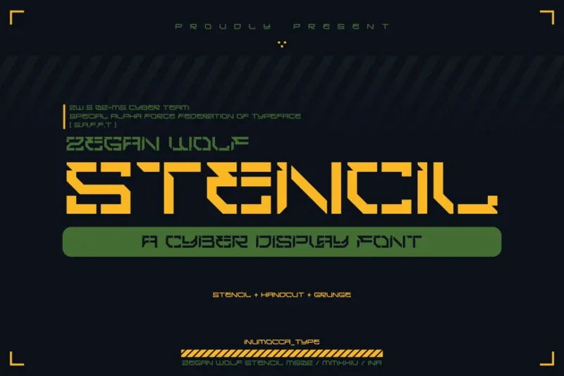
ZW Stencil is a decorative font that combines military precision with construction-site practicality. Its bold, stenciled design makes it ideal for creating impactful signage, vehicle graphics, and branding materials for construction companies and industrial projects.
ZONE 33
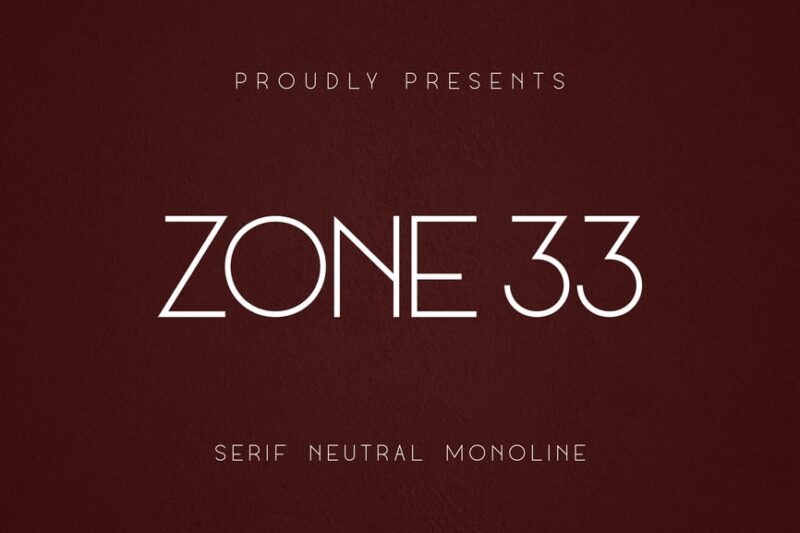
ZONE 33 is a versatile sans-serif font that bridges the gap between corporate professionalism and industrial chic. Its clean lines make it suitable for construction company branding, project proposals, and signage, offering a modern touch to building industry communications.
ThirtyNine-Stencil
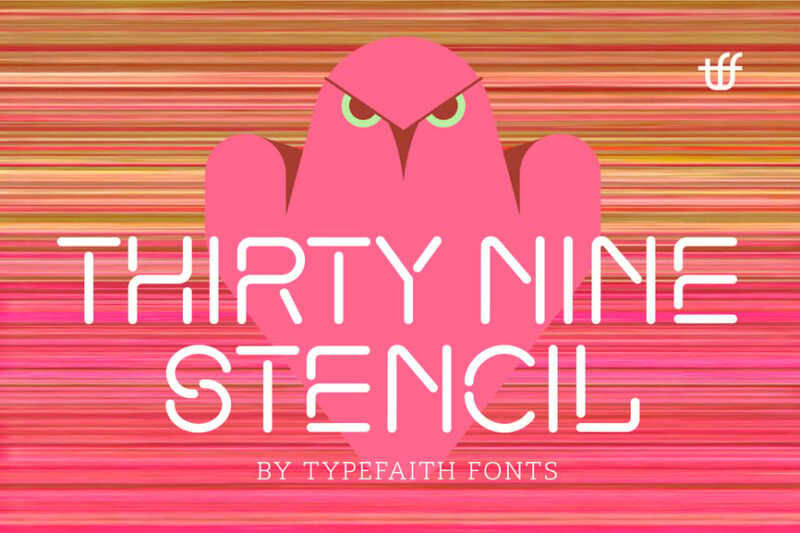
ThirtyNine-Stencil is a bold, decorative font that combines a stencil style with a neon-like appearance. This eye-catching typeface is perfect for creating standout logos and signage for construction companies, especially those working on modern or urban development projects.
Straight Fighter
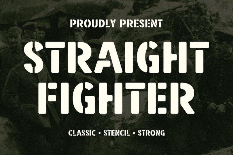
Straight Fighter is a masculine, stencil-style font that embodies the tough nature of construction work. Its bold, no-nonsense design makes it ideal for creating impactful signage, equipment branding, and marketing materials for building and contracting firms.
Manufaktur
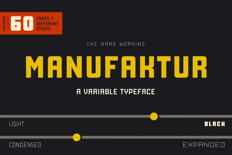
Manufaktur is an industrial-inspired sans-serif font that captures the essence of construction and manufacturing. Its clean, functional design makes it perfect for technical documentation, blueprints, and branding materials in the building industry, conveying a sense of precision and reliability.
Uphead | Industrial Font
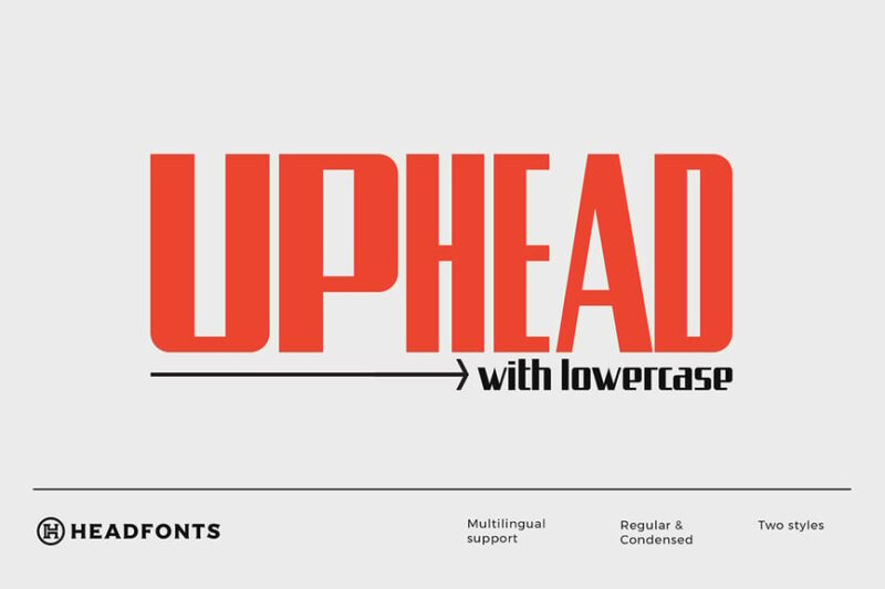
Uphead is a robust, industrial sans-serif font that exudes strength and durability. Its bold character makes it an excellent choice for construction company logos, project signage, and marketing materials, effectively communicating the solid nature of building and infrastructure work.
Gasterol – Industrial Steel Display Fonts
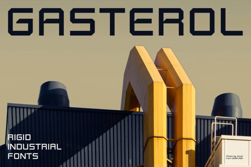
Gasterol is a set of industrial-inspired display fonts that evoke the strength of steel construction. These sans-serif typefaces are ideal for creating powerful headers, signage, and branding materials for construction firms, conveying a sense of robustness and reliability in building projects.
Industrial Sans
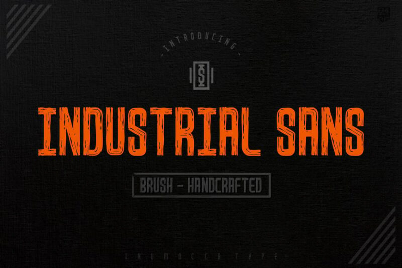
Industrial Sans is a versatile font family that combines sans-serif precision with handwritten elements, perfect for construction-related designs. Its modern tech aesthetic makes it suitable for architectural firms, engineering companies, and building projects that want to convey innovation and craftsmanship.
Derelict Typeface
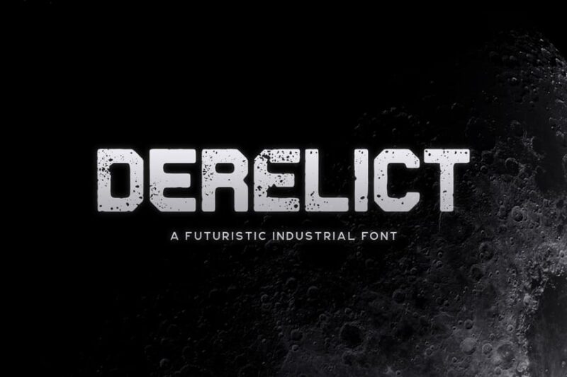
Derelict is a distressed, sans-serif font that captures the raw, unfinished aesthetic often associated with construction sites. Its weathered appearance makes it ideal for creating authentic-looking signage, branding materials, and graphics for building restoration projects or industrial-themed designs in the construction industry.
What Makes Construction Fonts Feel So Sturdy and Reliable?
Construction fonts don’t earn their reputation by accident. These heavy-duty typefaces share several key characteristics that make them perfect for industrial and construction-themed designs:
Bold, Thick Letterforms
First and foremost, construction fonts feature substantial weight. These aren’t delicate, thin typefaces – they’re built with thick strokes that can withstand visual “heavy lifting.” The robust letterforms mirror the strength and durability associated with construction work.
Just like steel I-beams support massive structures, these thick letterforms provide the visual foundation that makes designs feel unshakeable and trustworthy.
Industrial-Inspired Details
Many construction fonts incorporate design elements that reference industrial machinery, tools, and building materials. You might notice details like rivets, welded joints, stencil cuts, or weathered textures that echo the construction site aesthetic.
These subtle (and sometimes not-so-subtle) industrial touches help reinforce the connection between the typography and the construction industry.
Geometric Precision
Construction is all about precision, measurements, and getting things exactly right. The best construction fonts reflect this attention to detail with clean lines, consistent spacing, and geometric letterforms that feel engineered rather than organic.
This mathematical precision gives construction fonts their authoritative, professional appearance that clients and customers associate with quality workmanship.
Stencil and Military Influences
Many construction fonts draw inspiration from stencil lettering and military typography. These influences make sense – both contexts require clear, readable text that can withstand harsh conditions and maintain legibility even when partially obscured or weathered.
The result is typography that feels battle-tested and ready for the demanding environments where construction work happens.
Where Construction Fonts Shine Brightest
Construction fonts are incredibly versatile, but they truly excel in specific applications where their unique characteristics can make the biggest impact:
Construction Company Branding
This one’s obvious, but construction fonts are perfect for building contractors, general contractors, specialty trades, and construction management companies. They help establish credibility and communicate the strength and reliability clients want in their construction partners.
From business cards to vehicle wraps to website headers, construction fonts make sure your brand looks as solid as the structures you build.
Industrial and Manufacturing
Beyond construction, these fonts work beautifully for industrial equipment manufacturers, steel fabricators, welding services, and heavy machinery companies. The robust aesthetic aligns perfectly with the heavy-duty nature of industrial work.
Signage and Wayfinding
Construction sites, industrial facilities, and manufacturing plants need clear, legible signage that can be read quickly and from a distance. Construction fonts excel at this practical application while maintaining their tough aesthetic.
Packaging and Product Design
For tools, equipment, industrial supplies, and construction materials, packaging with construction fonts communicates durability and professional-grade quality. These fonts help products stand out on the shelf while reinforcing their rugged nature.
Digital and Print Advertising
When advertising construction services, industrial equipment, or building materials, construction fonts grab attention and immediately communicate the industry focus. They’re particularly effective in trade publications and industry-specific marketing materials.
When to Avoid Construction Fonts
While construction fonts are fantastic for many applications, there are situations where their heavy-duty aesthetic might not be the right fit:
Luxury and Elegance
For high-end residential construction, luxury home builders, or upscale architectural firms, construction fonts might feel too rough around the edges. These contexts often call for more refined serif fonts or elegant sans-serifs that communicate sophistication.
Healthcare and Wellness
The industrial aesthetic of construction fonts doesn’t align well with healthcare, wellness, or therapeutic services. These industries typically need fonts that feel caring, approachable, and gentle rather than tough and industrial.
Children and Education
While there might be exceptions for educational content about construction or building, most child-focused designs need playful, friendly fonts rather than the serious, industrial feel of construction typography.
Fine Dining and Hospitality
Restaurants, hotels, and hospitality businesses generally need fonts that create warmth and welcome rather than the no-nonsense attitude of construction fonts.
How to Choose the Perfect Construction Font
Selecting the right construction font for your project requires considering several key factors:
Project Scale and Context
Consider whether you’re designing for a small residential contractor or a massive commercial construction company. Larger operations might benefit from more refined construction fonts, while smaller, more hands-on businesses might embrace grittier, more industrial options.
Audience and Market
Think about who you’re trying to reach. Are you targeting other construction professionals who will appreciate authentic industrial details? Or are you marketing to property owners who might prefer a cleaner, more approachable construction aesthetic?
Brand Personality
Every construction company has its own personality. Some are all about cutting-edge technology and precision, while others emphasize traditional craftsmanship and reliability. Choose a construction font that reinforces your specific brand character.
Legibility Requirements
Consider where and how the font will be used. Vehicle graphics, outdoor signage, and safety materials all have specific legibility requirements that might influence your font choice.
Pairing Possibilities
Think about how your construction font will work with other typography in your design system. You’ll likely need to pair it with more neutral fonts for body text, so make sure your chosen construction font plays well with others.
Powerful Alternatives to Construction Fonts
If construction fonts don’t quite fit your needs, several other font categories can provide similar strength and reliability:
Industrial Sans-Serifs
Clean, geometric sans-serif fonts like Futura, Avenir, or Montserrat can provide strength and modernity without the overtly industrial aesthetic of construction fonts. These work well for tech-forward construction companies or architectural firms.
Slab Serifs
Robust slab serif fonts offer substance and authority while feeling slightly more approachable than hardcore construction fonts. They’re great for construction companies that want to feel established and trustworthy without being intimidating.
Military and Stencil Fonts
Fonts inspired by military stenciling provide the durability and functionality of construction fonts while feeling slightly more refined. These work well for security, logistics, and infrastructure companies.
Condensed Display Fonts
Tall, condensed fonts can provide the boldness and impact of construction fonts while feeling more modern and streamlined. These are excellent for construction companies focused on efficiency and innovation.
Common Construction Font Questions
Let’s address some frequently asked questions about construction fonts:
What font do construction companies use? Most construction companies use bold sans-serif fonts or custom industrial typefaces that convey strength and reliability. Popular choices include variations of Impact, condensed sans-serifs, and fonts with stencil or military influences.
Are construction fonts free to use commercially? It depends on the specific font and its license. Some construction fonts are available for free commercial use, while others require purchasing a license. Always check the font’s license agreement before using it in commercial projects.
What’s the best construction font for logos? The best construction font for logos depends on your company’s personality and target market. Generally, look for fonts that are bold, legible at small sizes, and distinctive enough to help your brand stand out while remaining professional.
Can I use construction fonts for non-construction businesses? Absolutely! Construction fonts work well for any business that wants to convey strength, reliability, and a no-nonsense attitude. They’re popular with security companies, logistics firms, industrial manufacturers, and even some tech companies that want a rugged aesthetic.
Building a Strong Foundation with Construction Typography
Construction fonts are more than just bold letters – they’re powerful branding tools that can instantly communicate strength, reliability, and professional competence. When chosen thoughtfully and used strategically, these fonts become the foundation of visual identities that feel as solid as the structures they represent.
Whether you’re designing for a small local contractor or a major industrial corporation, the right construction font can help your brand build trust, establish credibility, and stand out in a competitive marketplace. The key is understanding your audience, considering your brand personality, and choosing fonts that reinforce rather than contradict your core message.
Remember, great construction typography isn’t just about looking tough – it’s about creating designs that work as hard as the people they represent. So take the time to find the perfect construction font for your project. Your brand’s foundation depends on it.
From heavy-duty display fonts to precision-engineered typefaces, construction fonts offer the tools you need to build powerful, memorable designs. Now get out there and start building something amazing – your typography is ready for the job!

