In this article:
- My 39 Favorite Y2K Fonts Right Now
- What Makes a Font Feel Authentically Y2K?
- How to Pick the Perfect 2000s Font
- Where to Use Y2K Fonts
- Where to Avoid Y2K Fonts
- Y2K Font Alternatives
- Common Y2K Font Questions
- Embrace the Y2K Revival
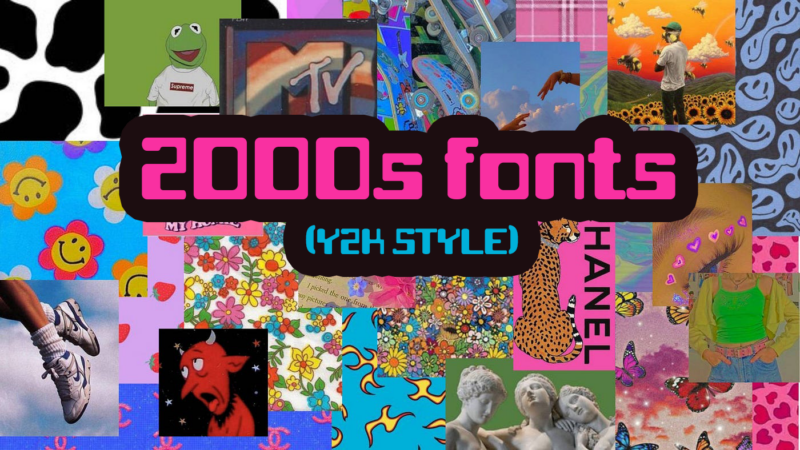
If you’ve noticed the resurgence of Y2K aesthetics lately, you’re not alone. As a designer who lived through (and designed in) the early 2000s, I’m fascinated by how this era’s distinct typography has come roaring back. Whether you’re creating for fashion brands, music projects, or just want to capture that perfect millennium vibe, choosing the right 2000s-inspired font can make or break your design.
In this post, I’ll help you navigate the world of Y2K typography, sharing insights from both my experience during the actual era and my observations of its modern revival. We’ll explore what makes these fonts tick, where to use them effectively, and how to capture that authentic turn-of-the-millennium feel.
My 39 Favorite Y2K Fonts Right Now
Flashbit
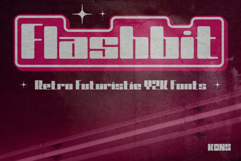
Flashbit is a retro-futuristic sans-serif font that captures the essence of Y2K aesthetics. Its bold, geometric shapes and clean lines make it perfect for designs aiming to evoke nostalgia for the turn of the millennium era.
Yerk
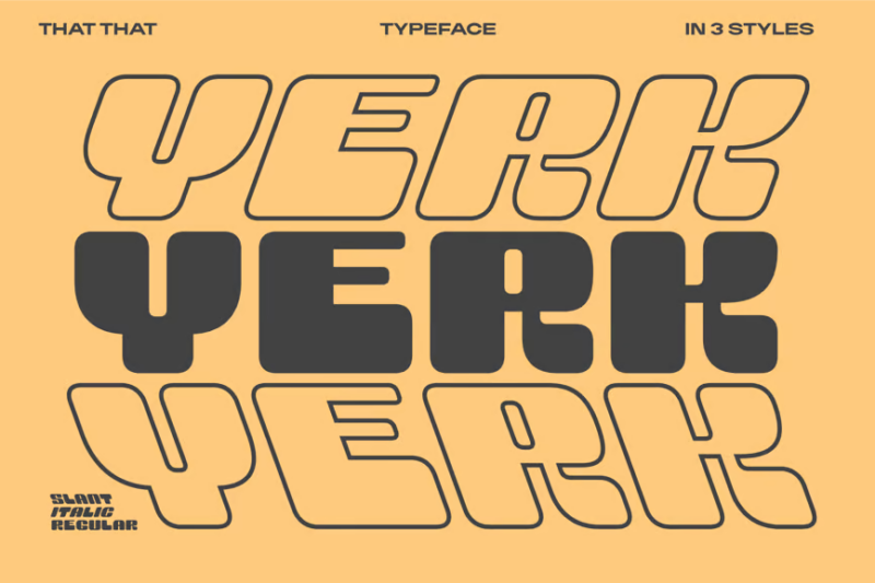
Yerk is a modern take on Y2K typography, offering a decorative sans-serif style. Its unique character forms and balanced proportions make it ideal for contemporary logos and branding projects with a nostalgic twist.
Noser

Get 300+ Fonts for FREE
Enter your email to download our 100% free "Font Lover's Bundle". For commercial & personal use. No royalties. No fees. No attribution. 100% free to use anywhere.
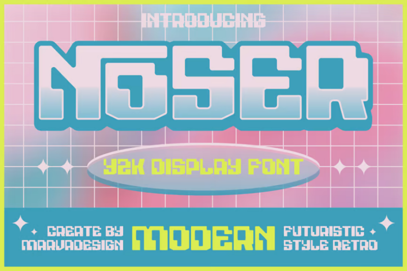
Noser is a decorative font that reimagines Y2K aesthetics for modern use. Its distinctive letterforms and playful geometry make it a standout choice for designers looking to create eye-catching headlines or unique branding elements.
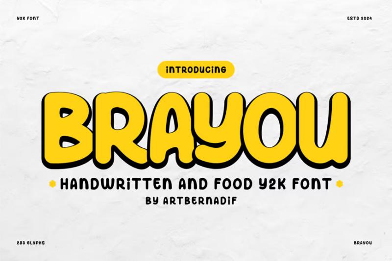
Brayou
Brayou is a handwritten script font with a Y2K twist, perfect for food-related designs. Its casual, energetic style combines nostalgia with a fresh, contemporary feel, making it ideal for menus, packaging, or social media graphics.
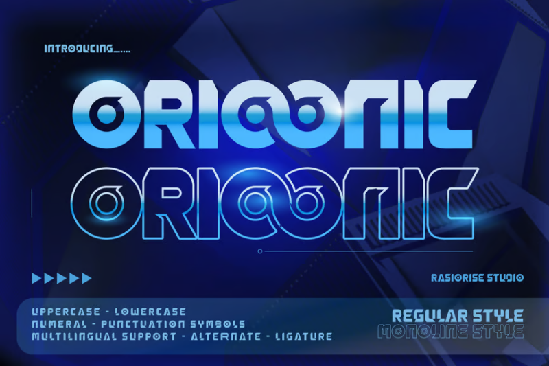
Orioonic
Orioonic is a futuristic Y2K-inspired decorative font with a techno edge. Its sleek, angular forms and digital aesthetic make it perfect for projects that aim to capture the excitement and technological optimism of the early 2000s.
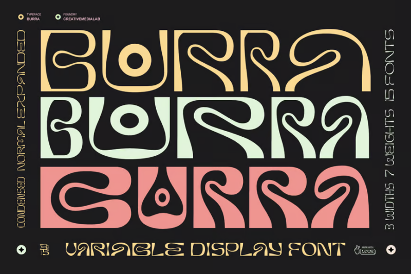
Burra
Burra is a psychedelic display font that combines sans-serif and decorative elements. Its groovy, retro-inspired shapes and flowing lines make it an excellent choice for designs that want to evoke a 60s or 70s vibe with a modern twist.
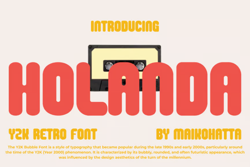
HOLANDA
HOLANDA is a Y2K retro sans-serif font with a futuristic flair. Its bold, chunky letterforms and subtle curves create a strong visual impact, perfect for headlines, posters, or any design aiming to capture millennial nostalgia.
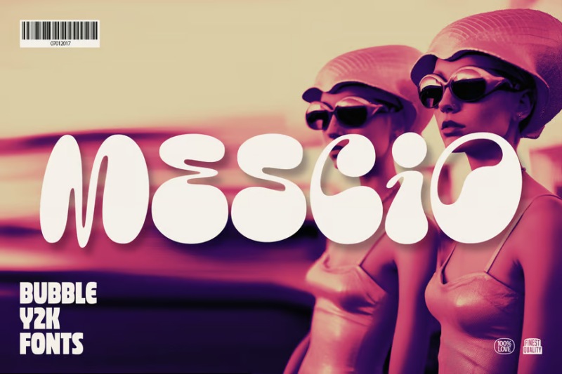
Mescio
Mescio is a bubble-style Y2K font that combines sans-serif and decorative elements. Its rounded, inflated look gives it a playful and nostalgic feel, making it ideal for music-related projects or designs targeting a younger audience.
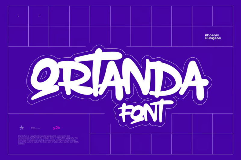
Ortanda
Ortanda is a playful script and handwritten font with a romantic touch. Its flowing lines and casual style make it perfect for designs that require a personal, intimate feel, such as wedding invitations or lifestyle branding.
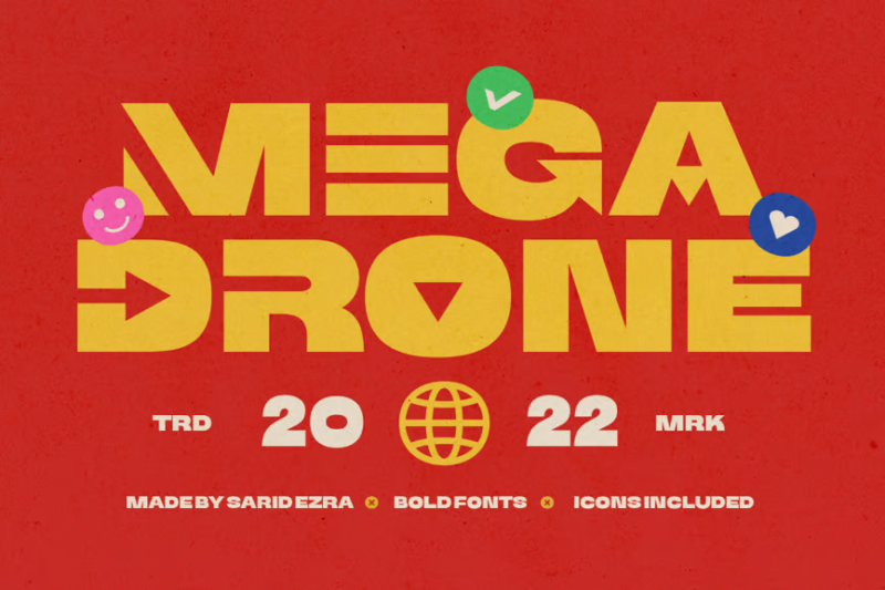
Mega Drone
Mega Drone is a bold, black display sans-serif font designed for maximum impact. Its heavy weight and strong geometric shapes make it ideal for logos and headlines that need to command attention and convey strength.
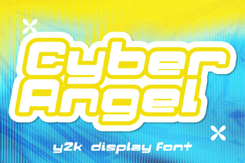
Cyber Angel Y2K Display
Cyber Angel is a Y2K-inspired display font that blends decorative and sans-serif styles. Its futuristic look and digital aesthetic make it perfect for designs that want to evoke the cyber culture and technological optimism of the early 2000s.
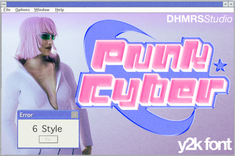
Punk Cyber
Punk Cyber is a modern game font that combines sans-serif elements with punk and cyber aesthetics. Its edgy, distressed look makes it ideal for gaming-related designs, album covers, or any project aiming for a rebellious, futuristic feel.
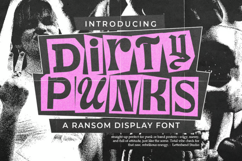
Dirty Punk
Dirty Punk is a gritty, decorative font that embodies the raw energy of punk rock. Its distressed, ransom-note style makes it perfect for album covers, concert posters, or any design that needs to convey an anarchic, rebellious attitude.
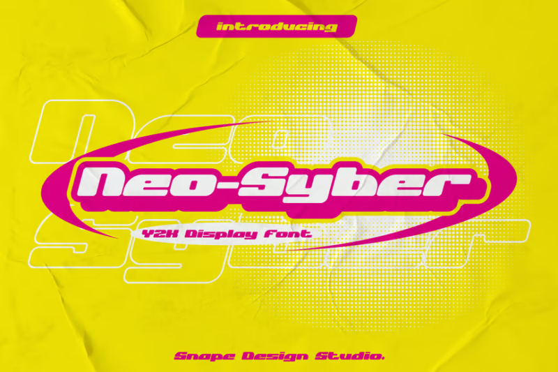
Neo-Syber
Neo-Syber is a Y2K-inspired decorative font that captures the essence of early digital aesthetics. Its futuristic letterforms and sharp angles make it ideal for projects that aim to evoke nostalgia for the turn of the millennium era.
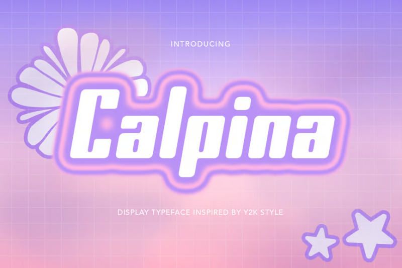
Calpina
Calpina is a Y2K retro font that combines sans-serif and decorative elements. Its playful, rounded shapes and bold lines capture the spirit of 90s and 2000s design, making it perfect for nostalgic branding or editorial projects.
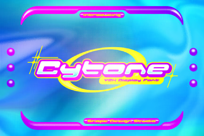
Cytone
Cytone is a Y2K-inspired decorative font that embodies the digital optimism of the early 2000s. Its unique letterforms and tech-inspired details make it an excellent choice for futuristic designs or projects targeting millennials.
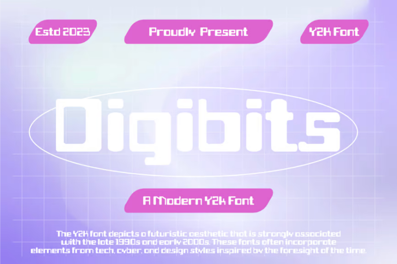
Digibits
Digibits is a modern Y2K font with a futuristic edge. Its clean lines and digital-inspired shapes make it perfect for tech-related designs, cyber-themed projects, or any work aiming to capture the essence of the digital age.
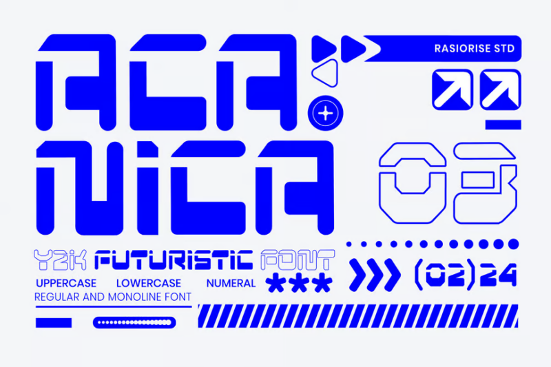
Acanica
Acanica is a Y2K futuristic display font with a mecha-inspired aesthetic. Its bold, angular forms and sci-fi feel make it ideal for gaming, tech, or entertainment projects that want to evoke a sense of futuristic excitement.
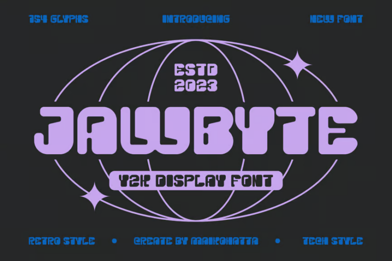
Jawbyte
Jawbyte is a Y2K display font with a strong futuristic appeal. Its unique, digitally-inspired letterforms make it perfect for tech-related branding, album covers, or any design that wants to capture the essence of the digital revolution.
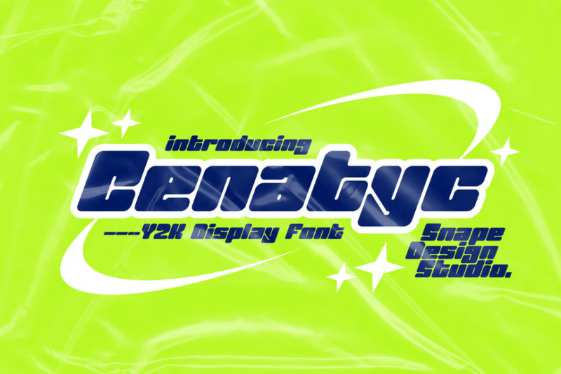
Cenatyc
Cenatyc is a Y2K-inspired font that blends decorative and sans-serif styles. Its bold, geometric shapes and clean lines make it an excellent choice for display purposes, particularly in designs aiming to evoke turn-of-the-millennium nostalgia.
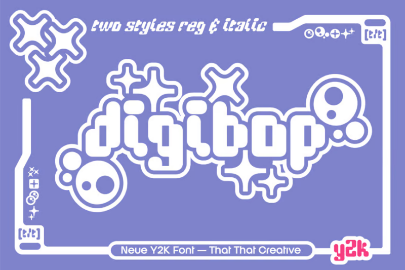
DigiBop
DigiBop is a Y2K-inspired decorative font with a playful, energetic feel. Its unique character forms and digital aesthetic make it perfect for logo design and branding projects targeting millennials or Gen Z audiences.
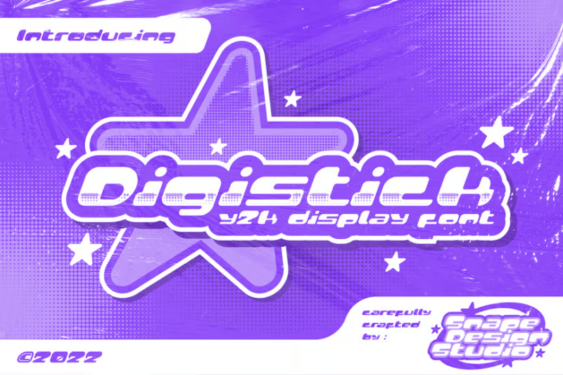
Digistick
Digistick is a Y2K-inspired decorative font that captures the digital optimism of the early 2000s. Its quirky, tech-inspired letterforms make it ideal for projects that want to evoke nostalgia or create a futuristic, digital vibe.
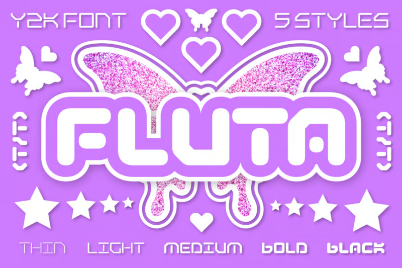
Fluta
Fluta is a Y2K-inspired decorative font with a bubbly, playful aesthetic. Its rounded forms and digital-inspired details make it perfect for designs targeting younger audiences or projects aiming to capture the fun, optimistic spirit of the early 2000s.
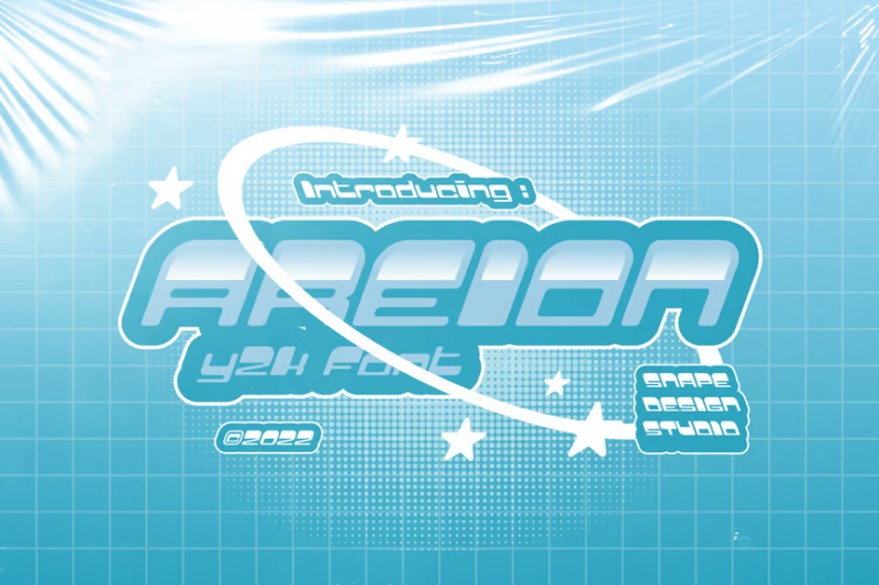
Areion
Areion is a Y2K-inspired font that combines decorative and sans-serif elements. Its futuristic letterforms and clean lines make it an excellent choice for modern branding, tech-related designs, or any project that wants to evoke a sense of digital innovation.
What Makes a Font Feel Authentically Y2K?
Looking back at the early 2000s, several key characteristics defined the typography of the era:
Futuristic Minimalism
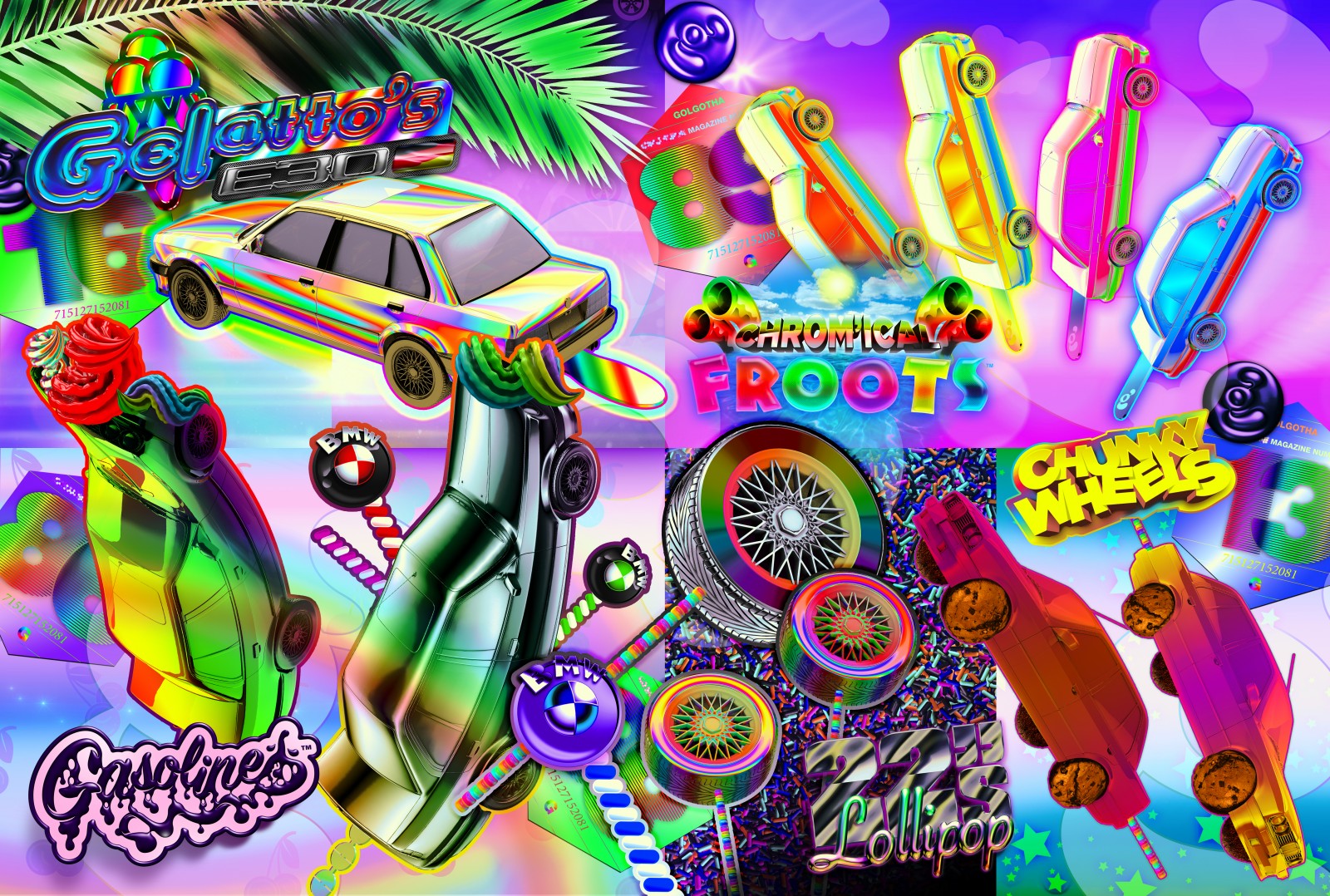
The approach of Y2K brought an obsession with the future, reflected in sleek, geometric fonts that looked like they belonged in a sci-fi movie. Clean lines and perfect circles dominated, often with a chrome or metallic finish that screamed “digital age.”
Tech Meets Organic
What I find fascinating about Y2K typography is how it balanced mechanical precision with organic, bubble-like forms. This wasn’t the strict geometry of the 90s – designers were starting to soften those edges, creating fonts that felt both digital and human.
Experimental Spacing
The early 2000s threw traditional kerning rules out the window. I remember how excited designers were to play with ultra-wide tracking and unconventional letter spacing. It wasn’t just about legibility anymore – it was about making a statement.
Chrome and Shine Effects
While not inherent to the fonts themselves, the ubiquitous chrome effect became so synonymous with Y2K typography that it’s practically impossible to separate the two. Modern Y2K-inspired fonts often build these effects right into their design.
How to Pick the Perfect 2000s Font
When selecting a Y2K-inspired font for your project, here’s what I consider:
Authenticity vs. Modern Appeal
The key is finding the sweet spot between authentic Y2K elements and contemporary usability. While pure nostalgia might tempt you to go full chrome-and-bubble, remember that today’s audiences consume content differently.
Project Context
Consider where and how your design will be viewed:
- Digital platforms require fonts that maintain legibility at various sizes
- Print projects can handle more decorative elements
- Social media might benefit from the boldest Y2K characteristics
Target Audience
Are you designing for:
- People who lived through Y2K and want nostalgia?
- Gen Z discovering the aesthetic for the first time?
- Brands trying to capture millennial attention?
Each audience might respond differently to various Y2K elements.
Where to Use Y2K Fonts
Having worked with these styles both then and now, here are my favorite applications:
Fashion and Streetwear
Y2K fonts are perfect for clothing brands tapping into millennial nostalgia or Gen Z’s discovery of the era. I’ve seen these fonts work particularly well on:
- T-shirt designs
- Brand logos
- Shopping bags
- Social media graphics
Music and Entertainment
The Y2K aesthetic is huge in:
- Album covers
- Concert posters
- Music videos
- Festival branding
Digital Media
These fonts can add personality to:
- Website headers
- App interfaces
- Social media posts
- YouTube thumbnails
Product Packaging
Especially effective for:
- Beauty products
- Tech accessories
- Limited edition releases
- Youth-oriented products
Where to Avoid Y2K Fonts
Just as important as knowing where to use these fonts is understanding where they might not work:
Professional Services
I generally advise against using Y2K fonts for:
- Law firms
- Medical practices
- Financial services
- Corporate communications
Academic Content
Not ideal for:
- Research papers
- Educational materials
- Scientific publications
- Professional documentation
Long-form Reading
Avoid using Y2K fonts in:
- Books
- Articles
- Reports
- Lengthy digital content
Y2K Font Alternatives
Sometimes you might want to capture that early 2000s feel without going full Y2K. Here are some alternatives I often recommend:
Modern Sans Serifs
Clean, geometric sans serifs can capture the futuristic aspect of Y2K without the full retro effect. See our modern fonts here.
Tech-Inspired Fonts
Contemporary tech-focused fonts often share DNA with Y2K designs while feeling more current.
Minimalist Display Fonts
These can capture the experimental spirit of Y2K typography while maintaining modern sophistication.

Common Y2K Font Questions
Let me answer some questions I frequently hear about Y2K typography:
What is the most Y2K font?
While there’s no single “most Y2K” font, Blu from the late 90s epitomizes the era’s chrome-heavy, futuristic aesthetic. Modern alternatives like Y2K Pro and Millennium capture similar vibes.
Can I use Y2K fonts professionally?
Absolutely – but context is key. These fonts work best for brands specifically targeting Y2K nostalgia or youth culture. For traditional professional settings, consider more subtle alternatives.
How do I make fonts look more Y2K?
The magic often lies in the effects. Chrome textures, bubble highlights, and gradient overlays can transform many fonts into Y2K-style typography. Just remember – moderation is key unless you’re going for maximum impact.
Embrace the Y2K Revival
The resurgence of Y2K aesthetics isn’t just nostalgia – it’s a fascinating remix of an era that shaped digital design. Whether you lived through it like I did or you’re discovering it fresh, these fonts offer exciting possibilities for contemporary design.
Just remember: like any trend, the key is understanding not just how to use it, but when and where it makes sense for your project. Used thoughtfully, Y2K typography can add that perfect touch of millennial flair to your designs.
Have a favorite Y2K font I didn’t mention? Share it in the comments below! And if you’re looking for more font inspiration, check out our other typography guides here on Design Work Life.
[End of article]
Would you like me to modify any section or expand on particular aspects of the article?

