In this article:
- What Are Monospaced Fonts?
- The Best Monospaced Fonts of 2026
- What Makes Monospaced Fonts Special?
- Where Can You Use Monospaced Fonts?
- Where to Avoid Monospaced Fonts
- How to Choose the Perfect Monospaced Font
- Monospaced vs. Proportional Fonts: Understanding the Difference
- The History of Monospaced Fonts
- Monospaced Fonts in Modern Design Trends
- Tips for Designing with Monospaced Fonts
- Common Monospaced Font Questions
- Free vs. Premium Monospaced Fonts
- Monospaced Fonts for Different Use Cases
- The Future of Monospaced Fonts
- Conclusion: The Enduring Appeal of Monospaced Fonts
Monospaced fonts—meaning, typefaces in which all characters have the same width—aren’t just for developers anymore. These fixed-width typefaces have broken free from the confines of code editors and terminal windows, making their way into everything from editorial design to branding projects. And honestly? It’s about time we gave them the recognition they deserve.
In this comprehensive guide, we’ll explore everything you need to know about monospaced fonts. From understanding what makes them tick to discovering the best options for your next project, we’re diving deep into the world of fixed-width typography. Let’s get started!
What Are Monospaced Fonts?
Monospaced fonts (also called fixed-width or non-proportional fonts) are typefaces where every character occupies exactly the same horizontal space. Unlike proportional fonts where an “i” takes up less room than an “m”, monospaced fonts give each letter, number, and symbol identical width.
This might sound like a limitation, but it’s actually a feature. That uniform spacing creates a grid-like structure that’s incredibly useful for specific applications. Think of it like this: if proportional fonts are jazz – fluid, dynamic, with varying rhythms – then monospaced fonts are more like a metronome, steady and precise.
The origins of monospaced fonts trace back to typewriters, where each keystroke moved the carriage by exactly one space. When computers came along, early text displays used the same fixed-width approach. While technology has evolved to support proportional fonts everywhere, monospaced typefaces stuck around because they’re just too darn useful.
The Best Monospaced Fonts of 2026
Not all monospaced fonts are created equal. Some are built for clarity at small sizes, others for aesthetic appeal, and some manage to nail both. Here are my top picks for the most impressive monospaced fonts you should know about:
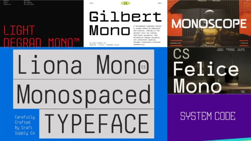
CS Liona Mono
CS Liona Mono is a sleek monospaced typeface that combines the precision of monospaced fonts with a modern sans-serif aesthetic. This versatile font is perfect for designers seeking a clean, architectural look in their coding projects or technical documentation.

Get 300+ Fonts for FREE
Enter your email to download our 100% free "Font Lover's Bundle". For commercial & personal use. No royalties. No fees. No attribution. 100% free to use anywhere.
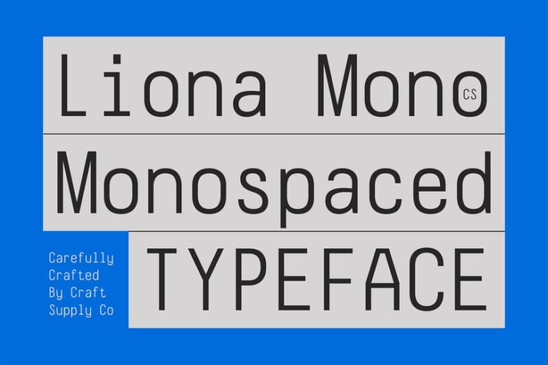
Markl Mono
Markl Mono is a distinctive monospaced font that offers a fresh take on traditional fixed-width typefaces. Its clean lines and balanced characters make it an excellent choice for designers looking to incorporate monospaced fonts into modern, minimalist designs.
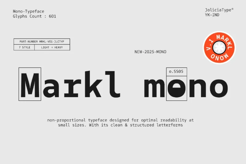
Matech
Matech is a cutting-edge monospaced font that brings a futuristic, techno vibe to your designs. This font’s pixel-inspired aesthetics and spacey feel make it ideal for designers working on sci-fi or technology-themed projects requiring a monospaced typeface.
Artavion Mono
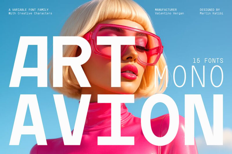
Artavion Mono is a versatile monospace typeface that offers variable font technology. This modern take on monospaced fonts allows designers to fine-tune the font’s appearance, making it an adaptable choice for various design contexts requiring fixed-width characters.
Monopack
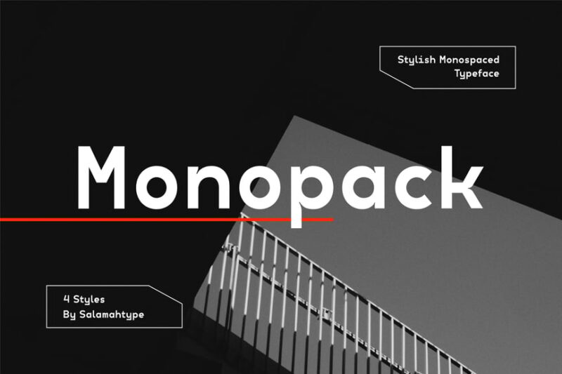
Monopack is a stylish monospace font that brings a touch of elegance to the world of fixed-width typefaces. Its refined design makes it particularly suitable for poster designs and other large-format applications where monospaced fonts can create striking visual impact.
Gail Rock
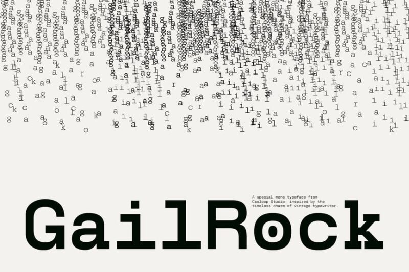
Gail Rock is a unique monospaced font that emulates the charm of typewriter text with added grit and character. This font’s ink bleed effect and monospace design make it perfect for designers looking to add a vintage, tactile feel to their branding projects.
Lenia Mono
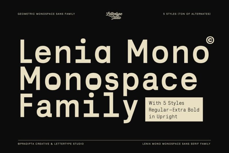
Lenia Mono is a geometric monospaced sans-serif family that combines precision with modern design principles. This versatile font is ideal for designers working on architectural projects or any application where clean, uniform character spacing is crucial.
Bergen Mono
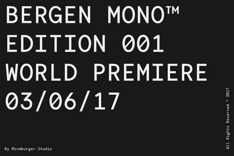
Bergen Mono is a sleek monospaced font that draws inspiration from futuristic design elements. Its clean lines and uniform character width make it an excellent choice for designers seeking a modern, tech-inspired monospaced typeface for their projects.
MonoPixel Awesome
![]()
MonoPixel Awesome is a unique monospaced font that combines pixel art aesthetics with colorful design elements. This playful typeface is perfect for designers looking to add a retro, gaming-inspired touch to their projects while maintaining the uniformity of monospaced fonts.
Monoglyphic
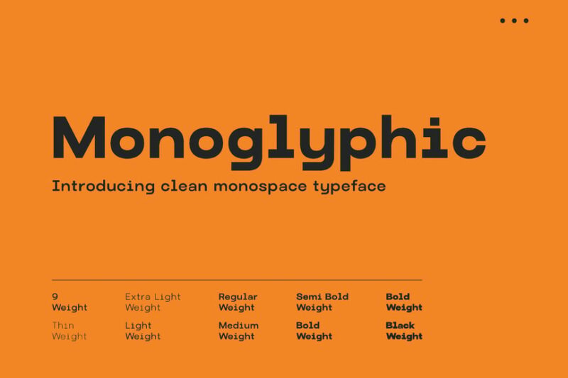
Monoglyphic is a clean, professional monospace typeface that offers exceptional legibility and uniformity. This font is perfect for designers who need a versatile, no-frills monospaced font for coding, technical documentation, or any project requiring precise character alignment.
Kiota Mono
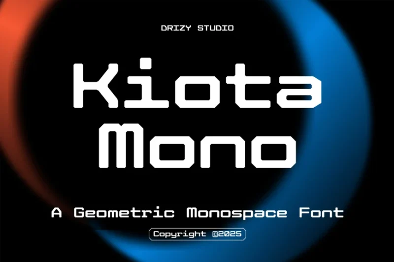
Kiota Mono is a geometric monospace font that captures the essence of Y2K and Gen Z aesthetics. This trendy typeface is ideal for designers looking to incorporate a youthful, nostalgic vibe into their projects while maintaining the precision of monospaced fonts.
System Code
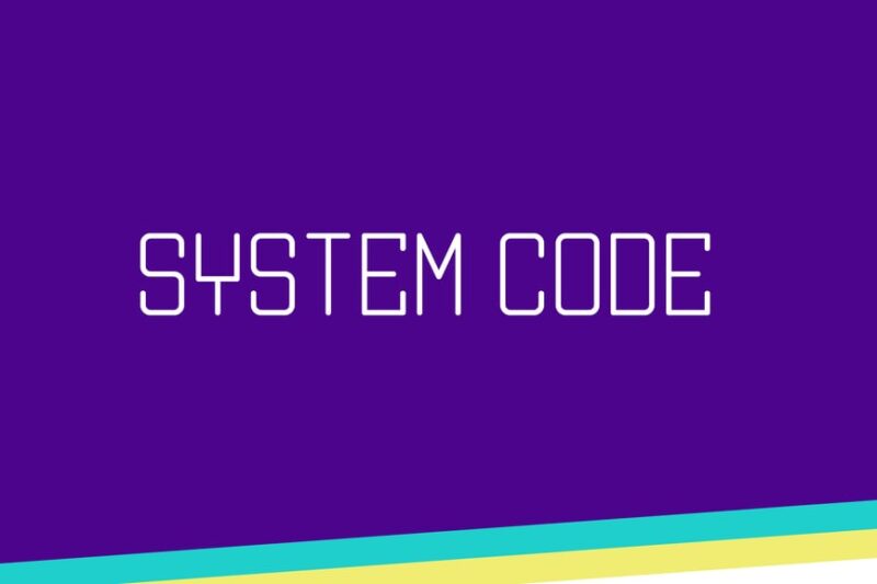
System Code is a tech-inspired decorative font that emulates computer code and robotic aesthetics. While not strictly monospaced, its design draws inspiration from the world of programming, making it an interesting choice for designers looking to evoke a technological feel in their work.
Light Degrad Mono
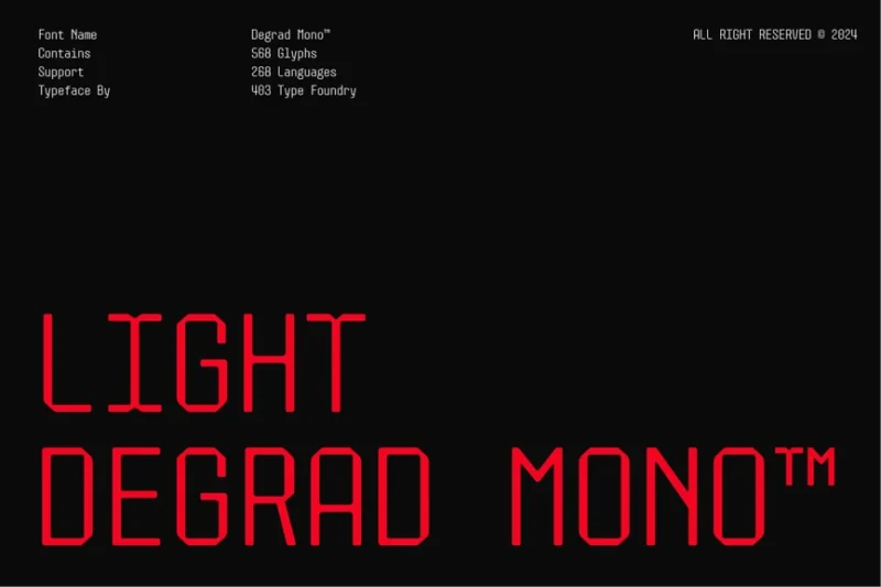
Light Degrad Mono is a sleek, minimalist monospaced font that features a subtle gradient effect. This unique typeface is perfect for designers looking to add a touch of sophistication to their projects while maintaining the uniformity and precision of monospaced fonts.
Alice Mono
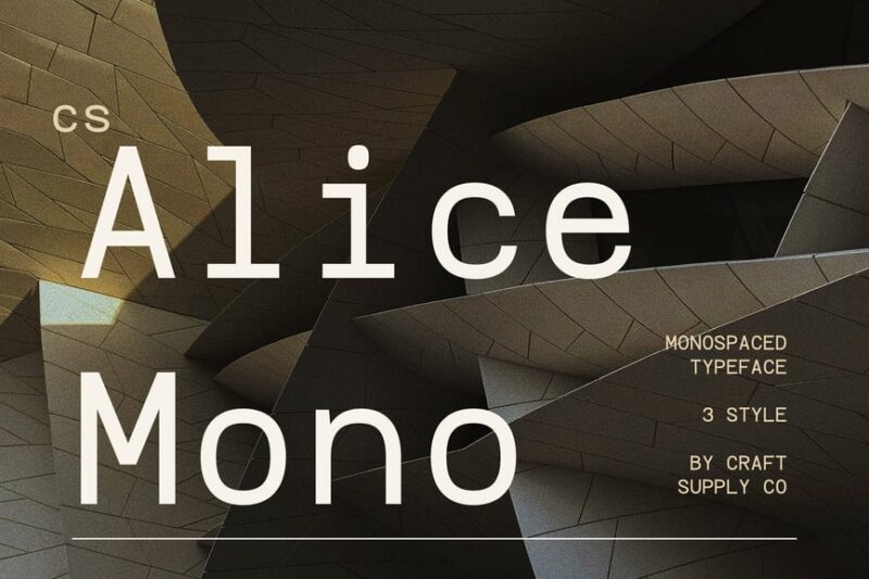
Alice Mono is a clean and elegant monospaced font that offers excellent readability and versatility. This typeface is ideal for designers who need a professional, no-nonsense monospaced font for various applications, from coding to editorial design.
Gilbert Mono
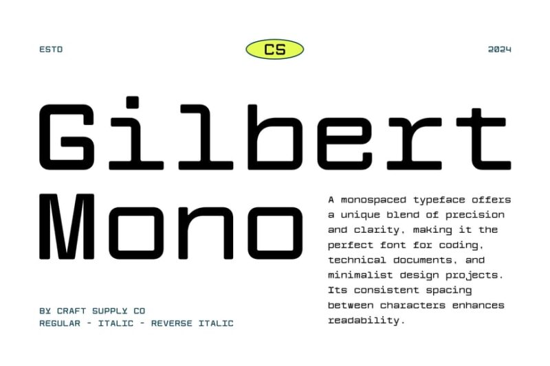
Gilbert Mono is a stylish monospace font that combines functionality with modern design sensibilities. Its uniform character width and clean lines make it an excellent choice for designers seeking a versatile monospaced typeface for both technical and creative projects.
Felice Mono
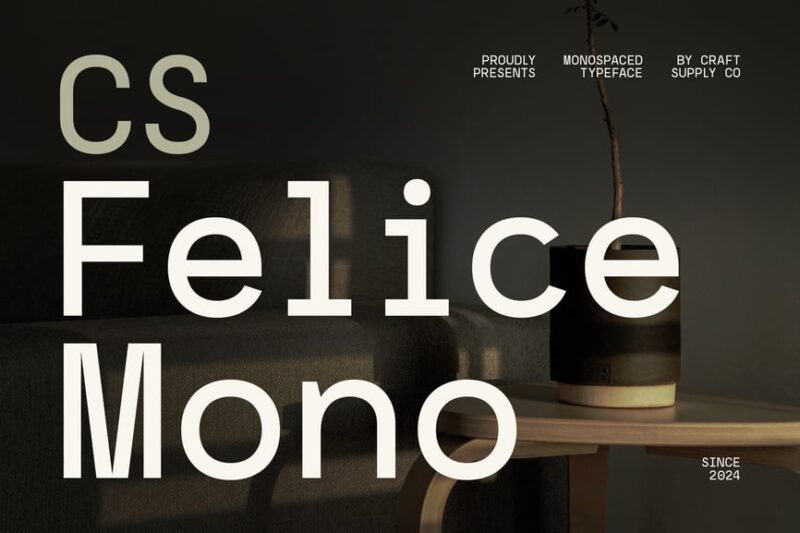
Felice Mono is an architectural-inspired monospaced font that offers a unique blend of form and function. This typeface is perfect for designers working on projects that require the precision of monospaced fonts while maintaining a sophisticated, structural aesthetic.
MBF World Mono
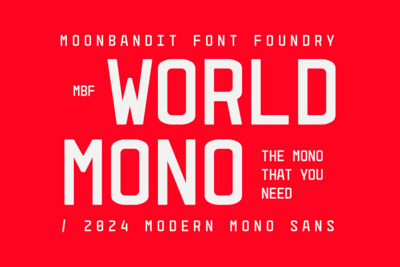
MBF World Mono is a versatile monospaced font that excels in logo design and branding applications. Its clean, uniform character width and modern aesthetics make it an ideal choice for designers creating memorable visual identities with a monospaced typeface.
Crowdy Monoletter
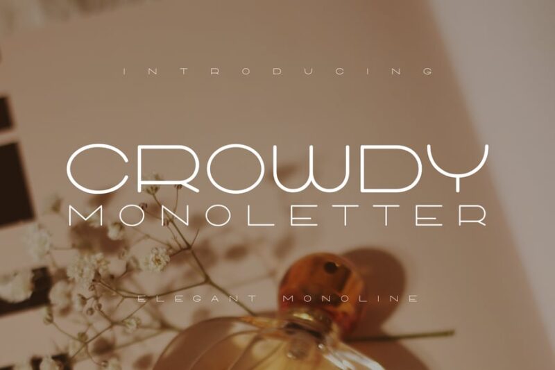
Crowdy Monoletter is a classy, monospaced font that brings a touch of elegance to fixed-width typefaces. This sophisticated font is perfect for designers looking to incorporate the uniformity of monospaced fonts into high-end, luxurious design projects.
Lidja
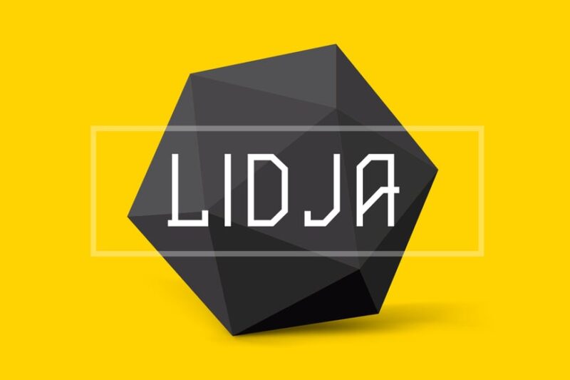
Lidja is a bold, decorative font that, while not strictly monospaced, offers a unique take on uniform character design. This typeface is ideal for designers looking to create eye-catching headlines or logos with a consistent, impactful presence.
Monoscope
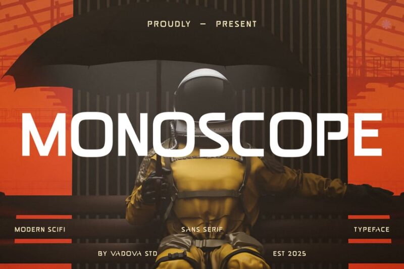
Monoscope is a futuristic, modern sans-serif font that draws inspiration from monospaced typefaces. This bold and sleek font is perfect for designers working on cutting-edge projects that require a strong, uniform visual presence with a nod to monospaced aesthetics.
System Glitch
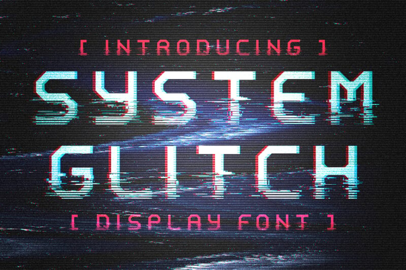
System Glitch is a display font that captures the essence of 80s computer aesthetics and glitch art. While not a traditional monospaced font, its glitchy design evokes the world of early computing, making it an interesting choice for designers looking to create retro-futuristic visuals.
What Makes Monospaced Fonts Special?
You might be wondering what gives monospaced fonts their distinct personality and why designers keep coming back to them. Let’s break down the key characteristics:
Perfect Alignment
First and foremost, that uniform character width creates impeccable vertical alignment. When you stack lines of text, everything lines up in neat columns. This is why programmers love them – you can instantly spot indentation issues or compare values in different lines.
Retro Aesthetic
There’s something undeniably nostalgic about monospaced fonts. They evoke memories of vintage computers, old-school typewriters, and early video games. That retro vibe has become incredibly popular in modern design, especially for brands wanting to tap into tech nostalgia.
Technical Precision
Monospaced fonts convey a sense of accuracy and attention to detail. They feel methodical, systematic, and precise – qualities that work beautifully for tech companies, data visualizations, and anything requiring a scientific or analytical tone.
Readability at Small Sizes
Many monospaced fonts are specifically designed to remain legible at tiny sizes. When you’re looking at dense blocks of code or detailed spreadsheets, that clarity becomes crucial. The fixed spacing helps your eye track across lines without getting lost.
Where Can You Use Monospaced Fonts?
The versatility of monospaced fonts might surprise you. While they’re synonymous with coding, their applications extend far beyond development environments:
Programming and Development
Obviously, this is home base for monospaced fonts. Code editors, terminal windows, and development environments universally use fixed-width typefaces. The alignment makes it easy to spot syntax errors, and the clarity reduces eye strain during long coding sessions.
Data and Spreadsheets
When you need to compare numbers or align data in columns, monospaced fonts are invaluable. Financial reports, statistical analyses, and tabular data all benefit from that consistent spacing. It’s why accounting software often defaults to monospaced typefaces.
Editorial and Magazine Design
Modern editorial designers have embraced monospaced fonts for their distinctive look. They work beautifully for pull quotes, captions, and even body text in the right context. Publications targeting tech-savvy audiences particularly love that contemporary-meets-retro aesthetic.
Branding and Logos
Tech startups, creative agencies, and innovative brands have discovered monospaced fonts make memorable logos. The geometric precision creates strong, distinctive wordmarks that stand out in crowded markets.
Art and Posters
The rigid structure of monospaced fonts provides an interesting contrast in artistic contexts. Designers use them to create tension between organic imagery and mechanical typography, or to achieve that coveted “tech art” aesthetic.
User Interfaces
Dashboards, admin panels, and technical interfaces often employ monospaced fonts for displaying code snippets, system logs, or terminal outputs. They signal to users that they’re looking at system-level information.
Where to Avoid Monospaced Fonts
As much as I love monospaced fonts, they’re not always the right choice. Here are contexts where you’ll want to think twice:
Long-Form Reading
Extended body text in monospaced fonts can be exhausting to read. That uniform spacing actually works against readability over long passages. Our eyes are trained to read proportional fonts more efficiently for sustained reading sessions.
Formal Documents
Legal contracts, academic papers, and formal business correspondence typically call for traditional proportional serifs. Monospaced fonts can feel too casual or technical for these contexts, potentially undermining the gravitas you’re trying to convey.
Luxury Branding
High-end fashion, premium hospitality, and luxury goods usually avoid monospaced fonts. They lack the elegance and refinement that proportional serifs and scripts provide. There are exceptions, but generally, monospaced = technical rather than luxurious.
Children’s Content
Kids learning to read need the visual cues that proportional fonts provide. The varying character widths help with word recognition and reading comprehension. Monospaced fonts can actually slow down young readers.
How to Choose the Perfect Monospaced Font
Selecting the right monospaced font requires considering several factors. Here’s my framework for making smart choices:
Purpose and Function
Start by asking: Why do you need a monospaced font? If it’s for code, prioritize legibility and character differentiation (can you easily tell 0 from O?). For design work, you might weight aesthetics more heavily.
Size and Scale
Consider where your text will appear. Some monospaced fonts excel at small sizes but feel clunky when large. Others make stunning display type but become hard to read when tiny. Test your font at actual use sizes.
Character Set
Do you need special characters? Programming ligatures? Multiple weights? International language support? Make sure your chosen font includes everything you need. Running into missing characters mid-project is frustrating.
License and Cost
Many excellent monospaced fonts are free and open-source, especially those built for developers. But if you’re using a font commercially in branding or client work, verify the licensing terms. Some free fonts restrict commercial use.
Personality and Tone
Even within monospaced fonts, there’s incredible variety. Some feel sleek and modern, others quirky and playful, still others vintage and nostalgic. Match the font’s personality to your project’s tone.
Monospaced vs. Proportional Fonts: Understanding the Difference
To really appreciate monospaced fonts, it helps to understand how they differ from their proportional cousins. Let’s break it down:
Proportional fonts vary character width based on the letter’s actual shape. An “i” might be 4 units wide while an “m” is 14 units wide. This creates natural, readable text that flows easily. It’s how we’re used to seeing most written content.
Monospaced fonts, on the other hand, force every character into the same width – let’s say 10 units. This means narrow letters like “i” get extra space on either side, while wide letters like “m” get compressed. The result looks more rigid and geometric.
The trade-off is fascinating. Proportional fonts are objectively more readable for body text and feel more natural to our eyes. But monospaced fonts provide that alignment and technical precision that’s irreplaceable in certain contexts.
In practice, many designers use both: monospaced fonts for technical elements, code blocks, or design accents, paired with proportional fonts for body text and primary content. This combination offers the best of both worlds.
The History of Monospaced Fonts
The story of monospaced fonts is intimately connected to the evolution of writing technology. It all started with the typewriter.
When Christopher Latham Sholes patented the first practical typewriter in 1868, he faced a mechanical constraint: each keystroke needed to move the carriage by exactly the same distance. Variable spacing would have required impossibly complex machinery for that era. So monospaced text wasn’t a choice – it was a necessity.
This limitation persisted for over a century. Every typewritten document, from business letters to manuscripts, used fixed-width characters. Writers and readers became so accustomed to this spacing that it simply looked “normal.”
When computers arrived, early text displays continued the tradition. Computer memory was precious, and storing one width value for all characters was far more efficient than tracking individual widths. Plus, those first programmers were often working with typewriter-style terminals anyway.
Even as technology advanced to support proportional fonts, developers stuck with monospaced typefaces for code. Why? That vertical alignment made code structure visually obvious. Indentation, brackets, and syntax elements lined up beautifully. It was simply better for the job.
Today, we’re seeing a renaissance of monospaced fonts in design. What was once a technical limitation has become a deliberate aesthetic choice. The retro-tech vibe resonates with contemporary audiences, and designers appreciate the geometric precision these fonts provide.
Monospaced Fonts in Modern Design Trends
Over the past few years, monospaced fonts have exploded beyond their traditional coding territory. Here’s where they’re making waves in 2026:
Brutalist Web Design
The brutalist design movement embraces raw, unpolished aesthetics, and monospaced fonts fit perfectly. They add to that intentionally “undesigned” look that’s paradoxically quite sophisticated.
Retro Gaming and 8-Bit Style
Nostalgia for early video games and computer graphics has brought monospaced fonts into gaming-related design. They instantly evoke that vintage tech feeling.
Tech Startup Branding
Silicon Valley and beyond, tech companies are using monospaced fonts to telegraph their technical credibility. It’s become shorthand for “we’re serious about technology.”
Cyberpunk and Futurism
The cyberpunk aesthetic relies heavily on monospaced fonts to create that hacker/coder vibe. Paired with neon colors and digital glitch effects, they’re essential to the look.
Minimalist Editorial
Forward-thinking magazines and blogs are using monospaced fonts as a way to break from traditional typography while maintaining readability. It feels fresh and contemporary.
Tips for Designing with Monospaced Fonts
Ready to incorporate monospaced fonts into your work? Here are some practical tips to get the best results:
Embrace the Grid
Monospaced fonts create an inherent grid structure. Don’t fight it – lean into that geometric quality. Align elements to that grid for maximum visual impact.
Mix with Proportional Fonts
Create contrast by pairing monospaced fonts with proportional typefaces. Use fixed-width for headlines or accents, proportional for body text. This combination provides visual interest while maintaining readability.
Adjust Letterspacing Carefully
The default spacing in monospaced fonts is usually pretty good, but sometimes you’ll want to adjust. Be subtle – these fonts are designed around specific spacing relationships, and dramatic changes can break their functionality.
Consider Line Height
Monospaced text often benefits from slightly increased line height compared to proportional fonts. That extra breathing room helps counteract the rigid horizontal spacing.
Use Color Strategically
The technical nature of monospaced fonts pairs beautifully with bold, saturated colors. Don’t be shy about using bright hues or high contrast combinations.
Test at Multiple Sizes
Always preview your monospaced font at actual usage sizes. What looks great as a 72pt headline might be illegible at 12pt, and vice versa.
Common Monospaced Font Questions
Let’s tackle some frequently asked questions about monospaced fonts:
What is a monospaced font?
A monospaced font is a typeface where every character occupies exactly the same horizontal space. Unlike proportional fonts where letters have varying widths, monospaced fonts give each character identical width regardless of its actual shape.
Why do programmers use monospaced fonts?
Programmers prefer monospaced fonts because they create perfect vertical alignment of code. This makes it easy to spot indentation, compare values in different lines, and see code structure at a glance. The uniform spacing also helps distinguish similar-looking characters.
Are monospaced fonts easier to read?
For short snippets of technical text, data, or code, yes. But for long-form reading, proportional fonts are actually more readable. Our eyes are trained to process varying character widths more efficiently over extended reading sessions.
Can I use monospaced fonts for logos?
Absolutely! Many modern brands, especially tech companies, use monospaced fonts in their logos. They create distinctive, memorable wordmarks with that contemporary technical aesthetic.
What’s the difference between monospaced and fixed-width fonts?
These terms are synonymous – they refer to the same thing. “Fixed-width” and “monospaced” both describe fonts where every character has identical width.
Are there monospaced serif fonts?
Yes! While most monospaced fonts are sans-serif, there are several excellent monospaced serif options. Courier is probably the most famous example. These combine the alignment benefits of fixed-width spacing with the traditional elegance of serifs.
Free vs. Premium Monospaced Fonts
One of the great things about monospaced fonts is the abundance of free, high-quality options. Since so many were developed for programming, they’re often released as open-source software.
Free options like JetBrains Mono, Fira Code, and IBM Plex Mono are genuinely excellent. They’re professionally designed, extensively tested, and include comprehensive character sets. For many projects, these free fonts are all you’ll ever need.
So when should you consider premium options? Here are some scenarios:
When you need a distinctive aesthetic that stands out from common coding fonts. Free monospaced fonts are widely used, so premium options help your design feel more unique.
If you require an extended font family with multiple weights and styles. Many free monospaced fonts offer only regular weight, while premium families might include light, bold, italic, and more.
For commercial branding where you want to ensure exclusivity. Using a premium font reduces the likelihood of your logo looking identical to someone else’s.
When you need specialized features like programming ligatures, powerline symbols, or extensive language support that free fonts might not include.
Monospaced Fonts for Different Use Cases
Not every monospaced font works equally well for every purpose. Here’s how to choose based on your specific needs:
For Coding
Prioritize character differentiation (clear distinction between 0/O, 1/l/I), comfortable reading at small sizes, and programming ligatures if you like them. Popular choices include JetBrains Mono, Fira Code, and Source Code Pro.
For Design and Display
Focus on personality and aesthetic appeal. You want something distinctive that makes a visual statement. Look at fonts like Space Mono, Inconsolata, or Roboto Mono for modern looks, or Courier variants for vintage vibes.
For Data and Spreadsheets
Clarity and number legibility are crucial. You need easy-to-scan digits and clear mathematical symbols. Consider fonts specifically designed for tabular data.
For Retro Projects
Embrace authentic vintage styles. Look for fonts that reference early computer displays, dot matrix printers, or classic typewriters. VT323 and Press Start 2P capture different aspects of tech nostalgia.
The Future of Monospaced Fonts
Where are monospaced fonts headed? The trends suggest they’re only becoming more popular in design contexts.
We’re seeing type designers create more sophisticated monospaced families with multiple weights, true italics, and refined details. These aren’t just functional fonts for code – they’re serious design tools.
Variable font technology is also being applied to monospaced typefaces, allowing for continuous adjustment of weight, width, and other parameters while maintaining fixed character width. This opens up new creative possibilities.
The aesthetic appreciation for monospaced fonts continues to grow. As retro-tech and cyberpunk influences remain strong in popular culture, these fonts feel increasingly contemporary despite their vintage associations.
In the development world, AI coding assistants and modern IDEs are creating new requirements for monospaced fonts. Designers are responding with typefaces optimized for these new contexts.
Conclusion: The Enduring Appeal of Monospaced Fonts
What started as a mechanical necessity in the typewriter era has evolved into a powerful design tool with surprising versatility. Monospaced fonts offer something unique in our increasingly fluid, proportionally-spaced world: structure, precision, and a distinctive technical aesthetic.
Whether you’re a developer seeking the perfect coding font, a designer looking for that retro-tech vibe, or simply someone who appreciates the geometric beauty of uniform character spacing, monospaced fonts have something to offer.
The key is understanding their strengths and limitations. Use them where they excel – in code, data, technical interfaces, and as distinctive design elements. Pair them thoughtfully with proportional fonts. And don’t be afraid to experiment with the many excellent options available.
From the classic reliability of Courier to the modern sophistication of JetBrains Mono, from retro gaming aesthetics to cutting-edge tech branding, monospaced fonts continue to prove their worth across contexts.
So go ahead, embrace the grid. Let those characters line up in perfect columns. There’s something deeply satisfying about that uniform spacing – a reminder that sometimes constraints breed creativity, and limitations can become signatures of style.
What’s your favorite monospaced font? Are you team classic Courier or modern minimalist? Let me know in the comments below!


