In this article:
- What Makes Music Fonts So Special?
- The Top Music Fonts That Are Striking a Chord in 2026
- Different Music Genres, Different Font Personalities
- How to Choose the Perfect Music Font for Your Project
- Where Music Fonts Shine Brightest
- When to Avoid Music Fonts
- The Psychology Behind Music Typography
- Expert Tips for Using Music Fonts Effectively
- Common Music Font Mistakes to Avoid
- The Future of Music Typography
- Creating Your Own Music Font Arsenal
- Conclusion: Finding Your Visual Voice
From vinyl records spinning in dusty shops to streaming playlists lighting up our screens, one thing has remained constant in music design: typography tells the story before the first note plays. As someone who’s watched fonts make or break entire album campaigns, I’ve learned that choosing the right typeface is like selecting the perfect opening chord – it sets the entire mood for what’s to come.
Think about it: would punk rock feel the same in elegant script? Could a symphony poster work with grunge lettering? The answer is a resounding no. Music fonts are the unsung heroes of the industry, working behind the scenes to translate sound into sight, emotion into visual language, and genre into immediate recognition.
Every letter, curve, and serif becomes part of the performance itself, creating an instant connection between your design and your audience’s expectations. In this deep dive into music typography, we’ll uncover the fonts that have shaped musical identity and discover how to harness their power in your own projects. Time to turn up the volume on your design game!
What Makes Music Fonts So Special?
Music fonts are typefaces specifically designed to evoke musical themes, genres, or the overall feeling of sound and rhythm. They’re the visual equivalent of a perfect chord progression – when done right, they create an instant emotional connection with your audience.
These fonts often incorporate elements that reference musical notation, instruments, sound waves, or the cultural aesthetics associated with different music genres. From elegant script fonts that whisper jazz ballads to bold, distressed typefaces that scream rock and roll, music fonts help bridge the gap between visual and auditory experiences.
What sets music fonts apart is their ability to convey mood and genre instantly. A flowing, ornate serif might transport viewers to a classical concert hall, while a gritty, hand-drawn font could place them front row at a punk show. This immediate genre recognition makes music fonts invaluable tools for designers working in the entertainment industry.
The Top Music Fonts That Are Striking a Chord in 2026
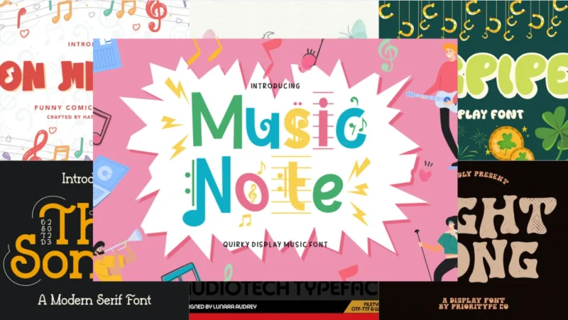
Music Note
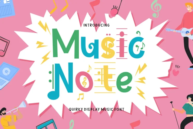
Music Note is a quirky display font with a musical theme. It features playful, note-inspired letterforms that would be perfect for music-related designs or fun, expressive projects.

Get 300+ Fonts for FREE
Enter your email to download our 100% free "Font Lover's Bundle". For commercial & personal use. No royalties. No fees. No attribution. 100% free to use anywhere.
Noto Music
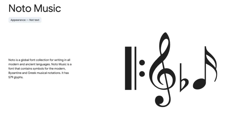
Noto Music is a specialized font designed for rendering musical notation. It’s part of Google’s Noto font family, ensuring consistent and beautiful typography across languages and scripts.
Sofunky
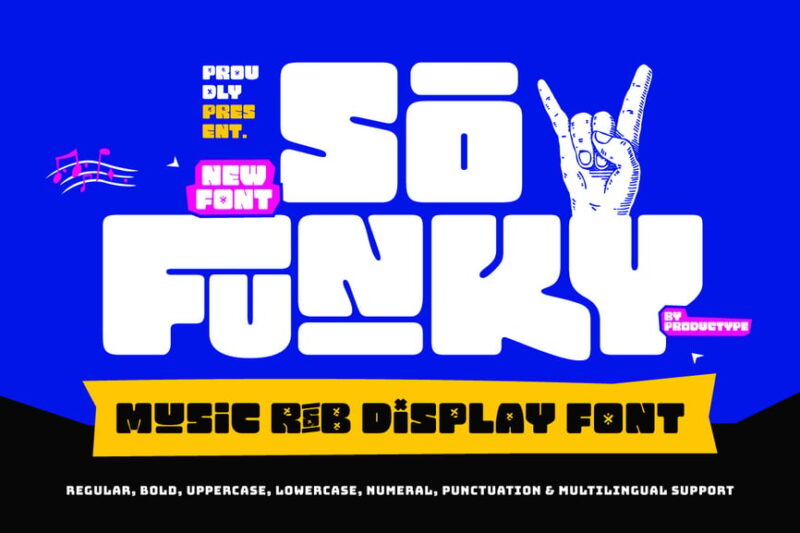
Sofunky is a bold, retro-inspired display font with a rock music vibe. Its chunky, funky letterforms make it ideal for creating eye-catching headlines or logos in music-related designs.
Musician Crush
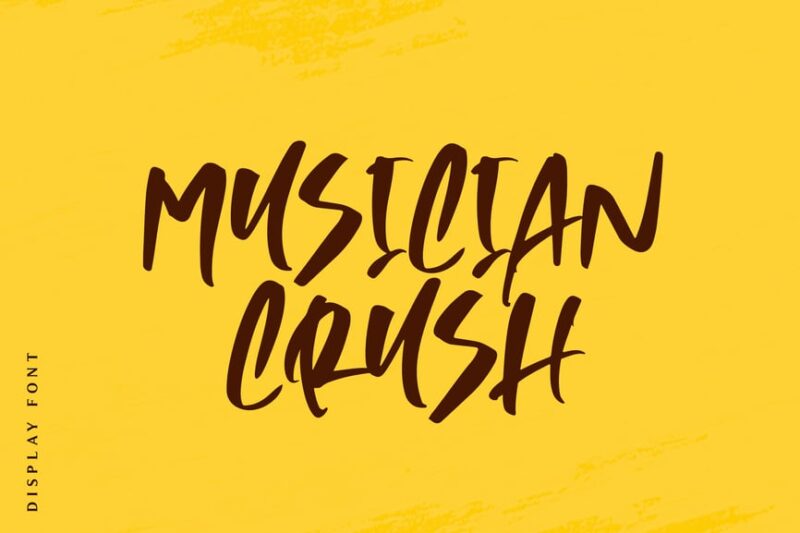
Musician Crush is a handwritten script font with a musical flair. Its casual, flowing style gives designs a personal touch, making it suitable for album covers, concert posters, or music-themed branding.
Sonophone
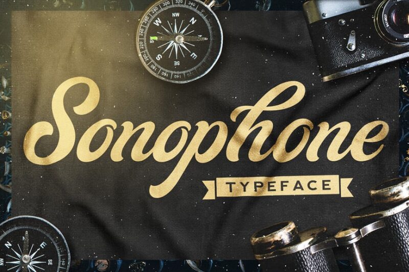
Sonophone is a cursive typeface with a classy aesthetic. Its musical undertones make it perfect for classy, bold musical designs.
Saxophone Font
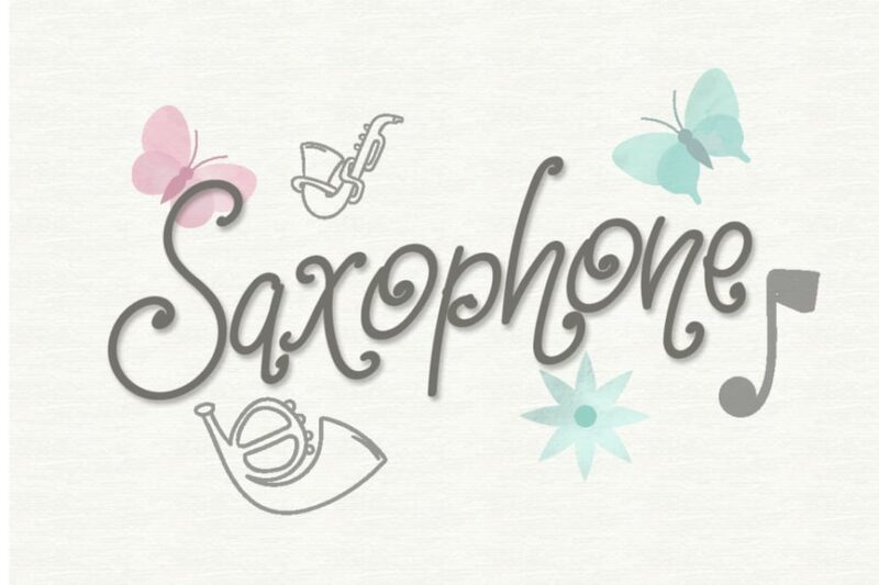
Saxophone Font is a handwritten, decorative typeface with a jazzy twist. Its fluid, expressive strokes evoke the smooth sounds of a saxophone, making it ideal for jazz-related designs or music event promotions.
Pesta Danza
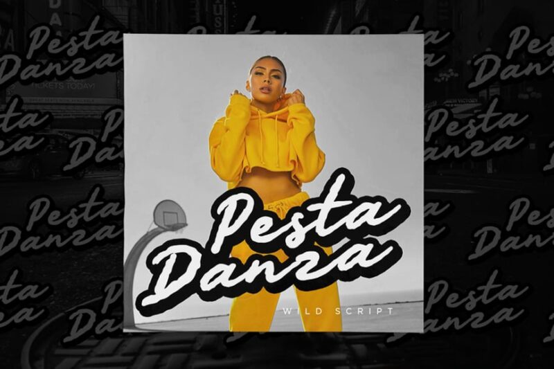
Pesta Danza is a wild, expressive script font with an artistic flair. Its energetic, streetwear font style is perfect for festival posters, album artwork, or any design requiring a vibrant, creative touch.
On Melody
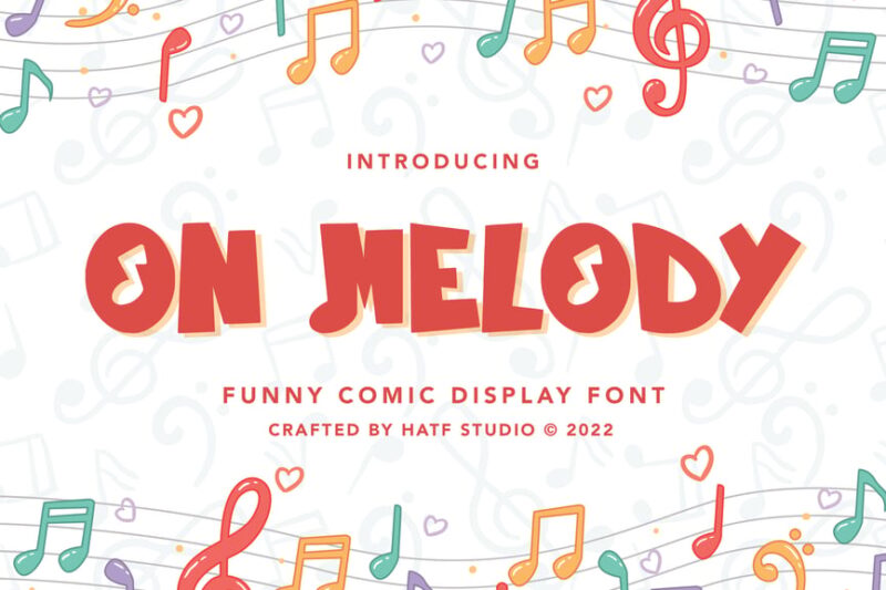
On Melody is a decorative font with a musical theme. Its playful, note-inspired design makes it suitable for DJ logos, music event promotions, or any project requiring a fun, melodic touch.
Fanfare
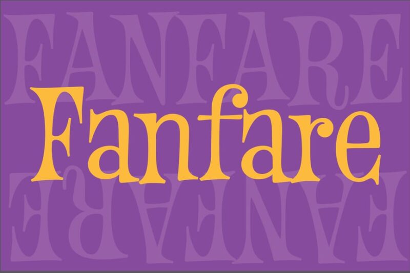
Fanfare is a decorative font with a cartoonish, musical flair. Its whimsical letterforms and playful style make it perfect for children’s music projects, animated titles, or fun event promotions.
Sonata
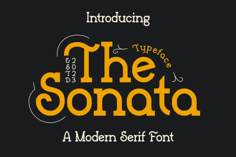
Sonata is a modern serif font with a premium, sophisticated look. Its elegant letterforms and subtle musical references make it suitable for high-end music events, classical concert programs, or upscale DJ branding.
Talkman Player
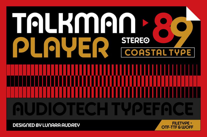
Talkman Player is a sans-serif font with an 80s-inspired aesthetic. Its retro look, reminiscent of old music players and VHS tapes, makes it perfect for nostalgic designs or vintage-themed music projects.
Bagpipe
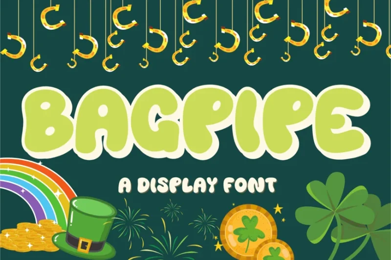
Bagpipe is a decorative font with a unique, smoky style. Its flowing, pipe-like letterforms give it a distinctive look, suitable for Celtic music designs, pub signage, or whiskey branding.
Right Song
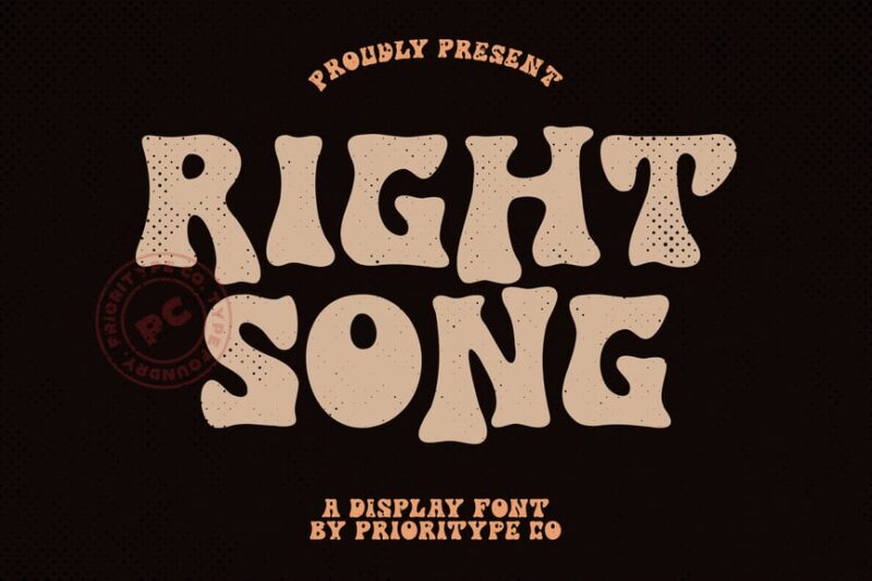
Right Song is a wild slightly distressed font with a musical theme. Its expressive, unconventional letterforms make it perfect for creating bold, attention-grabbing headlines in music-related designs or event posters.
Catchy Melody
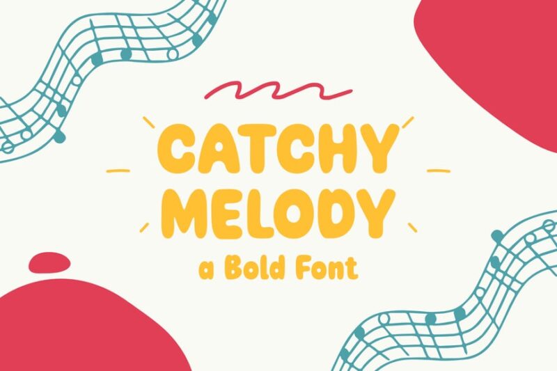
Catchy Melody is a rounded, decorative font with a kid-friendly vibe. Its playful, bouncy style makes it ideal for children’s music projects, fun album covers, or cheerful event promotions.
Melody Dingbat
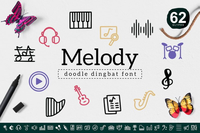
Melody Dingbat is a decorative symbol font featuring music-themed icons. It’s perfect for adding musical embellishments to logos, creating unique pattern designs, or enhancing music-related layouts.
Classical Melody
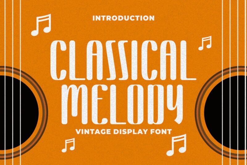
Classical Melody is a tall display font with an elegant, musical theme. Its ornate letterforms and classical style make it suitable for orchestra programs, vintage record designs, or upscale music event branding.
Symphony Script Font
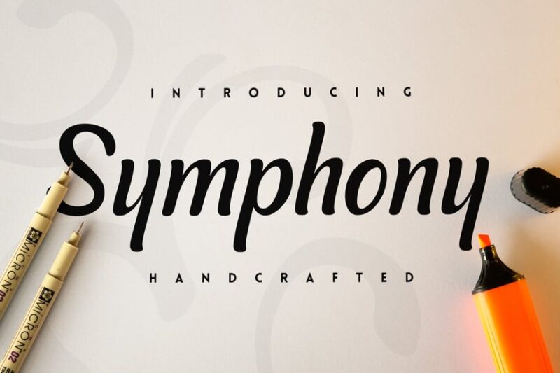
Symphony Script Font is an elegant, cursive typeface with a musical influence. Its flowing, sophisticated style makes it perfect for wedding invitations with a musical theme, high-end concert programs, or luxury branding in the music industry.
Violin
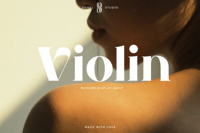
Violin is a serif font with a decorative, music-inspired twist. Its elegant letterforms and subtle musical references make it ideal for classical music branding, orchestra programs, or sophisticated music-related designs.
Piano Teacher
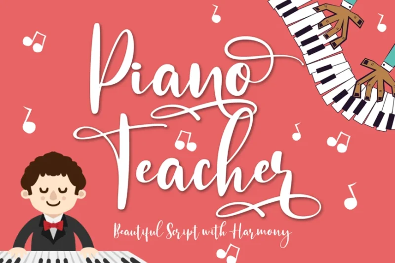
Piano Teacher is a handwritten script font with a flowing, dance-like quality. Its graceful strokes and musical undertones make it suitable for music lesson advertisements, piano recital programs, or elegant music-themed designs.
Set List
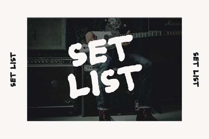
Set List is a sans-serif font with a grungy, marker-like aesthetic. Its rough, handwritten style makes it perfect for creating authentic-looking concert set lists, band merchandise, or edgy music event posters.
Orchard Song
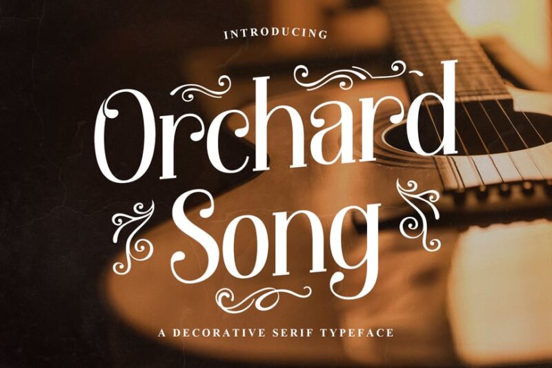
Orchard Song is a decorative serif font with ornate details. Its elegant, nature-inspired design makes it suitable for folk music album covers, rustic wedding invitations with a musical theme, or vintage-style concert posters.
Ring Bells
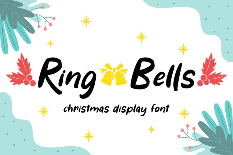
Ring Bells is a festive, handwritten font with a Christmas theme. Its playful style and bell-inspired details make it perfect for holiday music albums, winter concert promotions, or merry seasonal greetings with a musical twist.
Different Music Genres, Different Font Personalities
Just like music itself, fonts have personalities that align with specific genres. Understanding these relationships can help you choose the perfect typeface for your project.
Classical & Orchestral Music Fonts
Classical music calls for elegance, tradition, and sophistication. These fonts typically feature refined serifs, balanced proportions, and timeless appeal. Think ornate scripts reminiscent of hand-written sheet music or stately serif fonts that echo the grandeur of concert halls.
The best classical music fonts often incorporate subtle musical elements – perhaps a treble clef integrated into an ascender, or note heads that replace dots on letters. The key is subtlety; these fonts should whisper refinement rather than shout for attention.
Rock & Metal Music Fonts
Rock music fonts are all about attitude. They’re bold, rebellious, and unapologetically loud. These typefaces often feature distressed textures, sharp edges, and aggressive styling that mirrors the intensity of the music itself.
Metal fonts take this even further, sometimes incorporating gothic elements, flame motifs, or blade-like serifs that could cut glass. The goal is to create fonts that look like they could headbang right off the page.
Jazz & Blues Music Fonts
Jazz fonts capture the smooth, improvisational nature of the genre. They often feature flowing scripts, vintage-inspired sans serifs, or art deco influences that reference the golden age of jazz. These fonts should feel relaxed yet sophisticated, much like a late-night jam session in a smoky club.
Blues fonts might lean slightly grittier, with hand-drawn qualities that speak to the genre’s roots and raw emotional power. Think fonts that look like they were painted on a juke joint wall.
Electronic & EDM Music Fonts
Electronic music fonts embrace the digital age with geometric shapes, neon colors, and futuristic aesthetics. These fonts often feature clean lines, pixel-inspired details, or circuit board patterns that reference the technology behind the music.
Many electronic music fonts also play with lighting effects, gradients, and transparency to create that otherworldly, synthetic feel that defines the genre.
Hip-Hop & Urban Music Fonts
Hip-hop fonts reflect the genre’s street origins and bold attitude. They often feature graffiti-inspired letterforms, urban textures, or street art aesthetics. These fonts should feel authentic to the culture while maintaining readability and impact.
The best hip-hop fonts balance edginess with legibility, ensuring they can work across everything from album covers to merchandise to social media graphics.
How to Choose the Perfect Music Font for Your Project
Selecting the right music font isn’t just about finding something that looks cool – it’s about matching the typeface to your specific needs and audience. Here’s my process for choosing music fonts that hit all the right notes:
Consider Your Genre and Audience
Start by identifying the primary music genre and target demographic. A classical music festival will require very different typography than an underground rap battle. Your font choice should immediately communicate the type of music and attract the right audience.
Evaluate Readability Across Applications
Music fonts need to work across various applications – from tiny social media avatars to massive concert banners. Test your chosen fonts at different sizes and in various contexts to ensure they maintain their impact and readability.
Think About Mood and Energy Level
Different fonts convey different energy levels. A high-energy electronic music event needs fonts that feel dynamic and electric, while an intimate acoustic performance might call for something more subtle and warm. Match the font’s energy to the music’s energy.
Consider Pairing Potential
Music branding often requires multiple fonts working together. Consider how your primary music font will pair with secondary typefaces for body text, supporting information, and various design elements.
Where Music Fonts Shine Brightest
Music fonts excel in specific applications where their thematic nature can truly shine:
Album Covers and Music Packaging
This is perhaps the most obvious application, but it’s crucial to get right. Album cover typography needs to work with artwork, convey genre, and remain legible at thumbnail sizes for digital platforms.
Concert Posters and Event Marketing
Music fonts help concert posters cut through the noise and immediately communicate the type of show audiences can expect. They’re essential for creating hierarchy and drawing attention to key information like artist names and dates.
Band Logos and Music Branding
A great music font can become the foundation of an entire brand identity. Think about iconic band logos – many started with carefully chosen or custom music fonts that became synonymous with the artists themselves.
Music Websites and Digital Platforms
Online music platforms use music fonts to create engaging user experiences that reflect different genres and artists. These fonts help organize content and create visual variety across vast music libraries.
Merchandise and Apparel
Music fonts need to translate well to t-shirts, posters, stickers, and other merchandise. The best music fonts maintain their impact across different printing methods and materials.
When to Avoid Music Fonts
While music fonts are fantastic for many applications, they’re not always the right choice:
Formal Music Education Materials
Academic music theory textbooks, formal conservatory materials, and educational content often benefit from more traditional, highly legible typefaces rather than stylized music fonts.
Legal and Business Documents
Contracts, licensing agreements, and formal business correspondence in the music industry should prioritize clarity and professionalism over thematic appeal.
Detailed Technical Information
Liner notes with extensive credits, technical specifications, or complex information are better served by fonts optimized for reading rather than atmospheric music fonts.
The Psychology Behind Music Typography
There’s fascinating psychology behind how music fonts affect our perception. Certain letterform characteristics trigger associations with specific sounds, genres, and emotions.
Curved, flowing fonts often feel melodic and smooth, while angular, sharp fonts can feel percussive and aggressive. Heavy, condensed fonts might remind us of powerful bass lines, while light, airy fonts could evoke higher frequencies and delicate melodies.
Understanding these psychological connections helps designers choose fonts that not only look appropriate but actually enhance the musical experience through visual harmony.
Expert Tips for Using Music Fonts Effectively
After years of working with music fonts, here are my top recommendations for getting the most out of these specialized typefaces:
Layer for Impact
Don’t be afraid to layer music fonts with effects, textures, or other design elements. Music is inherently layered, and your typography can reflect that complexity while maintaining readability.
Consider Animation Potential
Many music applications benefit from animated typography. Choose fonts that will work well in motion graphics, whether for social media content, music videos, or live concert visuals.
Test Across Cultures
Music is universal, but cultural associations with typography vary. If you’re working on projects with international reach, research how your chosen fonts might be perceived in different markets.
Maintain Flexibility
Choose music fonts that offer multiple weights, styles, or variations. This flexibility allows you to create hierarchies and adapt to different design needs while maintaining consistency.
Common Music Font Mistakes to Avoid
Even experienced designers can fall into these traps when working with music fonts:
Over-Styling
Music fonts are often decorative by nature, but piling on additional effects can make them illegible and overwhelming. Sometimes, the font’s inherent character is enough.
Ignoring Context
A font that works perfectly for a death metal band might be completely inappropriate for a children’s music program. Always consider the full context of your project.
Sacrificing Legibility
No matter how perfect a music font looks thematically, if people can’t read it, it’s not serving its purpose. Readability should never be completely sacrificed for style.
Using Clichéd Combinations
Some music font and genre combinations have become so overused they feel clichéd. Don’t be afraid to explore unexpected pairings that still respect the genre’s essence.
The Future of Music Typography
As we look ahead, music fonts are evolving alongside the music industry itself. We’re seeing more fonts designed specifically for digital platforms, variable fonts that can adapt to different contexts automatically, and even fonts that respond to audio input in real-time.
The rise of immersive technologies like VR and AR is also creating new opportunities for three-dimensional music typography that can exist in virtual spaces alongside musical performances.
Creating Your Own Music Font Arsenal
Building a collection of quality music fonts is like assembling a great record collection – it takes time, curation, and an understanding of what makes each piece special.
Start with versatile fonts that can work across multiple genres, then gradually add more specialized typefaces as your projects demand them. Keep organized catalogs with genre tags, and don’t forget to maintain proper licensing for commercial projects.
Remember, the best music font collection isn’t necessarily the largest – it’s the one that gives you the right tool for every musical project that comes your way.
Conclusion: Finding Your Visual Voice
Music fonts are more than just decorative elements – they’re essential tools for creating visual experiences that harmonize with musical ones. Whether you’re designing for the next Billboard chart-topper or a local coffee shop’s acoustic night, the right music font can make your design sing.
The key is understanding that great music typography, like great music itself, is about more than technical proficiency. It’s about emotion, connection, and creating something that resonates with your audience on a deeper level.
So take these fonts, experiment with them, and find your own visual voice in the world of music design. After all, every great song started with someone willing to try a new combination of notes – and every great music design starts with someone willing to explore the perfect combination of letters.
Now turn up the volume and let your typography make some noise!