In this article:
- The Most Mind-Bending Glitch Fonts of 2026
- What Exactly Are Glitch Fonts?
- The Psychology Behind Glitch Typography
- Where Glitch Fonts Absolutely Shine
- When to Pump the Brakes on Glitch Typography
- Mastering the Art of Glitch Font Selection
- Pairing Glitch Fonts Like a Pro
- The Technical Side of Glitch Typography
- Common Glitch Font Mistakes (And How to Avoid Them)
- Glitch Fonts in Motion: Animation and Beyond
- The Future of Glitch Typography
- Wrapping Up: When Perfect Just Isn't Perfect Enough
Remember that moment when your computer screen started acting up, pixels dancing across your monitor in chaotic patterns? While most of us reach for the restart button, designers have been embracing these digital mishaps as pure typographic gold. Welcome to the wild world of glitch fonts – where broken is beautiful, and errors become art.
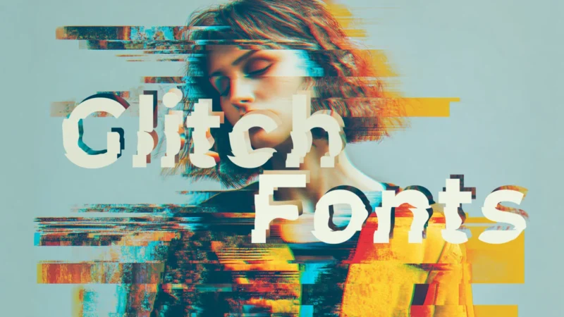
Glitch fonts capture that raw, digital disruption aesthetic that’s been taking the design world by storm. These intentionally “corrupted” typefaces bring an edgy, cyberpunk vibe to everything from album covers to tech startup logos. They’re the visual equivalent of that satisfying moment when chaos creates something unexpectedly stunning.
But here’s the thing about glitch fonts – they’re not just about looking cool (though they absolutely do). They tell stories of our digital age, reflecting our relationship with technology, imperfection, and the beauty found in system failures. When used right, they can transform a boring design into something that stops viewers dead in their tracks.
Ready to dive into the glitched-out universe of typography? Let’s explore how these fractured fonts can add that perfect touch of digital rebellion to your next project.
The Most Mind-Bending Glitch Fonts of 2026
Glitchy
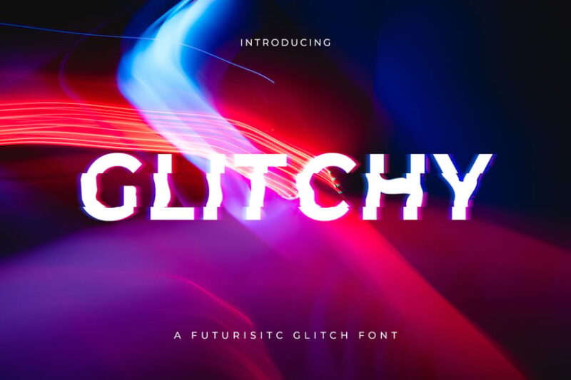
Glitchy is a digital glitch font that embodies a futuristic and distorted aesthetic. Its decorative style makes it perfect for creating eye-catching designs with a modern, tech-inspired feel.
Avalon
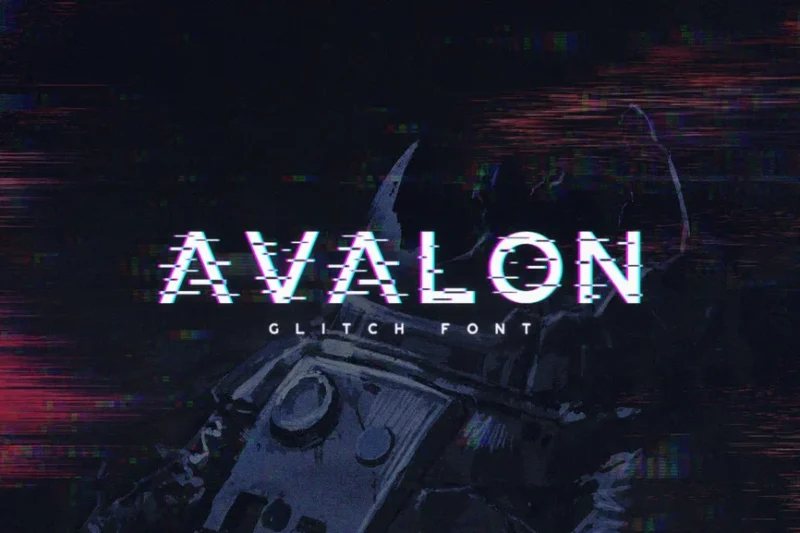
Avalon is a glitch font that combines elements of cyberpunk and digital distortion. This decorative typeface is ideal for projects that require a bold, edgy, and futuristic look.
System Glitch
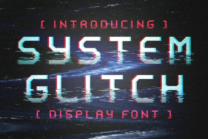
System Glitch is a display font that embraces the aesthetic of digital malfunction. Its decorative style makes it suitable for headlines, posters, and other designs that aim to capture attention with a technological twist.

Get 300+ Fonts for FREE
Enter your email to download our 100% free "Font Lover's Bundle". For commercial & personal use. No royalties. No fees. No attribution. 100% free to use anywhere.
Lucy Glitch
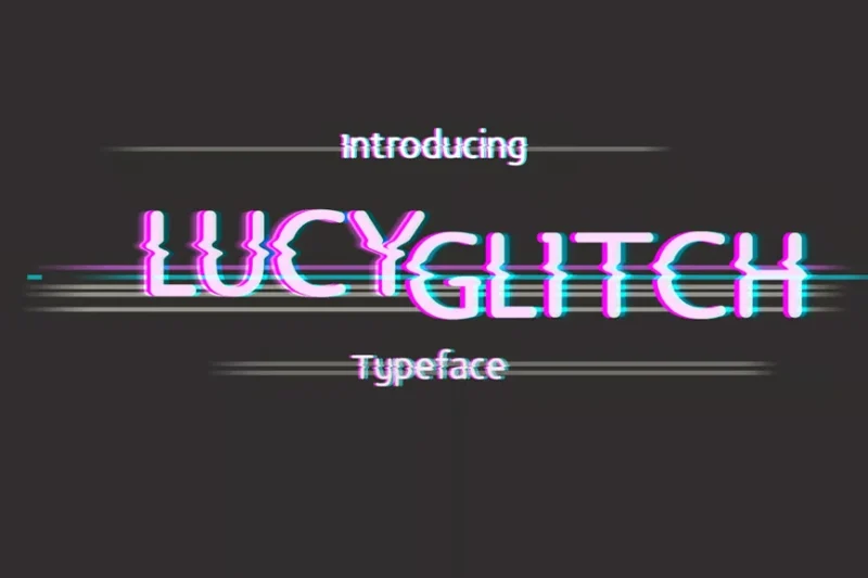
Lucy Glitch is a decorative sans-serif font that incorporates glitch elements to create a sense of digital failure. This typeface is perfect for designs that aim to convey a sense of disruption or technological breakdown.
Glitch Exsand
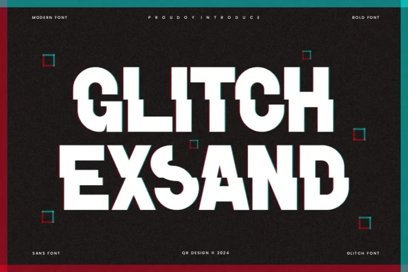
Glitch Exsand is a futuristic glitch font with a modern and innovative design. This decorative typeface is well-suited for logos and contemporary designs that require a bold, tech-inspired look.
Glitch Seven
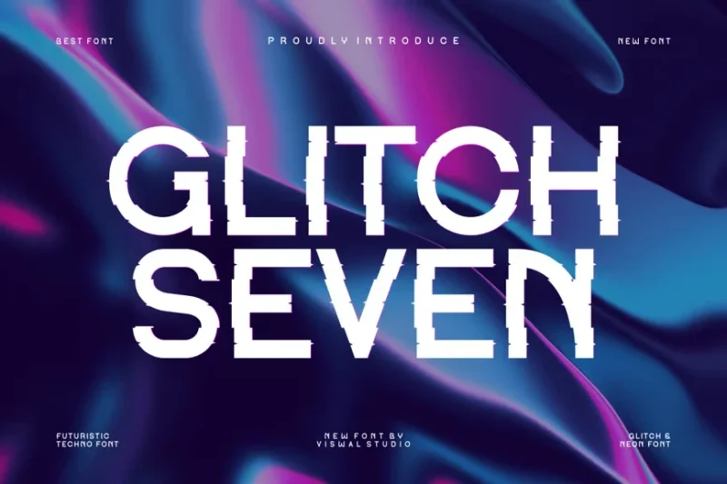
Glitch Seven is a decorative font that combines glitch aesthetics with a futuristic style. Its design evokes thoughts of space and digital realms, making it ideal for sci-fi themed projects or cutting-edge designs.
Glitro
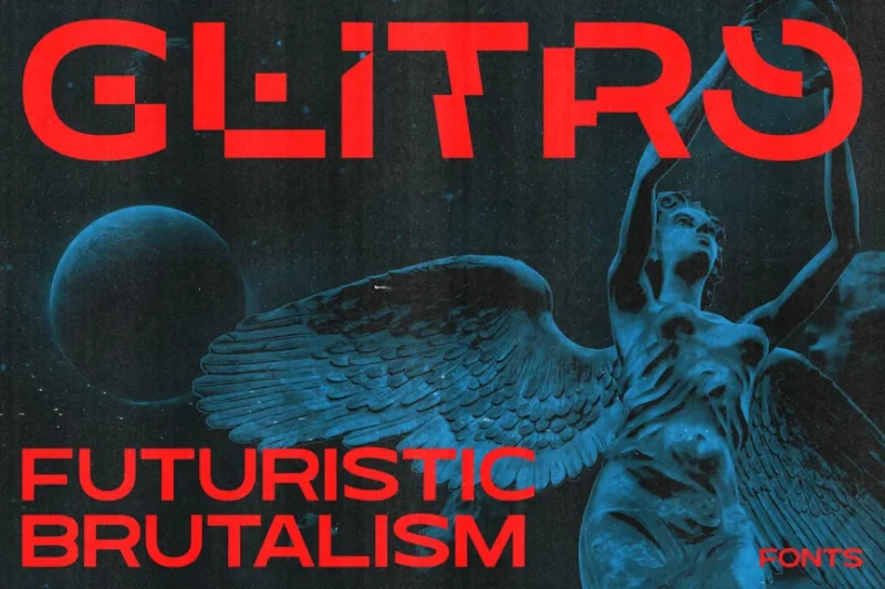
Glitro is a sans-serif font family that incorporates futuristic glitch elements. This typeface is perfect for sci-fi themed designs or projects that require a bold, technologically advanced look.
Sharpegaze
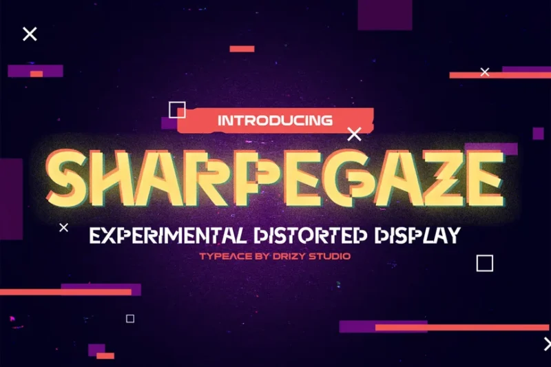
Sharpegaze is an experimental distorted almost sci-fi font. Its unique design makes it ideal for projects that require a bold, avant-garde aesthetic with a touch of digital distortion.
No Signal
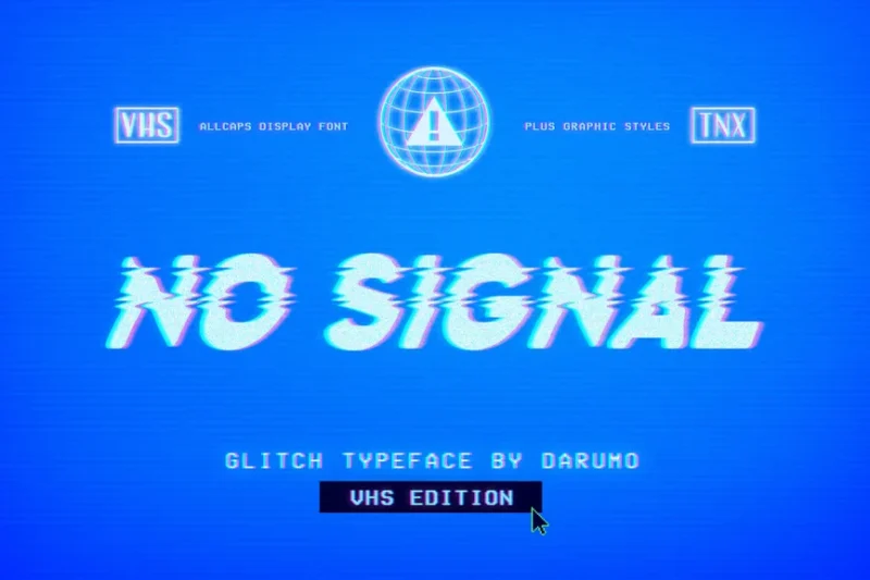
No Signal is a sans-serif decorative font that incorporates glitch effects. Its design mimics the appearance of a disrupted digital signal, making it ideal for projects that aim to convey a sense of technological interference or breakdown.
Glitch Conie
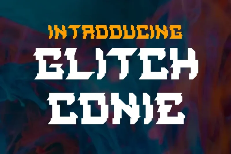
Glitch Conie is a decorative font that combines glitch aesthetics with vector-style design. This typeface is well-suited for creating logos and designs that require a modern, tech-inspired look with a touch of digital distortion.
Vorcas Glitch
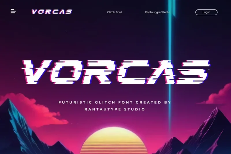
Vorcas Glitch is a decorative font that incorporates glitch elements into its design. This typeface is perfect for magazine layouts, posters, and other designs that require a bold, contemporary look with a digital twist.
Norvoid
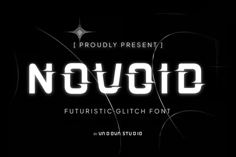
Norvoid is a futuristic glitch font with a decorative style. This typeface is ideal for projects that require a bold, forward-thinking aesthetic, perfect for tech-related designs or sci-fi themed works.
Stereovario
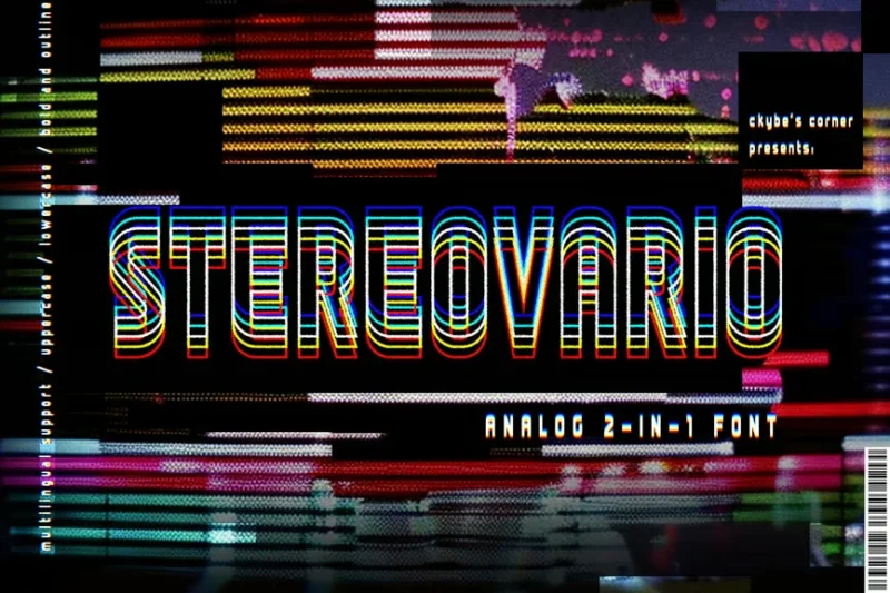
Stereovario is a unique 2-in-1 font that combines decorative and sans-serif styles. Its prism-like design makes it versatile for various projects, offering both a standard and a distorted version of each character.
The Glitch
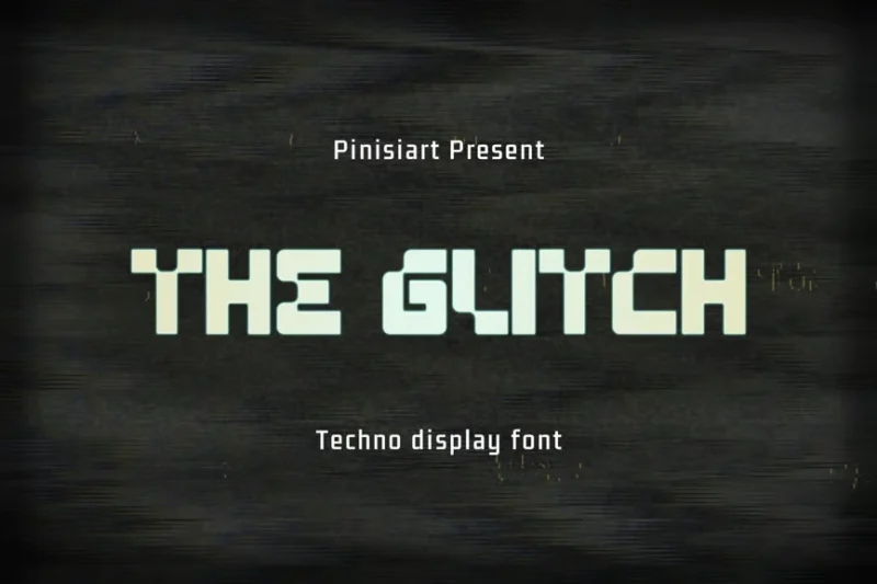
The Glitch is a techno display font with a sans-serif style. This typeface is perfect for technology-themed projects, conveying a sense of digital innovation and modern aesthetics.
Glitch Blazing
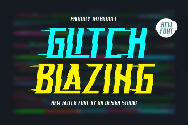
Glitch Blazing is a futuristic racing font that features authentic distorted elements. This typeface is ideal for creating bold, eye-catching designs with a digital malfunction aesthetic.
Rushgoda
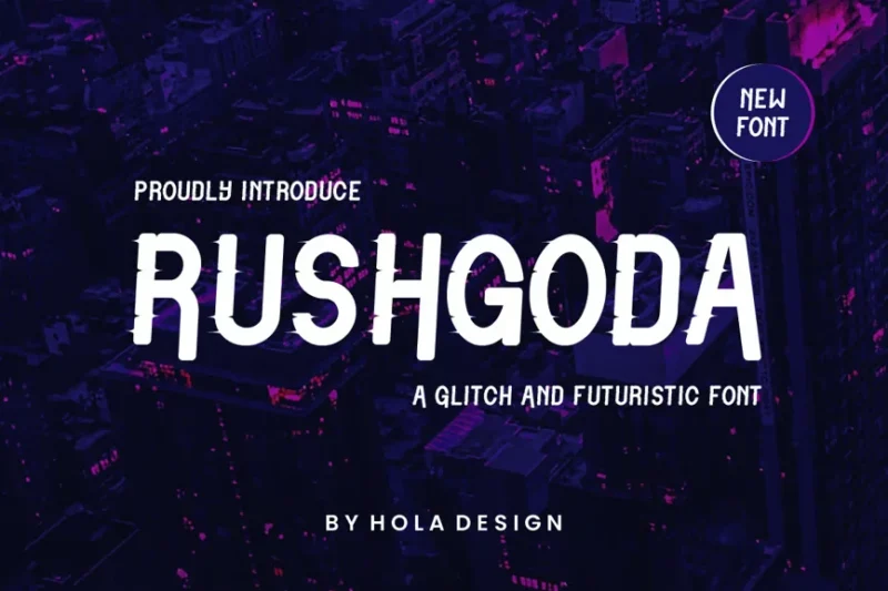
Rushgoda is a decorative font that combines glitch and tech aesthetics. This typeface is perfect for projects that require a futuristic, technology-inspired look with elements of digital distortion.
Singiko
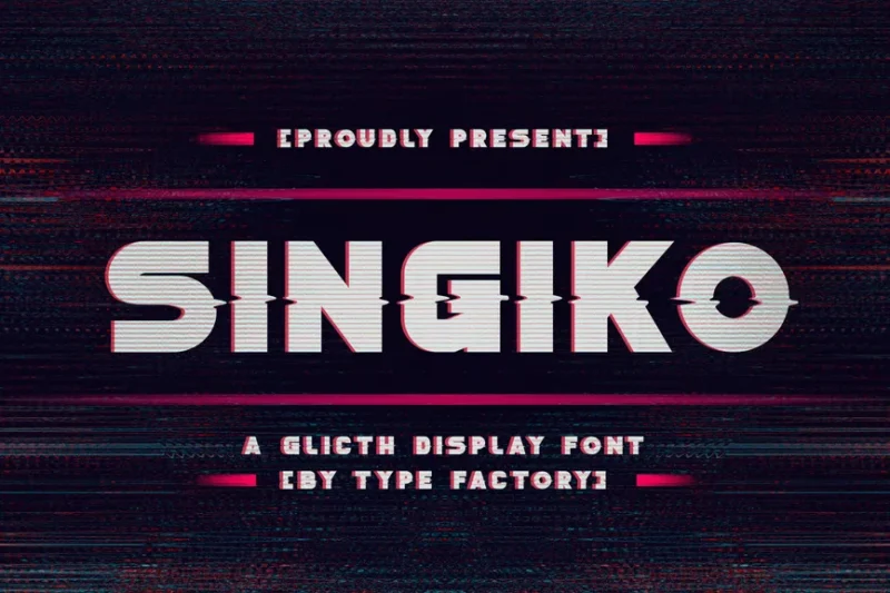
Singiko is a bold glitch display font with a decorative style. Its unique design makes it ideal for creating striking headlines or logos that require a modern, digitally-inspired aesthetic.
Glitch Click
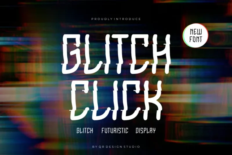
Glitch Click is a decorative font that blends cyber and glitch aesthetics. This typeface is well-suited for sports-related designs or projects that require a bold, futuristic look with a touch of digital distortion.
Corepix
![]()
Corepix is a unique glitch pixel serif font. This typeface combines pixel art aesthetics with glitch elements, making it perfect for retro-futuristic designs or projects that require a blend of old and new digital styles.
Pixelad
![]()
Pixelad is a decorative pixel font. Its design is inspired by retro video games, making it ideal for gaming-related projects, sports designs, or space-themed works that require a nostalgic digital feel.
Debug
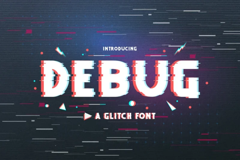
Debug is an uppercase glitch font with a decorative style. This typeface is perfect for branding projects or album covers that require a bold, tech-inspired look with elements of digital distortion.
Recbold
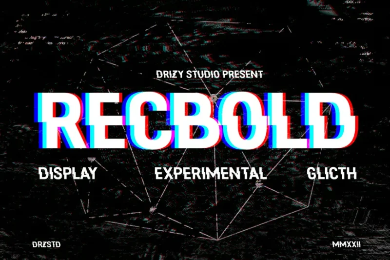
Recbold is an experimental glitch font with a sans-serif style. Its shredded, distorted design makes it ideal for display purposes in projects that require a bold, avant-garde aesthetic with a digital twist.
Avaluna
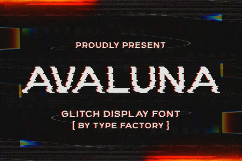
Avaluna is a glitch display font with a decorative style. This typeface features authentic glitch elements, making it perfect for creating eye-catching designs that require a bold, digitally-distorted aesthetic.
What Exactly Are Glitch Fonts?
Glitch fonts are typefaces designed to mimic the visual artifacts that occur when digital systems malfunction. Think scrambled pixels, corrupted data streams, and those wild distortions you see when your graphics card decides to have a moment.
These fonts deliberately incorporate visual “errors” like:
Pixel Displacement: Letters appear shifted, duplicated, or scattered across their baseline, creating that signature broken-transmission look.
Color Channel Separation: Red, green, and blue channels get offset from each other, producing those iconic chromatic aberration effects that scream “digital malfunction.”
Data Corruption Aesthetics: Missing chunks of letters, random noise patterns, and fragmented characters that look like they’ve been through a digital blender.
Scan Line Interference: Horizontal lines and static patterns reminiscent of old CRT monitors and analog TV interference.
The beauty of glitch fonts lies in their controlled chaos. While they appear random and broken, every distortion is carefully crafted to maintain readability while delivering maximum visual impact.
The Psychology Behind Glitch Typography
Why do glitch fonts captivate us so much? It’s not just about looking edgy – there’s genuine psychology at play here.
Embracing Imperfection: In our increasingly digital world, glitch fonts represent a rebellion against the pursuit of pixel-perfect design. They celebrate the beautiful accidents that happen when technology goes rogue.
Nostalgia for Analog: Paradoxically, these ultra-digital fonts often trigger nostalgia for older technology – VHS tapes, dial-up internet, and early computer graphics. They’re a bridge between our analog past and digital future.
Attention-Grabbing Disruption: Our brains are wired to notice when something’s “wrong.” Glitch fonts exploit this by creating visual tension that demands attention.
Authenticity in Artifice: In an age of polished, sanitized design, glitch fonts feel refreshingly honest about their digital nature. They don’t try to hide their artificial origins – they celebrate them.
Where Glitch Fonts Absolutely Shine
Glitch fonts aren’t one-size-fits-all solutions, but when used in the right contexts, they’re pure magic:
Tech and Gaming Brands: Nothing says “cutting-edge technology” like typography that looks like it’s been through a digital storm. Gaming companies, software startups, and tech conferences love glitch fonts for their futuristic, cyberpunk vibes.
Music and Entertainment: Electronic music artists, DJs, and streaming platforms use glitch fonts to convey energy, innovation, and that slightly rebellious edge that resonates with younger audiences.
Fashion and Streetwear: Glitch typography has become synonymous with urban fashion, particularly in streetwear brands targeting Gen Z consumers who grew up immersed in digital culture.
Event Posters and Flyers: Music festivals, art exhibitions, and underground events use glitch fonts to signal that they’re pushing boundaries and offering something different from the mainstream.
Social Media Graphics: Instagram stories, TikTok overlays, and YouTube thumbnails benefit from glitch fonts’ ability to stop the scroll and grab attention in crowded feeds.
Movie Posters and Trailers: Sci-fi, thriller, and horror films use glitch typography to create atmosphere and hint at themes of technology gone wrong or reality breakdown.
When to Pump the Brakes on Glitch Typography
While glitch fonts are undeniably cool, they’re not appropriate for every situation. Avoid them when you need:
Corporate Professionalism: Law firms, banks, and healthcare organizations typically need to project stability and reliability – qualities that glitch fonts actively work against.
Clear Information Delivery: User manuals, emergency instructions, and educational materials require maximum clarity. Glitch fonts can hinder comprehension when information is critical.
Timeless Branding: If you’re building a brand meant to last decades, glitch fonts might feel dated as digital aesthetics evolve. They’re very much of this moment in design history.
Accessibility Requirements: The visual distortions in glitch fonts can create real barriers for users with dyslexia, visual impairments, or cognitive differences.
Mastering the Art of Glitch Font Selection
Choosing the perfect glitch font requires balancing chaos with purpose:
Consider Your Disruption Level: Some glitch fonts whisper their digital nature with subtle pixel shifts, while others scream with full chromatic chaos. Match the intensity to your brand’s personality.
Test Across Platforms: Glitch effects can look dramatically different on various screens and devices. What looks perfectly corrupted on your monitor might be illegible on a phone.
Mind Your Message: The specific type of glitch matters. Scan lines evoke retro nostalgia, while pixel displacement feels more contemporary. Choose effects that align with your narrative.
Plan for Readability: Even the most artistically glitched font needs to communicate. Test with actual users to ensure your message isn’t lost in the visual noise.
Pairing Glitch Fonts Like a Pro
Glitch fonts work best when they’re not fighting for attention. Here’s how to create harmony in chaos:
Contrast with Clean: Pair glitched headlines with pristine sans-serif body text. The contrast amplifies both the chaos of the glitch and the clarity of the supporting type.
Color Coordination: Use the color channels from your glitch font’s chromatic aberration as accents throughout your design. This creates visual cohesion despite the apparent disorder.
Spacing and Breathing Room: Give glitch fonts plenty of white space. Their inherent visual complexity needs room to breathe, or your design becomes overwhelming.
The Technical Side of Glitch Typography
Creating effective glitch fonts isn’t just about slapping some distortion on existing letterforms. The best glitch fonts are built with intention:
Planned Randomness: Good glitch fonts use mathematical algorithms to create “random” distortions that are actually carefully controlled and repeatable.
Multiple Variants: Top-tier glitch fonts often include multiple versions of each character, allowing for varied corruption levels within the same word.
Animation Ready: Many modern glitch fonts are designed with motion graphics in mind, featuring characters that can seamlessly transition between corruption states.
Color Channel Awareness: Professional glitch fonts consider how their effects will appear when separated into RGB channels, ensuring the aberration effects work properly across different media.
Common Glitch Font Mistakes (And How to Avoid Them)
Even experienced designers can stumble when working with glitch typography. Here are the pitfalls to watch for:
Overdoing the Effect: More glitch isn’t always better. Sometimes a subtle pixel shift creates more impact than full-blown digital chaos.
Ignoring Hierarchy: Glitch fonts can flatten your type hierarchy if every element is equally corrupted. Use varying levels of distortion to maintain visual organization.
Forgetting the Context: A glitch font that works perfectly for a cyberpunk game poster might completely miss the mark for a wellness app.
Neglecting Performance: Heavy glitch effects can impact loading times and performance, especially in web applications. Optimize your implementations.
Glitch Fonts in Motion: Animation and Beyond
Static glitch fonts are just the beginning. The real magic happens when these corrupted characters start moving:
Procedural Animation: Modern glitch fonts often include parameters for real-time corruption, allowing text to glitch differently each time it appears.
Transition Effects: Glitch fonts excel at dramatic entrances and exits, with text appearing to corrupt into existence or dissolve into digital noise.
Interactive Corruption: Some applications use glitch fonts that respond to user interaction, becoming more or less corrupted based on mouse movement or touch input.
The Future of Glitch Typography
As we look ahead, glitch fonts continue evolving with technology:
AI-Generated Glitches: Machine learning algorithms are creating increasingly sophisticated and varied corruption patterns.
Real-Time Rendering: Web technologies are enabling true real-time glitch effects that were previously only possible in specialized software.
Accessibility Integration: Designers are developing “smart” glitch fonts that can dial down their effects for users who need clearer text.
Cross-Reality Applications: As AR and VR become mainstream, glitch fonts are finding new applications in spatial computing environments.
Wrapping Up: When Perfect Just Isn’t Perfect Enough
Glitch fonts represent something profound about our relationship with technology – they find beauty in breakdown, art in error, and meaning in malfunction. In a world obsessed with seamless user experiences and pixel-perfect interfaces, they remind us that sometimes the most interesting moments happen when things go beautifully wrong.
Whether you’re designing for a cutting-edge tech startup, an underground music festival, or a fashion brand that wants to capture digital native energy, glitch fonts offer a way to inject authentic digital rebellion into your typography.
The key is knowing when to embrace the chaos and when to dial it back. Used thoughtfully, glitch fonts don’t just communicate information – they create experiences that resonate with our increasingly complex relationship with the digital world.
So next time your computer glitches, don’t immediately reach for that restart button. Take a moment to appreciate the accidental art happening on your screen. You might just find inspiration for your next typographic adventure.
After all, in the world of glitch fonts, broken isn’t just beautiful – it’s essential.

