In this article:
- The Most Beautiful Korean Fonts of 2026
- Understanding Hangeul: The Science Behind Korean Typography
- Traditional vs. Modern Korean Fonts: Finding Your Style
- Pairing Korean Fonts with Latin Typefaces
- Where to Use Korean Fonts (And Where to Avoid Them)
- Common Korean Font Mistakes (And How to Fix Them)
- Finding Quality Korean Fonts: Free and Premium Resources
- Technical Tips for Working with Korean Fonts
- Expert Perspectives on Korean Typography
- The Future of Korean Typography
- Frequently Asked Questions About Korean Fonts
- Final Thoughts: Embracing the Beauty of Korean Typography
There’s something mesmerizing about watching Korean dramas with their beautifully designed title cards, or scrolling through Korean Instagram feeds where the typography seems to dance across the screen. The elegant curves of Hangeul characters possess a visual rhythm unlike any other writing system – and when paired with the right font, they become absolute poetry.
Korean fonts have exploded in popularity beyond the Korean peninsula, finding their way into global branding, K-pop album artwork, Korean restaurant menus, and design projects seeking that perfect blend of tradition and modernity. Whether you’re designing for a Korean audience, creating K-culture inspired content, or simply fascinated by the aesthetic beauty of Hangeul typography, understanding Korean fonts opens up a whole new world of design possibilities.
Ready to dive into the beautiful world of Korean typography? Let’s get started!
The Most Beautiful Korean Fonts of 2026
Not all Korean fonts are created equal. Some capture the flowing elegance of traditional brush calligraphy, while others embrace the sharp geometry of modern design. Here are my top picks for Korean fonts that truly shine:
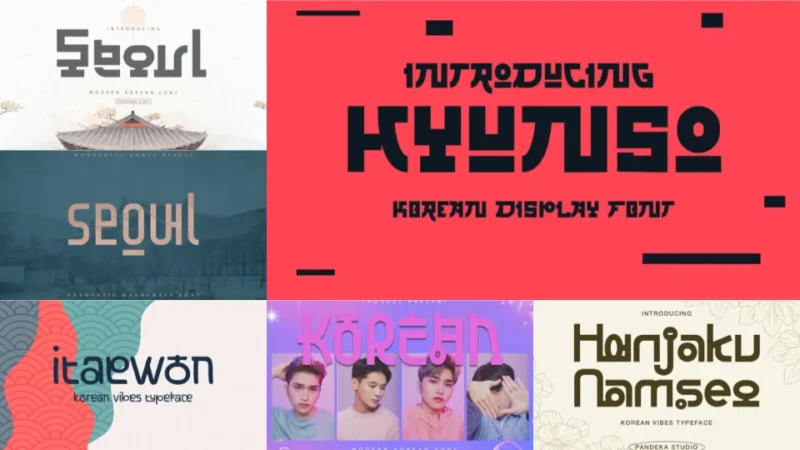
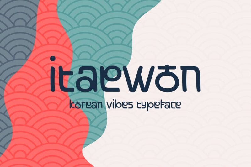
Korean – Modern Korean Font
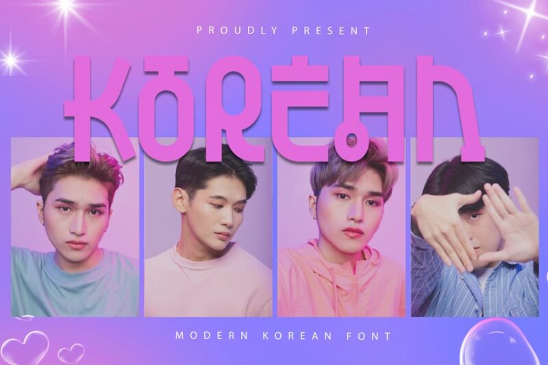
This modern Korean font offers a fresh take on traditional Korean typography. Perfect for designers seeking contemporary Asian-inspired typefaces, it blends seamlessly with both Korean and Japanese design elements, making it versatile for various projects requiring a modern East Asian aesthetic.
Korean Strawberry Milk
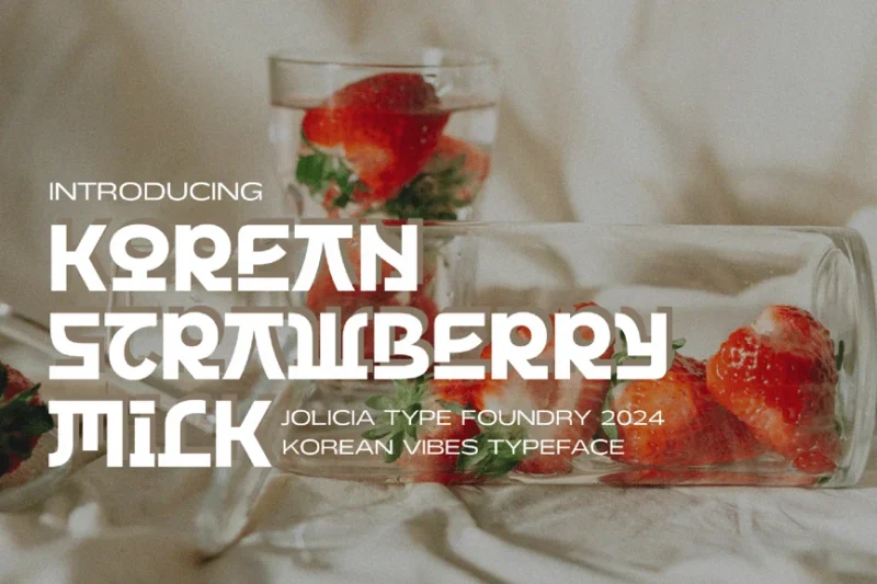
Korean Strawberry Milk is a playful and charming Korean-style font that exudes sweetness and youth. This delightful typeface is perfect for projects targeting younger audiences or brands aiming for a cute, Korean-inspired look. Its whimsical design makes it stand out among other Korean fonts.
Kpop Vibes
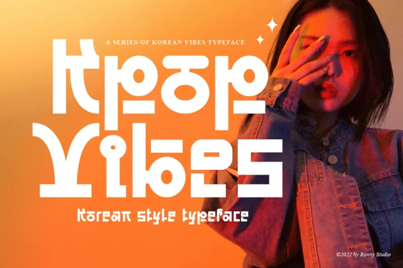
Kpop Vibes captures the essence of Korean pop culture in a dynamic typeface. This Korean-style font is ideal for projects related to music, entertainment, and youth culture. Its bold and energetic design makes it a go-to choice for designers working on K-pop inspired graphics or modern Asian branding.

Get 300+ Fonts for FREE
Enter your email to download our 100% free "Font Lover's Bundle". For commercial & personal use. No royalties. No fees. No attribution. 100% free to use anywhere.
Korean Modern Font
This Korean Modern Font offers a sleek and contemporary take on Korean typography. It’s an excellent choice for designers looking to incorporate a touch of Korean aesthetic into their projects. The font’s clean lines and balanced proportions make it suitable for a wide range of applications, from branding to editorial design.
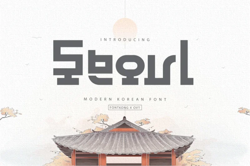
Seoul – Authentic Korean Typeface
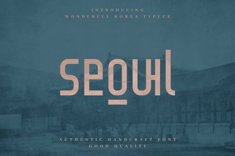
Seoul is an authentic Korean typeface that captures the spirit of South Korea’s capital city. This sans-serif font offers a genuine Korean feel while maintaining readability, making it an excellent choice for designers working on projects that require a true Korean font with a modern twist.
Hanjaku Namseo
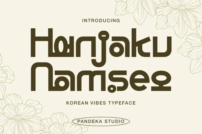
Hanjaku Namseo is a distinctive Korean typeface that blends traditional and modern elements. This font is perfect for designers seeking a unique Korean font that stands out in their projects. Its intricate design makes it ideal for headlines, logos, and other prominent display uses in Korean-themed designs.
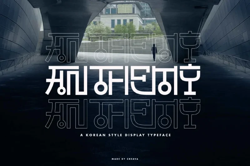
Mawjusti Korean Style Display Font
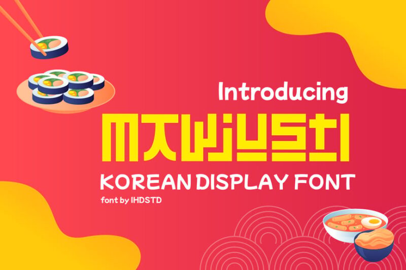
Mawjusti is a bold and expressive Korean-style display font. Its unique character shapes and strong presence make it an excellent choice for designers working on projects that require a powerful Korean typography element. This font is particularly suitable for food-related designs or projects with an Asian flair.
Kimyonja
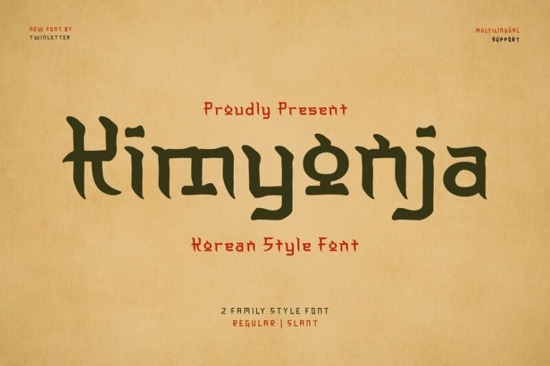
Kimyonja is a versatile Korean-style font that bridges the gap between traditional and modern design. This typeface offers a unique blend of Korean and Japanese aesthetic influences, making it an excellent choice for designers working on projects that require a pan-Asian feel with a Korean twist.
Joseoul
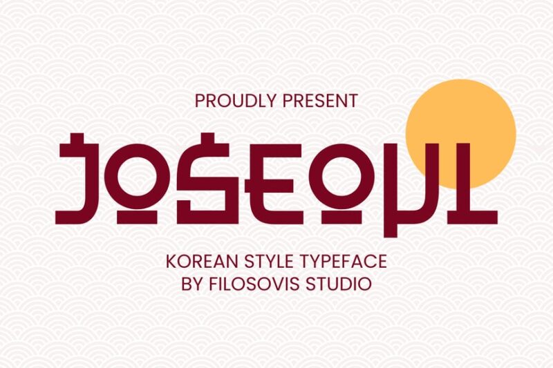
Joseoul is a Korean-style typeface that captures the essence of contemporary Seoul. This font is perfect for designers looking to infuse their projects with a modern Korean vibe. Its clean lines and balanced proportions make it suitable for a variety of applications, particularly in food-related or lifestyle-oriented designs.
Hakorel
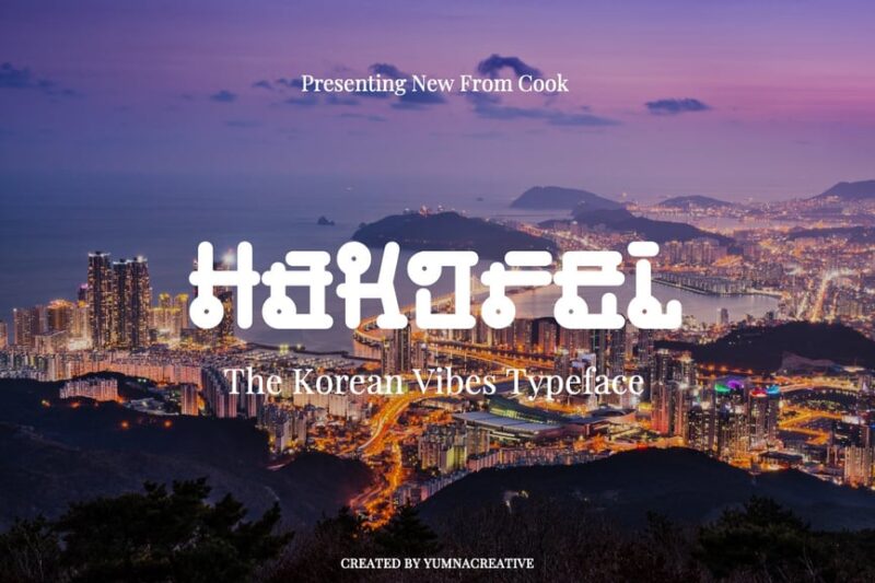
Hakorel is a bold and distinctive Korean font that commands attention. This decorative typeface is ideal for designers seeking a strong, impactful Korean font for headlines or display purposes. Its unique character shapes and confident style make it stand out among other Korean fonts.
Soulghost
Soulghost is a captivating Korean-style display font that brings a touch of mystery and elegance to designs. This typeface is perfect for projects that require a unique Asian-inspired look, blending Korean and Japanese aesthetic elements. Its distinctive character shapes make it ideal for creating memorable logos or headlines.
Anthemy Korean Display Font
Anthemy is a striking Korean display font that combines modern aesthetics with traditional Korean typography. This typeface is excellent for designers looking to create bold, eye-catching designs with a Korean flair. Its unique character shapes make it suitable for both Korean and Japanese-inspired projects.
Korean Style Bojagi Font
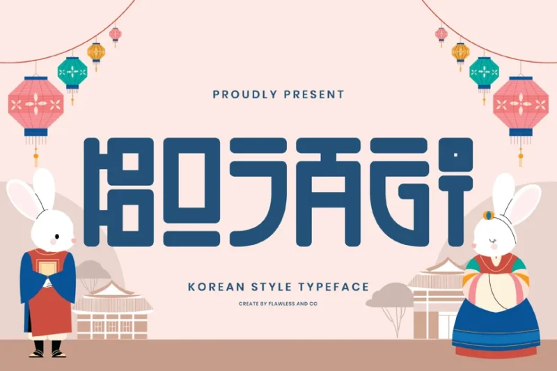
The Korean Style Bojagi Font draws inspiration from traditional Korean wrapping cloth patterns. This unique typeface offers designers a way to incorporate authentic Korean cultural elements into their projects. Its distinctive design makes it perfect for creating eye-catching headlines or logos with a genuine Korean feel.
Namra Korean Style Display Typeface
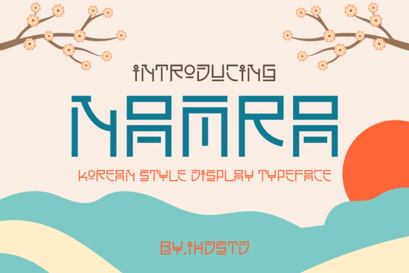
Namra is a Korean-style display typeface that exudes confidence and modernity. This font is ideal for designers working on projects that require a strong Asian typography element. Its bold character shapes and clean lines make it suitable for a wide range of applications in Korean-inspired designs.
Kinserim
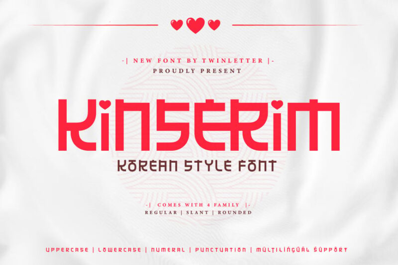
Kinserim is a elegant Korean-style font that bridges East Asian typography styles. This typeface offers a unique blend of Korean and Chinese influences, making it perfect for designers working on projects that require a pan-Asian aesthetic. Its graceful character shapes lend themselves well to both traditional and modern design contexts.
Jada Garden
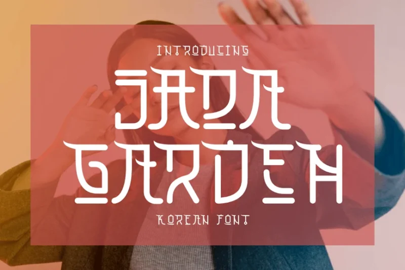
Jada Garden is a charming Korean-style font that evokes the beauty of a traditional garden. This typeface is ideal for designers seeking to add a touch of Korean elegance to their projects. Its delicate character shapes make it perfect for designs related to nature, beauty, or traditional Asian themes.
Sokcho
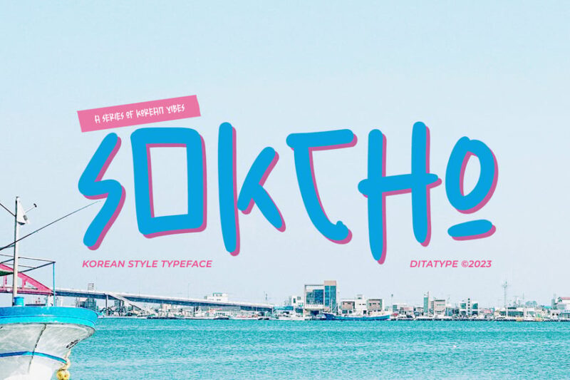
Sokcho is a versatile Korean font that captures the spirit of the coastal city it’s named after. This typeface offers designers a fresh, modern take on Korean typography, blending well with both Korean and Japanese design elements. Its clean, approachable style makes it suitable for a wide range of projects requiring a contemporary Asian feel.
South Korea – Modern Korean Font
This modern Korean font embodies the contemporary spirit of South Korea. It’s an excellent choice for designers looking to incorporate a sleek, up-to-date Korean typography element in their projects. The font’s balanced proportions and clean lines make it versatile for various applications, from digital to print media.
Konijhipa
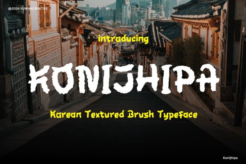
Konijhipa is a unique Korean texture font that adds depth and character to designs. This script-style typeface offers designers a way to incorporate handwritten Korean elements into their projects. Its organic, textured appearance makes it perfect for creating authentic, Asian-inspired designs with a personal touch.
Chaewon Korean Style Display Font
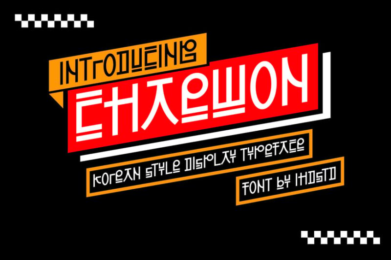
Chaewon is a bold and expressive Korean-style display font that demands attention. This typeface is ideal for designers working on projects that require a strong, modern Korean typography element. Its distinctive character shapes make it suitable for creating impactful headlines or logos in Korean-inspired designs.
Larthez

Larthez is a dynamic Korean brush font that brings energy and movement to designs. This script typeface offers designers a way to incorporate handcrafted Korean elements into their projects. Its fluid, brush-like strokes make it perfect for creating authentic, expressive designs with an Asian flair.
Seoul – Modern Korean Font
This modern Korean font captures the contemporary essence of Seoul. It’s an excellent choice for designers seeking to infuse their projects with a sleek, urban Korean typography element. The font’s clean lines and balanced proportions make it versatile for various applications, bridging Korean and Japanese design aesthetics.
Hyunso Korean style display font
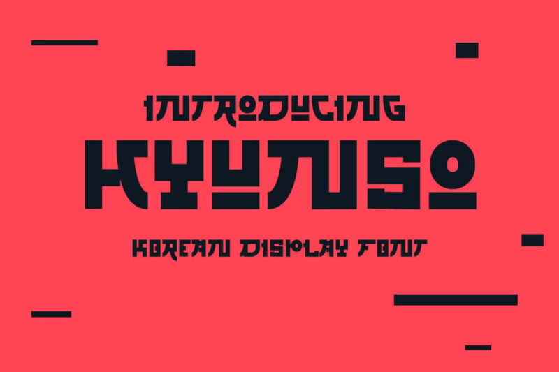
Hyunso is a striking Korean-style display font that combines traditional and modern elements. This typeface is perfect for designers looking to create bold, eye-catching designs with an authentic Korean feel. Its unique character shapes make it suitable for both Korean and kanji-inspired projects, offering versatility in Asian-themed designs.
Understanding Hangeul: The Science Behind Korean Typography
Before we go further, let’s talk about what makes Korean typography unique. Hangeul, the Korean alphabet, is arguably one of the most scientifically designed writing systems in the world. Created in 1443 by King Sejong the Great, it was intentionally designed to be easy to learn – and its structure has fascinating implications for typography.
Unlike alphabets where letters simply line up horizontally, Hangeul arranges characters in syllable blocks. Each block combines consonants and vowels in specific patterns, creating a compact square or rectangular shape. This means Korean fonts need to be designed with careful attention to how these elements fit together within each syllable block.
Here’s what makes Korean typography special:
Syllable Block Structure: Korean characters combine 2-6 individual letters into unified blocks. A font designer needs to ensure these combinations remain balanced and legible across thousands of possible combinations.
Stroke Harmony: Traditional Korean calligraphy emphasized harmony between horizontal and vertical strokes, thick and thin lines. Modern Korean fonts often reference these principles, even in contemporary designs.
Spacing Challenges: Korean text can look cramped if letter spacing isn’t properly calibrated. Good Korean fonts account for the visual density of syllable blocks and provide appropriate spacing.
Understanding these fundamentals helps you appreciate why quality Korean fonts take serious expertise to create – and why choosing the right one matters so much for your designs.
Traditional vs. Modern Korean Fonts: Finding Your Style
Korean fonts generally fall into several style categories, each with its own personality and ideal use cases:
Traditional Brush Fonts (Batang Style)
These fonts echo classical Korean calligraphy with their flowing strokes and varied line weights. They’re perfect for projects wanting to convey heritage, elegance, and cultural authenticity. Think traditional restaurant menus, cultural event posters, or historical documentary titles.
The thick-to-thin stroke variation in traditional fonts creates a sense of movement and artistry. They feel handcrafted, warm, and deeply connected to Korean cultural identity.
Gothic Fonts (Sans-Serif Style)
Korean gothic fonts are the sans-serif equivalents – clean, modern, and highly legible. They’re the workhorses of Korean typography, used everywhere from government documents to tech company websites.
Modern gothic fonts have a minimalist sensibility that works beautifully in contemporary design. They’re perfect for UI design, corporate branding, signage, and any project requiring clear, straightforward communication.
Display and Decorative Fonts
Want to make a statement? Display Korean fonts bring personality and flair. These might feature exaggerated proportions, playful shapes, or unique design elements that make text pop.
Display fonts are fantastic for headlines, logos, posters, album covers, and anywhere you want Korean text to be the star of the show. Just remember – like their Latin counterparts, these fonts work best in large sizes and short text passages.
Handwritten Fonts
Handwritten Korean fonts capture the personal, organic quality of actual handwriting. They can range from neat and refined to casual and energetic, making them versatile for projects needing a human touch.
These fonts shine in informal contexts: greeting cards, personal branding, casual restaurant menus, social media graphics, or anywhere you want text to feel approachable and authentic.
Pairing Korean Fonts with Latin Typefaces
Here’s where things get interesting. Many design projects require both Korean and English text, which means you need fonts that work harmoniously together. This is trickier than it sounds!
The challenge? Korean syllable blocks have a very different visual rhythm than linear Latin text. A Korean gothic font might look perfectly balanced on its own, but clash with a Latin sans-serif because of differences in x-height, weight, or overall proportions.
Match the Mood
First priority: ensure both fonts convey similar emotional qualities. If your Korean font has a traditional, elegant vibe, pair it with a refined serif like Garamond or a classical-feeling sans-serif. A playful Korean display font? Match it with something equally spirited in Latin.
Consider Visual Weight
Korean syllable blocks are naturally denser than Latin text because they pack multiple letters into one space. This means a Korean font and Latin font of the “same” weight might not actually look balanced together.
Often, you’ll want to choose a slightly lighter weight Latin font to visually balance with Korean text. Or go the opposite direction – pair bold Korean characters with an equally chunky Latin font for intentional visual impact.
Test at Multiple Sizes
Font pairings that work beautifully at headline size might fall apart in body text, or vice versa. Always test your Korean-Latin font combinations at the actual sizes you’ll be using them.
Use Font Families with Multi-Script Support
The easiest solution? Choose font families specifically designed to include both Korean and Latin characters. Professional type foundries create these with matched proportions, weights, and spacing, taking the guesswork out of pairing.
Some popular options include Noto Sans (Google’s massive open-source family), Spoqa Han Sans, and Nanum Gothic. These were designed from the ground up to work seamlessly across scripts.
Where to Use Korean Fonts (And Where to Avoid Them)
Korean fonts can elevate designs in countless contexts, but like any design element, they need to be used thoughtfully. Let’s talk about where they shine and where to proceed with caution.
Perfect Use Cases:
K-Culture Content: Whether you’re designing for K-pop fan content, K-drama reviews, or Korean beauty products, authentic Korean typography instantly boosts credibility and aesthetic appeal.
Restaurant and Food Branding: Korean restaurant menus, food packaging, or culinary content benefit enormously from appropriate Korean fonts. They set the tone and transport diners before they take a single bite.
Cultural and Educational Materials: Teaching Korean language? Promoting cultural events? Creating content about Korean history or traditions? Korean fonts are essential for authenticity.
Fashion and Beauty: The Korean beauty and fashion industries have distinct aesthetic sensibilities, and typography plays a huge role. Whether minimal and chic or bold and trendy, the right Korean font captures that K-fashion essence.
Music and Entertainment: Album artwork, concert posters, entertainment company branding – Korean fonts are essential in the music and entertainment space, especially with the global spread of K-pop and Korean film.
When to Exercise Caution:
Using Korean as Pure Decoration: Please don’t slap Korean characters onto designs just because they “look cool” without understanding what they say. This can result in embarrassing mistakes or, worse, unintentionally offensive content.
Assuming All Korean Fonts Are Interchangeable: A traditional brush font sends a completely different message than a modern geometric sans-serif. Choose fonts that actually match your project’s tone and purpose.
Ignoring Legibility for Native Readers: If your audience includes Korean speakers, prioritize their reading experience. Some decorative fonts that look gorgeous to non-Korean eyes might be difficult for native readers to parse quickly.
Cultural Appropriation Concerns: Be thoughtful about using Korean cultural elements, including typography, in commercial projects. When in doubt, involve Korean designers or consultants in your process.
Common Korean Font Mistakes (And How to Fix Them)
Even experienced designers can stumble when working with Korean typography for the first time. Here are pitfalls to avoid:
Mistake #1: Using Google Translate and Calling It a Day
Machine translation has come a long way, but it’s still far from perfect, especially for design contexts requiring nuanced, natural-sounding Korean. If you’re incorporating Korean text into professional designs, have it reviewed by a native speaker. Korean grammatical structure and cultural context can lead to awkward or incorrect translations that will be immediately obvious to Korean audiences.
Mistake #2: Treating Korean Text Like English Text
You can’t just translate English text to Korean and expect it to take up the same space or have the same visual rhythm. Korean syllable blocks have different proportions than Latin letters, which affects line length, text flow, and overall composition. What works perfectly in English might need significant layout adjustments in Korean.
Mistake #3: Insufficient Character Support
Some fonts only include a limited subset of Korean characters. This might work fine for simple text, but can cause problems with less common syllable combinations, resulting in missing characters or default font substitution that ruins your design. Always verify your chosen font includes complete Korean character coverage.
Mistake #4: Ignoring Cultural Context
Font styles carry cultural associations in Korean just as they do in English. A brush calligraphy font might feel elegant and traditional, but it could seem old-fashioned or inappropriate for a trendy youth brand. Research the cultural connotations of different Korean font styles before committing.
Mistake #5: Poor Spacing and Kerning
Korean text requires different spacing considerations than Latin text. The default settings in your design software might not be optimized for Korean typography. Pay attention to the space between syllable blocks, line height, and overall text density. When Korean text looks cramped or weirdly spaced, it’s usually a kerning issue.
Finding Quality Korean Fonts: Free and Premium Resources
Ready to start building your Korean font library? Here’s where to find both free and premium options:
Free Korean Font Resources:
Google Fonts offers several high-quality Korean fonts including Noto Sans Korean, Nanum Gothic, Black Han Sans, and Jua. These are completely free for commercial use and provide excellent starting points.
The Korean government has also released several fonts for public use, including Nanum fonts and Malgun Gothic. These professional-quality typefaces were designed specifically for Korean text and work beautifully in various contexts.
Font Squirrel and DaFont occasionally feature Korean-supporting fonts, though the selection is more limited than for Latin fonts. Always verify licensing terms before using in commercial projects.
Premium Korean Font Foundries:
For professional projects requiring unique typography, Korean type foundries offer exceptional quality. Sandoll Communications, Yoon Design Group, and Font Bank are among the most respected Korean type foundries, creating beautiful, carefully crafted fonts for every need.
These premium fonts often provide better character coverage, more weights and styles, and refined details that elevate professional design work. Yes, they’re an investment – but for important branding or publication projects, the quality difference is noticeable.
Adobe Fonts: Adobe Creative Cloud subscribers have access to several Korean fonts through Adobe Fonts, making them a convenient option if you’re already in the Adobe ecosystem.
Technical Tips for Working with Korean Fonts
Beyond aesthetics, there are practical considerations when working with Korean typography:
File Size Matters: Korean fonts tend to be much larger files than Latin fonts because they need to include thousands of syllable combinations. A comprehensive Korean font might be 5-10MB or larger, compared to 200KB for a typical Latin font. This affects web performance and file storage. For web projects, consider using web font services that serve only the characters you actually need.
Software Compatibility: Not all design software handles Korean text equally well. Adobe Creative Suite generally has excellent Korean text support, but some other applications might struggle with proper character rendering or text flow. Always test your chosen software’s Korean capabilities before committing to a large project.
Web Font Considerations: Loading a full Korean font on a website can significantly impact page load times. Services like Google Fonts subset Korean fonts to include only the most common characters, reducing file size while maintaining functionality for most use cases.
Encoding and Character Sets: Ensure your project files use UTF-8 encoding to properly support Korean characters. Incorrect encoding can result in broken characters or complete text failure.
Expert Perspectives on Korean Typography
I reached out to several designers with Korean typography experience to get their insights on working with Korean fonts:
Ji-Hye Park, Senior Designer at a Seoul-based branding agency, emphasizes authenticity: “Non-Korean designers often choose fonts that look beautiful but don’t quite feel natural to Korean readers. There’s a subtlety to how Korean fonts should flow and balance that comes from cultural understanding. When possible, get feedback from native Korean designers.”
Marcus Chen, who’s worked on numerous K-pop album designs, notes: “The biggest evolution I’ve seen in Korean typography is the embrace of experimental, bold styles in youth culture. Traditional rules still matter for formal contexts, but contemporary Korean design pushes boundaries in exciting ways. Don’t be afraid to be daring – but know the rules you’re breaking.”
Sarah Kim, a Korean-American designer specializing in bilingual branding, adds: “The challenge and opportunity of Korean-English design is creating visual harmony between two very different writing systems. The best solutions don’t fight this difference – they celebrate it, using the contrast to create dynamic, eye-catching designs.”
The Future of Korean Typography
Korean typography is experiencing a renaissance. As Korean culture continues its global expansion – from K-pop dominating music charts to Korean films winning Oscars – interest in Korean visual culture, including typography, has exploded.
We’re seeing more experimental Korean fonts pushing creative boundaries, more sophisticated multi-script font families designed from the ground up for global communication, and increased availability of quality Korean fonts for designers worldwide.
Variable fonts and modern web technologies are also making Korean typography more flexible and accessible than ever. Designers can now fine-tune Korean font weights and proportions in ways that weren’t possible just a few years ago.
Most excitingly, there’s growing appreciation for Korean typography’s unique aesthetic qualities beyond functional communication. Designers worldwide are discovering the visual beauty of Hangeul and incorporating it into diverse projects, creating cross-cultural design dialogues.
Frequently Asked Questions About Korean Fonts
Can I use Korean fonts even if my audience doesn’t read Korean?
Absolutely! Korean typography can add visual interest and cultural authenticity to designs even when your audience doesn’t read Korean. Just be thoughtful about what the Korean text actually says, and ensure it’s culturally appropriate for your context.
Are Korean fonts harder to work with than English fonts?
They have different considerations, but not necessarily harder. The main differences are file sizes, spacing requirements, and the need to understand syllable block structure. Once you understand these factors, Korean fonts are just as manageable as any other typography.
How many Korean fonts do I need in my toolkit?
Start with versatile basics: a good modern sans-serif (gothic), a traditional style, and perhaps one display font. As you work on more Korean projects, expand your collection based on your actual needs.
Can I create my own Korean font?
Technically yes, but it’s a massive undertaking. A complete Korean font requires designing thousands of syllable combinations. Some tools like Fontself allow you to create basic Korean fonts, but professional Korean type design typically requires specialized expertise and significant time investment.
What’s the difference between North and South Korean fonts?
There are some stylistic differences in typography between North and South Korea, primarily in how certain characters are formed. For most design purposes, you’ll be using South Korean font conventions, which are what’s commercially available and widely used in global Korean content.
Final Thoughts: Embracing the Beauty of Korean Typography
Korean fonts offer designers a world of creative possibilities. From the elegant flow of traditional calligraphy to the clean lines of modern gothic styles, Korean typography brings unique visual character to any project.
The key to working successfully with Korean fonts is approaching them with respect and curiosity. Take time to understand the cultural context, the technical requirements, and the aesthetic principles that make Korean typography special. Whether you’re designing for a Korean audience or incorporating Korean visual elements into cross-cultural work, thoughtful typography choices make all the difference.
As global design becomes increasingly multicultural, familiarity with non-Latin scripts like Korean is becoming not just useful, but essential. Korean typography in particular offers lessons in how writing systems can be both functionally brilliant and visually stunning – qualities that can inspire designers regardless of what scripts they’re working with.
So go ahead – explore these beautiful fonts, experiment with Korean typography in your projects, and discover the creative possibilities that Hangeul brings to your design palette. Just remember to approach it with cultural sensitivity, technical understanding, and an appreciation for the rich traditions that make Korean typography special.
After all, great design speaks every language – and sometimes, it speaks most beautifully in Hangeul.