In this article:
- The 23 Top Magazine Fonts That Define Publishing Excellence
- The Psychology Behind Magazine Font Choices
- How Different Magazine Categories Use Typography
- The Anatomy of Magazine Typography Systems
- The Evolution of Magazine Fonts Through the Decades
- How to Choose the Perfect Magazine Font
- The Technical Side of Magazine Typography
- Magazine Font Trends to Watch in 2026
- Common Magazine Font Mistakes to Avoid
- The Future of Magazine Fonts
- Building Your Own Magazine Font Library
- Conclusion: The Power of Perfect Magazine Typography
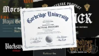
As a graphic designer who’s spent countless hours poring over magazine layouts, I can tell you that choosing the right magazine fonts is both an art and a science. There’s something magical about the way the perfect typeface can transform a simple article into a compelling narrative that readers can’t put down.
Magazine fonts aren’t just letters on a page – they’re the silent salespeople of the publishing world. They guide readers through stories, create hierarchy, establish brand identity, and most importantly, keep people turning pages. From the bold, attention-grabbing headlines of Vogue to the clean, readable body text of The New Yorker, every font choice matters.
In this comprehensive guide, we’ll explore the fascinating world of magazine typography, uncovering the secrets behind the fonts that make publications irresistible. So grab your favorite magazine, and let’s dive into this typographic adventure together!
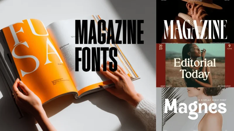
The 23 Top Magazine Fonts That Define Publishing Excellence
Let me share some of the most iconic and effective magazine fonts that have shaped the publishing industry:
Daily Magazine Serif Display Font
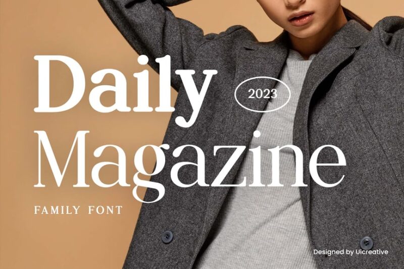
A sophisticated magazine font perfect for editorial layouts. This serif display typeface exudes elegance and readability, ideal for high-end fashion publications and lifestyle magazines.
Magazine Elegant Serif Font
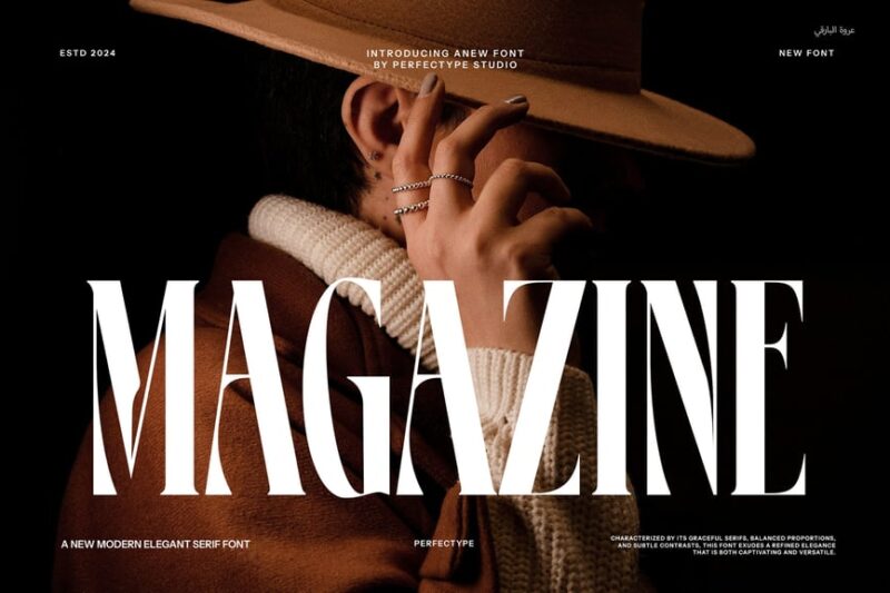
A classic and stylish magazine font that brings timeless elegance to any publication. This versatile serif typeface is perfect for creating eye-catching headlines and body text in both print and digital magazine layouts.
Fundley Font
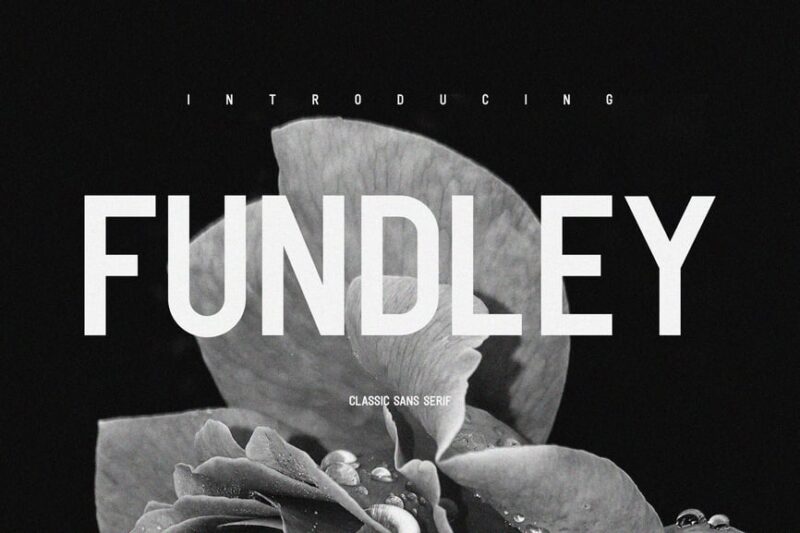
A modern sans-serif font that works well for contemporary magazine designs. Its clean lines and balanced proportions make it suitable for both headlines and body text in various magazine genres, from tech to lifestyle.

Get 300+ Fonts for FREE
Enter your email to download our 100% free "Font Lover's Bundle". For commercial & personal use. No royalties. No fees. No attribution. 100% free to use anywhere.
Editorial Today Serif Family Font
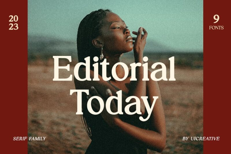
A comprehensive serif font family designed specifically for editorial use in magazines and newspapers (more newspaper fonts here). With its various weights and styles, it offers versatility for creating hierarchies in magazine layouts while maintaining a cohesive look.
Margine
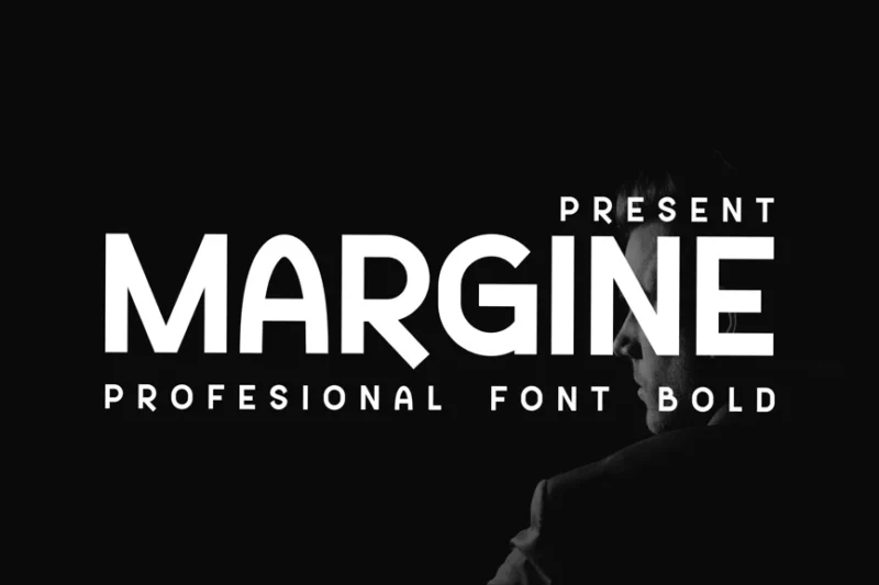
An elegant bold sans-serif font that adds a touch of sophistication to magazine designs. Its clean and modern aesthetic makes it suitable for fashion and lifestyle magazine layouts, particularly for headlines and pull quotes.
Clevon Blur
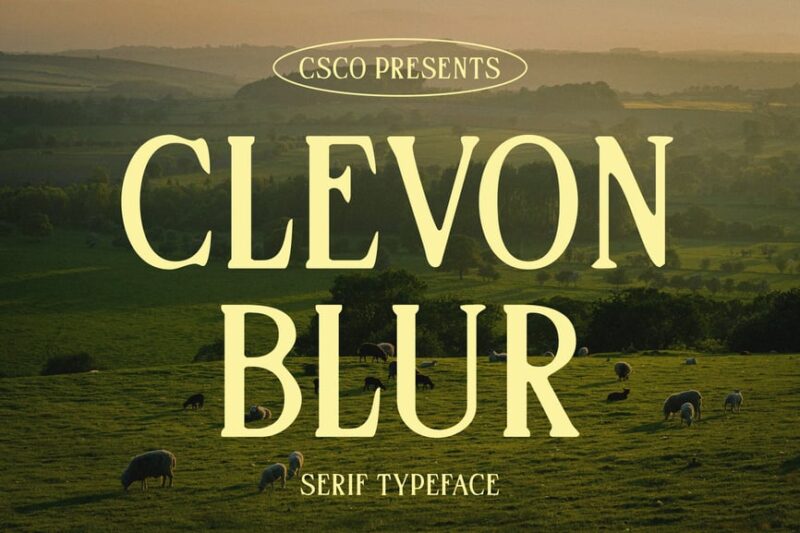
A unique serif font with a textured, blurred effect that adds a creative touch to magazine layouts. This timeless typeface can be used to create eye-catching headlines or artistic elements in fashion and art magazines.
Magnes – A Display Serif Font
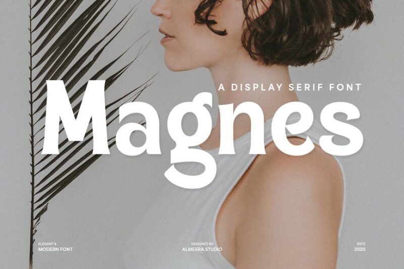
A striking display serif font perfect for magazine headlines and cover designs. Its distinctive character and elegant serifs make it an excellent choice for high-end publications and editorial layouts that demand attention.
Gravity Wanders – Stylish Bold Serif
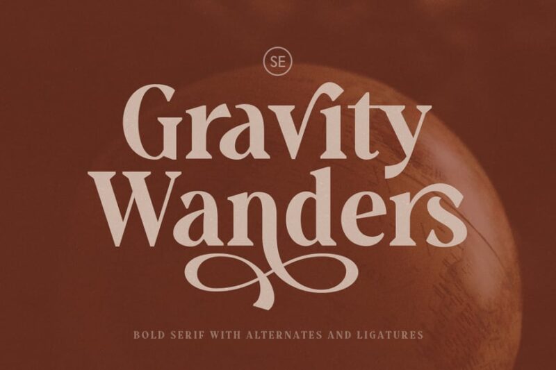
A bold serif font with a stylish twist, ideal for travel and lifestyle magazines. Its unique character adds personality to headlines and can create a strong visual impact in magazine layouts focused on adventure and exploration.
Berghan – Modern Grotesk
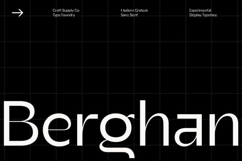
An experimental and organic sans-serif font that brings a contemporary edge to magazine designs. Its modern grotesk style makes it suitable for cutting-edge publications in fields like technology, art, and urban culture.
Aloha Magazine – Logo font
![]()
A playful sans-serif font designed specifically for magazine logos and branding. Its unique character makes it perfect for creating memorable mastheads and titles for lifestyle, travel, and leisure publications.
Alexandra Mnletter
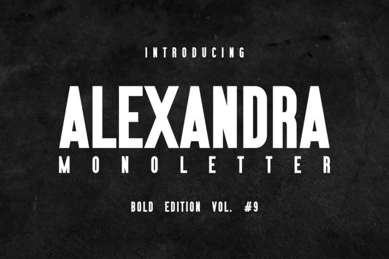
A distinctive sans-serif font with blackletter influences, ideal for creating striking magazine headlines. Its bold capital letters can add a touch of drama and sophistication to fashion and culture magazine covers. For more fonts like Impact, click here.
Harlet – Modern Sans Serif
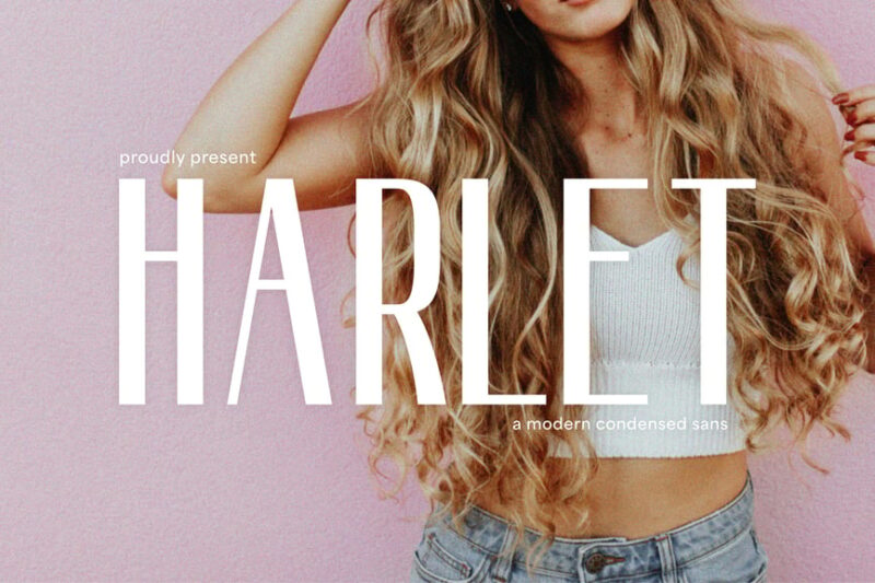
A sleek and modern sans-serif font that brings a contemporary feel to magazine layouts. Its clean lines and balanced proportions make it versatile for various magazine styles, from tech to fashion publications.
Magoet – Heritage Serif
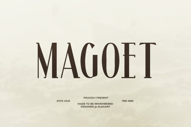
An art deco-inspired serif font that adds a touch of vintage elegance to magazine designs. Its historic charm makes it perfect for creating nostalgic or retro-themed layouts in lifestyle and culture magazines.
Kholic
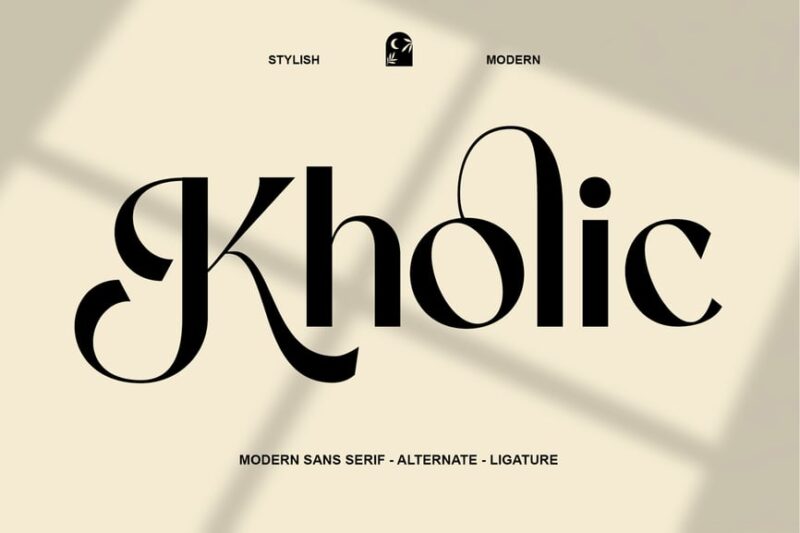
A modern sans-serif font with a fresh and youthful appeal, ideal for contemporary magazine layouts. Its clean and versatile design makes it suitable for a wide range of magazine genres, from fashion to technology.
Layne Rogan
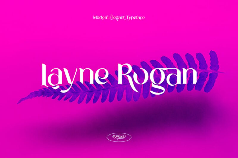
A decorative serif font that adds a touch of creativity to magazine typography. Its unique design makes it perfect for creating eye-catching headlines and artistic elements in design and lifestyle publications.
Cariot – Serif Display Font
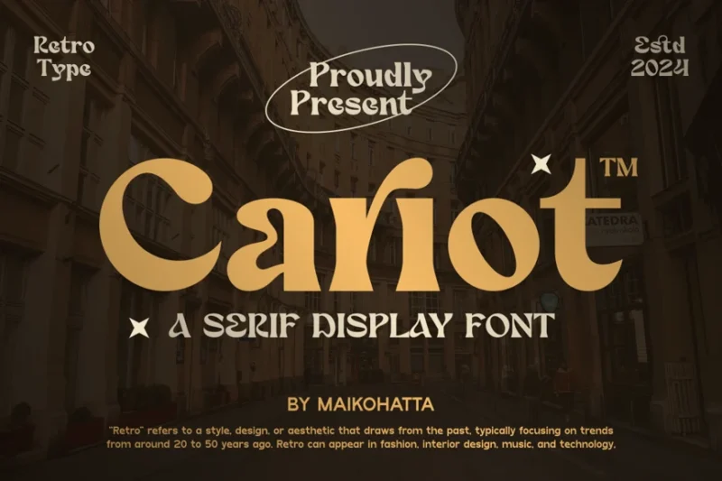
An elegant serif display font that brings sophistication to magazine layouts. Its refined character makes it ideal for architecture and design magazines, particularly for headlines and pull quotes.
Twistique – Psychedelic Fashion Font
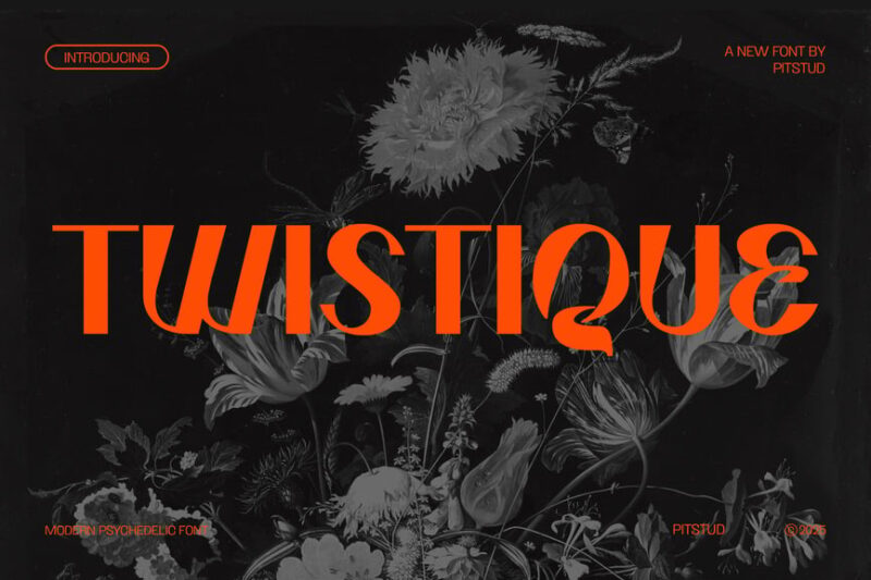
A funky and stylish decorative font that adds a psychedelic touch to magazine designs. Its unique character makes it perfect for creating attention-grabbing headlines in fashion and youth-oriented publications.
sherin attack
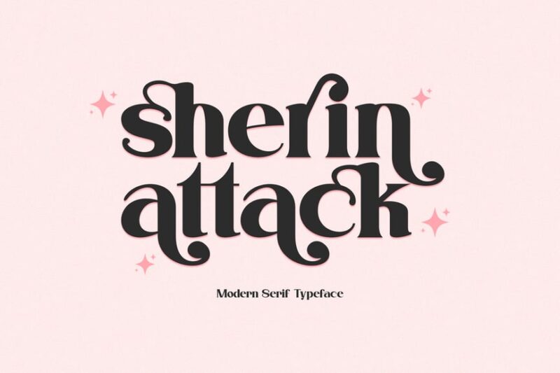
A bold and impactful serif font that commands attention in magazine layouts. Its strong character makes it ideal for creating powerful headlines and cover designs in news and current affairs magazines.
Vaqoeng – Modern Magazine Font & Logo Font
![]()
A versatile sans-serif font designed specifically for modern magazine layouts and logos. Its clean and contemporary style makes it perfect for creating cohesive branding across various magazine elements, from mastheads to body text.
Biomorph
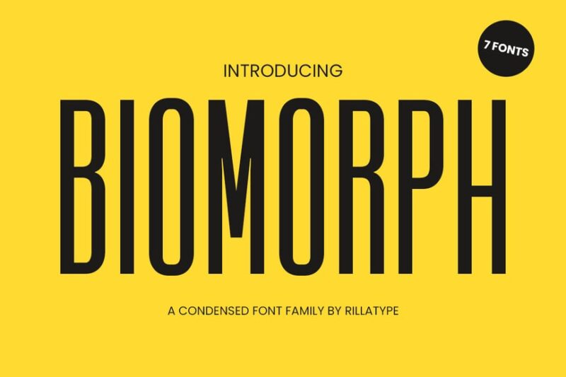
A unique sans-serif font family with an tall, sophisticated feel. Its distinctive character makes it suitable for creating eye-catching headlines and artistic elements in science, nature, and technology magazines.
Stinker Modern Sans Display Font
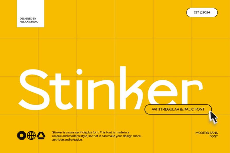
A bold and contemporary sans-serif display font that adds a modern edge to magazine designs. Its striking character makes it ideal for creating impactful headlines and cover designs in fashion and lifestyle publications.
Dickson family font sans serif
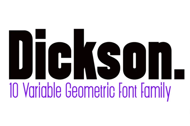
A clean and versatile sans-serif font family perfect for creating cohesive magazine layouts. Its range of weights and styles makes it suitable for both body text and headlines across various magazine genres.
Bolognia – Classic Serif
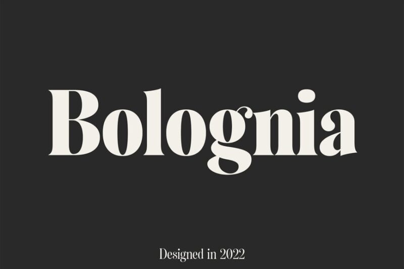
A timeless serif font inspired by 1950s typography, ideal for creating classic magazine layouts. Its elegant character makes it perfect for lifestyle, culture, and literary magazines that aim for a sophisticated, retro aesthetic.
Each of these fonts brings something unique to the table, whether it’s the timeless elegance of a serif or the modern clarity of a sans-serif.
The Psychology Behind Magazine Font Choices
Font psychology plays a massive role in magazine design. Publishers understand that different typefaces evoke different emotions and associations in readers’ minds.
Trust and Authority
Established magazines like Time and The Atlantic often rely on traditional serif fonts that convey authority and credibility. These fonts have historical weight behind them, making readers feel they’re getting reliable, well-researched information.
Modernity and Innovation
Tech and lifestyle magazines frequently choose clean, contemporary sans-serif fonts that feel fresh and forward-thinking. These fonts suggest the publication is on the cutting edge of trends and information.
Personality and Voice
Fashion magazines might opt for elegant, sophisticated fonts that mirror their content, while sports magazines could choose bold, energetic typefaces that match their high-energy subject matter.
How Different Magazine Categories Use Typography
The beauty of magazine fonts lies in their specialization. Different types of publications have developed distinct typographic personalities over the decades.
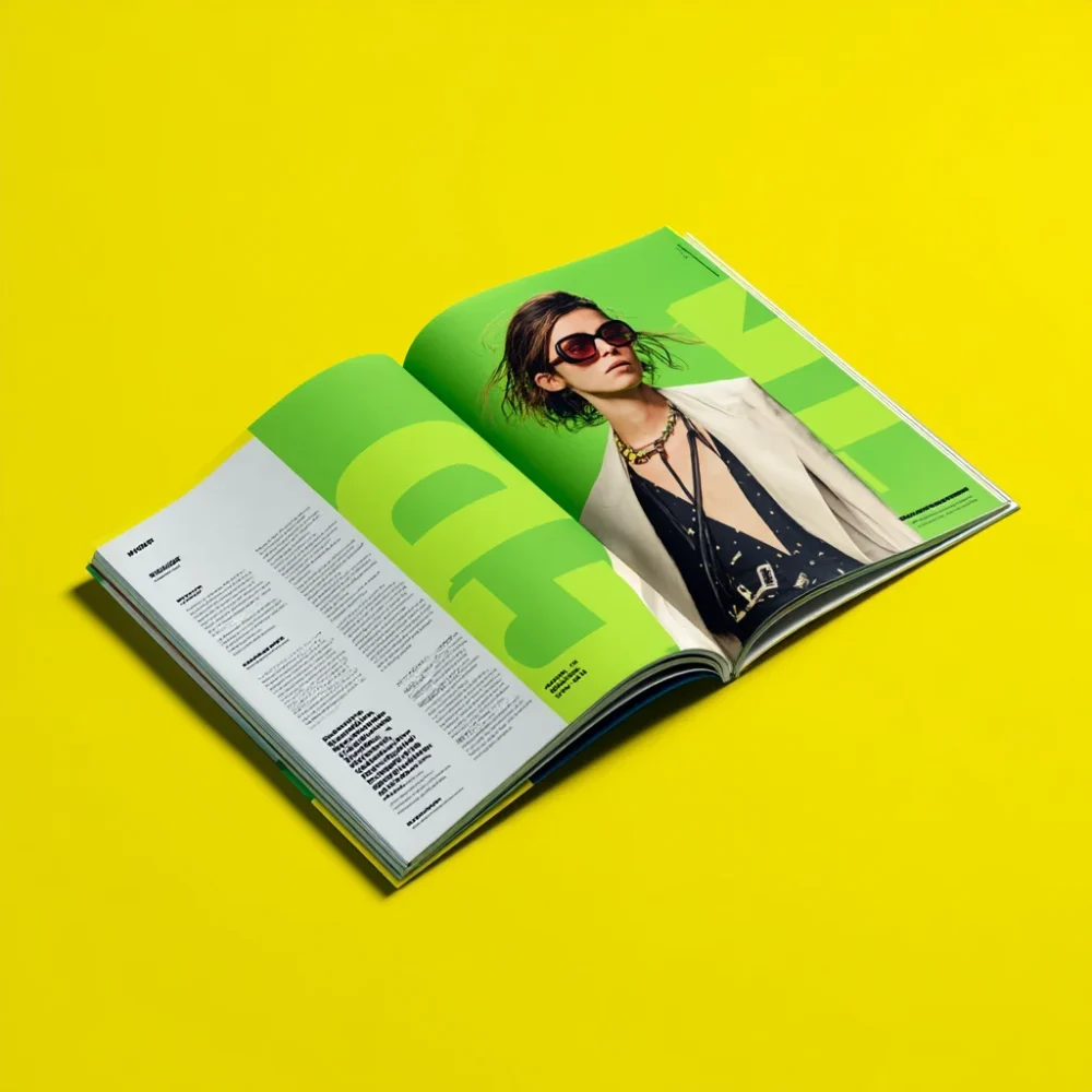
Fashion Magazines
Fashion publications are known for their dramatic use of typography. They often feature ultra-thin, elegant serif fonts paired with bold, condensed sans-serifs. The contrast creates visual drama that mirrors the fashion industry itself.
News Magazines
News publications prioritize readability and trust above all else. They typically use time-tested serif fonts for body text and clean, authoritative fonts for headlines. The goal is to convey serious journalism and credibility.
Lifestyle and Health Magazines
These publications often choose approachable, friendly fonts that feel accessible and welcoming. They want readers to feel comfortable and inspired, not intimidated by overly formal typography.
Technology and Business Magazines
Tech and business publications frequently embrace modern sans-serif fonts that convey innovation and professionalism. These fonts suggest the publication is forward-thinking and industry-savvy.
The Anatomy of Magazine Typography Systems
Successful magazines don’t just choose one font – they create complete typographic systems with carefully planned hierarchies.
Headlines and Cover Text
Magazine headlines need to grab attention from across a crowded newsstand. They’re typically set in bold, high-contrast fonts that remain readable even when scaled down for thumbnails or social media posts.
Subheadings and Pull Quotes
These elements guide readers through articles and highlight key information. They often use variations of the headline font or complementary typefaces that maintain visual cohesion.
Body Text
The workhorse of magazine typography, body text fonts must be incredibly readable over long passages. They need to be comfortable to read in various sizes and maintain clarity even when printed on different paper qualities.
Captions and Small Text
Often overlooked but critically important, caption fonts need to be legible at small sizes while maintaining the publication’s visual identity.
The Evolution of Magazine Fonts Through the Decades
Magazine typography has evolved dramatically since the early days of publishing, reflecting changes in printing technology, design trends, and reader preferences.
The Golden Age of Print
In the mid-20th century, magazines embraced bold, distinctive fonts that showcased the capabilities of new printing technologies. This era gave us many of the classic magazine fonts we still admire today.
The Digital Transition
As magazines moved online and began considering digital formats, typography had to adapt. Fonts needed to work across both print and screen, leading to the development of hybrid typefaces optimized for multiple mediums.
The Modern Era
Today’s magazine fonts reflect our multi-platform world. They need to look great in print, on websites, in mobile apps, and across social media platforms.
How to Choose the Perfect Magazine Font
Selecting the right font for a magazine involves considering multiple factors that go beyond simple aesthetics.
Brand Alignment
Your font choices should reflect your publication’s personality and values. A serious news magazine wouldn’t use the same fonts as a trendy fashion publication.
Readability Across Formats
In 2026, magazines exist across multiple platforms. Your fonts need to work in print, on screens, and in various digital formats.
Audience Considerations
Consider your readers’ preferences and reading habits. Older audiences might prefer larger, more traditional fonts, while younger readers might embrace more experimental typography.
Production Requirements
Consider practical factors like printing costs, file sizes for digital versions, and licensing requirements for commercial use.
The Technical Side of Magazine Typography
Beyond aesthetics, magazine fonts must meet specific technical requirements to function effectively in professional publishing environments.
Print Considerations
Magazine fonts need to reproduce cleanly at various sizes and maintain readability across different paper stocks and printing processes.
Digital Optimization
With many magazines now offering digital editions, fonts must render clearly on screens and maintain their character across different devices and resolutions.
Accessibility Standards
Modern magazines must consider accessibility requirements, ensuring their typography is readable for people with visual impairments or reading difficulties.
Magazine Font Trends to Watch in 2026
The magazine industry continues to evolve, and typography trends reflect broader changes in design, technology, and culture.
Typography is becoming more experimental, with magazines embracing custom fonts and unique typographic treatments that help them stand out in crowded markets. There’s also a growing emphasis on fonts that work seamlessly across print and digital platforms.
Sustainability is influencing font choices too, with some publications choosing fonts that use less ink or render more efficiently on screens to reduce environmental impact.
Common Magazine Font Mistakes to Avoid
Even experienced designers can fall into typography traps that undermine their magazine’s effectiveness.
Overcomplicated Font Systems
Using too many different fonts can create visual chaos and confuse readers. The best magazines typically use no more than three or four fonts throughout their entire publication.
Sacrificing Readability for Style
While unique fonts can create visual interest, they should never compromise readability. If readers struggle to read your content, even the most beautiful typography has failed.
Ignoring Brand Consistency
Your font choices should reinforce your brand identity across every issue. Constantly changing fonts can confuse readers and weaken brand recognition.
Poor Hierarchy
Without clear typographic hierarchy, readers don’t know where to focus their attention. Good magazine typography guides the eye naturally through the content.
The Future of Magazine Fonts
As we look ahead, magazine typography continues to evolve with advancing technology and changing reader habits.
Variable fonts are opening up new possibilities for responsive typography that adapts to different reading contexts. Artificial intelligence is beginning to influence font selection and optimization. And sustainability concerns are pushing the industry toward more efficient typography solutions.
The magazines that succeed in 2026 and beyond will be those that master the delicate balance between innovation and readability, creating typographic experiences that engage readers across all platforms.
Building Your Own Magazine Font Library
Whether you’re designing a new publication or refreshing an existing one, building a thoughtful font library is essential.
Start with versatile, high-quality fonts that can handle multiple roles within your publication. Invest in proper licensing to ensure you can use your chosen fonts across all platforms. And remember that the best magazine font library isn’t necessarily the largest – it’s the most strategically curated.
Consider fonts that offer multiple weights and styles, ensuring you have options for different contexts while maintaining visual consistency. Look for fonts with excellent readability characteristics and proven track records in professional publishing.
Conclusion: The Power of Perfect Magazine Typography
Magazine fonts are far more than decorative elements – they’re fundamental tools for communication, brand building, and reader engagement. The right typography can transform a good magazine into a great one, creating an immersive reading experience that keeps audiences coming back for more.
From the elegant serifs of luxury publications to the clean sans-serifs of tech magazines, every font choice contributes to the overall success of a publication. As the industry continues to evolve, one thing remains constant: great magazine typography will always be about finding the perfect balance between form and function.
The magazines that understand this balance – that choose fonts not just for their beauty but for their ability to serve readers and support content – are the ones that will continue to thrive in our increasingly digital world.
So the next time you pick up your favorite magazine, take a moment to appreciate the typography. Notice how the fonts guide your eye, support the content, and contribute to the overall reading experience. That’s the power of great magazine fonts at work – silently but effectively doing their job of making stories irresistible.
Remember, in the world of magazine publishing, every letter counts. Make yours count too.