In this article:
- The Most Bellissimo Italian Fonts of 2026
- What Makes a Font Feel "Italian"?
- Where to Use Italian Fonts in Your Designs
- Where to Avoid Italian Fonts
- How to Choose the Perfect Italian Font
- Pairing Italian Fonts Successfully
- Italian Font Alternatives
- Common Italian Font Questions
- Conclusion: The Enduring Appeal of Italian Typography
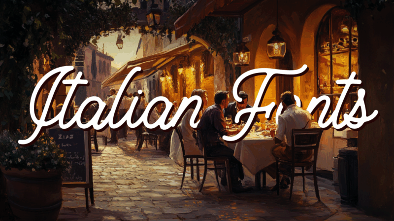
In the world of typography, few styles can capture the essence of a culture quite like Italian fonts. These typefaces aren’t just letters on a page—they’re windows into a civilization that has shaped art, architecture, and design for millennia. Understanding how to select and use Italian fonts can elevate your creative projects from ordinary to extraordinary.
When it comes to embodying the spirit of Italy—from the sun-drenched coasts of Capri to the historic streets of Florence—typography plays a crucial role. The fonts we choose can instantly transport viewers to bustling piazzas, grand basilicas, and Renaissance workshops where master artisans once created their iconic works.
Today’s Italian-inspired typefaces draw from centuries of calligraphic traditions, architectural details, and artistic movements that originated in the Italian peninsula. Whether you’re designing wedding invitations, restaurant menus, or fashion-forward branding materials, understanding Italian typography will unlock new creative possibilities. And when you’re done here, take a look at our french fonts too.
The Most Bellissimo Italian Fonts of 2026
Let’s dive straight into my top picks for Italian fonts that can add that perfect Mediterranean charm to your designs. Each of these fonts brings something unique to the table while capturing the essence of Italian style.
Brioche
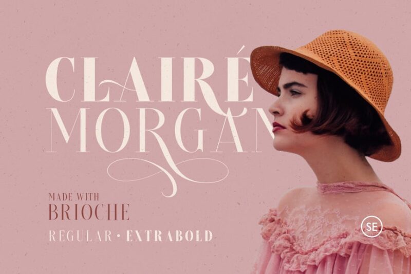
Brioche is an elegant font with a fashion-forward flair. It offers both Regular and ExtraBold weights, making it versatile for various design applications, particularly in women’s fashion-related projects.
Fatheya Food Font
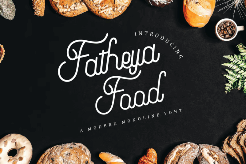
Fatheya is a delightful script font designed with food-related projects in mind. Its organic, handwritten style makes it perfect for menu designs, food packaging, or culinary branding.
Garuton
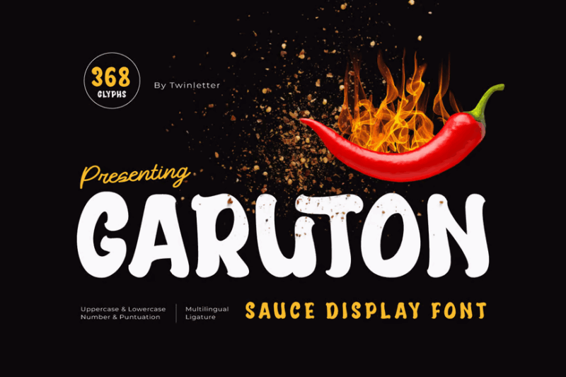
Garuton is a playful and decorative display font with a saucy twist. Its unique design makes it perfect for food-related projects, especially those involving tomatoes or sauces, adding a dash of personality to your typography.

Get 300+ Fonts for FREE
Enter your email to download our 100% free "Font Lover's Bundle". For commercial & personal use. No royalties. No fees. No attribution. 100% free to use anywhere.
Fiorent Deco
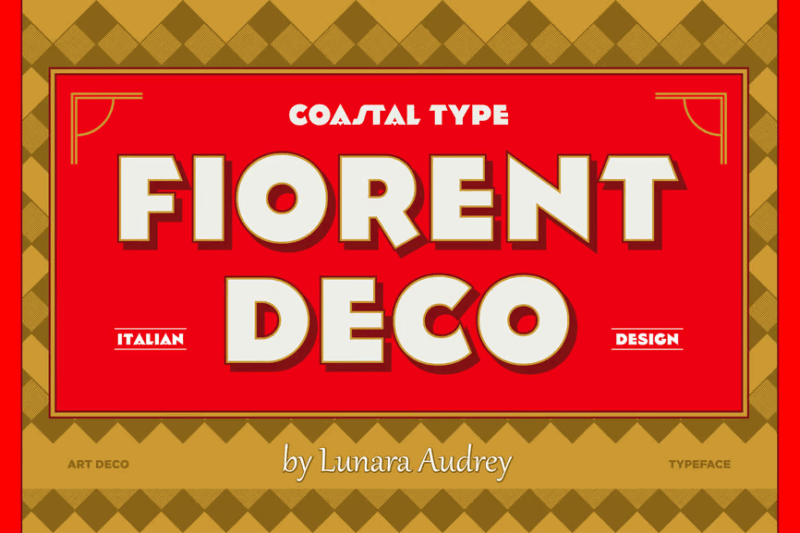
Fiorent Deco is an elegant sans-serif font with an Italian-inspired flair. Its refined style makes it ideal for packaging design, particularly for products with an Italian theme or those aiming for a sophisticated European look.
Cuciniere font
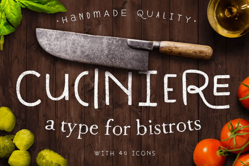
Cuciniere is a whimsy handwriting font designed with culinary applications in mind. It includes a set of kitchen-related icons, making it an excellent choice for cookbooks, menus, or any food-related design projects.
Pasta Cream Font
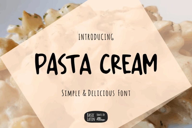
Pasta Cream is a clean and simple sans-serif font with a handmade feel. Its smooth, creamy texture makes it perfect for food-related designs, especially those involving pasta or dairy products.
Italiano Brush Font
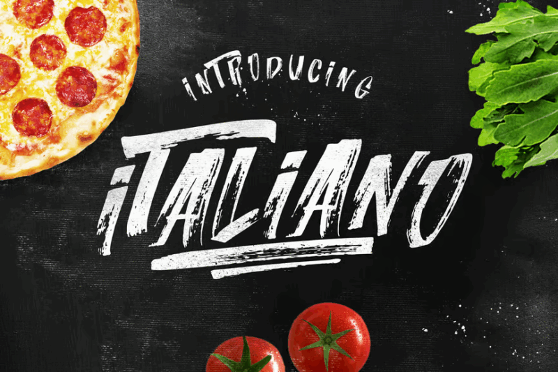
Italiano Brush is a lively script font with a handmade brush texture. Its expressive strokes and Italian flair make it ideal for designs that require a touch of authentic distress and artisanal charm.
Mambo Italiano Font
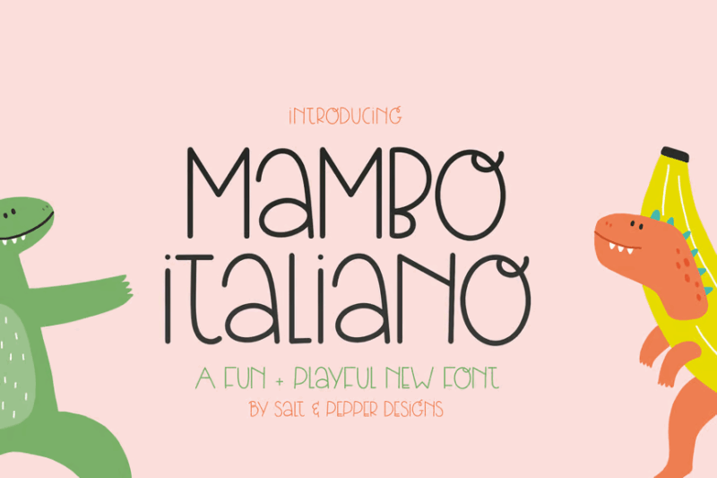
Mambo Italiano is a fun and playful decorative sans-serif font. Its quirky design makes it perfect for children’s products or designs that require a lighthearted, Italian-inspired touch.
Praline Amaretto – Vintage Font
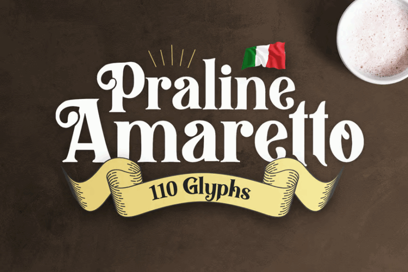
Praline Amaretto is a charming vintage-inspired serif font with decorative elements. Its nostalgic feel makes it ideal for designs that aim to evoke a sense of timelessness and classic elegance.
Frenda
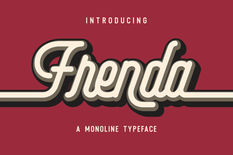
Frenda is a sleek monoline script font with a modern touch. Its consistent line weight and smooth curves make it perfect for branding projects that require a clean, contemporary handwritten look.
Fioretta Monoline Signature
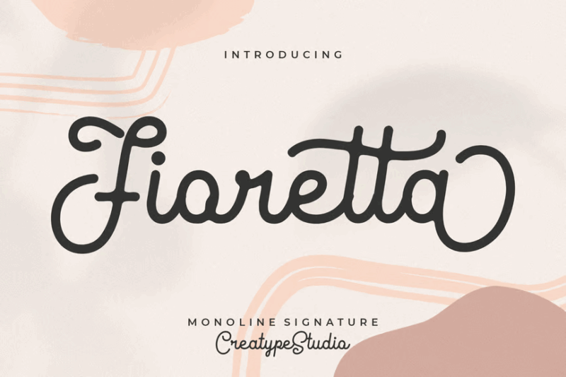
Fioretta is an elegant monoline signature script font. Its flowing lines and graceful curves make it ideal for projects that require a personal touch, such as wedding invitations or luxury branding.
Layttona Stylish Monoline
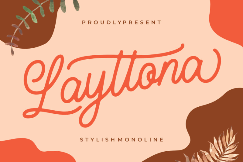
Layttona is a stylish monoline script font with a contemporary flair. Its clean lines and subtle flourishes make it versatile for various design applications, from logos to social media graphics.
Loverboys
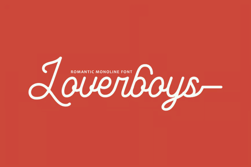
Loverboys is a romantic monoline script font perfect for Valentine’s Day designs. Its playful curves and heart-shaped details make it ideal for love-themed projects and sentimental designs.
Regad | Modern Food Font
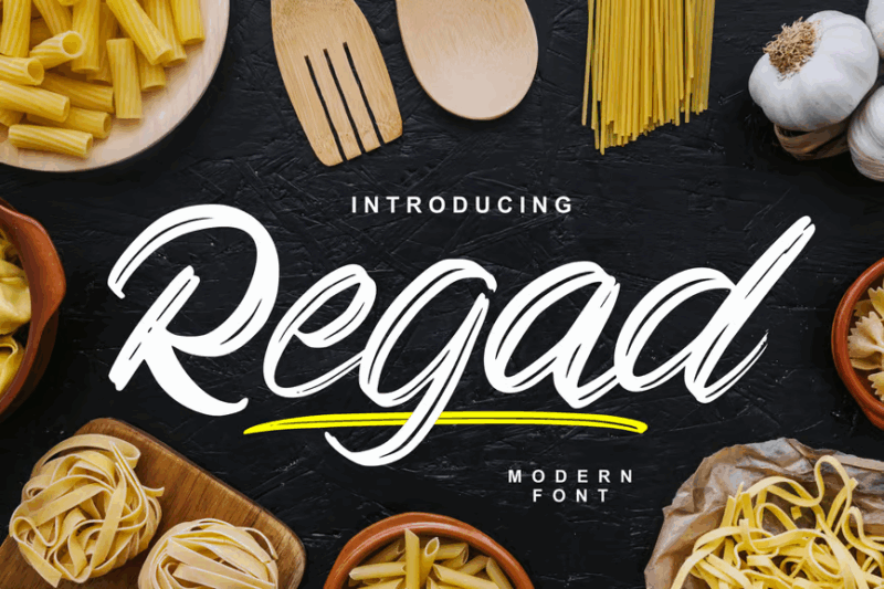
Regad is a modern font combining sans-serif and script styles, tailored for food-related designs. Its clean lines and subtle organic touches make it ideal for healthy food branding and contemporary culinary projects.
Esther Handmade
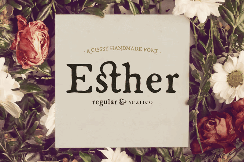
Esther Handmade is a charming earthy serif font with a handcrafted feel. Its unique character makes it perfect for projects that require a personal touch, such as invitations or artisanal product packaging.
Mahogany Lane Rustic Serif
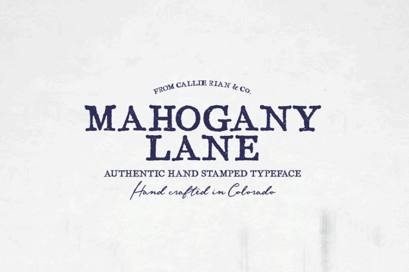
Mahogany Lane is a rustic serif font with a vintage appeal. Its weathered texture and classic letterforms make it ideal for designs that aim to evoke nostalgia or a timeless, handcrafted aesthetic.
Crème Glacée Rustic Vintage Handcrafted Font
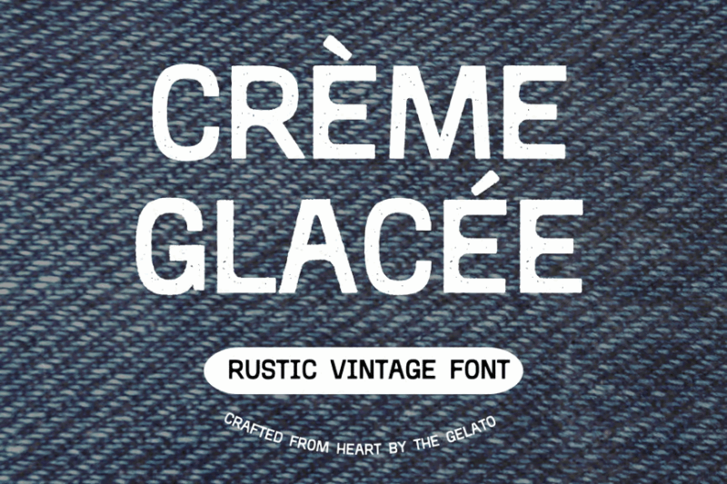
Crème Glacée is a versatile font combining rustic, vintage, and handcrafted elements. Its unique style, reminiscent of old stamps, makes it perfect for creating authentic, artisanal-looking designs.
Italian Horskey Signature Handlettering Script
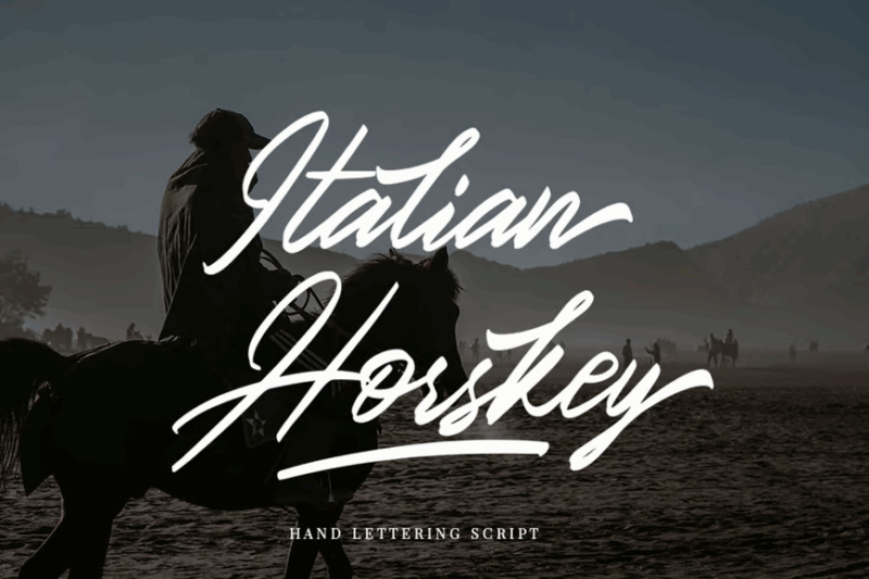
Italian Horskey is an elegant signature script font with a handlettered feel. Its flowing lines and natural variations make it ideal for creating authentic-looking signatures or adding a personal touch to designs.
Carrington serif family font
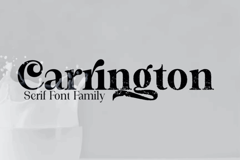
Carrington is a sophisticated serif font family with a modern twist. Its versatility makes it suitable for a wide range of design applications, from editorial layouts to branding projects.
Alifysta
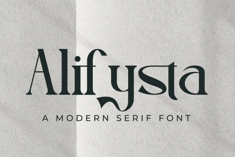
Alifysta is a stylish serif font with a focus on typography and readability. Its clean lines and elegant letterforms make it perfect for both body text and display purposes in various design projects.
Pesto Mafio – Bold Sans-Serif Font
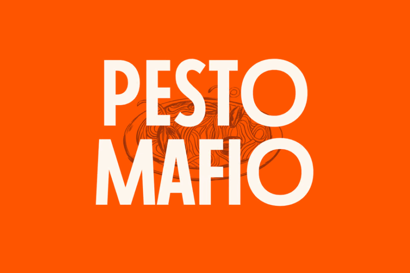
Pesto Mafio is a bold sans-serif font with a touch of art deco and feminine flair. Its strong presence and unique character make it ideal for headlines, logos, or any design that needs to make a statement.
Farielatte
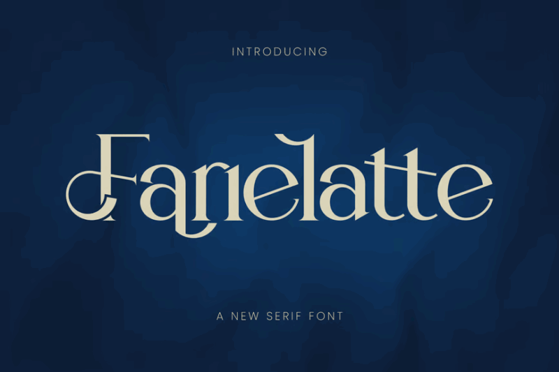
Farielatte is an elegant serif font with a contemporary feel. Its balanced proportions and refined details make it suitable for a wide range of applications, from body text to display typography.
Loede – Clean Sans Family (+Variable)
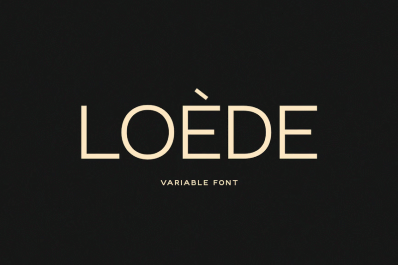
Loede is a modern, clean sans-serif font family that includes variable font technology. Its versatility and range of weights make it an excellent choice for comprehensive branding projects and responsive web design.
Julianne
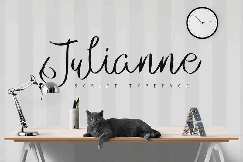
Julianne is a graceful script font with multilingual support. Its flowing curves and natural rhythm make it perfect for designs that require an elegant, handwritten touch across various languages.
Luvee Simple Elegant Sans
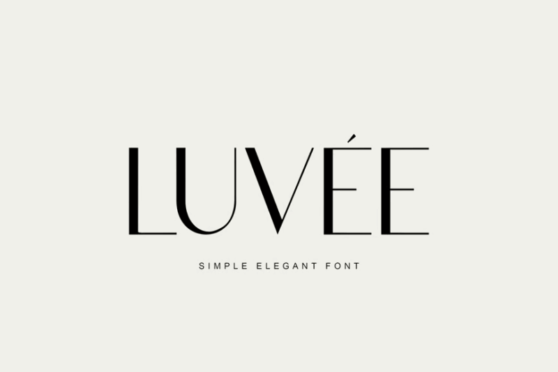
Luvee is a clean and elegant sans-serif font with a minimalist aesthetic. Its simple yet refined design makes it ideal for modern branding, editorial layouts, and any project that requires a touch of understated sophistication.
What Makes a Font Feel “Italian”?
Italian fonts get their distinctive character from several key features that reflect the country’s rich cultural and artistic heritage:
Classical Proportions
Many Italian fonts draw inspiration from Roman inscriptions and Renaissance lettering. They often feature balanced, harmonious proportions based on classical ideals. This architectural quality gives them a timeless, sophisticated appearance that feels inherently Italian.
The connection to ancient Roman capitals is particularly strong in many Italian-inspired typefaces. Those clean, elegant letter forms carved into monuments thousands of years ago continue to influence typography today, especially in fonts that aim to capture Italian sensibilities.
Expressive Flourishes
Italian typography frequently incorporates decorative elements and flourishes that reflect the country’s artistic traditions. These can range from subtle serifs to more elaborate swashes and ornaments in display fonts.
These flourishes aren’t just decorative—they echo the gestural quality of Italian handwriting and calligraphy. There’s often a certain expressiveness that feels like the visual equivalent of speaking with your hands, a quintessentially Italian trait.
Warmth and Personality
The best Italian fonts have a warmth to them that reflects the Mediterranean spirit. Unlike some colder, more mechanical typefaces, Italian-inspired fonts often feel human and approachable.
This warmth comes through in subtle variations in stroke weight, organic shapes, and sometimes a slight irregularity that makes the font feel handcrafted rather than mechanically perfect.
Historical Connections
Many Italian fonts reference specific periods in Italian history—whether it’s the Renaissance, the early 20th century Italian Futurist movement, or mid-century modern Italian design. These historical touchpoints give the fonts authenticity and depth.
For example, fonts inspired by Italian Renaissance manuscripts have a different character than those influenced by 1950s Italian advertising. Both are authentically “Italian” but in distinctly different ways.
Where to Use Italian Fonts in Your Designs
Now that we understand what gives Italian fonts their distinctive character, let’s explore some perfect applications for these typefaces:
Food & Beverage Branding
Italian fonts are naturally perfect for restaurants, cafés, and food products that want to evoke authentic Italian cuisine. They add immediate credibility to pizzerias, gelaterias, coffee shops, and pasta brands.
The right Italian font can transport customers to a sun-drenched piazza or a cozy trattoria before they’ve even tasted the food. That’s valuable brand equity for any Italian food business.
Travel & Tourism
For travel companies specializing in Italian destinations, tour operators, or vacation rentals in Italy, an authentic Italian font creates the perfect atmosphere of anticipation and romance.
The typography can help set expectations for the experience to come, whether that’s exploring ancient ruins, enjoying coastal vistas, or wandering through vineyard-covered hills.
Luxury Branding
Italian design is synonymous with luxury, from fashion houses to sports cars. Italian fonts can lend that same sense of craftsmanship, heritage, and elegance to upscale brands across industries.
The association with Italian style and quality makes these fonts a natural choice for premium products that want to position themselves as sophisticated and well-crafted.
Wedding & Event Design
The romance of Italy makes Italian fonts a popular choice for wedding invitations, especially for destination weddings in Italy or events with an Italian theme.
From elegant script fonts for formal affairs to rustic Italian-inspired typefaces for more casual celebrations, these fonts help set the mood for special occasions.
Editorial Design
For magazines, books, or websites focusing on Italian culture, cuisine, fashion, or design, Italian fonts provide appropriate stylistic context while enhancing readability.
They can be used as statement headline fonts or as more subtle body text choices that add a touch of Italian flair without overwhelming the content.
Where to Avoid Italian Fonts
While Italian fonts are versatile, there are some contexts where they might not be the best choice:
Ultra-Modern Tech Contexts
For cutting-edge technology companies or products focused on innovation, traditional Italian fonts might feel too historical or ornate. In these cases, clean, contemporary sans-serifs often work better.
That said, there are modern Italian-designed fonts that bridge this gap, bringing Italian design sensibilities into a more contemporary context.
Corporate Documentation
For serious business documents where readability and professionalism are paramount, highly decorative Italian display fonts could be distracting and inappropriate.
Save the more expressive Italian typefaces for branding elements, and stick with more understated choices for body text in corporate contexts.
Cultural Mismatch
Using overtly Italian typography for brands or projects representing different cultures could create confusion or feel inauthentic. A Japanese restaurant with an Italian font, for instance, would send mixed cultural signals.
Always ensure your typography choices respect and accurately represent the cultural context of your project.
How to Choose the Perfect Italian Font
Selecting the right Italian font for your project requires careful consideration of several factors:
Authenticity Level
Consider how explicitly “Italian” you want your typography to feel. Some projects call for fonts that scream “Italy!” while others benefit from more subtle references that might only be recognized by typography enthusiasts.
An Italian restaurant menu might warrant a more obviously Italian-inspired font, while a luxury brand might choose something with Italian heritage that feels sophisticated rather than stereotypical.
Historical Period
Different Italian fonts reference different periods in Italian history and design. Are you going for Roman antiquity, Renaissance elegance, mid-century Italian modernism, or contemporary Italian design?
Aligning your font choice with the specific historical reference point that suits your project will create a more cohesive design story.
Regional Influences
Italy has distinct regional cultures, from Venetian elegance to rustic Tuscan charm to sleek Milanese modernism. If your project relates to a specific region of Italy, consider typography that reflects those local characteristics.
A font that works perfectly for a Venetian carnival might feel out of place for a Sicilian olive oil producer.
Readability Needs
Balance aesthetic considerations with practical readability. Some highly decorative Italian fonts work beautifully for headlines or logos but would be exhausting to read in longer text passages.
Consider using more expressive Italian fonts for display purposes and pairing them with more readable options for body text.
Pairing Italian Fonts Successfully
Creating harmonious font combinations with Italian typefaces follows some specific principles:
Contrast with Complementary Styles
Pair an expressive Italian display font with a more neutral companion that allows the statement font to shine. A decorative Italian script might work beautifully with a clean sans-serif that provides breathing room.
The key is balance—letting the Italian character come through without overwhelming the design with competing decorative elements.
Consider Historical Consistency
When pairing multiple Italian-inspired fonts, try to keep them from the same general historical period for a more cohesive look. A Renaissance-inspired Italian serif would clash with a 1960s Italian modernist sans-serif.
If you’re mixing periods, do so intentionally and with a clear hierarchy that helps the reader understand the relationship between different text elements.
Respect the Italian Design Tradition
Italian design is known for its attention to proportion, balance, and elegance. Apply these principles to your font pairings by ensuring they create a harmonious overall composition.
The great Italian designers like Massimo Vignelli emphasized simplicity and thoughtful restraint—sometimes less is more, even with expressive Italian typography.
Italian Font Alternatives
If you can’t find the perfect Italian font for your project, consider these alternatives that can evoke similar feelings:
Mediterranean Fonts
Fonts inspired by broader Mediterranean typography traditions (Spanish, Greek, etc.) often share qualities with Italian fonts—warmth, expressiveness, and historical depth.
These can be excellent alternatives when you want that southern European character without being specifically Italian.
Classical Serif Fonts
Many high-quality serif fonts draw inspiration from the same classical Roman letter forms that influence Italian typography. Fonts like Baskerville or Garamond have that timeless quality without being overtly Italian.
These work well when you want a touch of traditional elegance without strong geographic associations.
Hand-Lettered Fonts
The warmth and personality of Italian fonts can sometimes be captured through well-designed hand-lettered typefaces, even if they don’t have specific Italian influences.
Look for fonts with natural variations and a human quality that feels authentic rather than mechanical.
Common Italian Font Questions
Let’s wrap up by answering some frequently asked questions about Italian fonts:
What is the most popular Italian font?
While there’s no single “most popular” Italian font, classics like Trajan (based on Roman inscriptions), Bodoni (created by Italian typographer Giambattista Bodoni), and more recent designs like Mostra Nuova have become go-to choices for designers seeking Italian flair.
What font is used in Italian restaurants?
Italian restaurants often use fonts that evoke either rustic Italian charm (for casual eateries) or elegant Renaissance-inspired typography (for upscale establishments). Fonts like Trattoria, Osteria, and Italia are popular choices specifically designed for this purpose.
What is traditional Italian typography?
Traditional Italian typography has evolved through several key periods: ancient Roman capitals, Renaissance humanist letterforms, Baroque expressiveness, and later innovations like Bodoni’s modern serifs. Each era contributed distinct characteristics to what we now recognize as Italian type design.
Are Italian fonts hard to read?
While some decorative Italian display fonts prioritize style over readability, many Italian-inspired typefaces are actually highly readable. Italian typography has a strong tradition of clarity and balance, especially in text fonts designed for books and other long-form reading.
Conclusion: The Enduring Appeal of Italian Typography
From the timeless elegance of Roman inscriptions to the bold innovation of Italian graphic design, Italian fonts offer designers a rich palette of typographic possibilities. They connect our work to centuries of artistic tradition while adding unmistakable warmth and character.
Whether you’re designing for an authentic Italian brand or simply want to add a touch of Mediterranean sophistication to your project, the right Italian font can transform your design from ordinary to extraordinary.
So the next time you’re selecting typography, consider the expressive potential of Italian fonts. They bring with them not just letters and words, but the spirit of Italian culture—its passion for beauty, its appreciation of craftsmanship, and its celebration of la dolce vita.
After all, in design as in life, it’s the Italian touches that often make all the difference.
Which Italian font is your favorite? Have you used Italian typography in your own designs? Share your experiences in the comments below!