In this article:
- 25 Most "Cha-Ching" Money Fonts in 2024
- Choosing a Money Font: What to Look For
- How do they actually design money fonts?
- What font is used on money?
- What font is used to show money?
- What font is the US dollar?
- Is it illegal to print money?
- What printer is used to print money?
Money fonts can make or break your design. When money is the name of the game, typography takes on even greater importance in your design projects. The perfect money font can make a design feel luxe, exclusive, trustworthy or playful. The wrong font? Well let’s just say it can make a business look less than professional.
In this post, I’ll help you in selecting, using and designing with money fonts. I’ll also give you a list of my go-to money fonts for all types of currency and finance-related design work. Let’s get started…
25 Most “Cha-Ching” Money Fonts in 2024
First, let’s dig into my picks for the best fonts to try.
Remember as you design for banking, wealth management, investments, and other money-related niches, trust and tradition reign supreme. But a little personality doesn’t hurt either. Use them wisely!
Dollar Stencil
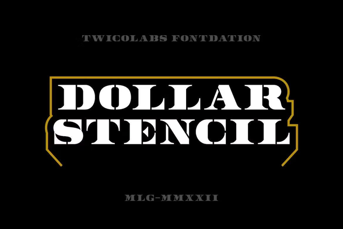
Dollar Stencil is a versatile all-caps font with a stenciled serif style inspired by money. It would work well for both vintage and modern finance themes.
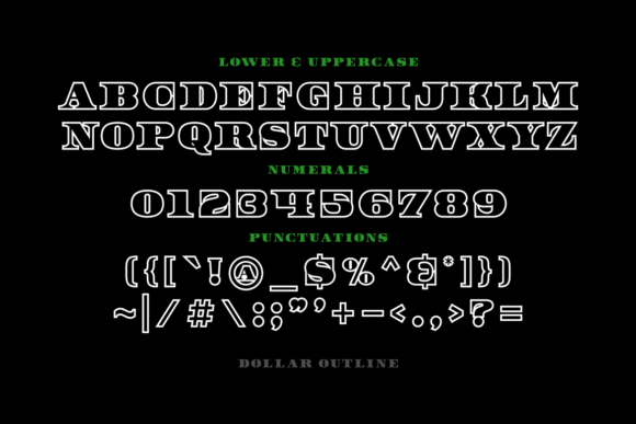
Dollar Outline

Get 300+ Fonts for FREE
Enter your email to download our 100% free "Font Lover's Bundle". For commercial & personal use. No royalties. No fees. No attribution. 100% free to use anywhere.
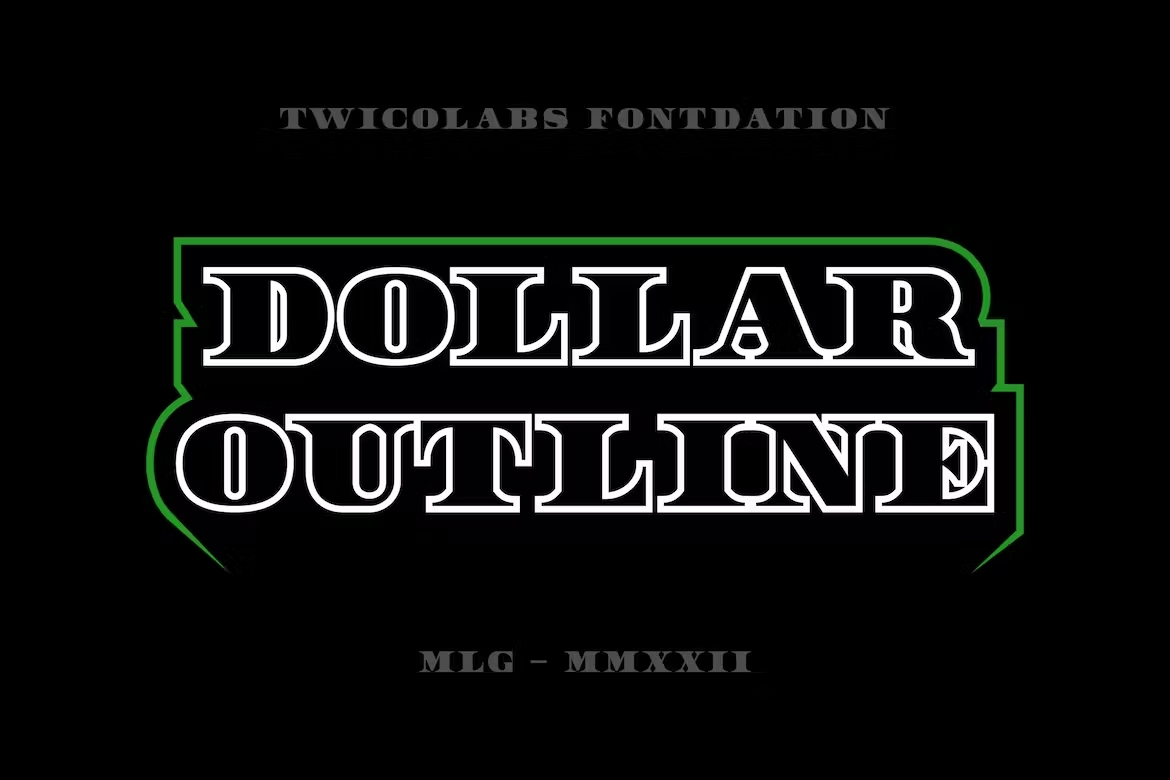
Dollar Outline puts a unique spin on money design with its hollow letterforms. The stenciled serif style lends a classic vibe even while the concept feels modern.
Moneywise
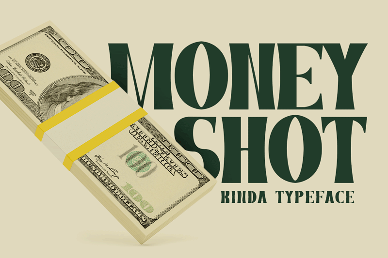
Moneywise is a stylish serif font perfect for designing financial documents. It has a traditional, reliable look while still remaining easy to read. The dynamic thick and thin strokes add elegance.
Waste Money

Waste Money is a bold, all-caps display font with a grungy, worn texture. It would be perfect for more urban streetwear-style financial branding that wants to feel raw and edgy.
Billy Money
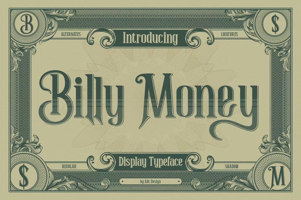
Inspired by ornate Victorian-era banknote lettering, Billy Money has a refined, upscale sensibility perfect for elevated financial designs.
The Money Font Duo
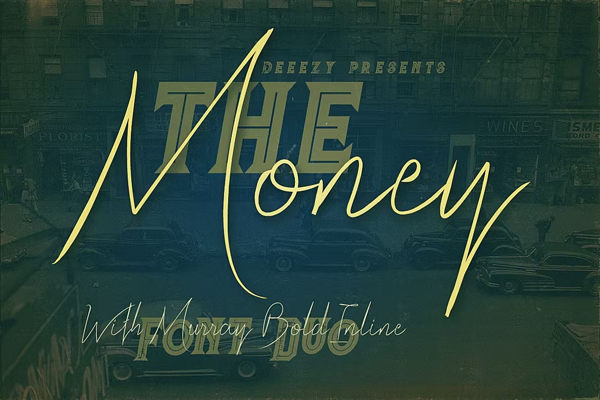
This creative money font bundle pairs a modern, sleek handwritten script with an edgy inline display font. Together they can handle a wide range of financial design needs.
Ethereum

Ethereum is a techy multi-layered font perfect for any cryptocurrency or blockchain related design. The sharp geometrics reference digital pixels for a very high-tech money vibe.
Cybercoin – Digital Font
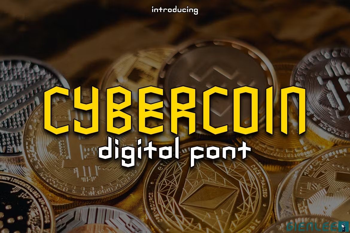
As another digital money font, Cybercoin has a techy pixel aesthetic flavored with a fun, bubbly cartoon style. Perfect for a young, hip crypto brand.
Money Money
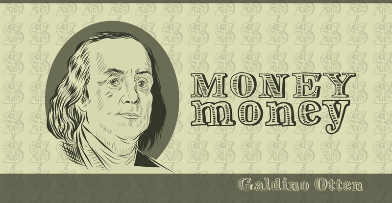
Money Money is a tall, condensed sans serif font. The closely stacked letters give it a sleek, modern money aesthetic perfect for financial tech brands.
Cash Currency
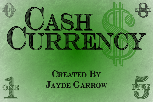
Cash Currency is a bold serif font with ornate embellished details that lend an upscale, exclusive vibe. The decorative edges make it ideal for high-end banking and wealth management brands wanting to feel established and luxe.
10 Bucks
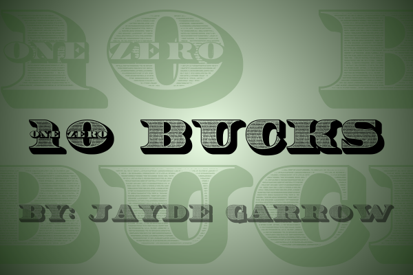
10 Bucks is modeled after classic American currency fonts. It captures the heritage look and feel of historical money design with serifs, thick & thin letter shapes, and custom letterforms.
Dollar Bill
Dollar Bill 2

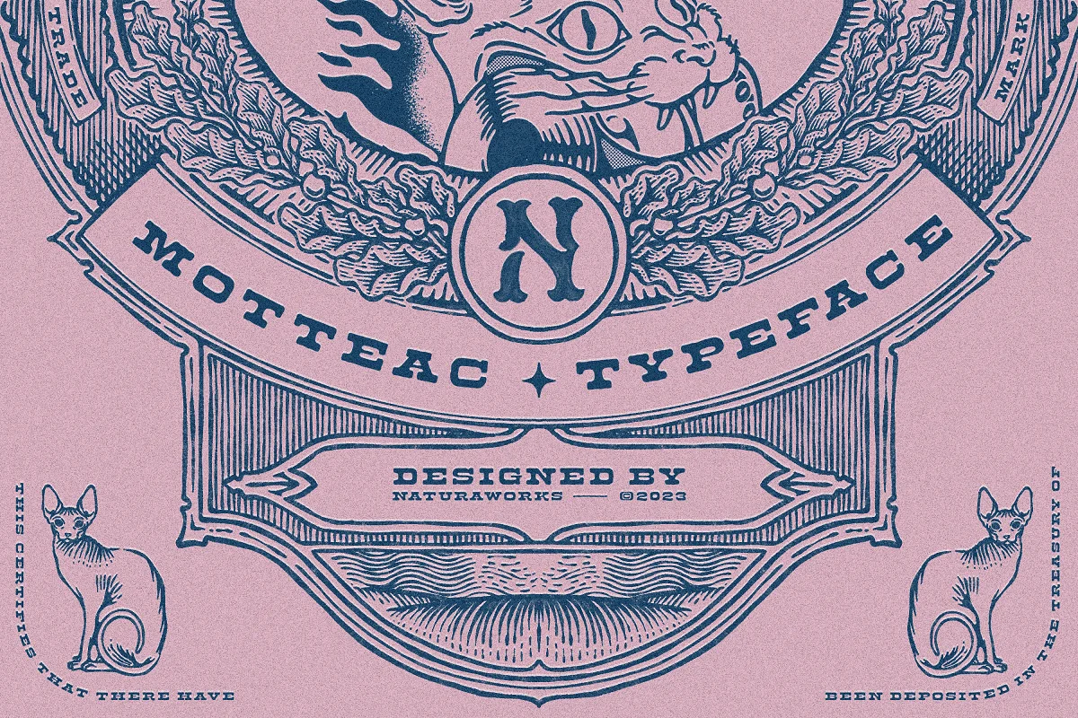
MOTTEAC DISPLAY TYPEFACE
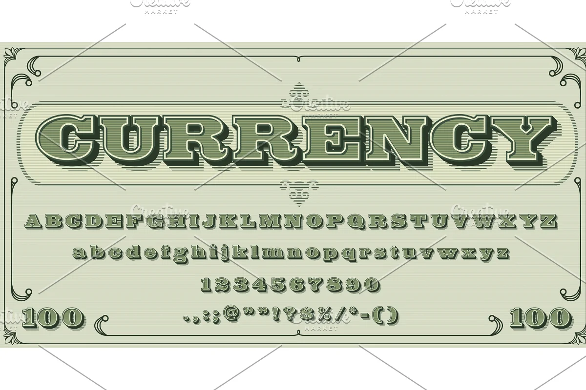
Money font, vintage type
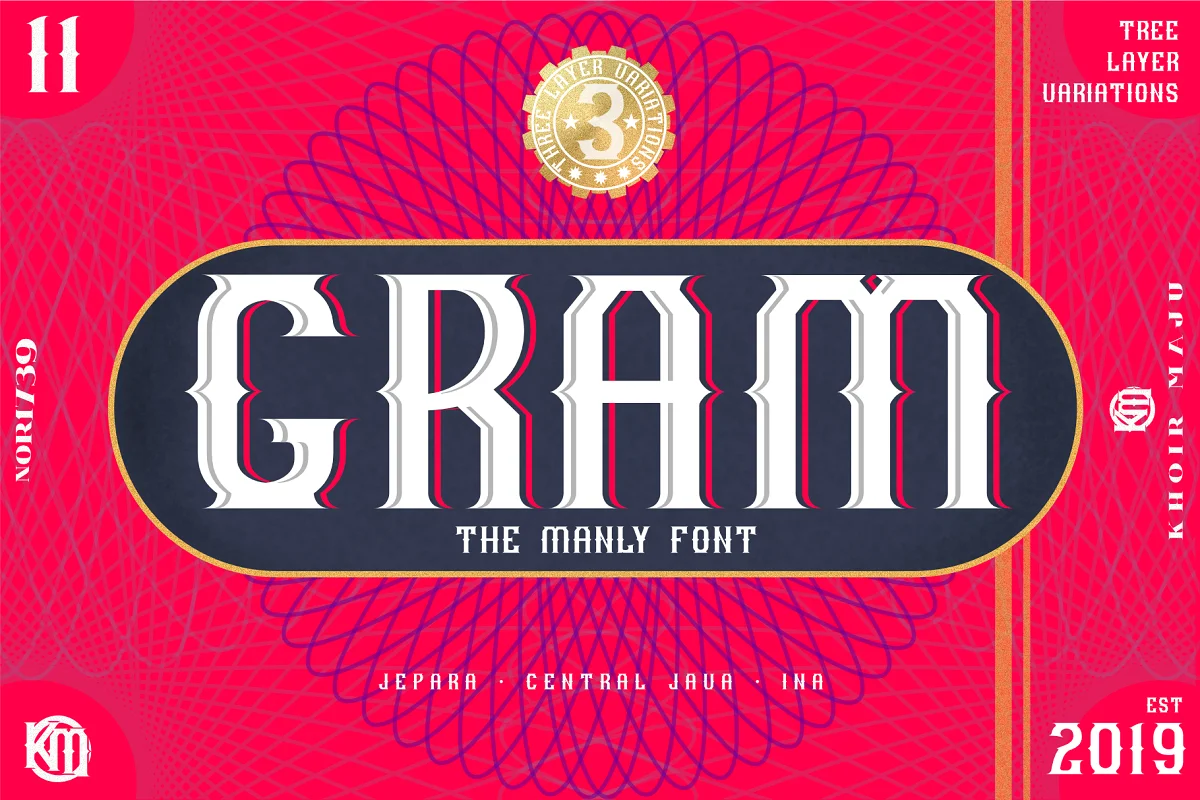
GRAM – New Display Font
New Coin font

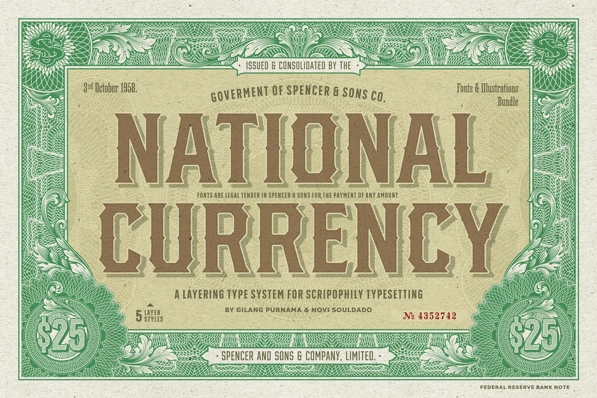
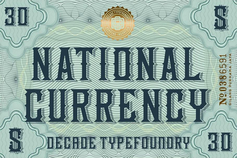
S&S National Currency Font Bundle
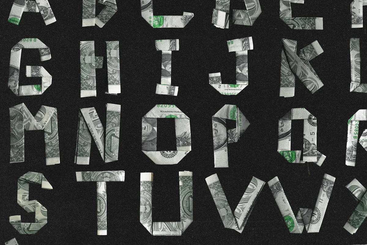
Dead Presidents Font
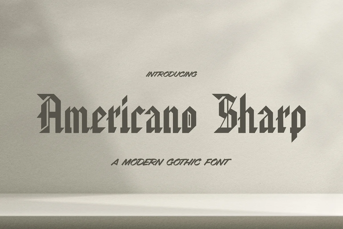
Americano Sharp Font
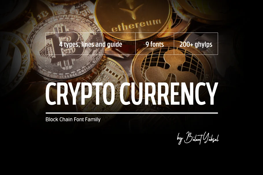
Cryptocurrency
National Currency Font
Money font, dollar latin alphabet
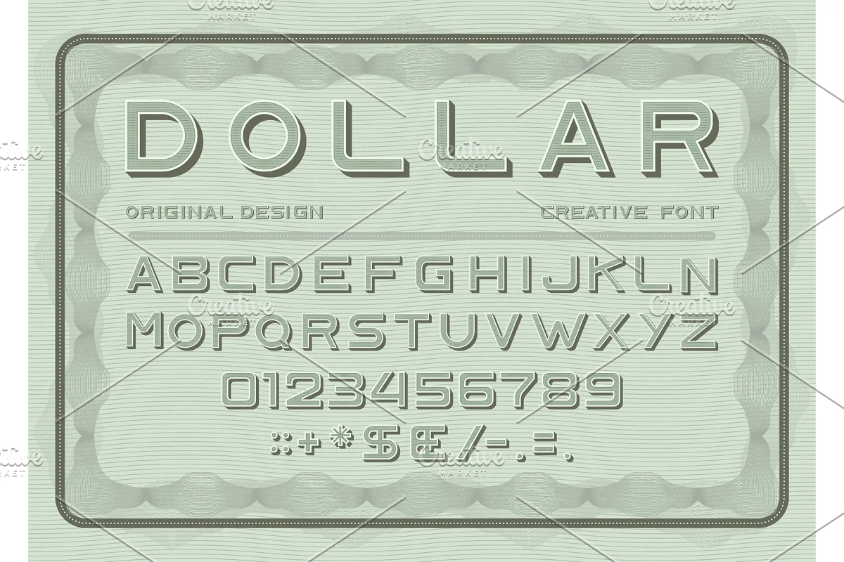
This sans serif money font adds a touch of vintage flair with its decorative background pattern. Nice for understated financial designs.
And for more fonts to inspire you, read this: Alliteration Inspiration: Coffee & Currency
Choosing a Money Font: What to Look For
When selecting a font to use in money-related designs, there are a few key characteristics that make a font feel authentic, credible and effective:
Trustworthiness
Money design is all about instilling consumer confidence. When someone sees your financial brand logo or marketing materials, you want them to intuitively feel they can trust you to be responsible with their money.
That means smart font choices. Err on the side of traditional, classic looks. While an edgy, bubbly display font might grab attention, it likely won’t make someone feel confident moving forward with a financial transaction.
That brings us to our next money font consideration…
Traditional Style
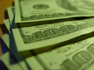
Have you ever noticed how money across history and geography tends to look, well, old fashioned? There’s a reason for that. Historical styles lend a sense of heritage and longevity—qualities that feel comforting when dealing with finances.
Serifs, a slightly formal vibe, motifs that look like engravings or calligraphy…these details trigger emotional responses that say “you’ve been around awhile so I can probably trust you.”
Of course modern sans serif fonts like Impact have their place too (more on that below in the list of top money fonts.) But tradition never goes out of style with money design.

Precision
Consistency and perfect alignment also help financial designs look buttoned up and detail-oriented—again, qualities you want in someone handling your money.
While scripts and hand lettered fonts have beauty and personality in many applications, a financial institution likely wants to come across as meticulous, flawless, and totally squared away.
How do they actually design money fonts?
Ever wondered how font designers actually create the fonts we see on currency from all around the world? What visual cues lend that undeniable “this looks like real money” vibe?
There’s a fascinating process and considered reasoning behind the most commonly used money fonts. While styles inevitably vary across cultures, here is some insight into best practices:
Utilize Historical Styles
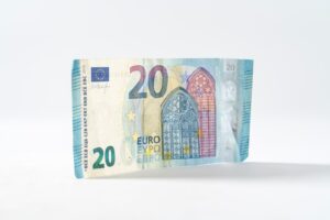
Most major currencies draw inspiration from the typographic sensibilities used on old coin engravings which of course looked to fancy calligraphic manuscripts for inspiration. This lends heritage and gravitas while looking undeniably fancy and important.
Incorporate Special Details
You’ll notice small custom details like fleur-de-lis, stars, and other subtle embellishments integrated into letterforms. These decorations reference motifs used frequently in old manuscripts and engravings when those styles were at their peak. Their inclusion triggers that hard-to-replicate “this looks expensive” impression.
Rely On Serif Fonts
Serif fonts based on old-style Roman faces like Garamond or updated Transitional serifs lend an upscale, exclusive vibe. Of course Sans serifs have come into greater use in modern currency design for their streamlined clarity—but serifs still dominate in the money design space.
Utilize Thick & Thin Strokes
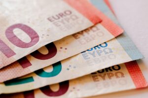
Classically-inspired money fonts incorporate letterforms with pronounced thick and thin lines. This references calligraphy and quill pens. The extreme contrast between delicate hairlines and bold verticals makes designs feel undeniably fancy.
Incorporate Unusual Lettershapes
Pay attention next time you scrutinize paper currency. You’ll notice unusual details like the two-storied “a”, single-storied “g”, curled “t” base, pointy triangular serifs, and other abnormal touches. Custom letter variants like these make a font feel proprietary, special…exclusive even.
What font is used on money?
Most paper currency uses specially designed proprietary fonts created by each country’s monetary authority.
For example, the US dollar uses fonts designed by the United States Bureau of Engraving and Printing. These tend to be serif fonts inspired by old engraved letters and historical manuscripts, however some countries have moved toward more modern, sans-serif fonts.
What font is used to show money?
To visually represent money in graphic designs, serif fonts with thick and thin strokes work well. Classics like Garamond or Georgia have that luxe money feel. For a more generic look, simple sans serifs like Arial can also represent currency.
What font is the US dollar?
The primary font used on the US dollar is a customized serif font created by the US Bureau of Engraving and Printing. It draws inspiration from engraving and stonecut letters as well as 18th century scripts. It’s meant to convey heritage and trust.
Is it illegal to print money?
In most countries, printing fake currency that could be confused for real money is illegal. Replicas must be stylized or scaled in ways clearly identifying them as non-legal tender. Creative font recreations are typically acceptable if they couldn’t fool people. Do not use the fonts on this page to create illegal replicas.
What printer is used to print money?
Government mints and currency producers use specialized intaglio printing presses to print real banknotes. These apply extreme pressure pushing paper into engraved metal plates to emboss the paper and create unique texture from the ink. Normal commercial printers don’t come close to this level of detail.

