In this article:
- The Most Blooming Spring Fonts
- What Makes a Font Feel Like Spring?
- Where Can You Use Spring Fonts?
- Where to Avoid Spring Fonts
- How to Pick the Perfect Spring Font
- Spring Font Pairing Ideas
- Common Spring Font Questions
When it comes to spring, there’s something special about finding fonts that embody that sense of renewal, growth, and blossoming creativity that makes our designs truly sing.
Spring fonts are exactly what they sound like – typefaces that capture the light, airy, organic feel of the season. They range from delicate scripts that mimic fresh blooms to clean sans-serifs with just enough personality to feel sun-kissed and renewed.
In this post, I’ll be diving deep into the best spring fonts to try in 2026. We’ll explore:
- What makes a font feel “springy”
- How to choose the perfect spring font for your project
- The best uses for spring fonts (and where to avoid them)
- Fantastic spring font pairings to consider
- Answers to common spring font questions
And much more. Let’s dive in!
The Most Blooming Spring Fonts
Spring Sounds
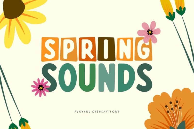
Spring Sounds is a decorative font that captures the essence of springtime. Its playful and whimsical letterforms are perfect for creating eye-catching headlines or logos that evoke a sense of freshness and renewal.
Sunday Spring
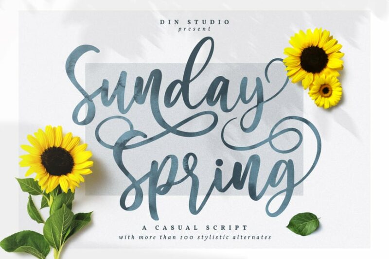
Sunday Spring is a script font that exudes a relaxed and casual vibe. Its flowing letterforms and natural curves make it ideal for projects that require a handwritten touch, such as invitations or social media graphics.
Pretty Spring
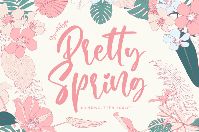
Pretty Spring is a delicate script font that embodies the beauty of the season. Its elegant and feminine design makes it perfect for wedding invitations, beauty products, or any project that requires a touch of sophistication.

Get 300+ Fonts for FREE
Enter your email to download our 100% free "Font Lover's Bundle". For commercial & personal use. No royalties. No fees. No attribution. 100% free to use anywhere.
Spring Farmhouse
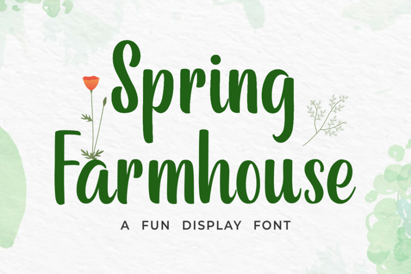
Spring Farmhouse is a rustic script font that combines country charm with springtime freshness. Its hand-drawn style and slight imperfections give it an authentic, homemade feel, ideal for farm-to-table branding or craft projects.
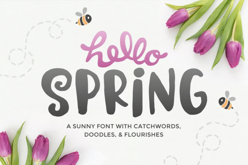
Hello Spring
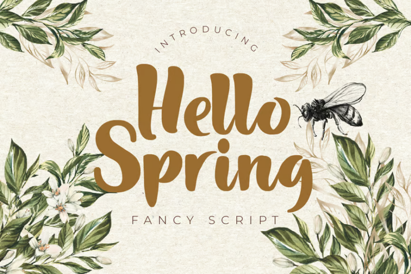
Hello Spring is a cheerful script font that welcomes the new season with open arms. Its bouncy baseline and playful curves make it perfect for greeting cards, social media posts, or any design that needs to convey joy and excitement.
Spring Floral Dingbat
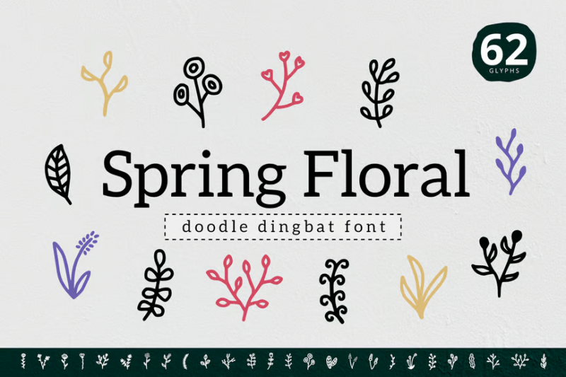
Spring Floral Dingbat is a decorative symbol font featuring an array of floral and nature-inspired designs. It’s an excellent tool for adding springtime embellishments to various projects, from invitations to packaging designs.
Fresh Spring
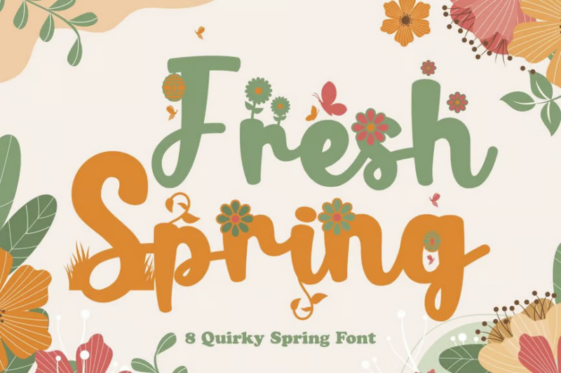
Fresh Spring is a collection of 8 quirky fonts that capture the playful spirit of the season. With a mix of script and decorative styles, this versatile set is perfect for children’s books, toy packaging, or any design that needs a fun, youthful touch.
Hello Spring Font
Hello Spring Font is an adorable decorative typeface that combines letters and spring-themed symbols. Its charming design makes it ideal for creating unique headlines, logos, or social media graphics that celebrate the season.
Spring Mood
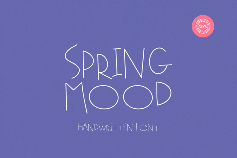
Spring Mood is a handwritten script font that captures the casual, breezy feel of the season. Its natural flow and slight irregularities give it an authentic look, perfect for personal branding, blog headers, or product packaging.
Spring Daily Cute
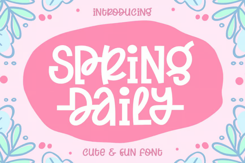
Spring Daily Cute is a playful font set that includes both handwritten characters and decorative symbols. Its versatility makes it ideal for creating unique designs for clothing brands, stationery, or digital content with a springtime theme.
Welcome Spring
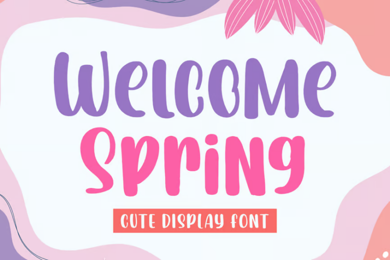
Welcome Spring is a cute script font that radiates warmth and friendliness. Its rounded letterforms and smooth connections make it perfect for Easter-themed designs, spring event invitations, or cheerful social media content.
Spring Wishes
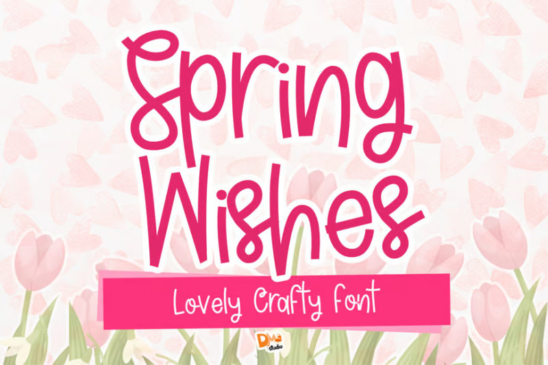
Spring Wishes is a unique font duo combining a sans-serif with a script style. This versatile pair offers a modern, monoline look that’s ideal for creating elegant spring-themed designs, from greeting cards to brand identities.
Magical Spring
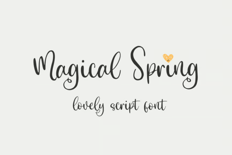
Magical Spring is a lovely script font that adds a touch of whimsy to any design. Its flowing curves and subtle texture make it perfect for craft projects, wedding stationery, or any design that requires a magical, springtime feel.
Magic Spring
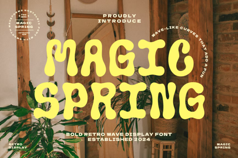
Magic Spring is a retro-inspired decorative font that brings a vintage touch to spring designs. Its bold, playful characters are perfect for creating eye-catching headlines or logos with a nostalgic twist.
Spring Garden
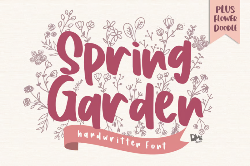
Spring Garden is a beautiful handwritten font that evokes the freshness of a blooming garden. Its natural, flowing style makes it ideal for creating organic-looking designs, from product packaging to social media content.
Bright Spring
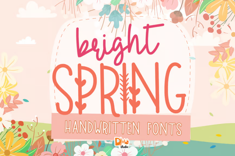
Bright Spring is a vibrant script font that captures the energy of the season. Its bold strokes and dynamic letterforms make it perfect for creating attention-grabbing headlines, logos, or lettering projects with a fresh, springtime feel.
Wildflowers in Spring Font Duo
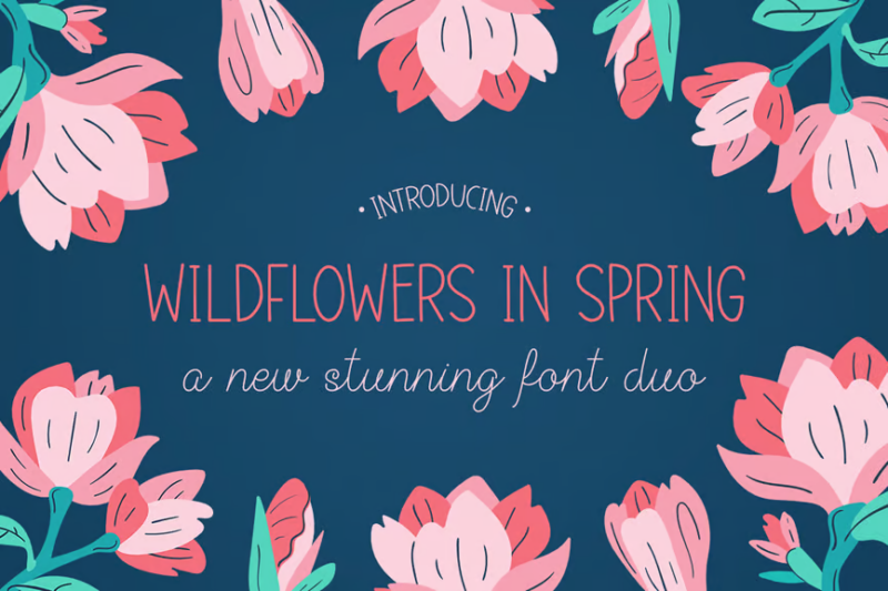
Wildflowers in Spring is a versatile flower font duo combining a script and a sans-serif. This pairing offers a perfect balance between elegance and simplicity, making it ideal for creating cohesive branding materials or editorial designs with a springtime theme.
Spring On
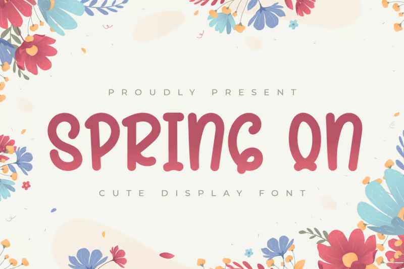
Spring On is a cute display font that combines script-like qualities with a playful, handwritten feel. Its charming design makes it perfect for creating engaging headlines, product packaging, or social media graphics that need a touch of springtime cheer.
Spring Baby
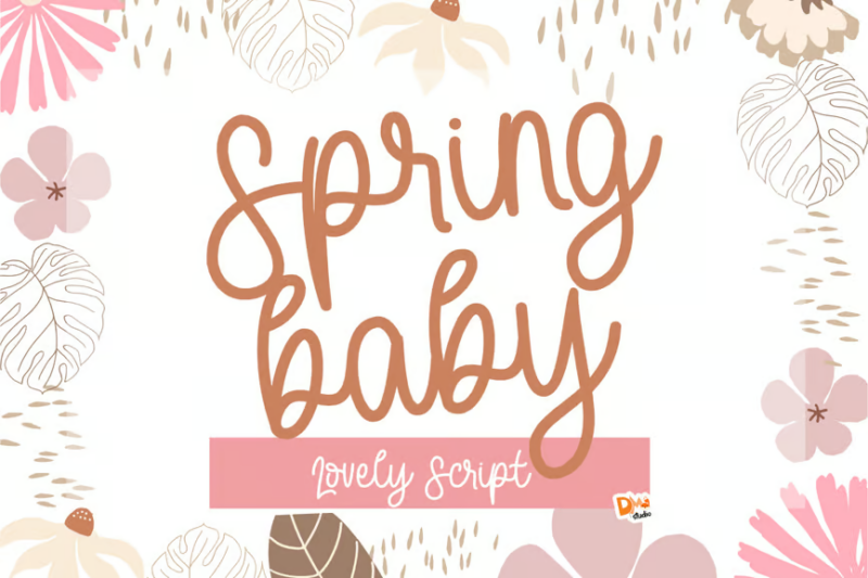
Spring Baby is a fresh and playful script font that exudes youthful energy. Its bouncy baseline and rounded forms make it ideal for children’s products, baby-related designs, or any project that requires a cute and lively touch.
Hello Spring | Fancy Serif Duo Font
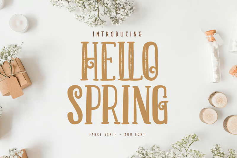
Hello Spring is a beautiful serif duo font that combines elegance with a touch of whimsy. Its decorative characters and subtle flourishes make it perfect for creating sophisticated spring-themed designs, from invitations to editorial layouts.
Spring Handwritten Font
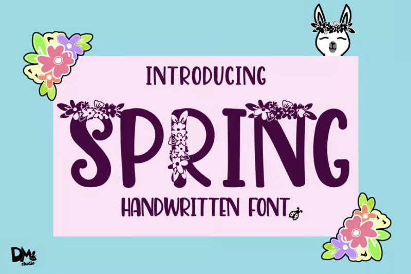
Spring Handwritten Font is a natural-looking script that captures the essence of authentic handwriting. Its organic flow and slight imperfections give designs a personal touch, making it ideal for signatures, quotes, or casual branding materials.
Surprise Spring
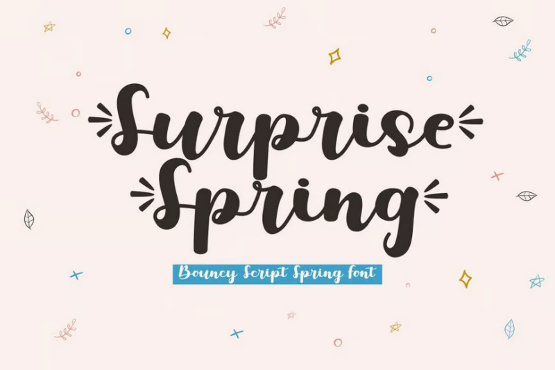
Surprise Spring is a delightful script font that brings an element of excitement to designs. Its dynamic letterforms and smooth connections make it perfect for creating eye-catching headlines, logos, or social media graphics with a springtime flair.
Sweet Rainbow
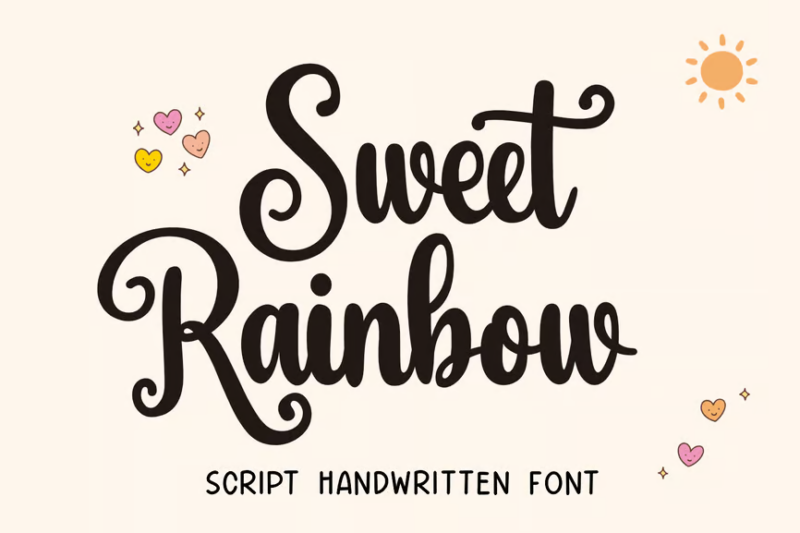
Sweet Rainbow is a charming script font designed for wedding-related projects. Its delicate curves and romantic style make it ideal for invitations, place cards, or any design that requires a touch of elegance and sweetness.
Chirp & Blossom Font
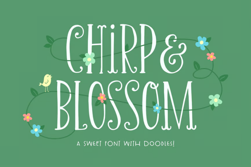
Chirp & Blossom is a cute decorative font that includes both characters and doodle-like symbols. Its playful design makes it perfect for creating whimsical spring-themed designs, children’s products, or any project that needs a touch of charm.
Balmy Morning Font Duo
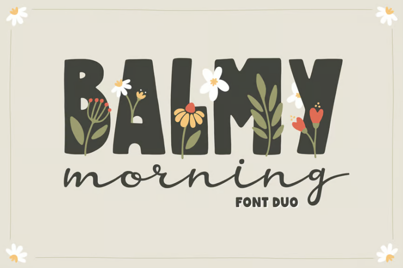
Balmy Morning is a versatile font duo that pairs a script with a bold display font. This combination offers a perfect balance between elegance and impact, making it ideal for creating striking headlines, logos, or branding materials with a fresh, springtime feel.
What Makes a Font Feel Like Spring?
Spring fonts get their fresh, rejuvenating personality from a few key characteristics:
Light, Airy Letterforms
First, the lightness. Spring fonts often feature letterforms that aren’t weighed down by heavy strokes or bulky serifs. Instead, they seem to float on the page with delicate, sometimes even wispy strokes that evoke the gentle spring breeze.
The light touch creates fonts that feel optimistic and fresh – perfect for the season of renewal. Many spring fonts also incorporate slightly increased letter spacing, allowing each character to “breathe” much like we do when we step outside on that first warm day after winter.
Natural, Organic Shapes
Spring fonts tend to incorporate organic, natural shapes reminiscent of new growth. You’ll often see subtle curves that mimic unfurling leaves or gentle flourishes that echo flowering branches.
This natural quality isn’t always overtly floral – sometimes it’s just a softened corner here or a slightly irregular line there. The slight imperfections give these fonts that handmade, natural feel that connects so well with spring’s organic energy.
Playful Personality
Finally, spring fonts often have a certain playfulness about them. After the seriousness of winter, these typefaces bring a welcome sense of joy and optimism.
Whether it’s through bouncy baselines, cheerful ligatures, or whimsical alternates, spring fonts carry that sense of possibility and renewal that defines the season. The combination creates a lively, animated effect that feels perfectly in tune with nature’s own reawakening.
Altogether these traits – light construction, organic shapes, and playful personality – define the fresh attitude of a spring font.
Where Can You Use Spring Fonts?
Now that we understand what makes spring fonts tick, where can we actually use them in designs? Their fresh, revitalizing vibe makes spring fonts versatile choices:
Seasonal Branding
Spring fonts are a natural choice for brands with seasonal collections or spring campaigns. From fashion labels to garden centers, florists to wedding planners – any business highlighting spring offerings can benefit from typography that feels as fresh as their products.
Retailers, particularly those selling outdoor gear, home décor, or clothing, often refresh their visual identity for spring. The right font can signal this seasonal shift while maintaining brand recognition.
Packaging
Spring fonts shine on packaging for seasonal products. Think limited-edition spring teas, floral-scented personal care products, or special spring food items.
The fresh, light quality of these fonts helps products stand out on shelves and communicates that sense of renewal consumers are seeking in springtime purchases.
Invitations and Stationery
Spring is peak season for weddings, baby showers, garden parties, and other celebrations. The perfect spring font sets a tone of optimism and new beginnings on invitations, programs, and other stationery.
Wedding designers particularly rely on spring fonts to capture that romantic, blossoming feeling for spring ceremonies. A delicate script or airy serif can transform a simple invitation into something truly special.
Digital Campaigns
Spring fonts help seasonal digital content feel current and relevant. Email newsletters announcing spring collections, website banners promoting spring sales, or social media graphics celebrating the equinox all benefit from typography that feels as fresh as the season.
Digital designers can use spring fonts to create that sense of renewal online that consumers are experiencing in the world around them.
Where to Avoid Spring Fonts
While fantastic for many applications, there are certain uses where spring fonts may not make the best choice. Namely in contexts requiring:
Year-Round Consistency
For core brand identities needing to work across all seasons, an overtly spring-like font might feel out of place during autumn or winter. Instead, choose versatile fonts with seasonal applications through color or supporting graphics.
High Legibility Needs
Some of the more decorative spring fonts – particularly those with extremely thin strokes or elaborate flourishes – may compromise readability at smaller sizes. For important information like terms and conditions, pricing, or safety instructions, stick with clearer options.
Serious or Somber Messaging
The inherent optimism and playfulness of spring fonts can sometimes undermine more serious communications. For corporate annual reports, legal notices, or critical announcements, a more neutral typeface maintains appropriate gravity.
So while fresh and invigorating for countless applications, thoughtfully evaluate context when deciding if a spring font makes sense. Their lightness may occasionally feel at odds with weightier subject matter requiring greater visual substance.
How to Pick the Perfect Spring Font
To choose an excellent spring font matching your needs, first reflect on:
Project Purpose
Consider the specific application. Is this for a one-time spring campaign, or something needing longevity? Will it appear primarily in print or digital formats? Understanding these parameters helps narrow your selection.
A wedding invitation might warrant a more decorative spring script, while a garden center’s seasonal catalog might need a more versatile, readable spring serif.
Brand Alignment
Even seasonal fonts should harmonize with existing brand identity. The perfect spring font complements rather than conflicts with your overall brand voice.
If your brand is minimalist and modern, look for spring fonts with clean lines and subtle organic touches rather than overtly decorative options.
Practical Considerations
Evaluate technical needs like language support, weight variety, and special character requirements. The most beautiful spring font won’t serve you well if it lacks needed diacritical marks or doesn’t offer enough weight options for hierarchy.
Also consider licensing – will this font be used by multiple team members across various applications? Ensure your licensing covers all intended uses.
Seasonality Balance
Finally, consider just how “springy” you want your font to be. Some projects call for subtly seasonal touches, while others benefit from more overtly spring-inspired typography.
Remember that color, accompanying imagery, and overall design also contribute to seasonal feel. Sometimes a more neutral font complemented by spring colors and motifs creates the perfect balance.
With purpose, brand alignment, practical requirements and seasonality in mind, selecting an appropriate spring font becomes intuitive!
Spring Font Pairing Ideas
Creating the perfect type system for spring often involves thoughtful pairing. Here are some combinations that work particularly well for the season:
Script + Sans-Serif
Pairing a light, airy script with a clean sans-serif creates wonderful contrast while maintaining that spring freshness. The script brings the seasonal personality while the sans-serif ensures readability and versatility.
Try using the script for headlines or featured quotes, with the sans handling body copy and supporting information.
Serif + Handwritten
A modern serif with slightly organic qualities pairs beautifully with a casual handwritten font. This combination feels sophisticated yet approachable – perfect for spring wedding suites or upscale garden party invitations.
Use the serif for the main information and the handwritten font for personal touches like names or special notes.
Two Sans-Serifs with Different Personalities
Pairing a geometric sans-serif with a more humanist sans can create subtle seasonal contrast. The geometric font provides structure while the humanist adds that organic, springlike quality.
This pairing works especially well for springtime corporate communications or retail campaigns needing to maintain brand professionalism while nodding to the season.
Remember that spring pairings, like the season itself, are about balance – structure and freedom, consistency and growth, tradition and renewal. Your font combinations can reflect these same harmonious oppositions.
Common Spring Font Questions
Let’s wrap up by answering some common spring font questions:
What fonts give a spring feeling?
Fonts with light, airy strokes, slightly organic shapes, and a sense of movement tend to evoke spring. Look for typefaces with subtle irregularities reminiscent of natural growth, or scripts with flowing connections that suggest blossoming and renewal.
What colors work best with spring fonts?
Fresh greens, soft pinks, gentle yellows, and clear sky blues complement spring fonts beautifully. Consider color gradients that mimic spring sunlight or the subtle color shifts in new foliage for an extra seasonal touch.
Can I use spring fonts year-round?
Some of the more versatile spring fonts – particularly those with just subtle organic qualities – can work year-round. However, extremely seasonal fonts might feel out of place in autumn or winter campaigns. When in doubt, test your font against imagery from different seasons to gauge its versatility.
What’s the difference between spring fonts and summer fonts?
Spring fonts tend to be lighter, more delicate, and often have a sense of new growth about them. Summer fonts generally feel more established and robust – they might share organic qualities but often have fuller, more confident strokes reflecting the fullness of summer’s maturity.
Spring fonts breathe fresh life and renewed energy into designs meant to capture this fleeting, beautiful season. Their light, organic qualities ensure your typography reflects the same awakening energy found in nature.
So try out some of these blooming spring fonts in your own seasonal projects. Used thoughtfully, they create memorable designs that make viewers feel the same optimism and possibility that comes with those first perfect spring days.


