In this article:
- The Most Majestic Roman Fonts of 2026
- What Makes Roman Fonts Feel So Timeless and Authoritative?
- Where Can You Use Roman Fonts?
- Where to Avoid Roman Fonts
- How to Choose the Perfect Roman Font
- Fantastic Roman Font Alternatives
- Common Roman Font Questions
As graphic designers, we’re constantly seeking typefaces that can transport our audiences to different eras and evoke specific emotions. And in 2026, Roman fonts are experiencing a remarkable renaissance, bringing the timeless elegance of ancient Rome to contemporary design projects.
Roman fonts are exactly what they sound like – typefaces inspired by the carved inscriptions found on ancient Roman monuments, tombstones, and architectural masterpieces. They have a noble, authoritative quality that feels both historic and surprisingly fresh in today’s design landscape.
In this post, I’ll be diving deep into the world of Roman fonts for 2026. We’ll explore:
- Key characteristics that make Roman fonts so compelling
- What gives Roman fonts their classical, prestigious feel
- The best uses for Roman fonts (and where to avoid them)
- Expert tips for choosing the perfect Roman typeface
- Answers to common Roman font questions
- And much more. Let’s embark on this typographic journey through time!
The Most Majestic Roman Fonts of 2026
Not all Roman fonts capture that authentic classical spirit equally well. So I’ve compiled a list of my favorite Roman-inspired typefaces that truly embody the grandeur of ancient Rome. Here they are:
Romanus
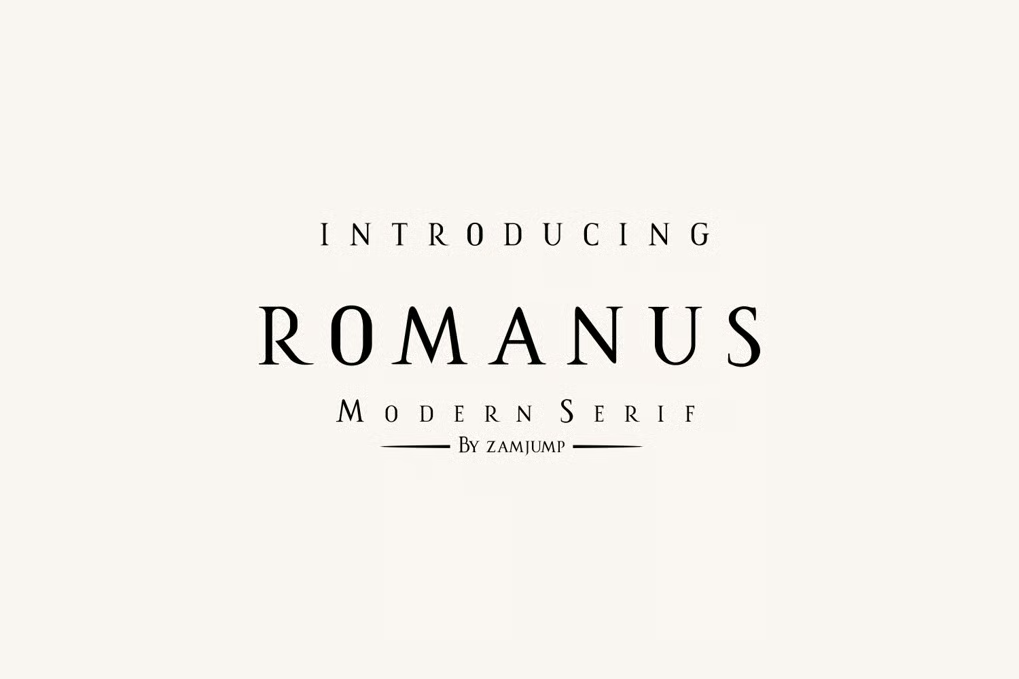
Romanus is a classic serif font that embodies the timeless elegance of Roman typography. Its clean lines and traditional letterforms make it perfect for projects requiring a touch of historical sophistication.
Tribal Romangreek
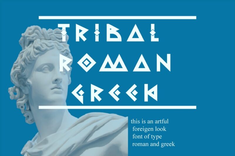
Tribal Romangreek is a unique decorative font that blends Greek and tribal aesthetics. It offers a distinctive look for designers seeking to create eye-catching headlines or logos with a cultural twist.
Roman Lover
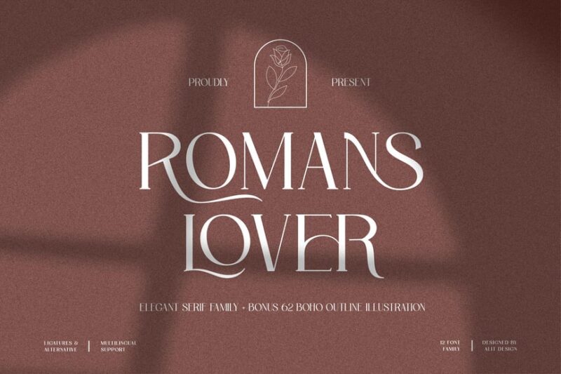
Roman Lover is a versatile serif font that pairs well with other typefaces. Its romantic overtones and classic structure make it ideal for elegant designs and editorial layouts.

Get 300+ Fonts for FREE
Enter your email to download our 100% free "Font Lover's Bundle". For commercial & personal use. No royalties. No fees. No attribution. 100% free to use anywhere.
Roman Editorial + Script Elegant Font Duo
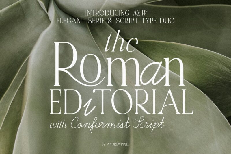
This font duo combines a sophisticated Roman serif with an elegant script, offering versatility for high-end designs. It’s perfect for creating aesthetic compositions in fashion, beauty, and luxury branding.
Romancio
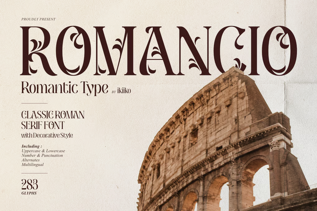
Romancio is a romantic serif font with an floral flair. Its delicate curves and ornate details make it ideal for wedding invitations, love-themed designs, and projects requiring a touch of Mediterranean charm.
Roman Sophisticated Serif
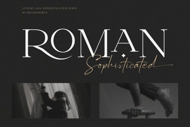
This sophisticated serif font exudes luxury and minimalism. Its refined letterforms and balanced proportions make it perfect for high-end branding, editorial design, and upscale marketing materials.
Romans Rexamples Font Duo
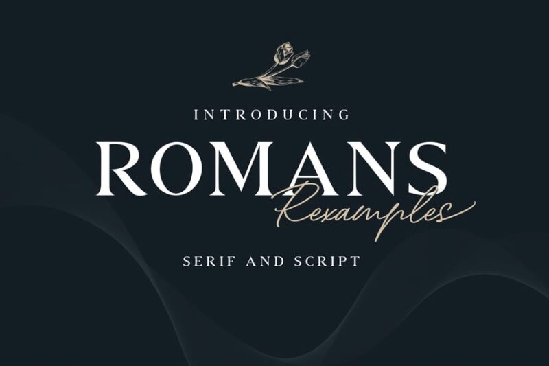
Romans Rexamples is a versatile font duo combining serif, script, and handwritten styles. This pairing offers designers a range of options for creating dynamic and visually interesting layouts.
Verte Roman
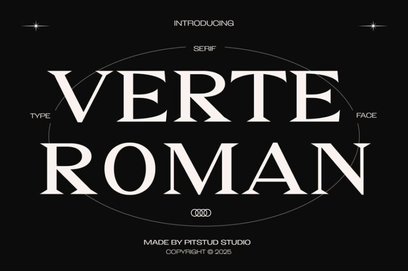
Verte Roman is a modern geometric serif font that blends luxury with bold shapes. Its unique character makes it suitable for contemporary branding, editorial design, and high-impact headlines.
Constantine
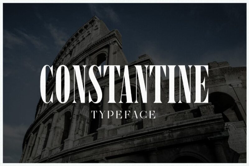
Constantine is a luxury display serif font with Greek influences. Its timeless elegance and strong character make it ideal for high-end branding, magazine headlines, and classical-themed designs.
Romelu Vomelu
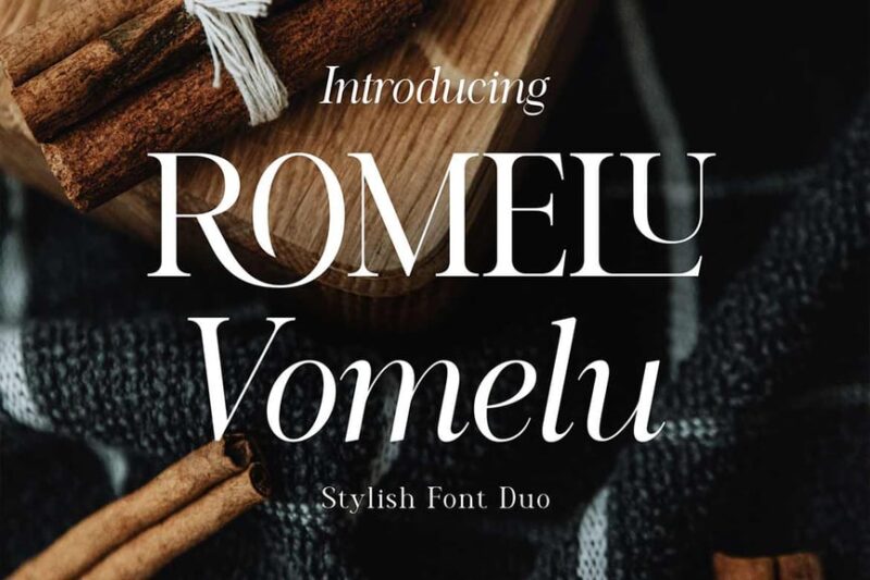
Romelu Vomelu is a modern serif font with both regular and italic styles. Its contemporary take on Roman typography makes it versatile for various design applications, from branding to editorial layouts.
Roma Invicta Font Duo
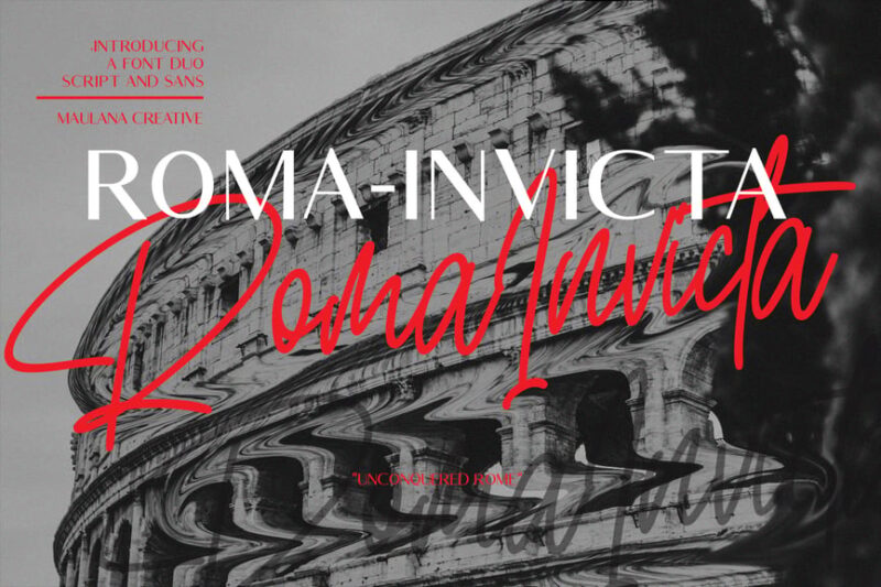
Roma Invicta is a font duo combining script and sans-serif styles. This versatile pairing offers designers the ability to create dynamic layouts with contrasting typefaces, perfect for branding and editorial design.
Roman Greek
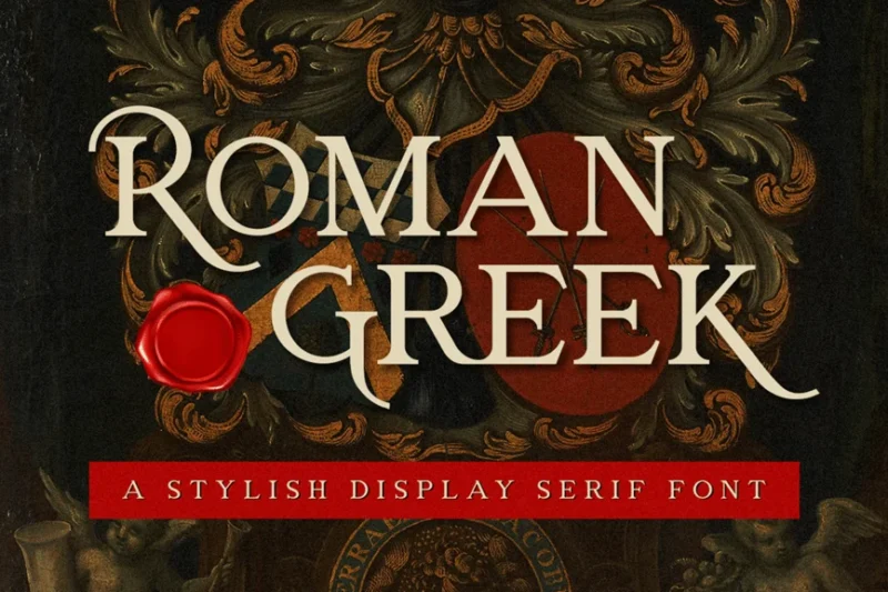
Roman Greek is a display serif font that blends Roman and Greek typographic elements. Its distinctive character makes it ideal for creating impactful headlines and logos with a classical flair.
Vendi
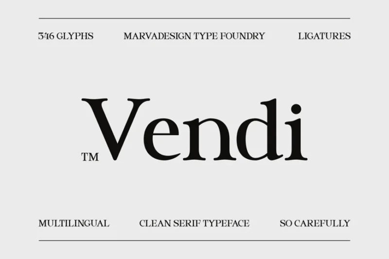
Vendi is a clean serif typeface designed for corporate and professional use. Its crisp lines and balanced proportions make it highly legible and versatile for various business applications.
Histora
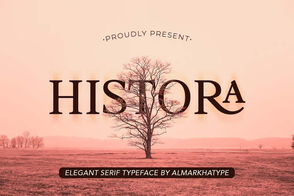
Histora is a classic Roman serif with a vintage, old-timey twist. Its timeless elegance combined with contemporary refinement makes it suitable for a wide range of design projects, from branding to editorial layouts.
Silvania
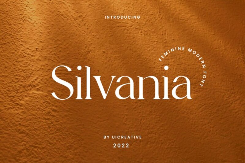
Silvania is a modern serif font with subtle script influences. Its elegant letterforms and balanced proportions make it ideal for high-end branding, editorial design, and sophisticated marketing materials.
Romegrow
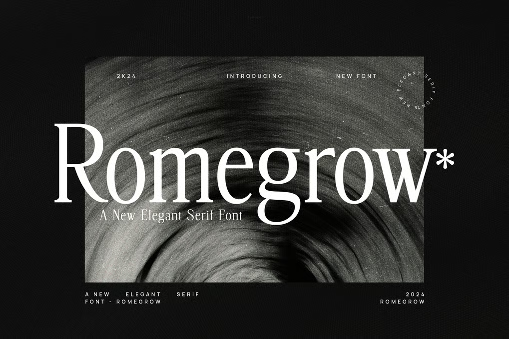
Romegrow is a tall serif font that pairs well with sans-serif typefaces. Its refined character and versatility make it suitable for a wide range of design applications, from branding to editorial layouts.
Regardant
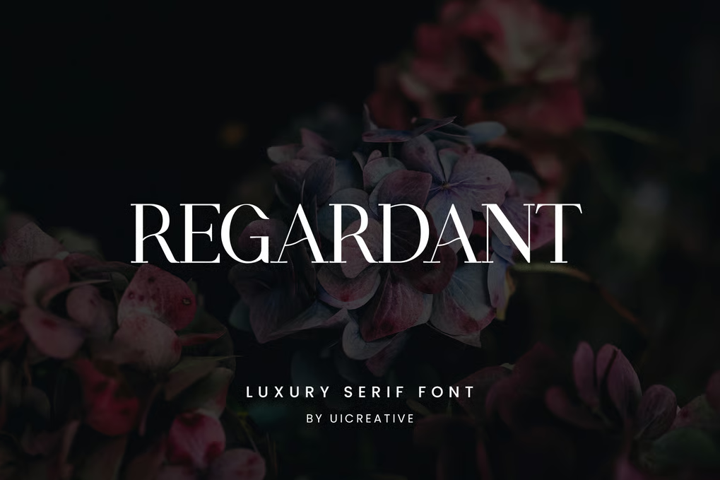
Regardant is a luxury serif font with script-like flourishes. Its sophisticated design and ornate details make it perfect for high-end branding, wedding invitations, and elegant packaging designs.
Romildo
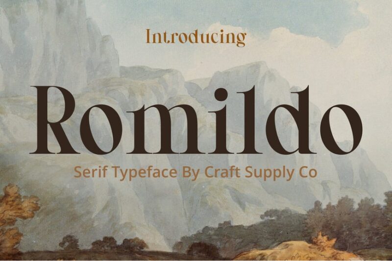
Romildo is a classic serif font with traditional roots. Its timeless design and balanced proportions make it ideal for projects requiring a touch of elegance and sophistication, such as book covers and formal invitations.
Romantis
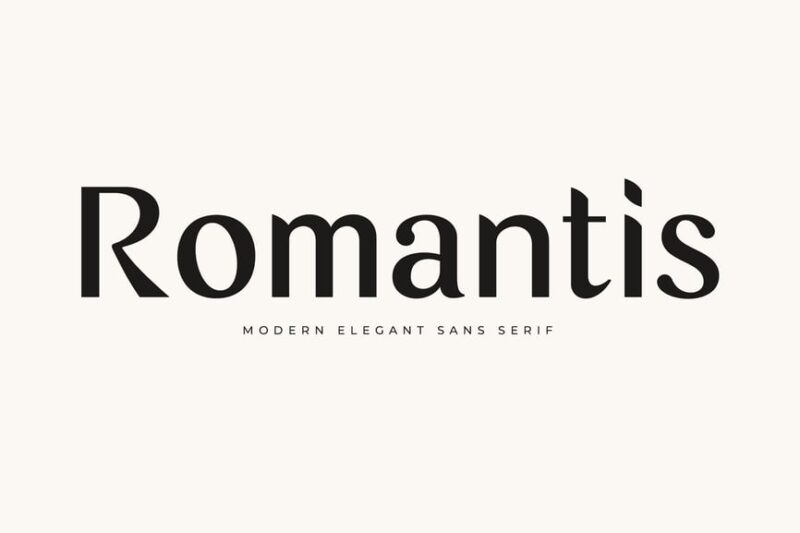
Romantis is a sans-serif font family with a romantic touch. Its clean lines and subtle curves make it versatile for various design applications, from branding to digital interfaces.
Roman Picisan
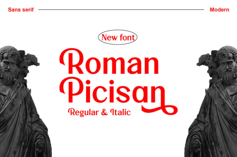
Roman Picisan is a modern sans-serif font with a contemporary edge. Its clean and minimalist design makes it ideal for branding projects, digital interfaces, and modern marketing materials.
Jatravein
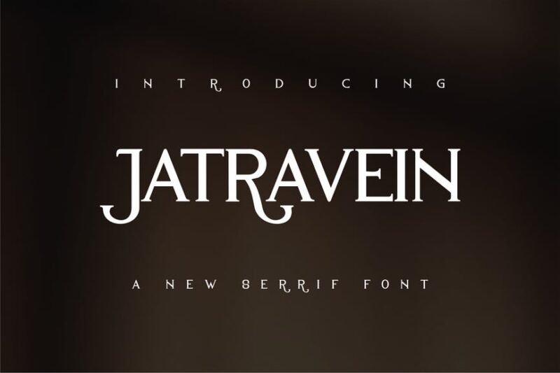
Jatravein is a bold serif font with strong, impactful letterforms. Its powerful presence makes it suitable for headlines, logos, and designs requiring a commanding typographic voice.
Salvager
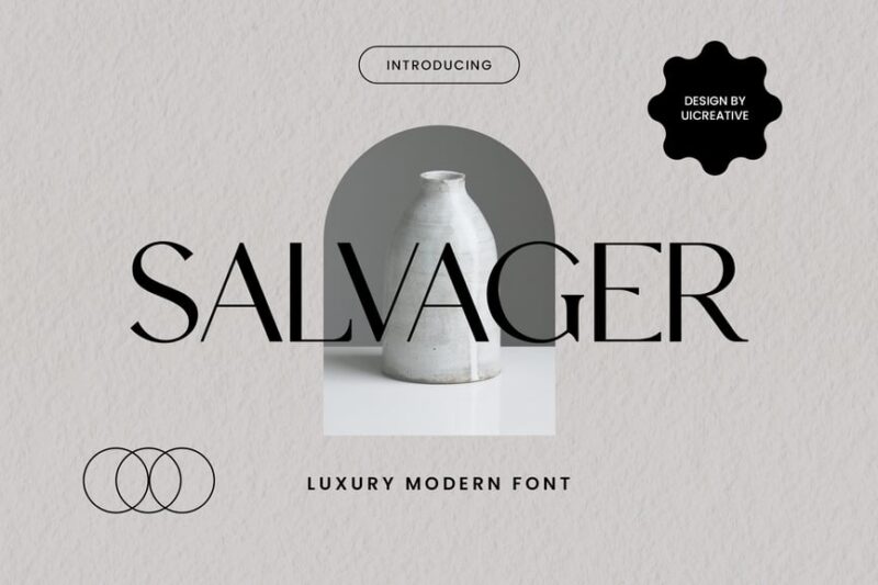
Salvager is a luxury serif font with subtle script influences. Its refined character and elegant details make it perfect for high-end branding, editorial design, and sophisticated packaging.
Andriani
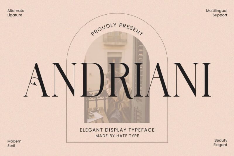
Andriani is an elegant serif font with a touch of sophistication. Its graceful letterforms and balanced proportions make it ideal for luxury branding, wedding stationery, and high-end editorial design.
Bolognia Rough
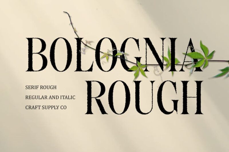
Bolognia Rough is a textured serif font with an Italian-inspired design. Its earthy, rustic character makes it perfect for creating authentic, artisanal branding and packaging designs.
Augustine
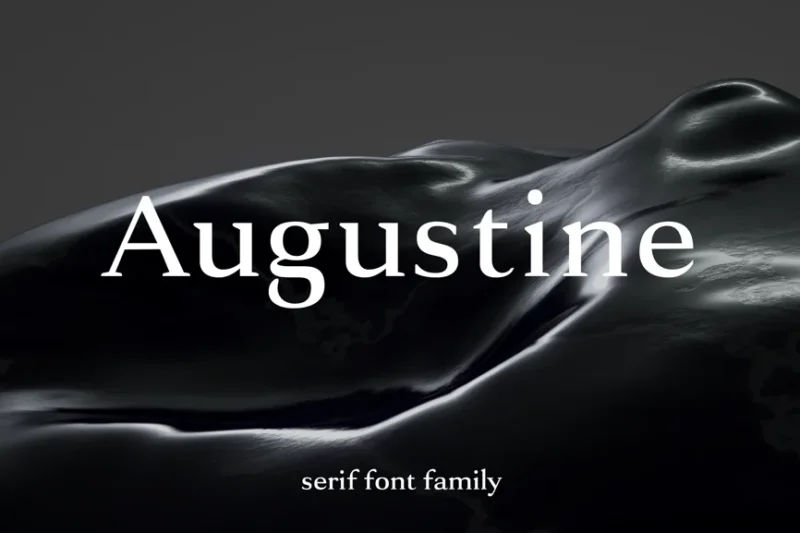
Augustine is a strong serif typeface with Latin and Roman influences. Its bold character and classic structure make it ideal for creating impactful headlines, logos, and designs with a timeless appeal.
Rome Gekors
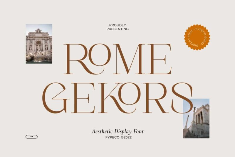
Rome Gekors is an aesthetic display font with a unique blend of Roman influences. Its distinctive letterforms make it perfect for creating eye-catching logos, headlines, and branding materials with a modern twist.
Mythology
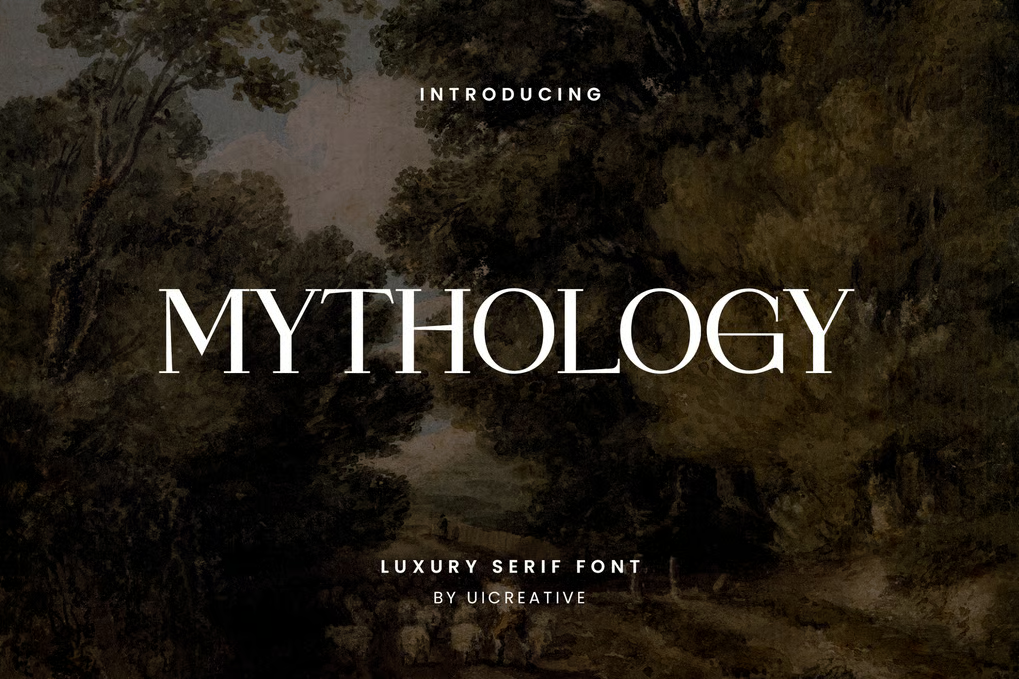
Mythology is a luxury serif font with subtle script elements. Its elegant design and refined details make it ideal for high-end branding, editorial layouts, and sophisticated marketing materials with a touch of classical charm.
What Makes Roman Fonts Feel So Timeless and Authoritative?
Roman fonts derive their commanding presence and classical elegance from several key design characteristics rooted in ancient stone carving traditions:
Carved Stone Inspiration
First and foremost, authentic Roman fonts are based on letterforms that were literally carved into stone. This origin gives them an inherent sense of permanence and gravitas. The letters were designed to be read from a distance and to endure for centuries – qualities that translate beautifully to modern design applications.
The most famous example is Trajan’s Column in Rome, erected in 113 AD, which features some of the most perfectly proportioned Roman letterforms ever created. Many contemporary Roman fonts draw direct inspiration from these ancient inscriptions.
Classical Proportions
Roman fonts follow the mathematical principles that the Romans themselves perfected. The letterforms are based on geometric relationships and golden ratios that create naturally pleasing, harmonious compositions. This mathematical precision gives Roman fonts their sense of order and sophistication.
The capital letters typically feature consistent heights with subtle variations that create visual rhythm, while the proportions between thick and thin strokes follow classical conventions that have influenced typography for over two millennia.
Authoritative Serifs
The distinctive serifs found on Roman fonts aren’t just decorative – they serve both practical and aesthetic purposes. Originally, these serifs helped prevent stone from cracking during the carving process and made letters more legible when carved into hard surfaces.
In modern applications, these serifs lend Roman fonts their authoritative, scholarly appearance. They guide the eye along lines of text while adding that unmistakable classical refinement that speaks of tradition, learning, and institutional authority.
Where Can You Use Roman Fonts?
Roman fonts’ classical heritage and authoritative presence make them versatile choices for numerous design applications where gravitas and tradition are valued:
Academic and Educational Institutions
Roman fonts are natural choices for universities, schools, libraries, and educational organizations. Their scholarly appearance instantly communicates knowledge, tradition, and academic excellence. Many Ivy League institutions use Roman-inspired fonts in their logos and official communications.
Legal and Government Applications
Law firms, courts, government agencies, and official documents benefit from Roman fonts’ authoritative presence. The typefaces convey stability, tradition, and institutional credibility – exactly what these organizations want to project.
Luxury and Premium Branding
High-end brands often employ Roman fonts to communicate exclusivity, heritage, and quality. From luxury fashion houses to premium spirits, Roman typography helps establish that coveted sense of timeless sophistication.
Memorial and Monument Design
Given their origins in stone carving, Roman fonts are perfect for memorial plaques, monuments, and commemorative designs. They carry the weight of history and provide the dignity appropriate for honoring people and events.
Publishing and Editorial
Book covers, magazine mastheads, and editorial designs often benefit from Roman fonts’ readability and classical appeal. They’re particularly effective for historical fiction, academic publications, and literary works.
Corporate Identity
Established corporations, particularly those in traditional industries like banking, insurance, and law, often choose Roman fonts to project stability, trustworthiness, and longevity.
Where to Avoid Roman Fonts
While Roman fonts excel in many contexts, there are situations where their classical formality might not be the best choice:
Modern Tech and Startups
For cutting-edge technology companies or innovative startups, Roman fonts might feel too traditional and conservative. These brands often need typefaces that feel more contemporary and forward-thinking.
Youth-Oriented Brands
Products and services targeting younger demographics might find Roman fonts too formal or old-fashioned. Younger audiences often respond better to more casual, approachable typography.
Casual and Playful Contexts
Birthday party invitations, children’s products, or casual lifestyle brands typically benefit from more relaxed, friendly typefaces rather than the formal dignity of Roman fonts.
How to Choose the Perfect Roman Font
Selecting the ideal Roman font requires careful consideration of several factors that will ensure your typography aligns with your project’s goals:
Consider Your Message
Think about the specific qualities you want to communicate. Seeking gravitas and authority? Look for fonts with strong, bold serifs and classical proportions. Want to convey scholarly elegance? Choose refined Roman fonts with more delicate details and sophisticated character variations.
Evaluate Readability Needs
Consider where and how your text will be read. For body text in lengthy documents, choose Roman fonts optimized for extended reading. For headlines and display use, you can opt for more decorative Roman styles with enhanced character and personality.
Assess Historical Authenticity
Determine how closely you want to adhere to historical accuracy. Some Roman fonts are faithful recreations of ancient inscriptions, while others take creative liberties with classical forms. Choose based on whether historical authenticity or creative interpretation better serves your project.
Test Across Applications
Always test your chosen Roman font across all intended applications – print materials, digital screens, and various sizes. Some Roman fonts that look magnificent in large display sizes may lose their character when used at smaller text sizes.
Fantastic Roman Font Alternatives
While Roman fonts themselves provide classical elegance, several alternative typeface categories can achieve similar effects in different contexts:
Transitional Serifs
Fonts like Times Roman or Georgia bridge classical and modern sensibilities. They maintain some Roman characteristics while feeling more contemporary and approachable for modern applications.
Inscriptional Fonts
These typefaces are specifically designed to mimic carved lettering but may draw from other historical periods beyond ancient Rome. They can provide similar gravitas with slightly different historical associations.
Classical Sans Serifs
Some sans serif fonts, like Optima, are inspired by classical Roman proportions but eliminate the serifs for a cleaner, more modern appearance while retaining the dignified character.
Common Roman Font Questions
Let’s address some frequently asked questions about Roman fonts:
What makes a font “Roman”?
Roman fonts are characterized by their inspiration from ancient Roman stone inscriptions, featuring classical proportions, distinctive serifs, and letterforms based on carved capital letters from monuments like Trajan’s Column.
Are Roman fonts only uppercase?
While many Roman fonts focus on capital letters (since ancient Roman inscriptions were primarily carved in capitals), modern Roman fonts typically include full character sets with uppercase, lowercase, numbers, and punctuation marks.
What’s the difference between Roman and serif fonts?
All Roman fonts are serif fonts, but not all serif fonts are Roman fonts. Roman fonts specifically reference ancient Roman lettering traditions, while serif fonts encompass a much broader category of typefaces with serifs from various historical periods and styles.
Can Roman fonts work for modern brands?
Absolutely! Many contemporary brands successfully use Roman fonts to convey heritage, quality, and sophistication. The key is choosing Roman fonts that balance classical elegance with contemporary readability and relevance.
Roman fonts offer designers a direct connection to one of history’s greatest civilizations while providing the gravitas and sophistication that many modern projects require. Their enduring appeal lies in their perfect marriage of mathematical precision and artistic beauty – qualities that the Romans mastered over two thousand years ago.
So consider incorporating some of these magnificent Roman fonts into your next design project. Used thoughtfully, they can elevate your work with the timeless authority and classical elegance that only comes from typography rooted in the eternal city itself.
Have favorite Roman fonts not mentioned here? I’d love to hear about them in the comments below!