In this article:
- The Most Authentic German Fonts of 2026
- A Journey Through German Typography History
- What Makes German Fonts So Distinctive?
- Modern Applications for German Fonts
- Choosing the Right German Font for Your Project
- The Art of Pairing German Fonts
- Cultural Sensitivity and German Typography
- The Future of German Typography
- Common German Font Questions Answered
- Bringing German Typography to Life
I’ve always been fascinated by the rich history and distinctive character of German fonts. There’s something absolutely captivating about the way Germanic typography tells stories of centuries-old traditions while adapting to modern design needs.
German fonts aren’t just letterforms – they’re cultural artifacts that carry the weight of history, from medieval manuscripts to modern Bauhaus minimalism. Whether you’re drawn to the ornate beauty of Blackletter scripts or the clean precision of contemporary German design, these typefaces offer a unique blend of tradition and innovation that can elevate any project.
In this comprehensive guide, we’ll explore the fascinating world of German fonts, diving deep into their historical significance, modern applications, and how you can incorporate these distinctive typefaces into your own design work.
Cultural Note: This exploration celebrates the rich typographic heritage of German design traditions. We approach these fonts with respect for their cultural significance and historical context, recognizing that typography is deeply intertwined with cultural identity and should be used thoughtfully and appropriately.
The Most Authentic German Fonts of 2026
Let me walk you through my carefully curated selection of the best German fonts available today. Each of these typefaces captures something essential about Germanic design philosophy:
Germans – Techno & Futuristic Font
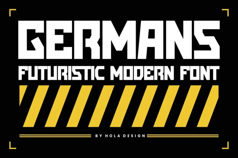
Germans is a cutting-edge blocky font that embodies a futuristic and technological aesthetic. Its clean lines and modern geometry make it perfect for sci-fi themed designs and tech-oriented logos, offering a sleek and forward-thinking appearance.
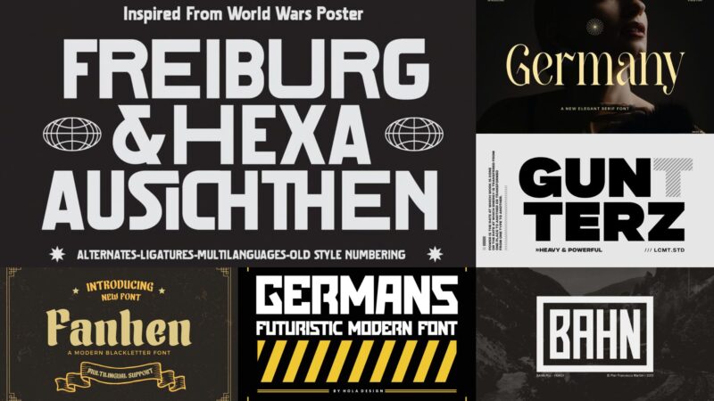
Fanhen
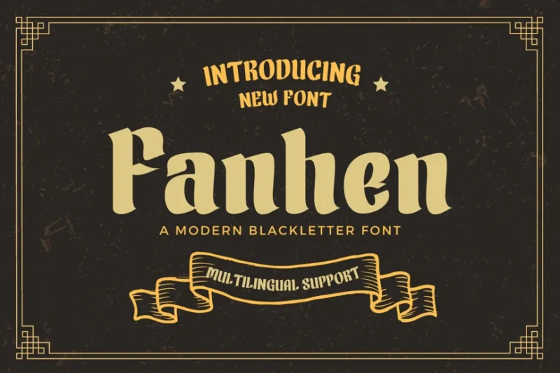
Fanhen is a calligraphy font that excels in creating eye-catching labels and badges. Its unique character shapes and ornamental details make it ideal for designs that require a distinctive and memorable touch, perfect for branding and packaging projects.

Get 300+ Fonts for FREE
Enter your email to download our 100% free "Font Lover's Bundle". For commercial & personal use. No royalties. No fees. No attribution. 100% free to use anywhere.
Cd Freiburg
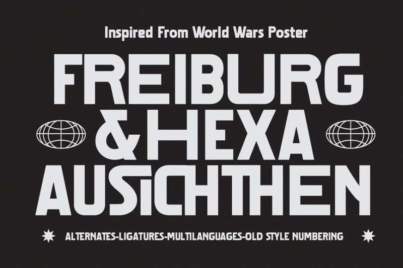
Cd Freiburg is a sans-serif font that captures the essence of 1930s typography with a vintage flair. Its clean lines combined with subtle retro elements make it versatile for both modern and nostalgic designs, offering a timeless appeal.
BAHN Pro – FAMILY
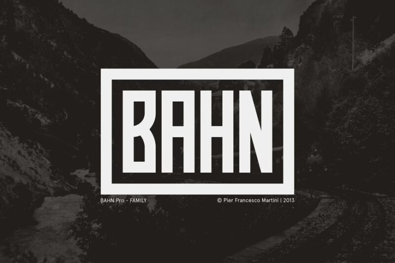
BAHN Pro is a sans-serif font family that blends Mexican and industrial influences. Its robust character set and varied weights make it highly versatile, suitable for a wide range of design projects from branding to editorial layouts.
Hamburg
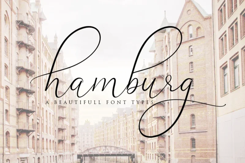
Hamburg is a script and handwritten cursive font that exudes an organic, natural feel. Its fluid strokes and authentic handcrafted appearance make it excellent for branding projects that require a personal touch or a sense of artisanal quality.
Schultheiss – Vintage Decorative Typeface
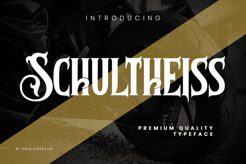
Schultheiss is a serif, decorative typeface that combines blackletter elements with modern vintage aesthetics. Its ornate characters and historical references make it perfect for designs requiring a touch of elegance and old-world charm with a contemporary twist.
Germany Elegant Serif Font
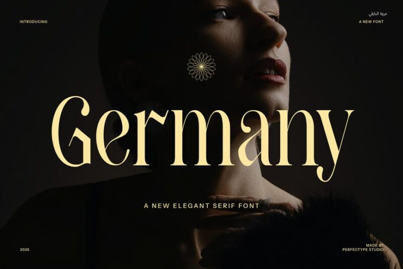
Germany Elegant is a serif font that combines German precision with French elegance. Its refined letterforms and graceful serifs make it ideal for high-end branding, luxury packaging, and sophisticated editorial designs.
Berlisch
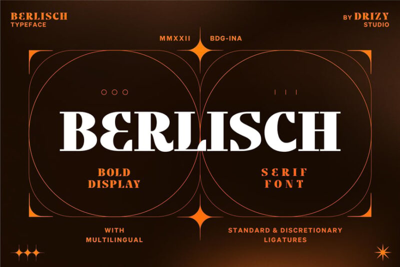
Berlisch is a distinctive serif font with a unique character all its own. Its balanced mix of classic serif elements and modern twists make it versatile for various design applications, from book covers to corporate branding.
Freich
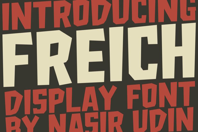
Freich is a sans-serif font that combines the boldness of war-inspired typography with an electric, energetic feel. Its strong, impactful characters make it suitable for headlines, posters, and designs that need to convey power and dynamism.
Munich
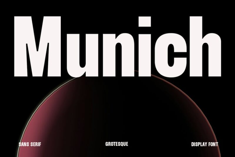
Munich is a tall, bold sans-serif font that commands attention. Its elongated characters and strong presence make it ideal for headlines, logos, and designs that need to make a big impact in limited space.
Schmalfette
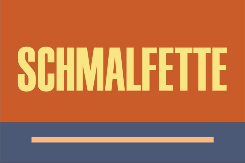
Schmalfette is a thick, block-style sans-serif font that exudes strength and stability. Its bold, condensed characters, similar to Impact, make it perfect for impactful headlines, signage, and designs that require a strong, authoritative presence.
Wolfgang Krauss
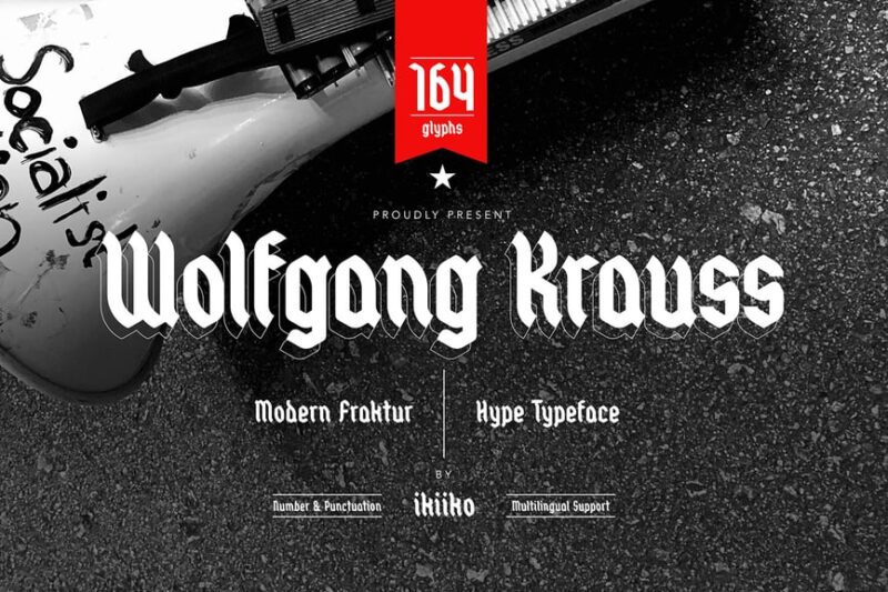
Wolfgang Krauss is a serif font that incorporates elements of Fraktur, giving it a distinctive display quality. Its blend of traditional and modern aesthetics makes it suitable for projects requiring a touch of historical elegance with contemporary appeal.
Bruder
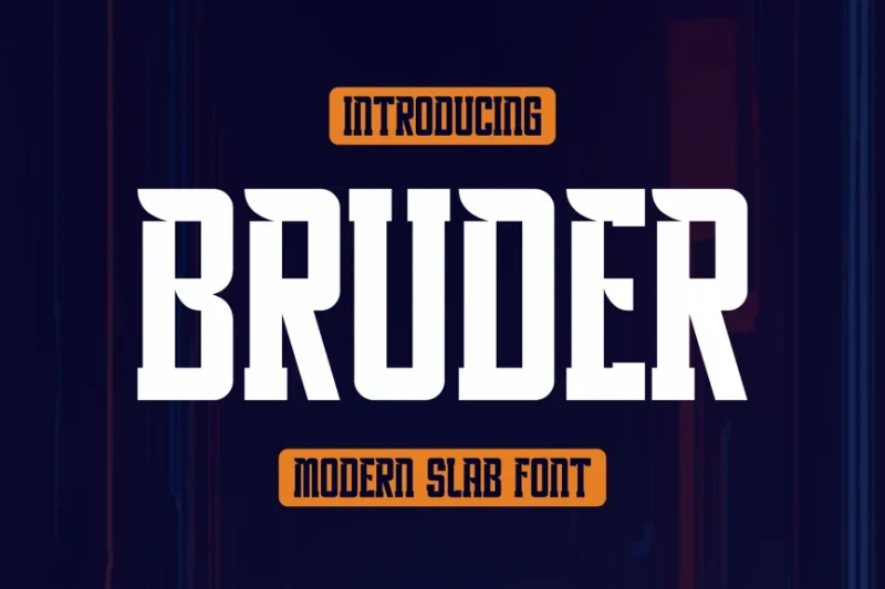
Bruder is a serif font designed with food and restaurant branding in mind. Its friendly, approachable character shapes make it particularly suitable for burger joints and casual dining establishments, adding a touch of warmth to logos and menus.
Gunterz
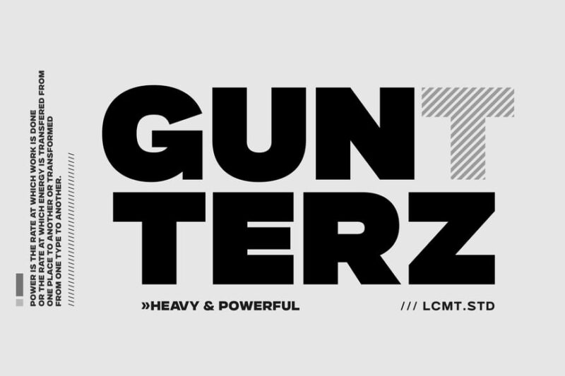
Gunterz is a sans-serif font that combines blackletter influences with a modern, square aesthetic. Its unique fusion of styles makes it stand out in designs requiring a bold, edgy look while maintaining readability and contemporary appeal.
Berlin | Modern Sans
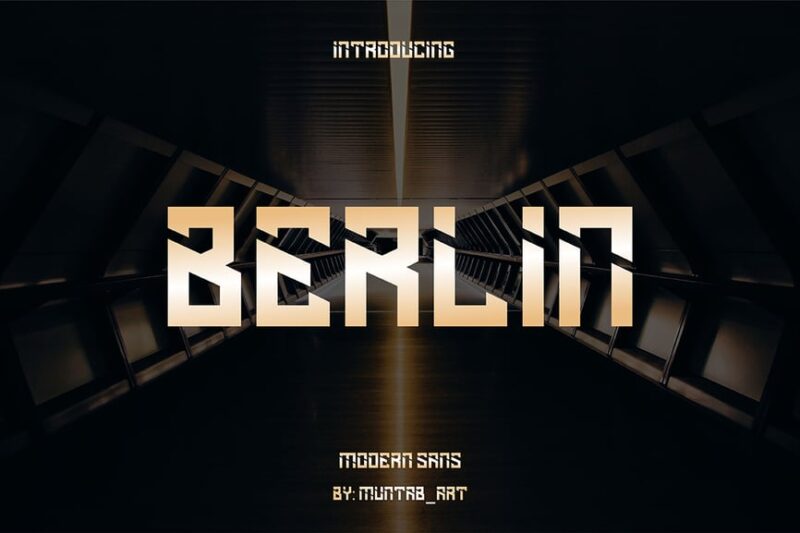
Berlin | Modern Sans is a versatile font family that includes both sans-serif and serif variations. Its clean, contemporary design makes it suitable for a wide range of modern applications, from digital interfaces to print media, offering flexibility and consistency across different design needs.
Gekomach Font
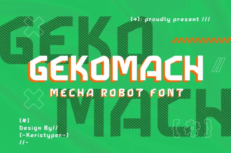
Gekomach is a sans-serif font with a strong techno and robotic influence. Its futuristic character shapes and geometric construction make it ideal for projects related to technology, science fiction, or any design requiring a cutting-edge, mechanical aesthetic.
Mische – Retro Display Font
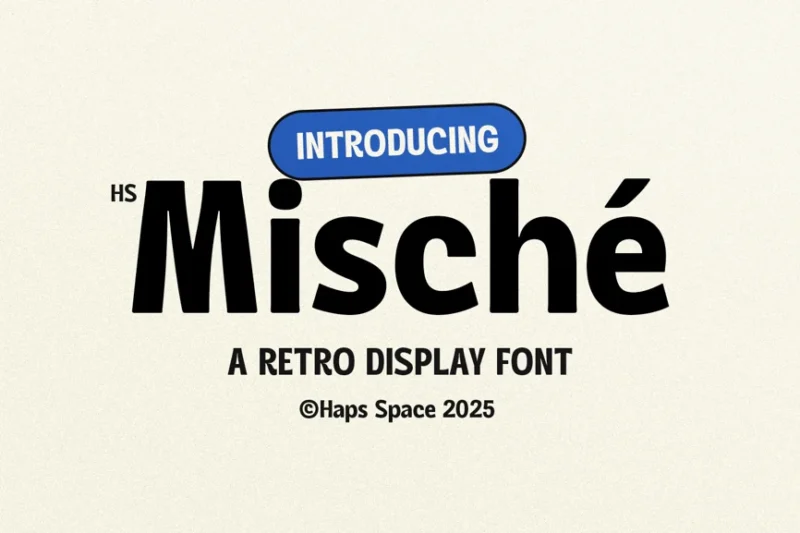
Mische is a sans-serif display font that captures the essence of 90s design. Its retro-inspired characters and playful geometry make it perfect for nostalgic projects, vintage-themed designs, or any work aiming to evoke the spirit of the 1990s.
Volling – Modern Condensed Sans Serif
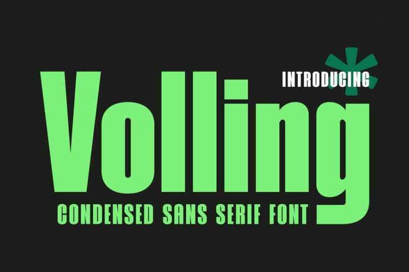
Volling is a modern, condensed sans-serif font that combines neue typography principles with retro influences. Its sleek, space-efficient design makes it excellent for headlines, posters, and designs where impactful text needs to fit in limited space.
Neubahn
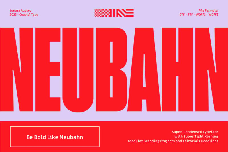
Neubahn is a sans-serif font inspired by Bauhaus design principles. Its clean, tall type shapes and balanced proportions make it ideal for logo design and modern branding projects, offering a timeless yet contemporary appeal.
Gerline Rough
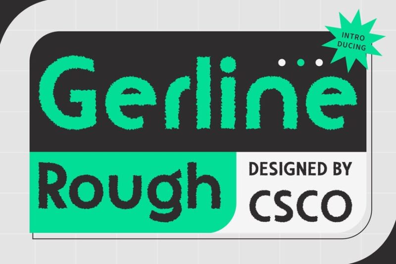
Gerline Rough is a sans-serif font with a textured, stone-like appearance. Its rugged character shapes and rough edges make it perfect for designs related to outdoor adventures, natural products, or any project requiring a raw, organic feel.
Brontoburger
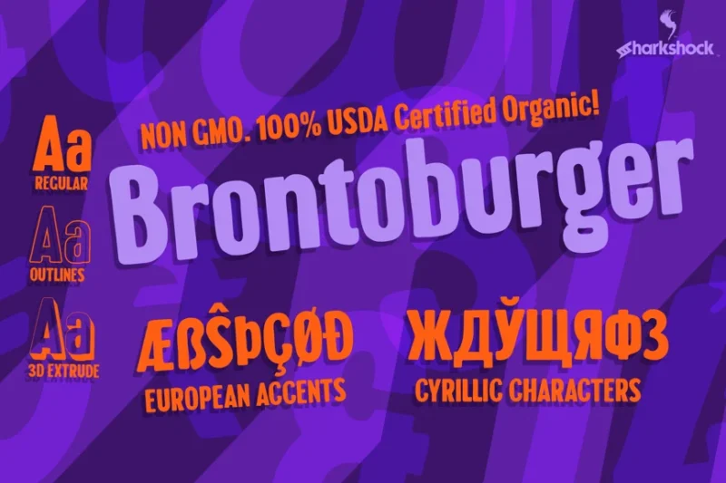
Brontoburger is a playful, bubbly sans-serif font that exudes fun and energy. Its rounded, friendly character shapes make it ideal for children’s products, casual dining establishments, or any design project aiming for a lighthearted, approachable feel.
Gerfard
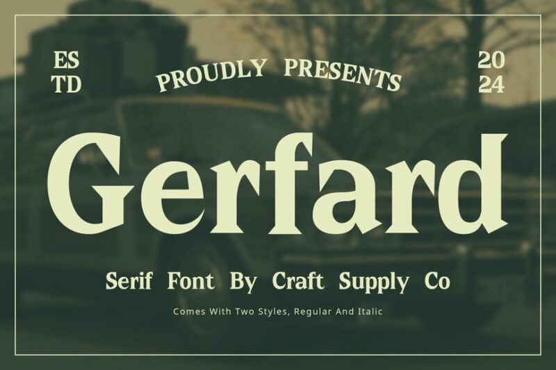
Gerfard is a serif font designed with food branding in mind, particularly suitable for burger restaurants. Its bold, appetizing character shapes and subtle serifs make it perfect for menu designs, food packaging, and restaurant logos that aim to evoke a sense of quality and flavor.
Glinken – Modern Condensed Sans Serif
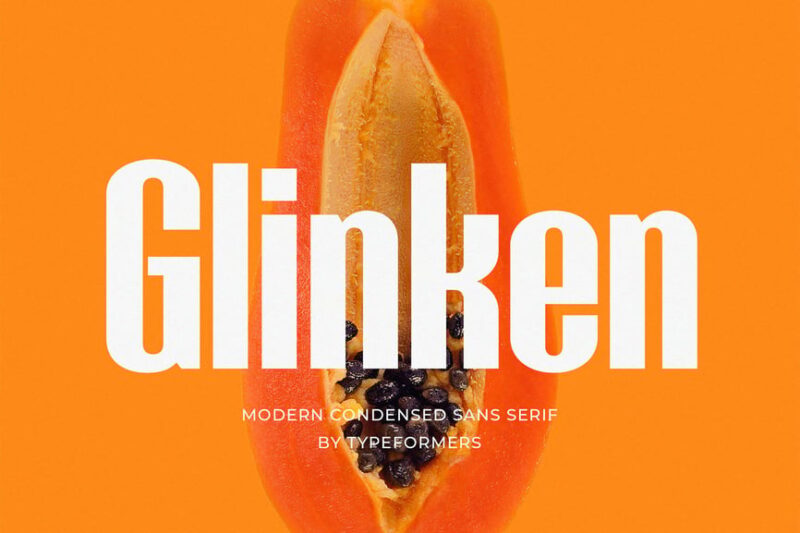
Glinken is a modern, condensed sans-serif font inspired by Swiss typography and neue design principles. Its clean, efficient character shapes make it excellent for contemporary branding, signage, and designs requiring a sleek, professional appearance.
Mensch
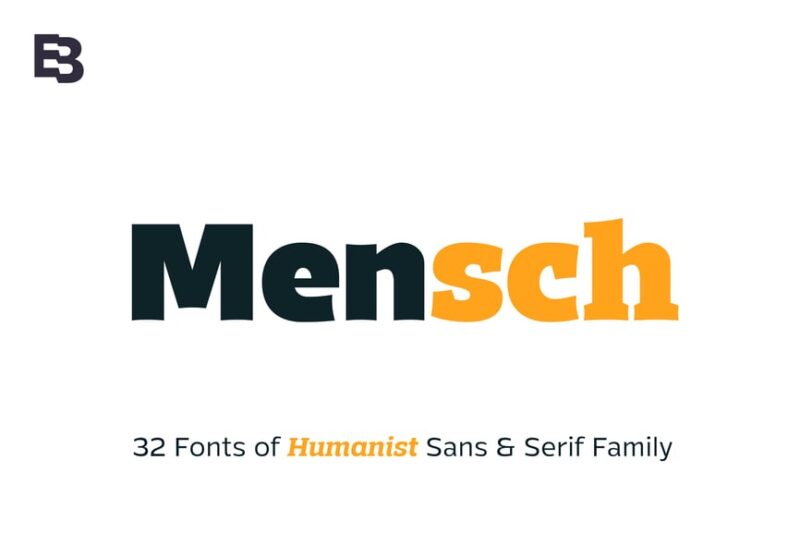
Mensch is a versatile font family that includes both serif and sans-serif variations. Its formal yet modern design makes it suitable for a wide range of applications, from corporate communications to editorial layouts, offering a balanced blend of tradition and contemporary style.
Hanserd
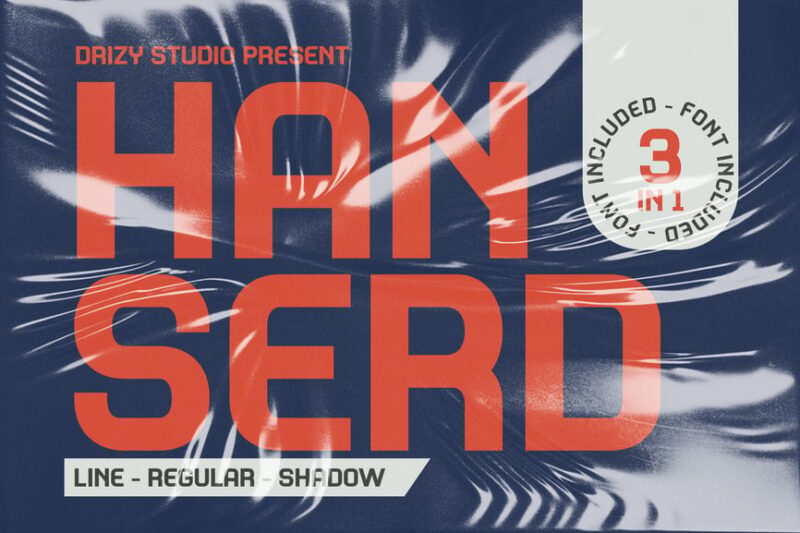
Hanserd is an expanded sans-serif font with a hybrid design approach. Its unique blend of traditional and modern elements makes it stand out in branding projects, offering a distinctive look that’s both familiar and fresh.
Schindler
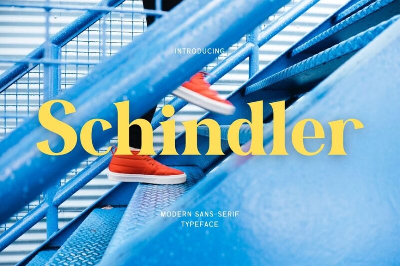
Schindler is a serif typeface that balances classic elegance with modern sensibilities. Its well-crafted letterforms make it suitable for a variety of applications, from book typography to branding projects that require a touch of sophistication.
Morgenlicht
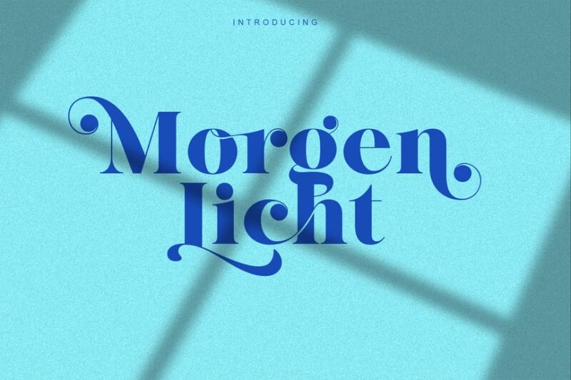
Morgenlicht is a serif font with a unique character all its own. Its distinctive letterforms and balanced proportions make it ideal for designs that require a touch of individuality while maintaining readability and elegance.
Mubeng Banter
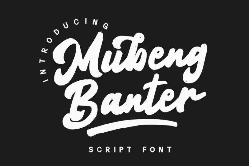
Mubeng Banter is a script and marker font that combines signature-like fluidity with a tropical vibe. Its casual, freeflowing style makes it perfect for designs related to beach resorts, summer events, or any project requiring a relaxed, vacation-like atmosphere.
Künzler – Condensed Handwritten Font
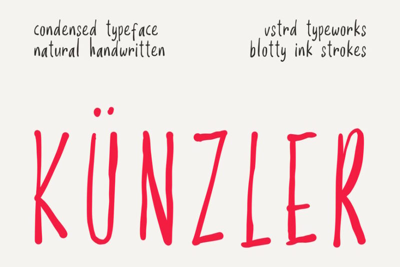
Künzler is a condensed pencil-thin font that mimics the look of thin crayon strokes. Its delicate, personal style makes it ideal for designs requiring a human touch, such as greeting cards, personal branding, or artistic projects that aim to convey authenticity and creativity.
A Journey Through German Typography History
Understanding German fonts means understanding the evolution of typography itself. Germany has been at the forefront of typographic innovation for centuries, from Gutenberg’s revolutionary printing press to the groundbreaking Bauhaus movement.
The story begins in the 15th century when Johannes Gutenberg developed movable type in Mainz. His Gothic typeface, based on the handwritten scripts of medieval scribes, became the foundation for what we now recognize as distinctly Germanic typography. This early influence established Germany as a powerhouse in the world of type design.
Fast-forward to the 20th century, and German typography took another revolutionary turn with the Bauhaus school. Designers like Herbert Bayer and Paul Renner challenged traditional notions of letterforms, creating clean, geometric sans-serif fonts that prioritized function and clarity. This modernist approach gave birth to iconic typefaces like Futura, which remains one of the most influential fonts in design history.
The contrast between ornate Blackletter traditions and minimalist Bauhaus principles perfectly captures the duality of German typography – a respect for craftsmanship and heritage balanced with innovation and forward-thinking design.
What Makes German Fonts So Distinctive?
German typography has several defining characteristics that set it apart from other typographic traditions:
Precision and Craftsmanship German fonts reflect the country’s reputation for meticulous attention to detail and engineering excellence. Whether it’s the precise curves of a Bauhaus geometric font or the intricate flourishes of a Blackletter script, German typefaces demonstrate an obsession with perfect execution.
Historical Weight Many German fonts carry the visual DNA of centuries-old manuscript traditions. Blackletter fonts, in particular, evoke the gravitas of medieval documents and religious texts. This historical connection gives German typography a sense of authority and permanence.
Functional Beauty The Bauhaus principle of “form follows function” is deeply embedded in German design philosophy. Even decorative German fonts serve a clear purpose, whether it’s conveying tradition, authority, or modernity. There’s rarely any ornamentation without intention.
Cultural Significance German fonts are deeply intertwined with national identity and cultural expression. From beer labels to architectural signage, these typefaces help define the visual landscape of German-speaking regions.
Modern Applications for German Fonts
German fonts have found new life in contemporary design, far beyond their traditional applications. Here’s where they shine in 2026:
Branding and Identity Companies seeking to convey heritage, craftsmanship, or precision often turn to German-inspired typography. Luxury brands, craft breweries, and artisanal products particularly benefit from the authenticity these fonts provide.
Editorial Design German fonts excel in magazine layouts, book design, and digital publications where readability meets character. The clean lines of Bauhaus-inspired fonts work beautifully for modern editorial applications.
Event Design Oktoberfest celebrations, cultural festivals, and heritage events naturally call for authentic German typography. These fonts help create immersive experiences that transport audiences to the heart of Germanic culture.
Packaging Design From premium food products to craft beverages, German fonts communicate quality and tradition. They’re particularly effective for products wanting to emphasize their artisanal or premium nature.
Digital Interfaces Modern interpretations of German fonts translate beautifully to screens, bringing warmth and personality to websites and apps that might otherwise feel sterile.
Choosing the Right German Font for Your Project
Selecting the perfect German font requires understanding both your project’s goals and the cultural context of your audience:
Consider Your Message Are you trying to convey tradition and heritage? A classic Blackletter font might be perfect. Looking for modern sophistication? A Bauhaus-inspired geometric might be your answer.
Respect Cultural Context German fonts carry cultural weight, so use them thoughtfully. Ensure your application respects the traditions these typefaces represent, especially when using historically significant styles like Fraktur.
Think About Readability While ornate German fonts are beautiful, they can be challenging to read in large blocks of text. Reserve decorative styles for headlines and accents, pairing them with more readable fonts for body text.
Test Across Media German fonts that look stunning in print might not translate well to digital screens, and vice versa. Always test your chosen typeface across all intended applications.
The Art of Pairing German Fonts
Creating harmonious font combinations with German typography requires a delicate balance:
Contrast is Key Pair ornate Blackletter headlines with clean, modern sans-serifs for body text. This creates visual hierarchy while maintaining readability.
Stay Within the Family Many German font families include multiple weights and styles. Using different variations of the same typeface often creates more cohesive designs than mixing completely different fonts.
Consider Historical Context When combining fonts, think about their historical periods. Pairing a medieval-inspired Blackletter with a futuristic tech font might create unwanted visual tension.
Cultural Sensitivity and German Typography
When working with German fonts, it’s essential to approach them with cultural awareness and sensitivity:
Understand Historical Context Some German font styles have complex historical associations. Research the background of fonts you’re considering, especially Blackletter styles that have been misappropriated in the past.
Use Appropriately Ensure your use of German fonts is respectful and appropriate to the content and context. These typefaces represent real cultural traditions and should be treated with corresponding respect.
Avoid Stereotypes While German fonts can effectively communicate certain qualities, avoid using them in ways that reinforce negative stereotypes or oversimplified cultural representations.
The Future of German Typography
German typography continues to evolve in 2026, with contemporary designers building on traditional foundations while pushing boundaries:
Digital Innovation Modern German type designers are creating fonts specifically optimized for digital environments, maintaining the character of traditional German typography while ensuring excellent screen readability.
Cultural Revival There’s a renewed interest in traditional German letterforms, with designers creating contemporary interpretations that honor historical precedents while feeling fresh and relevant.
Global Influence German design principles continue to influence typography worldwide, with the clean functionalism of Bauhaus design appearing in fonts created by designers around the globe.
Common German Font Questions Answered
What’s the difference between Gothic and Blackletter fonts? Gothic fonts refer to the broader category of medieval-style typefaces, while Blackletter specifically refers to the Germanic variations of Gothic scripts. All Blackletter fonts are Gothic, but not all Gothic fonts are Blackletter.
Are German fonts hard to read? Traditional Blackletter fonts can be challenging for modern readers, but many contemporary German fonts prioritize readability while maintaining distinctive character. The key is choosing the right font for your specific application.
Can I use German fonts for non-German content? Absolutely! German fonts can enhance designs regardless of language, as long as they’re used appropriately and respectfully. Many German fonts work beautifully for English text and other languages.
What’s the most versatile German font? Fonts inspired by Bauhaus principles, like geometric sans-serifs, tend to be the most versatile, working well across various applications from digital interfaces to print materials.
Bringing German Typography to Life
German fonts offer designers a unique opportunity to tap into centuries of typographic tradition while creating fresh, contemporary designs. Whether you’re drawn to the ornate beauty of traditional Blackletter scripts or the clean precision of Bauhaus-inspired geometric fonts, Germanic typography provides tools for creating designs that are both historically grounded and thoroughly modern.
The key to working successfully with German fonts lies in understanding their cultural significance and using them thoughtfully. These aren’t just pretty letterforms – they’re carriers of cultural meaning and historical weight that deserve respect and careful consideration.
As we move forward in 2026, German typography continues to evolve, offering exciting possibilities for designers willing to explore this rich typographic tradition. Whether you’re creating a brand identity, designing a publication, or crafting a digital experience, German fonts provide a distinctive voice that can set your work apart while honoring the incredible legacy of Germanic design.
So go ahead – explore the world of German typography. Let these remarkable fonts tell their stories through your designs, and discover how the precision, craftsmanship, and cultural depth of German letterforms can elevate your creative work to new heights.
Remember: Typography is a bridge between cultures, and German fonts offer a particularly rich crossing point between tradition and innovation, heritage and modernity. Use them wisely, respectfully, and with appreciation for the centuries of craftsmanship they represent.