In this article:
- 29 Perfect Alternatives to Times New Roman
- Things to Consider When Choosing a Times New Roman Alternative
- Why Use Times New Roman Alternatives?
- How to Use Times New Roman-Like Fonts Effectively
- Times New Roman – A Brief History
- What Really Made Times New Roman Famous?
- Frequently Asked Questions
- Wrapping Up
Times New Roman – timeless, dependable, and probably sitting on every computer right now. But what if you’re craving something with that same classic elegance, yet with a fresh modern twist?
For designers and content creators seeking fonts like Times New Roman, you’ve landed in exactly the right spot. We’ll explore what made this typeface a household name, dive into its rich history, and introduce you to an incredible collection of alternatives that capture its essence while bringing something new to the table.
From premium powerhouses to free gems, we’ll cover typefaces that can deliver the same professional gravitas as Times New Roman – sometimes even better. Ready to discover serif fonts that can elevate your body text, headlines, and scholarly projects? Let’s jump right in.
29 Perfect Alternatives to Times New Roman
There are countless alternatives to Times New Roman floating around, but I’ve carefully curated a collection of both premium and free fonts that can genuinely replace this classic workhorse. Let’s explore what makes each one special!
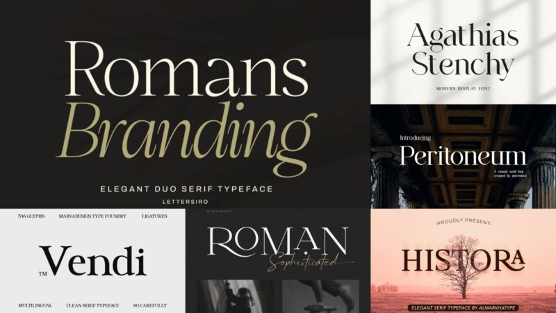
Romans Branding – Elegant Serif
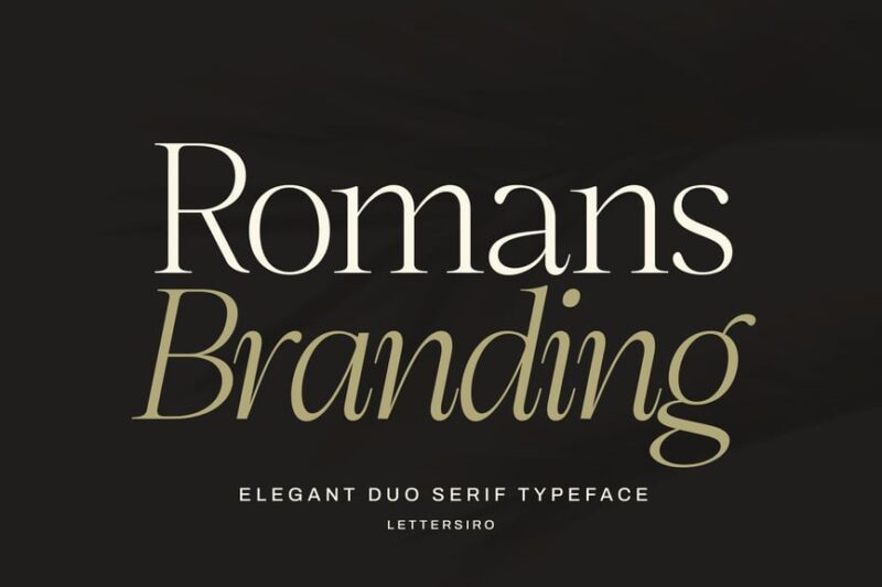
Romans Branding is a luxurious and bold serif typeface perfect for high-end branding projects. Its elegant curves and strong character strokes exude sophistication, making it suitable for luxury brands and upscale marketing materials.
Media Times 2.0
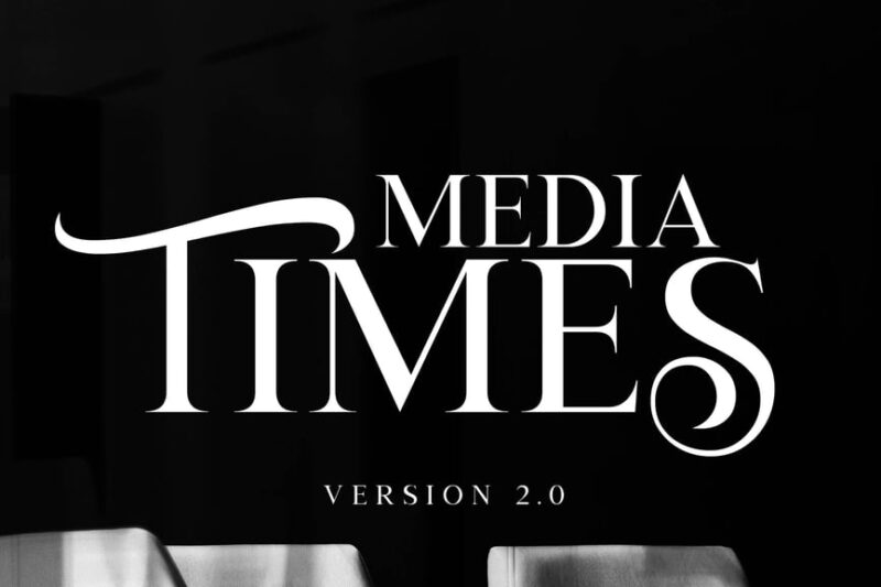
Media Times 2.0 is a refined serif font designed for corporate and branding applications. Its clean lines and professional appearance make it ideal for logos and official communications, striking a balance between tradition and modernity.
Media Times
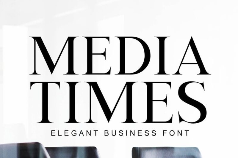
Media Times is a modern serif font that caters to corporate and media-related design needs. Its contemporary styling combined with classic serif elements makes it versatile for both digital and print applications in professional settings.

Get 300+ Fonts for FREE
Enter your email to download our 100% free "Font Lover's Bundle". For commercial & personal use. No royalties. No fees. No attribution. 100% free to use anywhere.
Vendi – Clean Serif Typeface
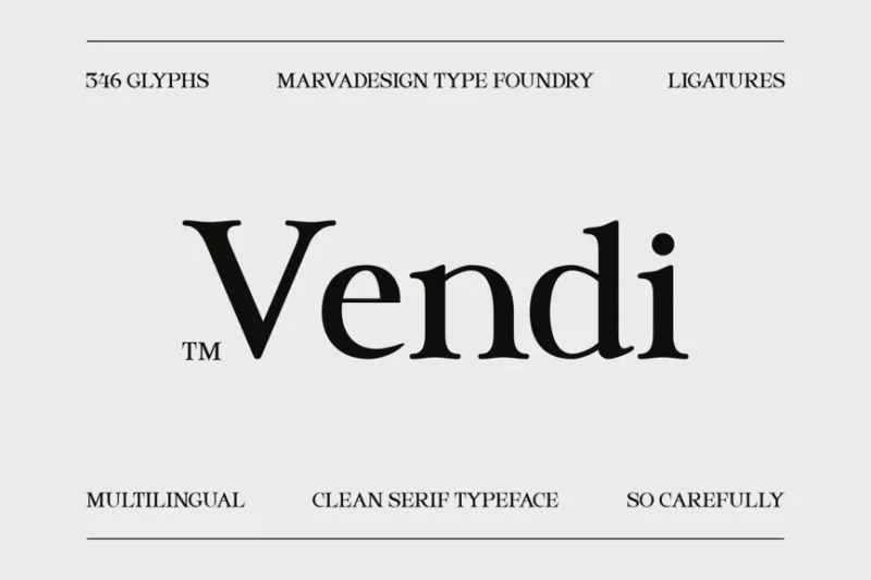
Vendi is a clean and crisp serif typeface designed for corporate use. Its minimalist approach to serif design ensures excellent readability while maintaining a professional and contemporary aesthetic, suitable for various business applications.
Bello
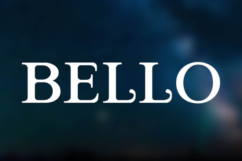
Bello is a sophisticated serif font tailored for corporate environments. Its refined character shapes and balanced proportions make it an excellent choice for professional documents, presentations, and branding materials that require a touch of elegance.
Earning
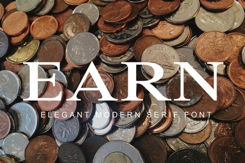
Earning is a professional serif font designed with corporate and financial sectors in mind. Its sturdy letterforms and clear design convey reliability and expertise, making it ideal for business reports, financial documents, and professional communications.
Amsterdam Serif – Luxury Business Font
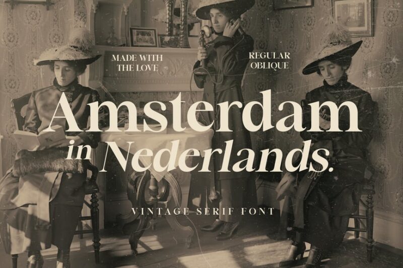
Amsterdam Serif is a luxurious business font that exudes sophistication and prestige. Its refined serifs and elegant proportions make it perfect for high-end branding, luxury product packaging, and upscale marketing materials targeting discerning audiences.
Korbiya
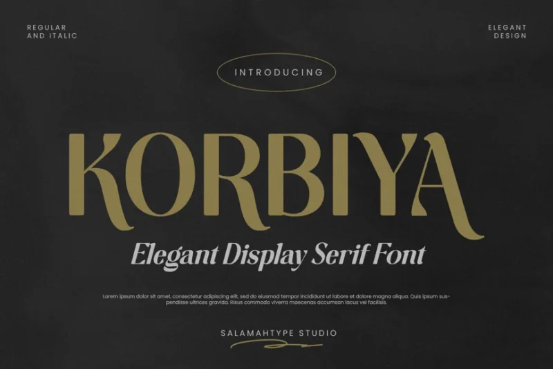
Korbiya is a modern serif font with a cultural twist. Its unique character design blends contemporary aesthetics with subtle cultural influences, making it suitable for projects that require a fresh, globally-inspired typographic approach.
Modern Font
This Modern Font is a sans-serif typeface that embodies contemporary design principles. Its clean lines and minimalist style make it perfect for luxury modern branding, digital interfaces, and cutting-edge design projects that require a sleek, forward-thinking aesthetic.
Polluxie Feminine Serif Font
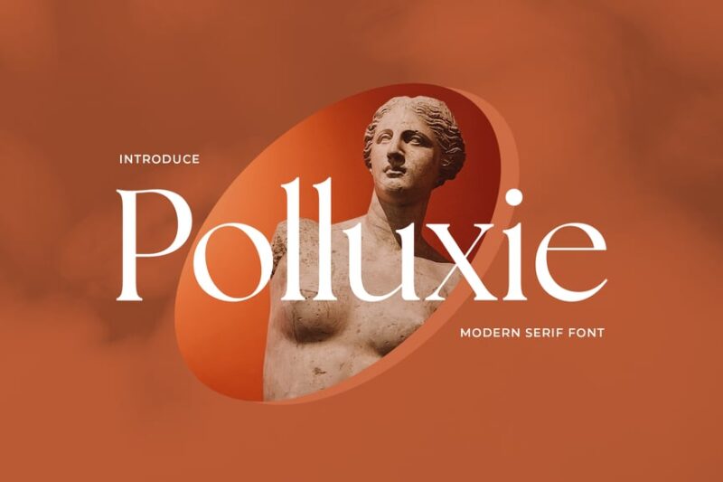
Polluxie is a feminine serif font with a nod to Roman and ancient typography. Its delicate serifs and graceful curves give it a soft, elegant appearance, ideal for projects that require a touch of classical beauty with a feminine flair.
Modern Font
This Modern Font is a serif typeface designed for contemporary logos and branding. It combines classic serif elements with modern proportions and clean lines, making it versatile for both traditional and forward-thinking design projects.
The Anchor
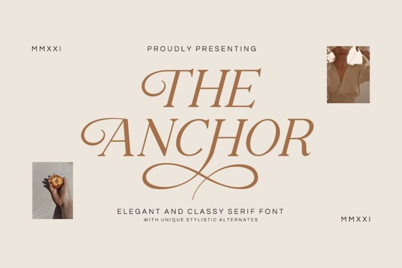
The Anchor is a serif font tailored for real estate and contemporary design needs. Its solid structure and refined details convey stability and modernity, making it an excellent choice for property branding, architectural firms, and modern business identities.
Bestick
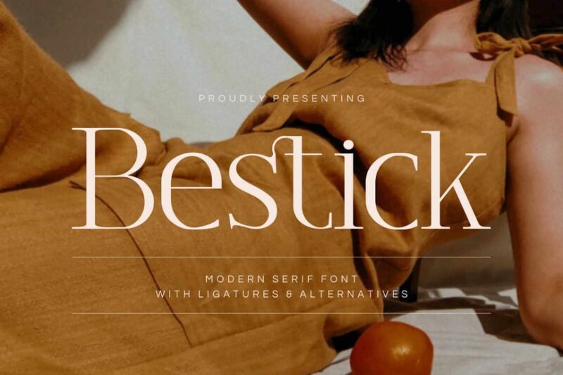
Bestick is a modern serif font designed with logos in mind. Its unique character shapes and balanced proportions make it stand out in branding projects, offering a fresh take on serif typography for contemporary design applications.
Sabira
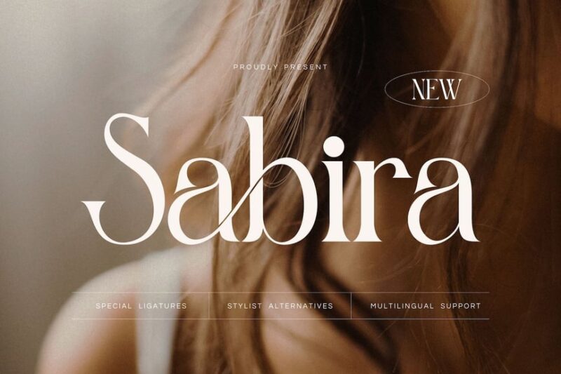
Sabira is a modern serif font that excels in logo design. Its distinctive serifs and carefully crafted letterforms create a memorable impression, making it ideal for brand identities that require a blend of tradition and contemporary style.
Modern – Colaste
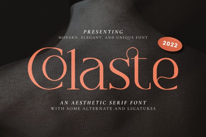
Modern – Colaste is a serif font designed for corporate logos and branding. Its sleek lines and modern interpretation of serif details make it a versatile choice for businesses looking to project a contemporary yet established image.
Merville
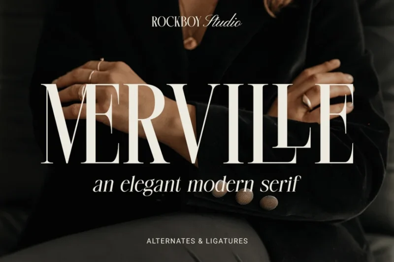
Merville is a serif font that shines in watermark applications. Its elegant serifs and balanced character design make it perfect for adding a sophisticated touch to images, documents, or branding materials that require a subtle yet refined typographic element.
Modern Font
This Modern Font is a serif typeface with decorative elements, designed for contemporary projects. Its unique blend of modern aesthetics and ornamental details makes it suitable for creative designs that require a distinctive and stylish typographic approach.
Moifate
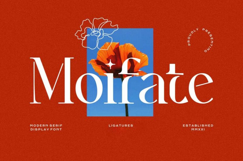
Moifate is a luxury serif font tailored for the furniture industry. Its refined serifs and elegant proportions evoke a sense of sophistication and quality, making it ideal for high-end furniture branding, interior design projects, and upscale home decor marketing.
Gaghest
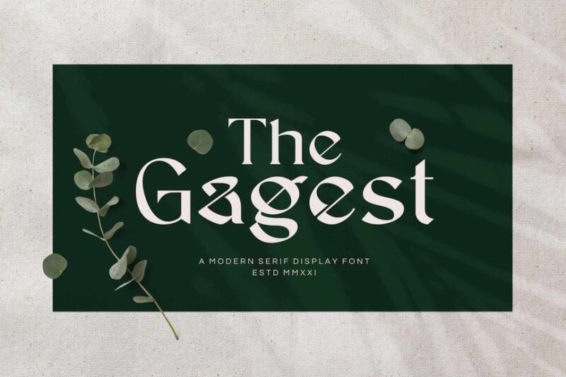
Gaghest is a serif font designed for corporate and company branding. Its professional appearance and well-balanced characters make it suitable for a wide range of business applications, from official documents to marketing materials and corporate identities.
Rosemode – Classic and Timeless Roman Serif
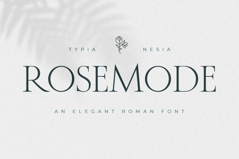
Rosemode is a classic Roman serif font with a bohemian and royal touch. Its timeless design and elegant serifs make it perfect for projects that require a sophisticated, vintage-inspired aesthetic, such as luxury branding or high-end editorial layouts.
Roman Editorial + Script Elegant Font Duo
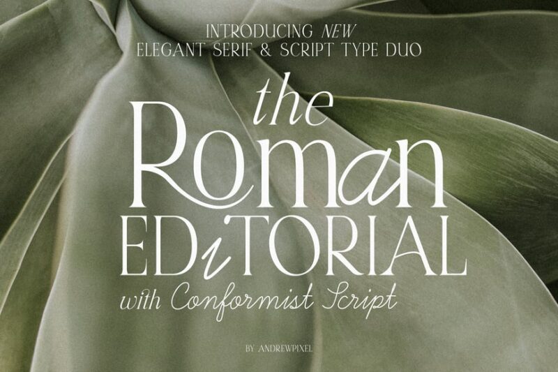
This font duo combines a Roman serif with an elegant script, offering versatility for sophisticated design projects. The pairing is ideal for wedding invitations, luxury branding, and high-end editorial layouts that require a balance of formality and grace.
Roman Sophisticated Serif
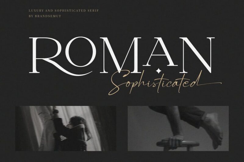
Roman Sophisticated Serif is a luxury typeface designed for upscale projects. Its refined serifs and elegant proportions make it excellent for high-end branding, fashion magazines, and luxury product packaging, often paired with complementary fonts for added versatility.
Trabuline
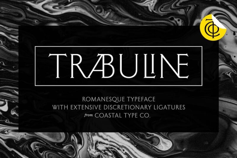
Trabuline is a serif font inspired by Roman typography. Its classical design with a modern twist makes it suitable for projects that aim to blend historical references with contemporary aesthetics, such as museum branding or cultural event materials.
Wolfsburg Romans Font
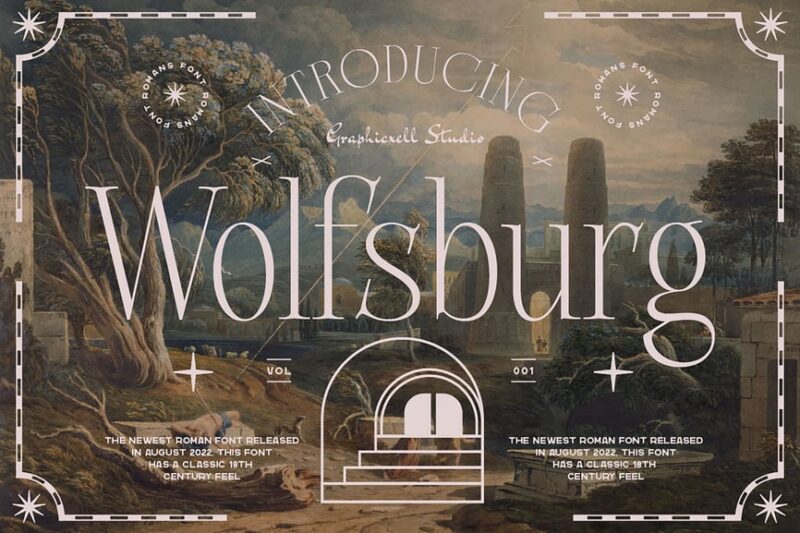
Wolfsburg Romans is a serif font that draws inspiration from ancient Roman typography. Its strong character and historical references make it ideal for projects requiring a sense of tradition and authority, such as academic publications or historical documentaries.
CS Boris – Elegant Font
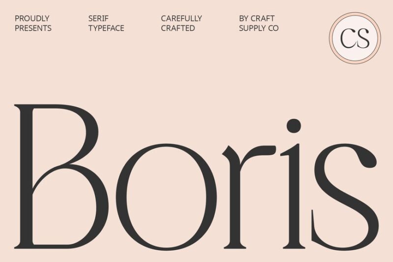
CS Boris is an elegant serif font that combines classical elements with modern refinement. Its sophisticated design makes it suitable for luxury branding, high-end packaging, and editorial layouts that require a touch of contemporary elegance.
Histora – Classic Roman Serif
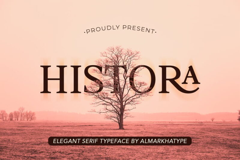
Histora is a classic Roman serif font with a modern twist. Its timeless design and clear letterforms make it versatile for both traditional and contemporary projects, from book typography to branding for established institutions.
Peritoneum Classic Serif Font
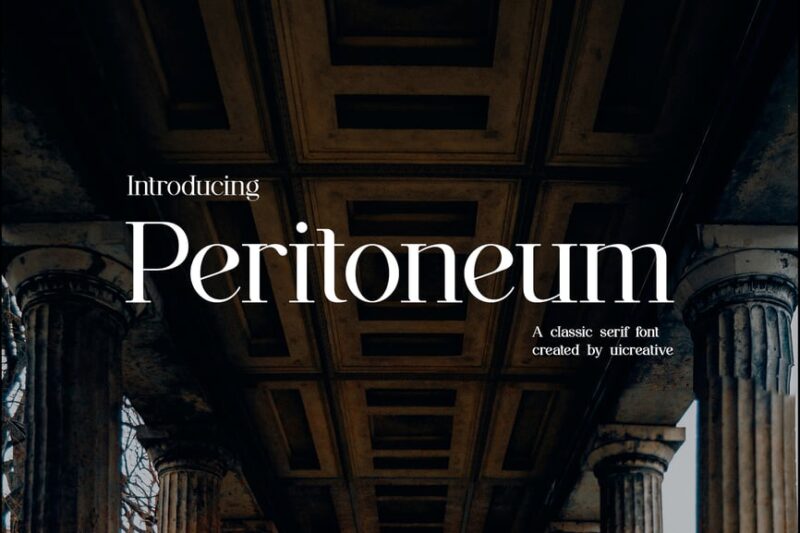
Peritoneum is a classic serif font inspired by Roman and ancient typography. Its distinctive serifs and well-proportioned characters make it suitable for projects that require a scholarly or historical feel, such as academic journals or museum exhibitions.
Nord Poem – Classic Roman Serif
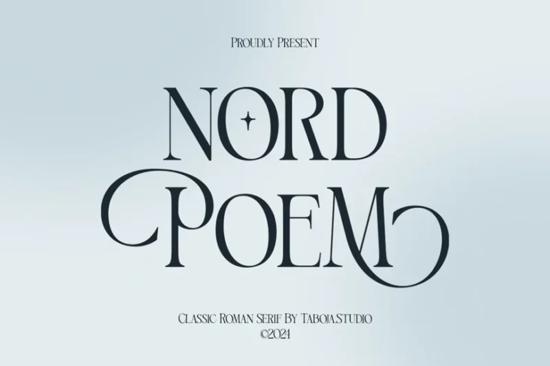
Nord Poem is a classic Roman serif font with a poetic touch. Its elegant design and balanced proportions make it ideal for literary projects, poetry collections, and artistic endeavors that require a blend of classical beauty and contemporary sensibility.
Agathias Stenchy Modern Serif Font
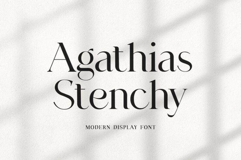
Agathias Stenchy is a modern serif font with Turkish and Roman influences. Its unique blend of cultural elements and contemporary design makes it suitable for projects that require a distinctive, globally-inspired typographic approach, such as international branding or multicultural publications.
Things to Consider When Choosing a Times New Roman Alternative
While I’ve shared an extensive collection of Times New Roman alternatives, I recommend considering these essential factors when making your selection.
Reading Context and Length
Consider where and how your text will be consumed. Times New Roman excels in long-form reading, so ensure your alternative maintains similar readability characteristics. For extensive documents, academic papers, or books, prioritize fonts with excellent spacing, moderate contrast, and proven performance in text applications. Display fonts might look impressive in headlines but fail miserably in paragraph text.
Medium and Output Quality
Evaluate whether your project will primarily exist in print or digital formats. Some alternatives perform better on screens, while others shine in high-resolution print applications. Consider factors like pixel density, printing quality, and viewing distances when making your selection. Fonts optimized for digital use often include special hinting and spacing adjustments that improve screen readability.
Professional Context and Audience Expectations
Times New Roman carries significant institutional weight and professional credibility. Ensure your alternative maintains appropriate gravitas for your specific context. Academic institutions, legal documents, and corporate communications often require fonts that project similar authority and trustworthiness. Consider your audience’s expectations and the message you want to convey through your typography choices.
Character Set and Language Support
Verify that your chosen alternative includes all necessary characters, symbols, and language support for your project. Times New Roman includes comprehensive character coverage, so ensure your replacement can handle special characters, diacritical marks, and any international requirements. This is particularly crucial for academic work, international publications, or projects involving multiple languages.
Licensing and Usage Rights
Understand the licensing terms for your chosen font, especially for commercial projects. While Times New Roman comes with most operating systems, commercial usage might require additional licensing. Many excellent alternatives offer more flexible licensing terms, including open-source options that provide complete freedom for commercial use without additional fees or restrictions.
Weight and Style Variations
Consider the range of weights and styles available in your chosen font family. Times New Roman offers limited style variations, while many modern alternatives provide comprehensive families with multiple weights, italics, and specialized variants. This flexibility becomes crucial for projects requiring typographic hierarchy and varied emphasis throughout the design.
Why Use Times New Roman Alternatives?
As much as I appreciate Times New Roman’s reliability and widespread recognition, it’s not always the optimal choice for contemporary projects. Here are several compelling reasons to explore alternatives.
Digital Optimization and Screen Performance
Times New Roman was designed primarily for print applications, and while it works on screens, many modern alternatives offer superior digital optimization. Contemporary fonts often include specialized hinting, improved spacing, and contrast adjustments specifically designed for various screen resolutions and reading environments. This results in better readability, reduced eye strain, and improved user experience across devices.
Brand Differentiation and Visual Identity
Times New Roman’s ubiquity can work against brands seeking distinctive visual identity. While its familiarity provides instant credibility, it also makes differentiation challenging. Choosing a thoughtfully selected alternative allows organizations to maintain professionalism while establishing unique visual character. This becomes particularly important in competitive markets where subtle design differences can impact brand perception and memorability.
Enhanced Design Flexibility
Many Times New Roman alternatives offer significantly more comprehensive font families with multiple weights, condensed versions, and specialized variants. This expanded range provides designers with greater flexibility for creating typographic hierarchy, emphasis, and visual variety within projects. The result is more sophisticated and visually engaging designs that maintain consistency while offering greater expressive range.
Modern Aesthetic Sensibilities
While Times New Roman remains timeless, some alternatives offer more contemporary aesthetic approaches that better align with current design trends and sensibilities. These fonts often feature refined details, improved proportions, and subtle design enhancements that feel more current while maintaining the classical elegance that makes serif fonts so enduring and valuable.
Specialized Features and Advanced Typography
Contemporary font alternatives often include advanced typographic features like ligatures, small caps, old-style numerals, and contextual alternates that weren’t available when Times New Roman was designed. These features enable more sophisticated and polished typography, particularly valuable for high-end publishing, branding, and professional communications where typographic refinement makes a significant difference.
International and Accessibility Considerations
Many modern alternatives offer superior international character support and accessibility features compared to Times New Roman. This includes better coverage of diverse languages, improved character spacing for readability, and design considerations for users with visual impairments. These improvements make content more accessible to global audiences while maintaining professional appearance and credibility.
How to Use Times New Roman-Like Fonts Effectively
Successfully implementing Times New Roman alternatives requires understanding both the strengths of serif typography and the specific characteristics of your chosen font.
Establish Proper Typographic Hierarchy
Create clear visual hierarchy by combining your chosen serif with complementary fonts for different content levels. Use your Times New Roman alternative for body text and headlines, while incorporating clean sans-serif fonts for captions, metadata, or supporting information. This creates visual variety while maintaining readability and professional appearance throughout your design.
Optimize Spacing and Line Height
Pay careful attention to spacing adjustments that enhance readability. Most serif fonts, including Times New Roman alternatives, benefit from generous line spacing (typically 1.4-1.6 times the font size) for comfortable reading. Adjust letter spacing subtly for different applications – slightly tighter for headlines, more open for small text sizes. These refinements significantly impact reading experience and professional appearance.
Consider Context and Application
Match your font choice to the specific application and reading context. Use robust serif alternatives for long-form text documents, academic papers, and books where sustained reading is expected. Reserve high-contrast display serifs for headlines, titles, and short-form content where visual impact is prioritized over extended readability. Understanding these distinctions ensures optimal performance and user experience.
Test Across Multiple Platforms and Sizes
Verify that your chosen alternative performs well across different platforms, devices, and sizes before final implementation. Test readability at various scales, from small mobile screens to large desktop displays and print applications. This testing phase often reveals performance differences that aren’t apparent during initial font selection but significantly impact final user experience and professional presentation.
Times New Roman – A Brief History
Times New Roman emerged from a fascinating collaboration between The Times newspaper and renowned typographer Stanley Morison in 1931. Commissioned to replace the newspaper’s previous typeface, Morison created a design that prioritized both readability and space efficiency – crucial considerations for newspaper production where every character counted.
The design drew inspiration from Plantin, a 16th-century typeface, but incorporated modern refinements that improved legibility under the challenging printing conditions of daily newspaper production. Times New Roman featured higher contrast between thick and thin strokes, more open letterforms, and carefully optimized spacing that enhanced readability while maintaining compact character width.
The font gained widespread recognition beyond newspaper applications when it was adopted by book publishers and eventually included with Microsoft Windows and Apple systems as a default font. This widespread distribution established Times New Roman as perhaps the most recognizable serif typeface in history, making it synonymous with professional publishing and academic documentation.
Times New Roman’s design philosophy emphasized functionality over ornamentation, resulting in a typeface that projected authority and credibility while remaining highly readable across various applications. This combination of practical performance and professional appearance contributed to its enduring popularity in academic, legal, and corporate contexts where trustworthiness and readability are paramount.
What Really Made Times New Roman Famous?
Times New Roman achieved iconic status through a combination of design excellence, strategic distribution, and perfect timing in the evolution of digital typography.
Superior Readability Engineering
The font’s design prioritized reading comfort through carefully balanced proportions, optimal contrast levels, and generous character spacing. These characteristics made it exceptionally effective for sustained reading, whether in newspapers, books, or digital documents. The letterforms were engineered to remain clear and legible even under challenging printing conditions, contributing to its reputation for reliability and professional performance.
Institutional Adoption and Academic Credibility
Universities, government agencies, and publishing houses embraced Times New Roman as a standard, establishing its association with serious, credible communication. This institutional adoption created a feedback loop where the font’s use in authoritative contexts reinforced its perception as trustworthy and professional. Academic institutions particularly favored its combination of readability and formal appearance for scholarly publications.
Digital Distribution and Accessibility
Times New Roman’s inclusion with major operating systems made it universally accessible, ensuring consistent appearance across different computers and platforms. This widespread availability eliminated concerns about font substitution and made it a safe choice for documents that needed to display consistently regardless of the recipient’s system. The universal access contributed significantly to its adoption in professional and academic contexts.
Perfect Balance of Tradition and Functionality
The font successfully bridged classical typography traditions with modern functional requirements. It offered the gravitas and elegance associated with traditional serif fonts while providing the practical performance needed for contemporary applications. This balance made it appealing to both conservative institutions valuing tradition and progressive organizations prioritizing functionality and readability.
Frequently Asked Questions
Why should I consider alternatives to Times New Roman?
While Times New Roman remains an excellent typeface, alternatives can offer improved digital optimization, better brand differentiation, enhanced design flexibility, and more comprehensive font families. Many modern alternatives provide superior screen readability, expanded character sets, and contemporary aesthetic refinements while maintaining the professionalism and credibility that make Times New Roman so valuable.
Are these Times New Roman alternatives free to use commercially?
Many excellent alternatives are available with open-source licenses that permit commercial use without additional fees. Google Fonts, in particular, provides numerous high-quality options with very permissive licensing. However, always verify specific licensing terms for your chosen font, especially for commercial projects, as requirements can vary between different typefaces and foundries.
How do I install new fonts on my computer?
Font installation varies by operating system. On Windows, download the font file, right-click it, and select “Install” or drag it to the Fonts folder in Control Panel. On Mac, double-click the font file and click “Install Font” in the preview window, or drag it to Font Book. On Linux, copy font files to the ~/.fonts directory or use your distribution’s font management tools.
Which Times New Roman alternative works best for academic papers?
For academic work, consider EB Garamond for classical elegance, Source Serif 4 for digital optimization, or Charis SIL for comprehensive language support. These fonts maintain the scholarly gravitas expected in academic contexts while offering improved readability and professional appearance. Always check your institution’s formatting requirements, as some may specify particular fonts or font categories.
Can I use these fonts for both print and digital applications?
Most modern font alternatives perform well in both print and digital contexts, though some are optimized for specific applications. Source Serif 4 and Merriweather excel in digital environments, while fonts like EB Garamond and Crimson Pro work beautifully in print. Variable fonts often provide the most flexibility, allowing optimization for different sizes and applications within the same font family.
What’s the difference between serif and sans-serif fonts?
Serif fonts like Times New Roman include small decorative strokes (serifs) at the ends of letters, while sans-serif fonts omit these details. Serifs traditionally aid readability in print by guiding the eye along lines of text, making them popular for books, newspapers, and formal documents. Sans-serif fonts often appear cleaner and more modern, making them common choices for digital interfaces and contemporary branding.
How do I pair Times New Roman alternatives with other fonts?
Effective font pairing typically involves combining your serif alternative with a complementary sans-serif font for different content types. Use your serif choice for body text and formal headings, while employing clean sans-serif fonts for captions, user interface elements, or contemporary design accents. Ensure sufficient contrast between paired fonts while maintaining harmonious proportions and consistent tone throughout your design.
Wrapping Up
And there you have it – 30+ fonts like Times New Roman that are ready to bring fresh energy to your projects! Times New Roman has certainly earned its place in typography history, but exploring these alternatives can add new dimensions to your designs. Whether you’re working on academic papers, professional documents, or creative projects that need that perfect balance of authority and readability, these fonts offer exciting possibilities.
Don’t hesitate to experiment and discover which typeface perfectly captures your project’s spirit. Each alternative brings its own personality and strengths to the table, and the right choice can transform your content from ordinary to extraordinary. Remember, selecting the ideal font isn’t just about appearance – it’s about creating the perfect reading experience while communicating your message with clarity and style.
The world of serif typography continues evolving, and these Times New Roman alternatives prove that classic elegance and modern functionality can work together beautifully. Whether you choose a free Google Font or invest in a premium typeface, you’re equipped with options that can elevate any project requiring that perfect combination of tradition and innovation.