In this article:
- The Most Iconic Movie Poster Fonts of All Time
- What Makes a Movie Poster Font Effective?
- Genre-Specific Font Strategies
- The Evolution of Movie Poster Typography
- How to Choose the Perfect Movie Poster Font
- Common Movie Poster Font Mistakes to Avoid
- The Future of Movie Poster Typography
- Conclusion: The Art of Cinematic Typography
As a graphic designer and film enthusiast, I’ve spent countless hours studying the typography that graces cinema’s most iconic posters. There’s something absolutely mesmerizing about how the right movie poster font can instantly transport you into a film’s world before you’ve even seen a single frame.
Movie poster fonts aren’t just letters on a page – they’re the visual gateway to storytelling. From the elegant scripts that whisper romance to the bold, industrial typefaces that scream action, these fonts work overtime to set expectations, create atmosphere, and yes, sell tickets.
The best movie poster fonts don’t just look pretty (though they absolutely do). They’re strategic choices that complement the film’s genre, target audience, and overall mood. Whether it’s the retro-futuristic glow of sci-fi blockbusters or the hand-drawn charm of indie comedies, typography plays a starring role in movie marketing.
In this comprehensive guide, we’ll explore the fonts that have shaped cinema advertising, dive into what makes certain typefaces perfect for different genres, and uncover the secrets behind Hollywood’s most memorable typographic choices. So grab your popcorn, dim the lights, and let’s roll into this typographic adventure!
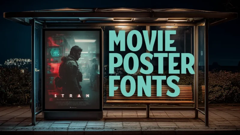
The Most Iconic Movie Poster Fonts of All Time
Let’s start with the heavy hitters – the fonts that have become so synonymous with cinema that they’re practically characters themselves.
Carbonized
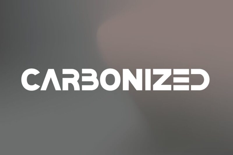
Carbonized is a bold sans-serif font with a decorative flair, perfect for movie titles and corporate branding. Its strong, industrial-inspired letterforms create a powerful visual impact, making it ideal for headlines and logos.
Scary Things
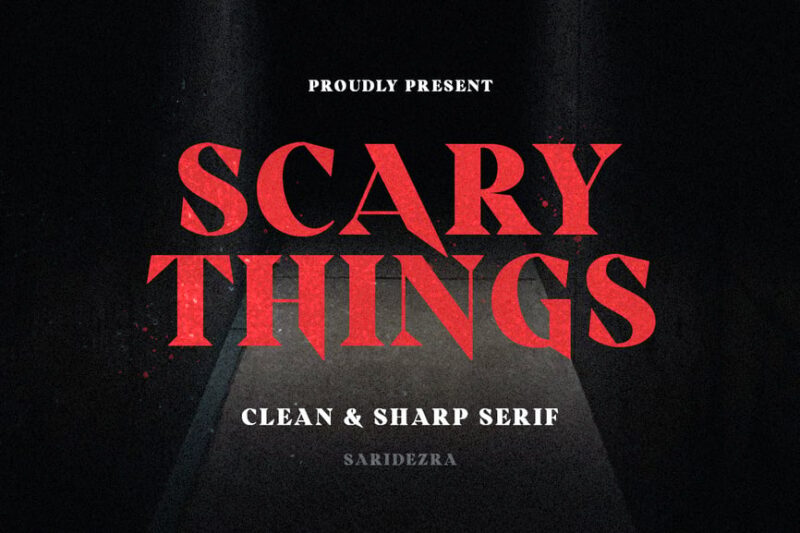
Scary Things is a sharp and creepy serif font designed to evoke a sense of horror and unease. This font is perfect for horror movie posters, Halloween designs, and eerie book covers.

Get 300+ Fonts for FREE
Enter your email to download our 100% free "Font Lover's Bundle". For commercial & personal use. No royalties. No fees. No attribution. 100% free to use anywhere.
Femine Font
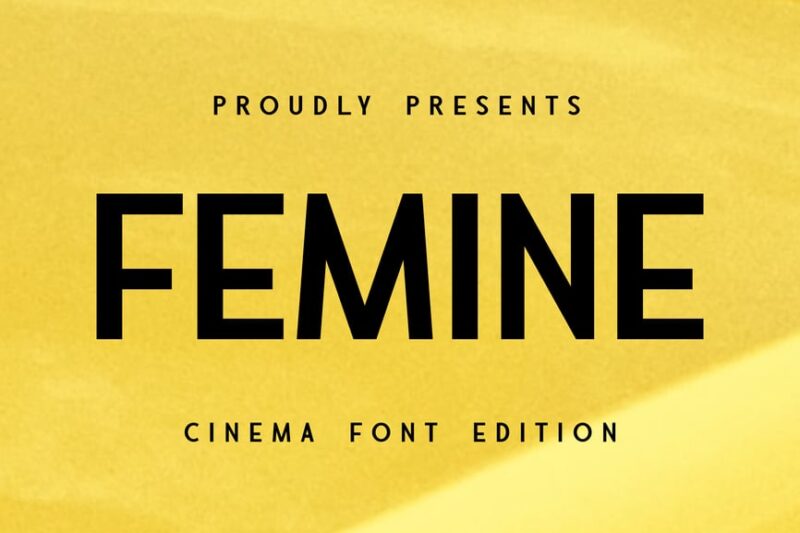
Femine Font is an elegant sans-serif typeface that exudes sophistication and femininity. Its graceful lines and subtle curves make it an excellent choice for movie titles, particularly in genres like romance or drama.
Brigand
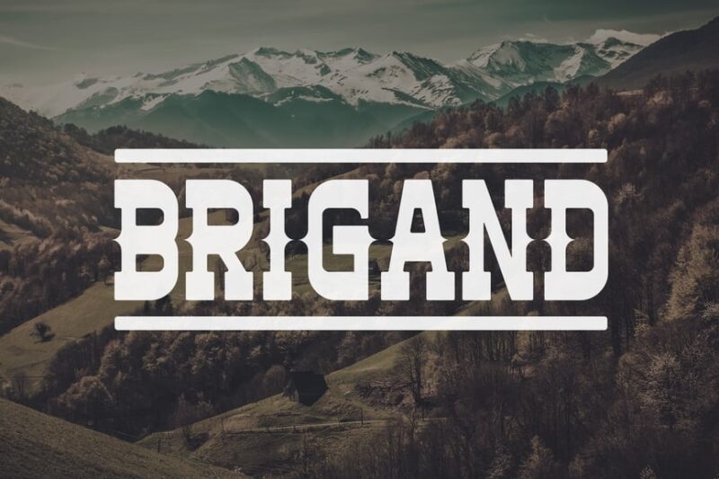
Brigand is a rugged serif font with a distinctive Western flair. Its marker-like strokes and weathered appearance make it perfect for designs related to the Old West, adventure, or rustic themes.
PIRATES
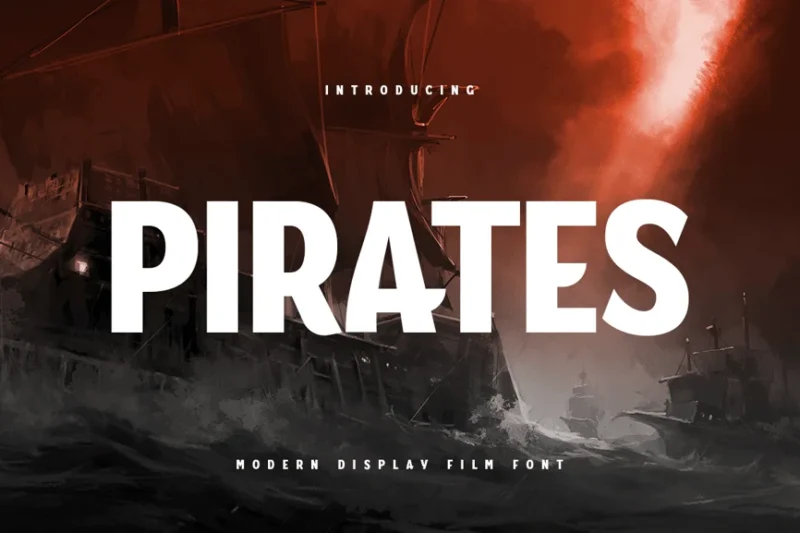
PIRATES is a modern display font designed for film and thriller genres. This pirate typeface combines a bold, adventurous spirit with a contemporary edge, making it ideal for movie posters and promotional materials.
BOOER
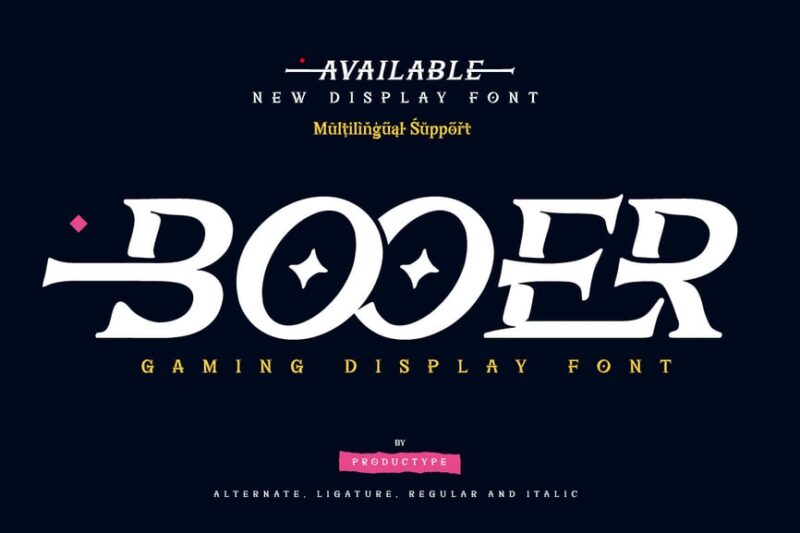
BOOER is a dynamic display font that blends serif elements with decorative features. Its superhero and comic-inspired design makes it perfect for action-packed designs, graphic novels, and energetic branding projects.
Strandall
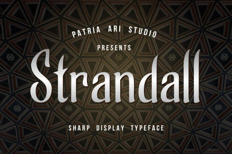
Strandall is a decorative font that captures the essence of cinema and movie culture. Its unique letterforms and stylized design make it an excellent choice for film-related projects, posters, and entertainment branding.
Theater
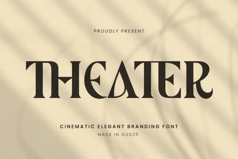
Theater is a cinematic ligature branding font with a serif style. Its retro-inspired design and elegant ligatures make it perfect for documentary titles, vintage-themed projects, and theatrical branding.
Possed
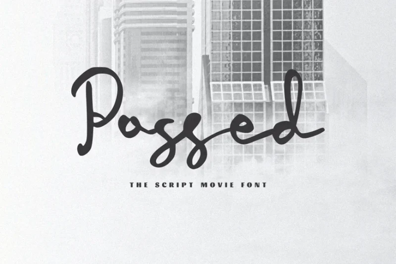
Possed is a script font designed to emulate handwritten movie scripts. Its authentic, flowing and handwritten style adds a personal touch to designs, making it ideal for film-related projects, creative writing, and artistic branding.
Speedo
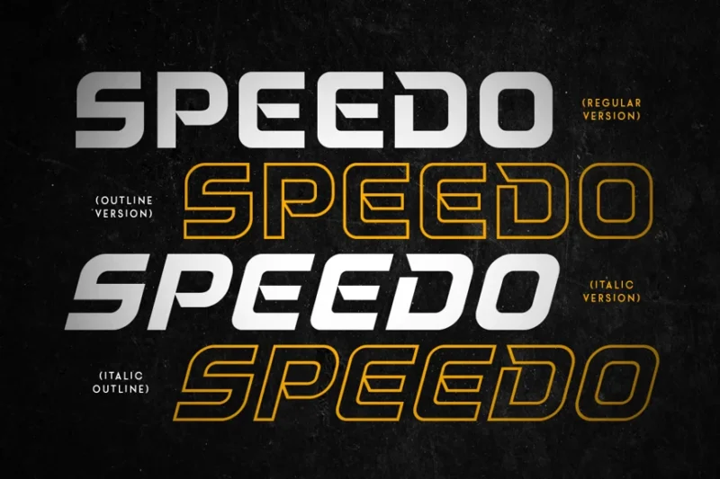
Speedo is a dynamic sans-serif font tailored for racing and automotive designs. Its sleek, technological appearance makes it perfect for sports branding, car-related projects, and modern, high-speed themed designs.
Devanger
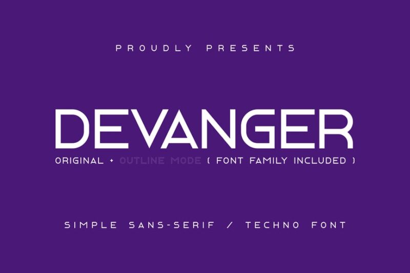
Devanger is a distressed sans-serif font with a tech-inspired edge. Its worn, industrial look combined with futuristic elements makes it ideal for grungy designs, sci-fi themed projects, and edgy branding.
Thick
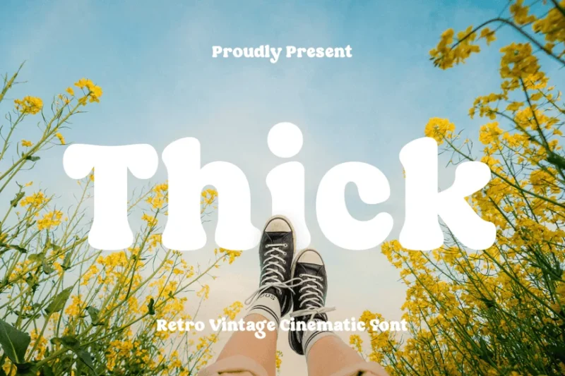
Thick is a bold, retro-inspired serif font designed for cinematic impact. Its chunky letterforms and vintage aesthetic make it perfect for creating eye-catching headlines, movie posters, and nostalgic designs.
Mystic Gate
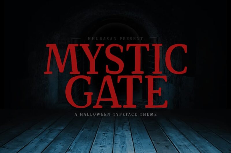
Mystic Gate is a decorative sans-serif font with a mystical and spiritual theme. Its unique letterforms and esoteric vibe make it ideal for designs related to witchcraft, spirituality, and otherworldly concepts.
Broonick
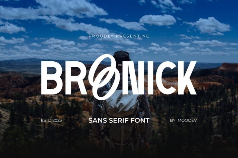
Broonick is a modern, minimal sans-serif font that emphasizes cleanliness and simplicity. Its sleek design makes it perfect for contemporary branding, minimalist layouts, and projects that require a refined, uncluttered look.
The World Of Storyman
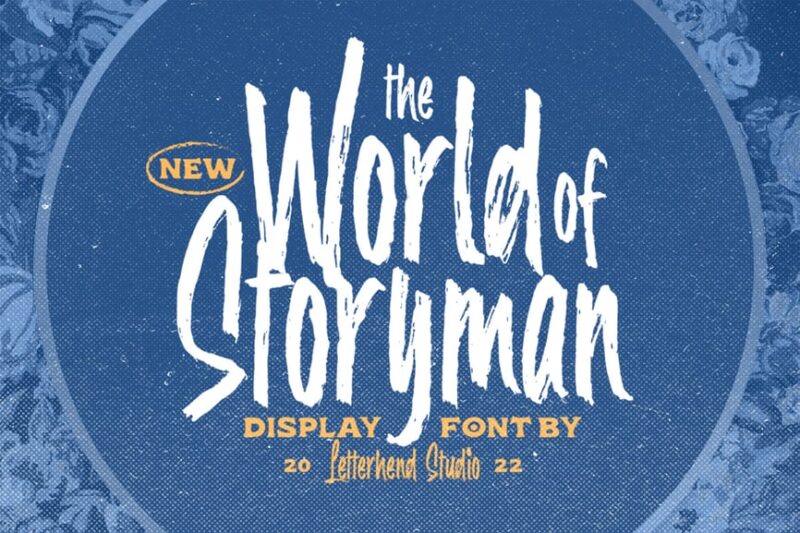
The World Of Storyman is a distressed script font with a Western-inspired flair. Its handwritten style and weathered appearance make it perfect for storytelling, adventure-themed designs, and rustic branding projects.
Bagera
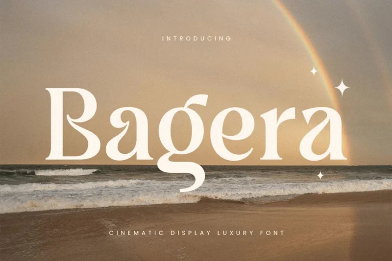
Bagera is a luxurious serif font designed for cinematic display. Its elegant letterforms and premium feel make it ideal for high-end branding, movie titles, and designs that require a touch of sophistication and glamour.
FAKTOR
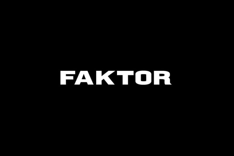
FAKTOR is a bold, decorative sans-serif font perfect for movie posters and superhero-themed designs. Its strong, impactful letterforms make it ideal for headlines, display purposes, and creating eye-catching title sequences.
Nezuko Typeface
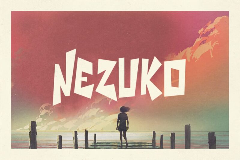
Nezuko Typeface is a decorative font inspired by anime and movie aesthetics. Its unique, stylized design makes it perfect for projects related to Japanese animation, comic books, and youth-oriented branding.
Balivia
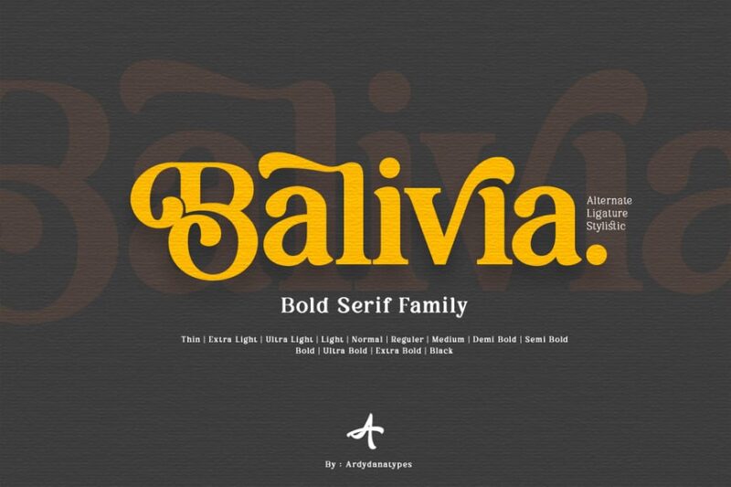
Balivia is a distinctive serif font. Its unique letterforms and Balinese influence make it suitable for exotic-themed projects, travel branding, and designs that require a touch of cultural flair.
Cinemate
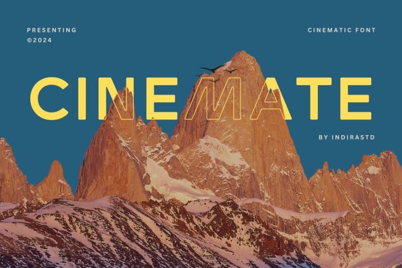
Cinemate is a cinematic sans-serif font that evokes a sense of adventure. Its bold, dramatic style makes it perfect for movie titles, travel-themed designs, and projects that require a touch of excitement.
Fantasy
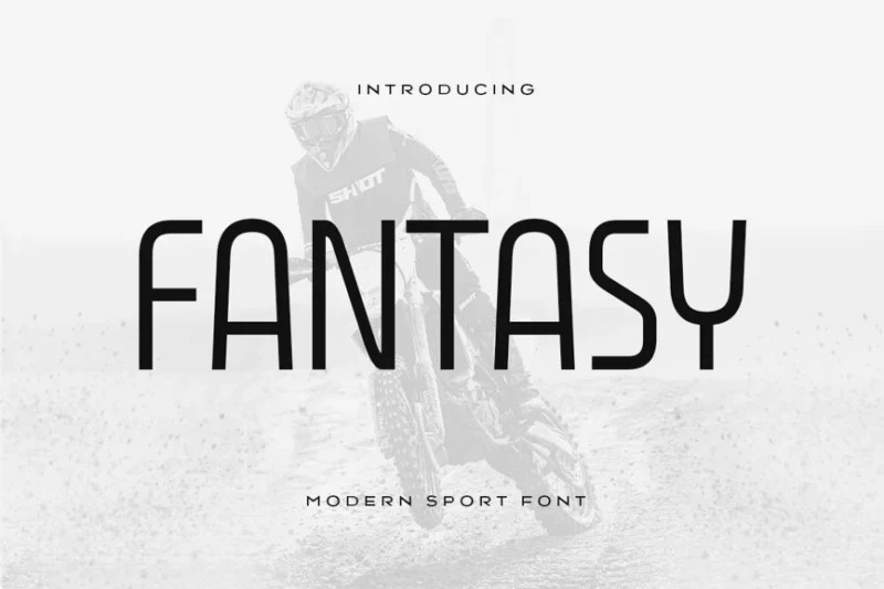
Fantasy is a modern sport font with a sans-serif style. Its dynamic, energetic design makes it ideal for racing-themed projects, sports branding, and designs that require a sense of speed and movement.
Noirden Sans Font
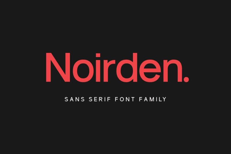
Noirden Sans Font is a sleek sans-serif typeface inspired by film noir and cinema. Its sophisticated design makes it perfect for creating moody, atmospheric designs, movie posters, and projects with a touch of mystery.
Angle Square
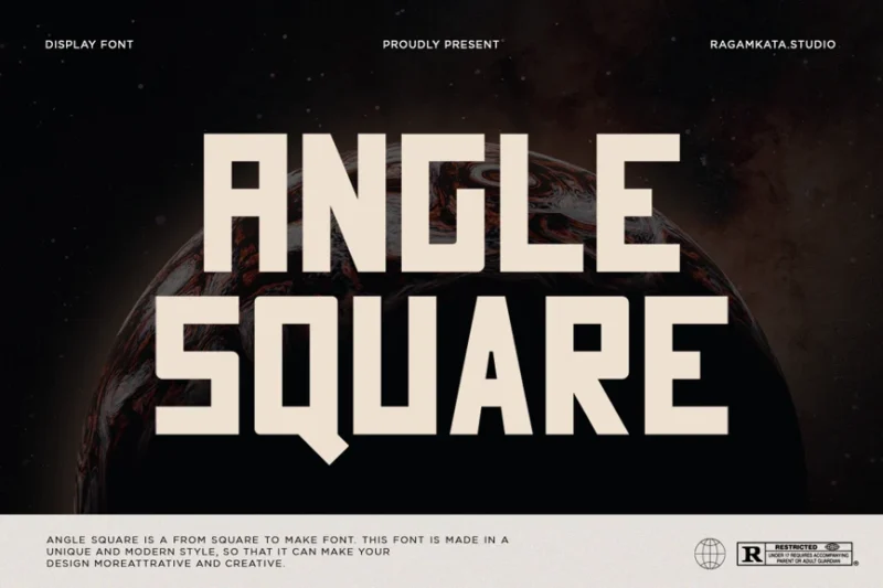
Angle Square is a unique, modern sans-serif font with a geometric twist. Its blocky design makes it suitable for movie fonts and gym-related branding, offering a fresh and contemporary look for various design projects.
Whangkinho
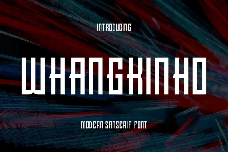
Whangkinho is an Asian-inspired sans-serif font with a focus on Korean aesthetics. Its unique blend of cultural elements and modern design makes it ideal for K-pop related projects, Asian-themed branding, and contemporary designs.
The Oldentime
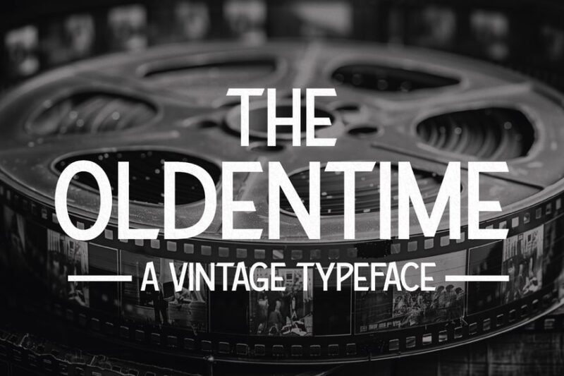
The Oldentime is a vintage sans-serif typeface inspired by the 1920s. Its old-timey design makes it perfect for creating period-specific movie fonts, retro-themed projects, and designs that evoke the glamour of the Roaring Twenties.
Kpop Vibes
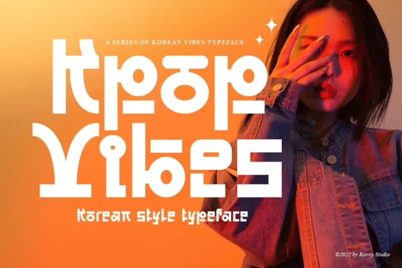
Kpop Vibes is a decorative typeface designed to capture the essence of Korean pop culture. Its stylish and energetic design makes it ideal for K-pop related projects, Anime, Korean-themed branding, and youth-oriented designs.
Qandaru
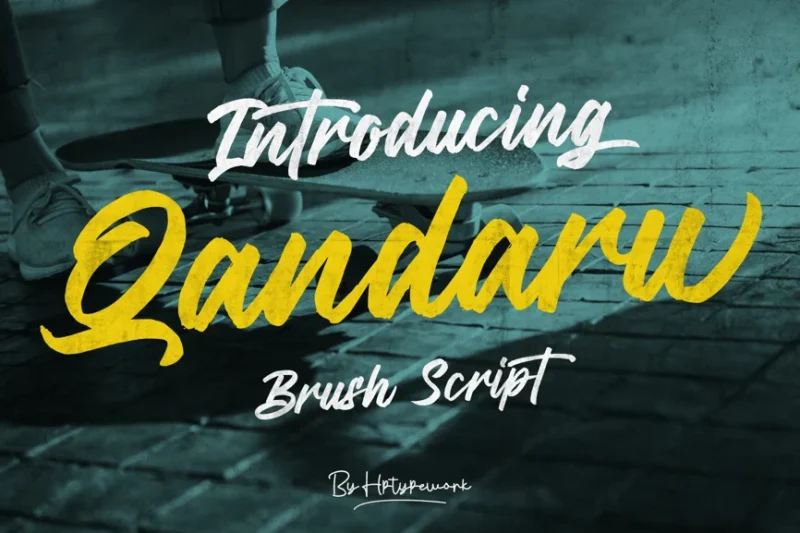
Qandaru is a handwritten script font with a chalkboard-like texture. Its stamp-inspired design gives it a unique, rustic feel, making it perfect for creating a handmade aesthetic in branding, packaging, and artisanal projects.
Gumok
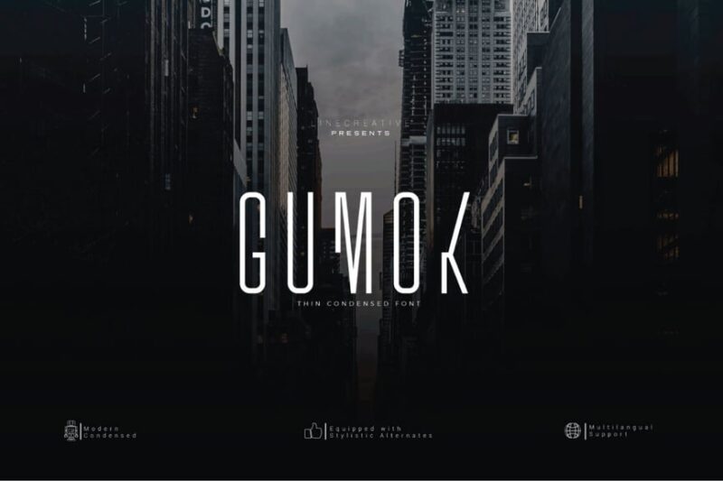
Gumok is a sharp, decorative sans-serif font with a modern edge. Its clean lines and geometric shapes make it suitable for real estate branding, architectural designs, and projects that require a contemporary, professional look.
Delfine
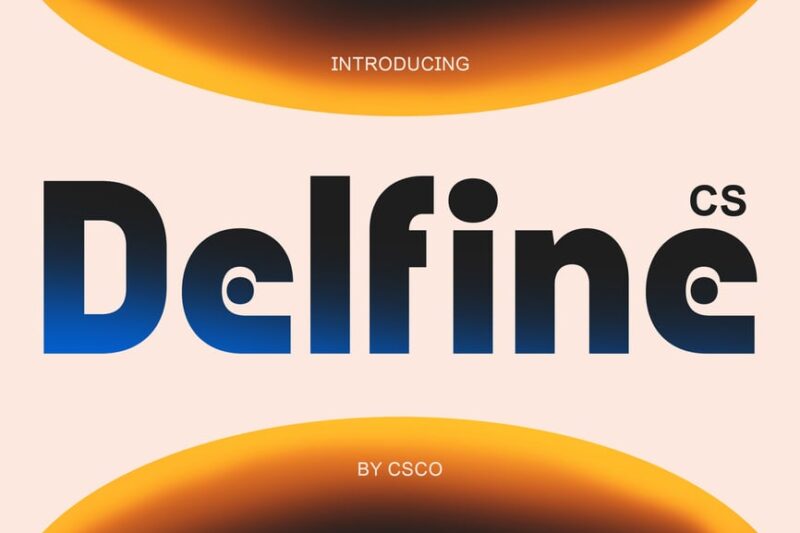
Delfine is a bold sans-serif font with a sci-fi movie aesthetic. Its futuristic design and strong presence make it ideal for creating impactful movie titles, tech-related branding, and designs that require a cutting-edge look.
Movie Credits Entertainment Font
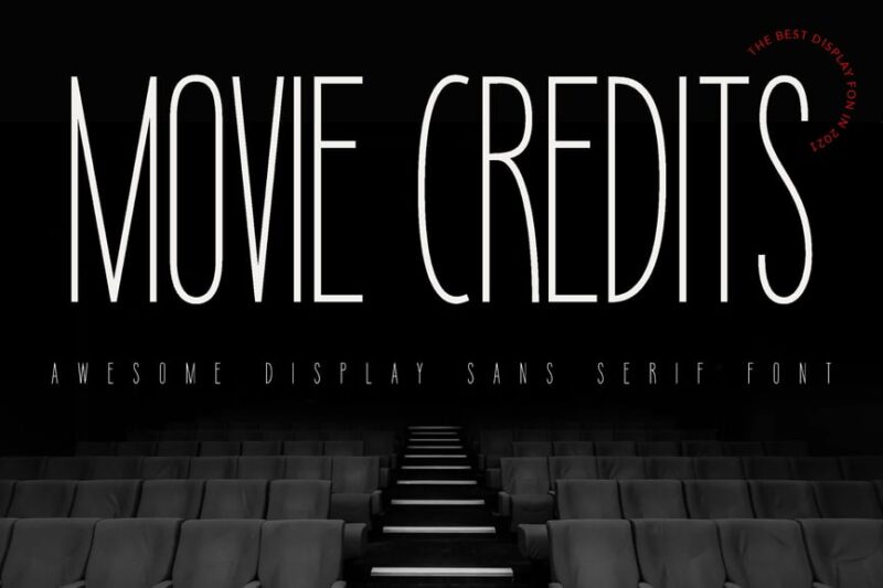
Movie Credits Entertainment Font is a tall typeface designed to mimic the style of movie end credits. Its clean, professional appearance makes it perfect for film industry projects, entertainment branding, and creating authentic cinematic designs.
What Makes a Movie Poster Font Effective?
Creating the perfect movie poster font isn’t just about making letters look cool or finding the right poster mockup file. There’s a psychology and strategy behind every typographic choice that successful movie marketers understand intuitively.
Immediate Genre Recognition
The best movie poster fonts act like visual shorthand for genre. A flowing script immediately signals romance or period drama, while jagged, distressed letterforms scream horror. This instant recognition helps audiences quickly identify whether a film is for them, making typography a crucial part of the marketing funnel.
Emotional Resonance
Great movie poster fonts don’t just communicate information – they make you feel something. The elegant curves of a romantic comedy’s title treatment should make your heart flutter slightly, while a thriller’s stark, angular typography should create a subtle sense of unease. This emotional connection is what separates memorable movie posters from forgettable ones.
Readability at Scale
Movie posters need to work everywhere from massive billboards to tiny thumbnail images on streaming platforms. The most successful movie poster fonts maintain their impact and legibility across all these applications, ensuring the title remains punchy whether it’s 50 feet tall or 50 pixels wide.
Brand Consistency
Major film studios often develop signature typographic approaches that become part of their brand identity. Marvel’s clean, heroic fonts feel distinctly different from A24’s artistic, indie-inspired typography. This consistency helps build audience expectations and loyalty over time.
Genre-Specific Font Strategies
Different movie genres have developed their own typographic languages over decades of cinema history. Understanding these conventions helps explain why certain fonts feel “right” for specific types of films.
Action and Thriller Fonts
Action movies demand fonts that feel strong, dynamic, and slightly dangerous. Think bold sans-serifs with sharp edges, industrial textures, and dramatic letter spacing. These fonts often incorporate metallic effects or subtle motion blur to suggest speed and intensity. The typography needs to feel as explosive as the films themselves.
Horror Font Choices
Horror movie typography walks a delicate line between being terrifying and remaining readable. The best horror fonts use techniques like dripping effects, jagged edges, scratched textures, or bone-like letterforms to create unease. But they never sacrifice legibility for shock value – audiences still need to know what movie they’re being scared by.
Romance and Drama Typography
Romantic films often embrace elegant scripts, flowing serifs, or delicate sans-serifs that feel warm and inviting. These fonts might incorporate subtle flourishes or gentle curves that mirror the emotional journey of the characters. Period dramas, meanwhile, often use historically-inspired typefaces that transport viewers to specific eras.
Comedy Font Personalities
Comedy movie fonts need to feel approachable and fun without being overly silly. Many successful comedy posters use friendly, slightly quirky fonts that hint at humor without resorting to obvious gimmicks. The typography should make you smile slightly – a preview of the laughs to come.
Sci-Fi and Fantasy Typography
Science fiction and fantasy films often push typography into experimental territory. These genres embrace futuristic sans-serifs, otherworldly custom lettering, or mystical scripts that suggest magic and wonder. The fonts themselves become part of the world-building, hinting at the extraordinary adventures waiting inside.
The Evolution of Movie Poster Typography
Movie poster fonts haven’t developed in isolation – they’ve evolved alongside broader design trends, technological advances, and changing audience expectations.
The Golden Age Influence
Classic Hollywood established many of the typographic conventions we still use today. The elegant title treatments of films from the 1930s and 1940s emphasized craftsmanship and prestige, using custom lettering that positioned movies as sophisticated entertainment. These historical approaches continue to influence contemporary poster design.
The Blockbuster Era
The rise of summer blockbusters in the 1970s and 1980s brought bolder, more aggressive typography to movie posters. Films needed to grab attention in crowded multiplex lobbies, leading to the development of fonts that could stop audiences in their tracks. This era prioritized impact over elegance.
Digital Revolution
Computer graphics opened up entirely new possibilities for movie poster typography. Suddenly, fonts could glow, sparkle, morph, or integrate seamlessly with photographic elements. This technological shift allowed movie posters to become more visually complex while maintaining typographic clarity.
Streaming Age Adaptations
Today’s movie poster fonts must work across more platforms than ever before. Typography needs to remain effective on everything from IMAX screens to smartphone apps. This has led to cleaner, more versatile font choices that prioritize clarity and impact across all media.
How to Choose the Perfect Movie Poster Font
Selecting the right font for a movie poster requires balancing multiple considerations. Here’s how to approach this crucial design decision.
Understanding Your Audience
Different demographics respond to different typographic approaches. Younger audiences might embrace bold, experimental fonts, while older viewers often prefer more traditional, established typefaces. Consider who you’re trying to reach and what typography might resonate with them.
Matching the Film’s Tone
The font should feel like it belongs in the same universe as the movie itself. A lighthearted romantic comedy shouldn’t use the same typography as a gritty crime thriller. The font choice should feel like a natural extension of the film’s personality.
Considering Technical Requirements
Think about where the poster will be displayed and ensure your font choice works in all those contexts. Will it need to work in black and white? How does it look when scaled down? Can it be easily modified for international markets? These practical considerations matter as much as aesthetic ones.
Testing for Impact
The best movie poster fonts create an immediate emotional response. Test your typography choices with fresh eyes – does the font make you more interested in seeing the film? Does it accurately represent what audiences should expect? Trust your instincts about emotional impact.
Common Movie Poster Font Mistakes to Avoid
Even experienced designers can fall into typographic traps when creating movie posters. Here are the pitfalls to watch out for.
Over-Complicating the Design
Sometimes designers try so hard to be creative that they sacrifice clarity and impact. The most effective movie poster fonts often embrace simplicity, allowing the typography to support rather than overwhelm the overall design. Remember: your goal is to sell the movie, not show off your font manipulation skills.
Ignoring Legibility
No matter how stylistically perfect a font might be, it’s useless if audiences can’t read it. This is especially important for smaller applications like streaming thumbnails or mobile displays. Always prioritize readability alongside visual impact.
Following Trends Too Closely
While it’s important to feel contemporary, chasing every typographic trend can make your poster feel dated quickly. The best movie poster fonts balance current appeal with timeless effectiveness. Think about how your choices will age over time.
Mismatching Genre Expectations
Using typography that conflicts with genre conventions can confuse audiences and hurt marketing effectiveness. While breaking rules can sometimes work, make sure you understand the conventions before you break them. Innovation should enhance rather than contradict the film’s identity.
The Future of Movie Poster Typography
As we look ahead, several trends are shaping the evolution of movie poster fonts.
Variable Font Technology
New font technologies allow for more dynamic, responsive typography that can adapt to different contexts automatically. This could revolutionize how movie posters work across multiple platforms and applications.
Cultural Sensitivity
Modern movie marketing increasingly considers global audiences from the beginning. This means choosing fonts that work well across different languages and cultural contexts, ensuring international appeal without losing local impact.
Interactive Typography
As more movie marketing moves into digital spaces, typography itself might become interactive. Imagine movie poster fonts that respond to user interaction or change based on viewing context. These possibilities could transform how audiences engage with film marketing.
Accessibility Focus
Greater awareness of accessibility issues is influencing font choices, with designers prioritizing options that work well for audiences with different visual abilities. This focus on inclusion is making movie poster typography more effective for everyone.
Conclusion: The Art of Cinematic Typography
Movie poster fonts might seem like a small detail in the grand scheme of filmmaking, but they’re actually one of the most important tools in a movie’s marketing arsenal. The right typography can create instant emotional connections, communicate genre expectations, and ultimately influence whether someone decides to buy a ticket.
From the elegant scripts of classic Hollywood to the bold experiments of contemporary blockbusters, movie poster fonts have evolved into a sophisticated art form. They’re the first impression many audiences have of a film, making typography choices crucial to a movie’s commercial success.
Whether you’re a designer working on your first movie poster or a film enthusiast curious about the magic behind the marketing, understanding these typographic principles can deepen your appreciation for the craft. After all, in the world of cinema, every element tells a story – including the letters that spell out the title.
The next time you’re scrolling through movie options or walking past a theater, take a moment to appreciate the typography. Those carefully chosen fonts are working hard to capture your attention, set your expectations, and invite you into new worlds of entertainment. In the end, that’s the true power of movie poster fonts – they don’t just announce films, they begin the storytelling process before the opening credits even roll.


