In this article:
- The Most Impressive Stamp Fonts of 2026
- What Makes a Great Stamp Font Feel Authentic?
- Where to Use Stamp Fonts Effectively
- Where to Avoid Using Stamp Fonts
- How to Pick the Perfect Stamp Font
- Creating Custom Stamp Effects
- Common Stamp Font Questions
- Conclusion: The Enduring Appeal of Stamp Typography
There’s something incredibly satisfying about the texture and character of a stamped impression. As a graphic designer who’s spent countless hours perfecting typographic choices for clients, I can tell you that stamp fonts offer a unique combination of authenticity and tactile appeal that digital-only designs often lack.
Stamp fonts recreate that distinctive look of rubber or wooden stamps pressed against paper – complete with imperfections, ink bleeds, and uneven impressions. They bring a human touch to designs that can otherwise feel too polished or sterile in our increasingly digital world.
In this deep dive, we’ll explore the most impressive stamp fonts of 2026, what makes them special, and how to use them effectively in your designs. Whether you’re creating vintage branding, crafting handmade product packaging, or adding texture to a digital project, these stamp fonts will give your work that perfect “pressed-by-hand” quality.
Let’s ink up and press down on the best stamp fonts that are making their mark this year!
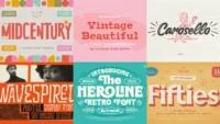
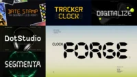
The Most Impressive Stamp Fonts of 2026
Not all stamp fonts can deliver that authentic pressed quality we’re looking for. I’ve compiled my favorite stamp fonts that truly capture the essence of physical stamping – including everything from postal markings to rubber stamps to vintage letter-pressing techniques.
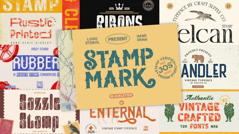
Handler Stamp Font
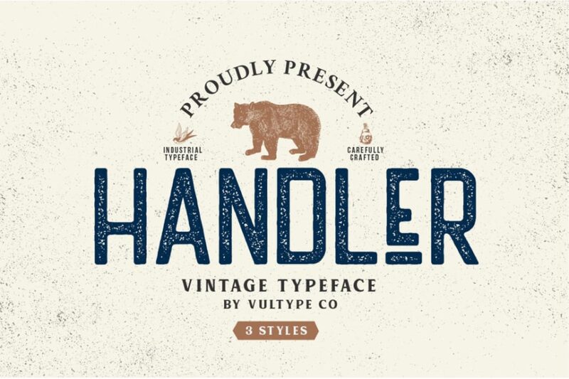
Handler Stamp Font is a sans-serif typeface with a vintage and retro aesthetic. It features a distressed, stamped appearance that adds character and authenticity to designs, making it ideal for projects requiring a nostalgic or worn look.
Ribons – Vintage Stamp Version
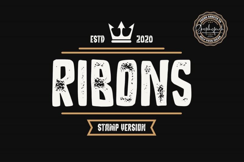
Ribons is a decorative script font with a vintage stamp effect. Its handwritten style combined with a distressed texture makes it perfect for creating authentic-looking labels, logos, and designs that require a touch of nostalgia and craftsmanship.

Get 300+ Fonts for FREE
Enter your email to download our 100% free "Font Lover's Bundle". For commercial & personal use. No royalties. No fees. No attribution. 100% free to use anywhere.
Stamp Mark – Vintage Stencil
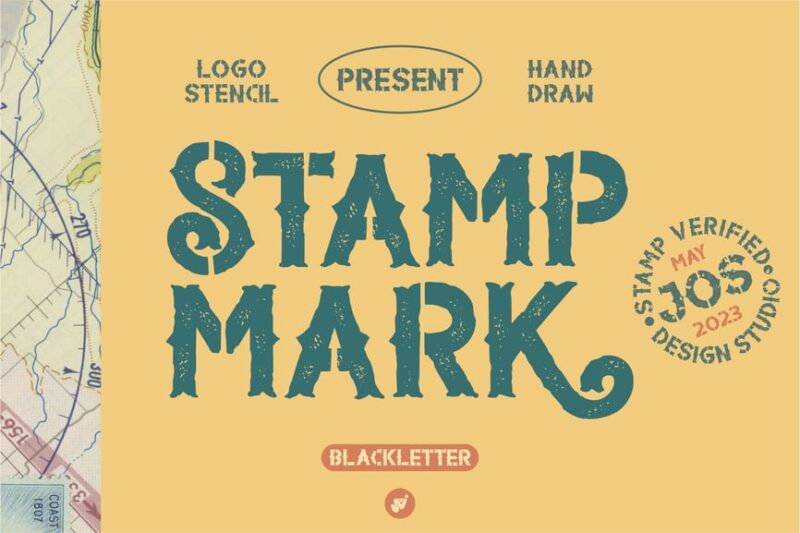
Stamp Mark is a vintage stencil font with a decorative flair. Its retro gaming-inspired design makes it suitable for creating bold headlines, logos, and graphic elements that demand attention and evoke a sense of nostalgia.
Velcan Stamp
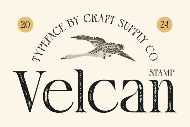
Velcan Stamp is a serif font designed for logos and headlines. Its stamp-like texture adds a tactile quality to the letterforms, making it an excellent choice for creating impactful branding and eye-catching titles with a vintage touch.
Adfile Stamp
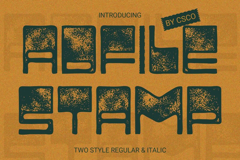
Adfile Stamp is a decorative font that exudes authenticity. Its stamp-like appearance and unique character shapes make it ideal for creating distinctive logos, headlines, and designs that require a genuine, handcrafted feel.
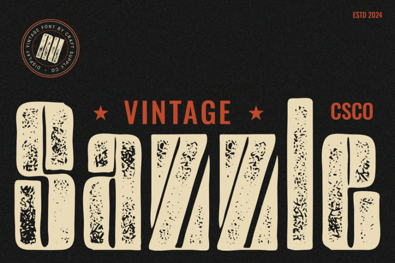
Sazzle Rounded Stamp
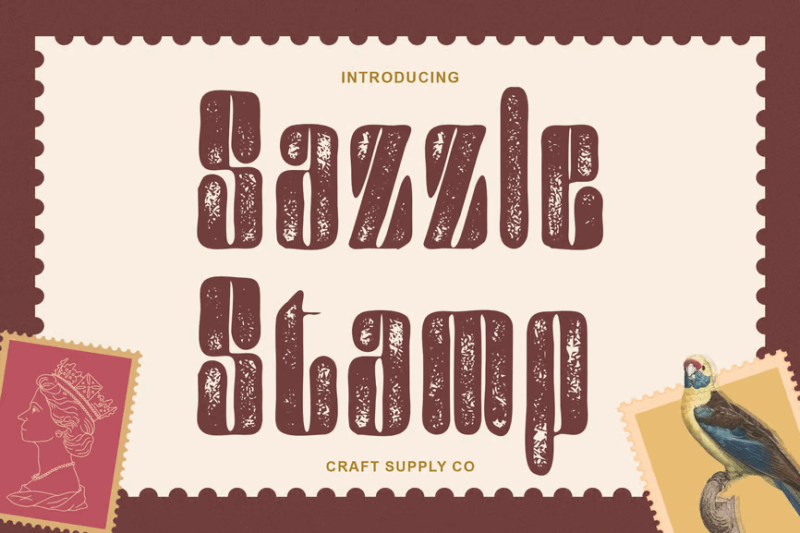
Sazzle Rounded Stamp is a sans-serif font with soft, rounded edges and a stamp-like texture. Its friendly appearance makes it suitable for logos and headlines that need to convey approachability while maintaining a vintage charm.
Rubbero – Rubber Stamp Condensed Font
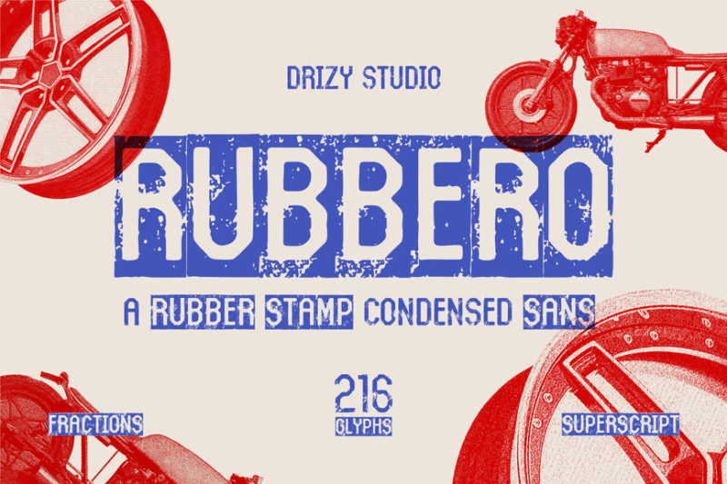
Rubbero is a condensed sans-serif font with a rubber stamp effect. Its narrow letterforms and distressed texture make it perfect for creating compact, impactful designs with an authentic, handmade quality.
Magedo Stamp
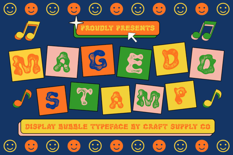
Magedo Stamp is a quirky, decorative font with a psychedelic flair. Its unique letterforms and stamp-like texture make it ideal for creating eye-catching designs, posters, and branding elements that demand attention and exude creativity.
TypedeerMono – Typewriter Stamp Display Font
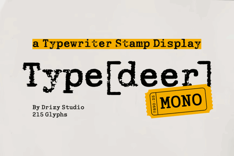
TypedeerMono is a serif font that mimics the look of old typewriter text with a stamp effect. Its monospaced design and distressed appearance make it perfect for creating nostalgic, vintage-inspired designs and typewriter-style text elements.
Art on the Wall Svg Stamp Font
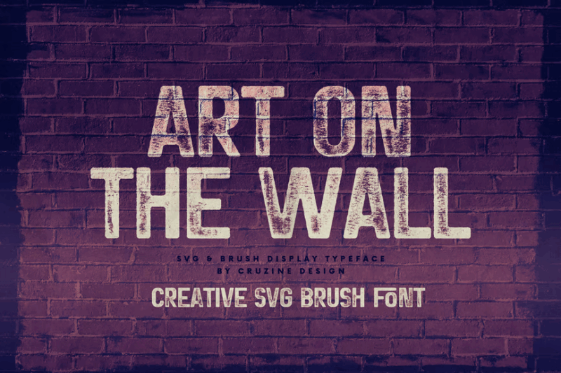
Art on the Wall is a sans-serif SVG font with a rough, stamped appearance. Its versatile design allows for easy customization and scaling, making it ideal for creating unique, textured designs for both digital and print applications.
Moanster Vintage Stamp
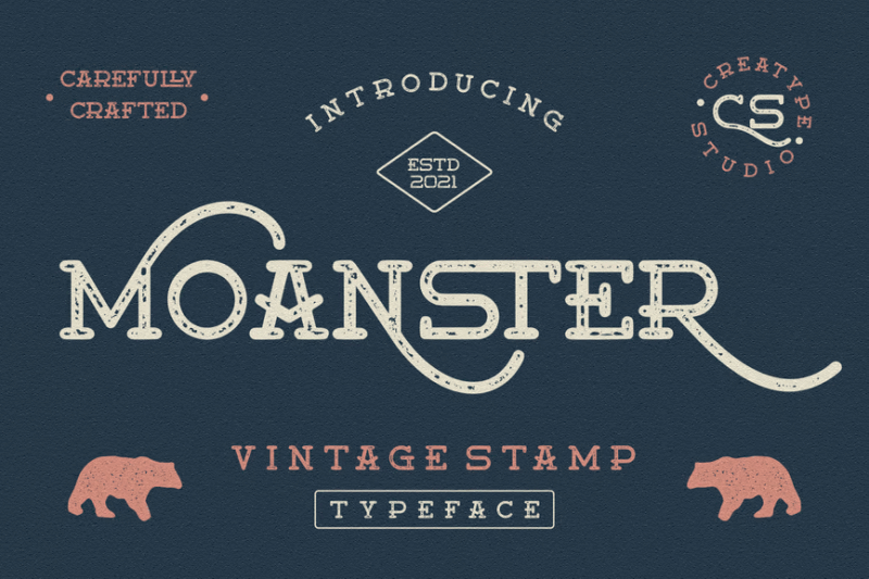
Moanster Vintage Stamp is a serif font with a hand-drawn, vintage aesthetic. Its irregular letterforms and distressed texture give it an authentic, aged appearance, perfect for creating designs that evoke nostalgia and craftsmanship.
Enternal Vintage Stamp Typeface
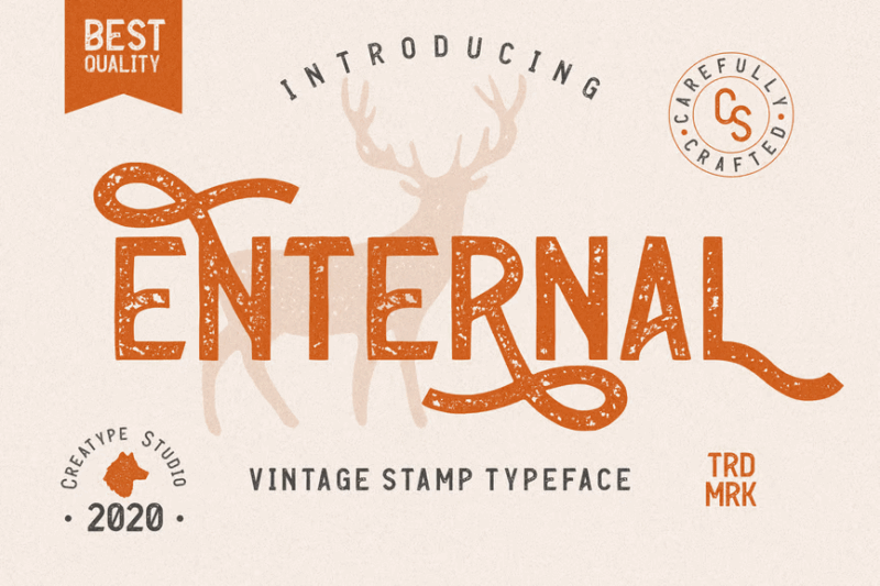
Enternal is a sans-serif vintage stamp typeface with a hand-crafted feel. Its weathered texture and slightly irregular characters make it ideal for creating authentic-looking vintage designs, logos, and branding elements.
Stampolar – Display Stamp Effect Font
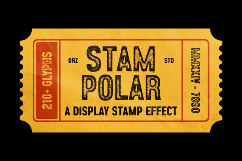
Stampolar is a sans-serif display font with a bold stamp effect. Its strong presence and distressed texture make it perfect for creating impactful headlines, logos, and designs that require a vintage, handmade aesthetic.
Navarone Display
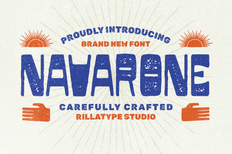
Navarone Display is a sans-serif font with a western-inspired design. Its bold characters and subtle texture make it suitable for creating eye-catching headlines and logos, especially for projects with a rugged or frontier theme.
Gutenberg – Font Family
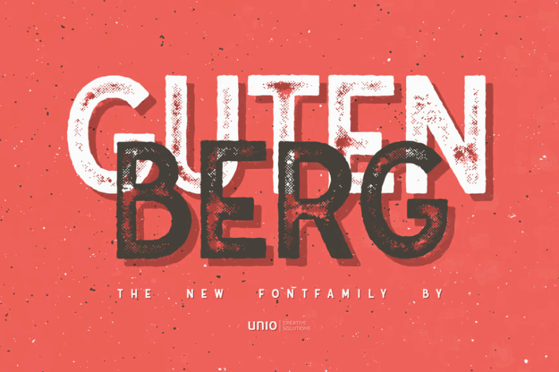
Gutenberg is a sans-serif font family inspired by traditional printing press techniques. Its versatile design and multiple weights make it suitable for a wide range of applications, from body text to headlines, while maintaining a subtle vintage charm.
Busky Stamp
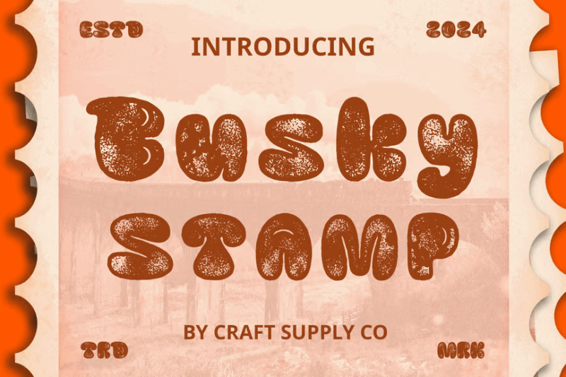
Busky Stamp is a decorative font with a bubble-like appearance and graffiti-inspired elements. Its playful design and stamp texture make it perfect for creating fun, eye-catching designs for youth-oriented or urban-themed projects.
Major Birch – Vintage Logo Font
![]()
Major Birch is a serif font designed for creating vintage-style logos. Its classic letterforms and subtle texture give it an air of timeless elegance, making it ideal for branding projects that require a touch of nostalgia and sophistication.
Labelshort – Risoprint Sans Effect Font
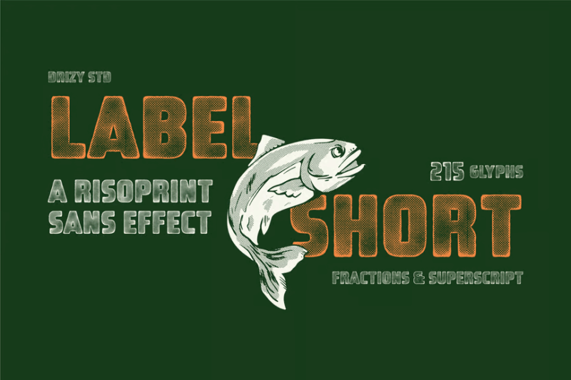
Labelshort is a sans-serif font with a risograph print effect, resembling rubber stamps. Its distressed texture and unique character shapes make it perfect for creating designs with an authentic, handmade feel, especially for labels and packaging.
Rustic Printed – Vintage Font
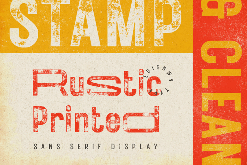
Rustic Printed is a sans-serif vintage font with a classic, retro feel. Its weathered texture and clean letterforms make it versatile for creating various vintage-inspired designs, from logos and packaging to posters and branding materials.
Becham Vintage
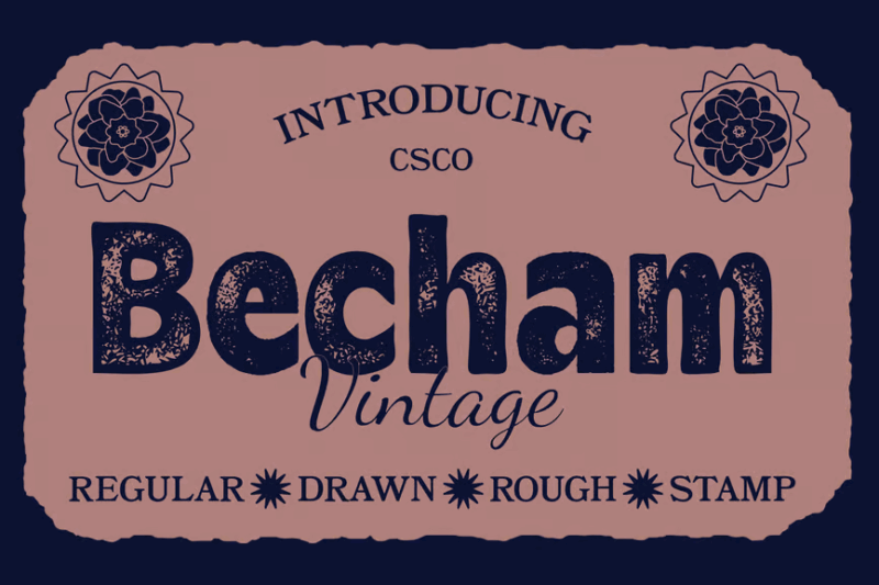
Becham Vintage is a bold, sans-serif font with a retro aesthetic. Its strong characters and subtle distressing make it ideal for creating impactful headlines, logos, and designs that require a vintage touch with modern readability.
Vintage Crafted – Hand Drawn Font
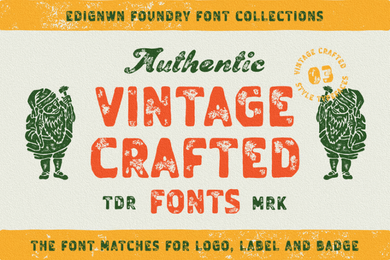
Vintage Crafted is a hand-drawn font combining sans-serif and script styles. Its authentic, handcrafted appearance makes it perfect for creating designs that require a personal touch, such as invitations, packaging, and artisanal branding.
Stamp Blocks
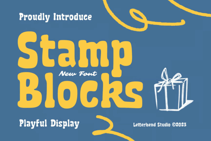
Stamp Blocks is a playful serif font with a cartoon-like quality. Its blocky design and stamped texture make it ideal for creating fun, eye-catching designs for children’s products, educational materials, or any project requiring a whimsical touch.
Galber Vintage
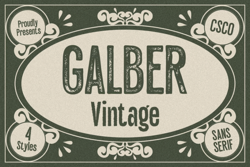
Galber Vintage is a sans-serif font with a classic stamp-like appearance. Its clean lines and subtle distressing make it versatile for creating vintage-inspired designs that maintain readability, perfect for logos, packaging, and branding projects.
Adfile Vintage
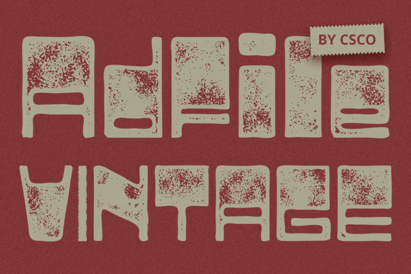
Adfile Vintage is a bold, decorative font with a squarish design. Its strong presence and distressed texture make it ideal for creating impactful headlines, logos, and designs that require a vintage, industrial feel.
Punizione – Vintage Font
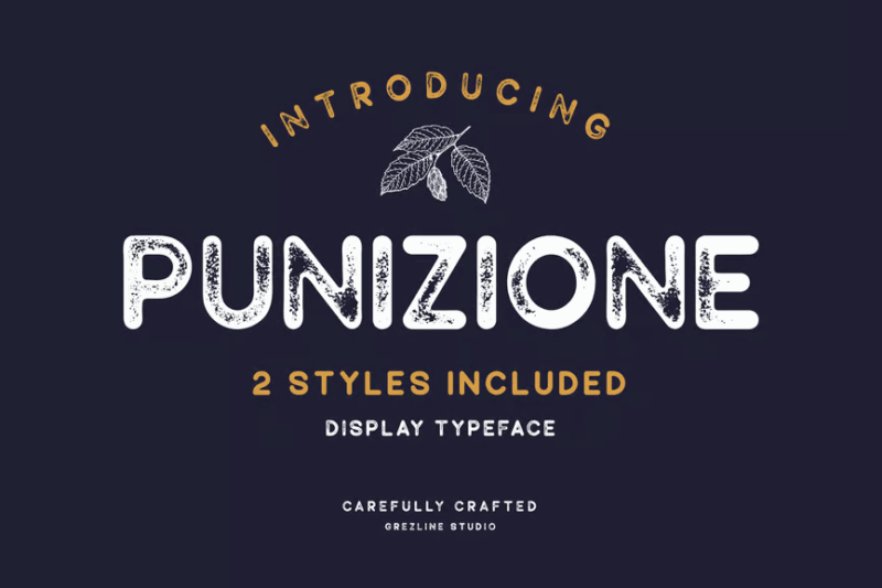
Punizione is a sans-serif vintage font with a grungy, weathered appearance. Its distressed texture and irregular edges make it perfect for creating authentic-looking vintage designs, especially for projects requiring a rugged or worn aesthetic.
Brother Garage – Display Font
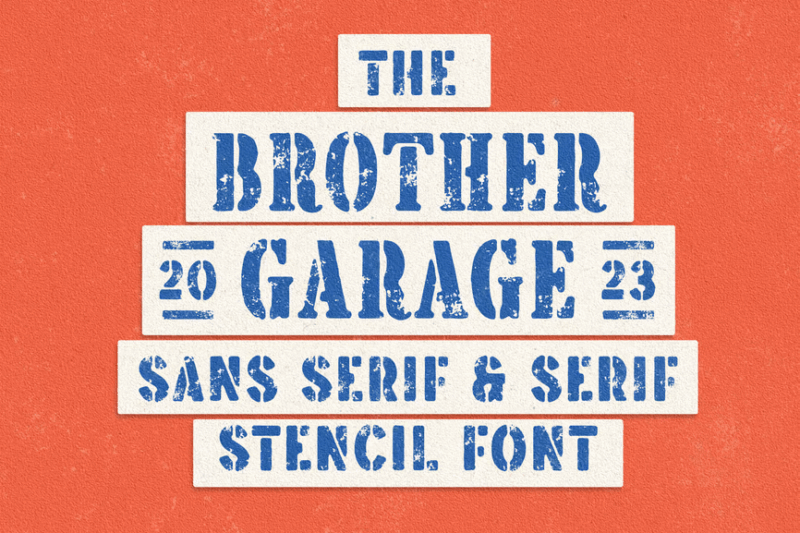
Brother Garage is a versatile display font family with serif, sans-serif, and decorative styles. Its retro-inspired design and motorcycle theme make it ideal for creating bold, eye-catching designs for automotive, lifestyle, or vintage-themed projects.
Rubber Stamp Display
Rubber Stamp Display is a script font that mimics handwritten text with a stamped effect. Its authentic appearance makes it perfect for creating signature-like elements, handcrafted labels, and designs that require a personal, artisanal touch.
Brocades – Crafted Font
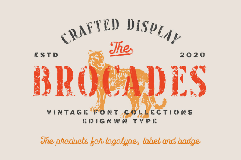
Brocades is a versatile font family including serif, sans-serif, script, and symbol styles. Its vintage-inspired design and textured appearance make it ideal for creating cohesive, authentic-looking designs across various applications and mediums.
Sazzle Vintage
Sazzle Vintage is a decorative font with a classic stamp-like appearance. Its distressed texture and unique character shapes make it perfect for creating vintage-inspired logos, labels, and designs that require an authentic, aged look.
Marline – Vintage Texture Font
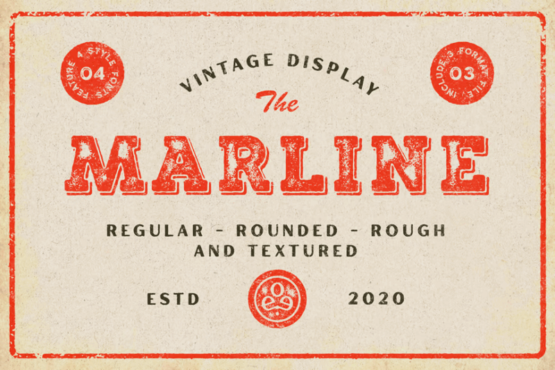
Marline is a serif font with a vintage texture and retro appeal. Its display-style design and weathered appearance make it ideal for creating eye-catching headlines, logos, and designs that require a nostalgic, time-worn aesthetic.
What Makes a Great Stamp Font Feel Authentic?
The best stamp fonts capture the unique qualities that make real-world stamping so distinctive. Let’s break down what gives stamp fonts their genuine character:
Uneven Ink Distribution
Real stamps rarely deposit ink with perfect consistency. Great stamp fonts replicate this with subtle variations in opacity and texture throughout each letterform. This inconsistency is what makes stamp fonts feel authentic – areas where ink pools more heavily contrast with lighter patches where the stamp barely made contact.
Distressed Edges
The edges of stamped letters rarely form perfect lines. Instead, they show slight bleeding, smudging, or fading that creates a distinctive border texture. Quality stamp fonts recreate these imperfect edges, with some letterforms appearing slightly worn or incomplete in spots.
Varied Pressure
When a physical stamp contacts paper, pressure isn’t applied perfectly. Some areas press harder than others, creating a natural variation in how the letterforms appear. Great digital stamp fonts mimic this by incorporating subtle differences in thickness and weight across characters.
Natural Imperfections
Specks, blots, and tiny gaps that occur naturally in physical stamping add character and authenticity. The best stamp fonts include these deliberate “flaws” to enhance the organic, handmade quality. These imperfections tell the viewer’s eye that this wasn’t generated by a perfect digital algorithm.
Weathered Character
Over time, physical stamps show wear as they’re used repeatedly. Excellent stamp fonts often incorporate this aged quality, with subtle degradation that suggests the stamp has a history. This weathered character adds depth and storytelling potential to your designs.
These characteristics working together create that distinctive stamped look that designers and audiences find so appealing. When selecting a stamp font, look for these qualities to ensure you’re getting the most authentic stamped appearance possible.
Where to Use Stamp Fonts Effectively
Now that we understand what makes stamp fonts special, let’s explore where they really shine in design applications:
Branding & Logos
Stamp fonts add authenticity and craftsmanship to brands wanting to convey handmade quality, tradition, or artisanal values. Craft breweries, coffee roasters, bakeries, and handmade goods all benefit from the tactile quality stamp fonts bring to brand identities.
Packaging Design
From food products to artisanal goods, stamp fonts on packaging create an immediate impression of care and attention to detail. They suggest that what’s inside has been handled with similar craft and consideration, making them perfect for small-batch or premium products.
Certificates & Official Documents
For a touch of authority and authenticity, stamp fonts excel on certificates, diplomas, and official-looking documents. They create that satisfying “officially stamped” feeling that adds weight and importance to the information being presented.
Event Materials
Wedding invitations, festival posters, and special event materials benefit enormously from stamp fonts. They create a sense of occasion and uniqueness, suggesting each item has been individually finished rather than mass-produced.
Vintage & Retro Designs
When creating designs with historical appeal or nostalgic vibes, stamp fonts are indispensable. They instantly transport viewers to earlier eras when mechanical printing and hand-stamping were the norm, perfect for retro-themed businesses or period-specific designs.
Social Media Graphics
In the digital space, stamp fonts help branded content stand out in crowded feeds. The textural quality catches the eye and adds a distinctive personality that more standard fonts can’t match, making them excellent for quotes, announcements, or branded posts.
Where to Avoid Using Stamp Fonts
While versatile, there are some applications where stamp fonts might not be the best choice:
Body Text
The very qualities that make stamp fonts distinctive – their textural inconsistencies and imperfections – can significantly reduce readability when used for longer passages. Reserve stamp fonts for headlines, short statements, or display purposes, and pair them with cleaner fonts for body text.
Technical Information
When precise information needs to be communicated clearly – like medical instructions, technical specifications, or financial data – stamp fonts can introduce unwanted ambiguity. Opt for clean, highly legible sans serif fonts in these contexts.
Contemporary Tech Brands
For brands positioning themselves as cutting-edge, forward-thinking tech companies, stamp fonts might send mixed signals. The vintage, handmade qualities could undermine messaging about innovation and modernity unless used very strategically as a contrast element.
Small Text Applications
At very small sizes, the distinctive texture and imperfections of stamp fonts can become muddy and difficult to read. If you need text to be legible at small sizes, consider more optimized fonts with better small-scale readability.
Formal Business Communications
Standard business documents like contracts, proposals, or formal communications generally benefit from a more professional, clean approach to typography. Save the stamp fonts for when you want to make a more distinctive brand statement.
How to Pick the Perfect Stamp Font
Selecting the right stamp font for your project requires consideration of several important factors:
Consider the Stamping Style
Different stamp fonts emulate different stamping techniques. Some recreate rubber stamps with their slightly bouncy, uneven impressions. Others mimic woodblock printing with more pronounced texture and grain. Still others reference official postmarks or metal-embossed seals. Choose the stamping style that best aligns with your design concept.
Match Historical Period
If you’re aiming for period authenticity, research stamping styles from your target era. Postal marks from the 1890s look quite different from 1970s rubber stamps. The right historical reference can make your design more convincing and emotionally resonant.
Evaluate Texture Density
Some stamp fonts have subtle, fine texturing that reads well even at smaller sizes. Others feature more dramatic distressing that demands larger display applications. Choose a texture density appropriate for how your font will be used and viewed.
Check Completeness
Many stamp fonts focus on uppercase letters and might have limited punctuation or special characters. Before committing to a stamp font, verify it includes all the characters you’ll need for your project.
Consider Color Versatility
Test how your chosen stamp font performs in different colors. Some stamp textures look convincing only in traditional ink colors like black, red, or blue, while others maintain their authentic appearance across a wider spectrum.
Pair Thoughtfully
Stamp fonts make strong stylistic statements, so they need to be paired thoughtfully with complementary fonts. Generally, clean sans-serifs or simple serifs provide the best contrast while letting the stamp font take center stage.
Creating Custom Stamp Effects
Sometimes an off-the-shelf stamp font doesn’t quite capture the exact look you’re after. Here are some techniques for creating or enhancing stamp effects:
Layer Multiple Impressions
Real stamps often get pressed multiple times, creating overlapping impressions. Try layering your stamp font at slight offsets with varying opacities to create a more authentic multi-stamped effect.
Add Contextual Texture
Enhance your stamp font by adding subtle paper texture beneath it, or overlay a light grunge texture to simulate the imperfect surface the stamp was pressed against.
Manipulate Individual Characters
For truly custom work, consider manipulating individual letterforms in vector software. Adding subtle distortions, removing small sections, or varying the opacity across different parts of letters can create a more convincing stamped appearance.
Explore Color Variations
Traditional stamp ink comes in limited colors (usually black, blue, or red), but experimenting with different hues and saturation levels can yield interesting results that still maintain authenticity.
Apply Contextual Angles
Real-world stamps rarely land perfectly level on the page. Applying a slight rotation to your stamp text can enhance the impression that it was manually applied rather than digitally generated.
Common Stamp Font Questions
Let’s address some frequently asked questions about stamp fonts:
What font looks like a stamp?
Fonts like Rubber Stamp, Postmark, Stampography, and Letterpress all effectively recreate different stamping styles. The key feature to look for is consistent inconsistency – where the font appears mechanically produced but with natural variations in ink distribution.
How can I make text look like a stamp in design software?
Beyond using dedicated stamp fonts, you can apply textured brushes or grain overlays to regular text, add slight distressing to edges, vary the opacity throughout letterforms, and slightly offset duplicate layers at reduced opacity to simulate multiple impressions.
Are stamp fonts legible enough for important information?
Most stamp fonts maintain good legibility for short phrases and headlines, but their textural qualities can reduce readability for longer text. For critical information, ensure your chosen stamp font has clear letterforms beneath its textural elements, or pair it with a more legible font for essential details.
Can I use stamp fonts for digital-only projects?
Absolutely! While stamp fonts reference physical printing techniques, they add valuable texture and character to purely digital designs. They create an interesting tension between the digital medium and the analog reference, which can make digital designs feel more tactile and engaging.
Do I need special licenses for commercial projects using stamp fonts?
Like all fonts, stamp fonts come with specific licensing terms. Many require commercial licenses for business use. Always check the license agreement from the font creator or marketplace where you purchased the font to ensure compliance with their terms.
Conclusion: The Enduring Appeal of Stamp Typography
In our increasingly digital world, stamp fonts offer something precious: a connection to the physical act of making marks on paper – one of humanity’s oldest forms of communication. There’s a reason these fonts continue to resonate with designers and audiences alike.
The beautiful imperfections of stamp fonts remind us that communication doesn’t have to be flawless to be effective. In fact, it’s often the little irregularities that make a message feel more human, more authentic, and ultimately more engaging.
Whether you’re creating branding for an artisanal business, designing packaging that stands out on shelves, or simply adding some tactile character to digital designs, stamp fonts offer a distinctive aesthetic that’s both nostalgic and timeless.
So next time your project needs that perfect touch of handcrafted authenticity, consider reaching for one of these outstanding stamp fonts. After all, in a world of perfect pixels, sometimes the most effective way to make your mark is with something that looks like it was pressed by hand.