In this article:
- 33 Most Dramatic Cinematic Fonts of 2026
- What Makes a Font Feel "Cinematic"?
- Cinematic Fonts By Film Genre
- How to Use Cinematic Fonts in Your Designs
- When to Use (and When to Avoid) Cinematic Fonts
- Famous Film Fonts and Their Stories
- Conclusion
If you’re designing movie posters, YouTube thumbnails, or film festival promos, the right cinematic font can turn a good design into something truly show-stopping. After diving deep into the typography behind blockbusters and indie hits alike, I’ve discovered what gives these fonts their undeniable screen appeal.
In this guide, we’ll spotlight the most striking cinematic fonts of 2026, exploring what makes them so effective, how to use them like a pro, and why certain typefaces have become shorthand for entire film genres. It’s time to say goodbye to ordinary lettering and put your designs in the director’s chair with these reel-worthy fonts!
33 Most Dramatic Cinematic Fonts of 2026
Cinemate
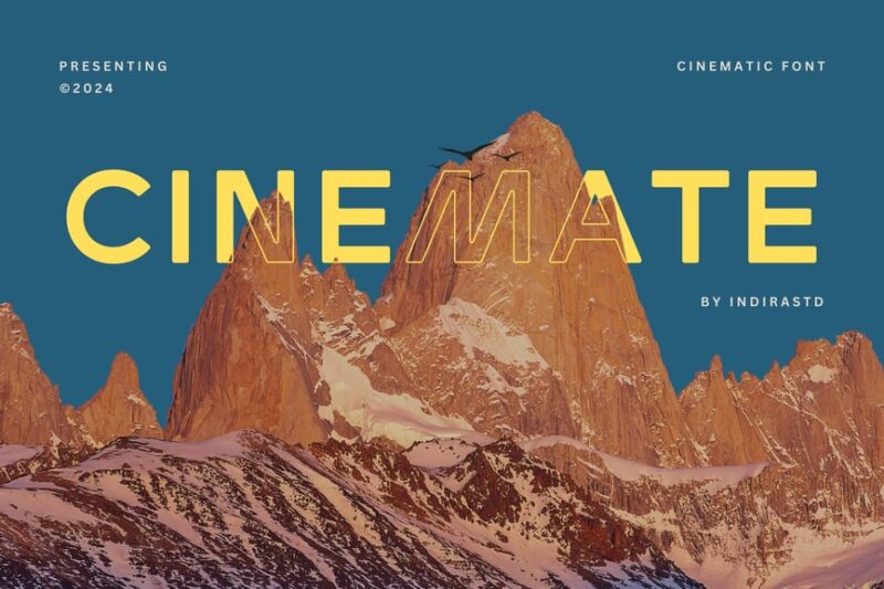
Cinemate is a sleek sans-serif font designed for cinematic and corporate applications. Its bold, clean lines and modern aesthetic make it perfect for movie titles, posters, and professional branding materials.
Kanvas Rooper
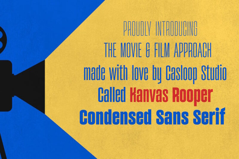
Kanvas Rooper is a condensed sans-serif typeface that captures the essence of 1950s cinema. Its variable design allows for flexibility, making it ideal for vintage-inspired movie posters, retro branding, and mid-century modern designs.
Droby Rodax
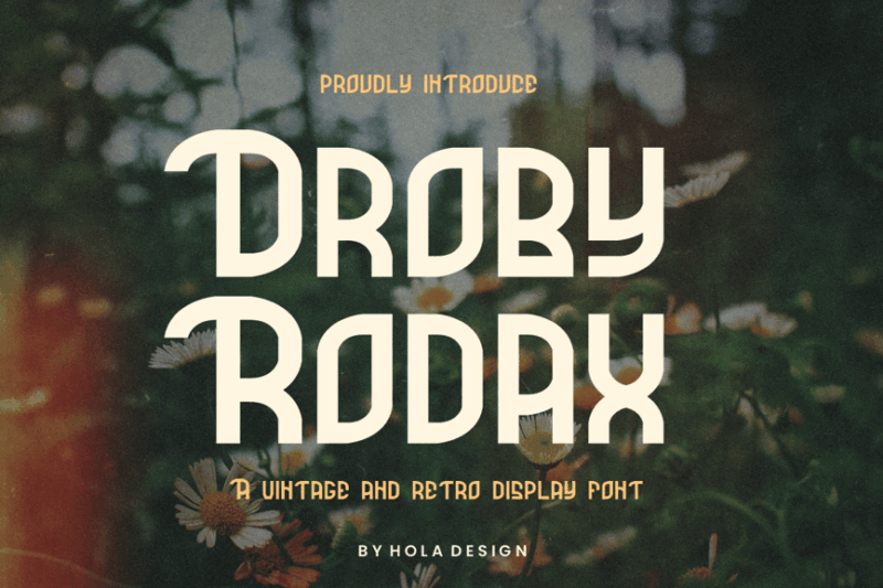
Droby Rodax is a decorative display font that evokes a vintage cinematic feel. Its retro charm and unique character make it perfect for creating eye-catching titles, posters, and designs that require a nostalgic touch.
Velmora
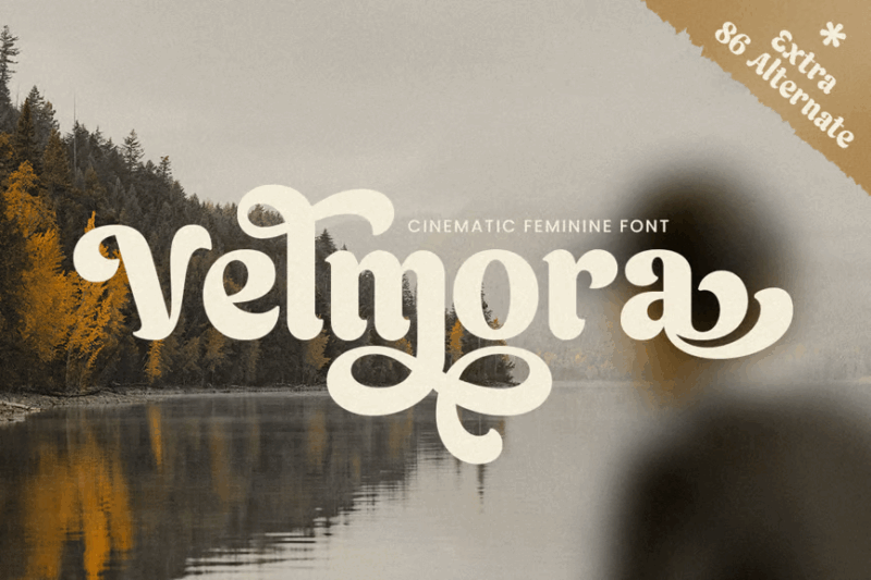
Velmora is a script and handwritten font that combines cinematic flair with feminine elegance. Its flowing curves and modern touch make it ideal for romantic movie titles, wedding invitations, and sophisticated branding projects.
Galline
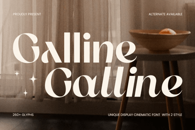
Galline is a unique sans-serif display font with a cinematic edge. Its distinctive letterforms and bold presence make it perfect for creating memorable movie titles, posters, and designs that demand attention.

Get 300+ Fonts for FREE
Enter your email to download our 100% free "Font Lover's Bundle". For commercial & personal use. No royalties. No fees. No attribution. 100% free to use anywhere.
Making
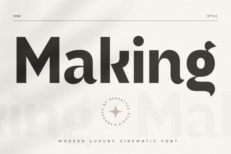
Making is a modern luxury sans-serif font with a cinematic twist. Its sleek lines and refined aesthetics make it ideal for high-end branding, elegant logotypes, and sophisticated film-related designs.
Quorum
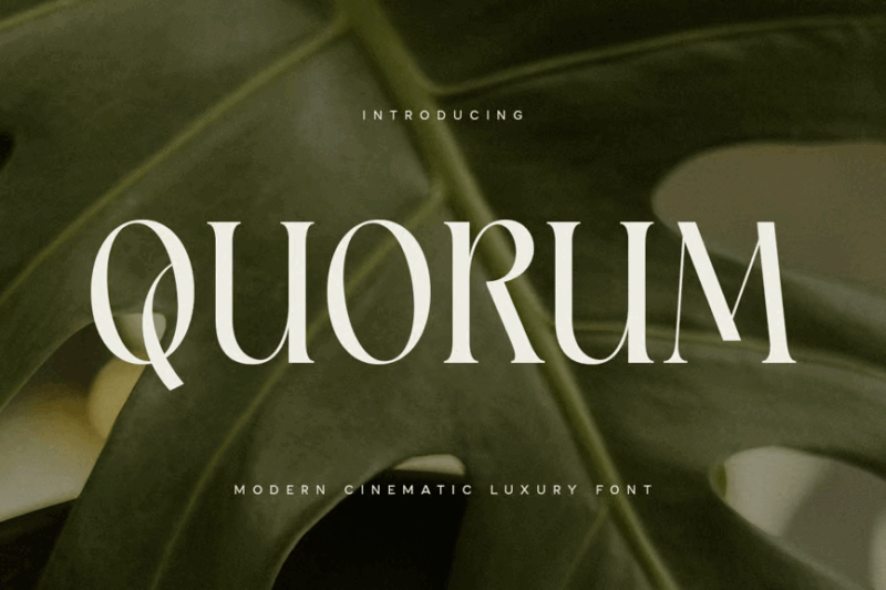
Quorum is a modern serif font that exudes luxury and cinematic appeal. Its elegant letterforms and balanced proportions make it perfect for upscale movie titles, premium branding, and high-end design projects.
Givena
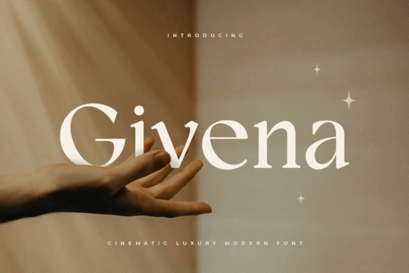
Givena is a cinematic luxury serif font with a modern twist. Its refined character and versatile design make it suitable for creating sophisticated movie titles, editorial layouts, and premium branding materials.
Silute
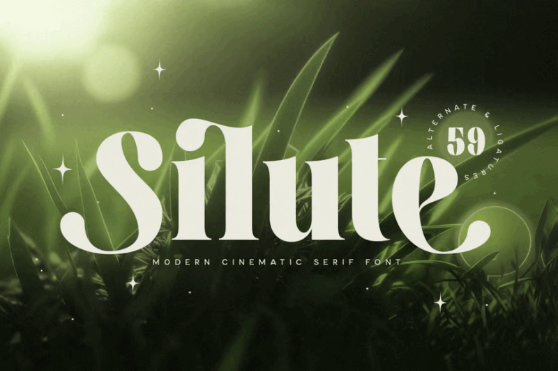
Silute is a luxury cinematic serif font that comes with a webfont version. Its modern and premium design makes it perfect for creating elegant movie titles, high-end websites, and sophisticated print materials. See more elegant fonts here.
Megatron
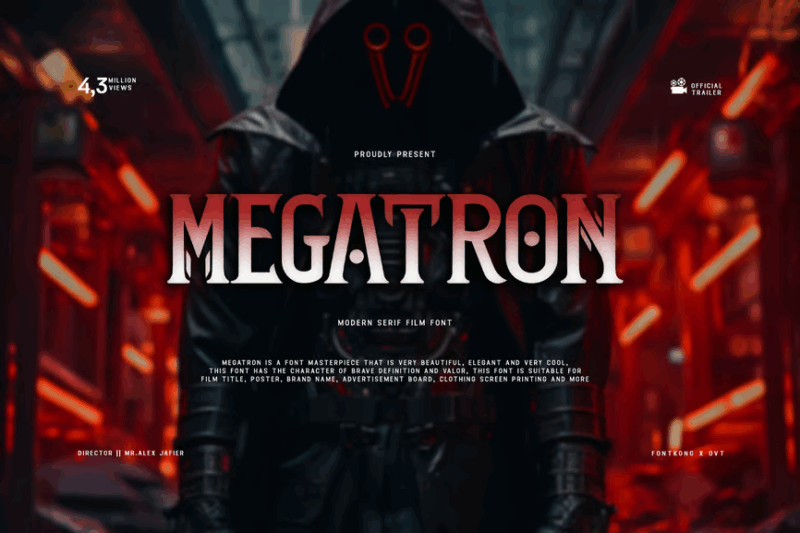
Megatron is a modern serif film font designed for cinematic impact. Its bold presence and contemporary style make it ideal for creating powerful movie titles, dramatic posters, and attention-grabbing designs in the film industry.
Andoria
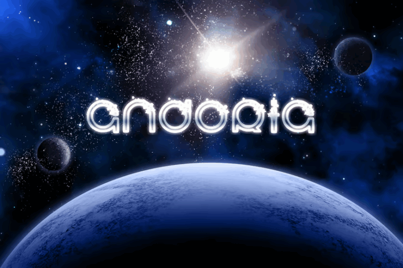
Andoria is a decorative serif font with a sci-fi twist. Its futuristic design and cosmic-inspired letterforms make it perfect for creating otherworldly titles, science-themed designs, and science fiction book covers.
SA Vredina Thin Ultra Condensed
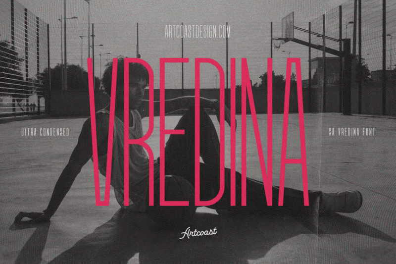
SA Vredina Thin Ultra Condensed is a sans-serif font with a technical edge. Its ultra-thin and condensed design makes it ideal for creating sleek, modern layouts, tech-inspired designs, and futuristic branding materials.
WALTER
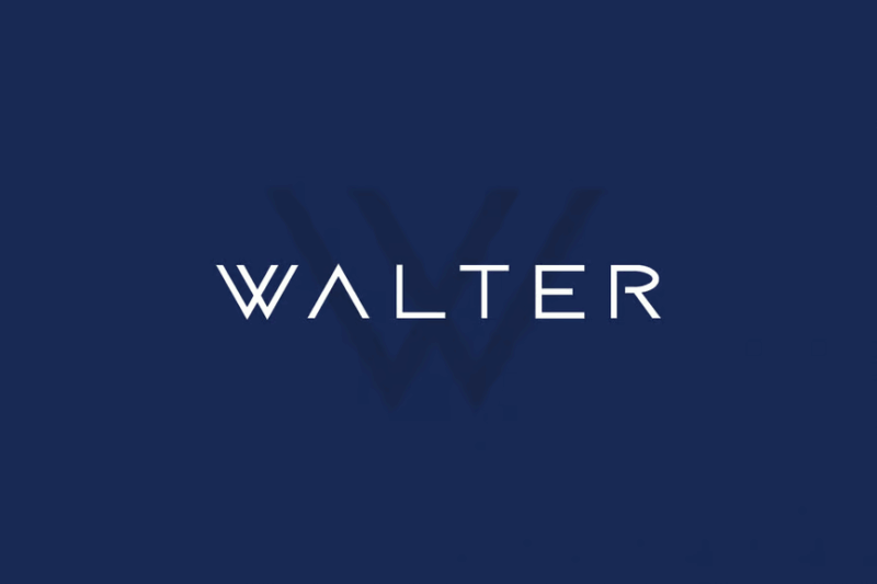
WALTER is a modern techno/sci-fi typeface that includes sans-serif, decorative, and symbol styles. Its futuristic design and versatile character set make it perfect for creating cutting-edge displays, tech branding, and science fiction-themed projects.
Western Bounty
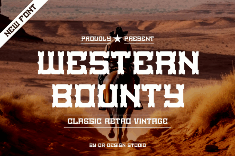
Western Bounty is a classic decorative typeface that captures the essence of the Old West. Its vintage charm and retro style make it ideal for creating authentic Western-themed designs, movie posters, and nostalgic branding materials.
Miera
![]()
Miera is a unique luxury serif font designed for creating distinctive logos. Its elegant letterforms and refined aesthetics make it perfect for high-end branding, upscale product packaging, and sophisticated design projects.
Topersify
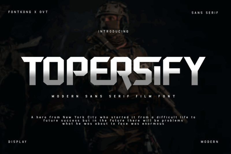
Topersify is a modern sans-serif film font with a cinematic flair. Its clean lines and contemporary design make it ideal for creating impactful movie titles, sleek posters, and modern branding in the film industry. For more military-style fonts, click here.
Curious
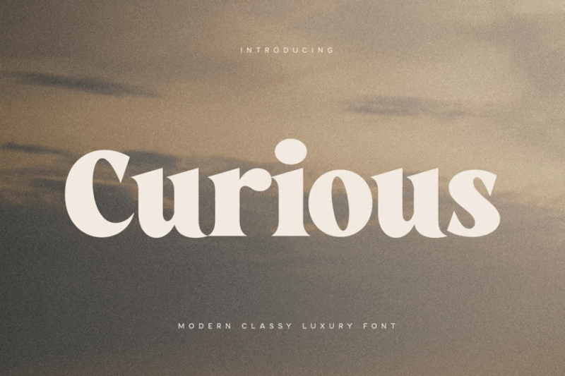
Curious is a modern, classy serif font with a luxurious touch. Its elegant design and cinematic appeal make it perfect for creating sophisticated movie titles, high-end branding materials, and premium editorial layouts.
Qubic Grid
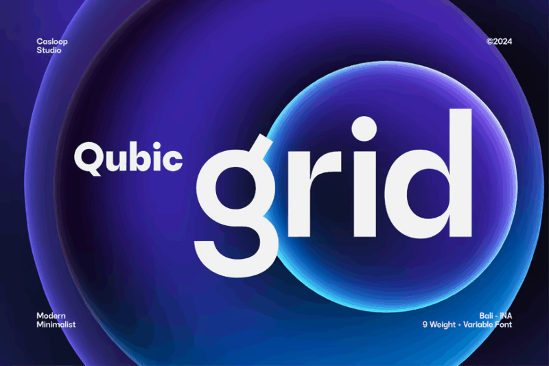
Qubic Grid is a modern grotesk variable font with a royal and futuristic aesthetic. Its innovative design and construction-inspired forms make it ideal for creating bold, cinematic titles and cutting-edge branding projects.
Casthara
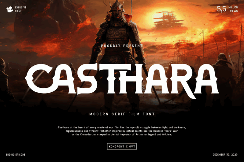
Casthara is a modern serif film font designed for cinematic impact. Its elegant letterforms and contemporary style make it perfect for creating sophisticated movie titles, dramatic posters, and high-end branding in the film industry.
Banilu Modern Sans
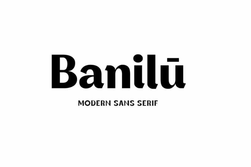
Banilu Modern Sans is a contemporary sans-serif font with a touch of serif influence. Its clean lines and versatile design make it suitable for a wide range of applications, from modern branding to sleek editorial layouts.
Angle Square
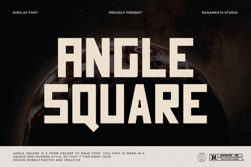
Angle Square is a unique modern sans-serif font with a geometric twist. Its bold, angular design makes it perfect for creating eye-catching logos, sporty branding, and contemporary designs that demand attention.
Avant ique
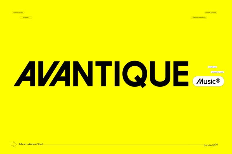
Avant ique is a geometric grotesk font inspired by the youthful spirit of the 60s and 70s. Its retro charm and flexibility make it ideal for creating vintage-inspired designs, fashion branding, and nostalgic marketing materials.
PIRATES
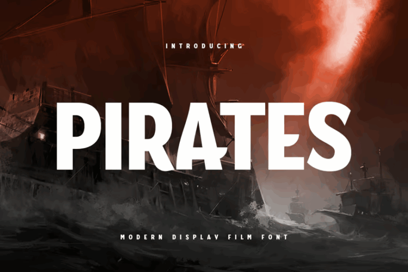
PIRATES is a modern display film font with a bold, sans-serif style. Its strong presence and contemporary design make it perfect for creating impactful movie titles, eye-catching posters, and modern logo designs. Like this look? You can see more Pirate Fonts here.
Etmes Modern Serif
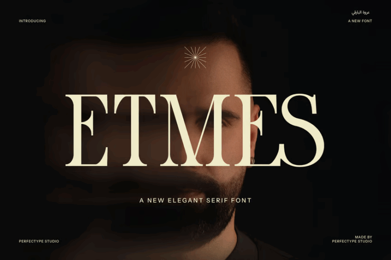
Etmes Modern Serif is an elegant font that combines contemporary style with classic serif elements. Its refined design makes it ideal for creating luxurious logos, high-end branding materials, and sophisticated editorial layouts.
Tuiven
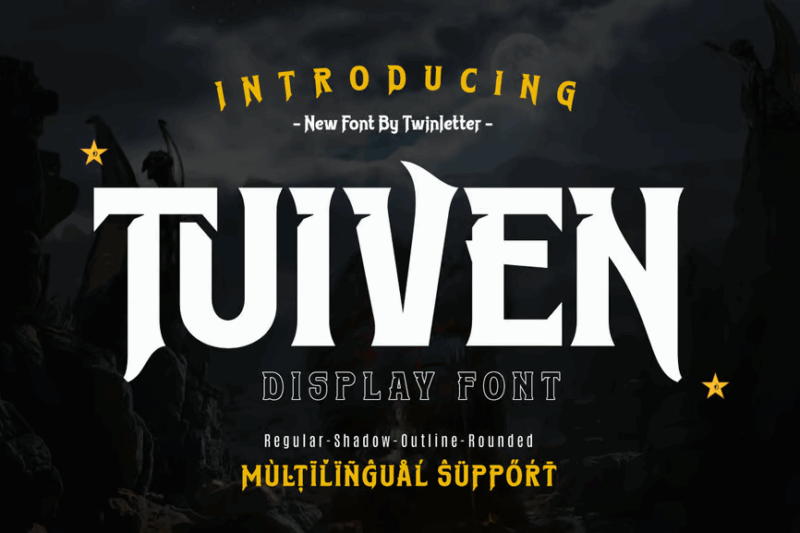
Tuiven is a decorative movie display font designed to make a statement. Its unique character and bold presence make it perfect for creating attention-grabbing movie titles, theatrical posters, and dramatic design projects.
Horse Westron
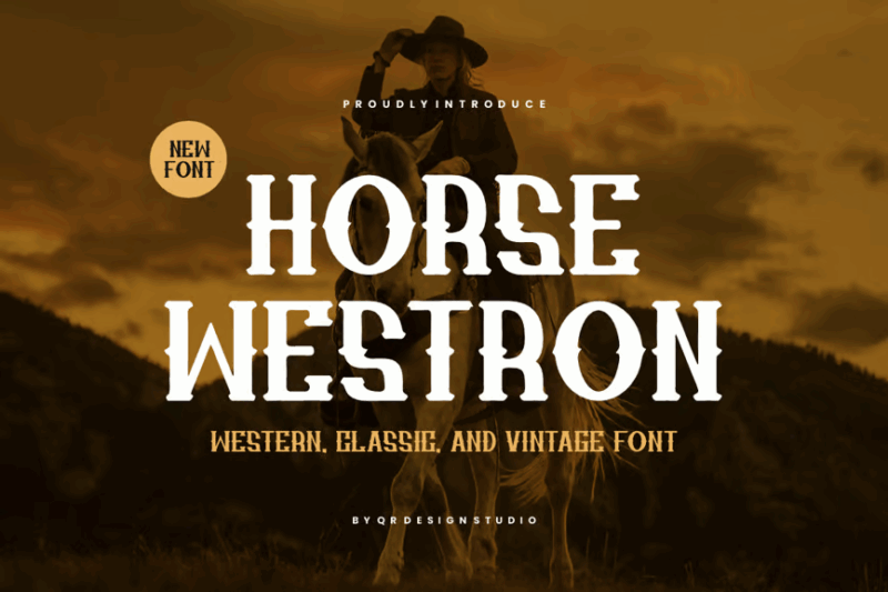
Horse Westron is a decorative Western and vintage-inspired font. Its classic Art Deco influences and old-world charm make it ideal for creating authentic Western-themed designs, retro branding, and nostalgic marketing materials.
Survalia
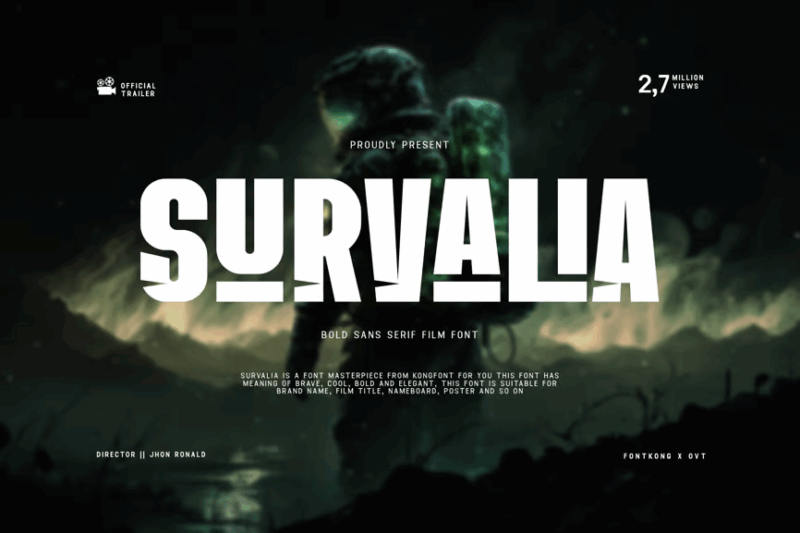
Survalia is a bold sans-serif film font designed for cinematic impact. Its strong presence and modern aesthetic similar to the Impact font make it perfect for creating powerful movie titles, striking posters, and attention-demanding designs in the film industry.
Roach
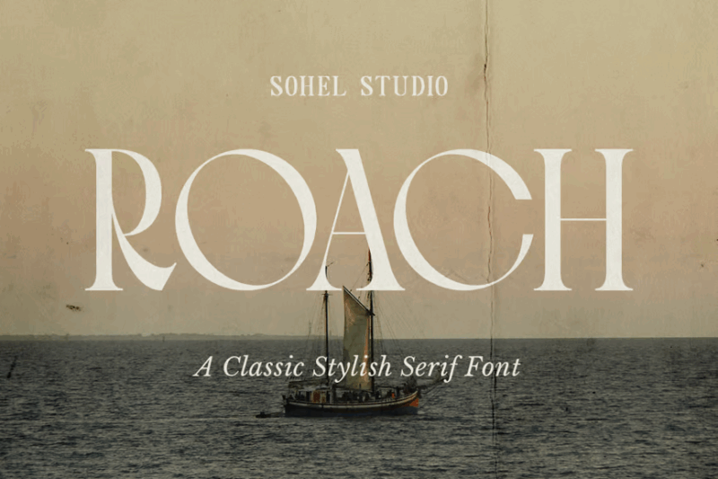
Roach is a modern, elegant serif font with a classic touch and a hint of Western style. Its versatile design makes it suitable for creating sophisticated branding, editorial layouts, and designs that blend contemporary and traditional aesthetics.
Oakheart
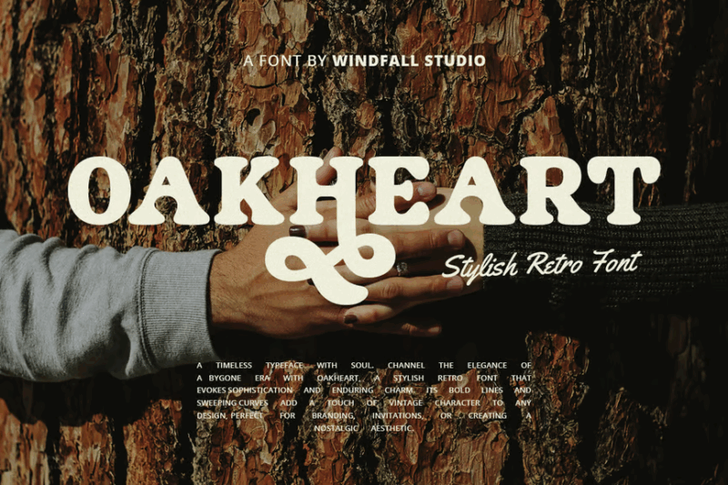
Oakheart is a modern, elegant serif font with a stylish 60s flair. Its versatile design combines contemporary elements with vintage charm, making it perfect for creating sophisticated branding, editorial layouts, and designs that require a touch of nostalgia.
What Makes a Font Feel “Cinematic”?
What exactly gives cinematic fonts their commanding screen presence? Several key characteristics work together to create that unmistakable film-worthy look:
Scale and Impact
Movie titles need to work at massive scales – from 30-foot theater screens to tiny streaming thumbnails. Cinematic fonts excel at both extremes with crystal-clear legibility and immediate visual impact. Their proportions are carefully calibrated to command attention at any size.
Think about iconic title sequences like “Star Wars” or “Jurassic Park.” Those fonts weren’t chosen by accident – they’re designed to be instantly recognizable even when glimpsed for a split second in a trailer.
Genre-Specific Styling
The best cinematic fonts telegraph genre instantly. Horror films gravitate toward distressed, jagged letterforms that evoke unease. Sci-fi titles often feature sleek, technological aesthetics with unusual angles and glowing effects. Period dramas employ elegant serifs that ground the viewer in a specific historical era.
These visual shorthand elements help audiences immediately understand what kind of film experience they’re about to have – before a single scene plays.
Emotional Resonance
Film is an emotional medium, and cinematic fonts must carry that emotional weight. The subtle curve of a letter, the thickness of a stroke, or the space between characters can convey everything from whimsical adventure to heart-pounding suspense.
Great cinematic typography doesn’t just label content – it becomes an integral part of the storytelling process itself.
Cinematic Fonts By Film Genre
Different film genres have developed their own typographic languages. Let’s explore the characteristic fonts associated with popular movie categories:
Horror & Thriller Fonts
Horror typography embraces the unsettling and macabre. Look for distressed textures, irregular baselines, and sharp, threatening serifs. Blood drips, scratched surfaces, and deteriorating letterforms all reinforce themes of danger and decay.
Classic examples include the infamous “Trajan” (used in countless thriller posters) and custom fonts like the jagged lettering from “The Shining” that seems to scream from the screen.
Sci-Fi & Futuristic Fonts
Science fiction fonts typically feature clean geometric shapes, unusual proportions, and technical styling. Many incorporate elements that suggest technology – circuit-like patterns, digital displays, or alien writing systems.
The bold simplicity of “Eurostile Extended” (featured in “2001: A Space Odyssey”) and the custom typography of “Blade Runner” exemplify this forward-looking aesthetic.
Action & Adventure Fonts
Action movies demand bold, powerful typography that conveys movement and energy. These fonts feature heavy weights, dramatic angles, and often include motion effects like blurring, lens flares, or metallic textures.
The condensed, impactful typography of the “Mission: Impossible” franchise or the metallic, battle-worn look of “Transformers” titles perfectly capture this high-octane spirit.
Period & Historical Films
Historical dramas rely on typography appropriate to their time period. Victorian-era films might showcase ornate serif fonts with flourishes and decorative elements, while 1920s-set stories often feature Art Deco typefaces with geometric precision.
“Wes Anderson Sans” (used in films like “The Grand Budapest Hotel”) and the elegant script fonts of period romances establish authenticity and transport viewers to another era.
Comedy & Family Fonts
Lighter film genres embrace playful, approachable typography. Rounded letterforms, bouncy baselines, and cheerful colors create a sense of fun and accessibility. Hand-drawn styles often appear in comedies and animated features.
The whimsical lettering of Pixar films or the friendly, informal typography of romantic comedies invites viewers into a world of entertainment without intimidation.
How to Use Cinematic Fonts in Your Designs
Ready to add some silver screen magic to your projects? Here’s how to make cinematic fonts work for you:
Pair with Supporting Cast
Just like a film needs both stars and supporting actors, your cinematic headline font needs complementary secondary typography. For readability, pair a dramatic display font with a clean, unobtrusive text font that won’t compete for attention.
When designing a movie poster or promotional materials, remember that your title font should command attention while secondary information (credits, taglines, release dates) should recede into the background.
Consider Context
A font that works perfectly for a horror film would feel jarringly out of place in a romantic comedy. Always match your typography to the tone and content of your project. Ask yourself: “If this design were a movie, what genre would it be?” Then choose accordingly.
Your audience brings expectations based on visual conventions they’ve absorbed through years of movie-watching. Use those expectations to your advantage rather than fighting against them.
Mind Your Hierarchy
Film posters and credits have a strict visual hierarchy. The title commands prominence, followed by the “starring” talent, then producers, director, and finally the smaller credits.
Maintain clear hierarchy in your designs by varying size, weight, and spacing. Don’t be afraid to go big with your main title – cinematic design isn’t the place for subtlety!
Embrace Special Effects (Thoughtfully)
Cinema is a visual effects medium, and cinematic typography often incorporates dimensionality, texture, and motion. Consider adding subtle 3D effects, appropriate textures, or dynamic positioning to your type.
However, exercise restraint – effects should enhance readability, not obscure it. The best typographic effects feel integral to the design rather than tacked-on afterthoughts.
When to Use (and When to Avoid) Cinematic Fonts
Understanding the appropriate contexts for cinematic typography is crucial for successful design:
Perfect For:
• Film and television marketing materials
• Entertainment websites and streaming platforms
• Video thumbnails and channel art
• Event promotions (especially for themed events, premieres, or festivals)
• Book covers (particularly for genres that share aesthetics with film, like thrillers or fantasy)
• Gaming interfaces and promotional materials
Approach With Caution:
• Corporate communications
• Academic or scientific publications
• Healthcare materials
• Financial services
• Any context where immediate clarity and professionalism take precedence over dramatic impact
Remember: cinematic fonts are designed to evoke emotion and create visual impact. In contexts where conveying information efficiently is the primary goal, they may introduce unnecessary complexity.
Famous Film Fonts and Their Stories
Some cinematic fonts have become cultural icons in their own right. Their stories reveal the power of thoughtful typography in filmmaking:
![]()
Star Wars
The iconic “Star Wars” typography wasn’t a standard font but was hand-drawn by artist Suzy Rice under George Lucas’s direction to look “fascist” and intimidating. Its dramatically extended letterforms and distinctive ‘W’ have become one of the most recognizable logos in entertainment history.
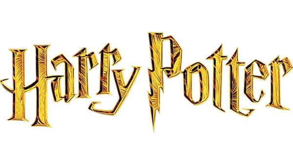
Harry Potter
The lightning-bolt “P” and distinctive serifs of the Harry Potter font instantly communicate magic and mystery. The logo has remained remarkably consistent across multiple films, books, and merchandise – proving the staying power of well-crafted cinematic typography.
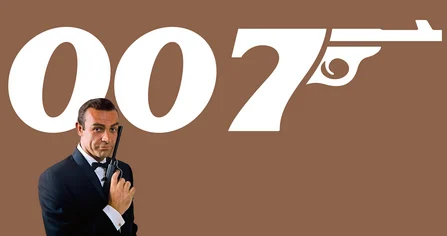
James Bond
The 007 franchise has maintained a consistent typographic identity since 1962’s “Dr. No.” The elegant, streamlined typography reflects Bond’s sophisticated character while subtly evolving to remain contemporary across six decades of films.
![]()
Universal Studios
Not just a film font but the logo for an entire studio, Universal’s distinctive globe typography has remained recognizable while undergoing subtle modernization through the years. It’s a masterclass in evolving a typographic identity without losing recognition.
Conclusion
As we’ve seen, cinematic fonts are far more than decorative elements – they’re storytelling tools that establish mood, genre, and emotional tone before a single character appears on screen. From the jagged tension of horror titles to the sleek futurism of sci-fi typography, these fonts speak a visual language that audiences instinctively understand.
Whether you’re designing for actual films or simply want to bring some movie magic to other projects, understanding the principles behind cinematic typography can elevate your work from everyday to extraordinary. The right font doesn’t just label content – it transforms it.
So next time you’re working on a project that could use some dramatic flair, consider reaching for one of these cinematic fonts. After all, in the world of design, sometimes the typography deserves top billing.
Which cinematic font style speaks to you most? Horror’s distressed edges? Sci-fi’s technical precision? The elegant serifs of period dramas? Let me know in the comments – I’d love to hear which typography stars have earned your personal Oscar!