In this article:
- The 2026 Collection: Top Simple Fonts That Deliver
- What Makes a Font "Simple"?
- Why Simple Fonts Are Having a Moment
- Where Simple Fonts Shine Brightest
- How to Choose the Perfect Simple Font
- Simple Font Mistakes to Avoid
- The Psychology Behind Simple Typography
- Simple Fonts in the Digital Age
- Pairing Simple Fonts Like a Pro
- Future-Proofing Your Font Choices
- Common Simple Font Questions Answered
- Conclusion: Embracing the Power of Simplicity
Sometimes the most powerful design choice is the simplest one. In a world drowning in decorative typefaces and elaborate scripts, simple fonts stand like quiet heroes – unassuming, reliable, and surprisingly versatile.
You know that moment when you’re scrolling through endless font libraries, overwhelmed by thousands of options, and you just want something that works? That’s where simple fonts come to the rescue. They’re the typography equivalent of a perfect white t-shirt – effortlessly stylish, endlessly adaptable, and never out of place.
But here’s the thing about simple fonts: calling them “simple” is almost doing them a disservice. These typefaces are masterfully crafted with clean lines, balanced proportions, and an understated elegance that takes real skill to achieve. It’s like that famous quote often attributed to various designers: “Simplicity is the ultimate sophistication.”
In this comprehensive guide, we’ll explore the world of simple fonts that are making waves in 2026. From the psychology behind minimalist typography to practical tips for choosing the perfect simple font for your project, we’ve got you covered.
So grab your favorite coffee (in a beautifully simple mug, of course), and let’s dive into the wonderfully uncomplicated world of simple fonts!
The 2026 Collection: Top Simple Fonts That Deliver
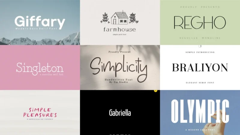
Simple Sans Family Font
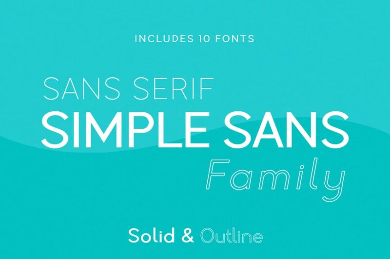
The Simple Sans Family Font is a comprehensive collection of simple fonts in various weights. This sans-serif family offers designers a wide range of options for creating cohesive and clean designs across different mediums and projects.
JUST Sans® Clean Modern Minimal Geometric Typeface
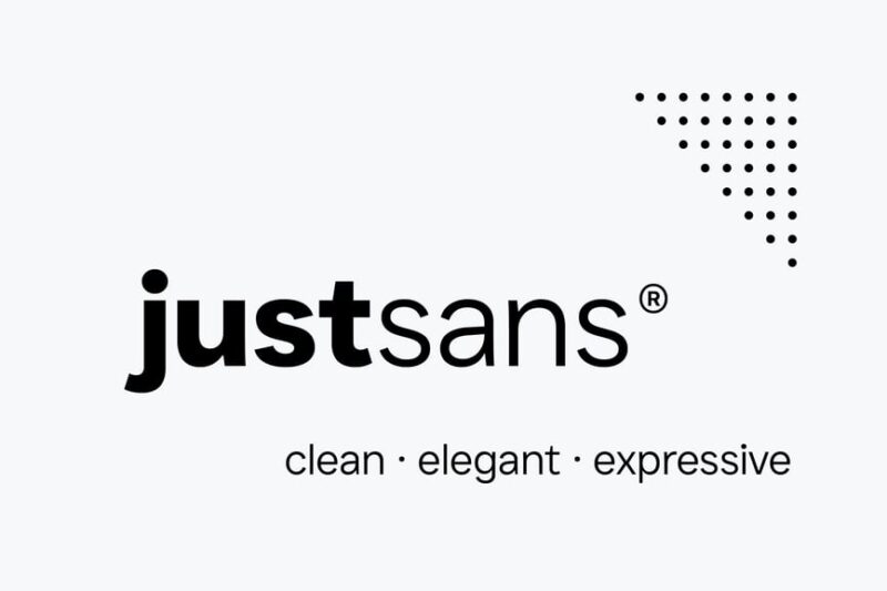
JUST Sans® is the epitome of simple fonts, offering a clean, modern, and minimal geometric design. This versatile typeface is perfect for designers who prioritize clarity and simplicity in their work, suitable for both digital and print applications.

Get 300+ Fonts for FREE
Enter your email to download our 100% free "Font Lover's Bundle". For commercial & personal use. No royalties. No fees. No attribution. 100% free to use anywhere.
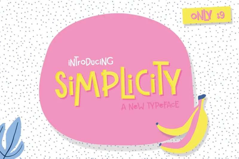
Simplicity – Handwritten Font
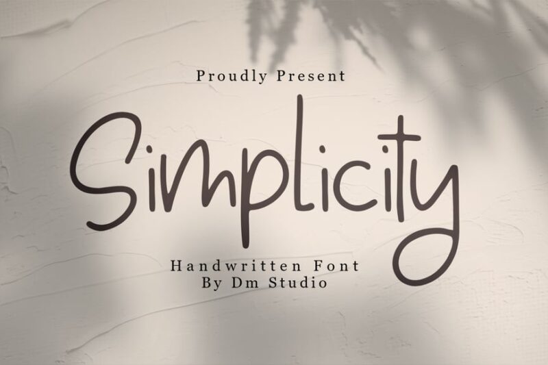
Simplicity is a charming handwritten font that embodies the essence of simple fonts. Its elegant script style makes it perfect for creating a personal touch in designs while maintaining readability and versatility.
Simplicity Font
This sans-serif Simplicity Font offers a cool and connected look, ideal for designers seeking simple fonts with a modern edge. Its clean lines and balanced proportions make it suitable for various design projects requiring a straightforward yet stylish typeface.
Simple Banget
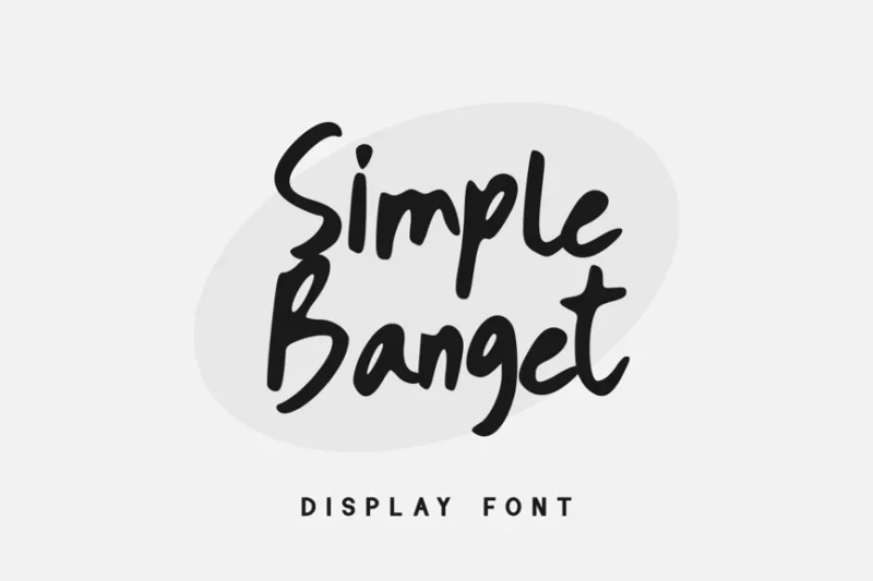
Simple Banget is a decorative font that combines simplicity with a food-inspired theme. This unique typeface is perfect for culinary-related designs, offering a fresh take on simple fonts while maintaining a playful and appetizing aesthetic.
Just Okey
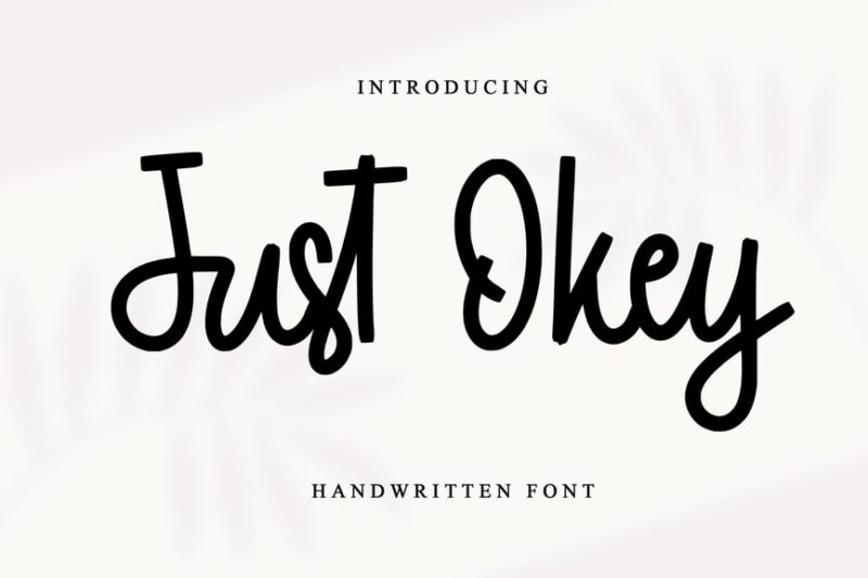
Just Okey is a script font that strikes a balance between brand identity and minimalism. It’s an excellent choice for designers looking for simple fonts with a touch of personality, perfect for creating memorable logos and headlines.
Simple Thing
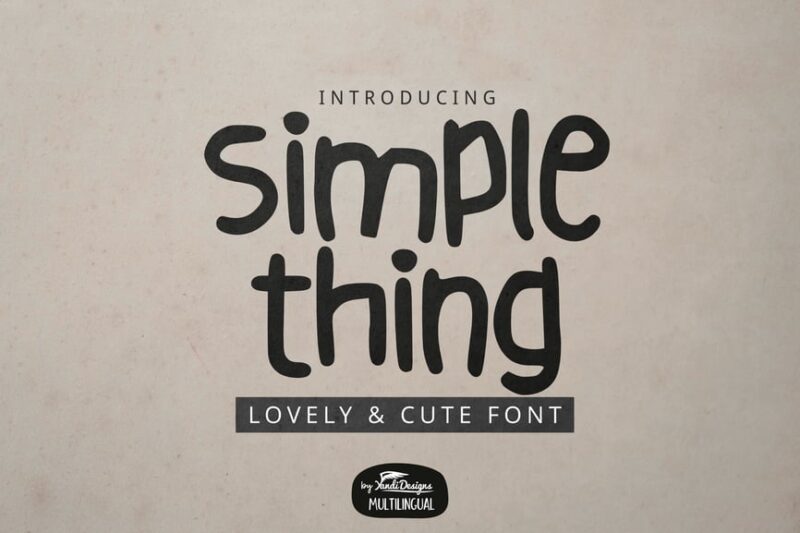
Simple Thing is a versatile font family combining sans-serif and script styles. This collection of simple fonts offers basic yet attractive typefaces, making it an ideal choice for designers who need variety without compromising on simplicity.
Drunken Stencilliya
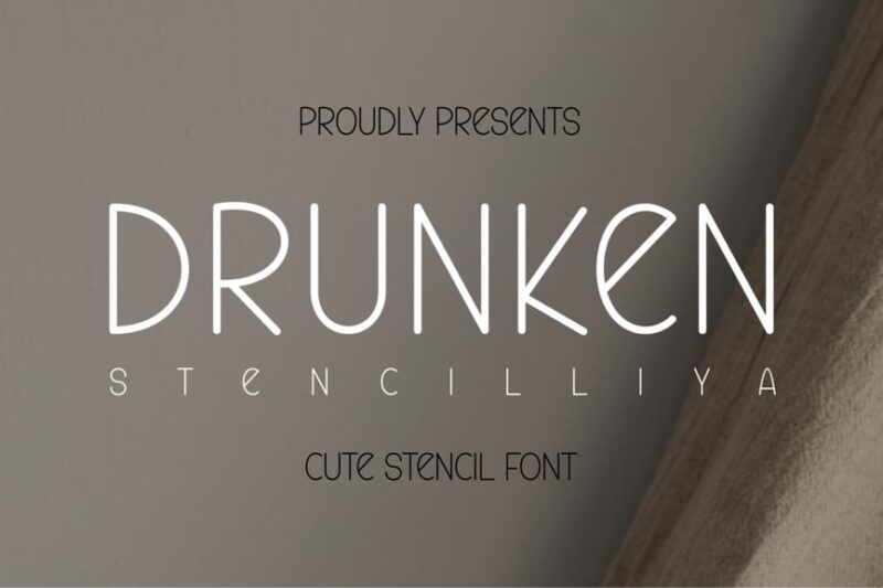
Drunken Stencilliya is a unique blend of script and sans-serif styles with a stencil twist. While not a traditional simple font, it offers a bold and edgy option for designers looking to add character to their work, especially in tattoo or street-style designs.
Pureline
Pureline is a script font that combines simplicity with elegance. This typeface is ideal for logotype design, offering a clean and sophisticated option for those seeking simple fonts with a touch of refinement and personality.
Darky Clean Minimal Font Family
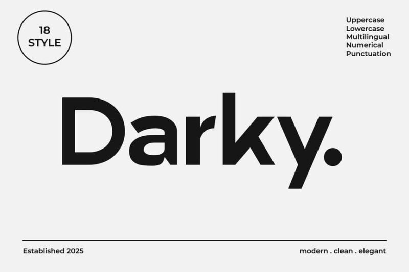
The Darky Clean Minimal Font Family embodies the essence of simple fonts with its grotesk-inspired design. This collection offers a range of weights, providing designers with versatile options for creating clean, modern, and minimalist designs.
Braliyon an Elegant Serif Font
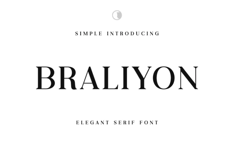
Braliyon is an elegant serif font that combines simplicity with sophistication. While not a traditional simple font, it offers a refined option for designers seeking a typeface that balances readability with a touch of class, perfect for luxury branding and editorial designs.
Polly
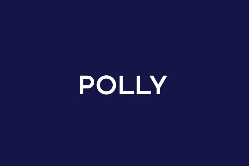
Polly is a rounded sans-serif font that embodies the spirit of simple fonts. Its soft edges and clean lines make it an excellent choice for designers looking to create friendly and approachable designs without sacrificing legibility or professionalism.
Bremenoff – Simple & Timeless Typeface
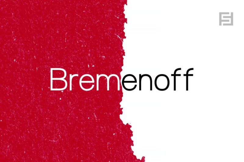
Bremenoff is a sans-serif typeface that truly lives up to its name as a simple and timeless font. It offers designers a versatile and enduring option for creating clean, modern designs that won’t go out of style, making it a valuable addition to any collection of simple fonts.
Singleton Font
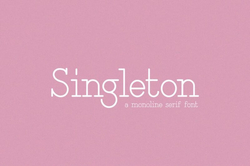
Singleton is a minimalist serif font that embraces simplicity without compromising on character. This typeface is perfect for designers seeking simple fonts with a touch of elegance, ideal for creating sophisticated yet understated designs across various mediums.
Simple Marker Font
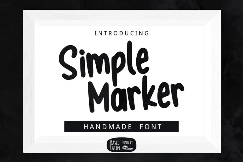
The Simple Marker Font offers a hand-drawn aesthetic while maintaining the essence of simple fonts. This versatile typeface is perfect for designers looking to add a personal touch to their work, ideal for creating casual, approachable designs with a hint of creativity.
Working – Condensed Sans Serif Typeface
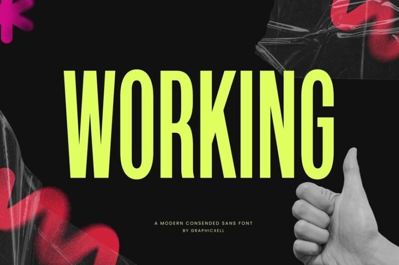
Working is a condensed sans-serif typeface that embodies efficiency and simplicity. This font is an excellent choice for designers seeking simple fonts that can convey information clearly in limited spaces, making it ideal for headlines, signage, and compact layouts.
JUST Sans® Font Duo – The Perfect Sans-Serif Pair
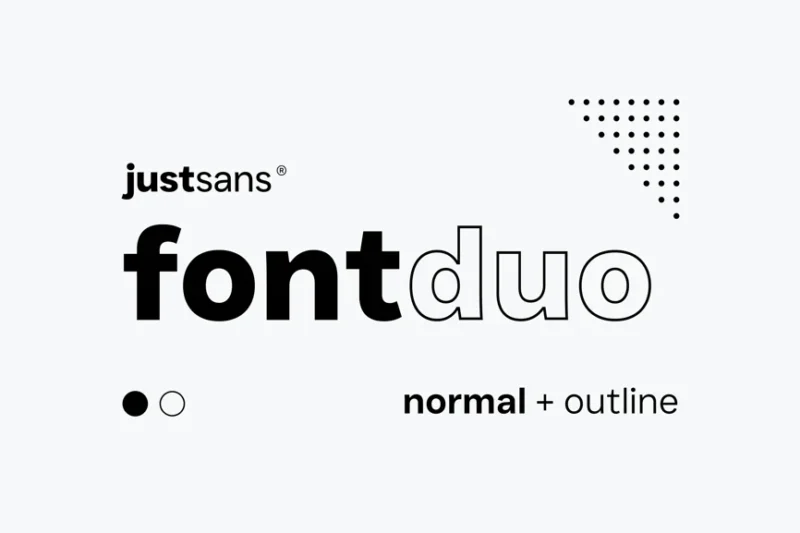
The JUST Sans® Font Duo offers a perfect pairing of simple fonts for versatile design applications. This combination provides designers with complementary sans-serif typefaces, ideal for creating cohesive and balanced layouts across various projects.
Simple Pleasures SVG + Vector Font
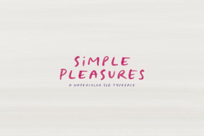
Simple Pleasures is a unique font that combines simplicity with a handwritten aesthetic. This SVG and vector font offers designers the flexibility of simple fonts with a personal touch, perfect for creating authentic and approachable designs across digital and print media.
Olimpic — Clean Modern Sans Serif Font
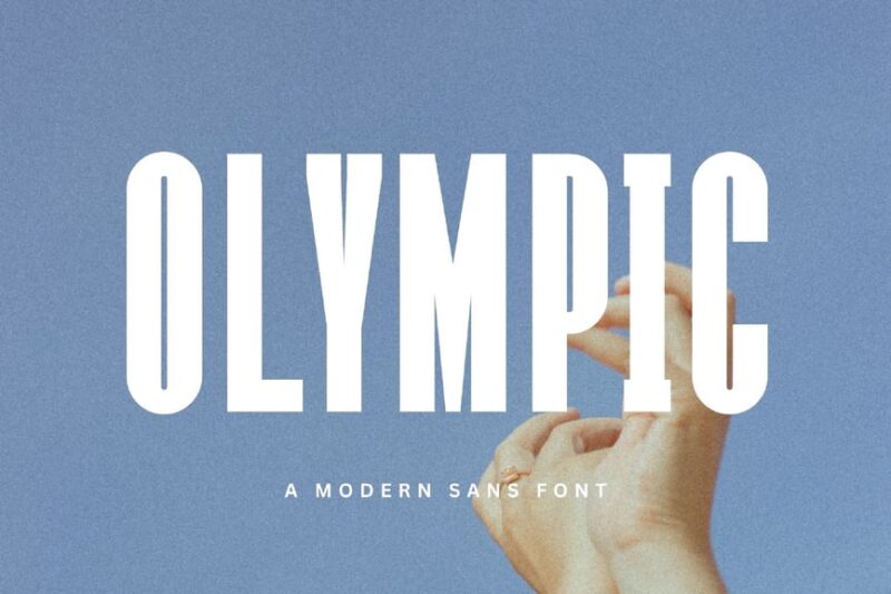
Olimpic is a clean, modern sans-serif font that exemplifies the beauty of simple fonts. Its sleek design and balanced proportions make it an excellent choice for designers seeking a versatile typeface for contemporary projects, from branding to digital interfaces.
Richie – Elegant Font
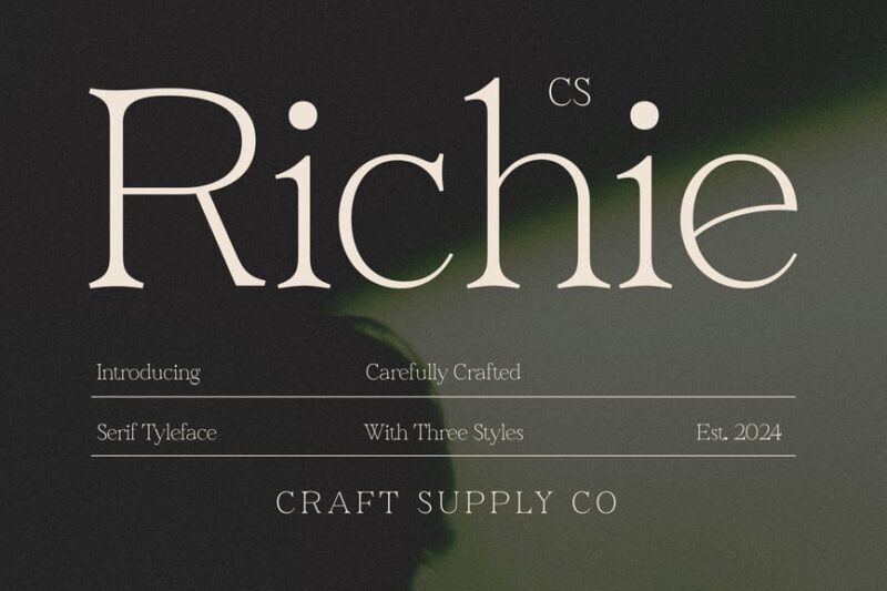
Richie is an elegant serif font that combines simplicity with sophistication. While not a traditional simple font, it offers designers a refined option for creating high-end, luxurious designs without overwhelming complexity, perfect for upscale branding and editorial work.
Giffary Fonts
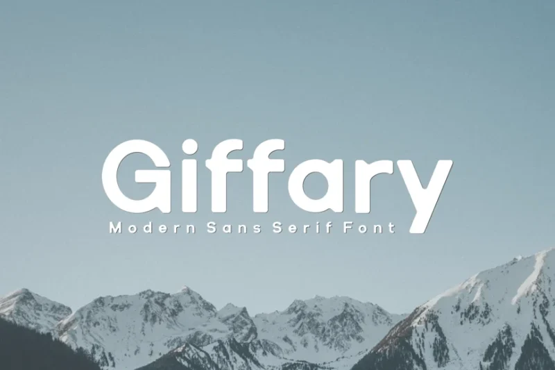
Giffary Fonts offer a collection of simple and elegant sans-serif typefaces. This versatile font family provides designers with a range of options for creating clean, modern designs while maintaining readability and visual appeal across various applications.
Gabriella – Modern Typeface + WebFonts
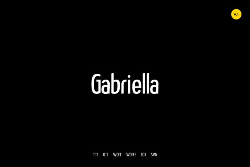
Gabriella is a modern typeface that embodies the essence of simple fonts while offering a unique decorative twist. This versatile font family, available as web fonts, provides designers with clean and contemporary options for creating striking designs across digital platforms.
Mosse
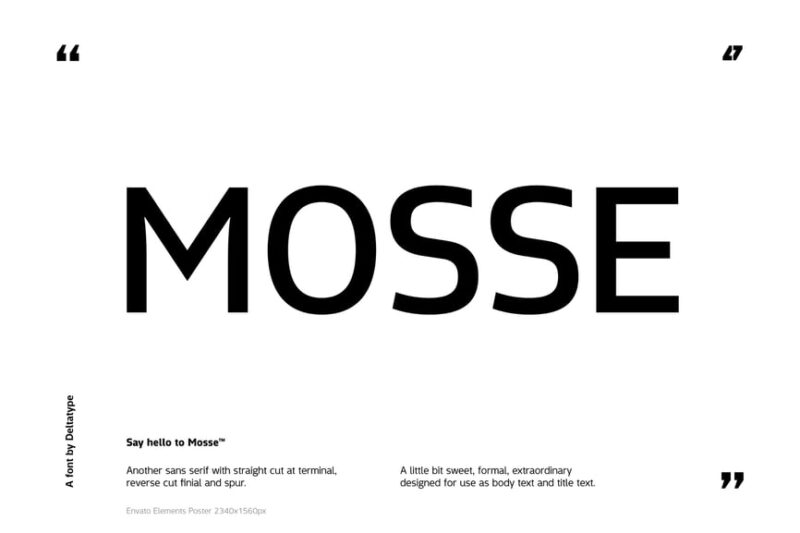
Mosse is a sans-serif font that embraces simplicity and basic design principles. This typeface is perfect for designers seeking simple fonts with a modern edge, ideal for creating clean, minimalist designs that prioritize readability and visual clarity.
Metrolic | Elegant Font
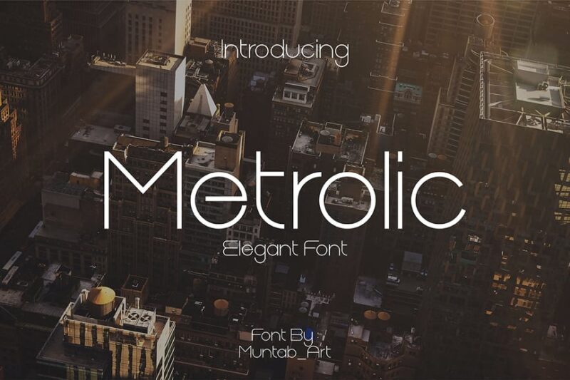
Metrolic is an elegant font that straddles the line between serif and sans-serif styles. While not strictly a simple font, it offers designers a refined and versatile option for creating sophisticated designs with a touch of modernity, perfect for branding and editorial work.
Regho
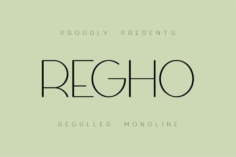
Regho is a sans-serif font with a futuristic flair that doesn’t compromise on simplicity. This typeface offers designers a modern and sleek option for creating forward-thinking designs, making it an excellent choice for tech-related projects and contemporary branding.
Quick – Simple Sans Serif Family Font
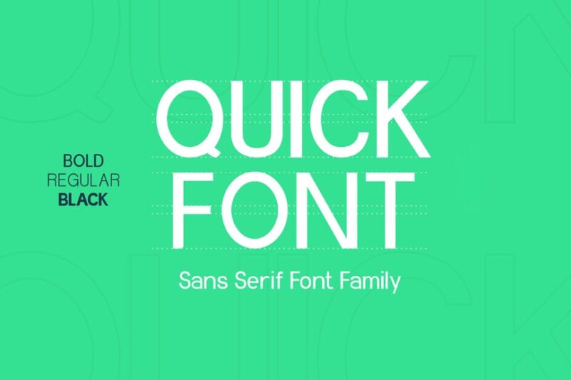
Quick is a comprehensive sans-serif font family that epitomizes simple fonts. This versatile collection offers designers a range of weights and styles, perfect for creating cohesive and clean designs across various mediums and projects.
Farmhouse rustic font
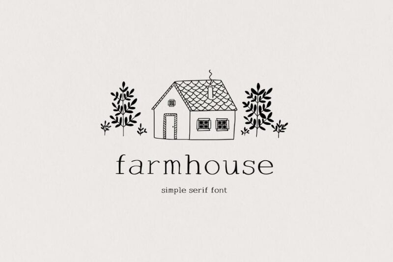
The Farmhouse rustic font offers a unique take on simple fonts with its country-inspired design. This serif typeface provides designers with a charming option for creating rustic, nostalgic designs that evoke a sense of warmth and simplicity.
EROS- serif font
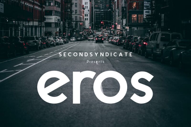
EROS is a soft and minimal serif font that balances elegance with simplicity. This typeface offers designers a refined option for creating sophisticated designs that maintain readability and visual appeal, perfect for both digital and print applications.
Geons – Modern Sans Serif
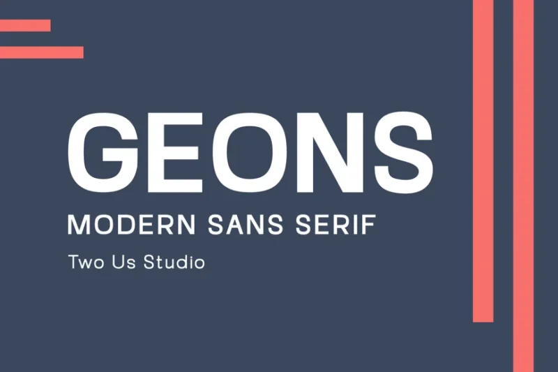
Geons is a modern sans-serif font that embodies the principles of simple fonts. Its clean lines and minimal design make it an excellent choice for designers seeking a versatile typeface for contemporary projects, from formal business materials to modern branding.
Memoline Font
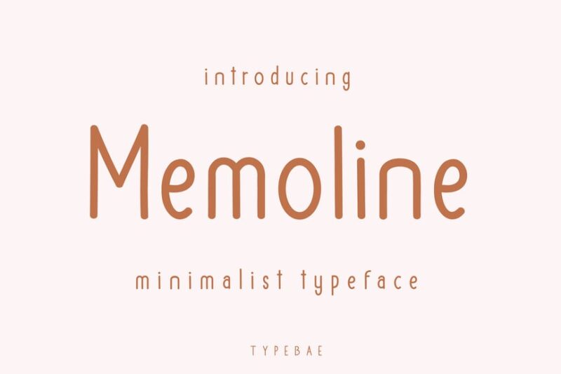
Memoline is a minimalist sans-serif font that truly captures the essence of simple fonts. Its clean and straightforward design makes it perfect for designers looking to create clear, uncluttered layouts that prioritize readability and visual harmony.
Simple Scratch Font
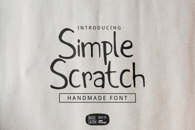
The Simple Scratch Font offers a unique blend of simplicity and handmade charm. This typeface is ideal for designers seeking simple fonts with a personal touch, perfect for creating authentic and approachable designs that stand out from more polished options.
Simplica – Minimalist Sans Serif Font
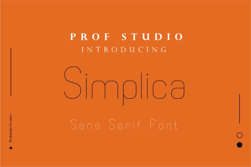
Simplica is a minimalist sans-serif font that epitomizes the beauty of simple fonts. Its thin, clean lines and modern aesthetic make it an excellent choice for designers looking to create sleek, contemporary designs that prioritize clarity and visual impact.
Leipzer – A Simple Serif Typeface
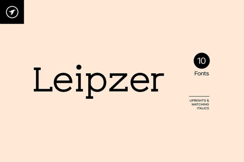
Leipzer is a simple serif typeface that combines classic elegance with modern simplicity. This font offers designers a versatile option for creating sophisticated designs that maintain readability and visual appeal, perfect for both digital and print applications.
What Makes a Font “Simple”?
Before we jump into our curated list, let’s decode what actually makes a font qualify as “simple.” It’s not just about having fewer decorative elements – there’s real design science behind it.
Clean, Geometric Shapes
Simple fonts typically feature letterforms based on basic geometric shapes. Think circles, squares, and triangles. These foundational forms create visual harmony and make text incredibly easy to scan and read.
The beauty lies in how these basic shapes are refined and balanced. A truly great simple font takes these elementary forms and perfects their proportions until they sing together in perfect harmony.
Minimal Stroke Variation
Unlike decorative fonts with dramatic thick and thin strokes, simple fonts maintain relatively consistent line weights throughout each letterform. This creates a clean, even texture when set as body text or headlines.
Generous Spacing
Simple fonts often feature well-considered letter spacing and word spacing. The designers understand that white space isn’t empty space – it’s breathing room that makes text more readable and visually comfortable.
Neutral Personality
The best simple fonts have what designers call “transparency” – they don’t call attention to themselves. Instead, they let your content shine through without distraction. They’re like the perfect supporting actor who elevates the star without stealing the scene.
Why Simple Fonts Are Having a Moment
In our increasingly complex digital world, simple fonts offer something precious: clarity. As screens get smaller and attention spans shorter, the value of clean, readable typography has never been higher.
The Rise of Minimalism
From Scandinavian design to tech company branding, minimalism has dominated visual culture for years. Simple fonts align perfectly with this aesthetic, offering clean sophistication without unnecessary ornamentation.
Mobile-First Design
With mobile devices accounting for over half of web traffic, fonts need to perform flawlessly at small sizes. Simple fonts excel here, maintaining legibility even when squeezed onto smartphone screens.
Accessibility Matters
Simple fonts often score higher on accessibility metrics. Their clean letterforms reduce cognitive load for readers with dyslexia or other reading differences, making content more inclusive.
Timeless Appeal
While trendy fonts come and go, simple fonts have staying power. Invest in a great simple font today, and it’ll still look fresh and relevant years from now.
Where Simple Fonts Shine Brightest
Simple fonts are remarkably versatile, but they absolutely excel in certain applications:
Corporate Branding
When a company wants to appear trustworthy, professional, and forward-thinking, simple fonts deliver. They convey competence without being boring, sophistication without pretension.
Web Design
Online, readability is king. Simple fonts load quickly, render cleanly across devices, and provide excellent user experience. They’re the workhorses of web typography.
Editorial Design
Magazines, newspapers, and blogs rely on simple fonts for body text because they can handle long-form reading without causing eye strain. Readers can focus on content, not letterforms.
Tech and Startups
Silicon Valley figured this out long ago – simple fonts make complex products feel approachable. They communicate innovation and efficiency in equal measure.
Minimalist Aesthetics
Whether it’s a luxury brand, an architect’s portfolio, or an art gallery, simple fonts complement minimalist design perfectly. They provide necessary information without visual clutter.
How to Choose the Perfect Simple Font
Not all simple fonts are created equal. Here’s how to pick the right one for your project:
Consider Your Medium
Will this font primarily live on screens or in print? Digital fonts need to handle various screen resolutions and sizes, while print fonts can have more subtle details that might get lost on screens.
Think About Tone
Even simple fonts have personality. Some feel more corporate and serious, others more friendly and approachable. Match the font’s subtle character to your brand’s voice.
Test at Size
Download font samples and test them at the actual sizes you’ll be using. A font that looks great at 72pt might be completely illegible at 12pt.
Check Language Support
If you’re working internationally, ensure your chosen font supports all the characters and diacritical marks you’ll need. Not all fonts handle extended character sets equally well.
Consider Pairing Options
Even if you’re choosing one primary simple font, think about what you might pair it with for hierarchy. Does it have different weights? Does it play well with complementary typefaces?
Simple Font Mistakes to Avoid
Even with straightforward typography, there are pitfalls to dodge:
The “Default Font” Trap
Just because Arial or Helvetica are simple doesn’t mean they’re the best choice for every project. These overused fonts can make designs feel generic and uninspired.
Ignoring Hierarchy
Simple doesn’t mean boring. Use font weights, sizes, and spacing to create clear visual hierarchy. Your readers should understand what’s most important at a glance.
Poor Spacing Decisions
Simple fonts rely heavily on good spacing for their effectiveness. Cramped text or excessive letter spacing can ruin even the most beautiful typeface.
One Size Fits All
Don’t assume one simple font can handle every use case in your design. Headlines might need a slightly different character than body text.
The Psychology Behind Simple Typography
There’s fascinating research behind why simple fonts work so well psychologically:
Cognitive Ease
Studies show that easy-to-read fonts create what psychologists call “cognitive ease” – readers feel more relaxed and confident about the content they’re consuming.
Trust and Credibility
Clean, simple typography unconsciously signals professionalism and attention to detail. Readers are more likely to trust information presented in well-designed, simple fonts.
Reduced Decision Fatigue
When typography doesn’t compete for attention, readers can focus their mental energy on processing content rather than decoding letterforms.
Simple Fonts in the Digital Age
As we move further into the digital future, simple fonts continue to evolve:
Variable Font Technology
New variable fonts allow designers to fine-tune weight, width, and other attributes without loading multiple font files. This technology particularly benefits simple fonts, which can now offer unprecedented flexibility.
Dark Mode Considerations
With dark mode becoming standard across platforms, simple fonts need to perform well on both light and dark backgrounds. The best simple fonts maintain their clarity and elegance regardless of the background color.
AI and Typography
Machine learning is beginning to influence font development, helping designers create simple fonts that perform optimally across various contexts and user preferences.
Pairing Simple Fonts Like a Pro
Even in the world of simple typography, strategic font pairing can elevate your designs:
The Safe Approach
Pair a simple sans-serif with a simple serif. This classic combination provides contrast while maintaining overall simplicity.
Weight Variation
Use different weights of the same font family to create hierarchy. A light weight for body text with bold weights for headlines keeps things cohesive yet interesting.
Size Relationships
Establish clear size relationships between different text elements. A good rule of thumb is to make each level of hierarchy at least 2 points different from the next.
Future-Proofing Your Font Choices
When investing in simple fonts, think long-term:
License Considerations
Ensure you have appropriate licensing for your intended use. Web fonts, print usage, and commercial applications often require different license types.
Format Support
Choose fonts available in modern formats like WOFF2 for web use and OpenType for print applications.
Designer Reputation
Fonts from established type foundries or respected independent designers are more likely to stand the test of time both aesthetically and technically.
Common Simple Font Questions Answered
What’s the difference between simple fonts and minimalist fonts?
While often used interchangeably, simple fonts focus on clean, uncomplicated letterforms, while minimalist fonts take reduction to an extreme, sometimes sacrificing readability for visual impact.
Are simple fonts boring?
Absolutely not! Simple fonts can be incredibly sophisticated and engaging. Their strength lies in their versatility and timeless appeal rather than flashy decoration.
Can simple fonts work for creative industries?
Definitely. Many creative agencies, design studios, and artists use simple fonts to let their work speak for itself. The typography becomes a neutral backdrop that highlights the creative content.
How do I know if a font is too simple?
If a font lacks personality for your brand or doesn’t provide enough visual interest for your specific use case, it might be too simple. However, remember that impact often comes from how you use a font, not just the font itself.
Conclusion: Embracing the Power of Simplicity
In a world of visual noise and information overload, simple fonts offer something invaluable: clarity, elegance, and timeless appeal. They’re not simple because they lack sophistication – they’re simple because they’ve been refined to their essential elements.
The best simple fonts in 2026 understand that true sophistication often lies in restraint. They communicate effectively without shouting, look professional without being stuffy, and remain readable across every platform and device your audience might use.
Whether you’re designing a corporate website, crafting a magazine layout, or building a brand identity, simple fonts provide the solid foundation upon which great design is built. They’re the quiet heroes of the typography world – and once you start using them effectively, you’ll wonder how you ever designed without them.
So next time you’re tempted by that elaborate script or decorative display font, consider the power of keeping it simple. Your readers will thank you, your designs will improve, and you’ll discover that sometimes the most impactful choice is the most understated one.
After all, in the immortal words often attributed to Leonardo da Vinci: “Simplicity is the ultimate sophistication.” And in the world of typography, truer words were never spoken.