In this article:
- The Best Fall Fonts of 2026
- What Makes a Font Feel Like Fall?
- Where Can You Use Fall Fonts?
- Where to Avoid Fall Fonts
- How to Choose the Perfect Fall Font
- Pairing Fall Fonts Like a Pro
- Fall Font Color Psychology
- Digital vs. Print: Fall Font Considerations
- Free Fall Font Alternatives
- Common Fall Font Mistakes (And How to Avoid Them)
- Fall Fonts Through the Decades
- Seasonal Font Trends: What's Hot in Fall Typography
- Creating Your Own Fall Font Pairings
- Frequently Asked Questions About Fall Fonts
- Conclusion: Embracing Autumn Through Typography
There’s something magical about that first crisp morning when you step outside and feel autumn in the air. The leaves haven’t quite turned yet, but you know they’re about to. That same anticipatory feeling – that perfect blend of cozy nostalgia and fresh beginnings – is exactly what the best fall fonts capture in design.
Fall fonts aren’t just about slapping some orange text on a pumpkin spice latte flyer (though let’s be honest, we’ve all been there). They’re about capturing the essence of the season – the warmth of a crackling fireplace, the texture of a chunky knit sweater, the rustling of leaves underfoot, and yes, the comfort of that first PSL of the season.
Whether you’re designing autumn wedding invitations, creating seasonal branding for a cozy coffee shop, or just want to add some harvest vibes to your next project, choosing the right fall font can transform your design from “meh” to “more cider, please!”
In this comprehensive guide, we’ll explore everything you need to know about fall fonts, including the best typefaces to use, how to pair them effectively, and where they work best. So grab your favorite fall beverage (no judgment on what that is), and let’s dive into the wonderful world of autumn typography!
The Best Fall Fonts of 2026
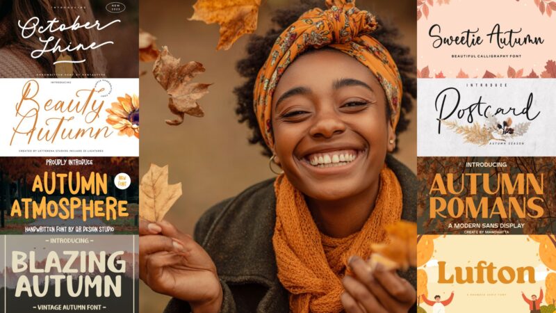
Not all fall fonts are created equal. Some scream “Halloween!” while others whisper “harvest festival.” I’ve curated a collection of my absolute favorite fall fonts that capture different aspects of the season. Here they are:
Autumn Delight
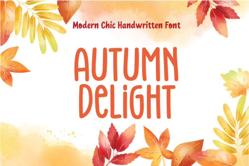
Autumn Delight is a chic handwritten fall font that captures the essence of the season. Its modern script style is perfect for creating cozy, inviting designs that evoke the warmth of autumn.
Autumn Atmosphere
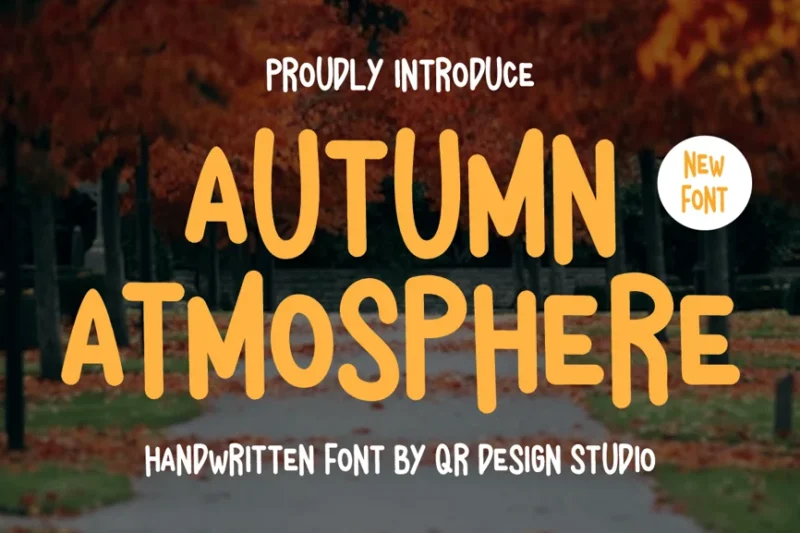
This fall-inspired script font brings the crisp, cool feeling of autumn to your designs. Autumn Atmosphere is ideal for creating seasonal branding, invitations, and social media graphics that celebrate the beauty of fall.

Get 300+ Fonts for FREE
Enter your email to download our 100% free "Font Lover's Bundle". For commercial & personal use. No royalties. No fees. No attribution. 100% free to use anywhere.
Pear Leaves
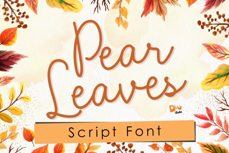
Pear Leaves is a delightful autumn script font that captures the whimsical nature of falling leaves. This versatile fall font is perfect for creating seasonal logos, packaging designs, and invitations that celebrate the changing seasons.
Start Autumn
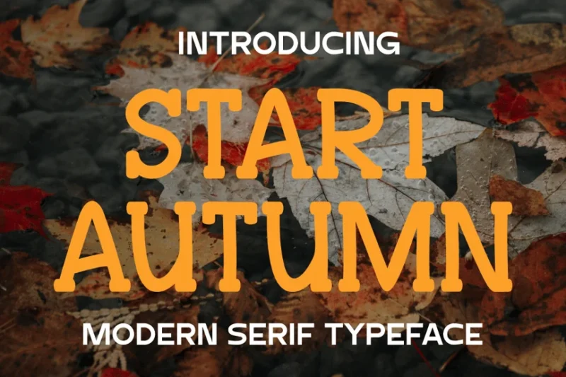
Start Autumn is a modern serif typeface that brings a touch of sophistication to fall-themed designs. This elegant fall font is ideal for creating high-end branding, editorial layouts, and marketing materials that convey the richness of the autumn season.
Orange Leafy
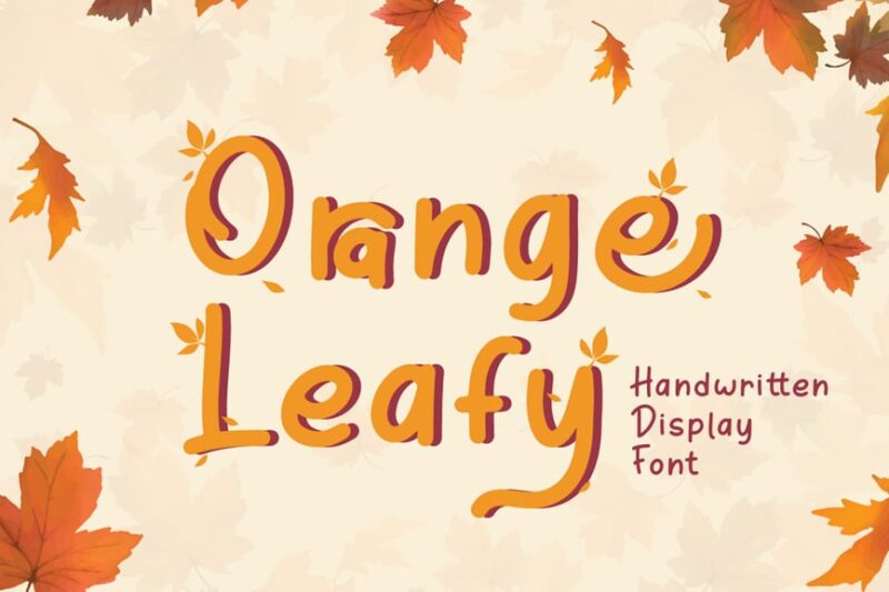
Orange Leafy is a vibrant autumn display font that captures the warm hues of fall foliage. This eye-catching fall font is perfect for creating bold headlines, posters, and seasonal advertising that celebrate the colors of autumn.
Harvest Bread

Harvest Bread is a rustic autumn display font that evokes the cozy feeling of freshly baked goods. This charming fall font is ideal for creating seasonal menus, packaging designs, and farm-to-table branding that celebrates the bounty of the harvest season.
Postcard Script
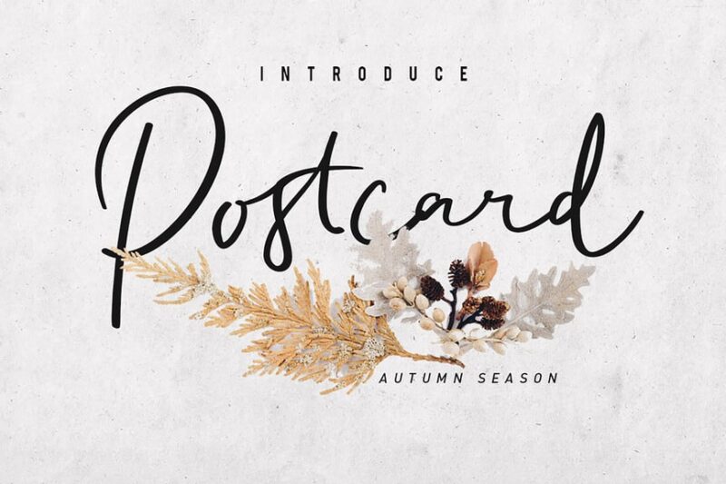
While not explicitly an autumn font, Postcard Script’s vintage charm makes it perfect for creating fall-themed designs with a nostalgic touch. Use this versatile script font to craft invitations, greeting cards, and social media graphics that capture the warmth of the season.
Autumn In Love Font Trio
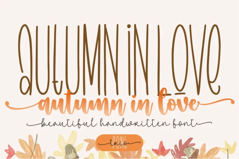
Autumn In Love is a versatile fall font trio that offers a range of styles for seasonal designs. This collection of autumn-inspired fonts is perfect for creating cohesive branding, invitations, and marketing materials that capture the romance and beauty of fall.
Autumn Field
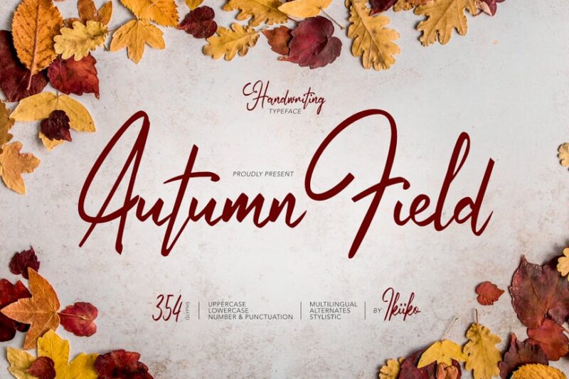
Autumn Field is a charming handwritten fall font that evokes the feeling of a crisp autumn day. This versatile typeface is ideal for creating seasonal greeting cards, social media posts, and packaging designs that celebrate the cozy ambiance of fall.
Fall Season
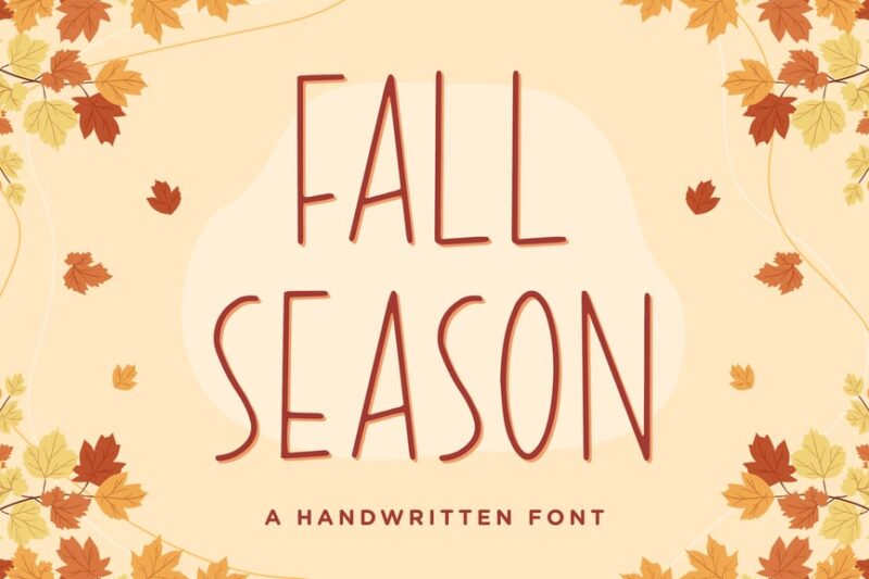
Fall Season is a playful handwritten font that captures the spirit of autumn. This whimsical fall font is perfect for creating fun and inviting designs for seasonal events, children’s products, and social media content that celebrates the joys of the fall season.
Cherions – SVG Sans
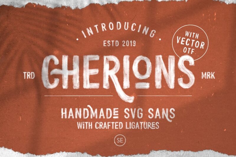
While not specifically a fall font, Cherions’ watercolor and eroded texture make it suitable for creating autumn-themed designs with a unique, artistic touch. This versatile sans-serif font can add a subtle seasonal flair to logos, headers, and social media graphics.
Autumn Scarletta
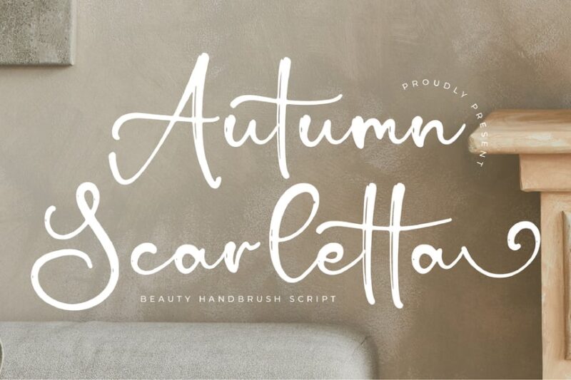
Autumn Scarletta is an elegant script font that embodies the sophistication of fall fashion. This stylish autumn typeface is perfect for creating high-end branding, editorial designs, and marketing materials that capture the luxurious side of the fall season.
Autumn Fairy Signature Monoline Script
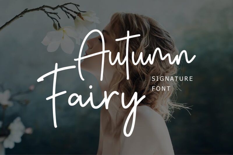
Autumn Fairy is a whimsical fall font that adds a touch of magic to seasonal designs. This enchanting script is ideal for creating fairy tale-inspired autumn branding, children’s book covers, and invitations that capture the wonder of the changing seasons.
Autumn – Modern Serif Font
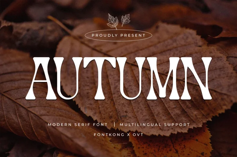
This modern serif font named Autumn brings a contemporary twist to fall typography. Its clean lines and subtle seasonal touches make it perfect for creating sophisticated autumn-themed branding, editorial layouts, and marketing materials with a timeless appeal.
Cd Autumn Summer Handwriting Script
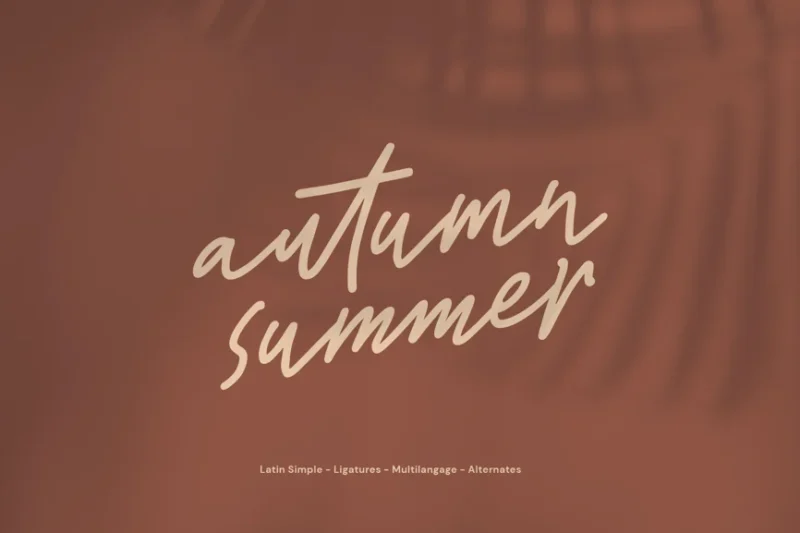
Cd Autumn Summer is a versatile handwriting script that transitions beautifully from summer to fall designs. This artistic fall font is ideal for creating seasonal social media content, greeting cards, and branding materials that capture the changing of the seasons.
Autumn Rouge Handwriting Script
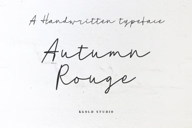
Autumn Rouge is a bold and expressive fall font that captures the rich, warm colors of the season. This dynamic handwriting script is perfect for creating eye-catching headlines, posters, and social media graphics that celebrate the vibrant beauty of autumn.
Autumn Brush Font
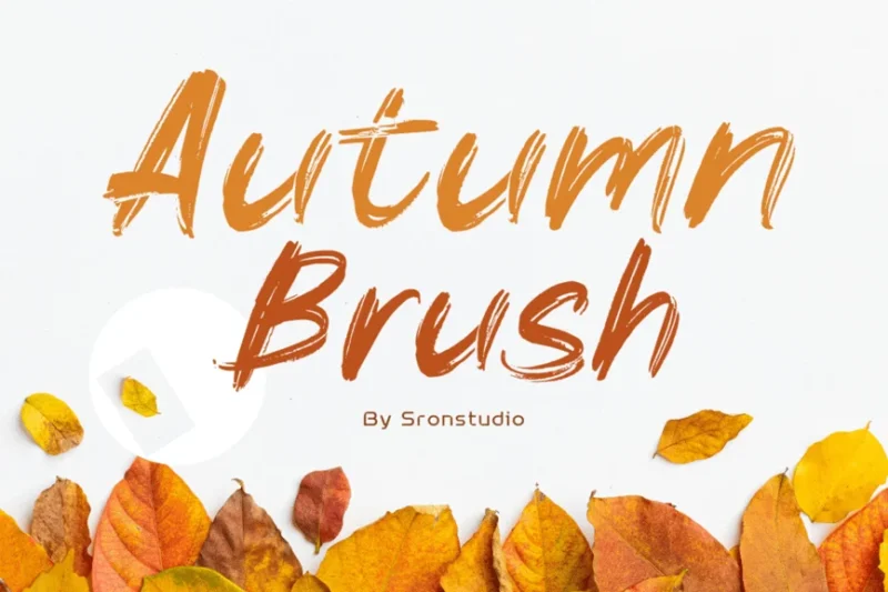
Autumn Brush is a rustic fall font that brings an authentic, hand-crafted feel to seasonal designs. This versatile brush script is ideal for creating autumn-themed logos, packaging, and social media content that evokes the cozy, artistic spirit of fall.
Autumn Children – Display Font
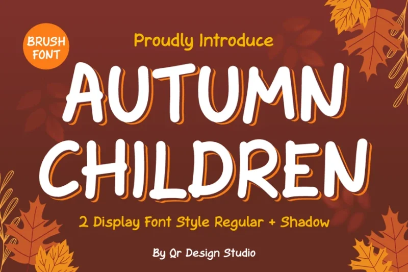
Autumn Children is a playful fall font that captures the joy and wonder of the season. This charming display typeface is perfect for creating children’s book covers, school event posters, and family-friendly autumn marketing materials that celebrate the fun side of fall.
Maple Memories – Script Font
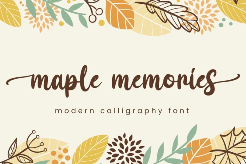
Maple Memories is a nostalgic fall font that evokes the warmth of autumn traditions. This elegant script is ideal for creating invitations, greeting cards, and seasonal branding that celebrates cherished fall memories and the cozy feeling of the season.
Happy Thanksgiving Font
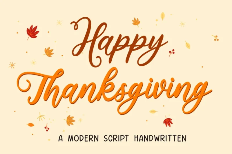
While specifically designed for Thanksgiving, this festive font captures the essence of fall celebrations. Use this autumn-inspired typeface to create invitations, menu designs, and seasonal marketing materials that evoke the warmth and gratitude of the harvest season.
Autumn Seasonal Font – Lufton
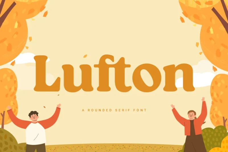
Lufton is a charming serif font with a subtle autumn twist. This versatile fall typeface is perfect for creating children’s book covers, school event posters, and family-friendly seasonal branding that captures the playful spirit of autumn.
Avocade
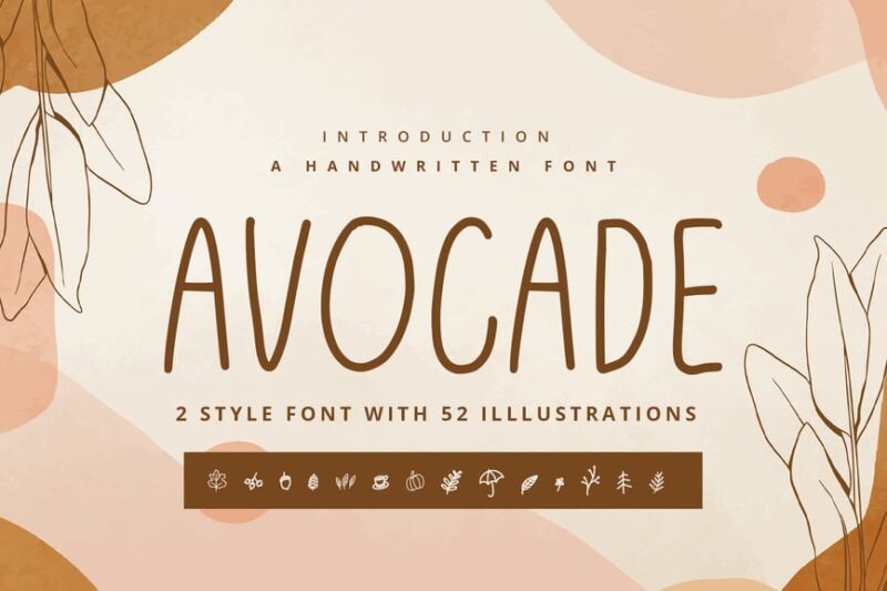
While not explicitly an autumn font, Avocade’s handwritten style makes it suitable for creating warm, inviting fall designs. This versatile script can add a personal touch to autumn-themed social media posts, greeting cards, and casual branding materials.
Blazing Autumn – Vintage Autumn Font
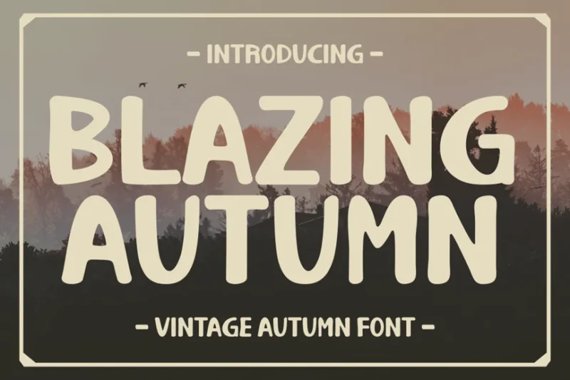
Blazing Autumn is a vintage-inspired fall font that captures the nostalgic charm of the season. This retro typeface is perfect for creating autumn-themed posters, packaging designs, and marketing materials that evoke a sense of timeless fall traditions.
Autumn Orange
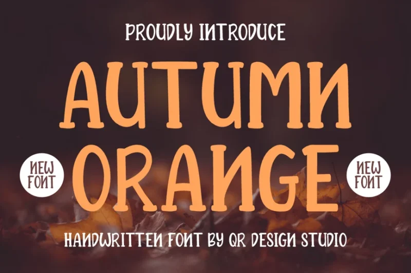
Autumn Orange is a vibrant fall font that embodies the warm hues of the season. This eye-catching script is ideal for creating bold headlines, seasonal branding, and social media graphics that celebrate the rich colors and energy of autumn.
Harvest Begins – Handwritten Typeface
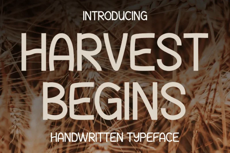
Harvest Begins is a rustic fall font that celebrates the bounty of the season. This handwritten typeface is perfect for creating farm-to-table branding, farmers market signage, and autumn event materials that evoke the cozy feeling of harvest time.
Harvest Autumn Font
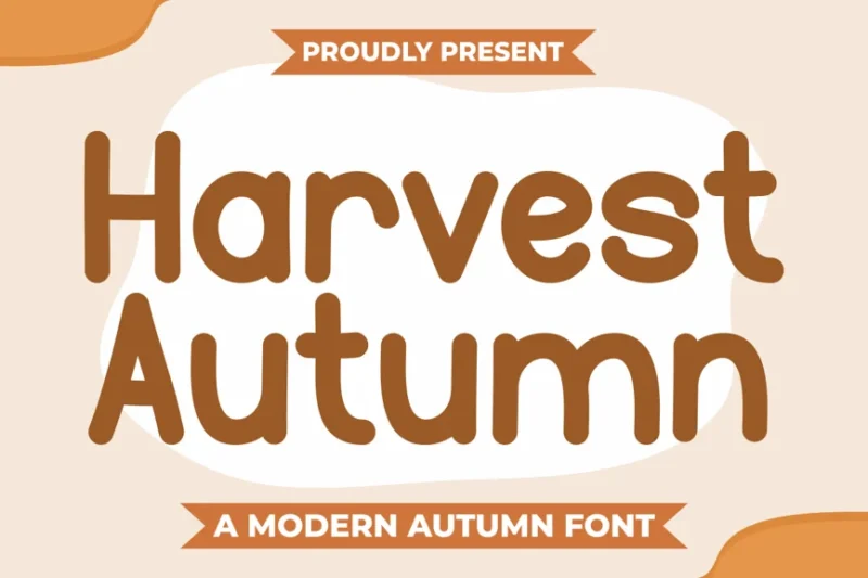
Harvest Autumn is a charming fall font that captures the essence of the season’s abundance. This versatile typeface is ideal for creating autumn-themed logos, packaging designs, and marketing materials that celebrate the richness and warmth of fall.
Autumn Romans – Modern Sans Display
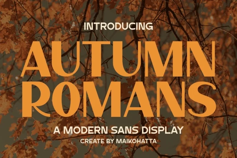
Autumn Romans is a sleek, modern sans-serif font with a subtle fall twist. This contemporary typeface is perfect for creating sophisticated autumn-themed branding, editorial layouts, and marketing materials that offer a fresh take on seasonal design.
Happy Fall – Modern Handwritten Typeface
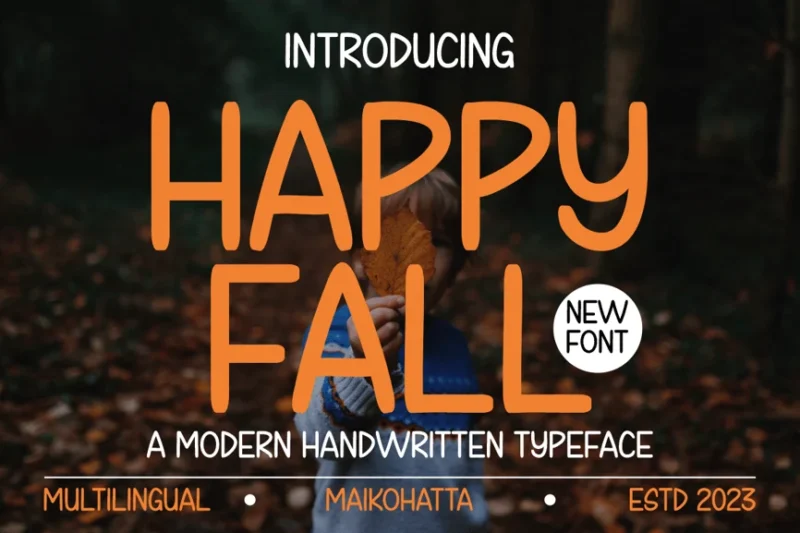
Happy Fall is a cheerful, modern handwritten font that celebrates the joys of autumn. This playful fall typeface is ideal for creating inviting social media content, greeting cards, and seasonal marketing materials that capture the fun and warmth of the season.
Sweetie Autumn Beautiful Calligraphy Logo Font
![]()
Sweetie Autumn is an elegant calligraphy font that brings a touch of sophistication to fall designs. This beautiful typeface is perfect for creating high-end autumn branding, wedding invitations, and luxury product packaging that celebrate the refinement of the season.
Pumpkin’s Brush
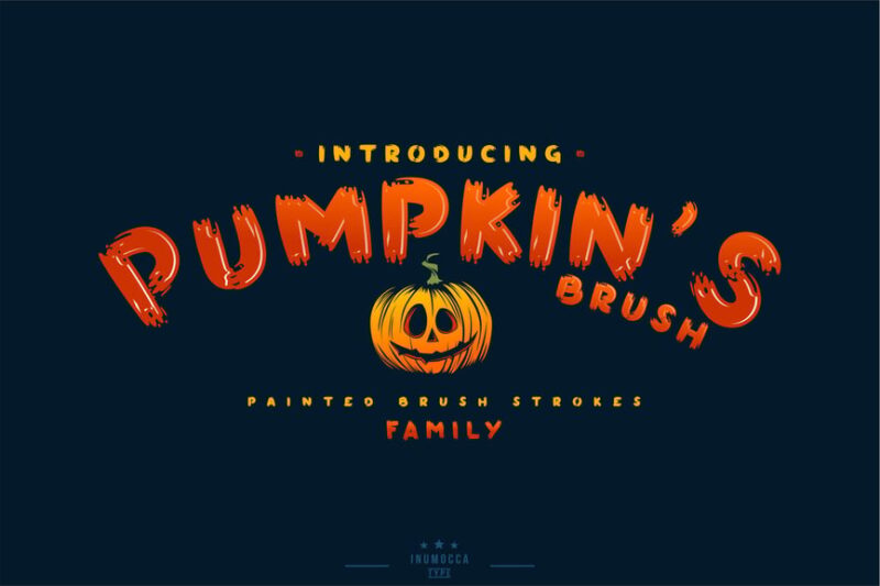
Pumpkin’s Brush is a playful fall font that captures the whimsical side of autumn. This fun, decorative typeface is ideal for creating Halloween designs, children’s autumn-themed products, and seasonal social media content that celebrates the festive spirit of fall.
Pumpkin Story – Cute Display Font
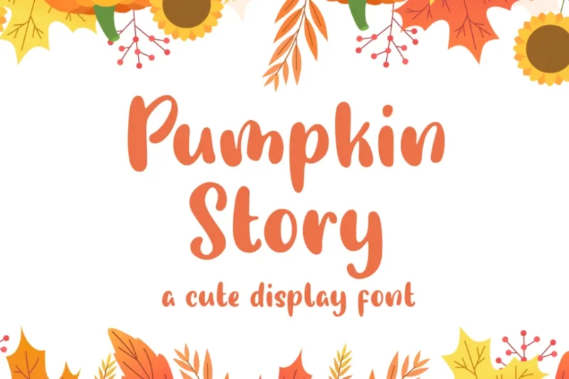
Pumpkin Story is an adorable fall font that brings a touch of whimsy to autumn designs. This cute display typeface is perfect for creating children’s book covers, Halloween party invitations, and playful seasonal branding that captures the magic of fall.
Pumpirols Handmade Display Font
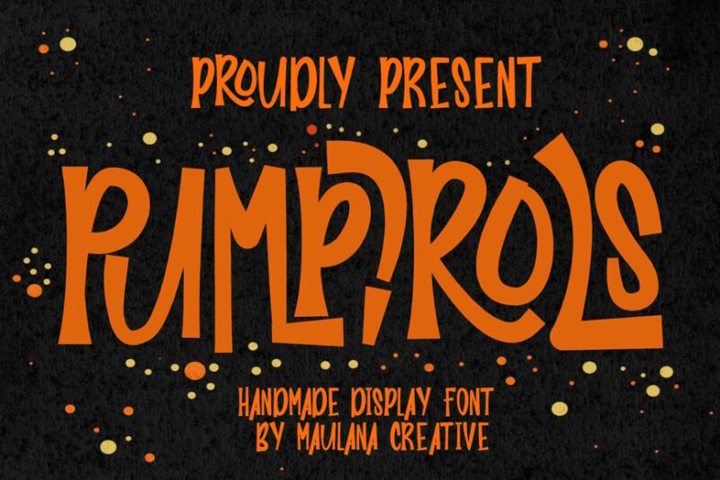
While designed for multiple holidays, Pumpirols’ handmade style makes it suitable for creating unique fall-themed designs. This versatile display font can add a touch of handcrafted charm to autumn event posters, seasonal packaging, and Halloween marketing materials.
Beauty Autumn Simple Handwritten Font
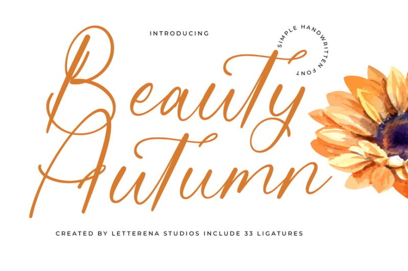
Beauty Autumn is an elegant, simple handwritten font that captures the grace of the season. This refined fall typeface is ideal for creating sophisticated autumn logos, wedding stationery, and high-end seasonal branding that convey the subtle beauty of fall.
October Shine Monoline Font
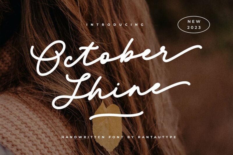
October Shine is a stylish monoline font that brings a modern touch to fall typography. While not explicitly autumn-themed, its name and sleek design make it perfect for creating contemporary autumn branding, social media content, and marketing materials with a fresh, seasonal feel.
What Makes a Font Feel Like Fall?
Ever wonder why certain fonts instantly transport you to a crisp October afternoon while others feel more like a beach vacation? Fall fonts have distinct characteristics that trigger those cozy autumn associations. Let’s break down what makes typography feel seasonal:
Warm, Organic Textures
Fall is all about texture – think rough bark, woven baskets, wool sweaters, and weathered wood. The best fall fonts incorporate these organic, tactile qualities into their letterforms. You’ll often see fonts with rough edges, hand-drawn imperfections, or rustic finishes that mimic natural materials.
These textured details make fonts feel handcrafted and authentic, much like the artisanal goods you’d find at a farmers market. The slight irregularities and organic shapes create visual warmth that perfectly complements autumn’s aesthetic.
Script and Hand-Lettered Styles
There’s something inherently cozy about handwritten fonts. Script fonts, especially those with flowing, organic curves, capture fall’s intimate, personal quality. They evoke handwritten recipe cards, journal entries by firelight, and the human touch that makes autumn feel so welcoming.
Many fall scripts feature connected letters with natural variation in weight and slant, mimicking actual handwriting. This creates an authentic, down-to-earth feeling that resonates with fall’s back-to-basics vibe.
Serif Fonts with Character
While not all fall fonts are serifs, traditional serif typefaces with personality work beautifully for autumn designs. Look for serifs with unique details – perhaps slightly bracketed serifs, slab serifs with rustic charm, or old-style serifs that feel vintage and timeless.
These fonts bring sophistication while still feeling grounded and approachable. They work especially well for fall branding that needs to balance professionalism with seasonal warmth.
Natural Color Associations
While color isn’t technically part of the font itself, fall fonts are designed to shine in autumn’s signature palette. They look stunning in deep burgundies, burnt oranges, golden yellows, warm browns, and forest greens.
The best fall fonts have letterforms that complement these colors naturally, with enough weight and presence to hold up against rich, saturated autumn hues without competing with them.
Where Can You Use Fall Fonts?
Fall fonts are incredibly versatile, but they truly shine in specific contexts. Here’s where these cozy typefaces work their autumn magic:
Seasonal Branding and Marketing
Coffee shops, bakeries, breweries, and retail stores often update their branding each fall. Fall fonts are perfect for seasonal menus, promotional materials, window displays, and limited-time product packaging. They help businesses tap into that autumn excitement that gets customers through the door.
Think pumpkin spice everything, harvest specials, fall collection launches, and autumn event promotions. The right fall font makes these campaigns feel timely and festive without being over-the-top.
Event Invitations and Stationery
Fall weddings, harvest parties, Thanksgiving dinners, and autumn celebrations all benefit from fonts that capture the season’s warmth. Whether you’re designing save-the-dates, dinner party invitations, or event programs, fall fonts add that perfect seasonal touch.
They work especially well for rustic weddings, barn venue events, apple orchard celebrations, and any gathering that embraces autumn’s natural beauty.
Social Media Graphics
In the age of Instagram and Pinterest, fall fonts help seasonal content stand out. They’re perfect for quote graphics, seasonal announcements, countdown posts, and autumn lifestyle content that needs to feel cozy and scroll-stopping.
Fall fonts photograph beautifully too, making them ideal for overlay text on autumn photos – think golden leaves, cozy sweaters, pumpkin patches, and harvest tables.
Packaging and Product Design
Seasonal products need seasonal packaging. Fall fonts work wonderfully for limited edition autumn items, craft fair goods, farmers market products, homemade preserves, artisanal candles, and handmade crafts.
They help products feel special and time-limited, encouraging customers to snag them while the season lasts.
Home Decor and Printables
The DIY and home decor markets boom every fall. Fall fonts are essential for printable wall art, chalkboard signs, kitchen decor, mantel displays, and seasonal home accents.
Whether it’s “Hello Fall,” “Grateful & Blessed,” or “Sweater Weather,” these fonts make autumn sentiments feel authentic and inviting.
Where to Avoid Fall Fonts
While fall fonts are fantastic for seasonal projects, there are definitely situations where they miss the mark. Here’s when to reach for something else:
Year-Round Corporate Branding
Unless you’re in a seasonally-focused business, fall fonts aren’t appropriate for permanent corporate materials. Your logo, business cards, and core brand identity need to work twelve months a year, not just September through November.
Save the autumn typography for seasonal campaigns and special promotions, but keep your foundational brand materials timeless.
Technical or Medical Contexts
Fall fonts tend to prioritize personality over pure legibility. In situations requiring crystal-clear communication – think medical forms, technical manuals, legal documents, or safety instructions – stick with straightforward, highly legible typefaces.
The decorative qualities that make fall fonts charming can actually hinder comprehension in contexts where clarity is paramount.
Formal or Serious Subjects
There’s a reason you don’t see fall fonts on law firm letterhead or financial reports. Their cozy, casual nature doesn’t align with the gravitas required for serious professional contexts.
When you need to project authority, sophistication, or seriousness, traditional typefaces serve you better than seasonal scripts.
Small Text Applications
Many fall fonts have intricate details, textures, or flourishes that become muddy at small sizes. Body text, fine print, and lengthy paragraphs need simpler, more readable fonts.
Reserve fall fonts for headlines, titles, short phrases, and display purposes where their decorative details can shine without sacrificing readability.
How to Choose the Perfect Fall Font
With so many autumn-inspired typefaces available, how do you pick the right one? Consider these factors:
Match Your Design’s Mood
Fall encompasses many moods. Are you going for rustic and farmhouse? Modern and minimalist? Vintage and nostalgic? Whimsical and playful? Gothic and mysterious?
A harvest festival poster needs different typography than a Halloween party invitation. A upscale autumn wedding calls for different fonts than a pumpkin patch farm stand. Identify your specific autumn aesthetic first, then find fonts that match.
Consider Your Audience
Who are you designing for? Kids love playful, bouncy fall fonts with personality. Adults might prefer sophisticated scripts or elegant serifs. Corporate clients often want subtle seasonal touches rather than over-the-top autumn vibes.
Your audience should guide how obvious or subdued your fall font choice is.
Think About Pairing
The best fall designs rarely use just one font. Plan how your fall display font will pair with body text. A ornate script headline needs a simple, clean sans-serif for balance. A bold, textured display font might pair beautifully with a traditional serif for body copy.
Test your pairings to ensure they complement rather than compete with each other.
Test at Different Sizes
Always preview your fall font at actual use size. That gorgeous textured script might look amazing as a huge headline but become illegible on a small Instagram square. Similarly, a font that seems plain at display size might reveal charming details when enlarged.
Make sure your chosen font works at every size you’ll need it.
Pairing Fall Fonts Like a Pro
The magic really happens when you combine fall fonts thoughtfully. Here are proven pairing strategies:
Script + Sans-Serif
This classic combination never fails. Use a flowing fall script for headlines or emphasis, then pair it with a clean, modern sans-serif for body text and supporting information. The contrast creates visual interest while maintaining readability.
This pairing works especially well for event invitations, social media graphics, and packaging where you need both personality and clarity.
Display + Serif
Pair a bold, decorative fall display font with a traditional serif for an elegant, sophisticated feel. This combination works beautifully for upscale autumn events, premium product packaging, and designs targeting mature audiences.
The display font brings seasonal personality while the serif provides timeless credibility.
Hand-Lettered + Simple Sans
Combine an organic, hand-drawn fall font with the simplest sans-serif you can find. This pairing lets your decorative font be the star while ensuring all supporting text remains perfectly legible.
It’s ideal for designs with lots of information that still need seasonal flair.
Two Different Fall Fonts
Yes, you can pair two fall fonts – but be strategic. Choose fonts with contrasting styles but similar weights. For example, pair a rustic slab serif with an organic script, or combine a textured display font with a simple hand-lettered style.
The key is ensuring they complement rather than clash. When in doubt, less is more.
Fall Font Color Psychology
The colors you pair with fall fonts matter just as much as the fonts themselves. Here’s how to make your autumn typography pop:
Warm Earth Tones
Browns, terracottas, and warm taupes ground fall fonts in the natural world. These colors feel organic and authentic, perfect for rustic, farmhouse, or natural product designs.
They work especially well with textured and hand-drawn fall fonts, reinforcing that handcrafted, artisanal feeling.
Jewel Tones
Deep burgundy, forest green, golden amber, and navy blue bring sophistication to fall typography. These rich, saturated colors elevate designs, making them feel more premium and polished.
Use jewel tones with elegant serif or refined script fall fonts for upscale autumn branding.
Harvest Palette
Classic autumn orange, golden yellow, and pumpkin hues scream “fall!” in the best way. While they can feel obvious, when used thoughtfully they create unmistakably seasonal designs that people love.
Balance these bold colors with neutrals to prevent designs from feeling overwhelming or cliché.
Unexpected Combinations
Don’t be afraid to experiment beyond traditional fall colors. Dusty pink and sage green can create a softer autumn aesthetic. Navy and copper feel modern and fresh. Black and gold bring drama and elegance.
The right fall font can feel seasonal even in non-traditional colors, giving you creative freedom while maintaining autumn vibes.
Digital vs. Print: Fall Font Considerations
Where your design lives matters when choosing fall fonts. Here’s what to consider for each medium:
For Digital Designs
Screen resolution affects how fonts render. Intricate fall fonts with fine details might look crisp on Retina displays but fuzzy on standard screens. Test your fonts across devices.
Also consider loading times – some decorative fonts have large file sizes that slow down websites. For web use, ensure your fall font is web-optimized or choose web-safe alternatives.
Social media platforms compress images, so choose fall fonts with clear, bold letterforms that survive compression without becoming muddy.
For Print Designs
Print is where decorative fall fonts truly shine. All those gorgeous textures, subtle details, and intricate flourishes that might get lost on screen come through beautifully in print.
However, consider your printing method. Embossed fall fonts look stunning on letterpress. Textured fonts shine in high-quality offset printing. But those same details might disappear in basic home printing.
Match your font choice to your printing capabilities for the best results.
Free Fall Font Alternatives
Not every project has budget for premium fonts. Fortunately, plenty of free alternatives capture autumn’s essence beautifully:
For free fall fonts, explore Google Fonts options like Merriweather for a classic fall serif, Dancing Script for organic autumn elegance, or Bebas Neue for bold harvest headlines. DaFont and Font Squirrel also offer free fall-appropriate fonts for personal use.
When using free fonts, always check the licensing. Many are free for personal use but require licensing for commercial projects. Read the fine print before using free fonts in client work or products you’re selling.
Free doesn’t mean compromising on quality – it just means doing your homework to find the gems among the options.
Common Fall Font Mistakes (And How to Avoid Them)
Even experienced designers can stumble with seasonal typography. Here are mistakes to avoid:
Overdoing the Autumn Theme
Just because you’re designing for fall doesn’t mean everything needs leaves, pumpkins, AND harvest vibes. Sometimes a subtle fall font paired with simple design elements creates more impact than a design that screams “AUTUMN!!!” at top volume.
Trust your fall font to carry the seasonal message. You don’t need to hit people over the head with it.
Sacrificing Readability
That ultra-decorative fall script might look gorgeous, but if your audience can’t read it, your design fails. Always prioritize legibility, especially for important information like dates, times, prices, or calls to action.
When in doubt, use decorative fall fonts sparingly for headlines and stick with simple, readable fonts for body text.
Using Too Many Fall Fonts
More fall fonts don’t make a design more autumnal – they make it cluttered. Stick to one or two fall fonts maximum, then use neutral supporting typefaces for everything else.
Think of fall fonts like pumpkin spice – a little goes a long way.
Ignoring Context
A font that’s perfect for a Halloween party invitation might feel wrong for a Thanksgiving dinner invitation. A typeface ideal for a cozy coffee shop feels off for a corporate fall reception.
Always consider your specific context within the broader fall season.
Fall Fonts Through the Decades
Autumn aesthetics have evolved over time, and so have fall fonts. Here’s a quick journey through the eras:
Vintage Fall (1920s-1950s)
Think art deco geometry, classic serifs, and elegant scripts. Vintage fall fonts evoke nostalgia for harvest festivals, Thanksgiving traditions, and simpler times. They work beautifully for retro-themed fall events and vintage-inspired autumn products.
Rustic Fall (1960s-1980s)
This era embraced back-to-nature aesthetics with wood type, slab serifs, and hand-lettered styles. These fonts feel authentically organic and work perfectly for farmhouse, rustic, and craft-focused fall designs.
Modern Fall (1990s-2010s)
As design became more streamlined, fall fonts evolved too. Clean lines, sophisticated scripts, and minimalist approaches to seasonal design emerged. These fonts prove fall can be elegant and understated.
Contemporary Fall (2026s)
Today’s fall fonts blend the best of all eras. We see vintage revival mixed with modern minimalism, rustic textures paired with clean geometry, and endless creative interpretations of autumn’s aesthetic.
This gives designers unprecedented freedom to create fall designs that feel fresh, personal, and perfectly suited to their projects.
Seasonal Font Trends: What’s Hot in Fall Typography
Fall font trends evolve each year. Here’s what’s trending in autumn typography right now:
Hand-Drawn Imperfection
Perfectly imperfect hand-drawn fonts continue dominating fall design. These authentic, human-touched typefaces feel personal and warm – exactly what autumn is all about.
Vintage Revival
Nostalgia drives design trends, and fall fonts are no exception. Vintage-inspired typefaces that recall historical eras – especially the 1970s – are having a major moment.
Sophisticated Minimalism
Not every fall design needs to be busy. Clean, minimalist fall fonts that suggest autumn through subtle details rather than obvious decoration are increasingly popular, especially for upscale brands.
Experimental Display Fonts
Designers are pushing boundaries with unexpected fall fonts that challenge traditional autumn aesthetics. Think geometric shapes with organic textures, or bold modern fonts in classic harvest colors.
Creating Your Own Fall Font Pairings
Ready to experiment with your own combinations? Here’s a framework for successful fall font pairings:
Start by choosing your hero font – the fall typeface that will dominate your design. This should capture your desired autumn mood and work at large sizes.
Next, select a supporting font with contrasting characteristics but complementary personality. If your hero is decorative, choose something simple. If your hero is script, pick something structured.
Finally, test your pairing in actual layouts. Set headlines in your hero font and body text in your supporting font. Do they work together? Does hierarchy feel clear? Can you easily distinguish different text elements?
If something feels off, adjust. Maybe your supporting font needs to be lighter or heavier. Maybe you need more contrast. Maybe less. Trust your designer’s eye and keep refining until it feels right.
Frequently Asked Questions About Fall Fonts
What makes a font look like fall?
Fall fonts typically feature organic, hand-drawn qualities, warm textures, script or serif styles, and designs that evoke natural materials like wood, leaves, or woven textures. They feel cozy, authentic, and connected to nature.
Can I use fall fonts year-round?
While fall fonts work best seasonally, some have qualities that translate beyond autumn. Rustic fonts can work for natural brands year-round. Elegant scripts suit any season. Just ensure your font choice matches your overall design intent, not just the calendar.
What’s the difference between fall fonts and Halloween fonts?
Halloween fonts specifically evoke spooky, gothic, or creepy themes with elements like drips, sharp edges, or distressed textures. Fall fonts capture autumn’s broader aesthetic – harvest, cozy comfort, and natural beauty. While some overlap exists, they serve different purposes.
Are script fonts always appropriate for fall designs?
Scripts work beautifully for fall, but they’re not required. Bold slab serifs, textured sans-serifs, and even clean geometric fonts can feel autumnal with the right treatment. Choose based on your specific project needs rather than assuming scripts are mandatory.
How many fall fonts should I use in one design?
Limit yourself to one or two fall fonts per design. Use one as your primary display font and keep supporting typography simple and neutral. Too many decorative fonts create visual chaos rather than cohesive autumn atmosphere.
Conclusion: Embracing Autumn Through Typography
Fall fonts are more than just seasonal decoration – they’re powerful tools for capturing autumn’s unique emotional resonance. Whether you’re designing harvest festival posters, autumn wedding invitations, seasonal social media content, or cozy coffee shop branding, the right fall font transforms good designs into great ones.
Remember, the best fall fonts don’t just look like autumn – they feel like it. They evoke the crunch of leaves underfoot, the warmth of a favorite sweater, the comfort of gathering with loved ones, and the bittersweet beauty of change.
As you explore fall typography, don’t be afraid to experiment. Mix vintage with modern, pair unexpected combinations, and trust your instincts about what feels right for your project. Fall is a season of abundance, after all – your designs should embrace that same richness and variety.
Whether you choose elegant scripts, rustic serifs, hand-drawn charmers, or bold display fonts, make sure your fall typography serves your design’s larger purpose. The font should enhance your message, not overshadow it.
So as the leaves begin to turn and that first hint of autumn arrives on the breeze, embrace the season through thoughtful typography. Your designs will be all the cozier for it.
Now if you’ll excuse me, I have a sudden craving for apple cider and an urgent need to design something autumnal. Happy fall, and happy designing!