In this article:
- What Are Serif Fonts? The Basics Explained
- The Rich History Behind Serif Fonts
- The Four Main Categories of Serif Fonts
- The Best Serif Fonts to Use in 2026
- Why Serif Fonts Still Matter in the Digital Age
- When to Use Serif Fonts (And When to Skip Them)
- Pairing Serif Fonts: Creating Typographic Harmony
- Serif vs. Sans Serif: The Great Typography Debate
- Famous Brands Using Serif Fonts
- How to Choose the Perfect Serif Font for Your Project
- Serif Font Accessibility and Readability
- Common Serif Font Mistakes to Avoid
- The Future of Serif Fonts in Design
- Frequently Asked Questions About Serif Fonts
- Wrapping Up: The Enduring Power of Serif Fonts
There’s something undeniably elegant about opening a classic novel and seeing those crisp, timeless letters on the page. Or landing on a website that somehow feels both modern and sophisticated at the same time. Chances are, you’re looking at a serif font doing its magic.
Serif fonts are the backbone of typography. They’re the fonts that make The New York Times feel authoritative, that give luxury brands their polished edge, and that somehow make long-form reading feel less like a chore and more like a pleasure.
But here’s the thing: not all serif fonts are created equal. Some scream “trust me, I’m a lawyer,” while others whisper “I’m sophisticated and cultured.” Some have been around for centuries, while others are fresh takes on classic designs.
In this deep dive, we’re going to unpack everything you need to know about serif fonts. From what makes them tick to when you should (and shouldn’t) use them, we’ll explore the fascinating world of these little decorative strokes that pack a serious typographic punch.
What Are Serif Fonts? The Basics Explained
Let’s start with the fundamentals. Serif fonts are typefaces that have small decorative strokes—called serifs—at the ends of their letter strokes. These little “feet” or “flags” are what distinguish serif fonts from their cleaner, more minimalist cousins: sans serif fonts (where “sans” literally means “without”).
Think of it this way: if you look at a capital “T” in a serif font, you’ll notice small horizontal lines at the top and bottom of the vertical stroke. Those are serifs. They’re like the typographic equivalent of adding a little flourish to your signature.
But serifs aren’t just decorative. They actually serve a purpose. These small strokes help guide the eye from letter to letter, creating what designers call a “horizontal flow” that makes reading—especially in long passages—easier on the eyes. It’s why you’ll still find serif fonts dominating the pages of books, newspapers, and magazines.

Get 300+ Fonts for FREE
Enter your email to download our 100% free "Font Lover's Bundle". For commercial & personal use. No royalties. No fees. No attribution. 100% free to use anywhere.
The Rich History Behind Serif Fonts
Serif fonts have a pedigree that would make any typography nerd weak in the knees. We’re talking ancient Rome levels of history here.
The story goes that serifs originated with Roman stonemasons who carved letters into stone monuments and buildings. When they chiseled letters, they’d finish each stroke with a small perpendicular cut to prevent the stone from chipping. These finishing strokes became the serifs we know today.
Fast forward to the 15th century, and early printing presses adopted serif letterforms because they mimicked the handwritten manuscripts people were used to reading. Johannes Gutenberg’s famous Bible? Yep, set in a serif typeface.
Over the centuries, serif fonts evolved through distinct periods—from the elegant Old Style serifs of the Renaissance to the rational Transitional serifs of the Enlightenment, and later to the bold Modern serifs of the Industrial Revolution. Each era left its mark on typography, giving us the rich variety of serif fonts we have today.
The Four Main Categories of Serif Fonts
Not all serif fonts are created equal. Typography experts generally classify serif fonts into four main categories, each with its own personality and historical context:
Old Style Serifs are the classics—fonts like Garamond and Caslon that emerged during the Renaissance. They’re characterized by low contrast between thick and thin strokes, angled stress, and bracketed serifs (meaning the serifs connect to the main stroke with a curve). These fonts feel warm, readable, and timeless. They’re the typography equivalent of a well-worn leather chair.
Transitional Serifs bridge the gap between Old Style and Modern serifs. Think Times New Roman or Baskerville. These fonts have more contrast between thick and thin strokes and a more vertical stress. They emerged during the 18th century Enlightenment when everything was becoming more rational and refined. Transitional serifs feel authoritative and trustworthy—perfect for newspapers and formal documents.
Modern Serifs (also called Didone) took things to the extreme with dramatic contrast between thick and thin strokes. Fonts like Bodoni and Didot fall into this category. They have thin, unbracketed serifs and vertical stress. These fonts scream luxury, fashion, and sophistication. You’ll see them on high-end fashion magazine mastheads and luxury brand logos.
Slab Serifs are the rebels of the serif world. With thick, blocky serifs and little contrast between thick and thin strokes, fonts like Rockwell and Courier feel sturdy and confident. They emerged during the Industrial Revolution and were designed to grab attention on posters and advertisements. Today, they’re perfect for brands wanting to feel bold yet approachable.
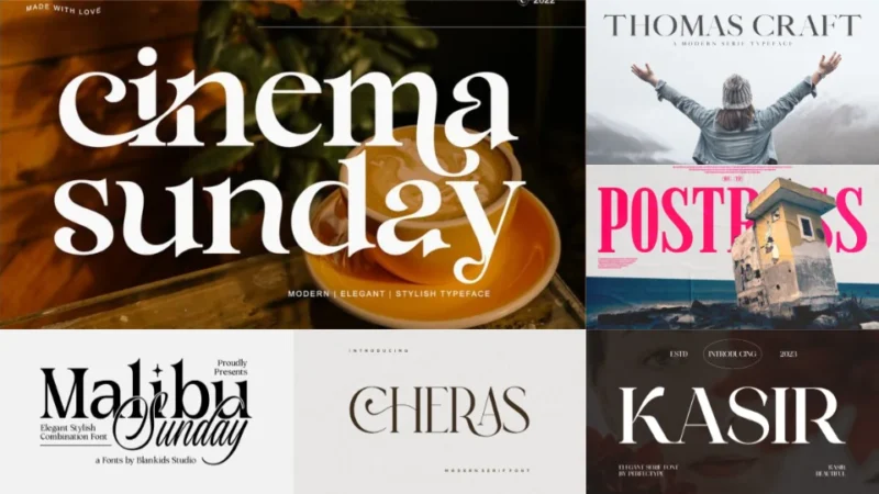
The Best Serif Fonts to Use in 2026
Cinema sunday
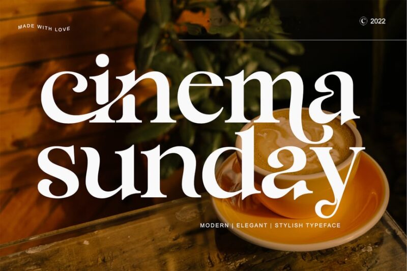
Cinema sunday is a decorative serif font that combines vintage charm with modern flair. This versatile typeface is perfect for designers looking to add a touch of cinematic nostalgia to their projects, while still maintaining a contemporary edge.
Royale Couture
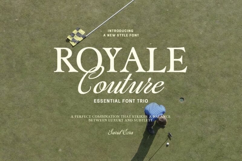
Royale Couture is an elegant serif font trio that exudes luxury and sophistication. This essential collection of serif fonts is ideal for high-end branding, editorial designs, and any project that demands a touch of refined elegance.
Malibu Sunday
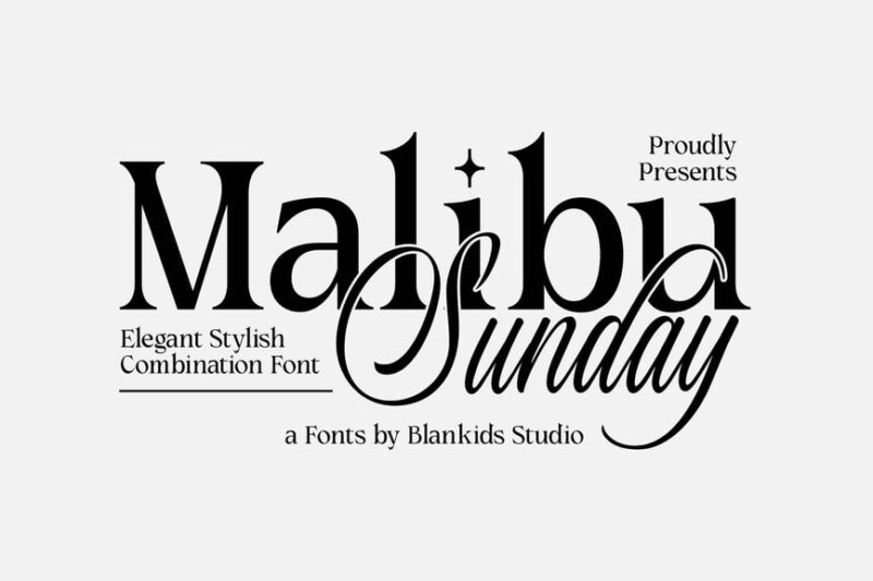
Malibu Sunday offers a stylish combination of serif, script, and handwritten fonts. This versatile set of serif fonts is perfect for creating elegant designs with a personalized touch, making it ideal for invitations, branding, and lifestyle-oriented projects.
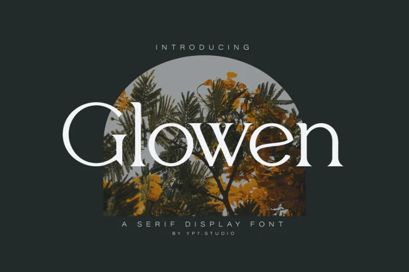
Erstoria
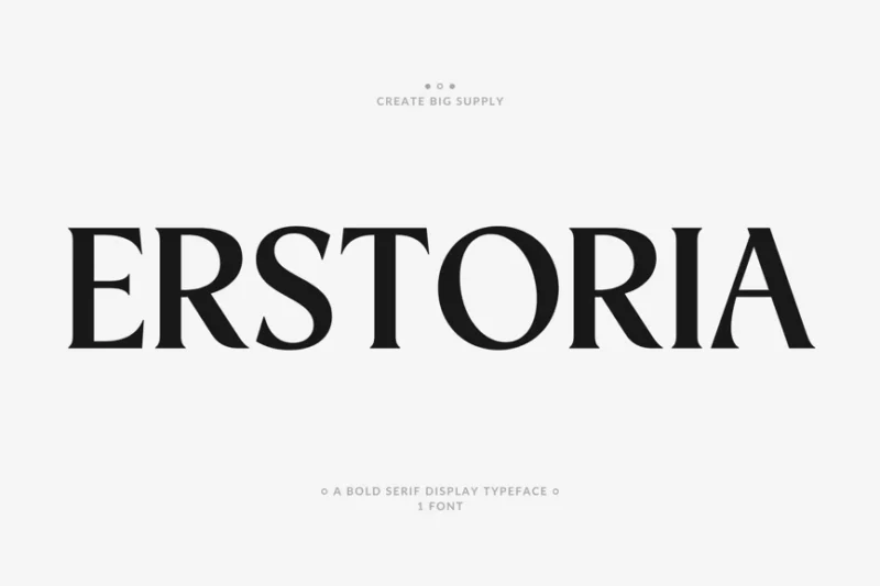
Erstoria is a bold serif display font with art deco influences. This striking typeface is ideal for creating impactful headlines and logos, offering designers a powerful tool for projects that demand attention and sophistication.
Jaguar
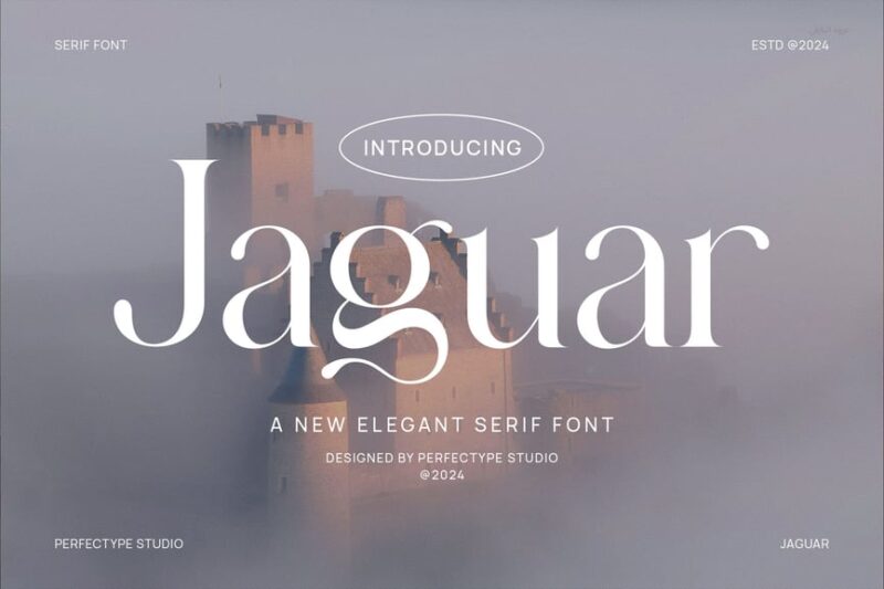
Jaguar is an elegant serif font designed for classic and timeless designs. This luxurious typeface is perfect for high-end branding, editorial layouts, and any project that requires a touch of sophistication and refinement.
Blue Mirage
![]()
Blue Mirage is a luxury modern logo font with a decorative serif style. This versatile typeface is ideal for creating high-end branding and fashion-forward designs, offering a perfect balance of elegance and contemporary flair.
Castio
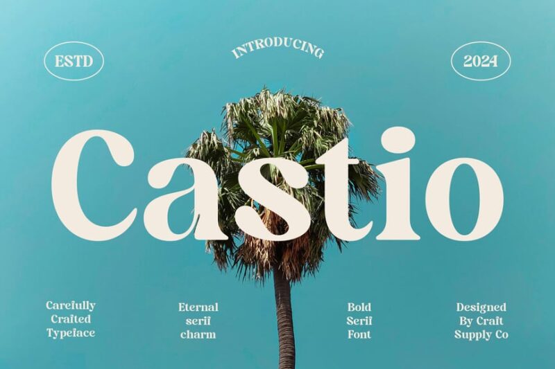
Castio is a bold serif font with old English and ethnic influences. This unique typeface offers designers a powerful tool for creating distinctive headlines and logos, perfect for projects that require a strong and characterful presence.
Raflesia
![]()
Raflesia is a luxury cinematic logo font with elegant serif details. This sophisticated typeface is ideal for creating high-end branding and film-related designs, offering a perfect blend of drama and refinement.
Platinum
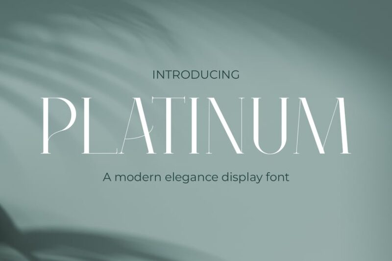
Platinum is a luxury modern elegant font with refined serif details. This versatile typeface is perfect for creating high-end branding, wellness-related designs, and any project that requires a touch of sophistication and contemporary elegance.
Modern Luxury Fashion Font
This Modern Luxury Fashion Font is a sophisticated serif typeface designed for high-end fashion and lifestyle branding. Its elegant lines and refined details make it perfect for creating stylish logos, editorial layouts, and luxurious packaging designs.
Vinylbuzz
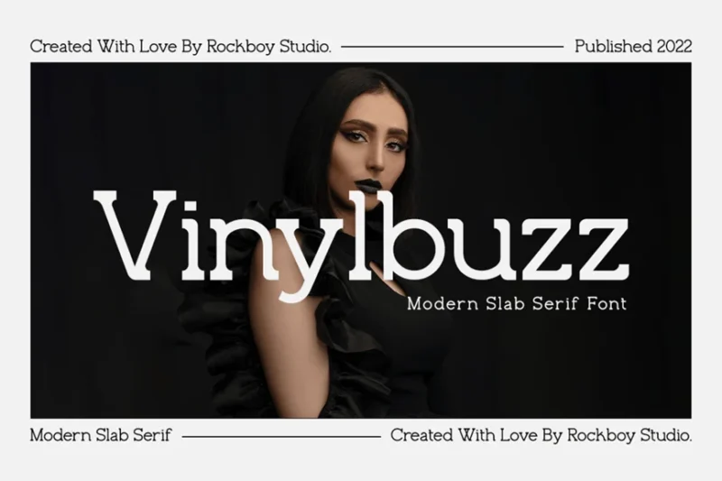
Vinylbuzz is a distinctive slab serif font with a retro-inspired feel. This unique typeface is perfect for creating eye-catching headlines and branding materials, offering designers a versatile tool for projects that demand both personality and readability.
Slab Serif Font Family Slab
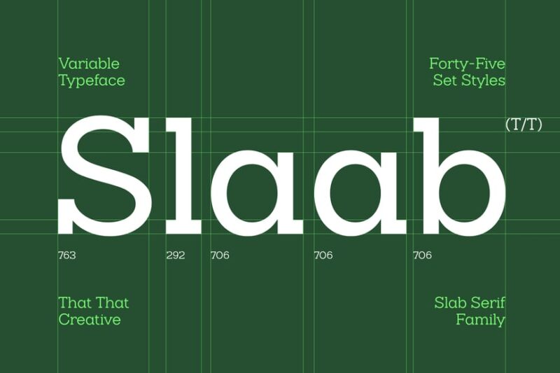
This Slab Serif Font Family offers a comprehensive collection of slab serif typefaces, including variable font options. This versatile family of serif fonts is perfect for creating cohesive designs across various mediums, from web to print.
Cambrino Slab Serif
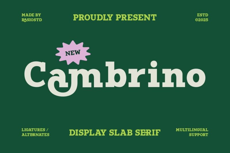
Cambrino is a stylish slab serif font that combines modern aesthetics with classic slab serif elements. This versatile typeface is perfect for creating impactful headlines and body text, offering designers a clean and contemporary serif option.
Sulling Modern Serif Font
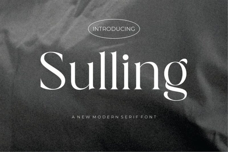
Sulling is a modern serif font that blends contemporary design with traditional serif elements. This elegant typeface is perfect for wedding invitations, high-end branding, and any project that requires a touch of sophistication and modernity.
Askilon
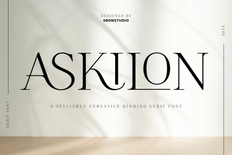
Askilon is a beautiful serif font that exudes elegance and refinement. This versatile typeface is perfect for creating sophisticated designs for salon, skin care, and beauty-related projects, offering a perfect balance of classic and contemporary aesthetics.
Kasir
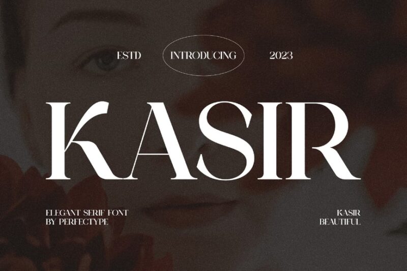
Kasir is an elegant serif font typeface that combines classic sophistication with modern flair. This versatile serif font is perfect for creating timeless designs across various mediums, from branding to editorial layouts.
Postress
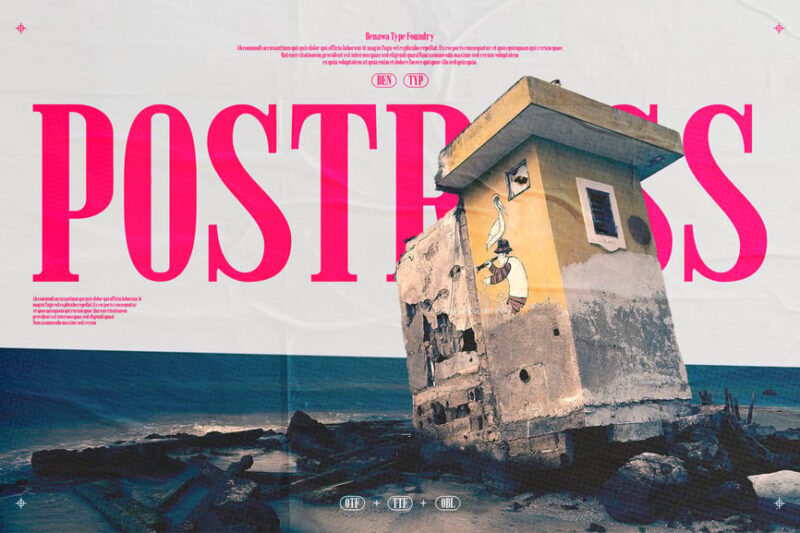
Postress is a condensed serif font with a distressed finish, offering a unique blend of vintage and modern aesthetics. This thin serif typeface is perfect for creating eye-catching headlines and logos with a touch of rustic charm.
Cheras
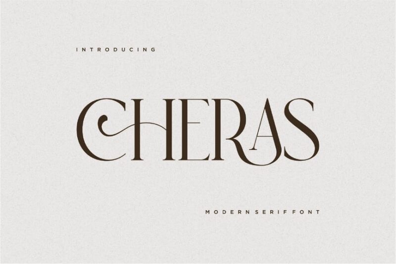
Cheras is a modern serif font that exudes luxury and sophistication. This elegant typeface is perfect for high-end branding, editorial designs, and any project that requires a contemporary serif with a touch of refinement.
Braliyon
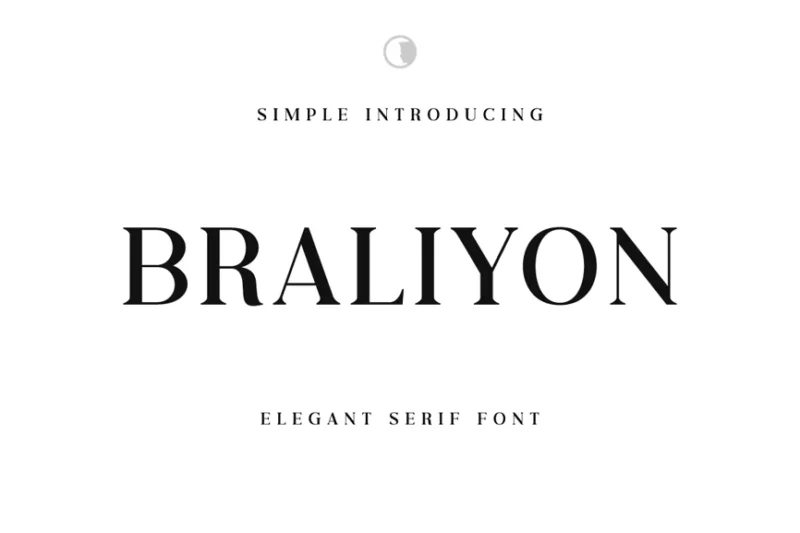
Braliyon is an elegant serif font that combines classic beauty with modern sensibilities. This versatile typeface is perfect for creating sophisticated designs across various mediums, offering designers a refined serif option with a contemporary edge.
Thomas Craft
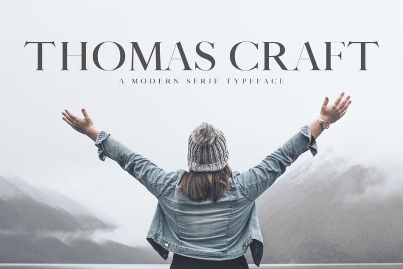
Thomas Craft is a modern serif typeface that draws inspiration from classic typewriter fonts. This versatile serif font is perfect for creating distinctive typography-driven designs, offering a perfect blend of nostalgia and contemporary style.
Vermolin
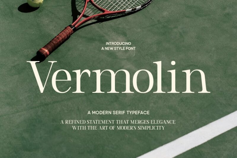
Vermolin is a sophisticated serif font that embodies minimalist modern design principles. This thin and elegant typeface is perfect for creating refined layouts and branding materials, offering designers a contemporary serif option with a touch of luxury.
Black Friday
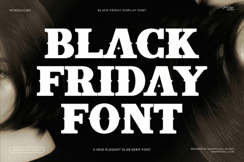
Black Friday is an elegant display serif font that combines classic sophistication with modern flair. This striking typeface is perfect for creating impactful headlines and logos, offering designers a powerful tool for projects that demand attention and refinement.
Sahertian
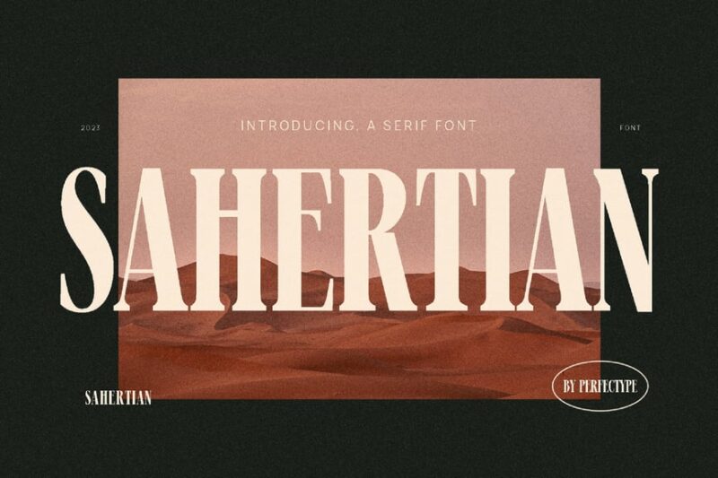
Sahertian is an elegant modern serif typeface that features tall, refined letterforms. This sophisticated font is perfect for creating high-end branding and editorial designs, offering a perfect balance of classic serif elements and contemporary aesthetics.
Roverse
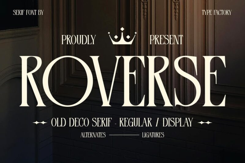
Roverse is an old decorative serif font with medieval influences and tall, distinctive letterforms. This unique typeface is perfect for creating eye-catching headlines and logos, offering designers a powerful tool for projects that require a touch of historical charm.
Lev Serif
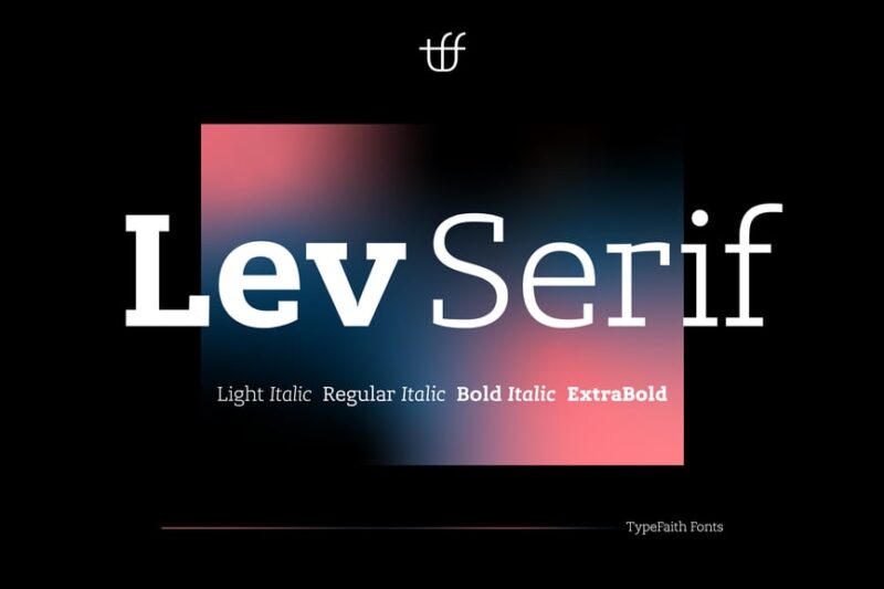
Lev Serif is a bold and masculine serif font that exudes strength and confidence. This powerful typeface is perfect for creating impactful headlines and branding materials, offering designers a versatile serif option for projects that demand a strong presence.
AMR Kovanov
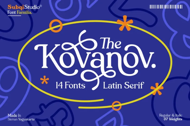
AMR Kovanov is a Latin serif font family with Asian-inspired decorative elements. This unique typeface offers designers a versatile set of modern serif fonts perfect for creating distinctive branding and editorial designs with a global appeal.
Rustcut
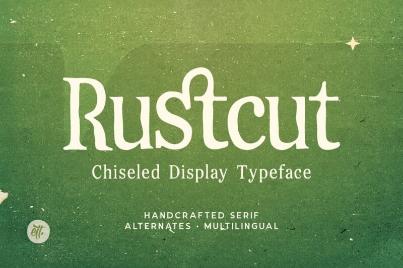
Rustcut is a chiseled display serif font that combines vintage charm with a modern edge. This distinctive typeface is perfect for creating eye-catching headlines and logos, offering designers a powerful tool for projects that require a touch of rustic sophistication.
Coplifher
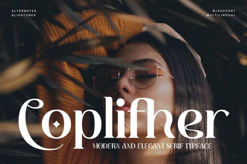
Coplifher is a modern serif font that blends classic elegance with contemporary design principles. This versatile typeface is perfect for creating sophisticated layouts and branding materials, offering designers a refined serif option for projects that demand a fresh, modern look.
Sevoilla
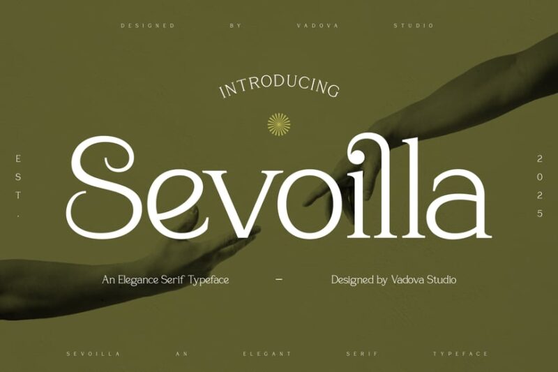
Sevoilla is an elegance serif font that exudes sophistication and refinement. This beautiful typeface offers designers a versatile tool for creating high-end branding and editorial designs, perfectly balancing classic serif elements with modern sensibilities.
Madali Serif Stylish
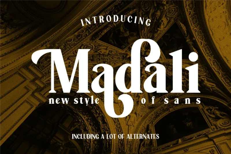
Madali Serif Stylish is a glamorous serif font that combines elegance with a touch of flair. This versatile typeface is perfect for creating sophisticated designs for fashion, beauty, and lifestyle brands, offering a perfect balance of style and readability.
SureThing
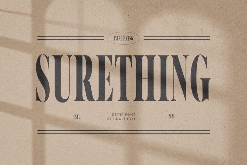
SureThing is an elegant serif font typeface that exudes luxury and sophistication. This refined serif font is perfect for creating high-end branding materials, editorial layouts, and any project that demands a touch of classic elegance with a modern twist.
Chayle
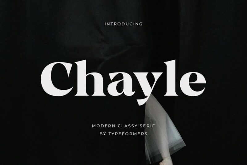
Chayle is a modern classy serif font that combines contemporary design with timeless elegance. This versatile typeface is perfect for creating sophisticated layouts and branding materials, offering designers a perfect balance of classic serif elements and modern aesthetics.
Waferick Serif
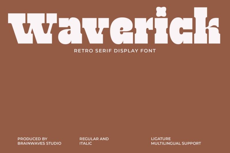
Waferick Serif is a retro-inspired serif font with a modern twist. This unique typeface offers designers a versatile tool for creating distinctive designs that blend vintage charm with contemporary flair, perfect for projects that require a touch of nostalgia.
Arilast Kingde
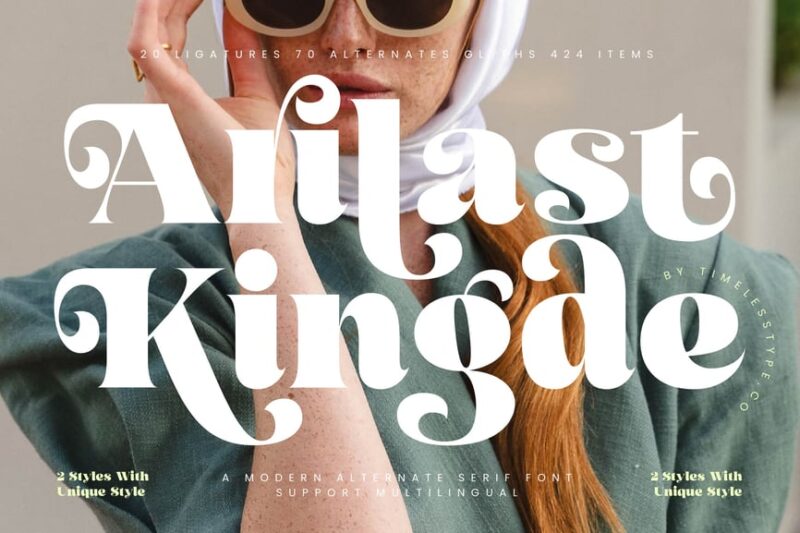
Arilast Kingde is a modern alternate serif font that offers bold and distinctive letterforms. This versatile typeface is perfect for creating impactful headlines and logos, providing designers with a powerful serif option for projects that demand attention and sophistication.
Why Serif Fonts Still Matter in the Digital Age
You might be wondering: in an age dominated by screens and sleek minimalist design, do serif fonts still have a place?
The answer is a resounding yes—but with some nuances.
For years, the conventional wisdom was that sans serif fonts were better for screens because they were cleaner and more legible at small sizes. And there’s truth to that, especially in the early days of low-resolution screens. But as screen technology has improved dramatically—with retina displays, 4K monitors, and high-resolution mobile screens becoming the norm—serif fonts have made a major comeback in digital design.
Major publications like Medium, The New York Times, and countless blogs now use serif fonts for body text on their websites. Why? Because well-designed serif fonts create a more pleasant, immersive reading experience. They feel more literary, more substantial, more thoughtful than their sans serif counterparts.
Plus, serif fonts add personality and differentiation in a sea of similar-looking websites. When everyone’s using Helvetica or Arial, a beautifully chosen serif font can make your brand stand out.
When to Use Serif Fonts (And When to Skip Them)
Serif fonts aren’t a one-size-fits-all solution. Like any design element, they shine in certain contexts and fall flat in others.
Perfect uses for serif fonts:
Long-form content is where serif fonts truly excel. Articles, blog posts, books, magazines—anywhere people are settling in for a longer read. The serifs help guide the eye and make sustained reading more comfortable. If you’re writing anything over 500 words, seriously consider a serif font for the body text.
Brands wanting to convey tradition, sophistication, or authority should lean heavily on serif fonts. Law firms, financial institutions, universities, and luxury brands have been using serifs for centuries for good reason. These fonts telegraph credibility and established expertise.
Print materials still favor serif fonts. From business cards to brochures to packaging, serifs look crisp and professional on paper. The high resolution of print makes even the finest serif details visible and beautiful.
When to avoid serif fonts:
User interfaces and navigation menus typically work better with sans serif fonts. When someone’s quickly scanning options or buttons, the clean simplicity of sans serif fonts wins out. You want instant clarity, not elegance.
Small text on low-resolution screens can make serifs look muddy or pixelated. While this is less of an issue with modern screens, if you’re designing for older devices or very small text sizes, sans serif fonts are the safer choice.
Youth-oriented or tech brands might find serif fonts feel too traditional or stuffy. If your brand personality is all about being cutting-edge, disruptive, or playful, a sans serif font might better capture that spirit.
Pairing Serif Fonts: Creating Typographic Harmony
One of the most powerful moves in typography is pairing serif fonts with other typefaces. The contrast between serif and sans serif fonts creates visual hierarchy and keeps designs from feeling monotonous.
The classic combination is using a serif font for body text and a sans serif font for headlines (or vice versa). This creates clear distinction between different levels of information while maintaining readability.
When pairing fonts, look for contrast but not conflict. Your serif and sans serif choices should feel like they’re from the same era or have similar proportions. For example, pairing the geometric Futura with the Modern serif Bodoni works beautifully because both have that rational, constructed quality.
Another approach is pairing different serif fonts together—maybe an Old Style serif for body text and a Slab serif for headings. Just make sure they’re different enough to create clear hierarchy but harmonious enough to feel cohesive.
A good rule of thumb: stick to two, maybe three, fonts maximum in any design. More than that and things start feeling chaotic rather than intentional.
Serif vs. Sans Serif: The Great Typography Debate
The serif versus sans serif debate has raged in design circles for decades. Which is more readable? Which is more modern? Which is better for screens?
Here’s the truth: both have their place, and the “better” choice depends entirely on context.
Serif fonts generally feel more traditional, formal, and literary. They carry the weight of centuries of use in books and documents. This makes them perfect for content that wants to feel authoritative, established, or sophisticated.
Sans serif fonts feel more modern, clean, and approachable. They emerged much later in typography history (19th century) and became associated with modernism and minimalism. They’re perfect for brands wanting to feel contemporary, straightforward, or friendly.
The readability debate is largely settled: both can be equally readable when well-designed and used appropriately. Serif fonts may have a slight edge in long-form print reading, while sans serifs might be marginally better for short bursts of text on screens. But the differences are smaller than people think.
The real answer? Choose based on the personality and tone you want to convey, not outdated rules about readability.
Famous Brands Using Serif Fonts
Some of the world’s most recognizable brands have built their identities around serif fonts. Let’s look at a few examples:
The New York Times uses a custom serif font (appropriately named NYT Cheltenham) that screams authority and journalistic integrity. It’s hard to imagine the Gray Lady in anything but a serif font.
Vogue’s iconic masthead has used Didot—a Modern serif font—for decades. The high contrast and razor-thin serifs perfectly capture the magazine’s fashion-forward, sophisticated identity.
Rolex uses a custom serif font that communicates timeless luxury and precision. The serifs reinforce the brand’s message of traditional craftsmanship and enduring value.
Sony recently rebranded with a custom serif font, moving away from their previous sans serif logo. The new serif design gives the tech giant a more sophisticated, premium feel.
These brands understand that serif fonts aren’t old-fashioned or outdated—they’re powerful tools for communicating specific brand values and personalities.
How to Choose the Perfect Serif Font for Your Project
Picking the right serif font can feel overwhelming with so many options available. Here’s a framework to guide your decision:
Start with your brand personality. Are you traditional or innovative? Playful or serious? Luxury or accessible? Different serif categories communicate different personalities. Old Style serifs feel classic and warm, Modern serifs feel luxurious and fashion-forward, Slab serifs feel bold and confident.
Consider your medium. Is this for print or digital? Large or small sizes? Body text or headlines? Some serif fonts are optimized for text setting with careful attention to readability at small sizes. Others are designed for display use and look best at large sizes in headlines or logos.
Think about your audience. Who are you designing for? A financial services firm catering to retirees might choose a different serif font than a literary magazine targeting young readers. Consider what typographic choices will resonate with your specific audience.
Test in context. Don’t just look at individual letters—see how the font performs with your actual content. Set a paragraph of body text. Create a few headlines. See how it looks at different sizes and weights. The best way to evaluate a font is to use it.
Check for complete families. Does the font have the weights and styles you need? A good serif font family should include at least regular, italic, bold, and bold italic. More weights (light, medium, semi-bold, etc.) give you more flexibility.
Serif Font Accessibility and Readability
Accessibility isn’t just a buzzword—it’s essential for reaching all users, including those with visual impairments or reading difficulties.
When choosing serif fonts with accessibility in mind, look for generous x-heights (the height of lowercase letters). Fonts with taller lowercase letters are generally more readable, especially at smaller sizes.
Open counters (the enclosed spaces in letters like ‘o’ and ‘e’) help distinguish letters and prevent them from filling in at small sizes. Fonts like Georgia were specifically designed with generous counters for screen readability.
Clear letter differentiation is crucial. Make sure your serif font clearly distinguishes between similar letters like ‘I’, ‘l’, and ‘1’, or ‘O’ and ‘0’. This is especially important for body text where context might not always make the meaning clear.
Contrast considerations matter too. While Modern serifs with their extreme thick-thin contrast look stunning, they can be harder to read for some users, particularly those with dyslexia or visual impairments. Transitional or Old Style serifs with more moderate contrast often perform better for accessibility.
Font size and line spacing are just as important as the font choice itself. No matter how readable your serif font is, set it too small or cram lines too close together, and you’ll create accessibility barriers.
Common Serif Font Mistakes to Avoid
Even experienced designers sometimes stumble with serif fonts. Here are the most common pitfalls:
Using too many different serif fonts in one design creates visual chaos. Stick to one serif font (in different weights) or pair one serif with one sans serif. More than that and you’re asking for trouble.
Choosing a serif font that fights your brand personality is a classic mistake. Don’t use a playful Slab serif for a conservative law firm or a formal Modern serif for a children’s toy company. Let your font choice reinforce, not undermine, your message.
Ignoring licensing can get you in legal trouble. Not all fonts are free for commercial use. Always check the license before using a font in client work or commercial projects. Some fonts require paid licenses; others have restrictions on how they can be used.
Setting body text too small in a delicate serif font makes reading painful. Those beautiful hairline strokes in Modern serifs? They disappear or look broken at small sizes. Choose your serif fonts based on how they’ll actually be used, not just how they look in the specimen.
Forgetting about responsive design means your beautiful serif font might look terrible on mobile devices. Test how your font renders across different screen sizes and devices. What looks elegant on a desktop might be illegible on a phone.
The Future of Serif Fonts in Design
Far from being relics of the past, serif fonts are experiencing a renaissance in 2026. Variable fonts—a relatively new technology—are opening up exciting possibilities for serif typography. These fonts allow designers to adjust weight, width, and other attributes on a sliding scale, giving unprecedented control over appearance.
We’re also seeing more experimental serif designs that push the boundaries of traditional categories. Designers are creating serifs with unexpected details, mixing characteristics from different serif styles, or adding contemporary twists to classic forms.
The web font revolution has made it easier than ever to use beautiful serif fonts online. Services like Google Fonts, Adobe Fonts, and others offer vast libraries of high-quality serif fonts that are optimized for screen display.
And perhaps most importantly, there’s a growing recognition that good typography isn’t about following rigid rules—it’s about making intentional choices that serve your content and audience. Serif fonts, with their rich history and diverse personalities, give designers a powerful palette to work with.
Frequently Asked Questions About Serif Fonts
What is the most popular serif font?
Times New Roman is probably the most widely recognized serif font, thanks to its default status in Microsoft Word for decades. However, in professional design circles, fonts like Garamond, Georgia, and custom serif faces are far more popular. The “best” serif font depends entirely on your specific needs and context.
Are serif fonts better for print or digital?
This used to be a clearer distinction, but modern high-resolution screens have leveled the playing field. Serif fonts work beautifully in both print and digital contexts when chosen appropriately. For long-form reading, many designers actually prefer serif fonts on screens because they create a more literary, immersive experience.
Do serif fonts make text easier to read?
It depends. For extended reading in print, serif fonts may have a slight advantage because the serifs help guide the eye along lines of text. However, for short bursts of text or on screens, the difference in readability between good serif and sans serif fonts is minimal. Both can be highly readable when well-designed and properly used.
Can I mix different serif fonts together?
Yes, but carefully. Mixing serif fonts is trickier than pairing a serif with a sans serif. If you do combine multiple serifs, make sure they’re different enough to create clear hierarchy (for example, an Old Style serif for body text and a Slab serif for headlines) but harmonious enough to feel cohesive. When in doubt, stick to one serif font family in different weights.
Are serif fonts outdated?
Absolutely not. While serif fonts have centuries of history, that doesn’t make them outdated—it makes them timeless. Many contemporary brands are actually moving toward serif fonts for their sophisticated, literary quality. The key is choosing the right serif font for your context and using it in a way that feels fresh and intentional.
Wrapping Up: The Enduring Power of Serif Fonts
Serif fonts have been guiding readers’ eyes for centuries, and they’re not going anywhere. From the stone-carved letters of ancient Rome to the pixel-perfect typography on your screen, these elegant letterforms continue to shape how we communicate.
What makes serif fonts so enduring? It’s their ability to convey both substance and style. They can feel authoritative without being cold, elegant without being pretentious, traditional without being outdated. A well-chosen serif font adds depth, personality, and polish to any design.
Whether you’re designing a website, crafting a brand identity, or just trying to make your resume stand out, understanding serif fonts gives you a powerful tool in your typographic toolkit. The key is being intentional—knowing not just which serif fonts exist, but when and why to use them.
So go forth and embrace those little decorative strokes. Experiment with different serif styles. See how an Old Style serif feels compared to a Slab serif. Pair serifs with sans serifs. Test your choices in context. The more you work with serif fonts, the more you’ll develop an intuitive sense for when they’re the perfect choice.
After all, typography is about communication. And sometimes, the most eloquent way to say something is with serifs.