In this article:
- The Most Winning Sports Fonts
- What Makes Sports Fonts Feel So Dynamic?
- Where Can You Use Sports Fonts?
- Where to Avoid Sports Fonts
- How to Pick the Perfect Sports Font
- The Evolution of Sports Typography
- Fantastic Sports Font Alternatives
- Common Sports Font Questions
- Conclusion: The Power of Sports Typography
As designers working on sports-related projects, we all know that finding the perfect font can be a game-changer. The right sports font instantly communicates energy, strength, and competitive spirit – whether you’re designing team jerseys, creating event posters, or building a fitness brand from scratch.
Sports fonts need to do heavy lifting – they must be bold enough to catch the eye, dynamic enough to convey motion, and distinctive enough to stand out in a crowded field. In 2026, we’re seeing sports typography evolve with fresh takes on classic varsity font styles alongside innovative new approaches.
The Most Winning Sports Fonts
After reviewing hundreds of options, I’ve compiled my draft picks for the top sports fonts that are dominating the field this year. These fonts bring the perfect combination of energy, readability, and athletic spirit to any design:
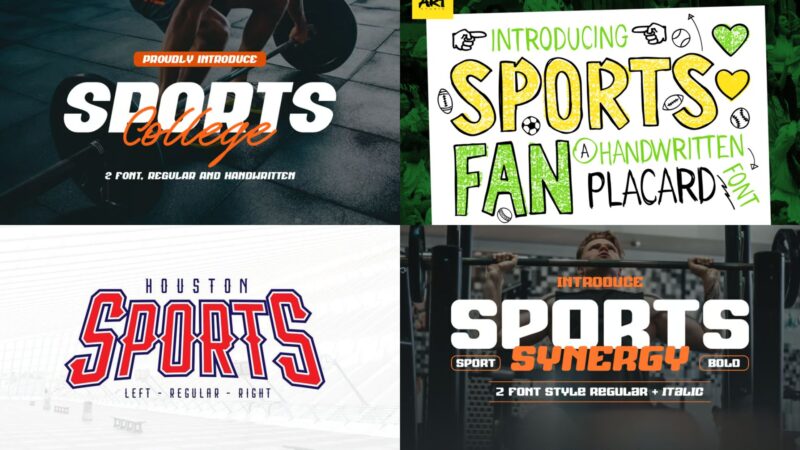
Houston Sports Font Family
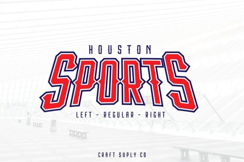
Houston Sports is a bold, decorative display font that captures the essence of sports energy. Its strong letterforms and dynamic curves make it perfect for sports-related branding and headlines, evoking a sense of power and movement.
Sports Invation
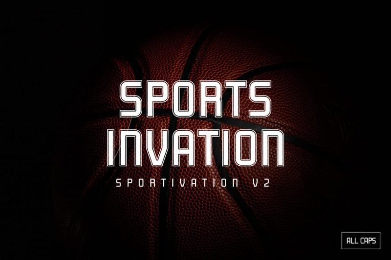
Sports Invation is a modern, sans-serif font designed with sports aesthetics in mind. Its clean lines and athletic feel make it ideal for contemporary sports branding, team jerseys, and event promotions, offering a sleek and professional look.
Sports Nerford Font
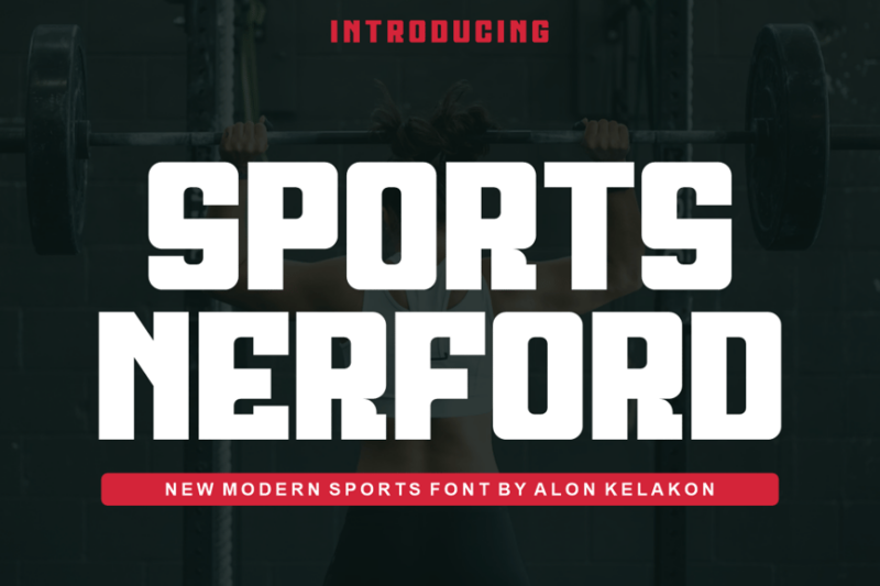
Sports Nerford is a versatile sans-serif font that combines readability with a sporty edge. Its balanced letterforms and subtle athletic touches make it suitable for various sports-related applications, from team merchandise to stadium signage.
Sportify
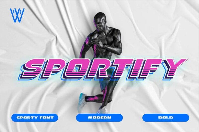
Sportify is a dynamic, decorative sans-serif font that embodies speed and energy. Its bold, angular design makes it perfect for gym branding, sports equipment packaging, and high-intensity fitness promotions, conveying a sense of action and movement.

Get 300+ Fonts for FREE
Enter your email to download our 100% free "Font Lover's Bundle". For commercial & personal use. No royalties. No fees. No attribution. 100% free to use anywhere.
Sports Fan
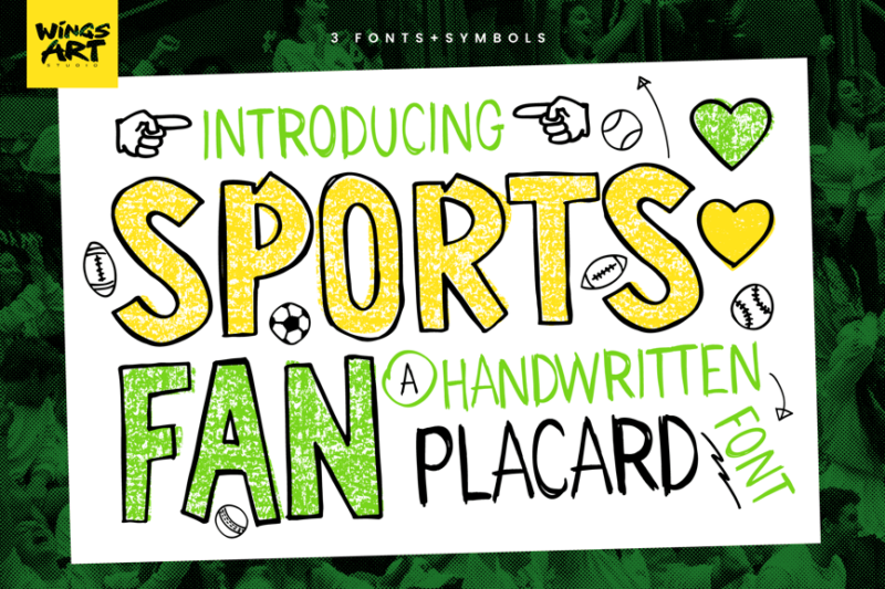
Sports Fan is a playful, handwritten font that captures the spirit of DIY sports placards. Its informal, energetic style is perfect for creating authentic fan-made looks in designs, adding a personal touch to sports graphics and social media content.
Blasher
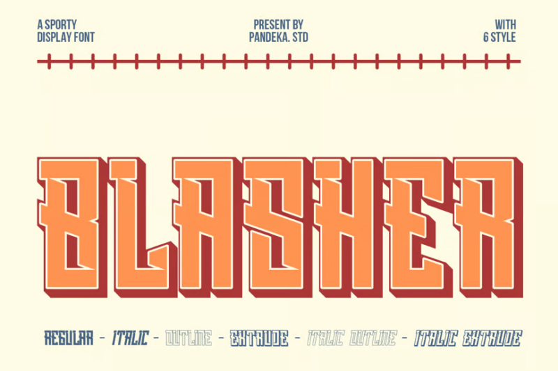
Blasher is a distinctive decorative font inspired by traditional baseball fonts. Its unique letterforms evoke classic baseball uniforms and signage, making it ideal for baseball-themed designs, team logos, and sports memorabilia with a nostalgic flair.
Jopersag
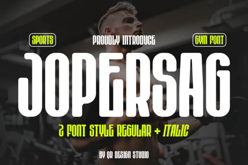
Jopersag is a versatile sport font that combines sans-serif structure with cursive elements. Its mix of display and script styles makes it suitable for a wide range of sports-related designs, from team logos to event posters, offering both readability and flair.
Monday Sports
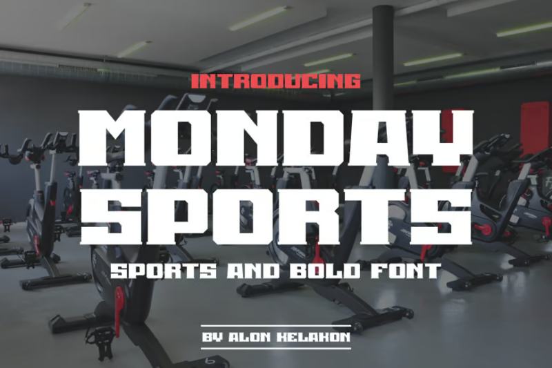
Monday Sports is a futuristic serif font with a sporty twist. Its modern take on traditional serif design makes it stand out in sports branding and digital media, offering a unique blend of classic structure and forward-thinking aesthetics.
Sports Synergy
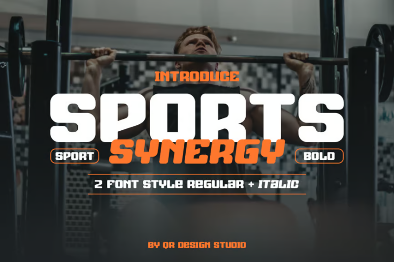
Sports Synergy is a luxurious sans-serif font that brings sophistication to sports design. Its refined letterforms and elegant structure make it suitable for high-end sports brands, luxury fitness centers, and upscale sporting events, adding a touch of class to athletic aesthetics.
Buleten
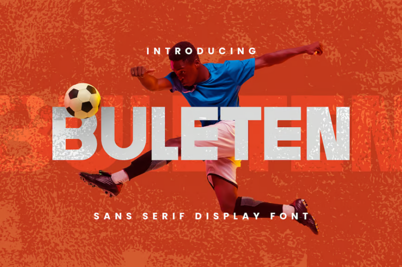
Buleten is a modern sans-serif font designed with sports in mind, particularly basketball and football. Its clean, bold letterforms provide excellent legibility for jerseys and scoreboards, while maintaining a contemporary look suitable for various sports applications.
Sporte
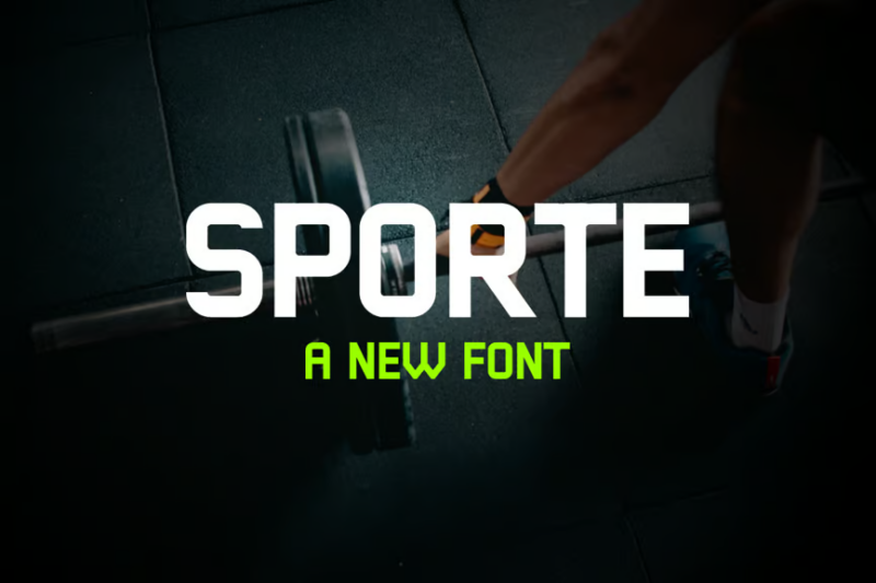
Sporte is a crisp, sans-serif font that embodies the essence of athletic design. Its clean lines and balanced proportions make it highly readable for sports statistics, team rosters, and athletic wear, while maintaining a modern and sporty appearance.
Sport Health

Sport Health is a sans-serif font that combines athletic energy with a focus on wellness. Its balanced design makes it ideal for health and fitness branding, sports nutrition packaging, and wellness center signage, conveying both vitality and well-being.
Sport Record

Sport Record is a luxurious sans-serif font that brings a touch of elegance to sports design. Its refined letterforms make it suitable for high-end sports brands, commemorative plaques, and prestigious sporting events, adding a sense of accomplishment and prestige.
Sports College
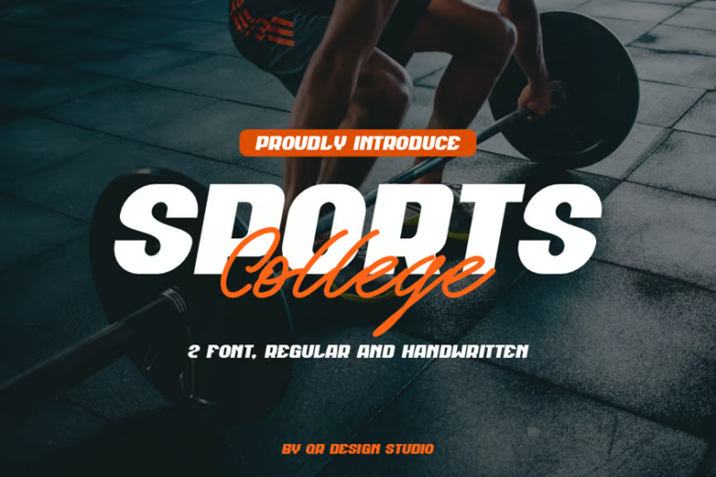
Sports College is a versatile collegiate font duo combining script and handwritten styles. This pairing is perfect for creating authentic college sports branding, offering a balance between tradition and energy that’s ideal for team merchandise, alumni communications, and campus events.
Sport Collage
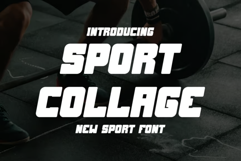
Sport Collage is a dynamic sans-serif font designed for creating impactful sports logos and graphics. Its bold, geometric forms make it ideal for team emblems, sports equipment branding, and athletic apparel designs, offering a strong visual presence.
Orqendha

Orqendha is a distinctive serif sport font that combines classic elements with modern flair. Its unique letterforms make it stand out in sports branding and headlines, offering a blend of tradition and contemporary style that’s perfect for team identities and sports publications.
Sport Font Pairing

Sport Font Pairing is a carefully curated set of sans-serif fonts designed to work harmoniously in sports and esports contexts. This collection offers versatility for creating cohesive branding across various applications, from team logos to streaming overlays and merchandise.
Team Sport
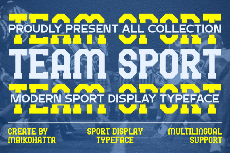
Team Sport is a modern serif display typeface that captures the essence of team spirit. Its bold, emblematic design makes it perfect for sports team logos, jersey numbers, and stadium graphics, conveying a sense of unity and strength in athletic branding.
Balegare
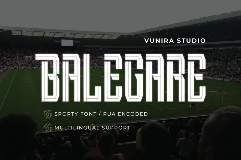
Balegare is a versatile sans-serif sport font with a focus on typography and vector compatibility. Its clean lines and balanced proportions make it ideal for creating scalable sports logos, infographics, and digital content, ensuring clarity across various media.
Zoroyes
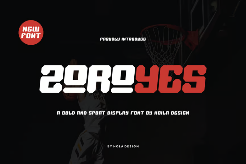
Zoroyes is a bold sans-serif sport font designed for maximum impact. Its strong letterforms and dynamic angles make it perfect for sports headlines, team jerseys, and athletic branding, conveying power and energy in every character.
Hidrox Sport
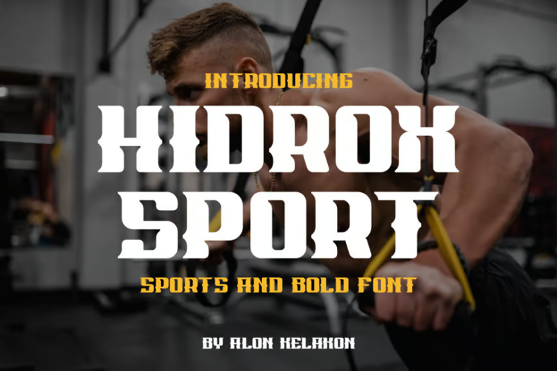
Hidrox Sport is a distinctive serif font that brings a unique character to sports design. Its blend of classic serif elements with modern twists makes it suitable for creating memorable sports logos, event posters, and athletic brand identities with a touch of sophistication.
Cornero
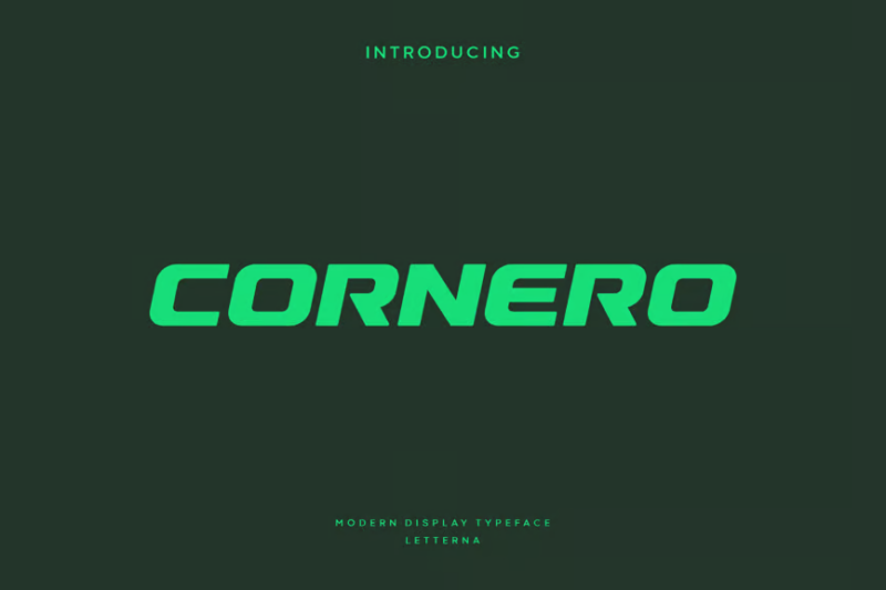
Cornero is a modern sans-serif typeface that embodies athletic and collegiate spirit. Its clean, bold design makes it ideal for sports team branding, university athletic departments, and fitness apparel, conveying strength and professionalism in equal measure.
ElevenFit

ElevenFit is a dynamic sport typeface that combines sans-serif structure with decorative elements for a cool neon font feel. Its energetic design makes it perfect for fitness branding, sports equipment packaging, and gym signage, conveying a sense of movement and vitality.
Sport Font – Gameday
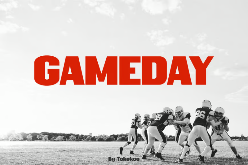
Gameday is a bold, high-energy sans-serif font designed to capture the excitement of sports events. Its strong, condensed letterforms make it ideal for scoreboards, team jerseys, and event promotions, embodying the intense spirit of game day.
Avazex Sport
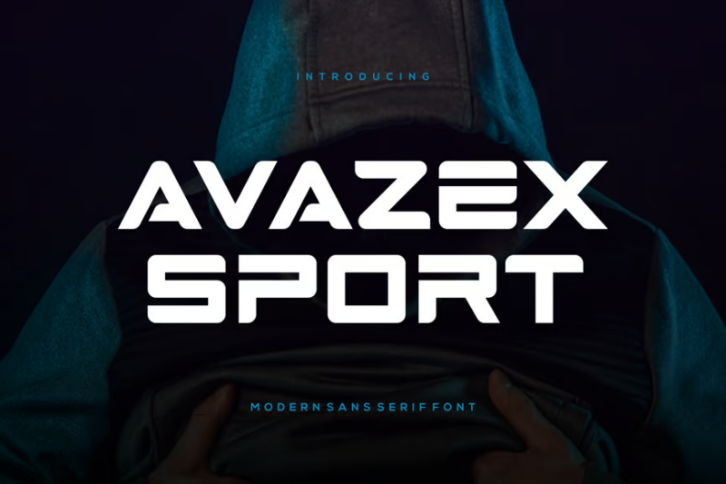
Avazex Sport is a sleek sans-serif font that brings a modern edge to sports design. Its clean lines and balanced proportions make it versatile for various applications, from team logos to digital scoreboards, offering clarity and contemporary style.
Buccane

Buccane is a modern sport serif font that combines traditional elements with contemporary flair. Its unique blend of classic structure and dynamic details makes it perfect for creating distinctive sports branding, especially for teams looking to convey both heritage and innovation.
Norwill-Sport Font
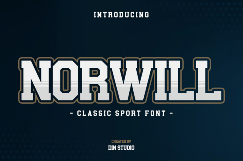
Norwill-Sport is a decorative font that brings character and energy to sports design. Its unique letterforms and dynamic style make it ideal for creating eye-catching sports logos, event posters, and merchandise designs that stand out from the crowd.
Rosover
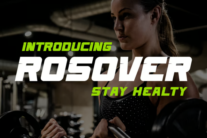
Rosover is a versatile sans-serif sport font that offers a fresh take on athletic typography. Its clean, modern design makes it suitable for a wide range of sports applications, from team branding to fitness app interfaces, providing a contemporary look with excellent readability.
Rowderby
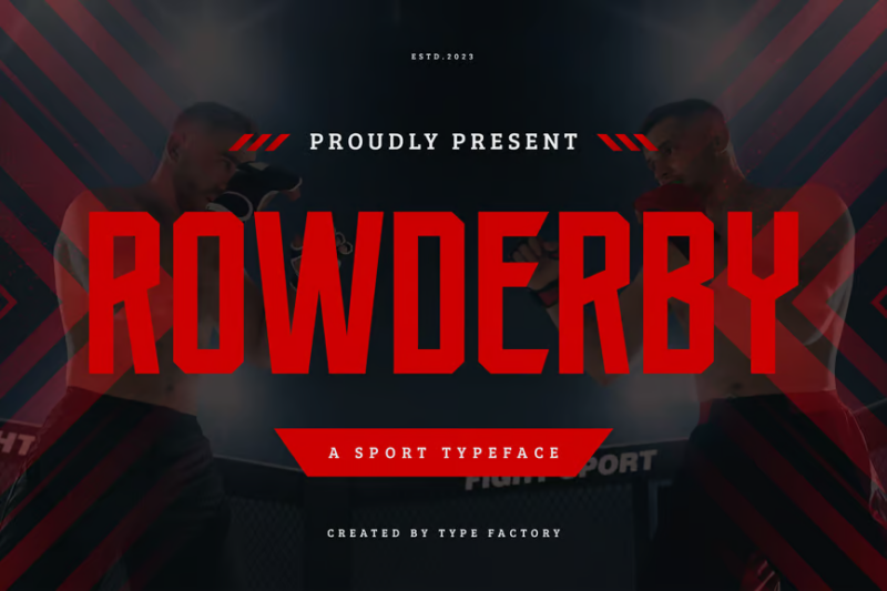
Rowderby is a dynamic sans-serif sport typeface characterized by its angular and energetic design. Its bold, sharp edges make it perfect for extreme sports branding, athletic wear graphics, and event promotions that require a sense of speed and intensity.
Sporter
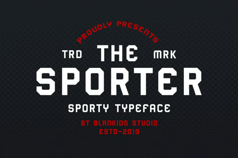
Sporter is a strong, sporty display typeface that commands attention. Its bold sans-serif design and athletic character make it ideal for sports headlines, team logos, and fitness branding, conveying power and determination in every letter.
Noize Sport Typeface
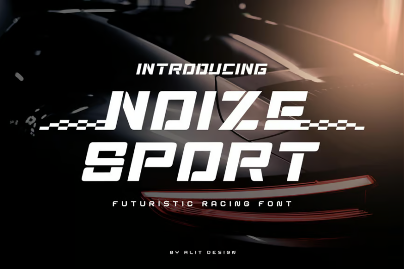
Noize Sport is a modern typeface that brings an element of excitement to sports design. Its sharp angles and dynamic forms make it particularly suitable for racing sports, extreme sports branding, and high-energy event promotions.
Sportstars

Sportstars is a versatile sans-serif font designed for sports events and marathons. Its clean, energetic style makes it perfect for race numbers, event banners, and promotional materials, offering excellent readability and a sense of movement.
Rodwick-Classic Sport Font
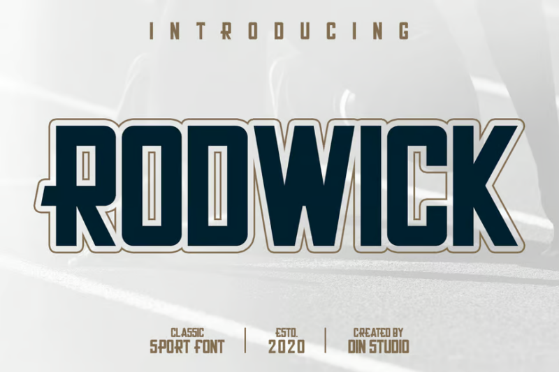
Rodwick-Classic is a decorative sport font that evokes a sense of traditional athleticism. Its vintage-inspired design makes it ideal for creating retro sports logos, throwback team merchandise, and classic gymnasium signage with an authentic feel.
Tercepat

Tercepat is an awesome decorative sport font that brings energy and excitement to designs. Its dynamic, flowing letterforms make it perfect for creating eye-catching sports logos, event posters, and athletic apparel graphics that convey speed and motion.
Goball
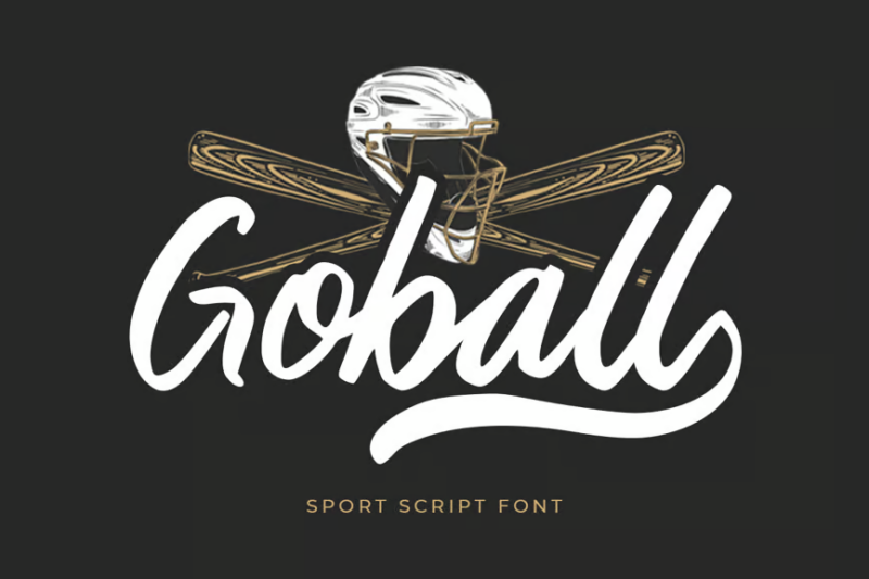
Goball is a sporty script font that captures the spirit of baseball and athletic branding. Its flowing, handcrafted style makes it ideal for creating authentic team logos, sports merchandise, and promotional materials that evoke a sense of tradition and passion for the game.
What Makes Sports Fonts Feel So Dynamic?
Sports fonts capture that unmistakable athletic energy through several key characteristics:
Bold, Heavy Weights
First, the thickness. Most sports fonts feature substantially heavier weights than standard typefaces. This bold presence gives letters the strength and impact that mirrors athletic performance. The heavyweight champions of typography, if you will.
The substantial weight ensures visibility from a distance – critical for jersey numbers viewed from the stands or billboards seen from the highway. This boldness communicates power and confidence instantly.
Dynamic Angles and Slants
Sports fonts rarely stand perfectly upright. They lean forward with purpose, suggesting movement, speed, and direction. These intentional angles create a sense of momentum that perfectly captures athletic action.
The forward tilt mimics the body position of athletes in motion – leaning into the effort, pushing forward toward the finish line. It’s typography that refuses to stand still.
Sharp Edges and Corners
Unlike rounded, friendly fonts, sports typography often features sharp, aggressive edges and pointed terminals. These angular details suggest precision, intensity, and competitive edge.
The sharp corners create a sense of danger and excitement that mirrors the adrenaline rush of competitive sports. They’re not playing around, and neither are these fonts.
Consistent Line Thickness
Most sports fonts maintain relatively consistent stroke width throughout each character. This uniformity creates a stable, balanced appearance that feels solid and dependable – just like the athletes we admire.
The lack of dramatic thick-to-thin transitions makes these fonts more legible at a distance and when in motion – critical for sports applications.
Custom Modifications
Many sports fonts feature distinctive customizations like unique serifs, cut-ins, or stencil-like breaks that give them a proprietary feel. These special details help create team identity and brand recognition.
Together, these characteristics – weight, angles, edges, consistency, and custom details – forge typefaces that feel as powerful and dynamic as the athletes and teams they represent.
Where Can You Use Sports Fonts?
Now that we understand what gives sports fonts their winning personality, let’s explore where they perform best:
Team Branding
Sports fonts are the MVPs of team identity design. They shine on jerseys, merchandise, stadium graphics, team websites, social media, and anywhere a team needs to make its mark.
The distinctive personality of a sports font can become as recognizable as the team logo itself, creating instant brand recognition.
Event Promotion
Tournament posters, marathon signage, championship merchandise, ticket designs, and broadcast graphics all benefit from the energy and excitement that sports fonts bring to the table.
Their bold presence helps event materials stand out in crowded promotional environments, capturing attention and conveying the excitement of the upcoming competition.
Sports Apparel
Athletic wear brands, fitness apparel, sports equipment, and recreational gear all leverage sports fonts to communicate performance, strength, and active lifestyle values.
The dynamic character of these fonts aligns perfectly with products designed for movement and physical achievement.
Fitness Industry
Gym branding, fitness app interfaces, workout program materials, nutrition products, and personal trainer marketing all benefit from typography that feels as energetic as their services.
Sports fonts help fitness businesses communicate strength, transformation, and the dynamic nature of physical training.
Youth Sports
Little league teams, school athletics departments, sports camps, and youth tournaments can use sports fonts to create a professional feel while maintaining the fun, engaging spirit of youth sports.
These fonts bring a touch of big-league excitement to programs focused on developing young athletes.
Where to Avoid Sports Fonts
While sports fonts crush it in many applications, there are places where they might fumble:
Long-form Reading
The heavy weight, angular shapes, and stylized characters of sports fonts make them exhausting for lengthy content. For articles, books, or any text requiring sustained reading, stick with more neutral body text options.
Sports fonts are sprinters, not marathon runners when it comes to readability.
Formal Corporate Settings
In traditional business contexts like banking, law, or healthcare, sports fonts may appear too casual or aggressive. These environments typically require typography that communicates stability and professionalism.
Save the sports fonts for the company softball team, not the annual report.
Luxury Branding
High-end brands typically rely on elegant, refined typography to communicate exclusivity and sophistication. Sports fonts, with their bold, aggressive character, often clash with luxurious aspirations.
The whisper of luxury and the shout of sports typography rarely harmonize well.
Sensitive Communications
Situations requiring empathy, sensitivity, or a gentle touch – like healthcare communications, condolences, or certain types of fundraising – may be undermined by the forceful presence of sports fonts.
Their energetic character can sometimes come across as shouting when a whisper would be more appropriate.
So while sports fonts win gold in activity-focused designs, they might be disqualified in contexts requiring subtlety, formality, or extended readability.
How to Pick the Perfect Sports Font
To select the ideal sports font for your project, consider these key factors:
Sport-Specific Style
Different sports have evolved distinct typographic traditions. Football tends toward block letters with strong horizontal elements. Basketball often features tall, vertical forms. Soccer frequently uses dynamic angles and curves suggesting ball movement.
Align your font choice with the visual language of the specific sport to create an authentic connection.
Application Context
Will the font appear on jerseys? Stadium signage? Digital scoreboards? Mobile apps? Each environment has different visibility requirements and viewing distances.
Jersey numbers need to be instantly recognizable from across the field. Digital applications may need versions optimized for smaller screens.
Team Heritage
Consider the history and visual tradition of the team or organization. Established teams often have typography deeply connected to their legacy. New teams have more freedom to establish fresh identities.
Dramatic font changes for historic teams can alienate longtime fans, while new franchises can use distinctive typography to stand out.
Target Audience
Youth sports might benefit from more playful, accessible sports fonts. Professional leagues often require more serious, authoritative typography. Extreme sports might demand edgier, more aggressive forms.
Match the character of your font to the expectations and preferences of your audience.
Technical Requirements
Consider practical factors like readability at various sizes, performance across different media, available weights and styles, and character set completeness.
The most visually striking font still fails if it doesn’t include all the required characters or performs poorly in your primary application.
With these considerations in mind, you’ll be well-equipped to draft the perfect typographic player for your sports design team!
The Evolution of Sports Typography
Sports typography has its own fascinating history, evolving alongside the sports industry itself:
Early Uniform Era (1900s-1940s)
The earliest sports uniforms featured simple, blocky letterforms focused purely on functionality. Numbers needed to be visible from the stands, and technology limited embroidery and printing options.
This era established the tradition of bold, high-contrast typography that continues to influence sports fonts today.
Television Age (1950s-1970s)
As televised sports grew in popularity, typography adapted to the new medium. Higher contrast, cleaner letterforms, and more distinctive team identities emerged as sports became visual entertainment.
This period saw the creation of many iconic team typography styles that fans still recognize instantly—many dating back to 70s fonts or earlier.
Brand-Conscious Era (1980s-1990s)
The explosion of sports merchandise transformed team typography into valuable intellectual property. Custom 80s fonts became more common as teams sought to create distinctive, ownable visual identities.
This period saw teams working with professional type designers to create proprietary fonts that could be protected and monetized.
Digital Revolution (2000s-2010s)
The rise of digital media created new requirements for sports typography. 2000s Fonts needed to work across websites, apps, social media, and high-definition broadcasts while maintaining the energy of traditional sports typography.
This era saw greater sophistication in font design, with considerations for cross-platform performance.
Contemporary Period (2026)
Today’s sports typography balances tradition with innovation. We’re seeing creative explorations of dimensional effects, animation potential, variable font technology, and custom fonts that change based on context or performance.
The best contemporary sports fonts honor athletic tradition while embracing new technical possibilities.
This evolution reflects how sports typography must constantly balance functional requirements (visibility, recognition, information hierarchy) with emotional impact (energy, tradition, team spirit).
Fantastic Sports Font Alternatives
While dedicated sports fonts are often the perfect choice, sometimes you might need alternatives that capture athletic energy with a different approach:
Geometric Sans Serifs
Fonts like Futura, Avenir, or Gotham offer clean, structural forms that communicate precision and performance without the overtly sporty aesthetic. Their geometric construction suggests technical excellence and modernism.
These can be excellent choices when you want athletic associations without the “varsity” look, particularly for contemporary fitness brands or technical sports equipment.
Industrial Slab Serifs
Slab serif fonts like Rockwell, Courier, or Glypha bring sturdy, workmanlike character to designs. Their solid construction and distinctive square serifs communicate strength and reliability.
These can be great alternatives for sports with blue-collar, hardworking associations like wrestling, rugby, or certain motorsports.
Condensed Sans Serifs
Narrow fonts like Bebas Neue, Oswald, or Tungsten maximize vertical impact while fitting into tight spaces – perfect for jersey numbers and headlines where space is at a premium.
Their efficient use of horizontal space makes them functional alternatives that maintain the commanding presence expected of sports typography.
Military-Inspired Stencils
Stencil fonts like Army, Liberator, or Cargo bring associations of discipline, precision, and toughness to designs. Their broken letterforms suggest ruggedness and durability.
These can be excellent choices for sports with tactical elements or military connections, like obstacle course racing, boot camps, or tactical shooting sports.
These alternatives can bring fresh perspective to sports design while maintaining the energy and dynamism essential to athletic branding.
Common Sports Font Questions
Let’s tackle some frequently asked questions about sports typography:
What font do most sports teams use?
While there’s no single dominant sports font, many teams use custom variations of block serif or sans serif fonts. Professional leagues often develop proprietary typefaces that teams must use for consistency. College athletics frequently use classic varsity-style block letters. The most common characteristic across sports typography is bold weight and strong presence.
What font is used for jersey numbers?
Jersey numbers typically use block-style fonts optimized for visibility at a distance. The specific styles vary by sport and league, with some using serif details while others prefer clean sans serif forms. The NFL, for example, uses a standardized block number system across all teams, while the NBA allows more variation in number styling.
Are there free sports fonts available?
Yes! Many quality sports fonts are available for free personal use, though commercial projects typically require licensing. Fonts like Varsity, College, and Athletic are popular free options that capture classic sports aesthetics. For professional projects, investing in a premium sports font with complete character sets and multiple weights is usually worth the cost.
How can I create a custom sports font?
Creating a custom sports font typically involves working with a professional type designer who specializes in athletic typography. The process begins with defining the brand attributes and technical requirements, followed by sketching concepts, digitizing the chosen direction, and refining the characters for optimal performance. For teams with sufficient budget, custom typography creates a truly unique visual identity.
What makes a good eSports font?
Effective eSports fonts blend traditional sports typography characteristics (bold presence, dynamic angles) with digital, technological elements that reference gaming. The best eSports fonts feel both athletic and futuristic, with technical details like circuit-like patterns, pixel influences, or glitch-inspired elements that connect to digital competition while maintaining the energy of traditional sports.
Conclusion: The Power of Sports Typography
As we’ve seen throughout this exploration, sports fonts do much more than simply spell out team names and jersey numbers. They embody the very spirit of athletic competition – the power, motion, tradition, and excitement that make sports a universal language.
The best sports fonts capture that ineffable quality that makes our hearts race when the game is on the line. They visually represent the dedication, perseverance, and excellence that athletes strive for with every performance.
When choosing typography for your sports-related projects, remember that you’re selecting more than just letterforms – you’re establishing the tone and energy for the entire brand experience. Whether you’re designing for a youth soccer league or a professional basketball team, the right font helps tell the story of athletic ambition and achievement.
As typography continues to evolve alongside sports culture, we can expect to see even more innovative approaches to capturing athletic spirit through letterforms. The digital age brings new possibilities for animated, responsive, and context-aware typography that reacts to the game itself.
So, as you tackle your next sports design project, give typography the attention it deserves. Choose fonts that not only look good but feel right – typefaces that communicate the perfect mix of tradition and innovation, power and precision, energy and control.
After all, in the competitive world of sports design, the right typography isn’t just part of the game – it helps you win it.
Which sports fonts are your go-to choices? Have you discovered excellent alternatives that bring athletic energy to your designs? Share your favorites in the comments below!