In this article:
- The Most Show-Stopping Thick Fonts of 2026
- What Makes Thick Fonts So Powerful?
- Where to Use Thick Fonts (And Where to Avoid Them)
- How to Pair Thick Fonts Like a Pro
- The Evolution of Thick Typography
- Common Thick Font Mistakes to Avoid
- Expert Insights on Thick Font Usage
- The Future of Thick Typography
- Conclusion: Making Your Mark with Thick Fonts
Thick fonts – also known as heavy, bold, or ultra-bold typefaces – are characterized by their substantial stroke weight and commanding presence. They’re the typography equivalent of turning up the volume on your design. When you need text that absolutely cannot be ignored, thick fonts are your best friend.
In this comprehensive guide, we’ll explore the world of thick fonts and discover why they’re absolutely crushing it in 2026. We’ll dive into:
- The psychology behind why thick fonts work so well
- Best use cases for heavy typography
- How to pair thick fonts without overwhelming your design
- The most jaw-dropping thick fonts to try this year
- Pro tips for using bold typography effectively
So grab your favorite design software, and let’s dive into the wonderfully weighty world of thick fonts!
The Most Show-Stopping Thick Fonts of 2026
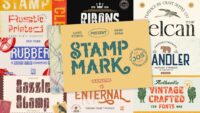
Not all thick fonts are created equal. Some are chunky but clunky, while others are hefty yet harmonious. I’ve curated a list of the absolute best thick fonts that are making waves in 2026:
Fat Chubby Sans
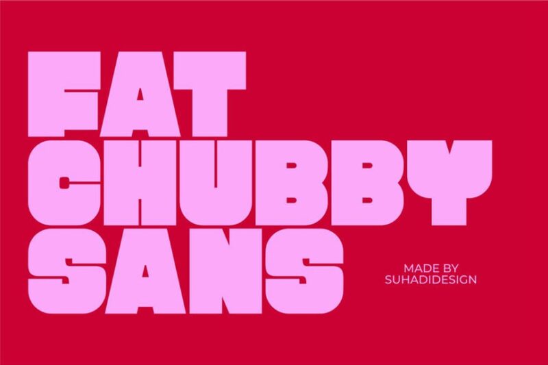
Fat Chubby Sans is a bold and playful sans-serif font with exaggerated thickness. Its rounded edges and chunky letterforms make it perfect for eye-catching headlines and logos, especially in designs targeting children or promoting fun, casual brands.
Thick
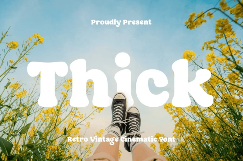
Thick is a retro-inspired serif font with a cinematic flair. Its bold strokes and vintage aesthetic make it ideal for movie posters, album covers, and designs aiming to evoke a nostalgic feel from the mid-20th century.
The Lied Font
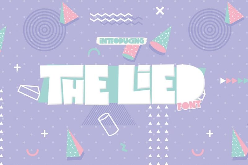
The Lied Font is a chunky sans-serif typeface with a modern twist. Its thick strokes and clean lines make it suitable for bold headlines and branding projects that require a strong, confident presence.

Get 300+ Fonts for FREE
Enter your email to download our 100% free "Font Lover's Bundle". For commercial & personal use. No royalties. No fees. No attribution. 100% free to use anywhere.
Hapgon
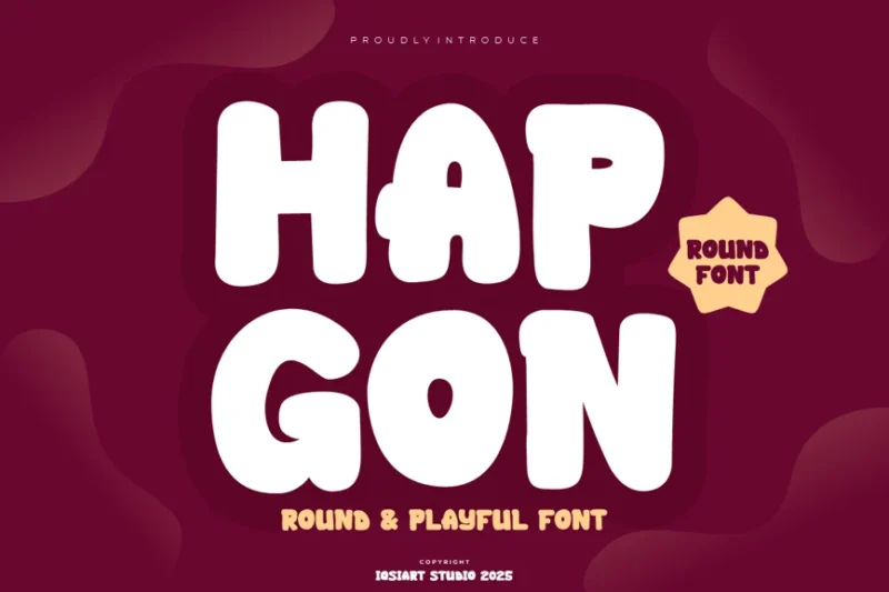
Hapgon is a round and thick sans-serif font that exudes friendliness and approachability. Its soft edges and balanced proportions make it perfect for children’s products, food packaging, and designs that aim to convey warmth and comfort.
Wambo
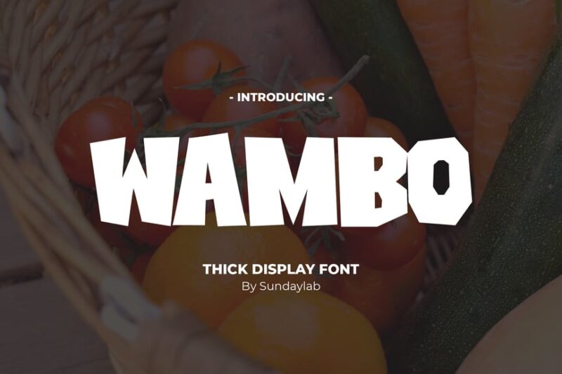
Wambo is a thick display font with a decorative flair. Its bold, chunky letterforms and unique character shapes make it stand out in large sizes, perfect for posters, advertisements, and designs that need to make a strong visual impact.
Mazement
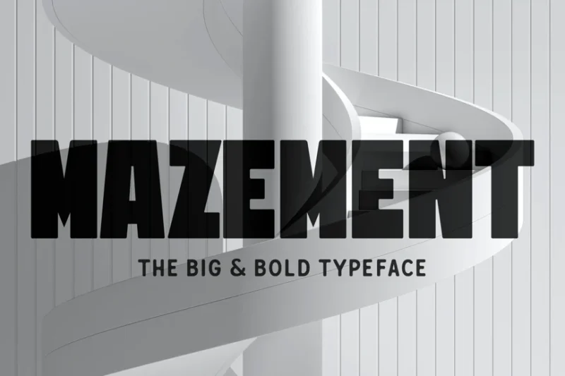
Mazement is a fat, decorative sans-serif font with a maze-like structure. Its unique design and bold presence make it ideal for creating eye-catching titles, logos, and branding materials that require a distinctive and memorable look.
Big Hoglet
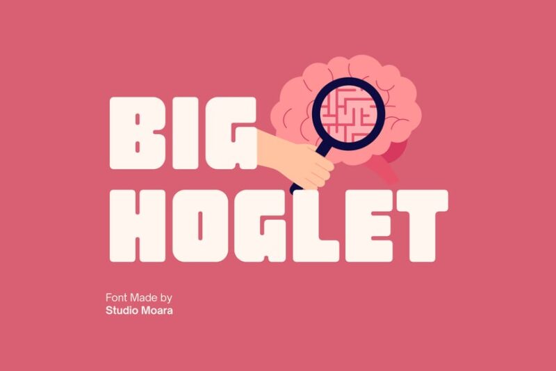
Big Hoglet is a retro-inspired chunky font with a playful personality. Its thick strokes and rounded edges give it a friendly, approachable feel, making it perfect for vintage-style designs, children’s products, and fun, casual branding projects.
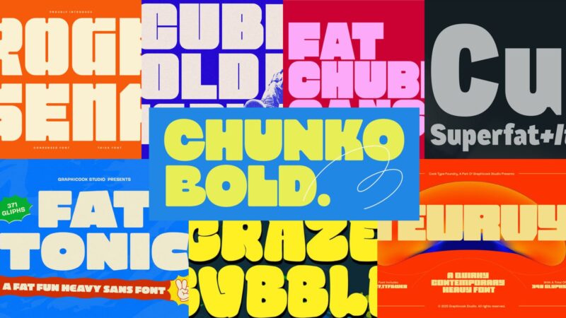
Chunko Bold
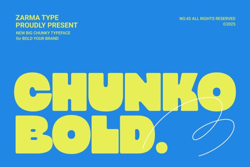
Chunko Bold is a wide and bold sans-serif font with a modern edge. Its thick strokes and generous spacing make it highly legible, ideal for headlines, posters, and designs that need to convey strength and confidence.
Fatbold Slim
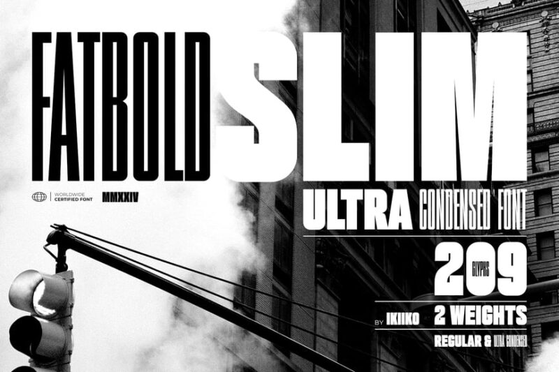
Fatbold Slim is an ultra-condensed sans-serif font that combines boldness with a slim profile. Its tall, narrow letterforms make it perfect for vertical signage, magazine headlines, and designs where space is at a premium but impact is crucial.
Sunday
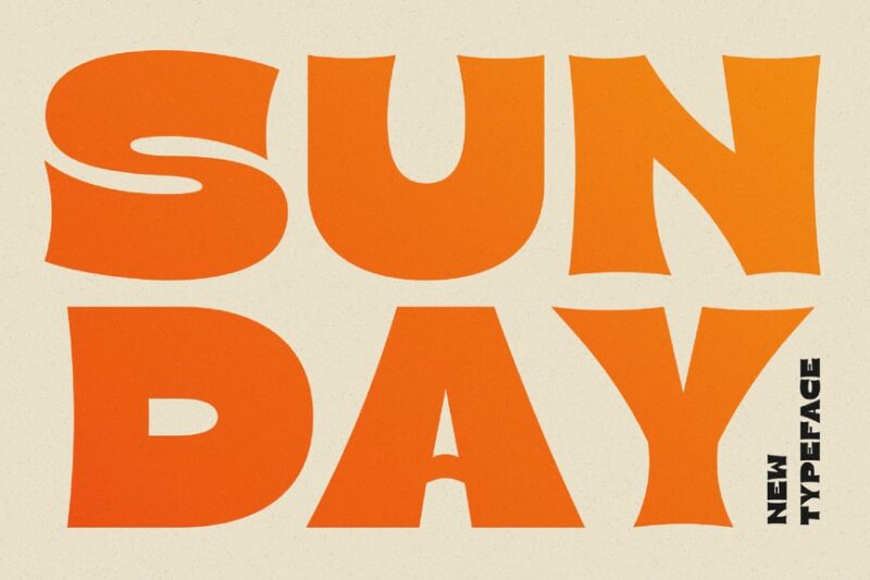
Sunday is a bold and beautiful sans-serif font with a beachy profile. Its clean lines and strong presence make it ideal for fashion magazines, lifestyle brands, and designs that aim to convey elegance with a modern twist.
Thick Gazone
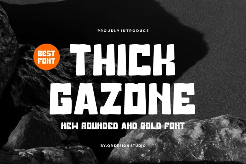
Thick Gazone is a rounded sans-serif font with a playful, island-inspired feel. Its thick strokes and friendly character make it perfect for educational materials, children’s books, and designs targeting a young audience or promoting learning.
Broc Sanbo
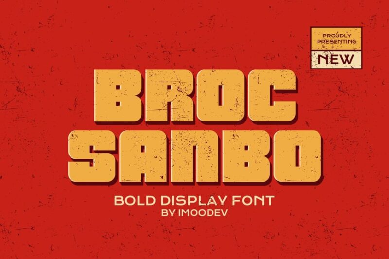
Broc Sanbo is a bold retro sans-serif font with a vintage flair. Its thick strokes and retro-inspired design make it ideal for creating nostalgic designs, vintage-style logos, and projects that aim to evoke a sense of the past with a modern twist.
Tarragon
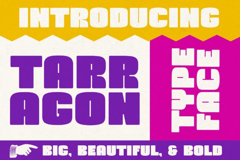
Tarragon is a chunky decorative typeface with a bold and tall presence. Its unique character shapes and strong vertical emphasis make it perfect for creating striking headlines, posters, and designs that need to command attention and stand out.
Colombo Sans
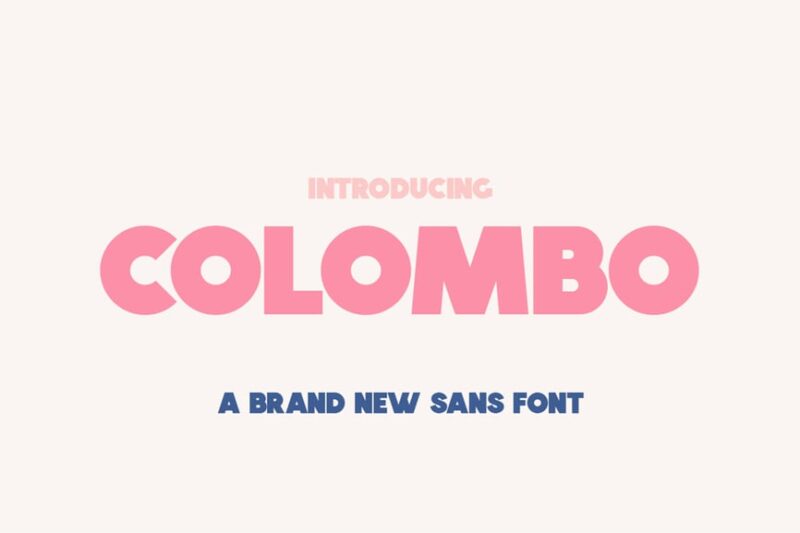
Colombo Sans is a fat sans-serif font with a modern and bold appearance. Its thick strokes and clean lines make it highly readable and impactful, ideal for headlines, logos, and designs that require a strong, confident visual presence.
Craze Bubble
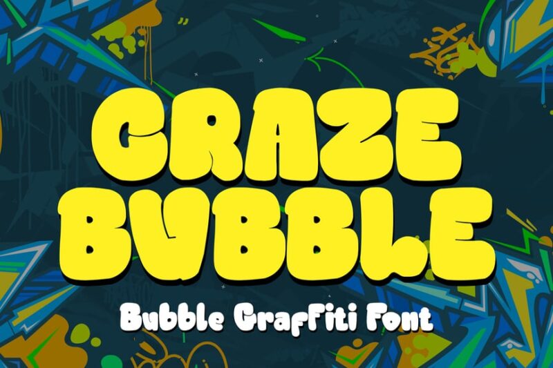
Craze Bubble is a thick graffiti-inspired font with a bubble-like appearance. Its urban style and bold presence make it perfect for street art designs, youth-oriented branding, and projects that aim to capture a rebellious, energetic spirit.
Onireak
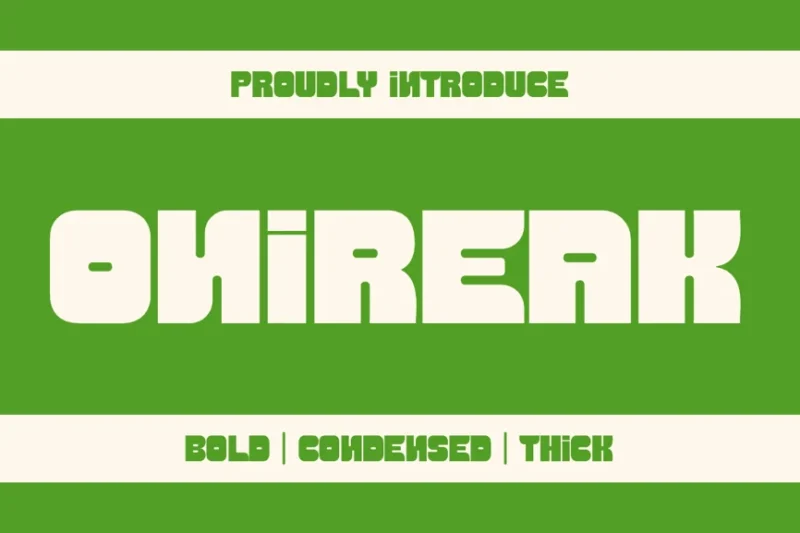
Onireak is a condensed sans-serif font with a sporty, collegiate feel. Its narrow profile and clean lines make it ideal for university branding, fitness-related designs, and projects that require a modern, athletic aesthetic.
Greks Webol
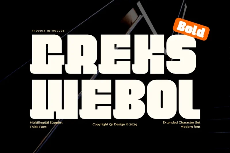
Greks Webol is a block and bold decorative font inspired by European grotesque styles. Its strong, geometric shapes and bold presence make it perfect for creating impactful headlines, logos, and designs that require a modern, confident look.
Aero Skyler
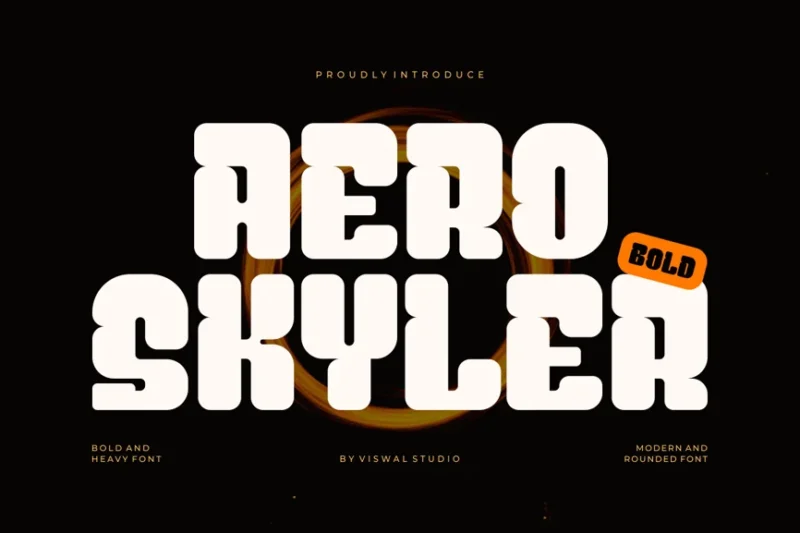
Aero Skyler is a bold decorative font with a wide, imposing presence. Its thick strokes and unique character shapes make it ideal for creating eye-catching titles, posters, and designs that need to make a strong visual statement.
Thickline
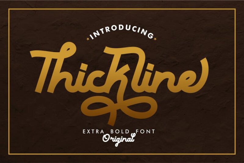
Thickline is a classic bold script font with a monoline feel. Its thick strokes and flowing lines make it perfect for creating elegant, yet impactful designs for invitations, branding, and projects that require a touch of sophistication with boldness.
Gomien
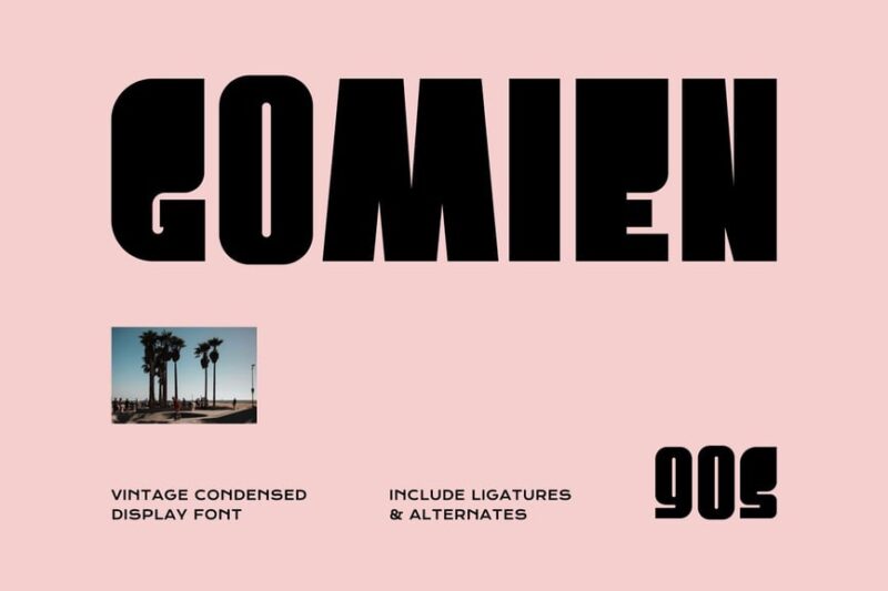
Gomien is a tall, bold sans-serif font with a modern edge. Its elongated letterforms and strong vertical emphasis make it ideal for creating striking headlines, posters, and designs that need to command attention in limited horizontal space.
Rinzek
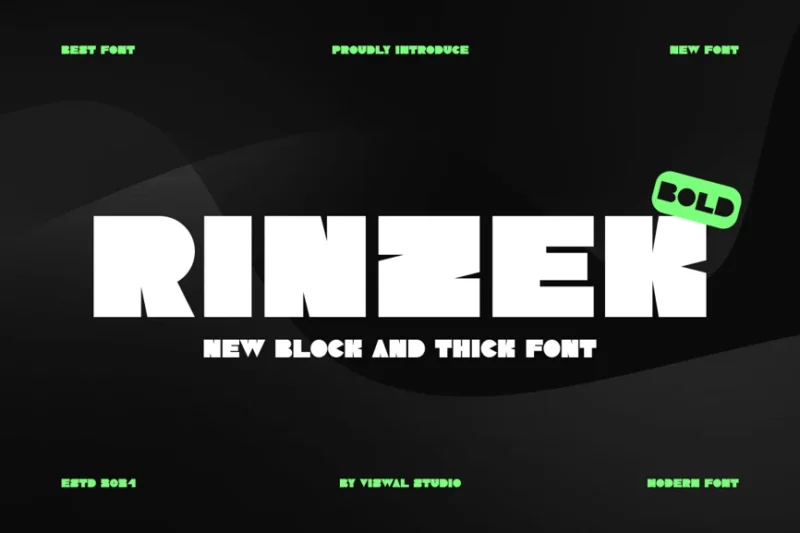
Rinzek is a block and thick sans-serif font with a sporty, racing-inspired feel. Its bold presence and dynamic character shapes make it perfect for automotive branding, sports-related designs, and projects that aim to convey speed and energy.
Lefer Sans Bold Display
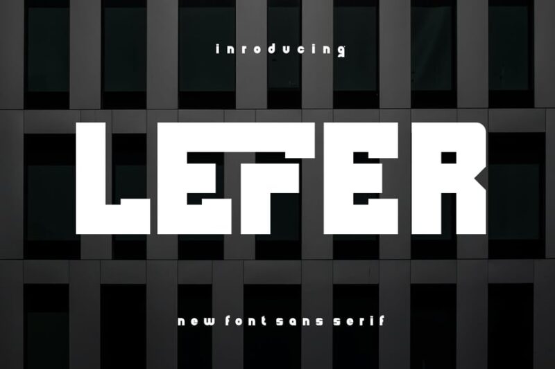
Lefer Sans Bold Display is a condensed sans-serif font with a strong, modern presence. Its bold strokes and compact design make it ideal for headlines, posters, and designs that need to make a powerful impact in limited space.
Thick Thinks
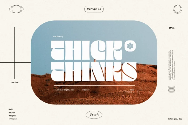
Thick Thinks is a bold and modern display serif font with a luxurious feel. Its thick strokes and elegant serifs make it perfect for high-end branding, fashion magazines, and designs that aim to convey sophistication and prestige.
Gothif
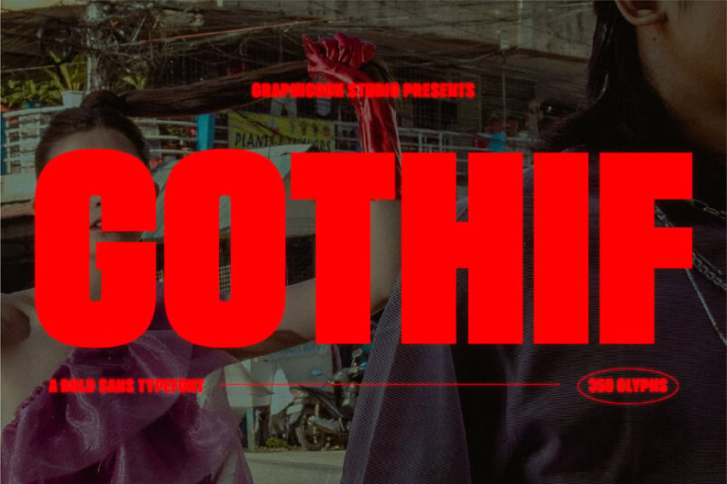
Gothif is a sans-serif font that offers a range of weights from thin to thick. It’s got a similar style to Impact, but with way more versatility.Its versatility makes it ideal for creating hierarchical typography, allowing designers to use different weights for various levels of emphasis within a single project.
Widthsans
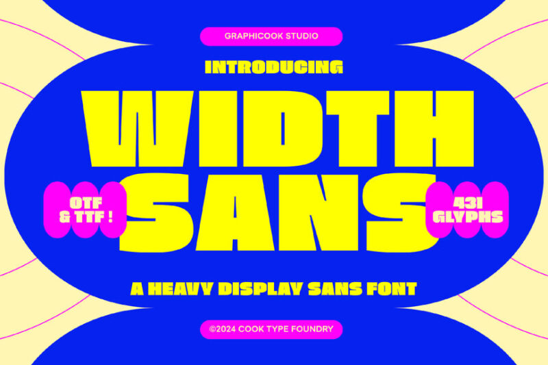
Widthsans is a fat sans-serif font with a bold, expansive presence. Its wide letterforms and thick strokes make it perfect for creating impactful headlines, logos, and designs that need to fill space and command attention.
More Sunny
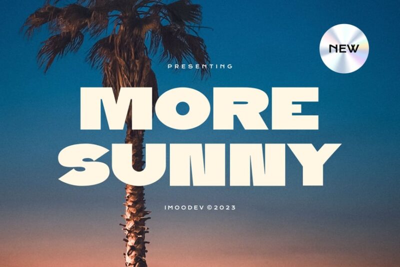
More Sunny is a chunky display sans-serif font with a cheerful, appetizing feel. Its rounded edges and bold presence make it ideal for food-related designs, children’s products, and projects that aim to convey warmth and positivity.
Roge Sena
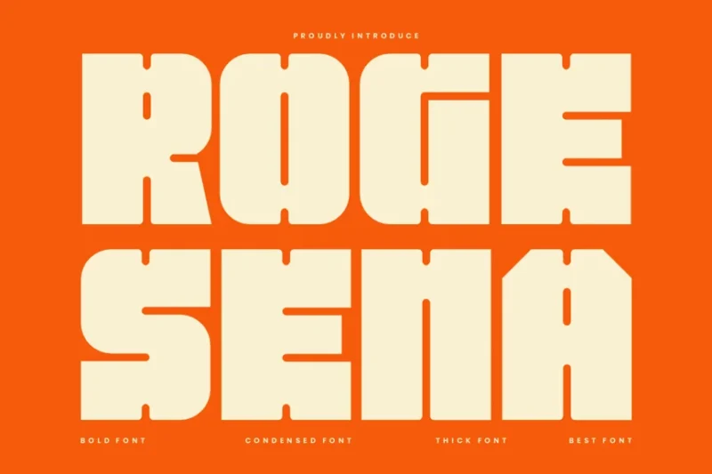
Roge Sena is a bold sans-serif font with a futuristic edge. Its thick strokes and modern character shapes make it perfect for tech-related branding, sci-fi designs, and projects that aim to convey innovation and forward-thinking ideas.
Scubik
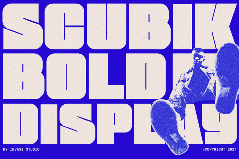
Scubik is a bold modular sans-serif font with a sporty, dynamic feel. Its chunky letterforms and geometric shapes make it ideal for sports branding, fitness-related designs, and projects that require a strong, energetic visual presence.
Sanrio
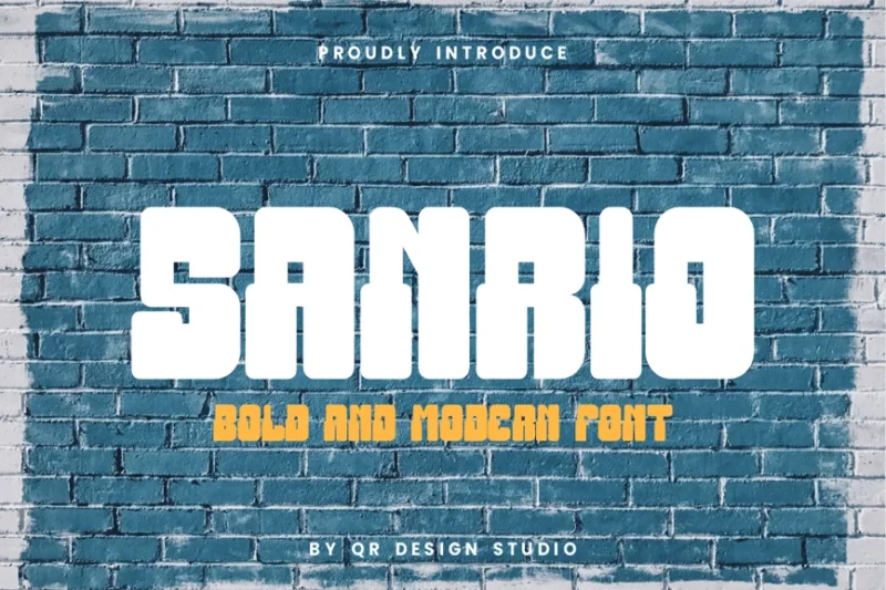
Sanrio is a thick and groovy decorative font with a playful, retro vibe. Its bold strokes and fun character shapes make it perfect for children’s products, college-themed designs, and projects that aim to evoke a sense of nostalgia and youthful energy.
Fams Bold
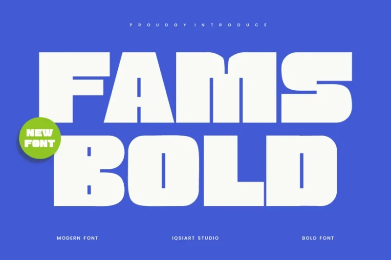
Fams Bold is a big, corporate-friendly sans-serif font. Its clean lines and strong presence make it ideal for business branding, professional presentations, and designs that need to convey reliability and authority in a modern context.
MUPEN
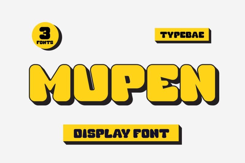
MUPEN is a neubrutalism-inspired bold shadow font with a striking presence. Its raw, unapologetic design makes it perfect for creating edgy, contemporary designs, posters, and digital media that embrace the neubrutalist aesthetic.
Fattonic
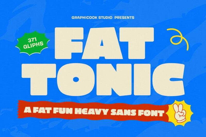
Fattonic is a wide and chunky sans-serif font with a bold, expansive presence. Its thick strokes and generous width make it ideal for creating impactful headlines, posters, and designs that need to fill space and grab attention quickly.
Food Cokies Font
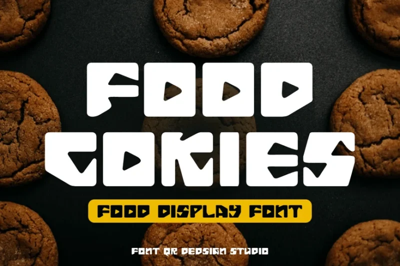
Food Cokies Font is a decorative typeface inspired by cookie shapes. Its playful, food-themed design and multilingual support make it perfect for culinary branding, bakery packaging, and designs related to sweets and baked goods.
CA Cula Superfat
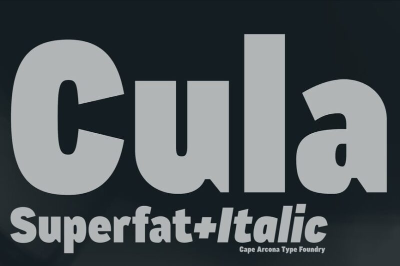
CA Cula Superfat is an extremely bold sans-serif font with a heavy, imposing presence. Its ultra-thick strokes make it ideal for creating powerful headlines, logos, and designs that need maximum visual impact and weight.
Bigsrain Bike
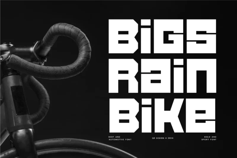
Bigsrain Bike is a blocky, automotive-inspired sans-serif font with a bold and tall font style. Its strong vertical emphasis and mechanical feel make it perfect for vehicle-related branding, racing events, and designs that aim to convey speed and power.
Teurvy
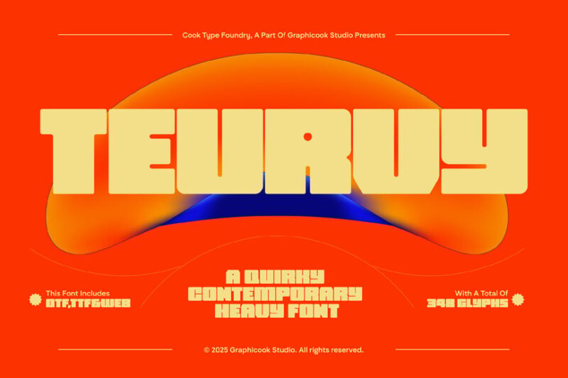
Teurvy is a wide and extended sans-serif font with a modern, expansive feel. Its broad letterforms and clean lines make it ideal for creating spacious layouts, impactful headlines, and designs that need to fill horizontal space effectively.
What Makes Thick Fonts So Powerful?
There’s real science behind why thick fonts pack such a visual punch. Understanding the psychology can help you use them more effectively in your designs.
Maximum Visual Impact
First and foremost, thick fonts create immediate visual hierarchy. The human eye is naturally drawn to high contrast and bold shapes. When surrounded by lighter text or white space, thick fonts become magnetic focal points that guide the viewer’s attention exactly where you want it.
This isn’t just design theory – it’s evolutionary psychology. Our brains are wired to notice things that stand out from their environment. In the wild, this helped our ancestors spot predators or prey. In design, it helps your message cut through the noise.
Authority and Confidence
Thick fonts convey strength, stability, and authority. Think about it – when you see heavy, bold letterforms, your brain associates them with power and importance. This is why so many successful brands use thick fonts in their logos. Nike’s bold swoosh-adjacent typography, Netflix’s chunky wordmark, and Spotify’s hefty lettering all communicate confidence and market dominance.
Improved Readability at Distance
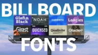
Here’s a practical benefit: thick fonts maintain their readability even when viewed from far away or at small sizes. The substantial stroke weight ensures that letterforms don’t disappear or become illegible when scaled down. This makes them perfect for billboards, signage, mobile interfaces, and any application where clarity is crucial.
Where to Use Thick Fonts (And Where to Avoid Them)
Knowing when and where to deploy thick fonts is crucial for design success. Let’s break down the best applications:
Perfect Use Cases
Headlines and Titles This is thick fonts’ natural habitat. Large, bold headlines grab attention and establish clear information hierarchy. Whether it’s a magazine cover, website hero section, or poster design, thick fonts make titles impossible to ignore.
Logos and Branding Many successful brands rely on thick fonts to communicate strength and memorability. Heavy typography creates instant brand recognition and conveys confidence to consumers.
Packaging Design On crowded store shelves, thick fonts help products stand out. Bold typography ensures your package catches the eye even in a sea of competing products.
Digital Interfaces For buttons, calls-to-action, and important interface elements, thick fonts provide the visual weight needed to guide user behavior effectively.
Poster and Billboard Design When your message needs to be seen from a distance, thick fonts ensure maximum legibility and impact.
Where to Exercise Caution
Body Text Reading large blocks of text in thick fonts can be exhausting for the eyes. The heavy stroke weight creates visual fatigue over extended reading sessions. Save thick fonts for headlines and use lighter weights for paragraphs.
Formal Documents In conservative industries like law, finance, or academia, thick fonts might appear too casual or unprofessional. Traditional serif fonts often work better in these contexts.
Small Sizes While thick fonts maintain readability better than thin fonts at small sizes, they can still become blob-like when scaled down too much. Test your thick fonts at actual usage sizes.
Overcrowded Designs If your design already has lots of visual elements competing for attention, adding thick fonts might create chaos rather than clarity. Sometimes restraint is more powerful.
How to Pair Thick Fonts Like a Pro
The key to successful thick font usage lies in thoughtful pairing and balance. Here are my go-to strategies:
The Contrast Principle
Pair your thick fonts with much lighter weights to create dramatic contrast. If your headline uses an ultra-bold font, your body text should be regular or light weight. This creates a clear hierarchy and prevents visual competition.
Complement, Don’t Compete
When combining multiple fonts, ensure they have different roles. Let your thick font be the star for headlines, while a clean, readable font handles supporting text. Avoid using two thick fonts together unless you’re going for a very specific artistic effect.
Consider Your Medium
Digital screens can handle high contrast better than print, so you might be able to use even bolder fonts online. For print work, consider how ink spread and paper texture might affect your thick fonts’ appearance.
Test Across Devices
What looks perfect on your large monitor might be overwhelming on a mobile phone. Always test your thick font choices across different screen sizes and resolutions.
The Evolution of Thick Typography
Thick fonts aren’t just a modern trend – they have deep roots in design history. From the bold propaganda posters of the early 20th century to the chunky computer fonts of the 1980s, heavy typography has always been used to make statements.
In recent years, we’ve seen thick fonts evolve beyond simple boldness. Modern thick fonts often feature subtle refinements, improved spacing, and better balance that make them more versatile than their predecessors. Designers are also experimenting with variable fonts that let you adjust weight on the fly, giving unprecedented control over thickness.
Common Thick Font Mistakes to Avoid
Even experienced designers can stumble when working with thick fonts. Here are the most common pitfalls:
Overdoing It
Just because thick fonts are impactful doesn’t mean you should use them everywhere. Restraint is key. Use thick fonts strategically for maximum effect.
Ignoring Spacing
Thick fonts often need more generous spacing than their lighter counterparts. Don’t let your bold letters feel cramped – give them room to breathe.
Choosing Thickness Over Quality
Not all thick fonts are well-designed. Some sacrifice legibility or elegance for pure weight. Choose thick fonts that maintain their character even at heavy weights.
Forgetting About Accessibility
Ensure your thick fonts meet accessibility standards for contrast and readability. What looks great to you might be difficult for users with visual impairments.
Expert Insights on Thick Font Usage
I reached out to several typography experts to get their take on the thick font trend. Here’s what they had to say:
Jessica Martinez, Senior Designer at TypeCraft Studios, notes: “Thick fonts are having a major moment because they cut through digital noise so effectively. In our attention-economy world, you have milliseconds to make an impression. Thick fonts deliver that instant impact.”
David Chen, Typography Professor at Design Institute, observes: “What I love about modern thick fonts is how sophisticated they’ve become. Early bold fonts were often crude and clunky. Today’s heavy typefaces maintain elegance even at extreme weights.”
Sarah Thompson, Creative Director at Bold & Beautiful Agency, adds: “The key with thick fonts is confidence. If you’re going to use them, commit fully. Half-hearted boldness just looks like a mistake.”
The Future of Thick Typography
Looking ahead, thick fonts show no signs of losing their appeal. Variable font technology is making it easier than ever to fine-tune weight and create custom thickness levels. We’re also seeing more thick fonts designed specifically for different media – from ultra-heavy fonts optimized for social media graphics to refined thick fonts perfect for luxury branding.
The trend toward minimalism hasn’t killed thick fonts; instead, it’s refined them. Modern thick fonts are cleaner, more purposeful, and more versatile than ever before.
Conclusion: Making Your Mark with Thick Fonts
Thick fonts are more than just a design trend – they’re a powerful tool for communication. When used thoughtfully, they can transform ordinary text into memorable messages that stick with your audience.
Remember, the goal isn’t just to be bold for boldness’s sake. Great thick font usage serves your message and enhances your design’s overall effectiveness. Whether you’re creating a logo that needs to work across all media, designing a poster that must grab attention from across the room, or building a website that needs to convert visitors, thick fonts can be your secret weapon.
The fonts I’ve shared in this guide represent the cream of the crop for 2026, but the perfect thick font for your project depends on your specific needs, audience, and brand personality. Don’t be afraid to experiment, test different options, and push boundaries.
After all, in a world full of whispers, sometimes you need to shout. And when it comes to typography, thick fonts are your megaphone.
So go ahead, make a statement. Choose thick fonts that reflect your brand’s confidence and watch as your designs command the attention they deserve. In the bold world of thick typography, there’s no such thing as being too impactful – only being too timid.
Ready to explore more typography trends? Check out our guides on serif fonts, script typography, and the latest in variable font technology.