In this article:
- The Most Elegant Thin Fonts of 2026
- What Makes Thin Fonts Feel So Sophisticated?
- Perfect Applications for Thin Fonts
- When to Avoid Thin Fonts
- How to Choose the Perfect Thin Font
- Expert Tips for Using Thin Fonts Effectively
- Common Thin Font Mistakes to Avoid
- The Future of Thin Fonts
- Thin Font Alternatives Worth Considering
- Frequently Asked Questions About Thin Fonts
- Conclusion: Embracing Elegance with Thin Fonts
As designers, we’re constantly searching for that perfect balance between readability and visual impact. And in 2026, thin fonts are bringing an air of sophistication and modern elegance that’s impossible to ignore.
Thin fonts, also known as light or ultra-light typefaces, feature delicate strokes that create an airy, minimalist aesthetic. They whisper rather than shout, drawing readers in with their subtle grace and refined appearance.
In this comprehensive guide, we’ll explore everything you need to know about thin fonts, including:
- The best thin fonts to elevate your designs in 2026
- What makes thin fonts feel so elegant and sophisticated
- Perfect use cases for thin fonts (and when to avoid them)
- Expert tips for pairing thin fonts effectively
- Common thin font mistakes and how to avoid them
So grab your favorite design beverage, and let’s dive into the delicate world of thin typography!
The Most Elegant Thin Fonts of 2026
Not all thin fonts are created equal. Some feel fragile and hard to read, while others strike that perfect balance between delicacy and legibility. Here’s my curated list of the most stunning thin fonts making waves this year:
Bepholar
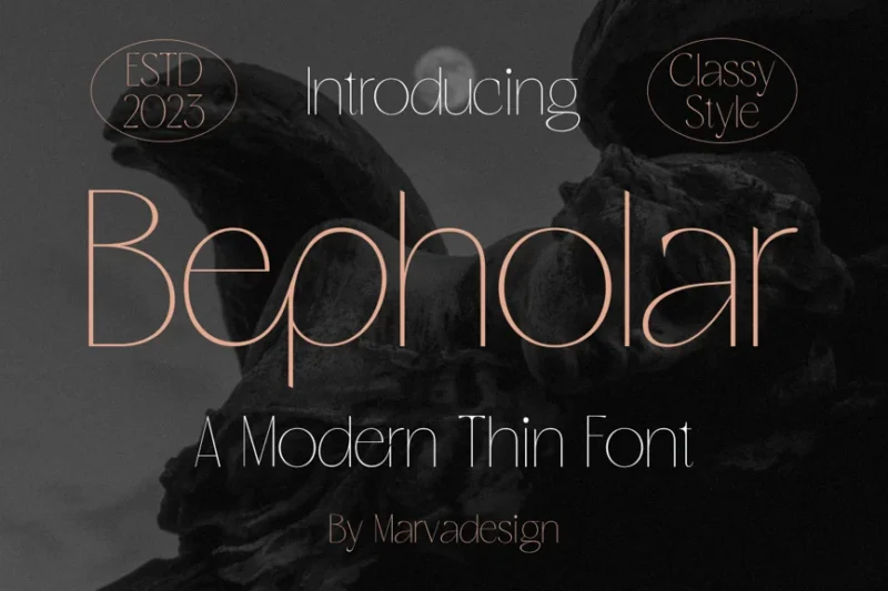
Bepholar is a sleek, modern sans-serif font with an exceptionally thin weight. Its minimalist design makes it perfect for creating elegant and contemporary typographic layouts, especially suitable for headlines and display purposes.
Thin King
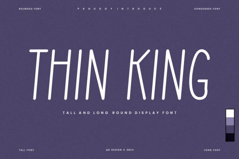
Thin King is a tall and condensed sans-serif font that combines a handwritten feel with doodle-like elements. This unique typeface is ideal for creating playful and expressive designs, particularly in branding and editorial projects.

Get 300+ Fonts for FREE
Enter your email to download our 100% free "Font Lover's Bundle". For commercial & personal use. No royalties. No fees. No attribution. 100% free to use anywhere.
Slimline Lineage
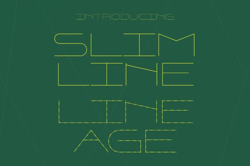
Slimline Lineage is an ultra-thin wide typeface that epitomizes minimalism. Its delicate lines and clean design make it an excellent choice for high-end branding, fashion-related projects, and modern, sophisticated layouts.
Pearls Beautiful Thin Sans
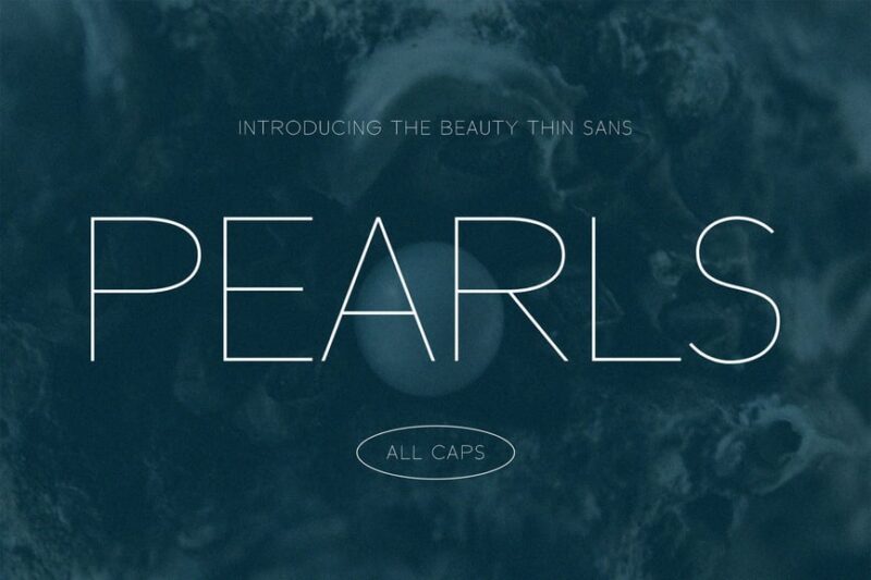
Pearls Beautiful Thin Sans is a refined and elegant sans-serif font with a very thin weight. Its graceful curves and clean lines make it perfect for luxury branding, high-end packaging, and editorial designs that require a touch of sophistication.
FC Thin Story
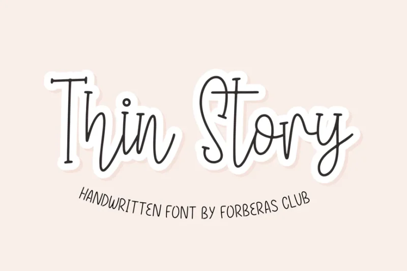
FC Thin Story is a modern cursive font with a thin, delicate appearance. Its flowing lines and contemporary feel make it ideal for creating elegant invitations, stylish logos, and eye-catching headlines in fashion and lifestyle-related designs.
Silver Thread
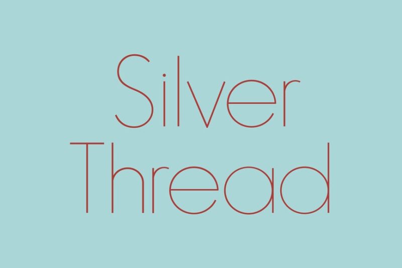
Silver Thread is a thin, sans-serif font with a subtle, refined appearance. Its delicate strokes and clean design make it perfect for creating elegant logos, sophisticated packaging, and minimalist branding materials.
Sunday Shine – Thin
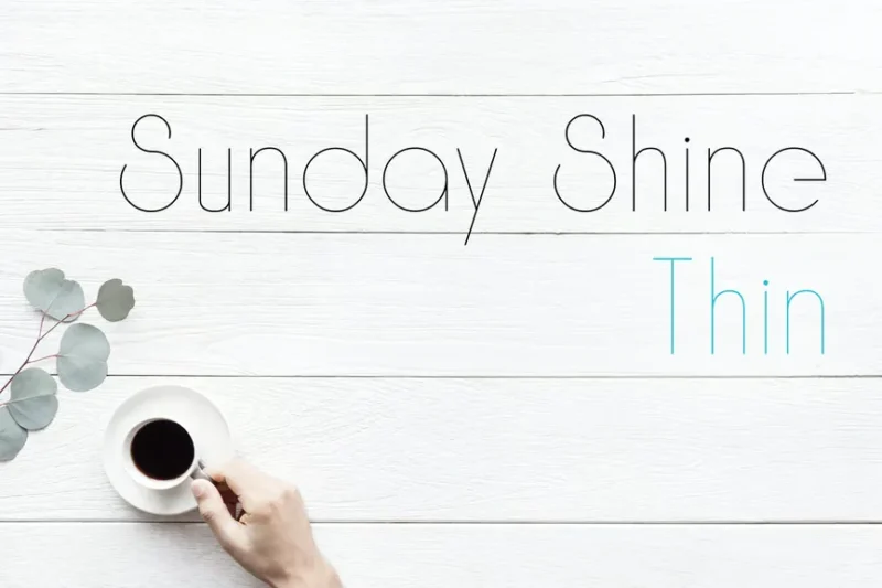
Sunday Shine – Thin is a sleek, display sans-serif font with a modern flair. Its thin weight and clean lines make it ideal for creating stylish headlines, posters, and branding materials that require a contemporary and refined look.
Simplica
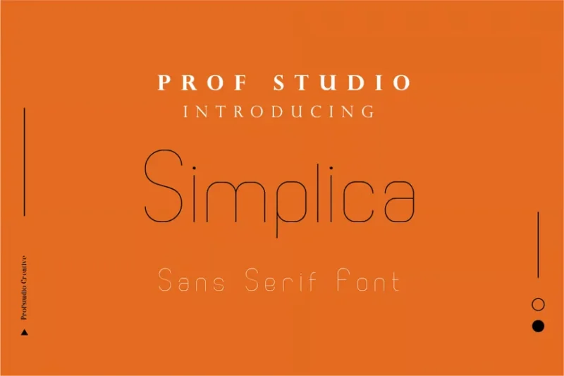
Simplica is a minimalist sans-serif font that embodies clean, modern design. Its straightforward and uncluttered appearance makes it versatile for various applications, from corporate branding to website design and user interfaces.
Thin Simple Sans Serif Font
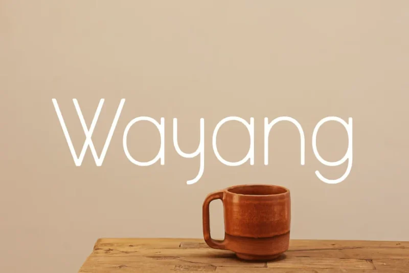
This thin, simple sans-serif font is designed for modern, minimalist aesthetics. Its clean lines and lightweight appearance make it excellent for creating contemporary logos, headlines, and branding materials that require a sleek, uncluttered look.
Laguna7 Font
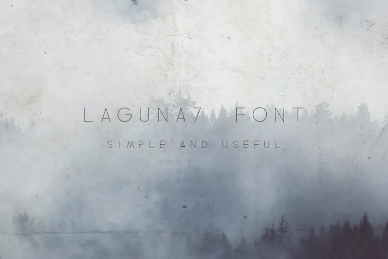
Laguna7 is a sans-serif font with a focus on linear design elements. Its clean, modern appearance makes it suitable for creating contemporary logos, headings, and branding materials, especially in projects that require a minimalist and refined aesthetic.
Kinders
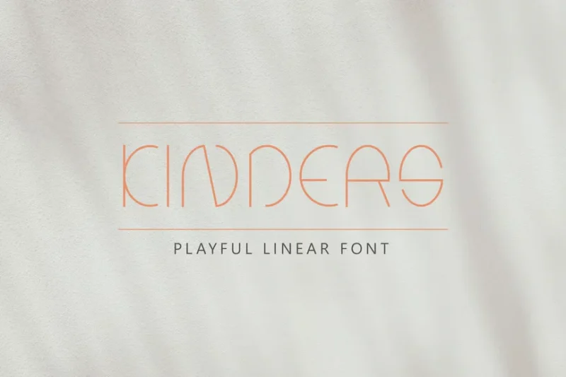
Kinders is a thin, linear decorative font with a playful and modern character. Its unique design makes it perfect for creating eye-catching display text, logos, and branding materials, particularly for projects aimed at a youthful or creative audience.
Skinny Notes Font
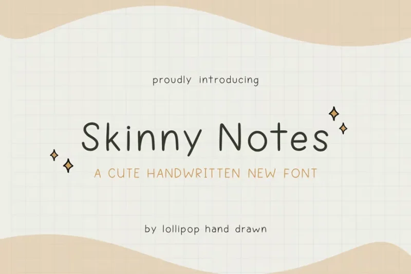
Skinny Notes is a thin, cute sans-serif font with a playful personality. Its delicate strokes and friendly appearance make it ideal for creating whimsical designs, children’s book covers, and branding materials for fun, lighthearted projects.
Mirriam
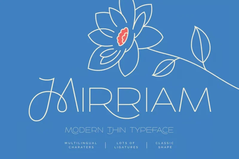
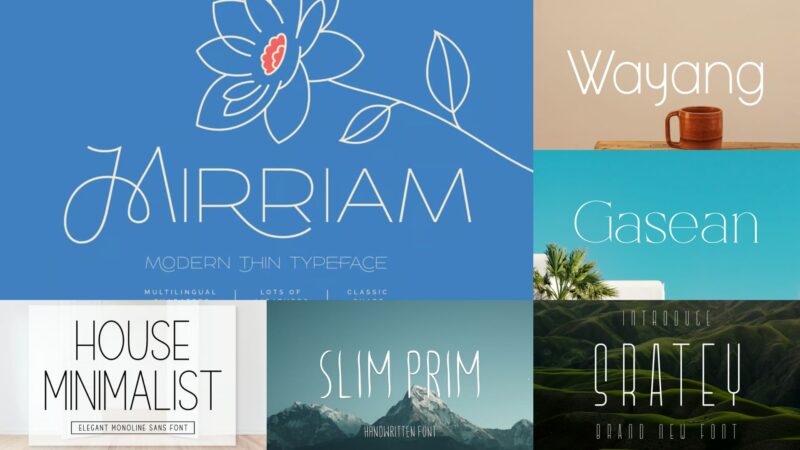
Mirriam is a modern, thin typeface that combines sans-serif and decorative elements. Its sleek design and contemporary feel make it perfect for creating sophisticated headlines, logos, and branding materials for fashion, beauty, and lifestyle-related projects.
Rountera Font
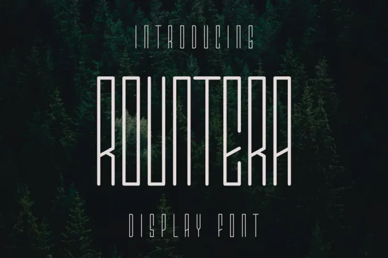
Rountera is a thin, condensed font with a modern edge. Its narrow letterforms and clean lines make it excellent for creating impactful headlines, posters, and branding materials, especially in designs that require a strong, contemporary presence.
Faddish
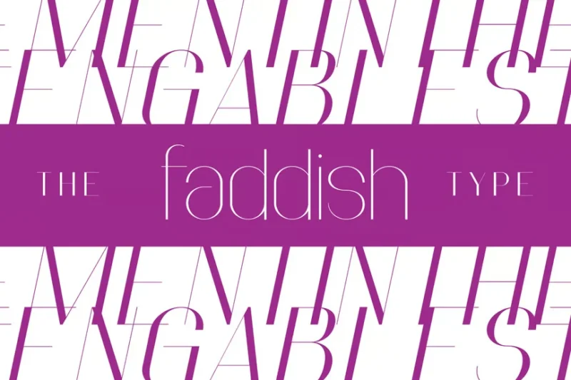
Faddish is a condensed sans-serif font with a trendy, modern appearance. Its sleek design and fashionable feel make it ideal for creating stylish headlines, magazine layouts, and branding materials for fashion-forward and contemporary projects.
Beautiful SVG Script Font
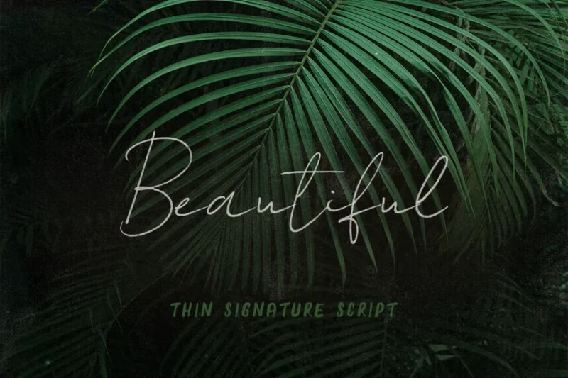
This beautiful SVG script font combines thin, elegant strokes with decorative elements. Its flowing lines and digital versatility make it ideal for creating stunning logos, invitations, and branding materials, especially for projects requiring a touch of elegance and sophistication.
AL – Nervesline
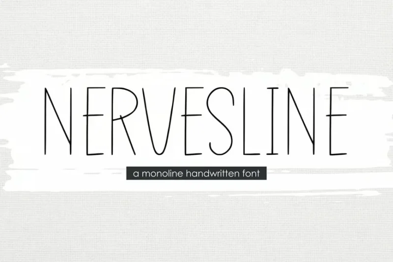
AL – Nervesline is a thin, handwritten script font with a delicate and organic feel. Its natural flow and subtle imperfections make it perfect for creating authentic-looking signatures, personal branding materials, and designs that require a human touch.
Albori Sans-Serif
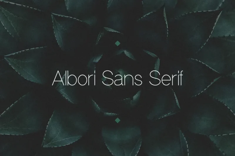
Albori is a sleek sans-serif font designed with magazine layouts in mind. Its clean lines and modern aesthetic make it excellent for creating stylish headlines, editorial designs, and contemporary branding materials across various media platforms.
The Rivers
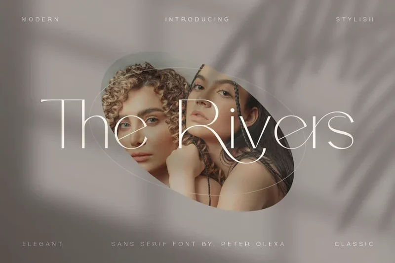
The Rivers is a modern, thin sans-serif font with decorative elements. Its unique blend of sleek lines and subtle embellishments makes it perfect for creating distinctive logos, headlines, and branding materials that require a contemporary yet creative touch.
Modern Thin Serif Display Font
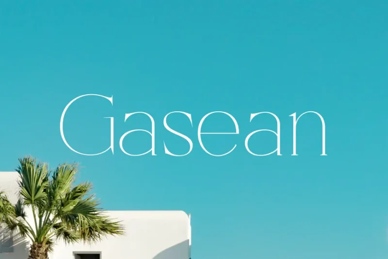
This modern, thin serif display font exudes luxury and sophistication. Its delicate serifs and refined appearance make it ideal for creating high-end branding materials, elegant packaging designs, and upscale editorial layouts.
Sratey Font
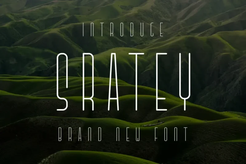
Sratey is a thin, technology-inspired sans-serif font. Its futuristic appearance and clean lines make it perfect for creating modern logos, tech-related branding materials, and designs that require a cutting-edge, innovative feel.
Lagiraffa
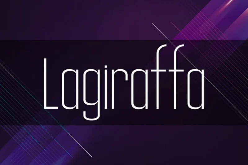
Lagiraffa is a playful sans-serif font inspired by the long neck of a giraffe. Its unique, elongated characters make it ideal for creating fun and distinctive logos, children’s book titles, and branding materials for projects that require a whimsical touch.
Slim Prim Font
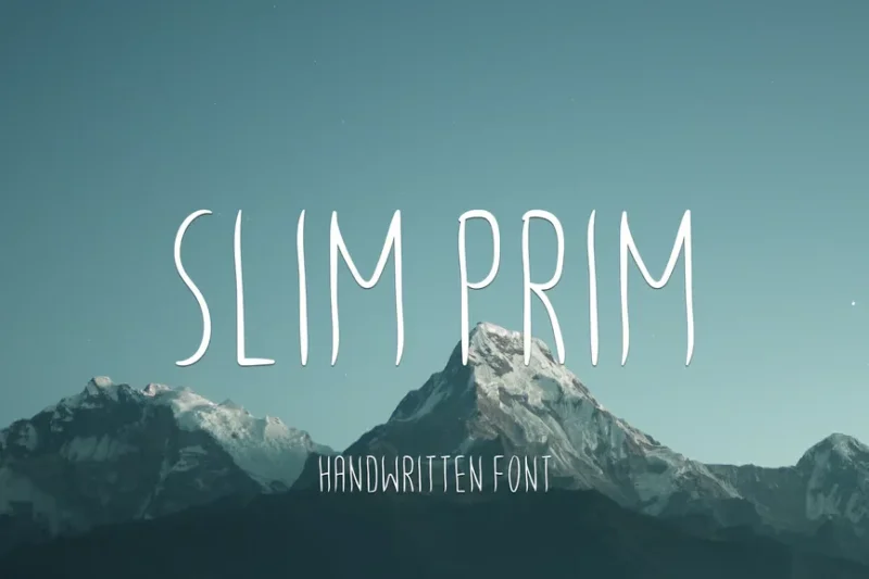
Slim Prim is a versatile font that combines script and sans-serif elements with a slim, elegant appearance. Its clean lines and subtle handwritten feel make it perfect for creating sophisticated logos, branding materials, and designs that require a touch of refinement.
Monocole
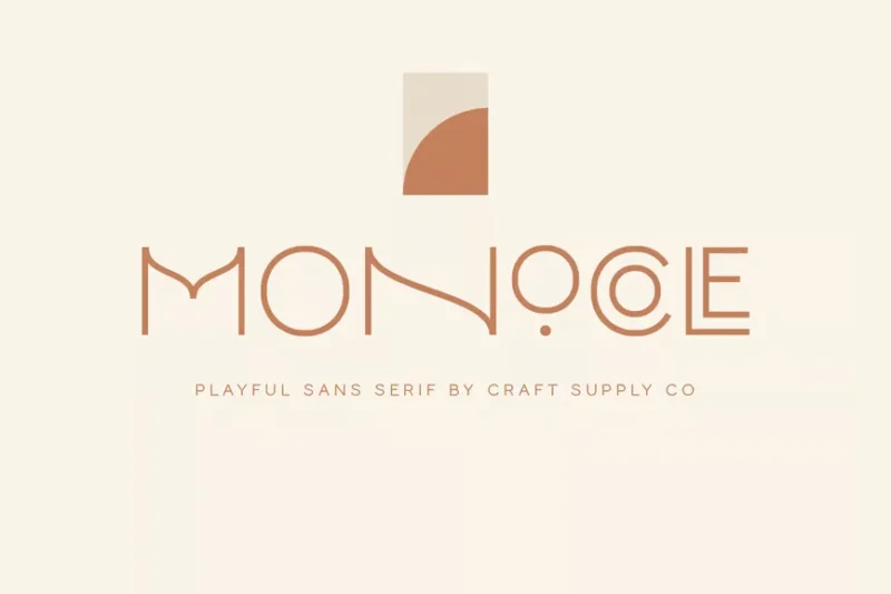
Monocole is a playful italian font family consisting of 8 weights, including a distinctive black style. Its versatile design and range of weights make it suitable for creating engaging typography across various design projects, from branding to editorial layouts.
He Loves Me Skinny Font
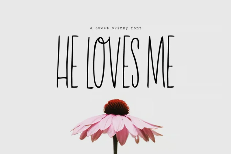
He Loves Me Skinny is a thin, handwritten script font with a girly and romantic feel. Its delicate strokes and playful character make it perfect for creating feminine designs, wedding invitations, and branding materials for projects targeting a young female audience.
Viona Niosa
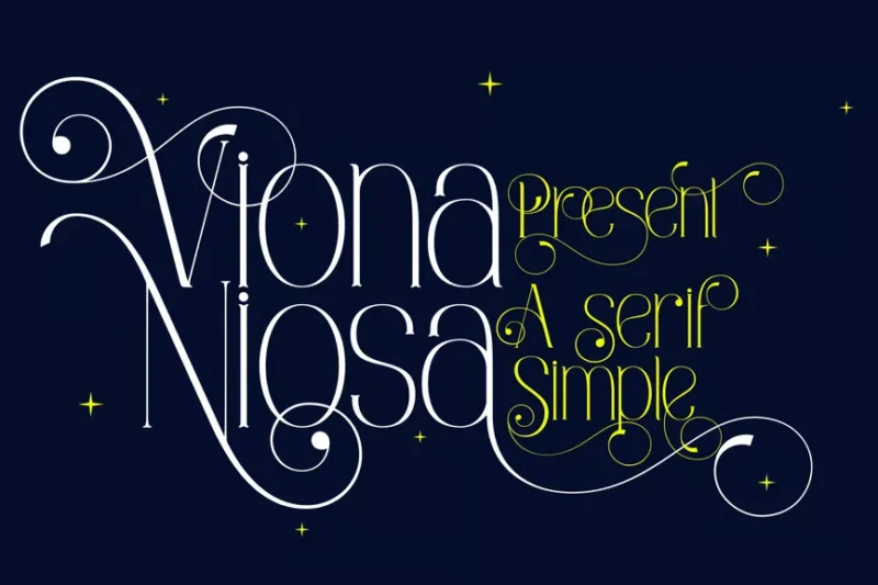
Viona Niosa is an elegant serif font designed with invitations in mind. Its refined appearance and graceful letterforms make it ideal for creating sophisticated wedding stationery, formal event invitations, and high-end branding materials.
Veilan
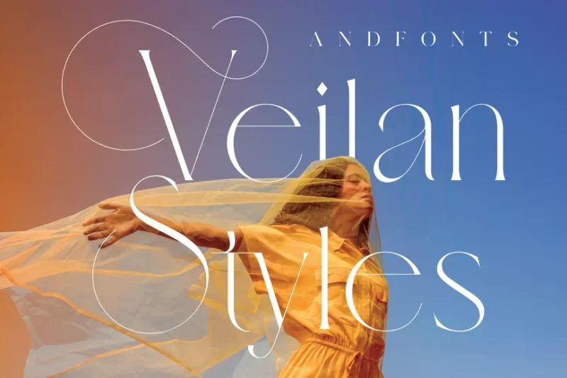
Veilan is a stylish serif typeface with a modern twist. Its blend of classic and contemporary elements makes it versatile for creating elegant typography in various design projects, from editorial layouts to branding materials and packaging designs.
Last Kids
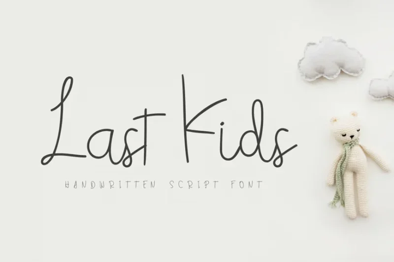
Last Kids is a playful, handwritten script font designed with children in mind. Its fun and energetic character makes it perfect for creating engaging typography for children’s books, educational materials, and branding projects aimed at a young audience.
Likweed Font
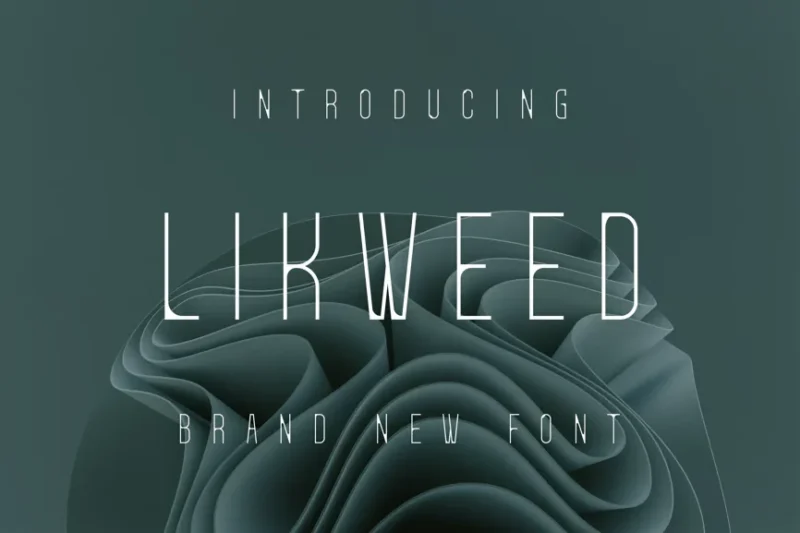
Likweed is a thin, technology-inspired sans-serif font. Its futuristic appearance and clean lines make it ideal for creating modern logos, tech-related branding materials, and designs that require a cutting-edge, innovative feel.
Empresso
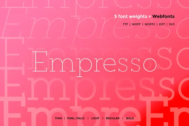
Empresso is a classic serif webfont that comes in 5 weights. Its timeless design and range of weights make it versatile for creating sophisticated typography across various digital platforms, from websites to mobile applications and digital publications.
Skinnytoon
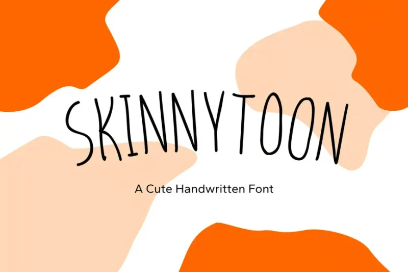
Skinnytoon is a thin, handwritten cartoon font with a playful and casual character. Its natural flow and imperfections make it perfect for creating authentic-looking handlettering, informal branding materials, and designs that require a personal, approachable touch.
Merumatta
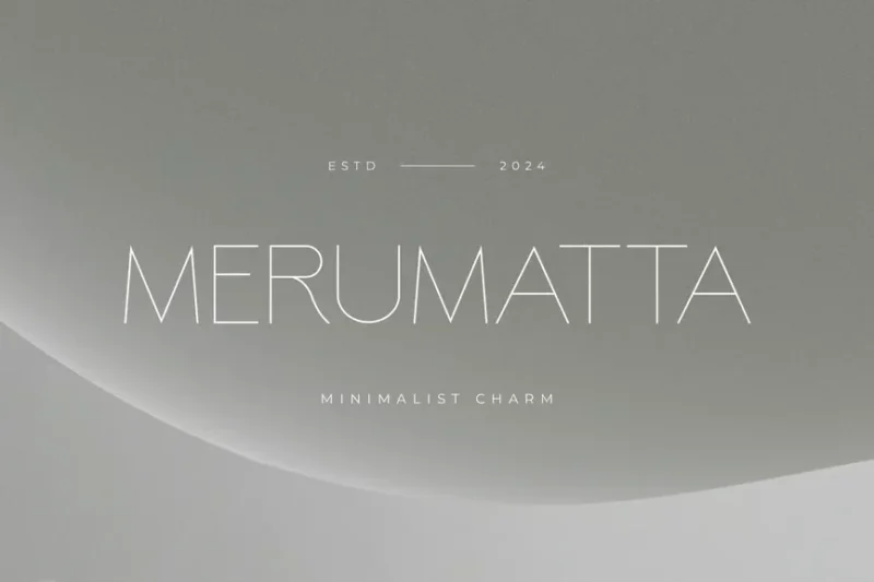
Merumatta is an elegant monotype sans-serif font designed for branding purposes. Its refined appearance and clean lines make it ideal for creating sophisticated logos, corporate identities, and high-end marketing materials across various industries.
SA Marino Sans Serif Typeface
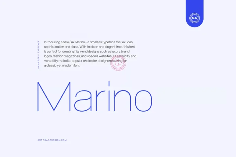
SA Marino is a minimal sans-serif typeface with a modern and clean aesthetic. Its straightforward design and versatility make it excellent for creating contemporary typography in various applications, from branding to web design and print materials.
AL – Photofarms
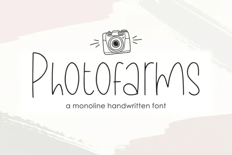
AL – Photofarms is a thin, handwritten script font with a delicate and organic feel. Its natural flow and subtle imperfections make it perfect for creating authentic-looking signatures, personal branding materials, and designs that require a human touch.
House Minimalist
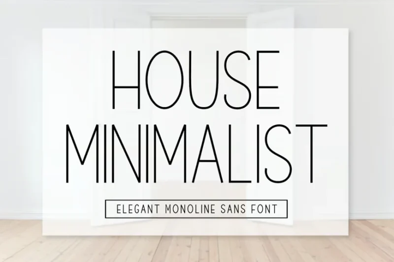
House Minimalist is an elegant monoline sans-serif font with a clean, minimalist design. Its refined appearance and thin strokes make it ideal for creating sophisticated logos, high-end branding materials, and modern typography in various design projects.
Jestran Font
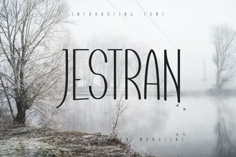
Jestran is a thin, technology-inspired sans-serif font. Its futuristic appearance and clean lines make it perfect for creating modern logos, tech-related branding materials, and designs that require a cutting-edge, innovative feel.
What Makes Thin Fonts Feel So Sophisticated?
Thin fonts possess an undeniable elegance that sets them apart from their bolder counterparts. But what exactly gives them that sophisticated edge?
Delicate Stroke Weight
The most obvious characteristic of thin fonts is their minimal stroke weight. These ultra-light letterforms create negative space that feels breathable and refined. It’s like the typographic equivalent of fine jewelry – the restraint is what makes it precious.
The delicate strokes require careful attention to detail, both in their creation and application. This inherent fragility demands respect and thoughtful handling.
Clean, Uncluttered Aesthetic
Thin fonts naturally create more white space around and within letterforms. This breathing room contributes to a clean, uncluttered appearance that feels modern and sophisticated.
The minimalist nature of thin fonts aligns perfectly with contemporary design trends that favor “less is more” philosophies.
Association with Luxury Brands
Many high-end fashion, beauty, and lifestyle brands have embraced thin fonts in their visual identities. This association has trained our eyes to connect thin typography with luxury, exclusivity, and premium quality.
Think of brands like Calvin Klein, Chanel, or Apple – they’ve all leveraged the power of thin, elegant typography to communicate sophistication.
Precision and Refinement
The technical challenge of creating readable thin fonts requires exceptional skill and precision. This craftsmanship translates into a perception of quality and attention to detail.
When viewers see thin fonts, they subconsciously appreciate the technical mastery required to make such delicate letterforms work effectively.
Perfect Applications for Thin Fonts
Understanding where thin fonts shine brightest can help you make strategic typography choices that elevate your designs:
Luxury Branding
Thin fonts are naturals for high-end brand identities. Fashion houses, jewelry brands, premium cosmetics, and luxury services all benefit from the sophisticated air that thin typography provides.
The elegance factor alone can help position a brand as premium and exclusive.
Editorial Design
Magazines, especially those focused on fashion, lifestyle, and culture, often use thin fonts for headlines and feature text. The elegant aesthetic complements high-quality photography and creates a refined reading experience.
Minimalist Web Design
In digital spaces where clean aesthetics reign supreme, thin fonts provide the perfect typographic foundation. They work beautifully for hero sections, navigation, and accent text.
Wedding and Event Stationery
For occasions that call for elegance and sophistication, thin fonts deliver that special touch. Wedding invitations, save-the-dates, and formal event materials benefit from their refined appearance.
High-End Packaging
Premium product packaging often employs thin fonts to communicate quality and attention to detail. Whether it’s perfume boxes or artisanal chocolates, thin typography adds that touch of class.
Photography Portfolios
Photographers often choose thin fonts because they don’t compete with their imagery. The subtle typography lets the photos take center stage while maintaining a professional appearance.
When to Avoid Thin Fonts
While thin fonts are undeniably beautiful, they’re not always the right choice. Here are situations where you might want to consider alternatives:
Small Sizes and Body Text
Thin fonts can become illegible at small sizes or when used for extensive body text. The delicate strokes may disappear or become strained when scaled down significantly.
For readability-critical applications, consider medium or regular weights instead.
Low-Resolution Displays
On older monitors or lower-resolution screens, thin fonts may appear broken or pixelated. Always test your thin font choices across different devices and screen qualities.
High-Contrast Situations
When designing for environments with challenging lighting conditions or high contrast requirements (like outdoor signage), thin fonts may lack the necessary visual weight to remain legible.
Accessibility Considerations
Users with visual impairments may struggle with thin fonts, especially when there’s insufficient contrast with the background. Always consider your audience’s accessibility needs.
Industries Requiring Authority
Some sectors – like legal, medical, or financial services – may benefit from fonts that project more authority and trustworthiness. Thin fonts might feel too delicate for these serious applications.
How to Choose the Perfect Thin Font
Selecting the right thin font requires careful consideration of several factors:
Context and Purpose
Consider the overall mood and message of your project. Are you designing for a luxury spa or a tech startup? A wedding invitation or a mobile app? The context should guide your font selection.
Readability Requirements
Evaluate how much text you’ll be setting in the thin font. If it’s just headlines and short phrases, you have more flexibility than if you need extensive readability.
Brand Personality
Ensure your thin font choice aligns with the brand’s personality and values. A playful, energetic brand might need a different thin font than a serious, professional one.
Technical Considerations
Factor in where and how the font will be used. Web fonts have different requirements than print fonts, and mobile applications have their own unique challenges.
Expert Tips for Using Thin Fonts Effectively
Here are some professional strategies for getting the most out of thin fonts:
Increase Letter Spacing
Thin fonts often benefit from slightly increased letter spacing (tracking). This additional breathing room enhances readability and emphasizes the elegant, airy aesthetic.
Mind Your Contrast
Ensure sufficient contrast between your thin font and its background. What looks good on a high-resolution monitor might not work on all devices.
Size Appropriately
Don’t be afraid to use thin fonts at larger sizes where they can really shine. Their elegance is most apparent when they have room to breathe.
Pair Thoughtfully
When combining thin fonts with other typefaces, consider the weight relationships carefully. A thin font paired with a bold weight can create beautiful contrast.
Test Thoroughly
Always test thin fonts across different devices, browsers, and contexts before finalizing your design. What works in one environment might not work in another.
Common Thin Font Mistakes to Avoid
Learn from these frequent pitfalls when working with thin typography:
Using Thin Fonts for Everything
While thin fonts are beautiful, using them for all text elements can create hierarchy problems and readability issues. Mix weights strategically for the best results.
Ignoring Legibility Limits
Don’t push thin fonts beyond their legibility limits. If readers are squinting to read your text, it’s time to consider a heavier weight.
Poor Color Choices
Light gray thin fonts on white backgrounds might look sophisticated in theory, but they often fail accessibility standards and frustrate users.
Inadequate Testing
Failing to test thin fonts across different environments can lead to designs that look great on your high-end monitor but fail in real-world conditions.
The Future of Thin Fonts
As we look ahead in 2026, thin fonts continue to evolve and adapt to new design challenges:
Variable Font Technology
Modern variable font technology allows for seamless transitions between thin and bold weights, giving designers unprecedented control over typography.
Improved Screen Technology
As display technology continues to advance, thin fonts become more viable for digital applications, opening up new possibilities for elegant web and app typography.
Accessibility Awareness
Growing awareness of accessibility needs is pushing thin font designers to create more readable options that maintain elegance while improving usability.
Thin Font Alternatives Worth Considering
If thin fonts don’t quite fit your project needs, consider these elegant alternatives:
Light Weight Fonts
Light weight fonts offer more substance than ultra-thin options while maintaining an elegant, refined appearance.
Condensed Fonts
Narrow, condensed fonts can provide a similar sophisticated feel while offering better readability in challenging conditions.
Modern Serif Fonts
Contemporary serif fonts with refined details can deliver sophistication without the legibility challenges of ultra-thin weights.
Frequently Asked Questions About Thin Fonts
Are thin fonts good for logos?
Thin fonts can work beautifully for logos, especially for luxury brands or minimalist companies. However, ensure the logo remains legible at all sizes and applications.
Can I use thin fonts for body text?
Generally, thin fonts aren’t ideal for extensive body text due to readability concerns. Save them for headlines, quotes, and accent text for the best results.
Do thin fonts work well on mobile devices?
Thin fonts can work on mobile devices, but they require careful consideration of size, contrast, and screen quality. Always test thoroughly across different devices.
What’s the difference between thin and light fonts?
While the terms are sometimes used interchangeably, thin fonts typically have even lighter stroke weights than light fonts. Light fonts offer a middle ground between thin and regular weights.
Conclusion: Embracing Elegance with Thin Fonts
Thin fonts represent the epitome of typographic elegance – they’re sophisticated, modern, and undeniably beautiful when used appropriately. Their delicate nature requires thoughtful application, but the payoff in terms of visual sophistication is immense.
Whether you’re designing a luxury brand identity, creating elegant wedding invitations, or building a minimalist website, the right thin font can elevate your work from good to extraordinary. The key is understanding their strengths and limitations, then applying them strategically where they can truly shine.
Remember, thin fonts aren’t about making a bold statement – they’re about creating an atmosphere, setting a mood, and inviting viewers into a more refined visual experience. When wielded skillfully, they become powerful tools in the designer’s arsenal.
So embrace the elegance of thin fonts, but use them wisely. Your designs – and your clients – will thank you for the sophisticated touch that only the perfect thin font can provide.
In the world of typography, sometimes the lightest touch makes the strongest impression. That’s the magic of thin fonts – they prove that in design, as in life, refinement often speaks louder than boldness.

