In this article:
- The Fastest Racing Fonts of 2026
- What Makes Racing Fonts Feel So Fast?
- Where Can You Use Racing Fonts?
- Where to Avoid Racing Fonts
- How to Pick the Perfect Racing Font
- Common Racing Font Questions
When it comes to capturing that heart-pounding excitement of motorsports, the right racing font can make all the difference between designs that merely crawl and those that roar past the finish line.
Racing fonts embody speed, power, and dynamic motion – their angular letterforms, dramatic slants, and bold profiles creating the visual sensation of movement even on static pages. In 2026, these high-octane typefaces are appearing everywhere from automotive branding to sports merchandise, event promotions, and even tech interfaces.
Let’s shift into high gear and dive in!
The Fastest Racing Fonts of 2026
Not all racing fonts cross the finish line with the same style. I’ve compiled a list of my favorite high-performance racing fonts that are dominating the track in 2026. Here they are:
Racing Crime
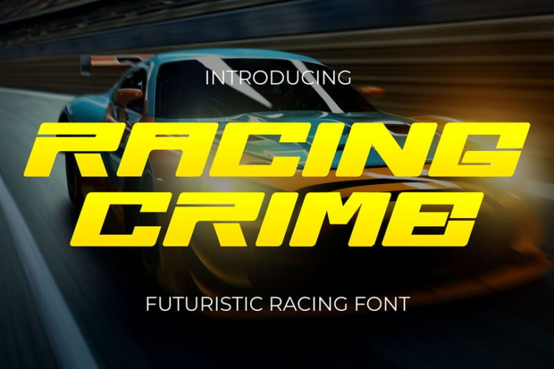
Racing Crime is a futuristic sans-serif font that captures the essence of high-speed racing. Its bold, angular letterforms convey a sense of movement and urgency, making it perfect for motorsport-related designs and edgy, impact-driven graphics.
Speed Rush
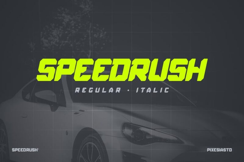
Speed Rush is a dynamic display font that embodies the thrill of racing. Its decorative style features elongated, streamlined letterforms that suggest motion and velocity, ideal for movie posters, game titles, or any design requiring a sense of speed and excitement.
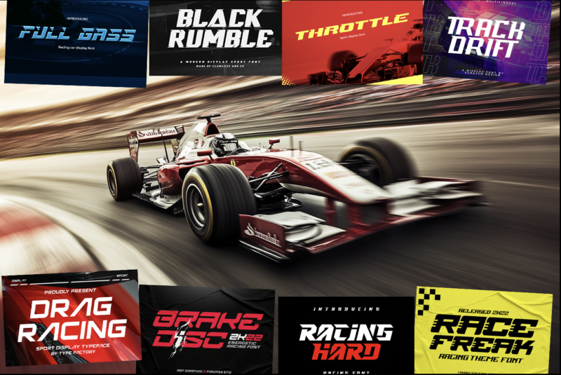
Drag Racing
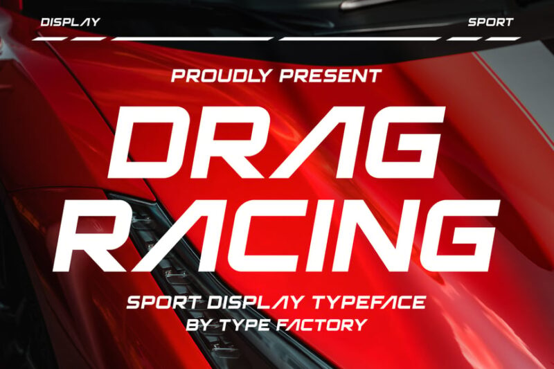
Drag Racing is a bold, competitive sport display typeface. Its chunky, aggressive letterforms evoke the power and intensity of drag racing, making it perfect for sports-related branding, event posters, and high-energy graphic designs.

Get 300+ Fonts for FREE
Enter your email to download our 100% free "Font Lover's Bundle". For commercial & personal use. No royalties. No fees. No attribution. 100% free to use anywhere.
Racing Font – Chaser
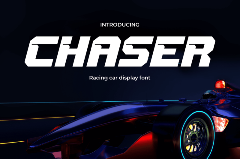
Chaser is a sleek sans-serif racing font that exudes speed and agility. Its clean lines and aerodynamic curves make it ideal for automotive branding, sports equipment design, and any project that requires a fast, modern aesthetic.
Racing Car
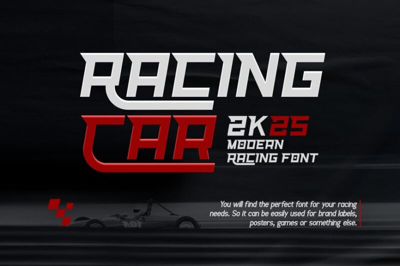
Racing Car is a modern serif font that blends classic elegance with contemporary automotive design. Its refined letterforms with subtle racing-inspired details make it suitable for high-end motorsport branding, luxury car marketing, and sophisticated racing-themed designs.
Full Gass
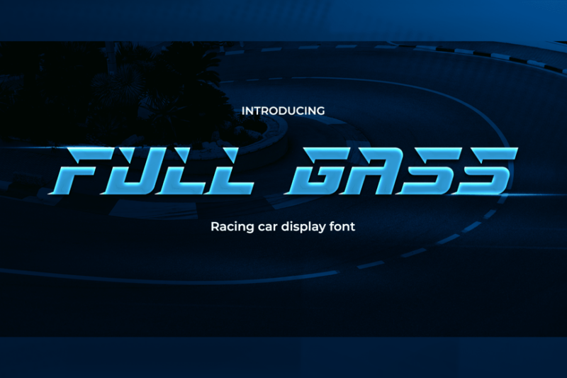
Full Gass is a sporty sans-serif font that captures the spirit of car racing. Its bold, energetic character set is perfect for speed-oriented designs, automotive logos, and racing team branding, conveying a sense of power and velocity.
Throttle
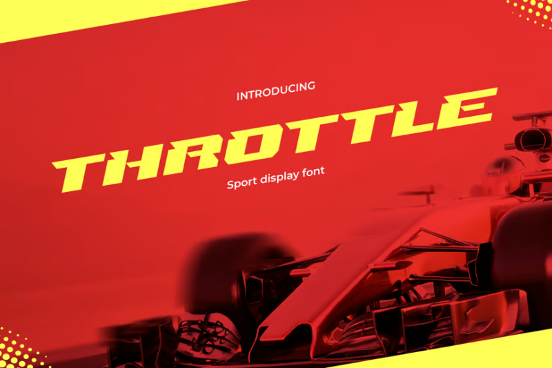
Throttle is a modern, decorative racing sport font that pushes the boundaries of speed in typography. Its dynamic, stretched letterforms create a sense of motion, making it ideal for racing event promotions, sports branding, and high-octane design projects.
Froza
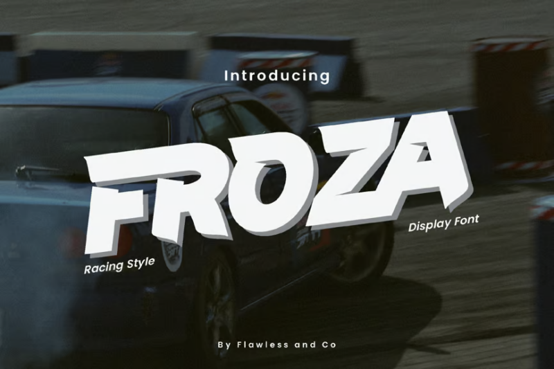
Froza is a distinctive display racing font with a sans-serif style. Its unique, angular letterforms offer a fresh take on racing typography, perfect for creating original and eye-catching designs in motorsport branding, gaming, and sports-related graphics.
Brake Disc
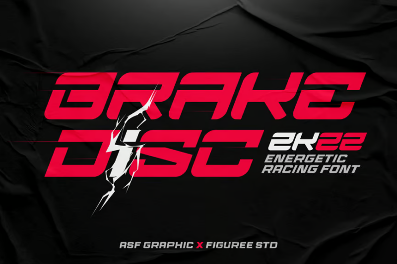
Brake Disc is an energetic, decorative racing font that brings the intensity of motorsports to your designs. Its bold, fragmented letterforms evoke the imagery of brake discs and speed, making it excellent for esports logos, racing game titles, and automotive-themed graphics.
Pro Racing

Pro Racing is a sporty sans-serif font that embodies the technological and futuristic aspects of modern racing. Its clean, streamlined design makes it versatile for various applications, from racing team uniforms to tech-oriented sports branding and interface design.
Rush Driver Racing Font
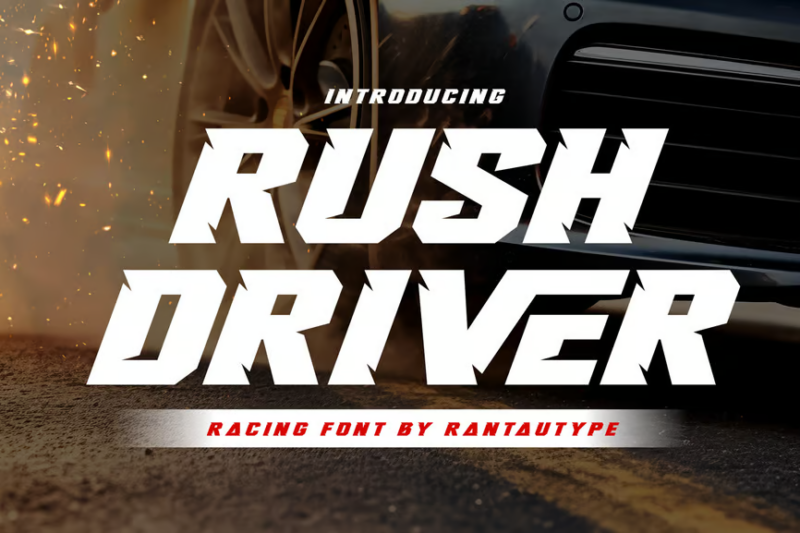
Rush Driver is a high-energy decorative font that captures the adrenaline of racing games. Its bold, aggressive letterforms with sharp angles and dynamic shapes make it perfect for racing game logos, esports team branding, and action-packed design projects.
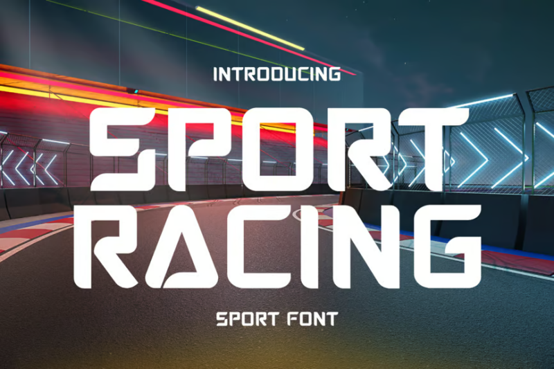
Sport Racing
Sport Racing is a versatile sans-serif font that combines the excitement of racing with clean, modern design. Its balanced letterforms make it suitable for both body text and display use in automotive logos, sports branding, and racing-related marketing materials.
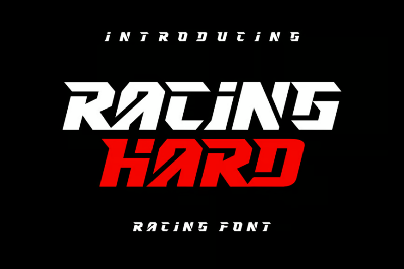
RACING HARD
RACING HARD is a robust, decorative font that embodies the grit and determination of motorsports. Its chunky, constructed letterforms suggest strength and durability, making it ideal for off-road racing brands, automotive parts marketing, and tough, high-impact designs.
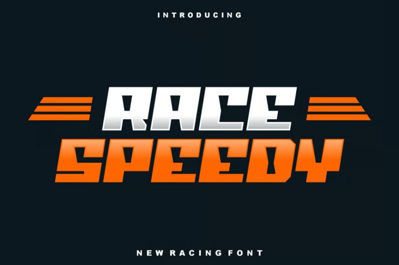
Race Speedy Font
Race Speedy is a dynamic serif font that brings a touch of elegance to racing typography. Its flowing lines and sharp serifs create a sense of speed and sophistication, perfect for high-end racing events, luxury sports car branding, and upscale automotive design projects.
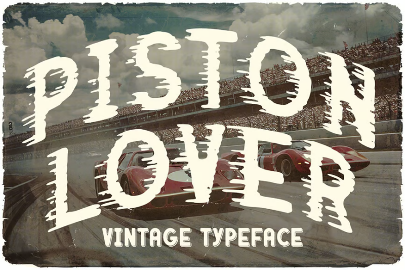
Piston Lover Retro Racing Font
Piston Lover is a retro-inspired sans-serif racing font that pays homage to classic motorsports. Its vintage feel combined with clean, modern execution makes it ideal for projects that blend nostalgia with contemporary design, such as classic car events, retro racing games, and throwback sports branding.
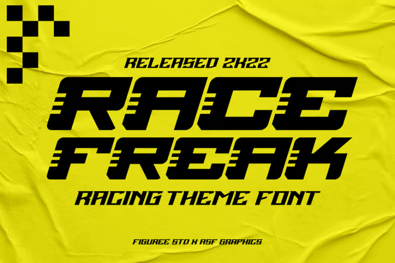
Race Freak
Race Freak is a bold, decorative font that embodies the passion and excitement of racing enthusiasts. Its exaggerated, sporty letterforms make it perfect for creating attention-grabbing headlines, event posters, and energetic branding for racing-themed products or services.
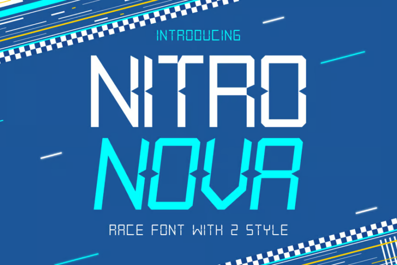
Nitro Nova
Nitro Nova is a futuristic, decorative race font that pushes the boundaries of speed and design. Its sleek, space-age letterforms evoke images of cutting-edge technology and supersonic speed, making it ideal for sci-fi racing games, futuristic sports branding, and high-tech automotive designs.
Nitro Speed
Nitro Speed is a high-octane sans-serif racing display font that exudes velocity and power. Its stretched, dynamic letterforms create a strong sense of horizontal movement, perfect for racing event banners, sports car advertising, and any design that needs to convey rapid motion.
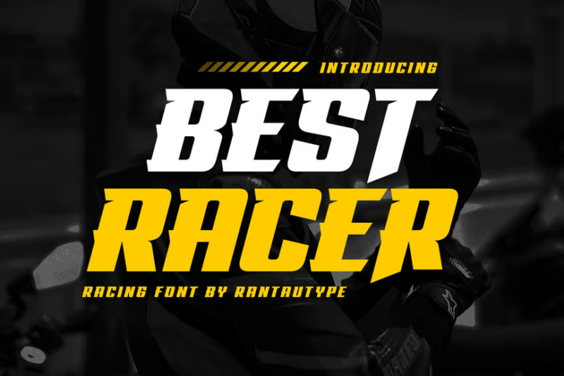
Best Racer Racing Font

Best Racer is a bold, decorative racing font designed to make a statement. Its confident, sporty letterforms are perfect for creating impactful headlines and logos for racing brands, sports equipment, and competitive events, conveying a sense of excellence and championship-level performance.
Quickstep
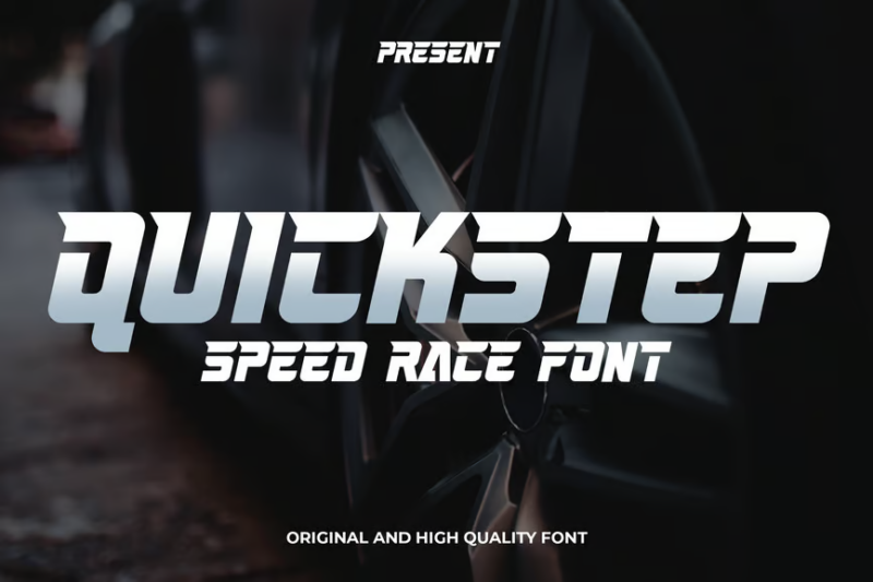
Quickstep is a versatile sans-serif font tailored for racing and esports designs. Its clean, modern letterforms with subtle speed-inspired details make it suitable for a wide range of applications, from team jerseys and gaming interfaces to sports equipment branding and racing simulations.
Gutsand
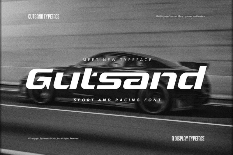
Gutsand is an expanded sans-serif font that brings a bold, commanding presence to sport and racing designs. Its wide, confident letterforms make it excellent for creating impactful headlines, jersey numbers, and strong visual identities for racing teams and sports brands.
Black Rumble Sport Racing Font
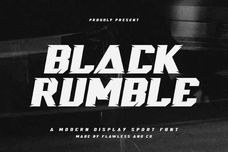
Black Rumble is a powerful, decorative sans-serif font that captures the raw energy of motorsports. Its thick, distressed letterforms evoke the grit and intensity of racing, making it perfect for creating bold headlines, event posters, and branding for extreme sports and high-octane events.
Fast Racer
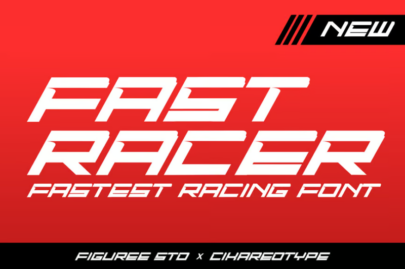
Fast Racer is a dynamic, decorative display font that embodies the speed and excitement of racing. Its elongated, streamlined letterforms create a strong sense of motion, ideal for motocross event promotions, racing game titles, and high-energy sports branding projects.
Dragger
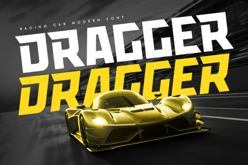
Dragger is a futuristic sans-serif font designed for sport racing car aesthetics. Its sleek, aerodynamic letterforms with subtle tech-inspired details make it perfect for modern automotive branding, racing team logos, and cutting-edge sports equipment design.
Steagle
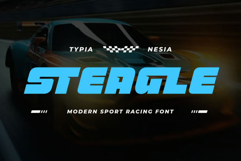
Steagle is a modern, expanded sans-serif font tailored for sport racing games. Its bold, geometric letterforms with subtle racing-inspired elements make it ideal for game interfaces, in-game branding, and promotional materials for racing simulations and sports-themed video games.
Broaven – Bold Expanded
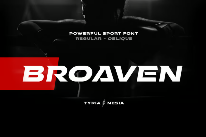
Broaven is a bold, expanded sans-serif font designed for racing sports games. Its wide, commanding presence and clean lines make it excellent for creating impactful game logos, menu screens, and in-game typography that’s easily readable at a glance during fast-paced gameplay.
Slugs Racer
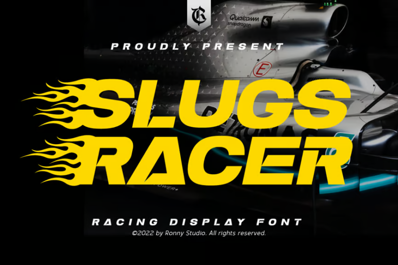
Slugs Racer is a unique, decorative sans-serif display font that brings a fresh perspective to racing typography. Its quirky, stretched letterforms with rounded edges create a playful yet speedy aesthetic, perfect for youth-oriented racing events, casual racing games, and fun sports branding.
Track Drift
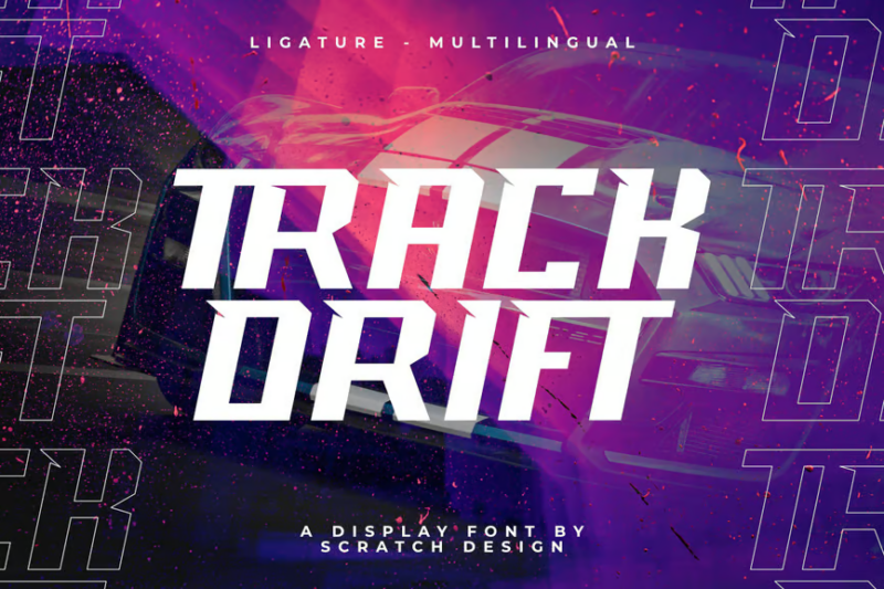
Track Drift is a dynamic, decorative sans-serif font that captures the excitement of drifting and race driving. Its skewed, motion-inspired letterforms create a sense of sliding and speed, making it ideal for drift racing events, automotive action graphics, and high-energy sports branding.
Veryfast
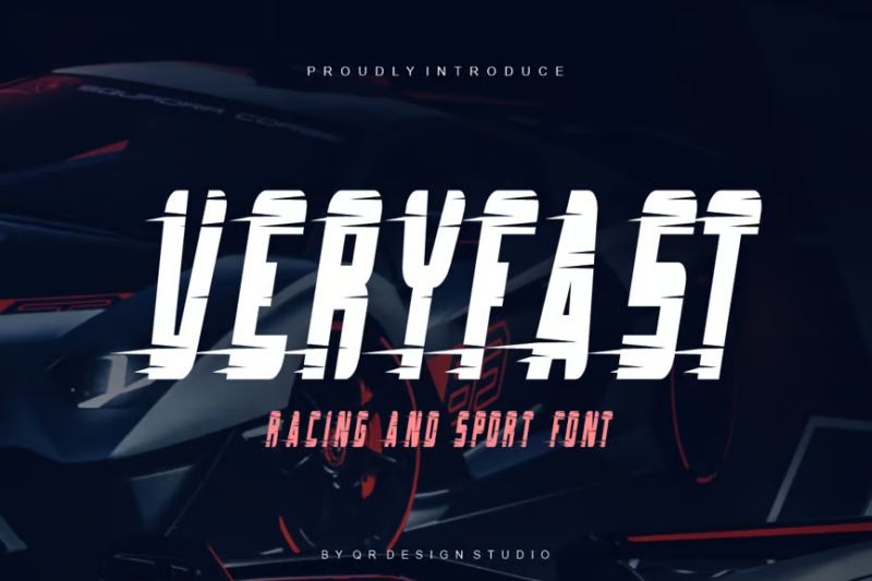
Veryfast is an aptly named decorative racing font that embodies pure speed. Its extremely elongated, horizontal letterforms create an exaggerated sense of velocity, perfect for creating eye-catching titles for racing games, speed-focused events, and any design that needs to convey rapid motion.
Speed Demon
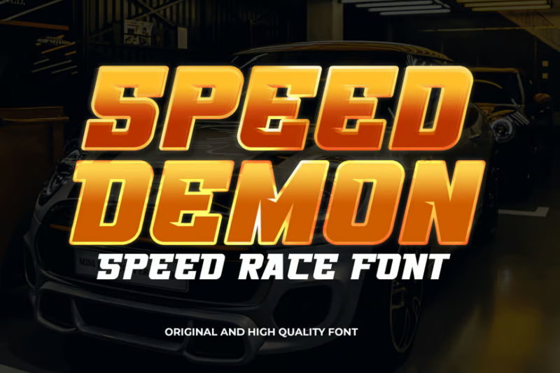
Speed Demon is a high-octane sans-serif font designed for car racing aesthetics. Its sharp, angled letterforms with aggressive details evoke the thrill and danger of high-speed racing, making it perfect for motorsport event promotion, racing team branding, and automotive-themed graphics.
POWER TORQUE

POWER TORQUE is a bold, cyberpunk-inspired sans-serif display font. Its futuristic, industrial design with sharp angles and mechanical elements makes it ideal for creating impactful titles in sci-fi racing games, tech-heavy automotive branding, and edgy sports equipment design.
Racer Boy
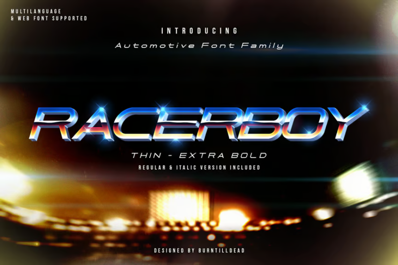
Racer Boy is an energetic sans-serif font that captures the youthful spirit of racing. Its athletic, slightly playful letterforms make it suitable for junior racing leagues, sports-themed apparel, and branding aimed at young racing enthusiasts and aspiring athletes.
MX Motocross font
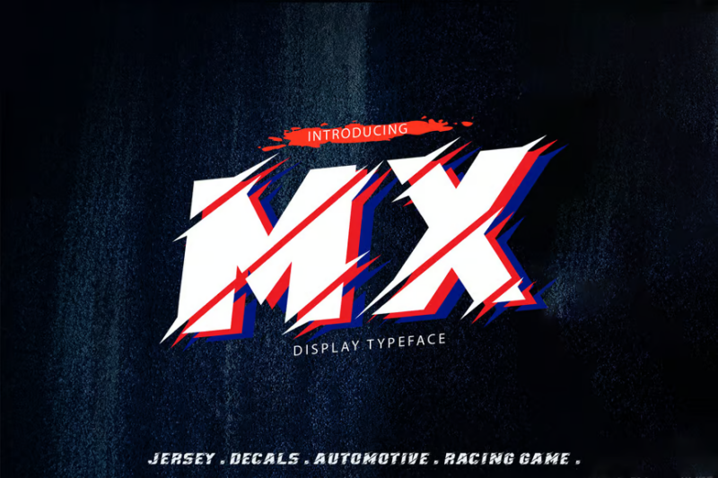
MX Motocross is a gritty, decorative font with accompanying symbols that embody the spirit of dirt bike racing. Its rough, textured letterforms evoke images of mud-splattered number plates and rugged terrain, perfect for motocross event branding, off-road racing logos, and extreme sports graphics.
Hardipe
![]()
Hardipe is a futuristic sans-serif font designed for grand, impactful logos. Its bold, tech-inspired letterforms with sharp angles and clean lines make it ideal for creating modern racing team identities, high-tech automotive brands, and forward-thinking sports equipment logos.
Quick Driver
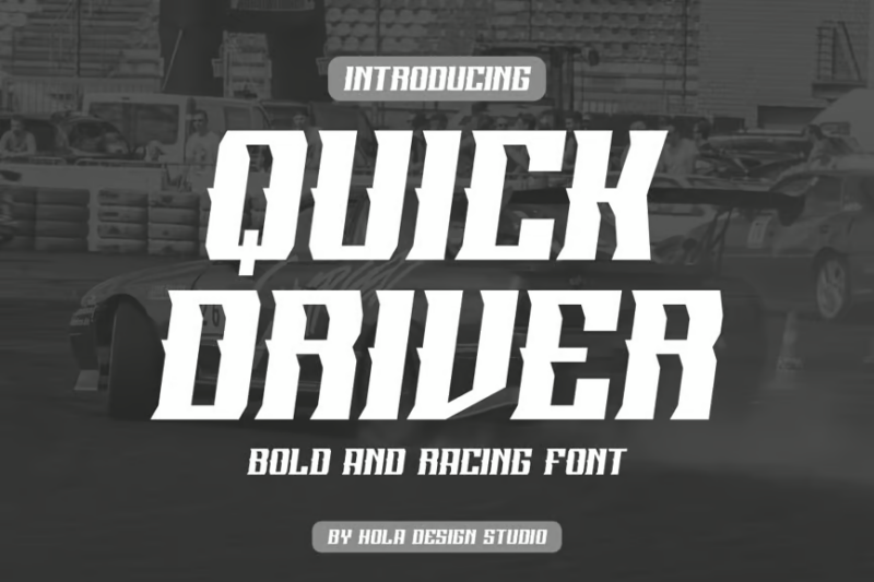
Quick Driver is a dynamic serif font that brings a touch of classic elegance to racing typography. Its flowing lines and sharp serifs create a sense of speed and sophistication, making it suitable for vintage car races, luxury sports car branding, and upscale racing event materials.
Torque Craver
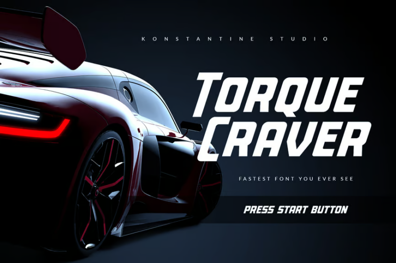
Torque Craver is a high-energy, decorative sans-serif font designed for fast-paced racing aesthetics. Its bold, fragmented letterforms suggest speed and power, making it perfect for creating attention-grabbing titles in racing games, motorsport event posters, and dynamic sports branding.
Criores
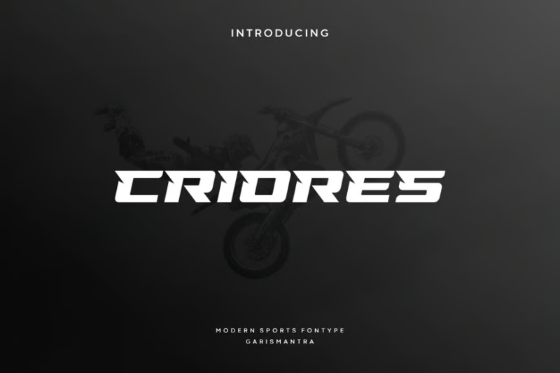
Criores is an athletic, decorative font with a focus on bike and racing aesthetics. Its dynamic, stretched letterforms with sharp edges evoke speed and agility, making it ideal for cycling events, motorcycle racing branding, and sports equipment design with a competitive edge.
Racerz
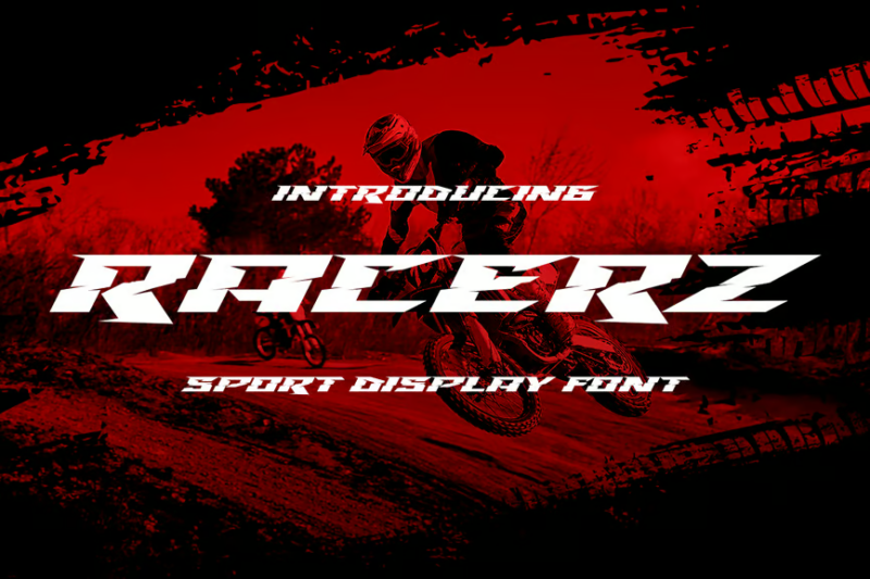
Racerz is a bold, decorative sans-serif display font that commands attention. Its strong, condensed letterforms with subtle racing-inspired details make it perfect for creating impactful headlines, event banners, and powerful branding for motorsports and high-energy athletic events.
BrigstoneRanger
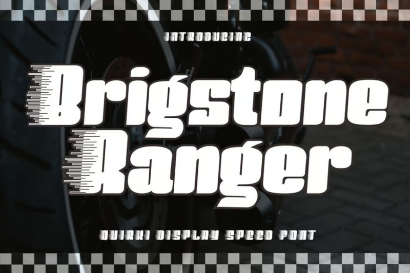
BrigstoneRanger is a quirky, decorative display font that brings a unique flair to speed-themed typography. Its playful, irregular letterforms with a hand-drawn feel make it suitable for creating fun, eye-catching designs for casual racing events, youth sports programs, and lighthearted automotive branding.
Gridete
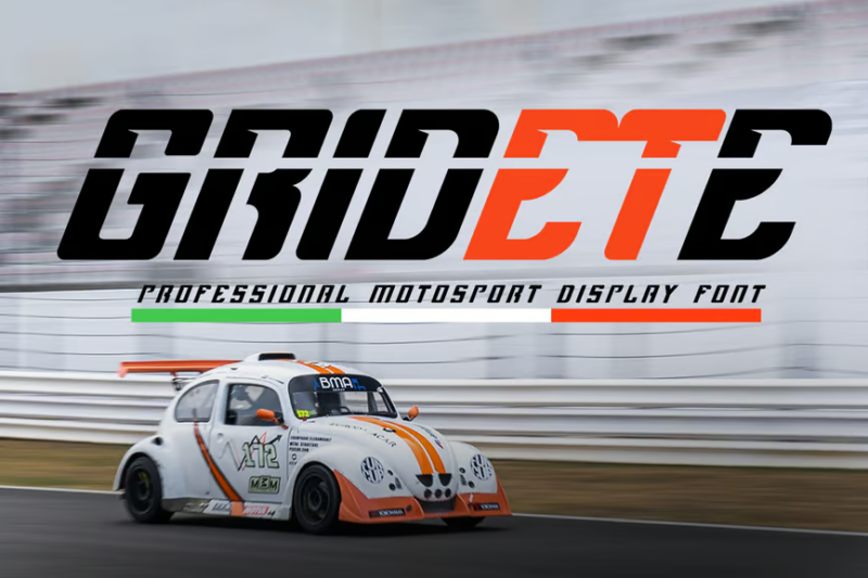
Gridete is a distinctive decorative display font with a technical edge. Its geometric letterforms with grid-like elements evoke images of race tracks and circuit boards, making it ideal for creating unique designs for tech-savvy racing events, futuristic sports branding, and cutting-edge automotive graphics.
Siegra
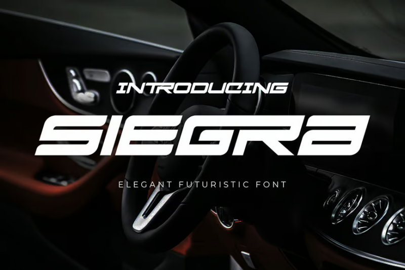
Siegra is a sporty, tech-inspired decorative font that blends athletic energy with automotive aesthetics. Its sleek, modern letterforms with mechanical details make it perfect for creating dynamic designs for racing tech companies, sports car branding, and futuristic motorsport events.
What Makes Racing Fonts Feel So Fast?
Racing fonts achieve their distinctive high-velocity personality through several key design characteristics:
Forward-Leaning Slant
First, most racing fonts feature a pronounced forward slant or italic angle. This rightward tilt immediately suggests forward movement, as if the letters themselves are leaning into a sharp turn or accelerating down a straightaway.
The more extreme the angle, the greater the sense of speed. Some racing fonts push this dynamic tilt to the edge of legibility, creating letterforms that seem to be literally racing off the page.
Sharp, Angular Shapes
Racing fonts often replace rounded elements with sharp, angular forms. Corners become pointed, curves transform into abrupt changes of direction, and terminals finish with dramatic cuts rather than soft endings.
These angular characteristics evoke the aerodynamic design of race cars themselves – every element engineered for reducing drag and maximizing speed. The visual sharpness translates into perceived velocity.
Dramatic Weight Contrast
Many racing fonts employ striking contrasts between thick and thin elements. These sudden transitions create visual energy and tension, mimicking the extreme forces at work in motorsports.
The alternating weight patterns also create a staccato rhythm that the eye must follow quickly, reinforcing the sensation of speed as you read the text.
Extended Horizontal Elements
Notice how many racing fonts feature extended crossbars, elongated terminals, or stretched horizontal strokes. These design elements create a sense of forward momentum and emphasize lateral movement.
Some fonts even incorporate actual motion lines or speed trails that streak backward from the main characters, literally illustrating velocity within the letterforms themselves.
Together, these design elements – forward slant, angular shapes, weight contrasts, and horizontal emphasis – create typography that doesn’t just sit on the page but seems to race across it at breathtaking speeds.
Where Can You Use Racing Fonts?
Racing fonts inject immediate energy into designs, making them excellent choices for:
Automotive Branding
The most natural application for racing fonts is within the motorsports and automotive industry. Racing teams, car manufacturers (especially performance divisions), aftermarket parts companies, and auto service businesses can all benefit from typography that communicates speed and power.
From logos and vehicle graphics to product packaging and technical manuals, racing fonts speak the visual language car enthusiasts understand and respond to.
Sports & Energy Products
Beyond cars, racing fonts work well for any brand promoting high energy and physical performance. Energy drinks, sports equipment, fitness apps, supplements, and athletic wear can all leverage these dynamic typefaces to convey power, strength, and intensity.
The aggressive, forward-moving energy of racing fonts aligns perfectly with the aspirational messaging these products typically employ.
Event Promotion
Racing fonts excel at creating excitement for time-sensitive events. Concerts, festivals, sales events, limited-time offers, and competitions benefit from typography that creates urgency and anticipation.
The dynamic nature of these fonts can help event promotion materials stand out in crowded advertising environments, capturing attention with their inherent energy.
Technology & Gaming
Many tech products and services – particularly those focused on performance, speed, or innovation – can effectively utilize racing fonts. Computer hardware, internet services promoting speed, software optimization tools, and especially racing video games can all leverage these fonts to reinforce their core value propositions.
The technical yet dynamic quality of racing typography often pairs well with technology branding.
Youth-Oriented Products
Brands targeting younger demographics often find racing fonts effective for communicating energy, rebellion, and excitement. The dynamic visual language of racing typography resonates with youth culture’s appreciation for intensity and authenticity.
Where to Avoid Racing Fonts
Despite their visual impact, racing fonts aren’t appropriate for every context. Be cautious about using them in:
Professional Services
Law firms, financial institutions, healthcare providers, and other professional services should generally avoid racing fonts for their primary branding. The aggressive energy and casual associations of these typefaces can undermine perceptions of stability, reliability, and thoughtful expertise.
For these industries, traditional serifs or clean, professional sans serifs communicate the appropriate level of gravitas and trustworthiness.
Luxury Products
Most high-end luxury brands (outside of exotic cars) should avoid racing fonts. The frenetic energy of these typefaces often contradicts the elegant restraint, timelessness, and refined aesthetic that luxury brands typically cultivate.
Fine dining, fashion, jewelry, and premium hospitality generally benefit from more sophisticated, understated typography.
Extended Reading
Never use racing fonts for body text or extended reading. Their stylized forms, extreme angles, and focus on visual impact rather than legibility make them tiring and difficult to read in paragraphs.
Racing fonts should be reserved for headlines, logos, and short bursts of text where their energy enhances rather than hinders communication.
Traditional or Historical Contexts
Projects requiring historical authenticity or traditional reverence are poor matches for racing typography. Heritage brands, classical music events, historical documentation, religious materials, and formal government communications should avoid these modern, high-energy fonts.
So while racing fonts excel at communicating speed and excitement, always consider whether their inherent energy supports or conflicts with your messaging before incorporation.
How to Pick the Perfect Racing Font
To choose an excellent racing font that matches your specific needs, consider these factors:
Racing Subgenre
Consider which racing culture best aligns with your project. Formula 1 has a sleek, technical, international flair. NASCAR has more traditional Americana influences. Drag racing has raw, explosive energy. Street racing has urban, gritty undertones.
Different racing fonts evoke different racing subcultures, so choose one that resonates with your specific audience and purpose.
Energy Level
Racing fonts range from mildly dynamic to explosively energetic. Determine how much visual intensity your project requires.
A slight forward slant might provide just enough motion for a professional automotive business, while fragmented, distressed letterforms with extreme angles might better suit an extreme sports event or energy drink.
Technical vs. Organic
Some racing fonts emphasize precision engineering with clean lines and mechanical perfection. Others capture the human element with hand-drawn qualities, distressing, or organic variations.
The former works well for technical products, luxury vehicles, and professional racing teams. The latter connects better with grassroots racing culture, individual athletes, and lifestyle brands.
Legibility Requirements
Always consider practical legibility needs. Some racing fonts push stylization to the limit, sacrificing immediate readability for visual impact.
For logos or short headlines where recognition matters more than quick reading, you can embrace more extreme styles. For wayfinding, information, or any text that must be understood instantly, opt for more moderate racing fonts that balance energy with clarity.
By thoughtfully evaluating racing subgenre, energy level, technical/organic balance, and legibility needs, you’ll select a racing font that perfectly aligns with your project requirements!
Common Racing Font Questions
Let’s wrap up by answering some common racing font questions:
What font do racing teams use?
Professional racing teams typically use custom typefaces developed specifically for their brand identity, though many incorporate elements of fonts like Eurostile, Compacta, or custom modifications of industrial sans serifs. Formula 1, for example, uses a proprietary font called “Formula 1” designed by Wieden+Kennedy that balances technical precision with dynamic energy.
What is the NASCAR font called?
NASCAR itself uses a custom proprietary typeface for its main branding, though it shares characteristics with condensed sans serifs like Compacta Bold. Individual NASCAR teams typically have their own custom typography based on their sponsors and brand identity, often featuring bold, compressed letterforms with dramatic forward slants.
What font looks like racing stripes?
Fonts that incorporate racing stripes or speed lines include “Speed Demon,” “Turbo Charge,” and “Velocity Stripes.” These typefaces literally integrate horizontal lines into their design, mimicking the classic racing stripe aesthetic. For a more subtle approach, look for fonts with extended horizontal terminals that suggest motion trails.
What makes a font look fast?
A font looks fast when it incorporates forward slants, sharp angles instead of curves, dramatic weight transitions, extended horizontal elements, and sometimes literal motion lines or fragmentation. The most effective “fast” fonts combine several of these elements while still maintaining sufficient legibility for their intended use.
Racing fonts inject that heart-pounding energy of motorsports into designs whenever you need to communicate speed, power, or dynamic motion. From authentic motorsport applications to any project needing a jolt of adrenaline, the right racing font can take your designs from zero to sixty in record time!
So give some of these high-octane typefaces a test drive in your next project. When used thoughtfully, they’ll help your designs leave the competition in the dust.


