In this article:
- 50 Fantastic 50s Fonts That Define Retro Cool
- What Makes 50s Fonts So Distinctive?
- Where 50s Fonts Really Shine
- When to Avoid 50s Fonts
- How to Choose the Perfect 50s Font
- Expert Tips for Using 50s Fonts Authentically
- Fantastic 50s Font Alternatives
- Common 50s Font Questions
- Conclusion: Embracing the Timeless Appeal of 50s Fonts
There’s something undeniably magical about 50s fonts that continues to captivate designers and audiences alike decades later.
When we talk about 50s typography, we’re really discussing the visual language of an entire cultural movement. These weren’t just letters – they were bold statements of optimism, innovation, and the dawn of consumer culture. From neon-lit diner signs to sleek automobile logos, 50s fonts helped define the aesthetic of an era that still influences design today.
In this comprehensive guide, I’ll take you on a typographic time travel journey through the best 50s fonts available for your modern design projects. We’ll explore what makes these retro typefaces so special, how to use them effectively, and where they truly shine. So put on your blue suede shoes, and let’s dive into the fabulous world of 50s typography!
50 Fantastic 50s Fonts That Define Retro Cool
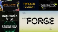
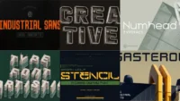
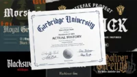
I’ve curated this collection of the absolute best 50s-inspired fonts available today. Each captures a specific aspect of that iconic mid-century aesthetic we all love. Here they are:
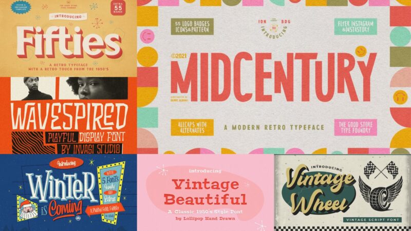
Fifties Typeface
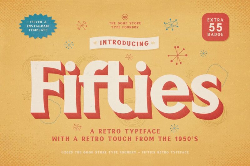
Fifties Typeface is a charming serif font that captures the essence of 1950s design. With its retro-inspired curves and decorative elements, this typeface is perfect for creating nostalgic and vintage-themed projects.
MidCentury Typeface

MidCentury Typeface is a sleek sans-serif font that embodies the clean lines and minimalist aesthetic of mid-century modern design. Its versatile and timeless appearance makes it suitable for a wide range of contemporary projects.
Wavespired – Display Retro
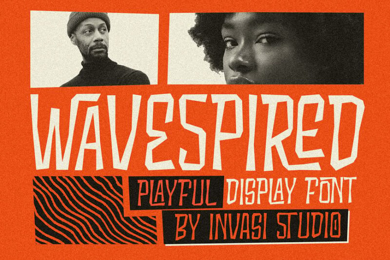
Wavespired is a bold and playful display font that combines retro and vintage elements with a modern twist. Its wavy, decorative style makes it ideal for eye-catching headlines and branding in projects with a fun, nostalgic vibe.

Get 300+ Fonts for FREE
Enter your email to download our 100% free "Font Lover's Bundle". For commercial & personal use. No royalties. No fees. No attribution. 100% free to use anywhere.
Winter Is Coming
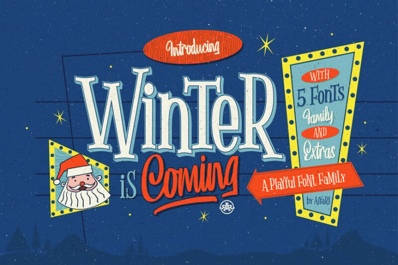
Winter Is Coming is a versatile font collection featuring decorative serifs, scripts, and symbols. This comprehensive typeface is perfect for creating enchanting winter-themed designs and projects that require a touch of fantasy and whimsy.
Vintage Beautiful Font
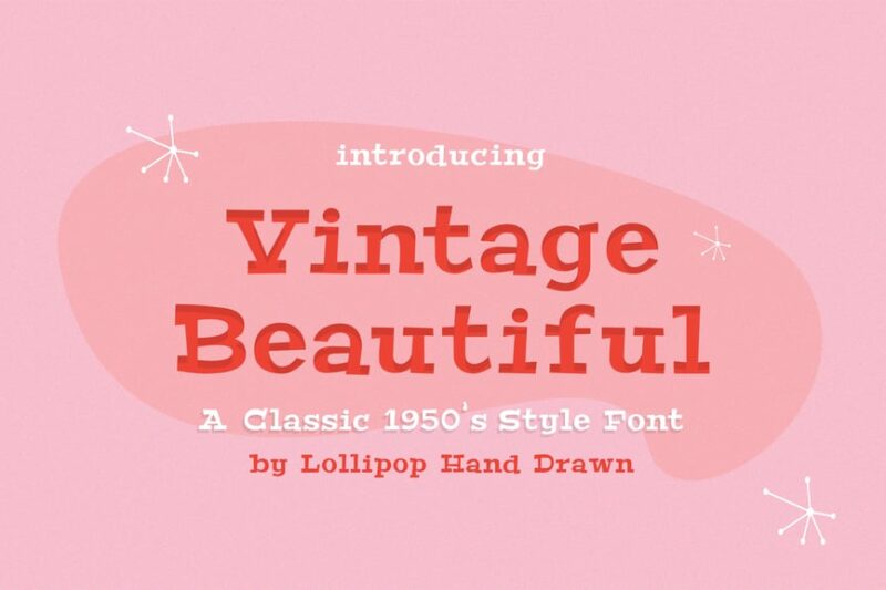
Vintage Beautiful Font is an elegant serif typeface that captures the charm of 1950s typography. Its graceful curves and refined details make it perfect for creating sophisticated vintage-inspired designs and branding materials.
Vintage Wheel – Vintage Script Font
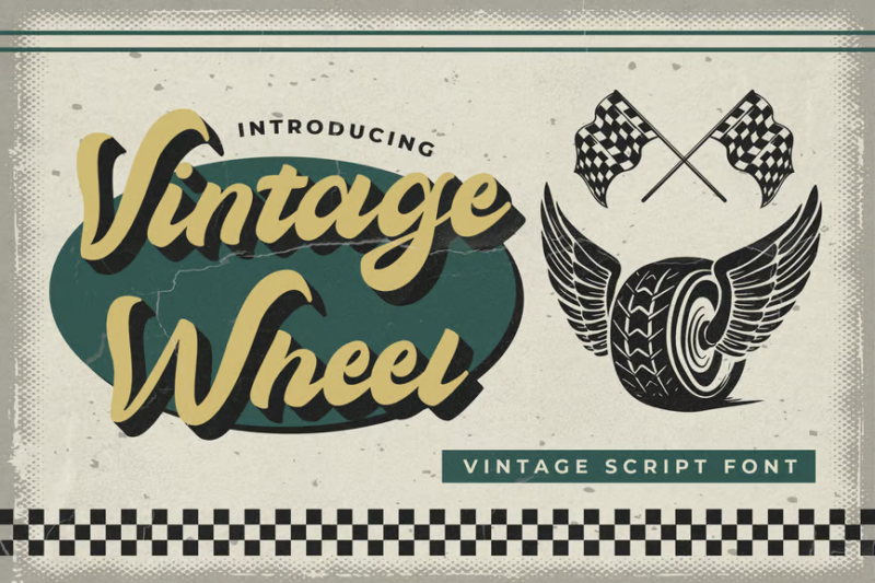
Vintage Wheel is a decorative script font that evokes the spirit of the 1950s and 1980s. Its flowing, handwritten style with a touch of retro flair makes it ideal for creating nostalgic designs, logos, and packaging.
Rockabilly Romance – A 1950s Script Font
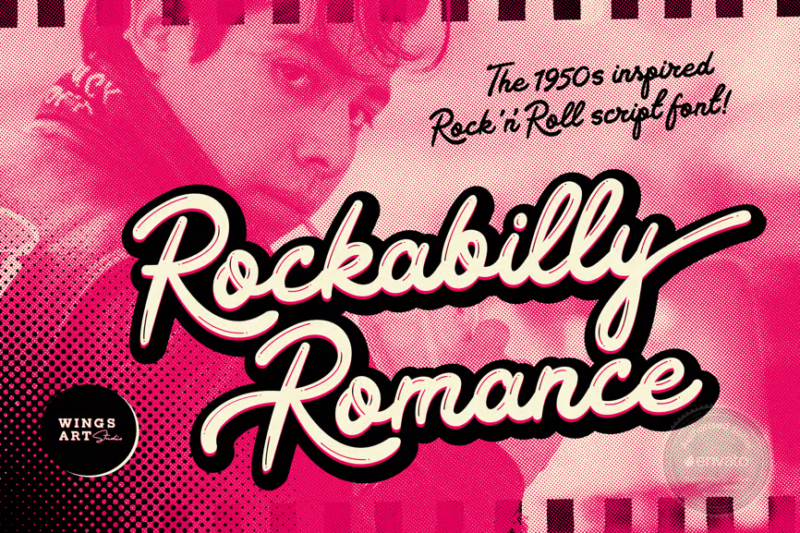
Rockabilly Romance is a lively script font that captures the energy and style of 1950s rock ‘n’ roll culture. Its bold, dynamic strokes make it perfect for creating retro-inspired designs, album covers, and event posters.
Kanvas Rooper – Condensed 1950s Cinematic Typeface
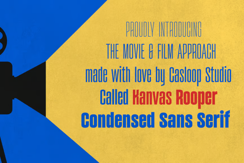
Kanvas Rooper is a condensed sans-serif font inspired by 1950s movie posters and marquees. Its narrow, variable design makes it versatile for creating eye-catching headlines and titles with a vintage cinematic feel.
Space Rocks! A Retro 1950s Sci-Fi Font
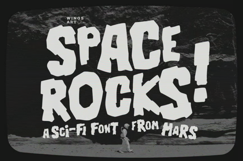
Space Rocks! is a fun and quirky decorative font that captures the essence of 1950s science fiction. Its retro-futuristic design makes it perfect for creating eye-catching titles and graphics for vintage-inspired sci-fi projects.
Carosello
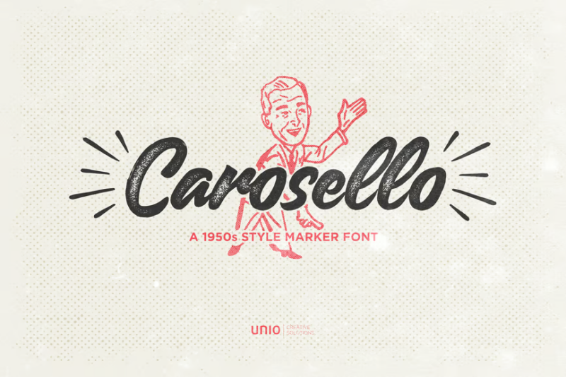
Carosello is a bold script font with a marker-like texture. Its energetic and expressive style makes it ideal for creating dynamic quotes, headlines, and branding materials that require a hand-drawn, personal touch.
Surfnik: A Hand-Made Vintage Surf and Beatnik Font
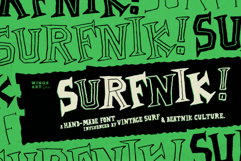
Surfnik is a unique serif font that combines vintage surf culture with beatnik aesthetics. Its hand-made appearance and retro vibe make it perfect for creating authentic, nostalgic designs for surf-related brands and projects.
Vasque – Vintage Display Fonts
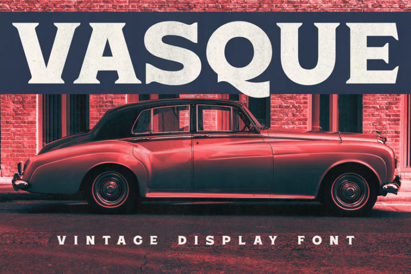
Vasque is a collection of bold, vintage-inspired display fonts. With its mix of serif and decorative styles, this typeface is perfect for creating eye-catching headlines and logos with a strong retro aesthetic.
Let’s Jazz
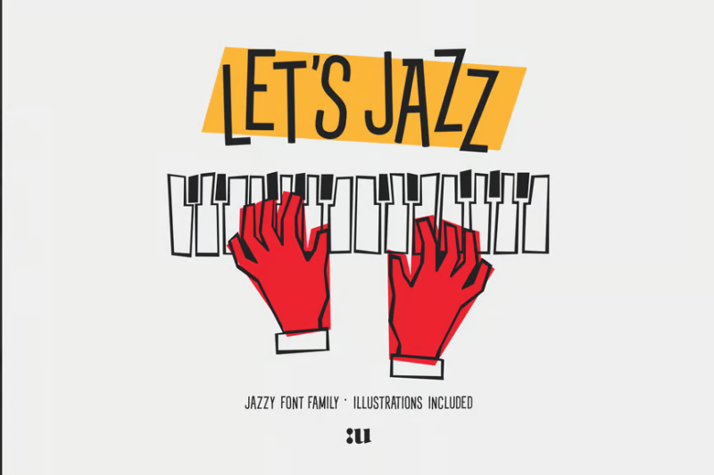
Let’s Jazz is a groovy sans-serif font that captures the spirit of 1960s jazz culture. Its smooth curves and playful design make it ideal for creating music-related projects, event posters, and retro-inspired branding materials.
Heroline – Retro Font
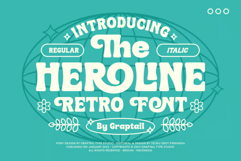
Heroline is a stylish retro sans-serif font with a distinctive vintage flair. Its clean lines and subtle decorative elements make it versatile for creating logos, headlines, and designs that require a touch of nostalgia.
Retro Romantic Font
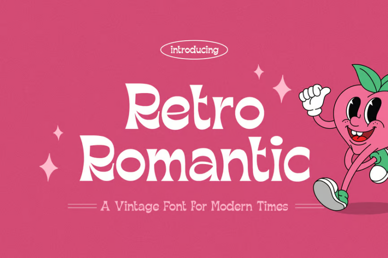
Retro Romantic Font is an elegant serif typeface that evokes the charm of 1960s romance. Its graceful curves and vintage-inspired details make it perfect for creating sophisticated designs for weddings, invitations, and romantic-themed projects.
Dinfest Bold – Retro Font
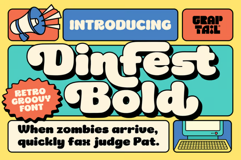
Dinfest Bold is a playful and decorative sans-serif font inspired by 90s design. Its bold, chunky letterforms and retro aesthetic make it ideal for creating eye-catching headlines, logos, and designs with a fun, nostalgic vibe.
Aeroflow – Vintage Aviation Display
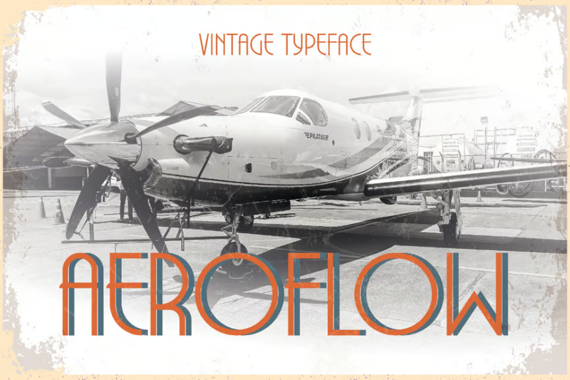
Aeroflow is a sleek sans-serif font inspired by vintage aviation design. Its streamlined appearance and subtle retro touches make it perfect for creating logos, signage, and branding materials for aviation-related projects and travel themes.
The Normans – Retro Display Font
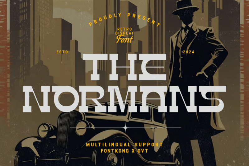
The Normans is a bold serif display font with a strong retro character. Its vintage-inspired design and old-school typography make it ideal for creating eye-catching headlines, posters, and branding materials with a nostalgic feel.
Jukebox Jive – Playful Typeface
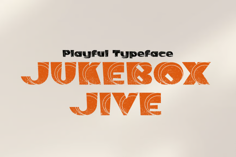
Jukebox Jive is a fun and lively decorative font that captures the spirit of retro music culture. Its playful design and energetic character make it perfect for creating eye-catching titles, logos, and designs for children’s products or music-related projects.
Ironside – Vintage Sans
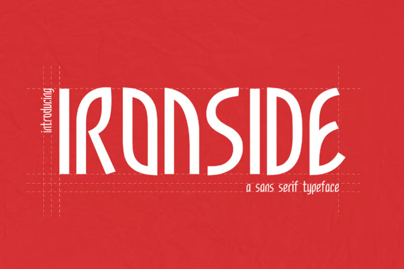
Ironside is a stylish vintage-inspired sans-serif font with art deco influences. Its elegant and timeless design makes it versatile for creating sophisticated logos, headlines, and branding materials with a touch of retro charm.
Juvenile Typeface + Flyers + Instagram + Badge
![]()
Juvenile Typeface is a comprehensive font package inspired by mid-century design. This versatile collection includes various styles and graphic elements, making it perfect for creating cohesive branding materials and social media content with a retro flair.
Retrican – Retro Sans Font
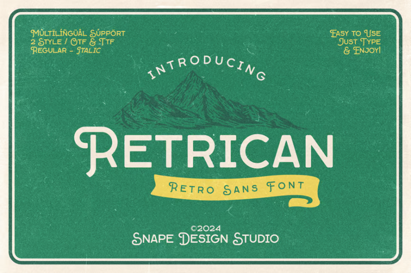
Retrican is a charming retro sans-serif font with a vintage aesthetic. Its clean lines and subtle retro details make it versatile for creating logos, headlines, and designs that require a touch of nostalgia without sacrificing readability.
Bulgie – Newest Retro Sans Font
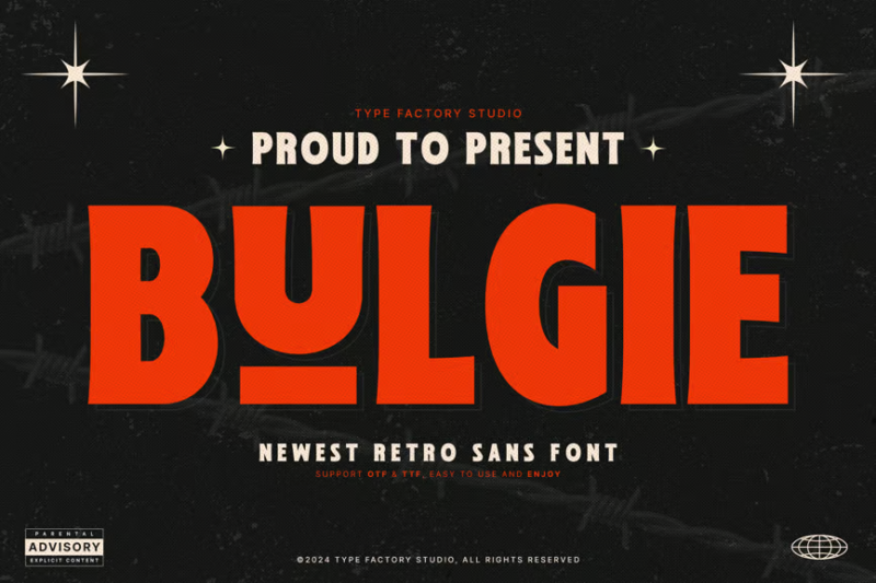
Bulgie is a bold and playful retro sans-serif font with a modern twist. Its rounded, chunky letterforms and retro-inspired design make it perfect for creating eye-catching headlines, logos, and designs with a fun, vintage vibe.
Decoserif
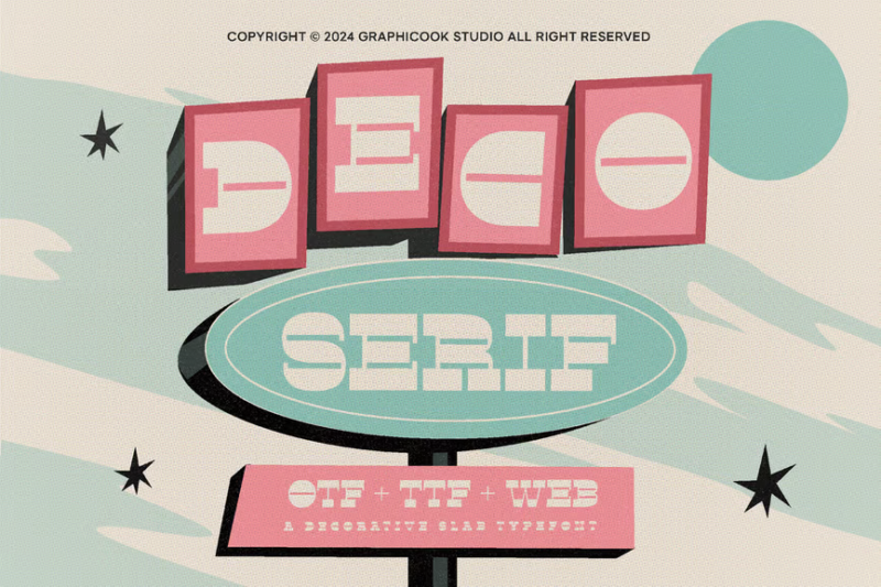
Decoserif is a stylish display font that combines sans-serif elements with decorative touches. Its trendy design and unique character make it ideal for creating modern logos, headlines, and branding materials with a contemporary edge.
Sercent
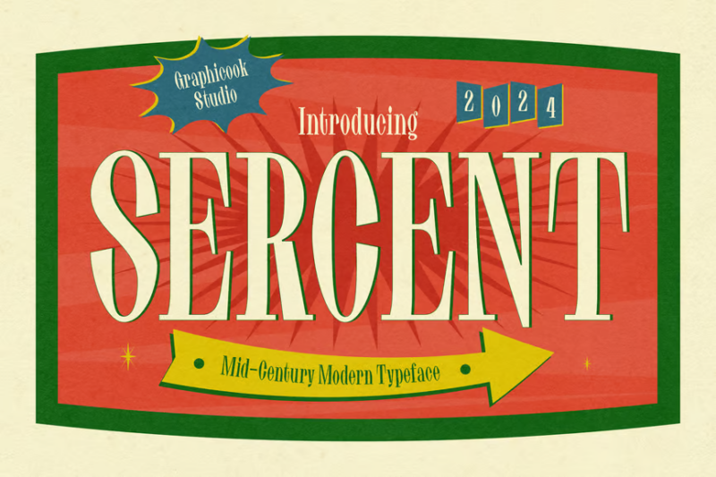
Sercent is an elegant serif font with a classic, timeless appeal. Its refined design and subtle details make it perfect for creating sophisticated typography in editorial layouts, branding materials, and high-end product packaging.
Revontrast
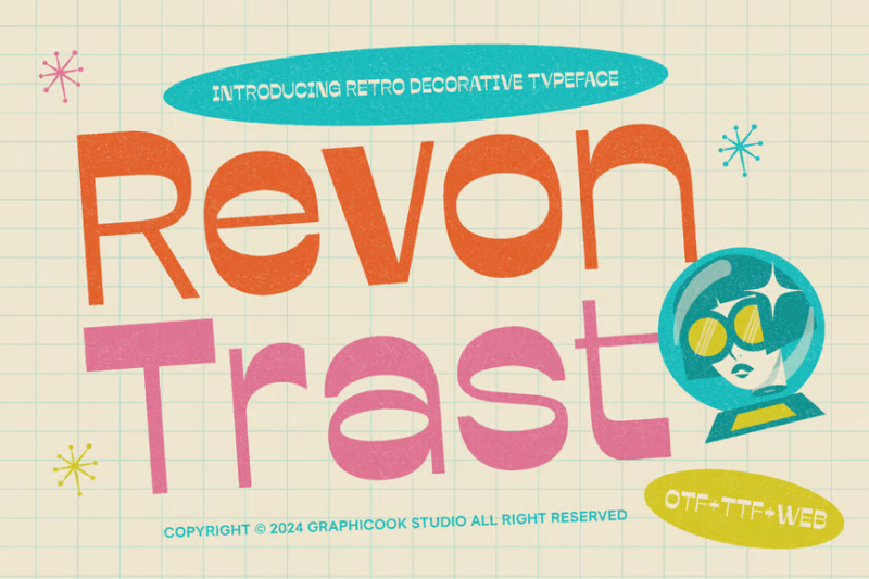
Revontrast is a modern display sans-serif font with a trendy aesthetic. Its clean lines and contemporary design make it versatile for creating eye-catching headlines, logos, and branding materials for fashion, technology, and lifestyle brands.
Moliga – Modern Bold Sans
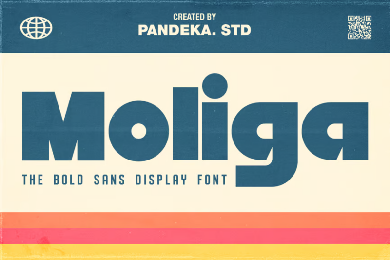
Moliga is a sleek and modern bold sans-serif font. Its clean, minimalist design and strong character make it ideal for creating impactful headlines, logos, and branding materials for contemporary projects across various industries.
Kanoz Brush Font
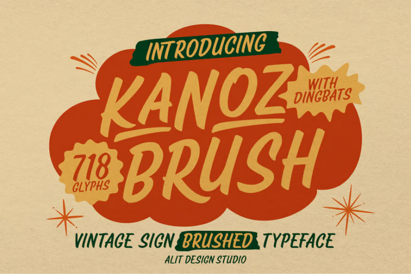
Kanoz is a dynamic brush script font with a hand-lettered feel. Its energetic strokes and organic texture make it perfect for creating authentic, personal-looking designs for branding, packaging, and social media content.
Country Foody – Condensed Retro Font
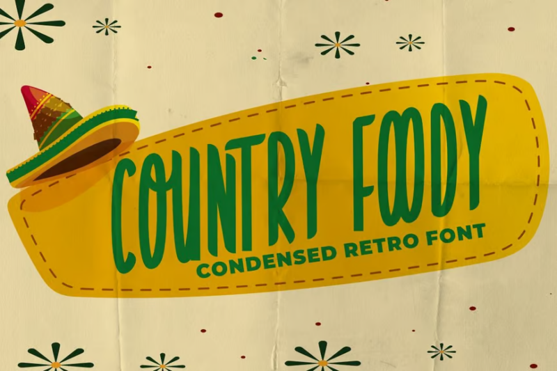
Country Foody is a charming condensed retro font with a vintage flair. Its narrow design and playful character make it ideal for creating eye-catching titles and logos for food-related projects, packaging, and rustic-themed designs.
Lettrano – Display Font
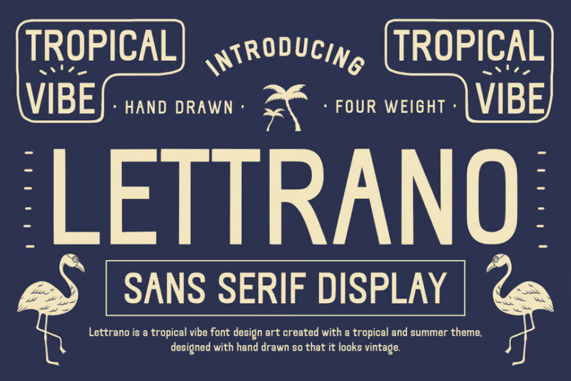
Lettrano is a stylish display sans-serif font with a vintage tropical vibe. Its unique design and retro-inspired details make it perfect for creating eye-catching headlines, logos, and branding materials for travel, hospitality, and lifestyle projects.
Alpha Strada: Clean Sans Serif Motorsports Font
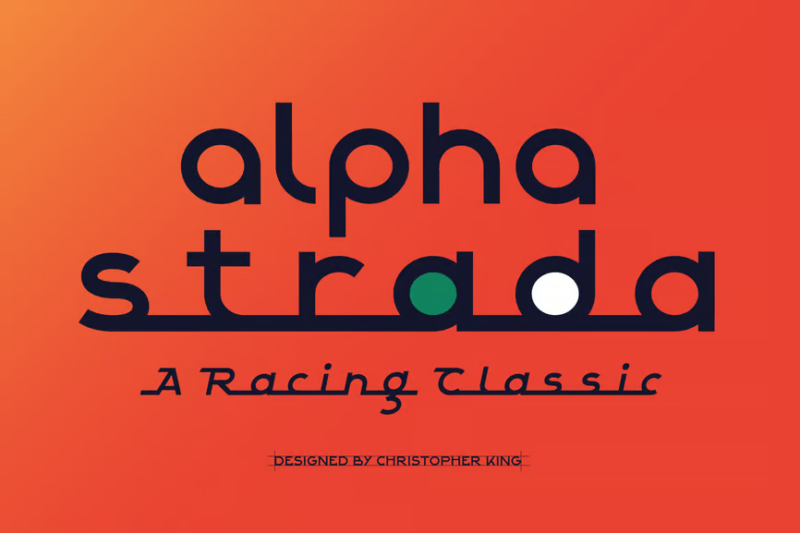
Alpha Strada is a sleek sans-serif font designed with motorsports in mind. Its clean lines and vintage-inspired details make it ideal for creating logos, headlines, and branding materials for luxury automotive brands and racing-related projects.
What Makes 50s Fonts So Distinctive?
The 1950s were a unique moment in American and global design history. Post-war optimism, technological innovation, and economic prosperity created the perfect environment for typographic experimentation. But what specific characteristics define the quintessential 50s font? Let’s break it down:
Bold Geometry and Clean Lines
The 50s embraced modernism with enthusiasm. Typography of the era often featured strong geometric shapes and clean, precise lines. This reflected the era’s fascination with science, technology, and the future. Fonts like Futura (though created earlier) found their perfect home in 50s design because of these qualities.
Exaggerated Serifs and Slabs
While geometric sans-serifs were popular, the 50s also loved dramatic serifs. Many advertising fonts featured exaggerated, chunky slab serifs that commanded attention on billboards and in magazine spreads. These weren’t your traditional book serifs – they were bold statements designed to grab attention in an increasingly competitive advertising landscape.
Playful Informality
Perhaps the most beloved 50s type style was the informal, hand-drawn look. These casual scripts and quirky display fonts captured the era’s sense of fun and optimism. Often slightly irregular and featuring bouncy baselines, these fonts felt personal and inviting – perfect for the friendly consumer culture emerging at the time.
Stylized Atomic Elements
The atomic age heavily influenced 50s design, and typography was no exception. Stars, starbursts, atoms, and boomerang shapes often appeared alongside (or integrated into) letterforms. These elements weren’t just decorative – they symbolized the era’s fascination with science and technology.
Distinctive Baseline Arrangements
Many 50s fonts played with letter positioning, placing characters at varying heights or angles. This created dynamic, energetic compositions that broke free from traditional typographic constraints. The result was text that seemed to move and dance across the page.
Where 50s Fonts Really Shine
Now that we understand what makes 50s fonts special, where can we put them to good use in modern design? These retro typefaces aren’t just for nostalgia projects – they have plenty of contemporary applications:
Restaurant and Food Service Branding
Diners, burger joints, ice cream parlors, and other food establishments can benefit enormously from the nostalgic appeal of 50s typography. The warmth and friendliness of these fonts evoke memories of classic American dining experiences, making customers feel welcome and comfortable.
Entertainment and Music
The 50s were a golden age for entertainment, and the typography reflects this vibrant energy. Bands, venues, festivals, and events with a retro vibe can leverage 50s fonts to establish an immediate connection to that exciting cultural moment. Rockabilly and early rock and roll aesthetics pair perfectly with these typefaces.
Apparel and Fashion
Clothing brands that want to capture a touch of vintage cool often turn to 50s typography. From t-shirts to labels to lookbooks, these fonts signal authenticity and timeless style. Particularly effective for brands with midcentury modern influences.
Automotive Industry
Car culture exploded in the 50s, and the typography of the era remains closely associated with classic automobiles. Auto shops, restoration services, car shows, and even modern vehicle brands looking for a touch of heritage can benefit from these fonts’ association with the golden age of American automotive design.
Holiday and Special Events
The 50s aesthetic has become intertwined with certain holidays and celebrations. From summer barbecues to Christmas festivities, 50s fonts can help establish a nostalgic, warm atmosphere that feels both special and familiar.
When to Avoid 50s Fonts
While 50s fonts are versatile and appealing, they’re not right for every project. Here are some contexts where you might want to consider other typographic options:
Corporate and Financial Services
Most 50s fonts project a casual, sometimes playful personality that might undermine the seriousness and stability expected from banks, investment firms, and other financial institutions. For these clients, more conservative typefaces usually work better.
Ultra-Modern Tech Companies
Unless they’re specifically going for a retro-futuristic vibe, cutting-edge technology firms might find 50s typography at odds with their forward-looking identity. The nostalgic associations could potentially distract from messages about innovation.
Luxury and Premium Brands
High-end luxury brands typically gravitate toward typography that signals exclusivity and refinement. The more playful, democratic nature of many 50s fonts might not align with the sophisticated image luxury brands want to project.
Academic and Scientific Publications
The personality-filled nature of 50s fonts usually makes them inappropriate for serious academic or scientific contexts, where clarity and neutrality are paramount. Save these expressive typefaces for contexts where their character adds value rather than distracts.
How to Choose the Perfect 50s Font
With so many fantastic options available, selecting the right 50s font for your project can feel overwhelming. Here’s my process for narrowing down the choices:
Identify the Specific 50s Sub-Era
The 1950s weren’t typographically monolithic – early 50s designs often carried influences from the 40s, while late 50s typography began showing elements that would define the 60s. Determine which part of the decade best matches your project’s needs.
Consider Regional Variations
American, European, and other regional interpretations of 50s design had their own distinct flavors. American 50s fonts tend to be bolder and more exuberant, while European versions often show more restraint and modernist influence. Choose accordingly.
Match to Specific Industries
Different industries developed their own typographic languages during the 50s. Automotive fonts differ from food service typography, which differs from entertainment lettering. Research period examples from your client’s specific industry for the most authentic approach.
Check Legibility at Required Sizes
Many 50s display fonts look fantastic as large signage but become illegible when reduced to smaller sizes. Ensure your chosen font performs well at all the sizes you’ll need for your project.
Consider Complementary Fonts
50s designs rarely used just one typeface. Think about font pairings that enhance the period feel while ensuring good typographic hierarchy. A bold 50s display font often pairs well with a more neutral sans-serif for body text.
Expert Tips for Using 50s Fonts Authentically
As someone who’s spent years studying and working with midcentury typography, I’ve gathered some insider knowledge on using these fonts effectively:
Color is Crucial
50s fonts rarely existed in isolation – they were part of a complete color palette. Pastels, particularly turquoise, pink, and yellow, were popular, as were bold primaries. The right color combinations can dramatically enhance the period authenticity of your typography.
Embrace Asymmetry
50s layouts often featured dynamic, asymmetrical arrangements. Don’t feel compelled to center everything – experiment with offset compositions that create energy and movement.
Add Period-Appropriate Illustrations
Typography in the 50s frequently appeared alongside distinctive illustration styles. Simple, geometric character illustrations or atomic-age motifs can help reinforce the midcentury feel of your designs.
Study Original Sources
The best way to understand 50s typography is to look at actual examples from the period. Visit antique stores, browse online archives, or check out books showcasing 50s advertisements, signage, and packaging. Notice how letterforms were used in their original context.
Don’t Overdo It
The most common mistake designers make with retro typography is going too far. You don’t need to use every 50s design element at once. Sometimes a single, well-chosen 50s font used with restraint can be more effective than a design that hits every midcentury note.
Fantastic 50s Font Alternatives
If you can’t find exactly what you need in midcentury-specific fonts, these alternatives can often capture a similar feeling while offering more versatility:
Classic Sans-Serifs with History
Fonts like Futura, Franklin Gothic, and Trade Gothic were all created before the 50s but were heavily used during the decade. These versatile workhorses can bring a touch of midcentury modernism while remaining timeless.
Modern Script Alternatives
Today’s digital type foundries offer many script fonts that capture the spirit of 50s hand-lettering without being direct reproductions. These can offer better language support and more refined details while maintaining that casual midcentury energy.
Neo-Retro Display Faces
Some contemporary designers have created typefaces that aren’t direct 50s revivals but capture the essence of the era while adding modern sensibilities. These can be perfect when you want to reference the 50s without creating a period piece.
Common 50s Font Questions
Let’s wrap up by addressing some frequently asked questions about 50s typography:
What font is used in 50s diners?
Classic diners often featured multiple font styles, but common choices included bold slab serifs for main signage, playful scripts for specialty items, and clean sans-serifs for menus. Fonts like Refrigerator Deluxe, Populaire, and Rocket Script capture this aesthetic well.
What is the classic 50s movie font?
1950s movie posters and titles used a variety of styles, but dramatic, condensed sans-serifs were particularly popular for thrillers and action films, while romantic comedies often featured elegant scripts. Fonts like Playbill, Hairpin Curves, and Thirsty Script Extrabold recreate these looks effectively.
What font was used in 50s advertising?
1950s advertising embraced typographic diversity, with different industries developing their own styles. However, hand-lettered scripts, bold geometric sans-serifs, and attention-grabbing display faces were common across many campaigns. Studying vintage magazines from the era reveals the incredible variety of approaches.
Are 50s fonts still relevant today?
Absolutely! 50s typography has shown remarkable staying power, regularly cycling back into contemporary design. The optimism, clarity, and personality of these fonts continue to connect with audiences across generations. While trends come and go, the distinctive character of 50s lettering remains an enduring influence on modern typography.
Conclusion: Embracing the Timeless Appeal of 50s Fonts
The 1950s gave us some of the most distinctive and beloved typography in design history. From diners to drive-ins, album covers to advertisements, the letterforms of this era continue to evoke powerful feelings of nostalgia, optimism, and cultural transformation.
As you explore the wonderful world of 50s fonts for your own projects, remember that the most successful retro designs don’t just copy the past – they reinterpret it for contemporary audiences. The best tribute to 50s typography isn’t slavish reproduction but creative evolution that respects what made these fonts special in the first place.
Whether you’re designing a rockabilly band poster, branding a new diner, or simply adding a touch of midcentury charm to a personal project, the right 50s font can transport viewers to a pivotal moment in design history – a time of boundless creativity, bold experimentation, and typographic joy.
So which of these fabulous 50s fonts caught your eye? Are you a fan of the bold geometric styles, or do the playful scripts speak to you more? Let me know in the comments below!