In this article:
- 18 Grooviest 60s-Inspired Fonts
- Why 60s Fonts Are Having a Moment
- Key Characteristics of 60s Typography
- How to Use 60s Fonts in Modern Design
- Where to Use 60s Fonts in 2026
- Common Mistakes to Avoid
- The Future of Retro: Why 60s Fonts Will Keep Trending
- Conclusion: Embracing the Groovy in 2026
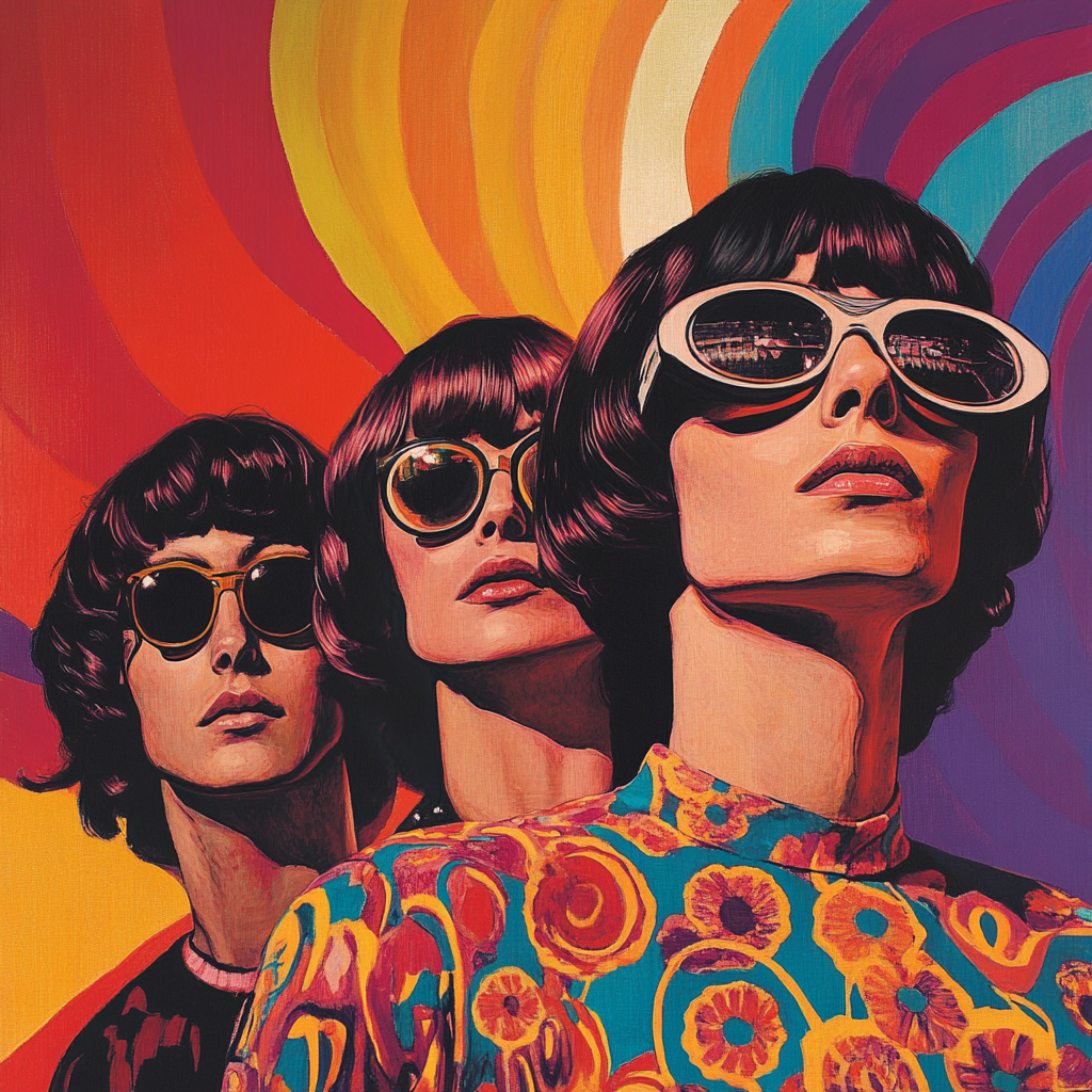
The swinging sixties brought us more than just incredible music and revolutionary fashion – it gave us some of the most iconic typography that continues to influence design today. As a long-time typography enthusiast, I’m constantly amazed by how these retro fonts manage to feel both nostalgic and surprisingly fresh in 2026.
Whether you’re working on a vintage-inspired project or looking to add some groovy vibes to your modern designs, 60s typography offers a perfect blend of playfulness and sophistication that’s incredibly relevant for today’s aesthetic landscape.
18 Grooviest 60s-Inspired Fonts
Flicking – Retro Vintage Font
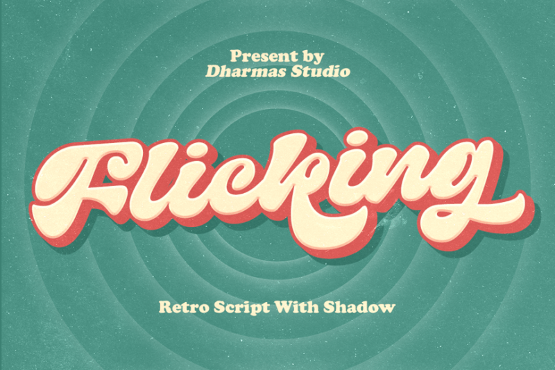
Flicking is a charming retro-inspired script font that exudes vintage charm. Its fluid strokes and playful curves make it perfect for creating eye-catching headlines or logos with a nostalgic feel. The font’s Cooper-inspired elements add a touch of classic Americana to any design.
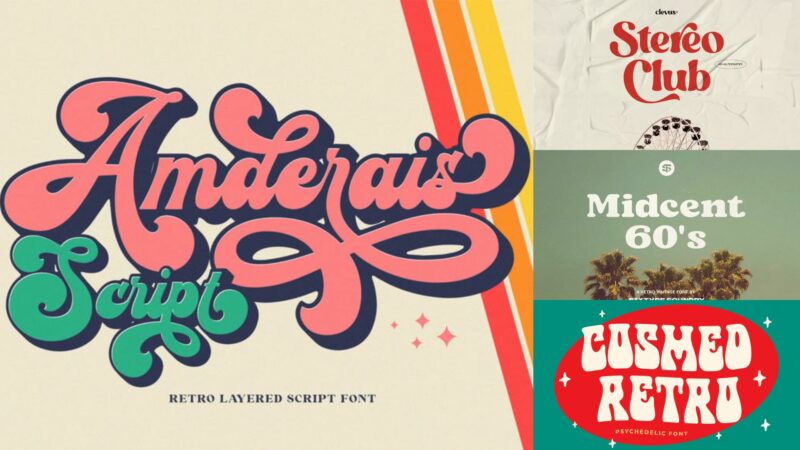
Amderais | Retro Layered Script Font
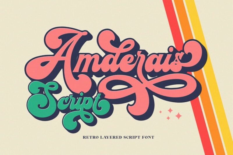
Amderais is a bold and dynamic retro script font with a layered design. Its thick strokes and dramatic curves create a strong visual impact, ideal for vintage-inspired branding or poster designs. The layered feature allows for creative color combinations and added depth to your typography.
Ramdone – Retro Script
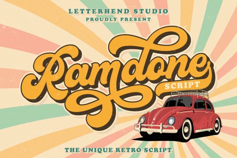
Ramdone is a groovy retro script font that captures the essence of 1970s design. Its bold, flowing lines and rounded edges give it a fun and carefree personality. This font is perfect for creating eye-catching headlines or logos with a distinct vintage vibe.
Royal Kingsley
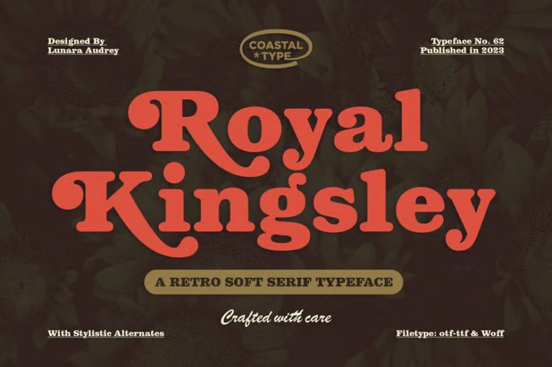
Royal Kingsley is an elegant serif font with a touch of vintage flair. Its regal swashes and ornate details make it ideal for high-end branding or luxury packaging design. The font’s retro influences add a timeless quality to any project requiring a sophisticated typographic treatment.
Vintage Bold Script Font
This Vintage Bold Script Font offers a powerful and confident handwritten style. Its thick strokes and natural flow make it perfect for creating impactful logos and branding materials. The font’s vintage charm adds character and authenticity to designs aiming for a classic, timeless appeal.

Get 300+ Fonts for FREE
Enter your email to download our 100% free "Font Lover's Bundle". For commercial & personal use. No royalties. No fees. No attribution. 100% free to use anywhere.
Peace and Love Font Duo
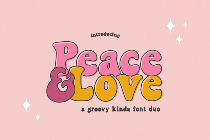
Peace and Love is a playful sans-serif font duo that captures the spirit of the 1960s counterculture. Its fat, rounded letters exude a friendly and approachable vibe. This versatile pair is perfect for creating groovy designs for music festivals, retro-themed events, or nostalgic branding projects.
Cosmed Retro Font
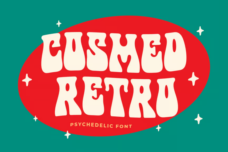
Cosmed is a chunky, retro-inspired decorative font that commands attention. Its bold geometric shapes and rounded corners give it a distinctly vintage feel reminiscent of 1970s design. This font is ideal for creating impactful headlines or logo designs with a strong retro aesthetic.
Magical Night
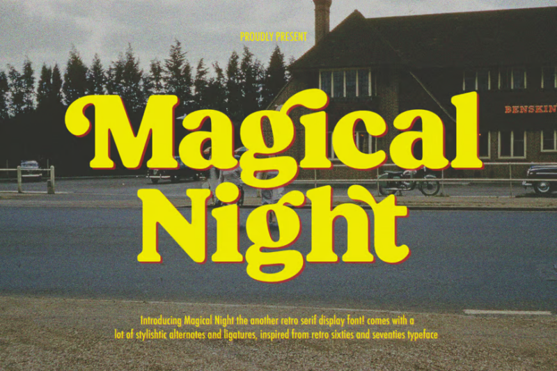
Magical Night is an enchanting serif font with a vintage twist. Its delicate lines and subtle flourishes evoke a sense of nostalgia and whimsy. This font is perfect for creating dreamy, romantic designs or adding a touch of retro elegance to branding and packaging projects.
Kosnat Trunks Retro Display Typeface
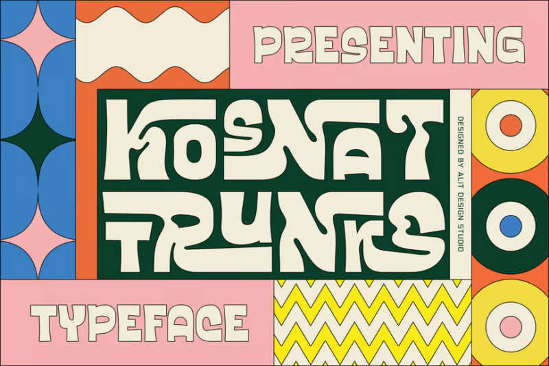
Kosnat Trunks is a bold retro display typeface with a nod to classic Oakley-inspired designs. Its chunky letterforms and unique angles create a strong visual impact, perfect for sports-related branding or energetic advertising campaigns. This font brings a dynamic, vintage-sport aesthetic to any project.
Chinook
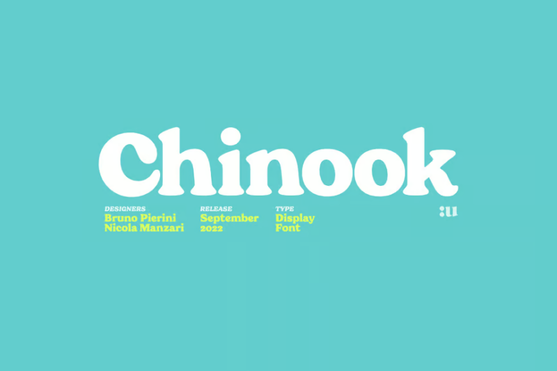
Chinook is a versatile serif display font with a modern twist on classic typography. Its clean lines and elegant alternates make it suitable for a wide range of design applications. This font strikes a balance between readability and distinctive character, perfect for both headlines and body text.
Kiera – Display Font
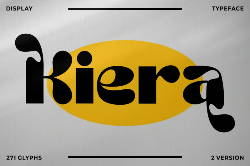
Kiera is a psychedelic display font that captures the essence of 1960s and 70s graphic design. Its flowing, organic forms and trippy curves create a mesmerizing visual effect. This font is ideal for creating eye-catching posters, album covers, or any design requiring a bold, retro-inspired typographic treatment.
Beautiful Love Font
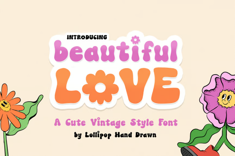
Beautiful Love is a playful sans-serif font with a touch of decorative flair. Its swinging, curvaceous letterforms evoke a sense of joy and affection. This font is perfect for creating designs related to love, relationships, or any project that requires a friendly and approachable typographic style.
Flower Power Font
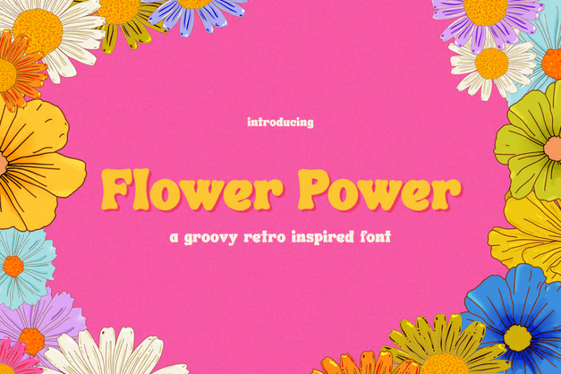
Flower Power is a groovy sans-serif font that embodies the spirit of the 1960s counterculture. Its bold, rounded letters and flower-inspired elements create a fun and nostalgic vibe. This font is ideal for vintage-inspired designs, music festival branding, or any project aiming to capture the essence of the hippie era.
Midcent 60s – Retro Black
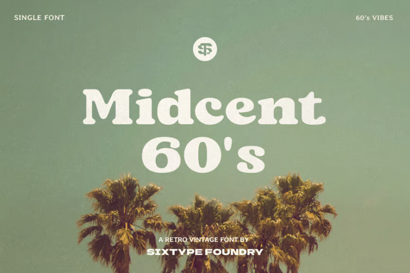
Midcent 60s is a bold, retro-inspired serif font that pays homage to mid-century typography. Its heavy weight and slight Cooper Black influence give it a strong, vintage character. This font is perfect for creating impactful headlines or logo designs with a distinct 1960s aesthetic.
Wicked Mouse
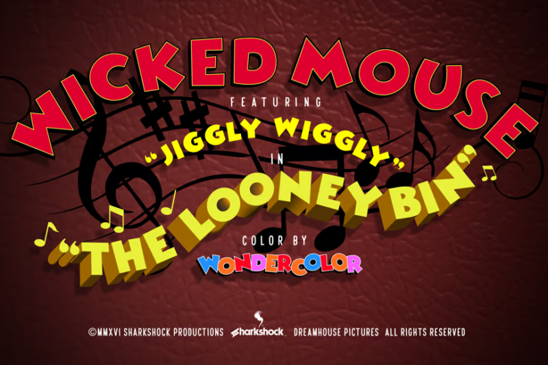
Wicked Mouse is a playful sans-serif font with a magical twist. Its 3D effect and whimsical curves give it a fun, cartoon-like quality. This font is ideal for children’s books, animated projects, or any design that aims to capture a sense of wonder and excitement.
Stereo Club
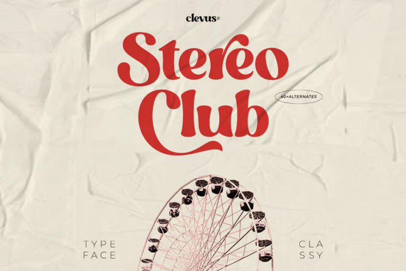
Stereo Club is a sophisticated serif font with a retro flair. Its clean lines and subtle vintage details create a classy, timeless appearance. This font is perfect for high-end branding, editorial design, or any project that requires a touch of nostalgic elegance.
Long Summer
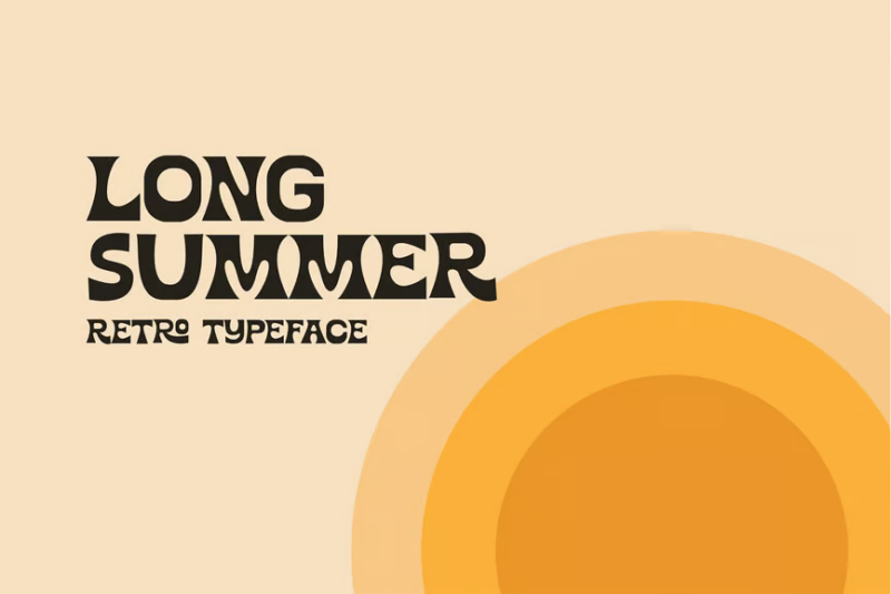
Long Summer is a versatile font family that includes script, serif, and sans-serif styles. Its retro-inspired design captures the carefree spirit of summer vacations. This font set is perfect for creating cohesive, nostalgic designs across various applications, from branding to editorial layouts.
Marthy – Psychedelic Retro Display
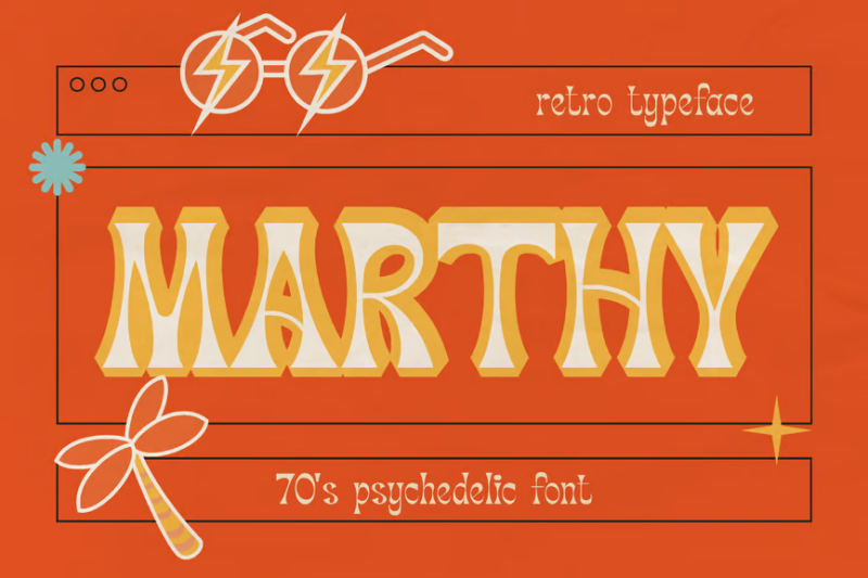
Marthy is a groovy, psychedelic display font that embodies the free-spirited aesthetic of the 1970s. Its fluid, organic forms and trippy curves create a bold visual impact. This font is ideal for creating eye-catching posters, album covers, or any design that aims to capture the essence of the carefree disco era.
Why 60s Fonts Are Having a Moment
The resurgence of 60s typography isn’t just about nostalgia – it’s about tapping into a unique creative energy that resonates with contemporary design needs. The era’s experimental approach to letterforms, combined with its bold, optimistic aesthetic, provides exactly the kind of standout visual impact that today’s designers are looking for.
What makes these fonts particularly relevant in 2026 is their ability to cut through the digital noise. In an age of minimalist sans-serifs and cookie-cutter corporate typography, 60s fonts offer personality and character that feels authentically human.
Key Characteristics of 60s Typography
The 60s were all about breaking rules and pushing boundaries, and this rebellious spirit is reflected in the era’s distinctive typographic traits:
Organic Curves: Unlike the rigid geometry of modern fonts, 60s typefaces embrace natural, flowing forms that feel hand-drawn and alive.
Bold Proportions: The decade loved extremes – either super-bold, chunky letterforms or delicate, spidery lines, with very little middle ground.
Psychedelic Influences: Warped perspectives, rainbow gradients, and undulating forms reflect the era’s experimental spirit.
Playful Serifs: When serifs appear in 60s fonts, they’re often exaggerated or decorative, turning traditional typography on its head.
How to Use 60s Fonts in Modern Design
Successfully incorporating 60s typography into contemporary designs requires a thoughtful approach. Here’s how to make these retro fonts work in 2026:
Balance with Modern Elements: Pair your groovy 60s font with clean, contemporary sans-serifs to create an interesting tension between old and new. This prevents your design from feeling like a pure throwback.
Color is Key: While the 60s were known for psychedelic color schemes, today’s applications often work best with a more restrained palette. Try using your 60s font in a single, bold color against a neutral background.
Scale Matters: 60s fonts tend to have strong personalities, so they usually work best at larger sizes where their unique details can shine. Use them for headlines, logos, and feature text rather than body copy.
Where to Use 60s Fonts in 2026
These versatile fonts find themselves at home in numerous contemporary applications:
Branding: For businesses wanting to convey creativity, authenticity, or a connection to craft and heritage.
Editorial Design: Magazine headlines and pull quotes that need to grab attention while maintaining readability.
Social Media: Where standout typography can help content break through the noise of crowded feeds.
Package Design: Especially for products targeting millennials and Gen Z, who appreciate authentic retro aesthetics.
Event Marketing: Perfect for music festivals, art shows, and cultural events that want to evoke a sense of creative freedom.
Common Mistakes to Avoid
While 60s fonts can be incredibly effective, there are some pitfalls to watch out for:
Over-Decoration: The 60s were maximalist, but in 2026, less is often more. Don’t feel obligated to use every decorative variant or color option just because they’re available.
Poor Pairing: These fonts have strong personalities – pairing them with equally distinctive typefaces can create visual chaos. Always balance them with simpler, more neutral options.
Inappropriate Context: While 60s fonts are versatile, they’re not suitable for every situation. Corporate annual reports or medical communications, for instance, usually require more conservative typography.
The Future of Retro: Why 60s Fonts Will Keep Trending
As we move further into 2026, the appeal of 60s typography shows no signs of waning. If anything, our increasing desire for authenticity and human connection in design makes these fonts more relevant than ever.
Their ability to convey warmth, creativity, and a touch of rebellious spirit continues to resonate with contemporary audiences. As designers seek ways to stand out in an increasingly digital world, these analog-inspired typefaces offer a perfect solution – one that bridges the gap between nostalgia and innovation.
Conclusion: Embracing the Groovy in 2026
The enduring appeal of 60s fonts lies in their unique ability to feel both timeless and timely. As we navigate the design landscape of 2026, these typefaces offer a welcome reminder that great design isn’t about following trends – it’s about creating meaningful connections through visual communication.
Whether you’re a seasoned designer or just starting to explore typography, 60s fonts provide an exciting toolset for creating distinctive, memorable work. Just remember: like all powerful design elements, they work best when used thoughtfully and with purpose.
So go ahead, embrace the groovy, and let these enduring typefaces bring some 60s spirit to your 2026 designs. After all, some things never go out of style – they just keep getting better with age.
