In this article:
- 1. Wordmark Logos
- 2. Lettermark Logos
- 3. Symbol Logos
- 4. Abstract Logos
- 5. Emblem Logos
- 6. Mascot Logos
- 7. Combination Logos
- Incorporate These Designs With Intention
I love talking to logo designers and learning what made them choose specific elements to include in their projects. They almost always mention the importance of in-depth conversations with clients to understand their businesses and goals. This initial discovery phase is crucial – it’s where you uncover not just what a client wants, but what their brand truly needs to communicate.
However, choosing an appropriate logo design for a client is also essential because it will help the public develop lasting impressions and may result in them repeatedly choosing certain businesses over others. A well-designed logo acts as a visual anchor for brand recognition, making it crucial to get it right from the start.
Learning about the main logo design types and seeing examples is a great way to get inspired and unleash your creativity. But before we dive into specific styles, remember these fundamental principles of logo design:
- Simplicity is key: A logo should be instantly recognizable and work at any size
- Color psychology matters: Choose colors that reflect your brand’s personality and industry
- Versatility is crucial: Your logo should work in both color and monochrome
- Timelessness over trends: Avoid design elements that might feel dated in a few years
Let’s explore the seven main types of logos and learn how to effectively implement each style.
1. Wordmark Logos
![]()
Wordmark logos rely entirely on text, using distinctive typography to create a strong brand identity. This style works exceptionally well for companies with strong, memorable names that can stand alone as their brand identifier.
Coca-Cola, for instance, uses a flowing, cursive script that exudes timelessness and nostalgia. The font choice wasn’t arbitrary – it reflected the handwriting style popular during the company’s founding era while remaining readable and distinctive.

Get 300+ Fonts for FREE
Enter your email to download our 100% free "Font Lover's Bundle". For commercial & personal use. No royalties. No fees. No attribution. 100% free to use anywhere.
Similarly, Visa’s clean, bold lettering reinforces its reliability and professionalism. These brands prove that a well-crafted font alone can make a logo instantly recognizable.
When designing a wordmark logo:
- Choose a font that reflects your brand’s personality
- Consider custom typography for uniqueness
- Ensure excellent legibility at all sizes
- Test the spacing between letters (kerning) carefully
- Create variations for different applications (horizontal, vertical, abbreviated)
2. Lettermark Logos
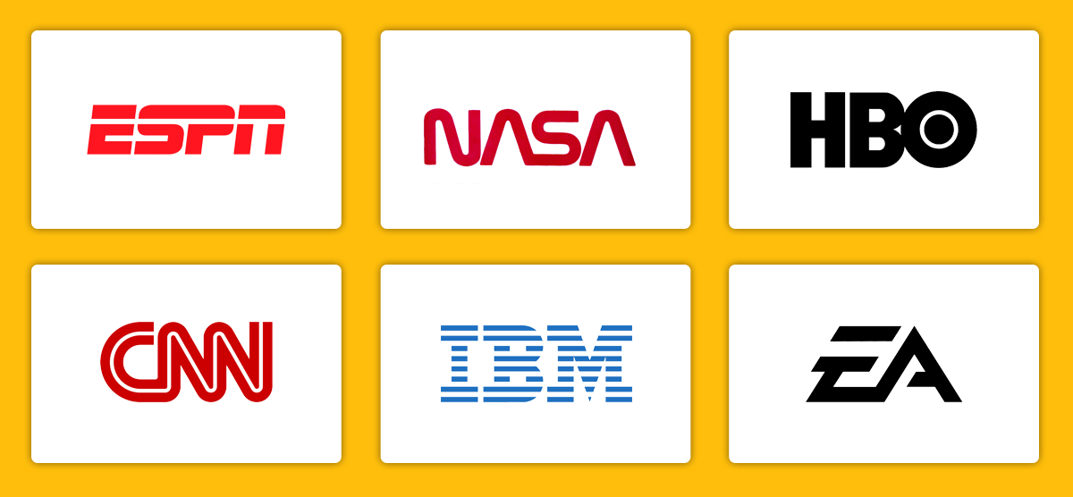
Lettermark logos simplify branding by using initials instead of full names. This approach is particularly effective for brands with lengthy names that need a more concise visual representation.
Think of ESPN, CNN, or NASA—each has condensed its brand into a sleek, memorable abbreviation. The key to successful lettermark design lies in making those few letters distinctive enough to stand out in a crowded marketplace.
These logos are ideal for brands with lengthy names, ensuring easy recognition and visual appeal while maintaining a professional aesthetic. They’re particularly popular in technology, media, and international businesses where brevity aids recognition across languages.
Design tips for lettermark logos:
- Experiment with letter combinations to find the most visually appealing arrangement
- Consider negative space opportunities
- Test the logo in various weights and sizes
- Ensure the initials are meaningful and memorable
- Create a balanced composition that works as a cohesive unit
3. Symbol Logos
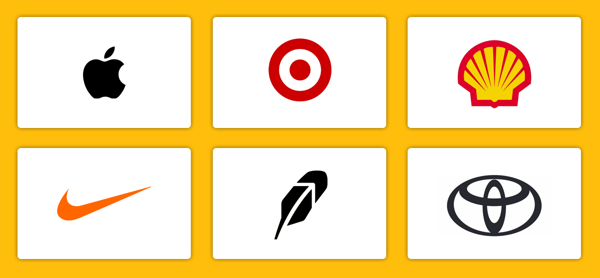
A symbol logo is a graphic-based logo without text, requiring careful consideration of visual metaphor and meaning. These logos must work exceptionally hard to convey brand identity without the crutch of text.
One standout example is the Robinhood logo, which uses a feathered arrow symbolizing upward financial growth. The design cleverly incorporates the company’s namesake through the feather element while suggesting positive financial movement.
Target’s bullseye and Apple’s minimalist apple silhouette also exemplify how an image alone can become synonymous with a brand’s identity. These logos succeed because they’re simple enough to be memorable yet distinctive enough to be unique.
Key considerations for symbol logos:
- Start with extensive sketching to explore various concepts
- Test the symbol’s recognition factor with different audiences
- Ensure the design works at extremely small sizes
- Consider cultural implications across different markets
- Create variations for different contexts (app icon, favicon, etc.)
4. Abstract Logos

Abstract logos use unique, non-representational shapes to convey a brand’s message. This style offers the freedom to create something truly unique that can evolve with the brand over time.
Adidas’ three-stripe design suggests movement and progress, while Mastercard’s overlapping circles symbolize financial trust and connectivity. These designs succeed because they create distinctive visual assets that can stand alone while conveying the brand’s core values.
Pepsi’s iconic sphere is another example, with its dynamic color waves creating an energetic brand presence. The design has evolved over time while maintaining its core visual elements, demonstrating the longevity possible with abstract logos.
Guidelines for abstract logo design:
- Begin with brand attributes and translate them into shapes
- Use color strategically to enhance meaning
- Consider movement and flow in the design
- Test the logo’s memorability with target audiences
- Create a story behind the abstract elements
5. Emblem Logos
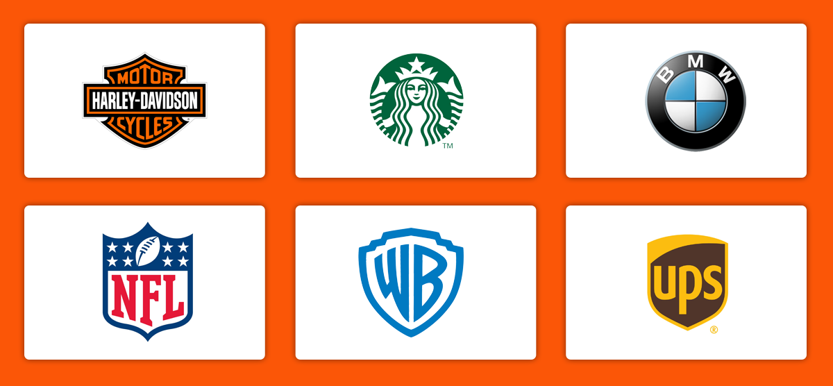
Emblem logos integrate text within a detailed symbol or crest, often evoking a classic, authoritative feel. This style works particularly well for institutions, educational organizations, and brands wanting to convey heritage and tradition.
Harley-Davidson’s badge-like logo reinforces its legacy of strength and rebellion, while Warner Bros.’ iconic shield design solidifies its Hollywood heritage. The contained nature of emblem logos creates a sense of authority and permanence.
UPS, with its sleek, shielded mark, communicates reliability and security in the logistics industry. The design manages to feel both traditional and modern, showing how emblem logos can evolve while maintaining their core characteristics.
Best practices for emblem logos:
- Ensure text remains legible at smaller sizes
- Create simplified versions for different applications
- Balance traditional elements with modern design principles
- Consider the shape’s symbolic meaning
- Test the logo in both positive and negative space
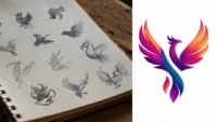
6. Mascot Logos
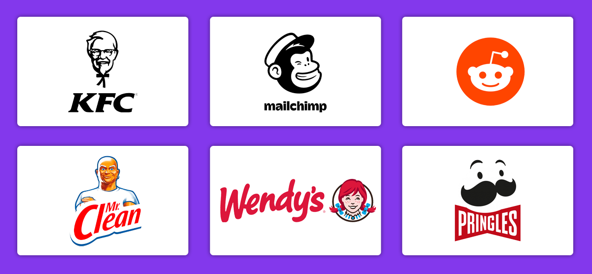
Brands using mascot logos incorporate illustrated characters to create a friendly and relatable image. This approach can be particularly effective for brands targeting families or wanting to add personality to their identity.
KFC’s Colonel Sanders is a classic example, making the brand feel personal and welcoming. The character has evolved over time while maintaining its core recognizable elements.
Similarly, Mailchimp’s chimp mascot adds a playful, approachable touch to an otherwise technical service, while Reddit’s smiling alien represents its fun, community-driven platform. These mascots succeed by creating emotional connections with audiences.
Tips for mascot logo design:
- Develop a character that reflects brand values
- Consider animation potential for digital applications
- Create various expressions and poses for different contexts
- Ensure the mascot works in silhouette
- Design with merchandising possibilities in mind
7. Combination Logos
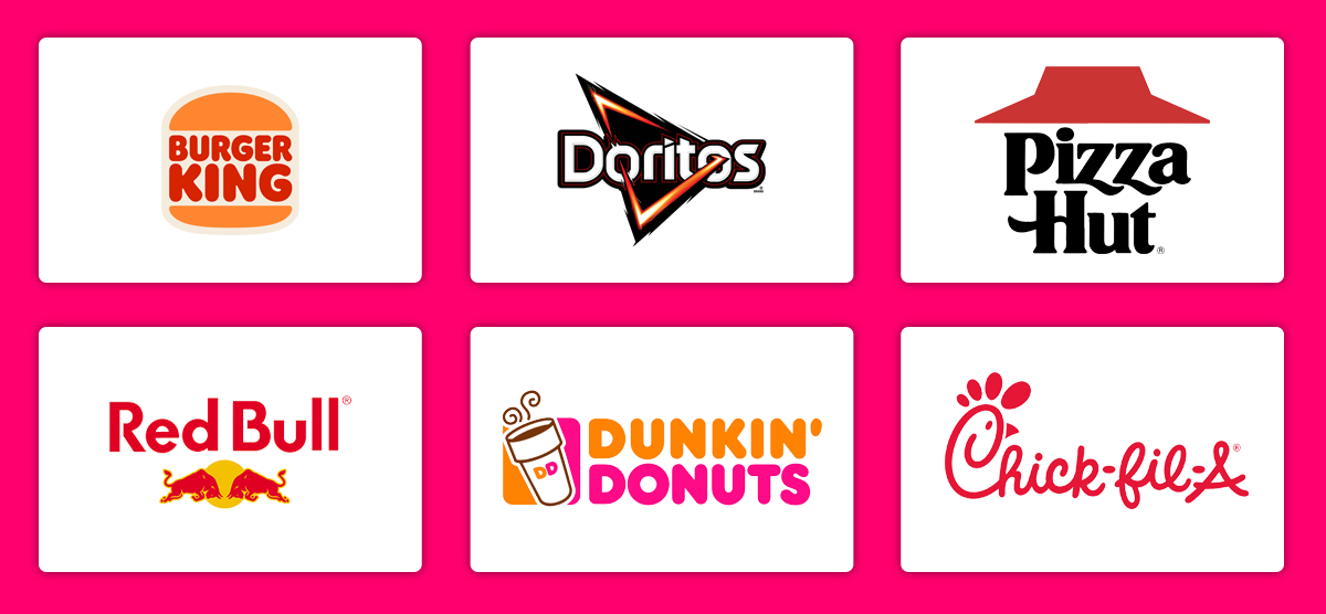
Combination logos blend text with an icon, offering versatility in branding. This approach provides the best of both worlds: instant recognition through imagery and clear brand identification through text.
Burger King’s logo integrates its name within a burger-like design, making the brand identity unmistakable. The design works both as a complete unit and with its elements separated for different applications.
Doritos uses bold typography alongside a triangular icon, reinforcing its signature chip shape. Red Bull’s charging bulls and rising sun create a dynamic visual identity that embodies energy and action. These logos succeed by creating memorable, cohesive designs that work across all platforms.
Strategies for combination logos:
- Ensure elements work both together and separately
- Create a clear hierarchy between text and symbol
- Design for various formats and orientations
- Consider how elements can be animated for digital use
- Test different arrangements of text and symbol
Incorporate These Designs With Intention
I hope this overview and examples of logo designs will help you feel more confident when tackling your next project. In addition to following the best practices described here, communicate with your client to get their ongoing input and ideas as you develop different possibilities.
Remember that great logo design is an iterative process. Don’t be afraid to explore multiple directions and refine your work based on feedback. The goal is to create something that not only looks good but effectively serves its purpose as a brand identifier.