

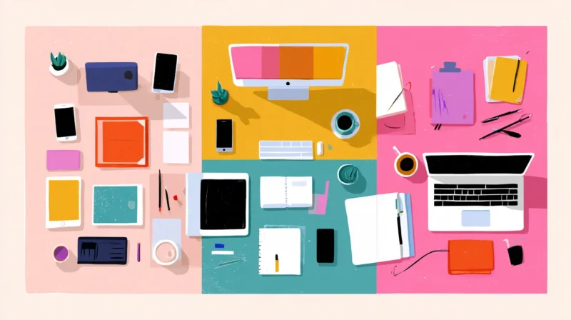
Confession: my desk used to be a mess of colors I never chose on purpose. A grey mouse from an old job, a navy desk mat that was on sale, a lime green mug somebody gave me at a conference. None of it was bad on its own. Together, it looked like the bottom of a junk drawer.
What finally fixed it wasn’t buying a whole new setup. I picked a palette and started asking one boring question before every purchase: does this fit?
And yes, I’m counting the tiny stuff. My phone sits on that desk for most of the day, usually face up on a charging stand, so its case is basically a little block of color I look at a hundred times between meetings. Once I noticed that, I started treating it as part of the setup.
So here are seven workspace palettes I’d happily live with. Each one has five hex codes you can copy into Figma, Canva or whatever you use, plus a few ideas for the desk, the tech and a phone case that pulls the look together.
A Quick Note on Using These
None of this is a rulebook. Roughly speaking, the lightest shade works best on big surfaces like walls, desktops or a full-size desk mat. Middle tones go on chairs, shelves and storage boxes. Save the darkest or brightest colors for small things you see up close, like cables, a mouse, a mug or your phone.
Designers often talk about a 60/30/10 split (main color, secondary, accent), and it’s a handy starting point for a desk too. Design Work Life’s own muted color palettes use a pretty similar approach, if you want more to play with.
In practice, a lot of that 10% ends up being your phone. It’s on the desk all day, usually face up, and it’s the one piece you can change in seconds. That’s why each palette below comes with a phone case suggestion. They’re all from BURGA, a design brand that creates its prints in-house, mainly because its iPhone 18 Pro Max cases come in so many designs that I could find a close match for every palette. If your phone sits on a magnetic stand, go for BURGA Tough, BURGA Elite or BURGA Elite Mirror, which are all MagSafe compatible.
7 Workspace Color Palettes
1. Oat Milk Studio
-
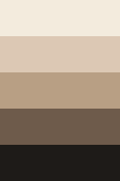
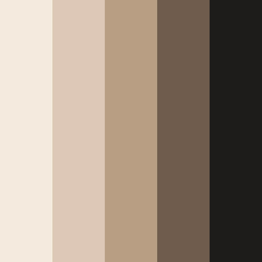
 #F3EBDD


-
#DCC8B4
-
#B89F84
-
#6E5B4B
-
#1E1B18
Download this color palette
 735×1102
Pinterest image
 2160×3840
Vertical wallpaper

 900×900
Square
 3840×2160
4K Wallpaper


Get 300+ Fonts for FREE
Enter your email to download our 100% free "Font Lover's Bundle". For commercial & personal use. No royalties. No fees. No attribution. 100% free to use anywhere.
Cream, warm sand and one almost-black. This is the light wood desk, linen pinboard, beige ceramic mug kind of palette. Calm, warm, a little Scandinavian.
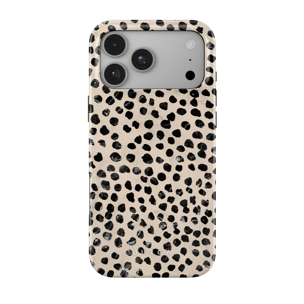
I’d build this one around an oak or birch desk, a cream keyboard with dark keys and a sandy felt mat. My pick for the phone is BURGA Almond Latte. It’s a cream case with scattered black spots, so you get the lightest and darkest colors in the palette on one small object.
2. After Hours Monochrome
-
#0F0F10
-
#2B2B2E
-
#8A8A8F
-
#CFCFCF
-
#F5F5F2
Download this color palette
 735×1102
Pinterest image

 2160×3840
Vertical wallpaper

 900×900
Square

 3840×2160
4K Wallpaper

Black, graphite, two cool greys and an off-white so the whole thing doesn’t feel like a cave. Very “my setup could be in a product video.”
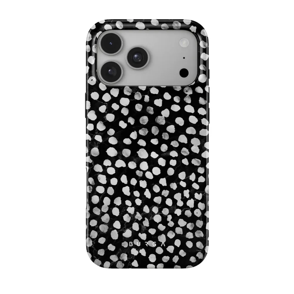
Think black mat, space grey keyboard and mouse, matte black lamp. Put a warm bulb in that lamp, by the way, or it all gets a bit dentist’s office. For the phone, BURGA Night Sky is a dark print covered in tiny light dots. It reads as plain black from across the room, then you pick it up and there’s texture.
3. Lisbon Blue
-
#1F2A6B
-
#2E4A8C
-
#A9BCE0
-
#E8EEF7
-
#F7F3EA
Download this color palette
 735×1102
Pinterest image

 2160×3840
Vertical wallpaper

 900×900
Square

 3840×2160
4K Wallpaper

Deep ink blue with sky and chalk. Blue desks are weirdly easy to focus at. They look good on Instagram too, if you’re that kind of person (no judgment, I am).
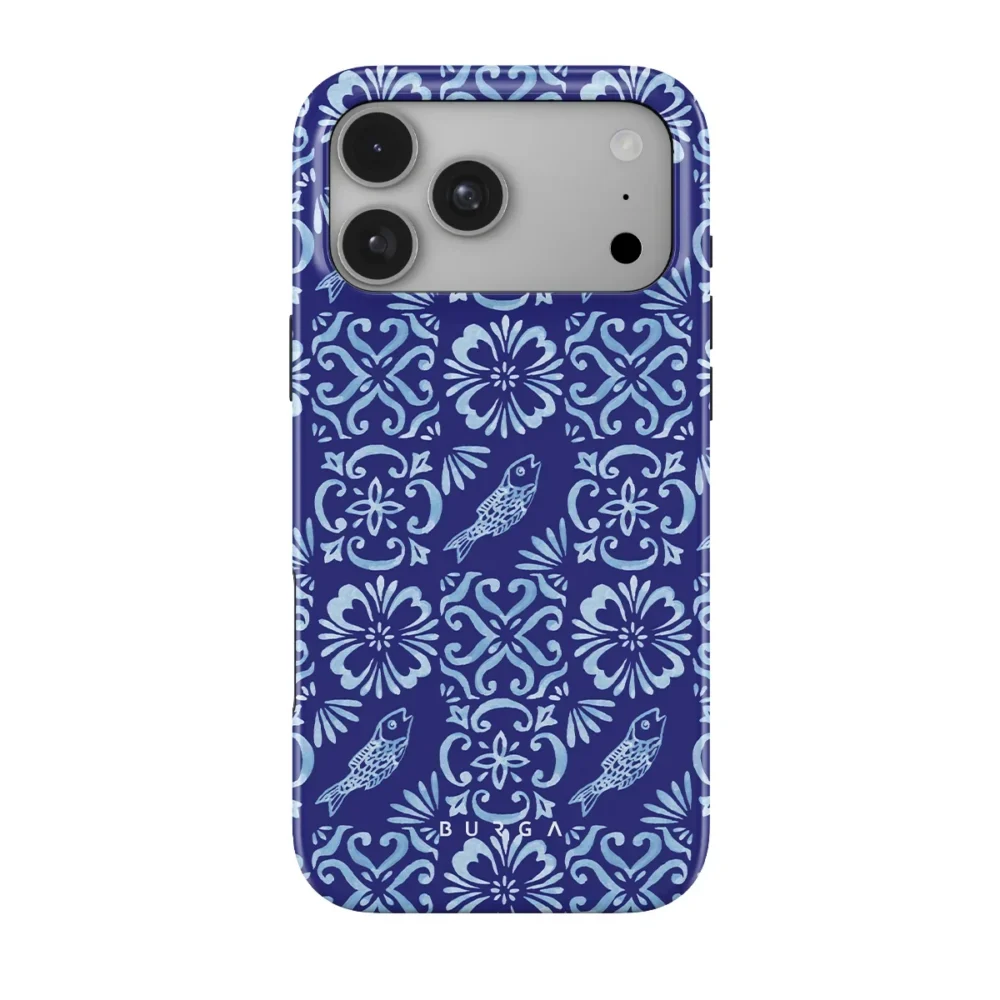
Go with a navy mat, a white keyboard and some blue-and-white ceramics for pens. BURGA Lisboa is basically made for this desk. Same deep blues, little lighter blue details, done.
4. Quiet Prep
-
#14163C
-
#3B4A6B
-
#C9B79C
-
#F2E2CC
-
#FAF6EE
Download this color palette
 735×1102
Pinterest image

 2160×3840
Vertical wallpaper

 900×900
Square

 3840×2160
4K Wallpaper

Navy and cream. Basically the colors of a good blazer. It’s a bit traditional, which I mean as a compliment, and it suits a home office that’s also your reading corner.
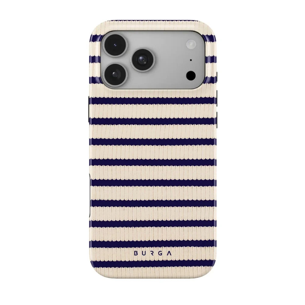
Walnut works great here, so does anything with a dark stain. Add a leather or cream desk pad and a couple of brass bits. BURGA Old Money is the phone case I’d pair with it, since it mixes the same cream and navy and somehow manages to look classic without being stuffy about it.
5. Slate and Koi
-
#5F7488
-
#8FA3B5
-
#E8E3DA
-
#C2653A
-
#8A3B24
Download this color palette
 735×1102
Pinterest image

 2160×3840
Vertical wallpaper

 900×900
Square

 3840×2160
4K Wallpaper

Dusty slate blue warmed up with burnt orange. Go easy on the orange, though. I’d stop at a cable and a notebook. Maybe a print.
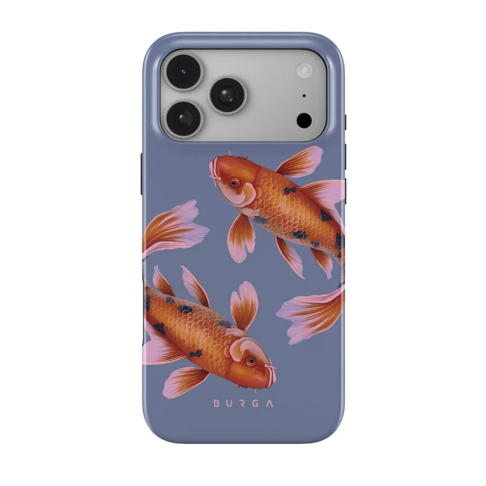
Grey-blue walls, light grey tech and one terracotta planter get you most of the way. The phone case that finishes it is BURGA Zen, golden koi swimming on a calm blue background. Hold it up next to these hex codes and they line up almost perfectly.
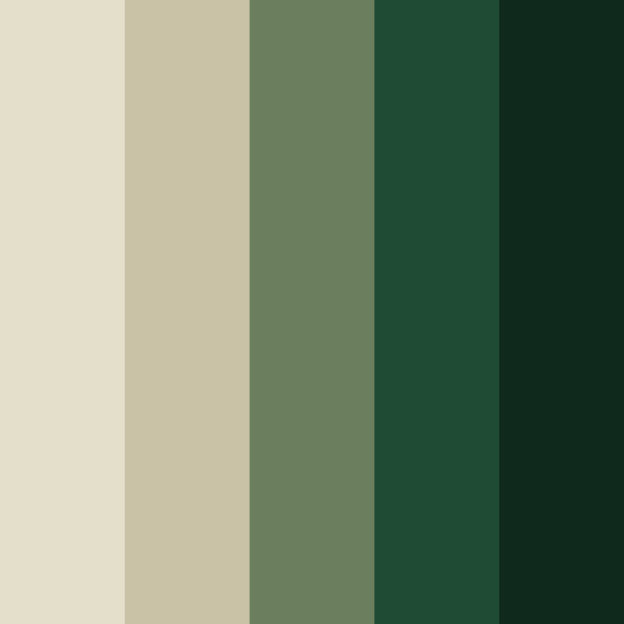
6. Old-World Green
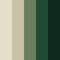
-
#E4DFCB
-
#C9C2A6
-
#6B7F5E
-
#1F4A33
-
#0F2A1D
Download this color palette
 735×1102
Pinterest image

 2160×3840
Vertical wallpaper

 900×900
Square
 3840×2160
4K Wallpaper
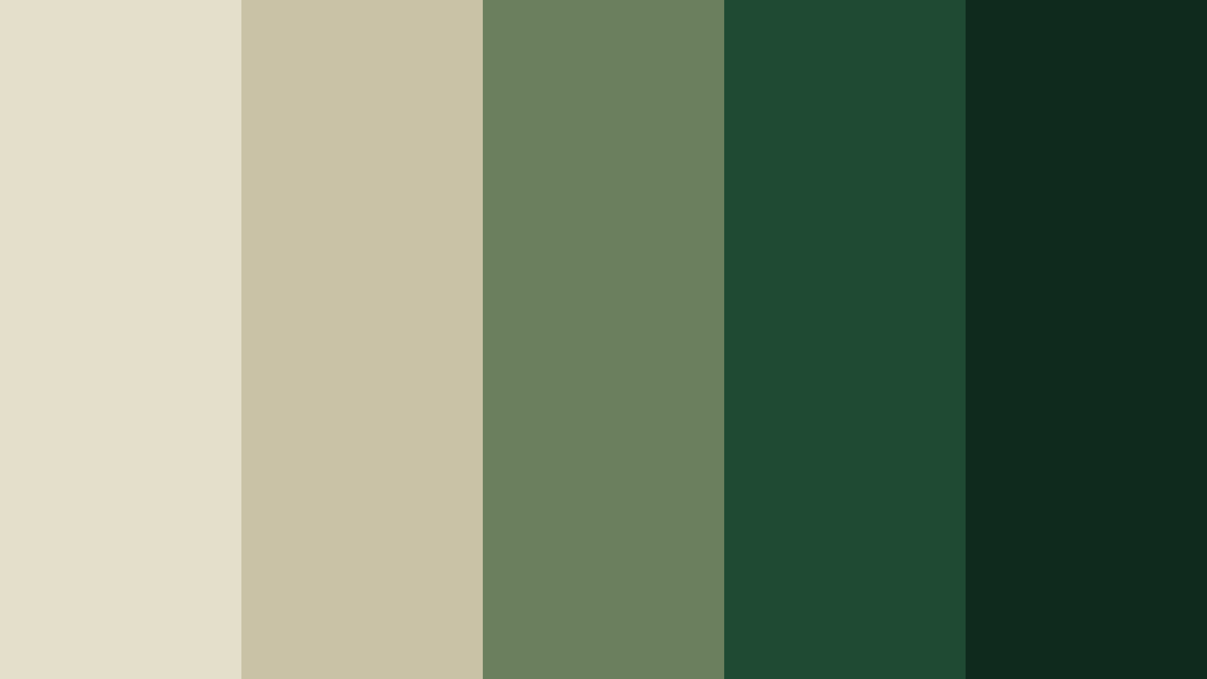
Parchment, olive and a deep forest green. If you’d rather your office felt like an old library than a startup, this is your one. Real plants, if you can keep them alive.
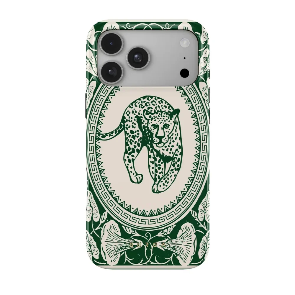
Picture a banker’s lamp (or anything vintage-ish), green glass, lots of wood. Then the fun part: BURGA Antique, which has refined green details and a leopard sitting on a nude background. I didn’t expect to like it this much with the greens, but I do.
7. Pastel Pop
-
#F27BA2
-
#B8B6E0
-
#F3DE8F
-
#F05A5A
-
#FFF6EC
Download this color palette
 735×1102
Pinterest image

 2160×3840
Vertical wallpaper

 900×900
Square

 3840×2160
4K Wallpaper

Bubblegum pink, lilac, butter yellow, plus a red so it doesn’t get too sugary. Keep the big surfaces white or very light and let the small things do the talking.
White desk, pastel keycaps, a lilac mat, a messy stack of sticky notes. You get the idea. BURGA Roller Disco swirls pink, yellow and blue together, so it’s pretty much this whole palette squeezed onto a phone.
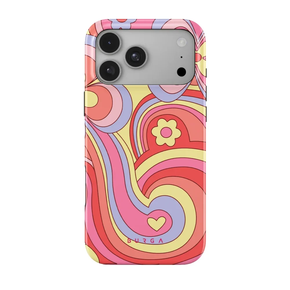
Most of a desk setup stays put for years. The phone doesn’t. It sits right in front of you all day, and a case takes seconds to swap, so it’s the easiest place to test a color before you commit to a new desk mat or lamp.
There’s a practical side too. If your phone lives on a magnetic stand or charger, pick a MagSafe-compatible case.
A Few Things I Learned the Hard Way
Work around what’s staying. Your desk finish, wall color and floor aren’t going anywhere, so choose a palette that likes them.
Two accents, max. One is usually plenty. Five starts to look like an accident.
Watch your bulbs. I learned this one the annoying way. Warm bulbs make creams and wood look lovely and blues look kind of dead, and daylight bulbs flip that around.
Test with the small stuff first. Not sure about a color? Live with it on your phone case for a few weeks before you buy the matching desk mat.
Use each color at least twice. If the koi orange is on your phone, add it once more somewhere, a notebook or a cable maybe. That repetition is what makes a desk look planned.
Wrapping Up
Good desks come from a bit of planning, not a big shopping spree. Grab one of these palettes, save the hex codes, and run every new purchase past it, right down to your phone. A case in a matching print is one of the easiest places to start, and it’s the piece you’ll end up looking at most.