In this article:
- The 8 Most Bewitching Halloween Color Palettes
- Why Halloween Colors Cast Such a Powerful Spell
- Bringing Halloween Palettes to Life in Modern Design
- The Cultural Magic Behind Halloween Color Traditions
- Adapting Halloween Palettes Across Different Design Disciplines
- Conclusion: Embracing the Dark Side of Design
As a designer who absolutely lives for the spooky season, I can’t help but get excited when October rolls around and Halloween colors start making their grand entrance. There’s something utterly captivating about the way deep oranges dance with midnight blacks, and how eerie purples can transform an ordinary design into something truly haunting. If you’re ready to embrace the darker side of design and add some supernatural charm to your projects, you’ve stumbled upon the perfect treasure trove of inspiration.
Whether you’re crafting a bone-chilling brand identity, designing invitations for a monster mash, or simply wanting to infuse your work with that perfect Halloween atmosphere, these eight carefully curated color palettes will have you conjuring up designs that are absolutely to die for.
The 8 Most Bewitching Halloween Color Palettes
1. Classic Midnight Terror
-
 #FF4500


-
#000000
-
#8B4513
-
#2F4F4F
Download this color palette
 735×1102
Pinterest image

 2160×3840
Vertical wallpaper

 900×900
Square

 3840×2160
4K Wallpaper

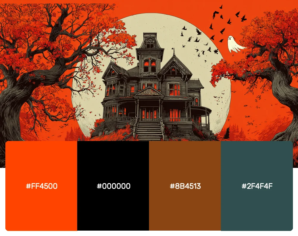
Nothing beats the timeless combination that’s been sending shivers down spines for generations. This palette captures the essence of traditional Halloween with its deep, rich tones that feel both familiar and mysteriously alluring. I find myself reaching for these colors whenever I want to create something that feels authentically spooky without being too over-the-top. It’s perfect for vintage Halloween projects or when you want that classic haunted house vibe.
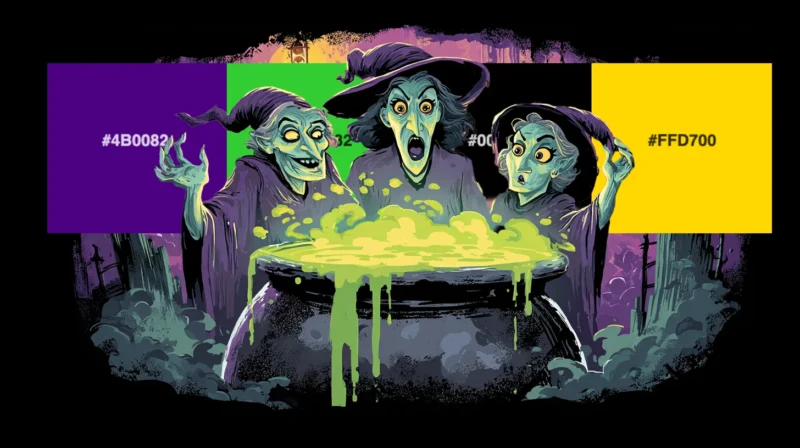
2. Witch’s Brew
-
#4B0082
-
#32CD32
-
#000000
-
#FFD700
Download this color palette
 735×1102
Pinterest image

 2160×3840
Vertical wallpaper

 900×900
Square

 3840×2160
4K Wallpaper

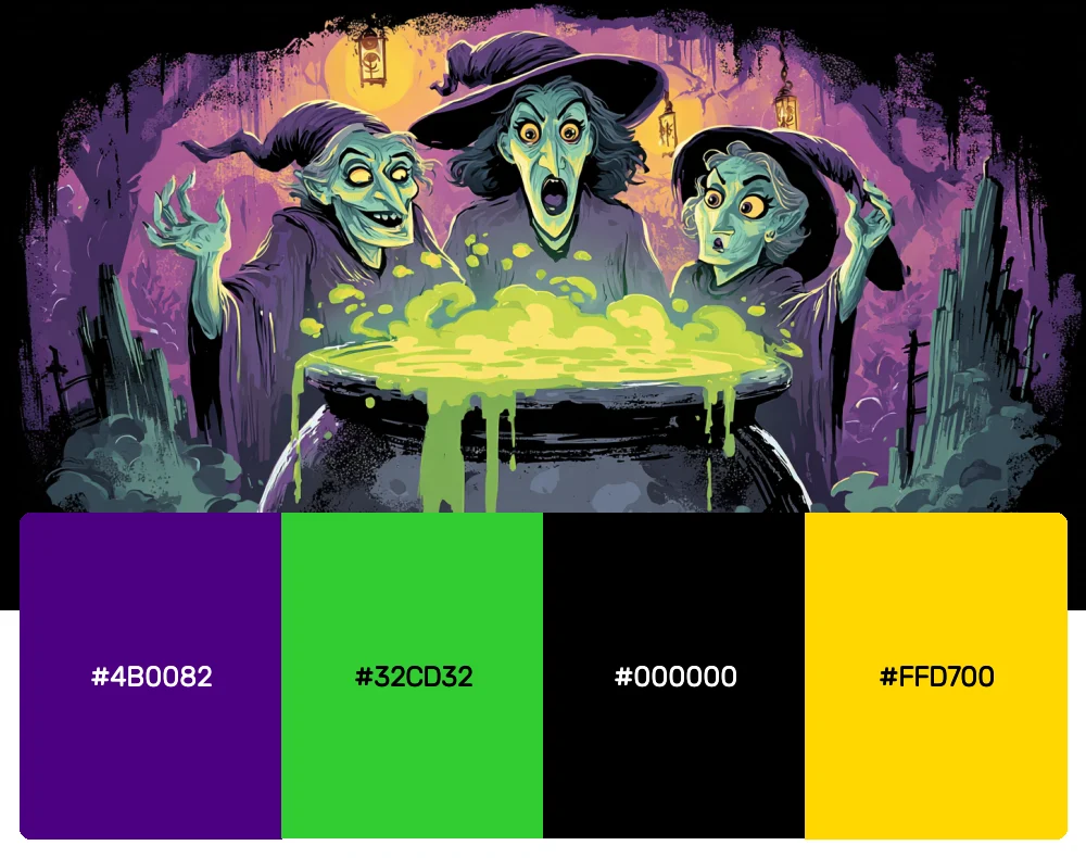
Step into the witch’s lair with this enchanting palette that combines the mystical depths of indigo with an otherworldly lime green. The touch of gold adds that magical shimmer you’d expect to find bubbling in a cauldron. I love using this combination for projects that need a touch of supernatural elegance – think upscale Halloween events or mystical branding that doesn’t want to feel too commercial.
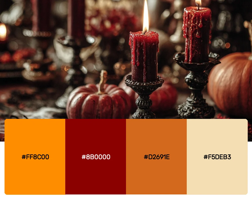
3. Pumpkin Patch Sunset
-
#FF8C00
-
#8B0000
-
#D2691E
-
#F5DEB3
Download this color palette
 735×1102
Pinterest image
 2160×3840
Vertical wallpaper

 900×900
Square

 3840×2160
4K Wallpaper


Get 300+ Fonts for FREE
Enter your email to download our 100% free "Font Lover's Bundle". For commercial & personal use. No royalties. No fees. No attribution. 100% free to use anywhere.
Inspired by those perfect autumn evenings when the sun casts everything in a warm, golden glow, this palette brings together the cozy comfort of harvest season with just enough darkness to keep things interesting. The deep crimson adds drama while the wheat tone keeps everything grounded in that harvest festival feeling. This one’s my go-to for family-friendly Halloween designs that still pack a visual punch. If you like this one, you’ll also like these 10 autumn/fall color palettes.
4. Gothic Glamour
-
#800080
-
#C0C0C0
-
#000000
-
#8B0000
Download this color palette
 735×1102
Pinterest image

 2160×3840
Vertical wallpaper

 900×900
Square

 3840×2160
4K Wallpaper
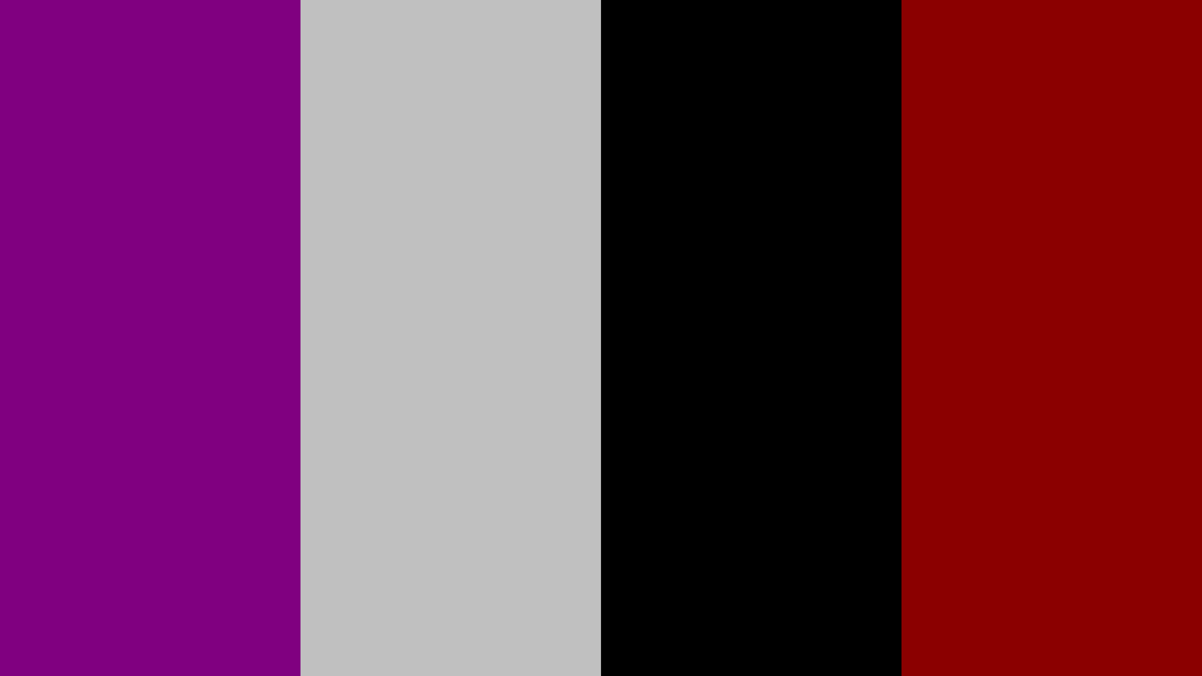
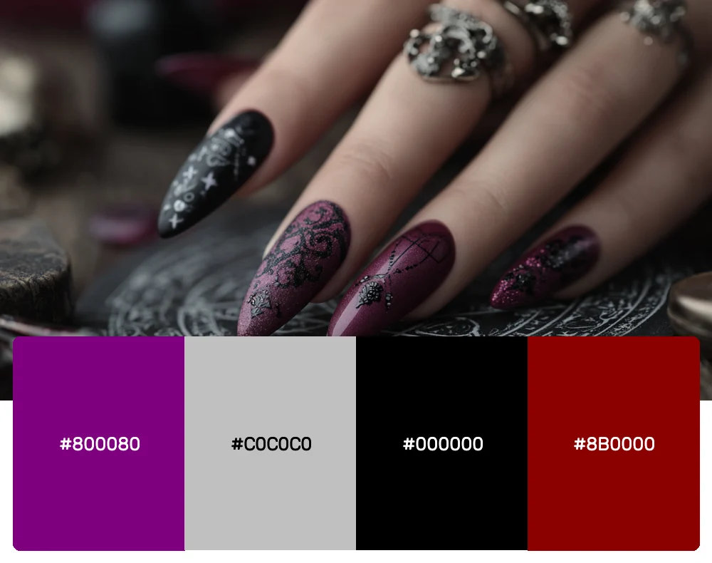
For those moments when Halloween needs to feel sophisticated and slightly dangerous, this palette delivers in spades. The rich purple paired with metallic silver creates an air of mysterious elegance, while the deep burgundy adds just the right amount of vampire-worthy drama. I often turn to these colors when designing for upscale Halloween parties or gothic-inspired fashion projects.
5. Ghostly Apparition
-
#F8F8FF
-
#708090
-
#2F2F2F
-
#E6E6FA
Download this color palette
 735×1102
Pinterest image

 2160×3840
Vertical wallpaper

 900×900
Square

 3840×2160
4K Wallpaper

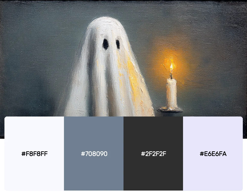
Sometimes the most haunting designs come from restraint, and this ethereal palette proves that point beautifully. These muted, ghostly tones create an atmosphere that’s more unsettling than scary – perfect for subtle Halloween themes or when you want to evoke that spine-tingling feeling without going full horror. I find this palette works wonderfully for elegant Halloween weddings or sophisticated seasonal branding. And don’t forget to pair with a nice ghostly font too.
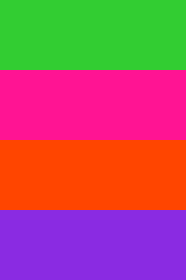
6. Monster Mash
-
#32CD32
-
#FF1493
-
#FF4500
-
#8A2BE2
Download this color palette
 735×1102
Pinterest image
 2160×3840
Vertical wallpaper

 900×900
Square

 3840×2160
4K Wallpaper

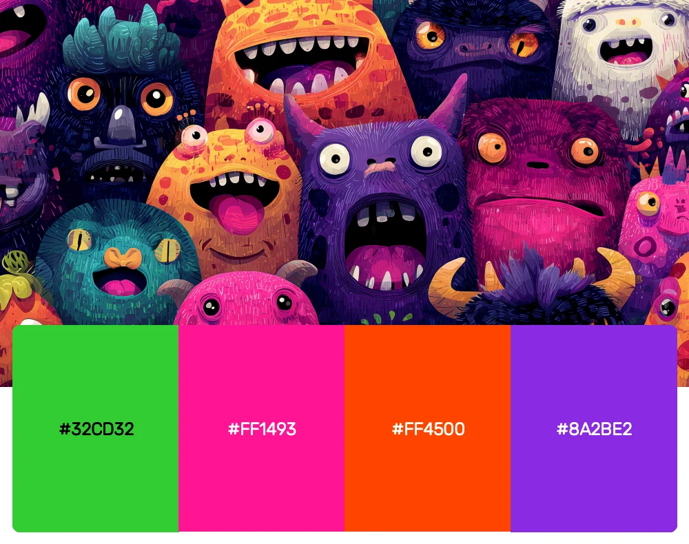
When you want your Halloween designs to feel fun, playful, and just a little bit crazy, this electric combination brings all the energy of a monster dance party. These bold, almost neon hues capture that cartoonish horror vibe that’s perfect for kids’ Halloween events or retro-inspired spooky designs. It’s loud, it’s proud, and it’s guaranteed to get attention. Especially when paired with a fun monster-themed font.
7. Autumn Cemetery
-
#8B4513
-
#556B2F
-
#2F4F4F
-
#F4A460
Download this color palette
 735×1102
Pinterest image

 2160×3840
Vertical wallpaper

 900×900
Square

 3840×2160
4K Wallpaper

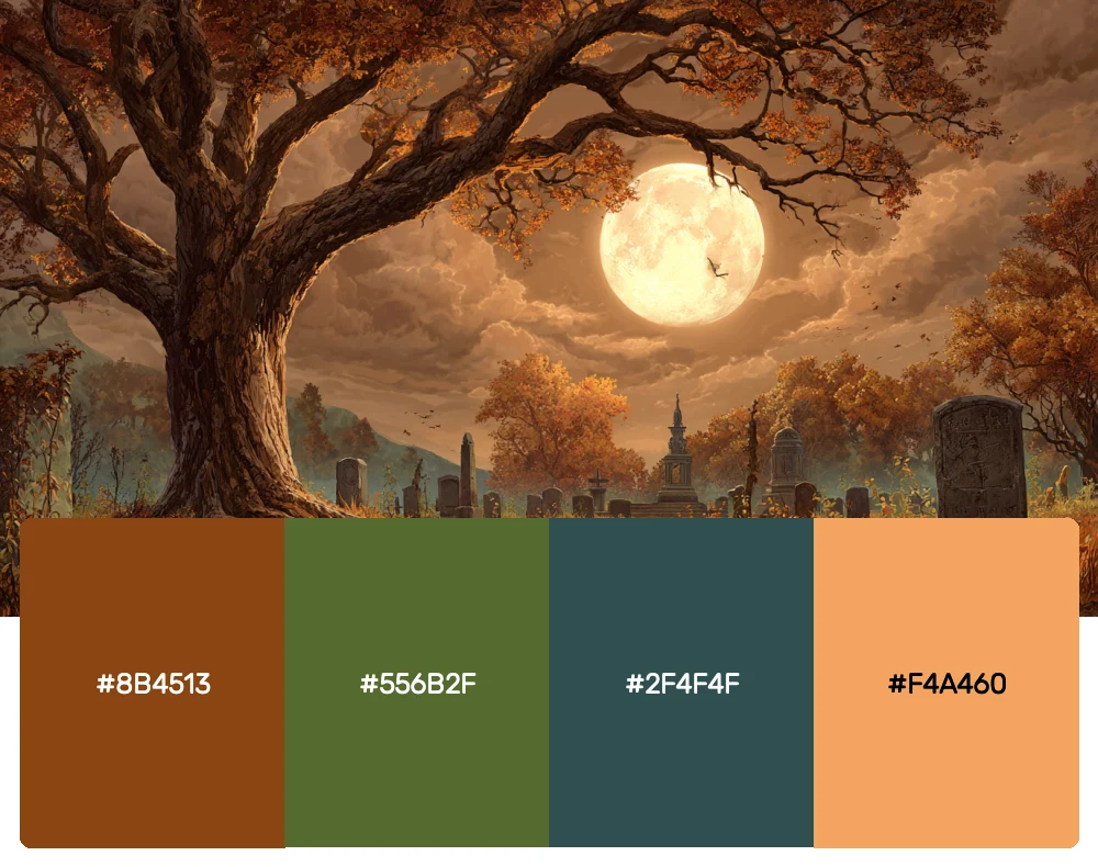
This earthy, muted palette draws inspiration from those atmospheric cemetery scenes where fallen leaves carpet ancient gravestones. The combination of deep browns and olive greens creates a naturally spooky feeling that doesn’t rely on bright oranges or jet blacks. I love using this for more subtle Halloween projects or when I want to capture that melancholy beauty of late autumn.
8. Blood Moon Rising
-
#DC143C
-
#000000
-
#B22222
-
#800000
Download this color palette
 735×1102
Pinterest image

 2160×3840
Vertical wallpaper

 900×900
Square

 3840×2160
4K Wallpaper

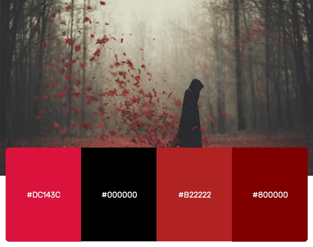
Dark, dramatic, and undeniably powerful, this monochromatic red palette is for those times when you want to create something truly intense. The varying shades of crimson and burgundy create depth while maintaining that ominous, blood-soaked atmosphere. This palette is perfect for horror-themed projects, vampire-inspired designs, or any time you need colors that command respect and maybe just a little bit of fear.
Why Halloween Colors Cast Such a Powerful Spell
Before we dive deeper into how to use these palettes, it’s worth exploring why Halloween colors have such a profound psychological impact on us. The traditional Halloween palette didn’t just appear out of thin air – these colors have deep cultural and psychological associations that make them perfect for creating that spine-tingling atmosphere we crave during spooky season.
Orange, for instance, is associated with autumn, harvest, and the changing seasons, but in darker contexts, it can feel fiery and dangerous. Black has long been linked with mystery, death, and the unknown, making it the perfect backdrop for supernatural themes. Purple carries connotations of magic and mysticism, while deep reds evoke everything from passion to danger to, well, blood.
As a designer, I’ve found that understanding these psychological triggers helps me choose the right Halloween palette for each project. Are you trying to create family-friendly fun or genuine scares? Do you want cozy autumn vibes or full-on horror atmosphere? The colors you choose will set the entire tone for your design.
Bringing Halloween Palettes to Life in Modern Design
Now that we’ve explored these hauntingly beautiful color combinations, you might be wondering how to incorporate them into contemporary projects without your designs looking like they crawled out of a 1950s horror movie. Here’s what I’ve learned about modernizing Halloween aesthetics:
Start with Sophisticated Typography
One of the quickest ways to update Halloween colors for modern use is pairing them with the right halloween fonts. I love the contrast of a sleek sans-serif font against those deep, moody Halloween hues. It creates an intriguing tension between old and new that feels fresh and current.
Use Strategic White Space
Halloween palettes can be intense, so giving them room to breathe is crucial. Don’t be afraid of white space – it helps prevent your design from feeling overwhelming and allows those rich colors to really shine. Think of white space as the calm before the storm, making your spooky colors even more impactful when they appear.
Embrace Subtle Gradients
Modern design loves subtle transitions, and Halloween colors work beautifully in gentle gradients. Try blending a deep orange into black, or letting purple fade into midnight blue. These soft transitions feel contemporary while maintaining that supernatural atmosphere.
Mix in Unexpected Textures
Consider incorporating Halloween colors through textures and patterns rather than solid blocks. Watercolor effects, distressed textures, or subtle grain can add sophistication to even the boldest Halloween palette.
The Cultural Magic Behind Halloween Color Traditions
As someone who’s always been fascinated by design history, I love exploring how Halloween color traditions developed. The association between orange and black for Halloween isn’t random – it stems from ancient Celtic traditions where orange represented the harvest and the changing seasons, while black symbolized the approaching winter and death.
The addition of purple to Halloween palettes came much later, influenced by the Victorian fascination with spiritualism and the supernatural. Green entered the Halloween color story through its association with witchcraft and otherworldly beings, while deep reds have always carried connotations of danger, passion, and the macabre.
Understanding this rich history helps me appreciate why these color combinations feel so naturally Halloween-appropriate. They’re not just arbitrary choices – they’re the result of centuries of cultural associations and symbolic meaning.
Adapting Halloween Palettes Across Different Design Disciplines
One of the things I find most exciting about Halloween color palettes is their incredible versatility. They can be adapted to work beautifully across various design fields:
Brand Identity and Logo Design
Halloween-inspired palettes aren’t just for October projects. I’ve used these rich, dramatic color combinations for year-round branding, particularly for businesses that want to convey sophistication, mystery, or creativity. A deep purple and gold combination can feel luxurious and magical, while orange and black can convey energy and boldness.
Interior and Event Design
In interior design, Halloween palettes can create incredibly atmospheric spaces that work well beyond the spooky season. Deep oranges and browns create warm, cozy environments, while purples and blacks can add drama and sophistication to any room. For event design, these colors can transform ordinary venues into extraordinary experiences.
Digital and Web Design
While Halloween colors might seem too bold for web design, I’ve found they can create memorable and engaging digital experiences when used thoughtfully. Consider using them for accent colors, hover effects, or call-to-action buttons. The key is balance and knowing when to let these powerful colors take center stage and when to let them play supporting roles.
Fashion and Product Design
The fashion world regularly draws inspiration from Halloween palettes, and for good reason. These rich, complex colors photograph beautifully and create striking visual impact. In product design, Halloween-inspired colors can help products stand out on crowded shelves while conveying personality and attitude.
Conclusion: Embracing the Dark Side of Design
As we’ve journeyed through these eight spine-tingling Halloween color palettes, I hope you’ve discovered new ways to incorporate the magic and mystery of spooky season into your design work. These aren’t just colors for October – they’re powerful tools for creating atmosphere, emotion, and unforgettable visual experiences year-round.
The key to successfully using Halloween palettes lies in understanding their psychological impact and cultural significance, then applying them with intention and creativity. Don’t be afraid to experiment, but also remember that sometimes the most haunting designs come from restraint and subtlety rather than going full monster mash.
Whether you’re designing a sophisticated brand identity that needs a touch of mystery, creating event materials that demand attention, or simply wanting to add some dramatic flair to your next project, these Halloween-inspired palettes offer endless possibilities for creative expression.
So go ahead, embrace your inner designer witch or warlock. Mix those potions of orange and black, conjure up some purple magic, or cast a spell with deep, mysterious reds. After all, the best designs often come from stepping into the shadows and discovering what lurks there. Happy haunting, and even happier designing!