In this article:
- The 8 Most Captivating Pink Color Palettes
- Why Pink Palettes Are Dominating Design in 2025
- Mastering Pink Palettes in Modern Design
- The Psychology Behind Pink's Appeal
- Applying Pink Palettes Across Design Disciplines
- The Future of Pink in Design
- Conclusion: Embracing Pink's Power
I can confidently say that pink is having its moment—and it’s not going anywhere. Far from being just a “girly” color, pink has evolved into one of the most versatile and sophisticated hues in the design world. Whether you’re creating a brand identity, designing a website, or planning an interior space, the right pink palette can convey everything from playful energy to elegant sophistication.
I’ve curated 8 exceptional pink color palettes that showcase the incredible range and potential of this remarkable color. Each palette tells its own story and offers unique possibilities for your creative projects.
The 8 Most Captivating Pink Color Palettes
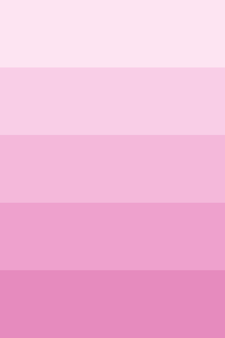
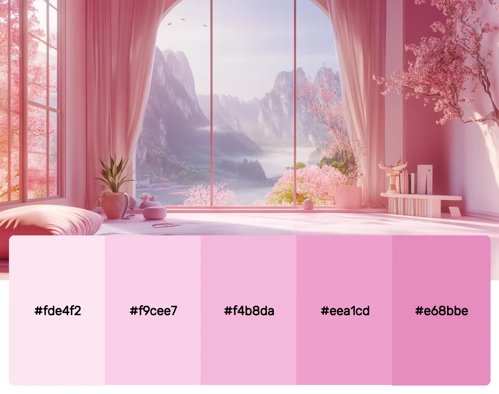
1. Blushing Romance
-
 #fde4f2


-
#f9cee7
-
#f4b8da
-
#eea1cd
-
#e68bbe
Download this color palette
 735×1102
Pinterest image
 2160×3840
Vertical wallpaper

 900×900
Square

 3840×2160
4K Wallpaper
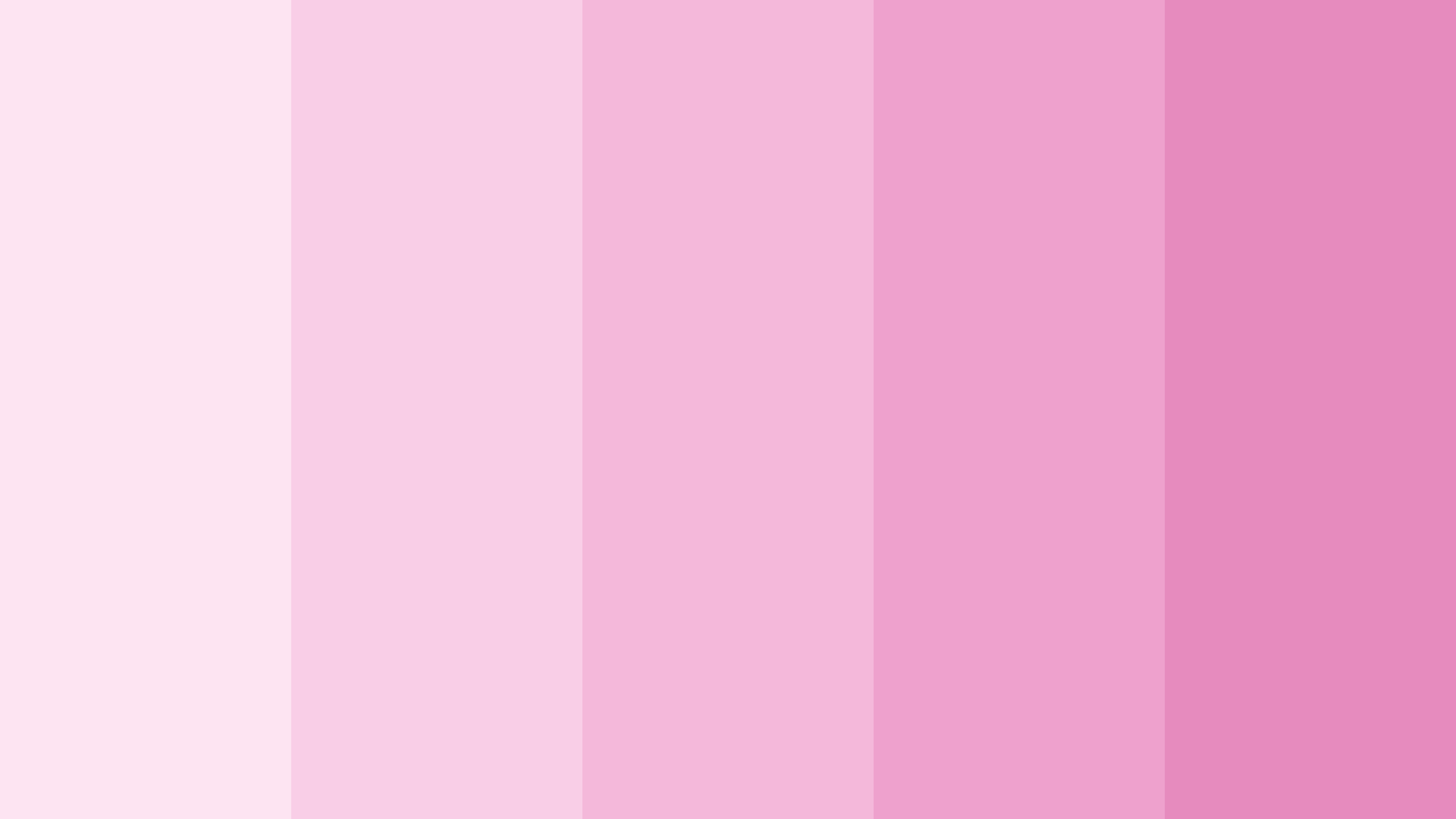
This dreamy gradient palette captures the essence of soft femininity without being overwhelming. I love how these gentle pinks flow seamlessly from barely-there blush to deeper rose tones. It’s perfect for wedding brands, beauty products, or any project that needs to feel tender and romantic while maintaining sophistication.
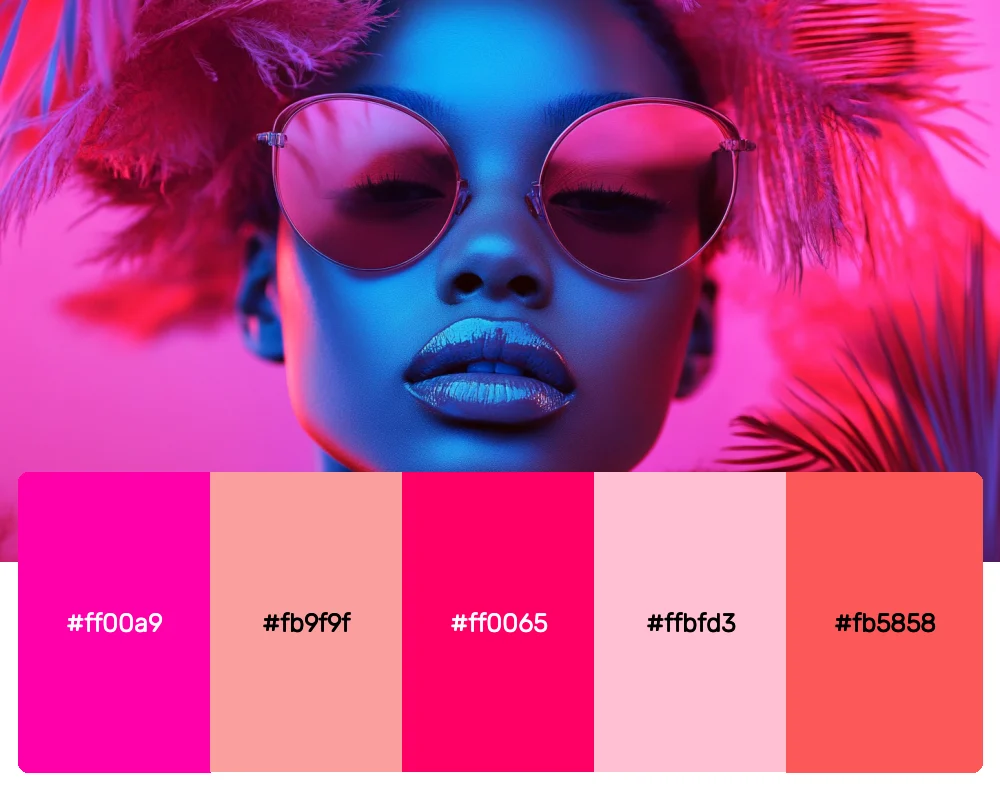
2. Electric Passion
-
#ff00a9
-
#fb9f9f
-
#ff0065
-
#ffbfd3
-
#fb5858
Download this color palette
 735×1102
Pinterest image

 2160×3840
Vertical wallpaper

 900×900
Square

 3840×2160
4K Wallpaper

When you need to make a bold statement, this high-energy palette delivers. The vibrant magentas and corals create an electric tension that’s impossible to ignore. I often reach for these colors when working on fashion brands, entertainment projects, or anything that needs to pulse with life and excitement.
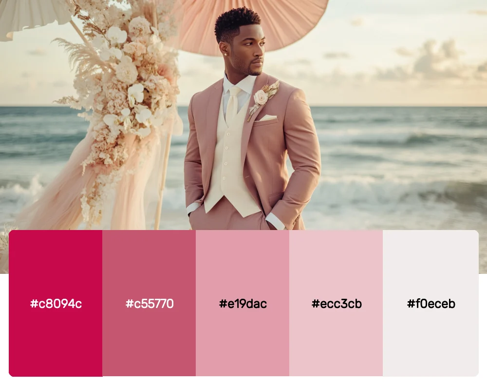
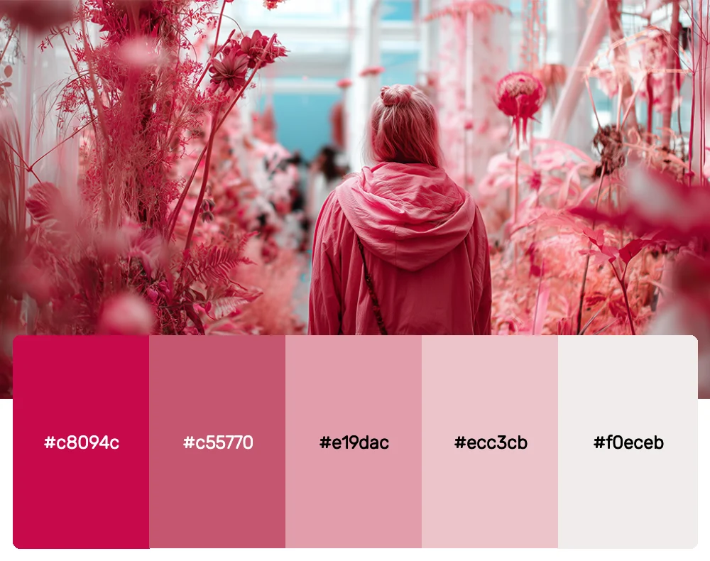
3. Vintage Berry
-
#c8094c
-
#c55770
-
#e19dac
-
#ecc3cb
-
#f0eceb
Download this color palette
 735×1102
Pinterest image

 2160×3840
Vertical wallpaper

 900×900
Square

 3840×2160
4K Wallpaper

This sophisticated palette bridges the gap between pink and burgundy, offering a mature take on the color family. The deep berry tones paired with soft roses create a palette that feels both timeless and contemporary. It’s my go-to choice for luxury brands or projects that need gravitas without sacrificing warmth.

Get 300+ Fonts for FREE
Enter your email to download our 100% free "Font Lover's Bundle". For commercial & personal use. No royalties. No fees. No attribution. 100% free to use anywhere.
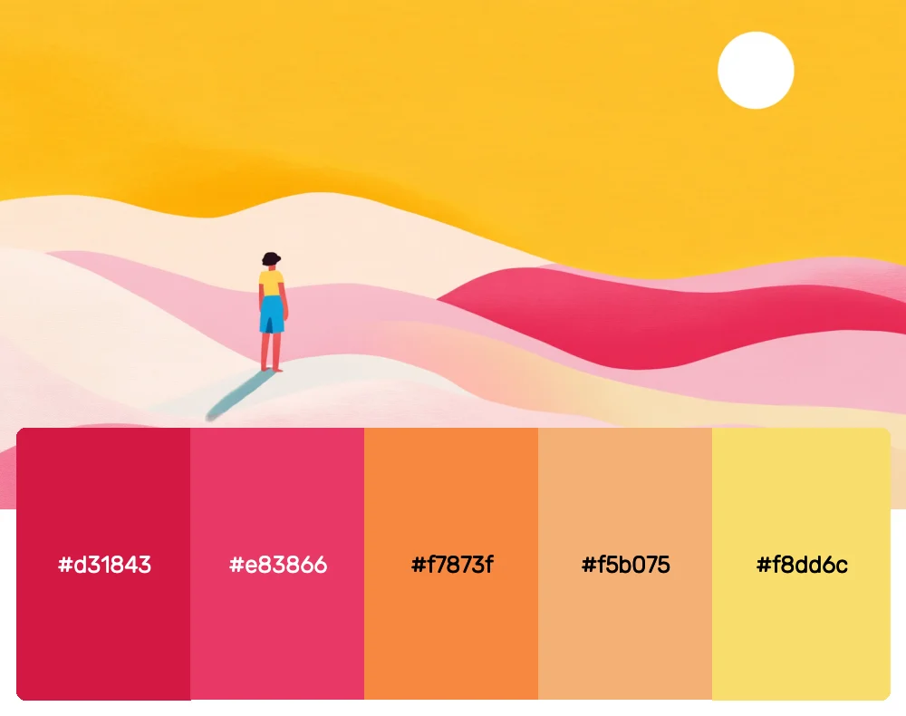
4. Sunset Bloom
-
#d31843
-
#e83866
-
#f7873f
-
#f5b075
-
#f8dd6c
Download this color palette
 735×1102
Pinterest image

 2160×3840
Vertical wallpaper

 900×900
Square

 3840×2160
4K Wallpaper

Who says pink can’t play well with other colors? This vibrant palette seamlessly blends passionate pinks with warm oranges and sunny yellows, creating a gradient that feels like a perfect sunset. I love using this combination for lifestyle brands, travel companies, or any project that needs to feel optimistic and adventurous.
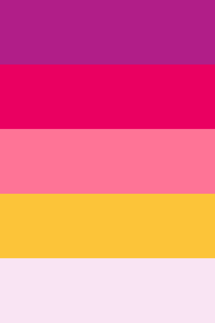
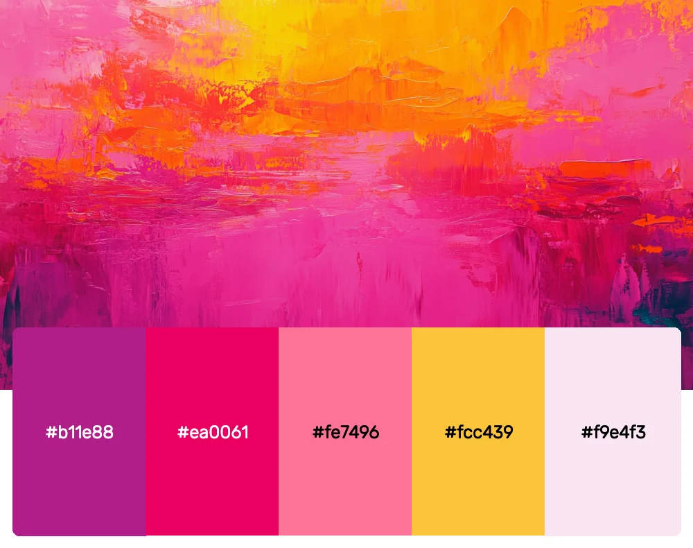
5. Neon Dreams
-
#b11e88
-
#ea0061
-
#fe7496
-
#fcc439
-
#f9e4f3
Download this color palette
 735×1102
Pinterest image
 2160×3840
Vertical wallpaper

 900×900
Square

 3840×2160
4K Wallpaper

This palette captures the electric energy of neon signage and club lights. The contrast between the intense magentas and the bright yellow creates a dynamic tension that’s both retro and futuristic. It’s perfect for tech startups, music brands, or any project that wants to feel cutting-edge and bold.
6. Dusty Rose Garden
-
#c8094c
-
#c55770
-
#e19dac
-
#ecc3cb
-
#f0eceb
Download this color palette
735×1102Pinterest image
2160×3840Vertical wallpaper
900×900Square
3840×21604K Wallpaper
Sometimes the most beautiful palettes are the ones that whisper rather than shout. These muted, dusty pinks feel like they’ve been kissed by time, offering a vintage charm that’s incredibly versatile. I find myself using this palette for everything from artisanal brands to minimalist websites where subtlety is key.
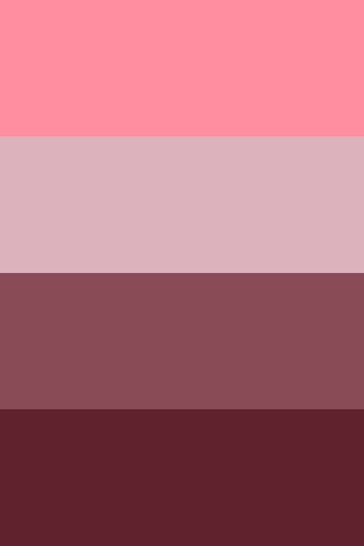
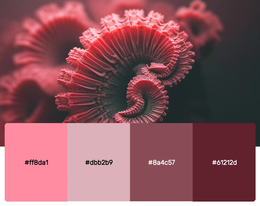
7. Coral Crush
-
#ff8da1
-
#dbb2b9
-
#8a4c57
-
#61212d
Download this color palette
 735×1102
Pinterest image
 2160×3840
Vertical wallpaper

 900×900
Square

 3840×2160
4K Wallpaper

This palette explores pink’s relationship with brown and burgundy, creating a sophisticated color story that feels both earthy and elegant. The coral pinks paired with deeper berry tones create depth and richness that works beautifully in both digital and print applications.
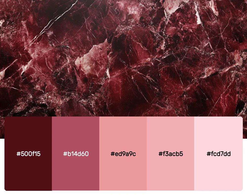
8. Midnight Rose
-
#500f15
-
#b14d60
-
#ed9a9c
-
#f3acb5
-
#fcd7dd
Download this color palette
 735×1102
Pinterest image

 2160×3840
Vertical wallpaper

 900×900
Square

 3840×2160
4K Wallpaper

Perhaps my favorite palette in this collection, Midnight Rose proves that pink can be dramatic and mysterious. Starting from an almost-black burgundy and climbing to the softest blush, this palette tells a complete story. It’s perfect for projects that need to feel luxurious, intimate, and slightly rebellious.
Why Pink Palettes Are Dominating Design in 2025
Before we dive deeper into how to use these palettes, let’s explore why pink has become such a powerhouse in contemporary design. Pink has undergone a remarkable transformation in recent years, shedding outdated stereotypes to become a symbol of confidence, creativity, and bold self-expression.
The rise of gender-neutral design has opened up new possibilities for pink, allowing it to be appreciated for its aesthetic qualities rather than its cultural associations. From millennial pink’s Instagram-worthy softness to the bold magentas dominating fashion runways, pink has proven its versatility time and again.
As a designer, I’ve witnessed firsthand how pink palettes can transform a project’s emotional impact. These colors have the unique ability to feel both nostalgic and futuristic, playful and sophisticated, depending on how they’re applied.
Mastering Pink Palettes in Modern Design
Using pink effectively in design requires understanding its psychological impact and knowing how to balance its intensity. Here are the strategies I’ve developed over years of working with pink palettes:
Start with Context
The key to successful pink palette implementation is understanding your project’s context. A tech startup might use electric pinks to convey innovation and energy, while a wellness brand might opt for softer roses to communicate calm and care. I always begin by asking: what emotion do we want to evoke?
Balance is Everything
Pink can be overwhelming if not balanced properly. I often pair bold pinks with neutrals like cream, gray, or white to give the eye a place to rest. Conversely, when working with subtle pinks, I might add a pop of complementary color to create visual interest.
Consider Your Medium
Pink behaves differently across various media. What looks perfect on screen might appear too saturated in print, while colors that seem muted digitally might lack impact in physical applications. Always test your pink palettes across all intended mediums before finalizing your design.
Typography Matters
The relationship between pink and typography can make or break a design. I’ve found that clean, modern sans-serifs work beautifully with bold pinks, while script fonts can enhance romantic pink palettes. The key is ensuring readability while maintaining the palette’s emotional impact.
Embrace Pink’s Versatility
Don’t limit pink to traditionally “feminine” applications. Some of the most striking designs I’ve created use pink in unexpected contexts—from corporate presentations to architectural visualizations. Pink’s versatility is one of its greatest strengths.
The Psychology Behind Pink’s Appeal
Understanding why pink resonates so deeply with audiences can help you use these palettes more effectively. Pink sits at the intersection of passionate red and pure white, creating a color that embodies both energy and calm. This duality makes it incredibly powerful in design applications.
Research shows that pink can reduce aggression and create feelings of comfort and nurturing. However, brighter pinks can also stimulate excitement and creativity. This range of psychological effects makes pink palettes incredibly valuable for designers who want to create specific emotional responses.
In branding, pink has become associated with innovation and disruption, partly thanks to companies that have used it to challenge industry norms. When everyone else is using blue or black, a well-executed pink palette can help a brand stand out dramatically.
Applying Pink Palettes Across Design Disciplines
One of the things I love most about these pink palettes is how adaptable they are across different design fields. Each discipline offers unique opportunities to showcase pink’s versatility:
Digital Design
In web and app design, pink palettes can create interfaces that feel approachable and engaging. I often use softer pinks for background elements and brighter pinks for calls-to-action, creating a visual hierarchy that guides user behavior naturally. The key is ensuring sufficient contrast for accessibility while maintaining the palette’s emotional impact.
Brand Identity
Pink palettes in branding can communicate everything from playful creativity to premium luxury. I’ve used deep berry pinks for law firms wanting to appear approachable, and electric magentas for startups looking to disrupt their industries. The versatility of pink makes it suitable for almost any brand personality when applied thoughtfully.
Interior Design
In physical spaces, pink palettes can transform environments in remarkable ways. Soft pinks create calming, nurturing spaces perfect for bedrooms or wellness centers, while bolder pinks can energize commercial spaces like retail stores or restaurants. I love how pink walls can make a space feel both intimate and expansive.
Print Design
Pink palettes in print require special consideration for color accuracy and paper choice. Matte papers can make pinks feel more sophisticated, while glossy finishes enhance their vibrancy. I always work closely with printers to ensure the final result matches my digital vision.
Fashion and Textiles
The fashion world has embraced pink in all its forms, from subtle blush accessories to statement magenta garments. Pink palettes in fashion can convey confidence, femininity, rebellion, or sophistication depending on the shade and styling.
The Future of Pink in Design
As we move through 2025, I predict pink will continue evolving as a design staple. We’re seeing interesting developments in how pink interacts with technology—from AR filters that enhance pink tones to smart lighting that can shift between different pink hues throughout the day.
The sustainability movement is also influencing pink palette choices, with designers increasingly drawn to pinks inspired by natural elements like flowers, minerals, and sunsets. This trend toward organic pink inspiration creates palettes that feel both contemporary and timeless.
Conclusion: Embracing Pink’s Power
These 8 pink color palettes represent just the beginning of what’s possible with this remarkable color family. Whether you’re drawn to the romantic softness of Blushing Romance or the dramatic intensity of Midnight Rose, each palette offers unique opportunities to connect with audiences on an emotional level.
The key to successfully incorporating pink palettes into your work is understanding their psychological impact and matching them to your project’s goals. Don’t be afraid to experiment—some of my most successful projects have come from pushing pink palettes into unexpected territories.
Remember that great design isn’t just about following trends; it’s about creating meaningful connections between your work and your audience. Pink palettes, with their incredible range of emotional expression, offer powerful tools for making those connections.
So go ahead and embrace pink’s potential. Whether you’re a seasoned designer or just beginning your creative journey, these palettes will help you create work that’s not just visually stunning, but emotionally resonant. The world needs more bold, confident design—and pink might just be the perfect color to help you deliver it.
Happy designing!