In this article:
- The 8 Most Inspiring Sage Green Color Palettes
- Why Sage Green Is Having Its Moment
- Mastering Sage Green in Your Design Work
- Sage Green Across Different Design Applications
- The Psychology Behind Sage Green's Appeal
- Looking Forward: Sage Green's Staying Power
- Bringing It All Together
There’s something undeniably calming about sage green that makes it one of my absolute favorite colors to work with as a designer. This muted, earthy hue has this incredible ability to ground a space while still feeling fresh and contemporary. Whether you’re working on a branding project, designing an interior space, or creating digital content, sage green offers a versatility that few colors can match.
What I love most about sage green is how it bridges the gap between trendy and timeless. It’s not going anywhere anytime soon, and honestly, I don’t think it ever should. This sophisticated color has been quietly revolutionizing design palettes across every industry, and today I’m excited to share eight of my favorite sage green color combinations that will elevate your next project.
The 8 Most Inspiring Sage Green Color Palettes
1. Garden Fresh
-
 #D2E5C4


-
#B2C69E
-
#95B07B
-
#79955D
-
#5A743C
Download this color palette
 735×1102
Pinterest image

 2160×3840
Vertical wallpaper

 900×900
Square

 3840×2160
4K Wallpaper

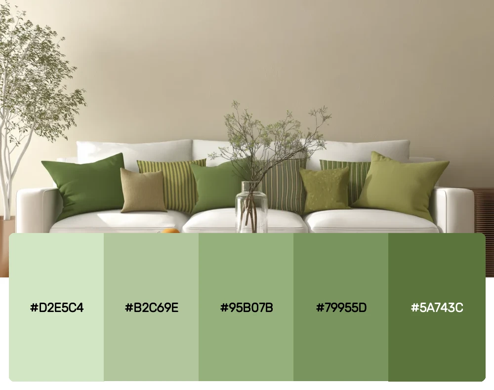
This monochromatic sage palette is pure perfection for anyone wanting to create depth without complexity. I use this combination constantly in botanical-themed projects because it captures every shade of green you’d find in a thriving garden. The progression from light to dark creates natural hierarchy, making it incredibly functional for both print and digital work.
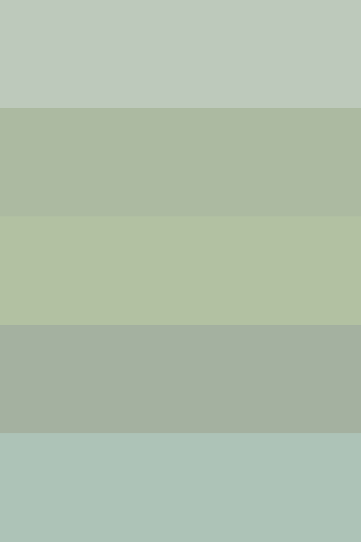
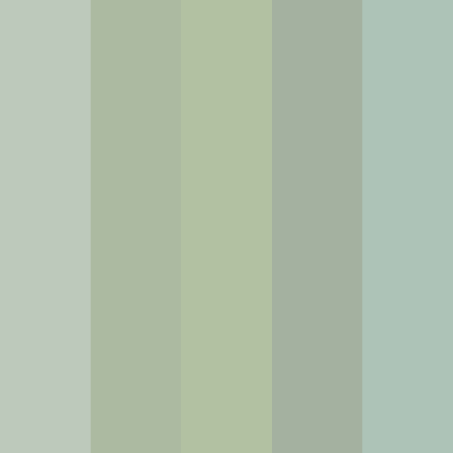
2. Misty Morning
-
#BDC9BB
-
#ACBAA1
-
#B2C1A2
-
#A4B1A0
-
#ADC3B7
Download this color palette
 735×1102
Pinterest image
 2160×3840
Vertical wallpaper

 900×900
Square
 3840×2160
4K Wallpaper

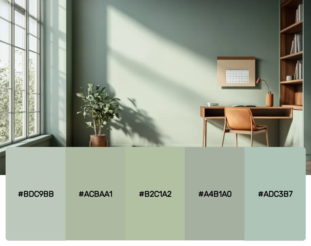
When I need something soft and ethereal, this is my go-to palette. These gentle sage tones remind me of early morning fog rolling over hills. It’s perfect for wellness brands, spa environments, or any project that needs to evoke tranquility and peace. The subtle variations create interest without ever feeling overwhelming.
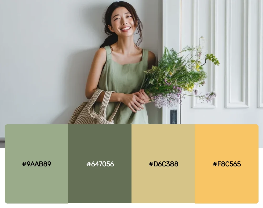
3. Harvest Moon
-
#9AAB89
-
#647056
-
#D6C388
-
#F8C565
Download this color palette
 735×1102
Pinterest image

 2160×3840
Vertical wallpaper

 900×900
Square

 3840×2160
4K Wallpaper


Get 300+ Fonts for FREE
Enter your email to download our 100% free "Font Lover's Bundle". For commercial & personal use. No royalties. No fees. No attribution. 100% free to use anywhere.
The combination of sage green with warm golds creates magic every single time. This palette captures that perfect autumn moment when the light hits everything just right. I love using this for brands that want to feel both grounded and optimistic – it’s earthy sophistication with a sunny disposition.
4. Moody Botanical
-
#4D5D42
-
#6A894B
-
#8DA67E
-
#9B999A
-
#C6B5DF
Download this color palette
 735×1102
Pinterest image

 2160×3840
Vertical wallpaper

 900×900
Square

 3840×2160
4K Wallpaper

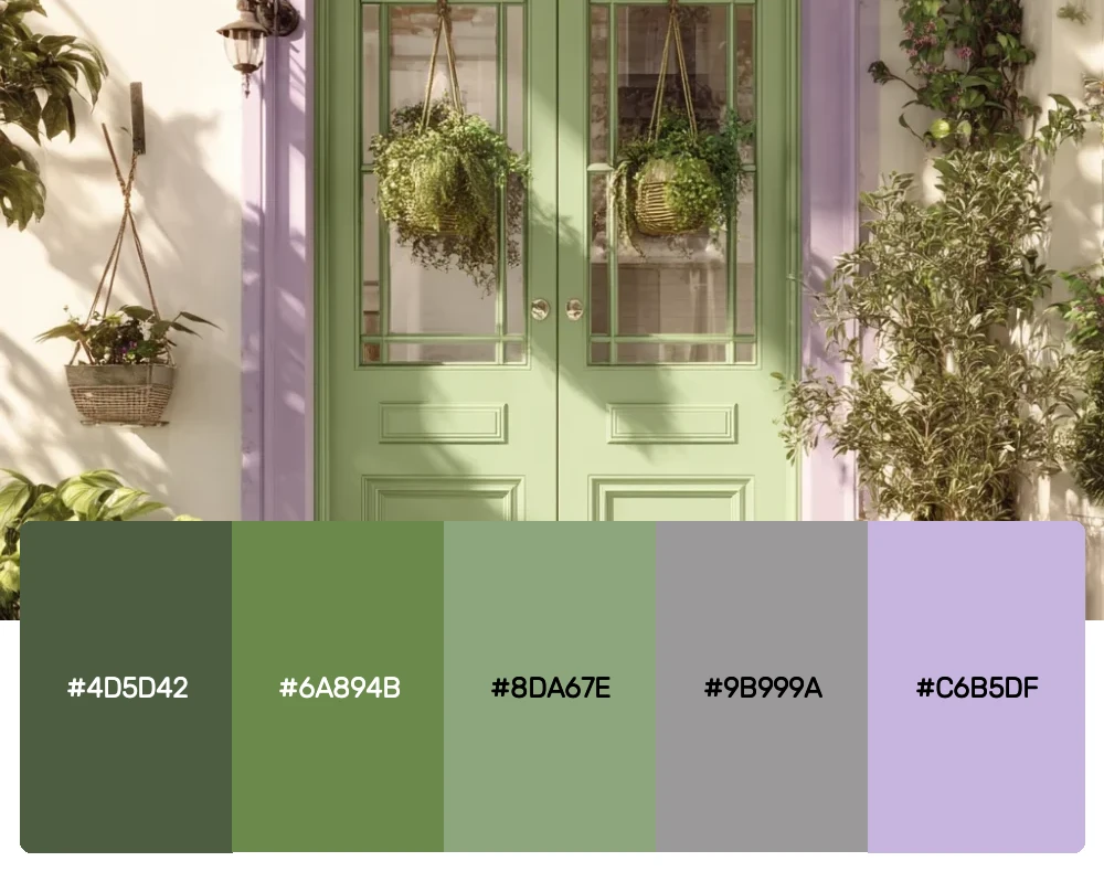
For projects that need a bit more drama, this palette delivers beautifully. The deeper sage tones paired with that unexpected lavender create intrigue without losing the calming essence of green. I find this combination works wonderfully for upscale restaurants or luxury lifestyle brands that want to feel approachable yet refined.
5. Countryside Charm
-
#A3AC9A
-
#8A9A5B
-
#93A395
-
#748B74
-
#827D67
Download this color palette
 735×1102
Pinterest image

 2160×3840
Vertical wallpaper

 900×900
Square

 3840×2160
4K Wallpaper

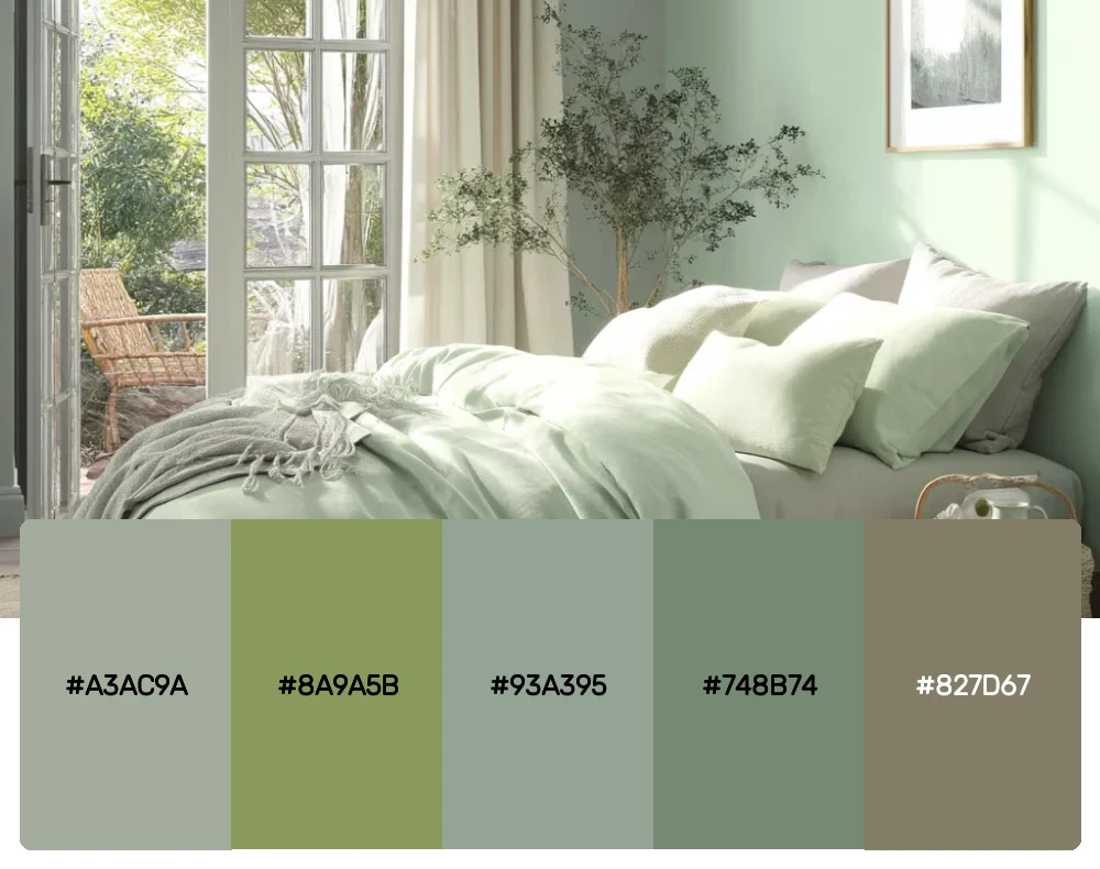
This palette feels like a walk through the English countryside – all rolling hills and weathered stone walls. The mix of sage greens with those earthy undertones creates incredible depth. I use this combination for projects that need to feel established and trustworthy, like financial services or heritage brands.
6. Industrial Farmhouse Zen
-
#CED3D2
-
#3F5054
-
#6F675E
-
#9CAB86
-
#C8CAB5
Download this color palette
 735×1102
Pinterest image

 2160×3840
Vertical wallpaper

 900×900
Square

 3840×2160
4K Wallpaper
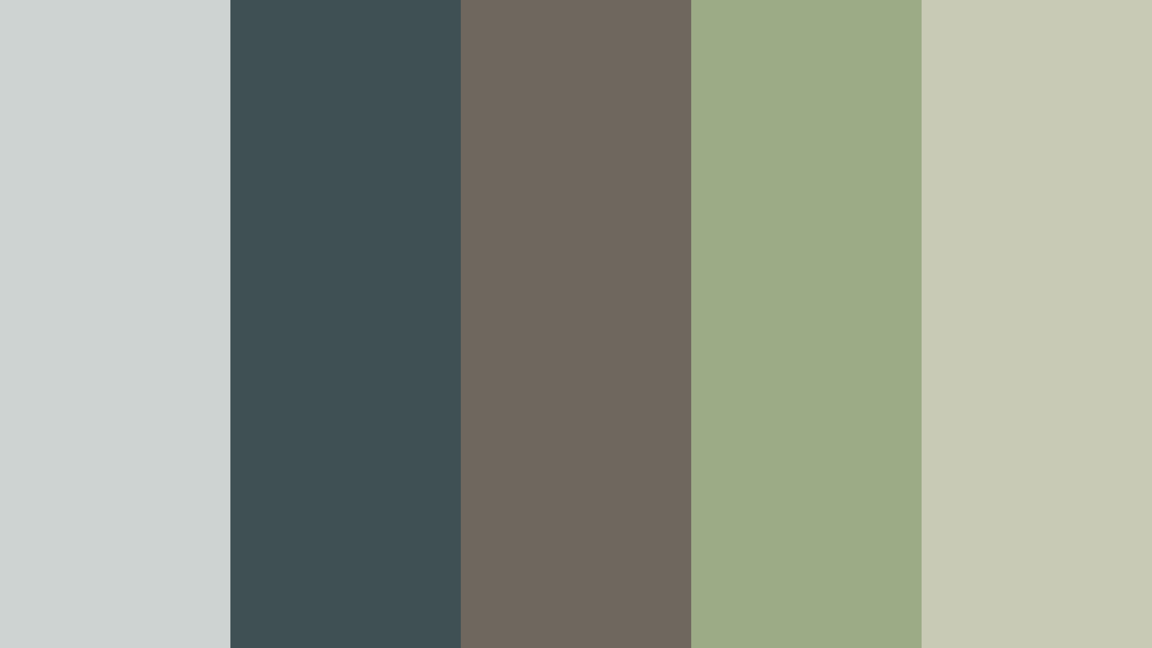
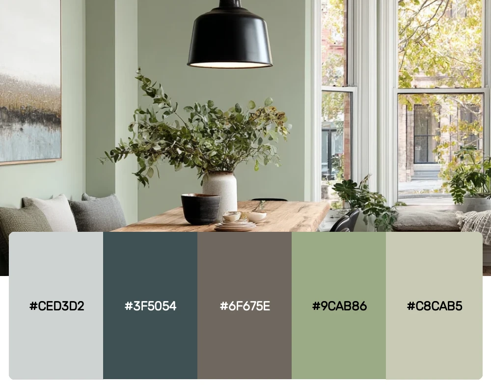
The marriage of sage green with industrial grays might seem unexpected, but it creates this incredibly sophisticated modern aesthetic. This palette is perfect for tech companies or architectural firms that want to feel innovative yet grounded. The sage adds warmth to what could otherwise be cold, sterile colors.
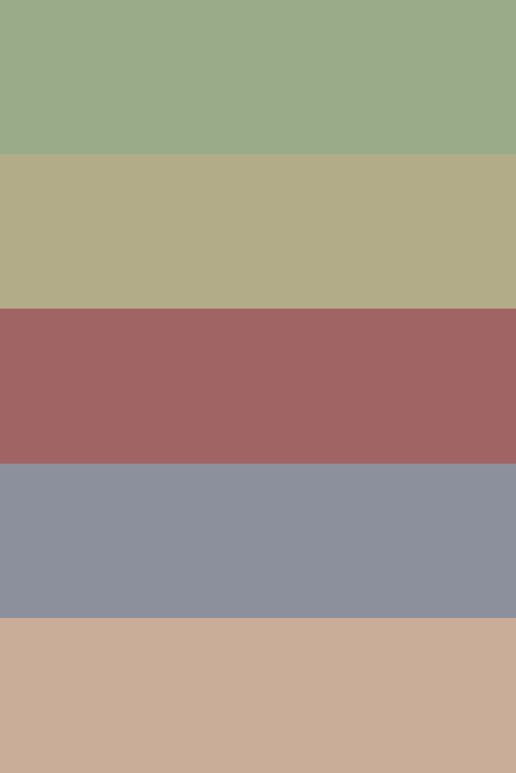
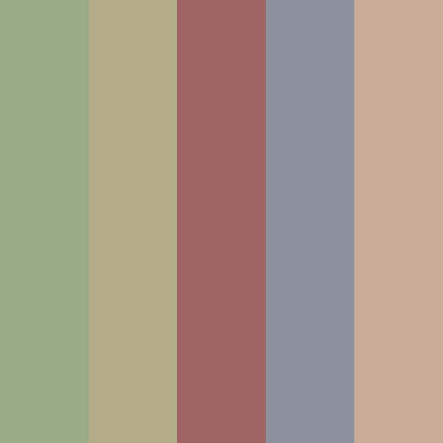
7. Desert Sage
-
#9AAB89
-
#B2AC88
-
#A06464
-
#8C909C
-
#C9AD99
Download this color palette
 735×1102
Pinterest image
 2160×3840
Vertical wallpaper

 900×900
Square
 3840×2160
4K Wallpaper

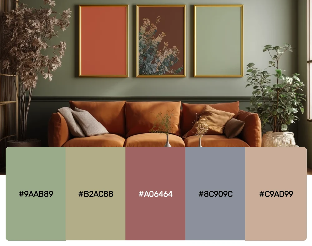
Inspired by the American Southwest, this palette combines sage with dusty terra cottas and warm beiges. There’s something so comforting about these colors together – they feel like sunset in the desert. I love using this for hospitality brands or any project that wants to evoke adventure and warmth.
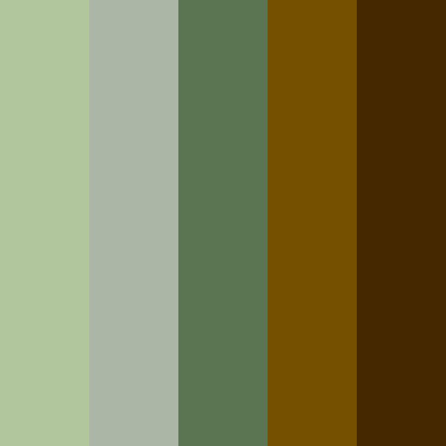
8. Forest Floor
-
#B2C69E
-
#ACB6A6
-
#5B7553
-
#745000
-
#462800
Download this color palette
 735×1102
Pinterest image

 2160×3840
Vertical wallpaper

 900×900
Square
 3840×2160
4K Wallpaper

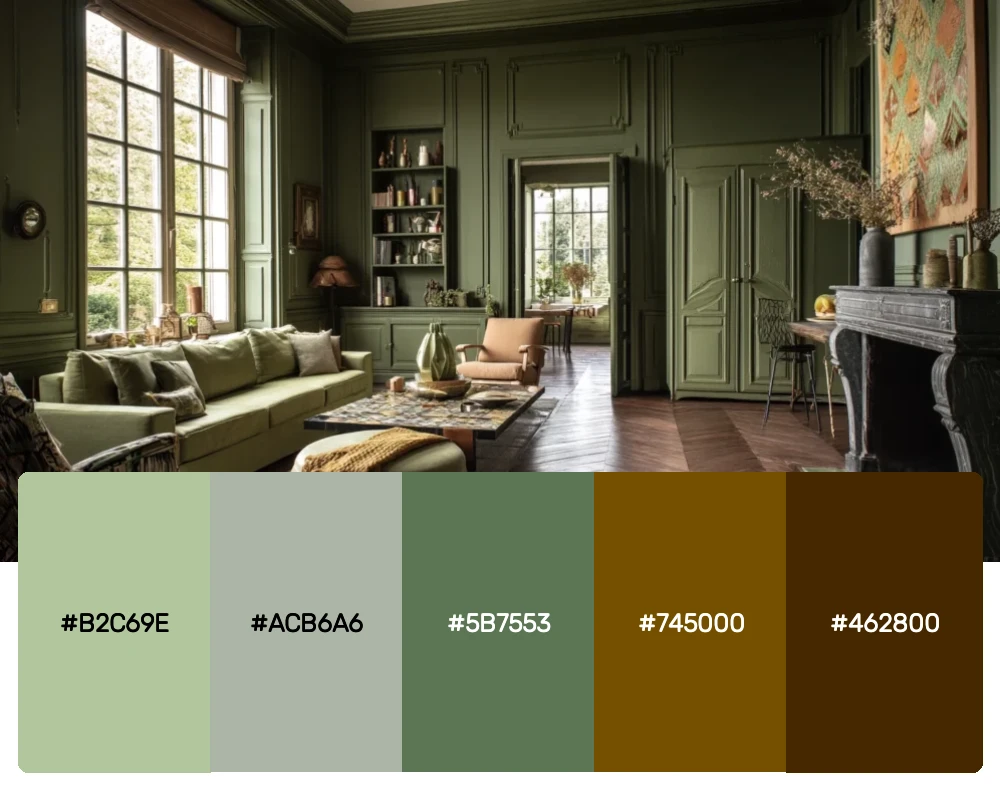
This rich, earthy combination takes sage green into deeper territory with those gorgeous chocolate browns. It reminds me of walking through an old-growth forest where the light filters through layers of leaves. Perfect for organic brands, outdoor companies, or any project that wants to feel authentic and connected to nature.
Why Sage Green Is Having Its Moment
As someone who’s been watching color trends for years, I can tell you that sage green’s popularity isn’t just a passing fad. This color speaks to our collective desire for calm in an increasingly chaotic world. It’s the visual equivalent of taking a deep breath – immediately soothing and centering.
The rise of biophilic design has also played a huge role in sage green’s dominance. As we spend more time indoors, we’re craving those connections to nature, and sage green delivers that botanical feeling without being overly literal. It’s nature-inspired design at its most sophisticated.
What makes sage green particularly special is its incredible adaptability. Unlike brighter greens that can feel overwhelming or dated, sage green has this chameleon-like quality that allows it to work in virtually any context. Pair it with warm woods and it feels rustic; combine it with metallics and it becomes luxurious; add some crisp whites and suddenly it’s Scandinavian minimalism.
Mastering Sage Green in Your Design Work
The key to working with sage green successfully is understanding its undertones. Some sage greens lean more yellow, others more blue or gray. Recognizing these subtle differences will help you create more cohesive palettes and avoid color clashes that can make your work feel off.
I always recommend testing your sage green palettes in different lighting conditions. What looks perfect on your computer screen might feel completely different in natural light or under warm artificial lighting. This is especially crucial for interior design projects or any work that will be viewed in physical spaces.
When building palettes around sage green, I like to think about the mood I’m trying to create. For calm, peaceful vibes, I’ll pair it with other muted tones and plenty of white space. For something more energetic, I might add unexpected pops of coral or sunny yellow. The beauty of sage green is that it’s such a diplomatic color – it plays well with almost everything.
Sage Green Across Different Design Applications
Branding and Logo Design In branding work, sage green communicates reliability, growth, and environmental consciousness without hitting people over the head with it. I love using it for wellness companies, sustainable brands, and professional services that want to feel approachable. The key is pairing it with typography that reinforces your brand personality – clean sans serifs for modern feels, or elegant serifs for more traditional approaches.
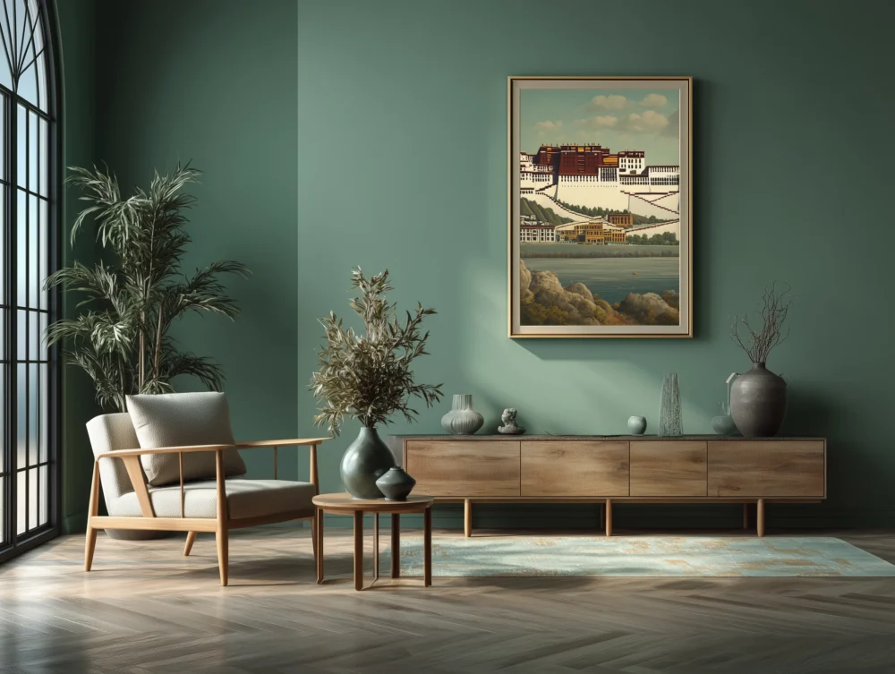
Interior Spaces Sage green walls have become incredibly popular, and for good reason. The color creates an instant sense of calm while still feeling current. I particularly love using darker sage greens in dining rooms or bedrooms where you want that cozy, enveloping feeling. Lighter sages work beautifully in kitchens and bathrooms where you want freshness without the sterility of pure white.
Digital Design For websites and apps, sage green offers a refreshing alternative to the blues and grays that dominate digital design. It’s easy on the eyes, which makes it perfect for apps focused on wellness, meditation, or any platform where users will spend extended time. Just be mindful of accessibility – always test your sage green backgrounds with various text colors to ensure proper contrast ratios.
Product Design The natural, organic feeling of sage green makes it perfect for product packaging, especially in the beauty, food, and wellness sectors. It communicates quality and naturalness without feeling overly earthy or crunchy. I’ve seen it work beautifully on everything from skincare packaging to high-end kitchen appliances.
The Psychology Behind Sage Green’s Appeal
Color psychology tells us that green represents growth, harmony, and balance – all things we desperately need in our modern lives. But sage green takes these positive associations and adds sophistication. It’s green without the intensity, nature without the rawness.
There’s also something inherently honest about sage green. It doesn’t try too hard or demand attention the way brighter colors do. This authenticity resonates with consumers who are increasingly skeptical of brands that feel forced or overly polished. Sage green whispers where other colors shout, and sometimes that’s exactly what your message needs.
Looking Forward: Sage Green’s Staying Power
While I can’t predict the future, I’m confident that sage green will remain relevant for years to come. It hits all the right notes for contemporary design – it’s calming without being boring, natural without being literal, and sophisticated without being pretentious.
The color also photographs beautifully, which matters more than ever in our Instagram-driven world. Whether it’s a sage green accent wall or a product shot featuring sage packaging, this color translates perfectly to social media, helping brands create that coveted “aesthetic” that drives engagement.
As we continue to prioritize wellness and sustainability in design, sage green offers the perfect visual shorthand for these values. It’s a color that makes people feel good, and in a world that often doesn’t, that’s incredibly powerful.
Bringing It All Together
These eight sage green palettes represent just the beginning of what’s possible with this incredible color. Whether you’re drawn to the monochromatic serenity of Garden Fresh or the unexpected sophistication of Industrial Zen, there’s a sage green palette that can elevate your next project.
The secret to success with sage green is trusting its natural elegance. Don’t feel like you need to overstyling or complicate things – sage green’s beauty lies in its understated sophistication. Let it be the calm, confident foundation that allows other elements of your design to shine.
So go ahead and embrace the sage green revolution. Your designs (and your stress levels) will thank you for it. After all, in a world full of visual noise, sometimes the most powerful statement you can make is a quiet one.