In this article:
- The Quiet Power of Muted Colors
- 8 Exquisite Muted Color Palettes
- The Psychology Behind Muted Color Choices
- Mastering Muted Palettes in Different Design Contexts
- Creating Harmony with Muted Colors
- The Future of Muted Color Design
- Embracing the Art of Subtlety
Chasing the perfect balance between impact and subtlety is not always easy. I’ve developed a deep appreciation for muted color palettes. There’s an understated elegance to these softened hues that speaks volumes without shouting. While bold, saturated colors certainly have their place, muted palettes offer something different entirely—a sense of refinement, calm, and timeless sophistication that never goes out of style.
If you’re ready to explore the quieter side of color theory and discover how restraint can actually amplify your design’s impact, you’re in for a treat. I’ve curated eight stunning muted color palettes that prove you don’t need to scream to be heard.
The Quiet Power of Muted Colors
Before we dive into these gorgeous palettes, let’s talk about what makes muted colors so compelling. These aren’t your typical desaturated grays—muted colors are complex, nuanced hues that have been toned down with hints of gray, white, or their complementary colors. The result is a sophisticated color story that feels both contemporary and timeless.
What I love most about working with muted palettes is their versatility. They create breathing room in designs, allow other elements to shine, and have an almost therapeutic quality that feels increasingly important in our overstimulated world. Whether you’re designing a wellness brand, a luxury product line, or simply want to create something that feels effortlessly elegant, muted colors are your secret weapon.
8 Exquisite Muted Color Palettes
1. Gently Muted
-
#A8BAB8
-
#5D749D
-
#9B8DAC
-
#FFCCCC
-
#FFF1F0
Download this color palette
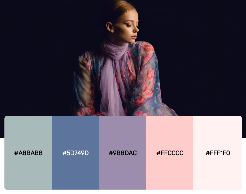
This palette whispers rather than speaks, combining soft sage greens with dusty blues and the gentlest blush tones. I find myself reaching for this combination when designing for wellness brands or creating spaces that need to feel inherently calming. The interplay between the cool blues and warm pinks creates a sophisticated tension that’s both soothing and engaging.
2. Fashionably Muted
-
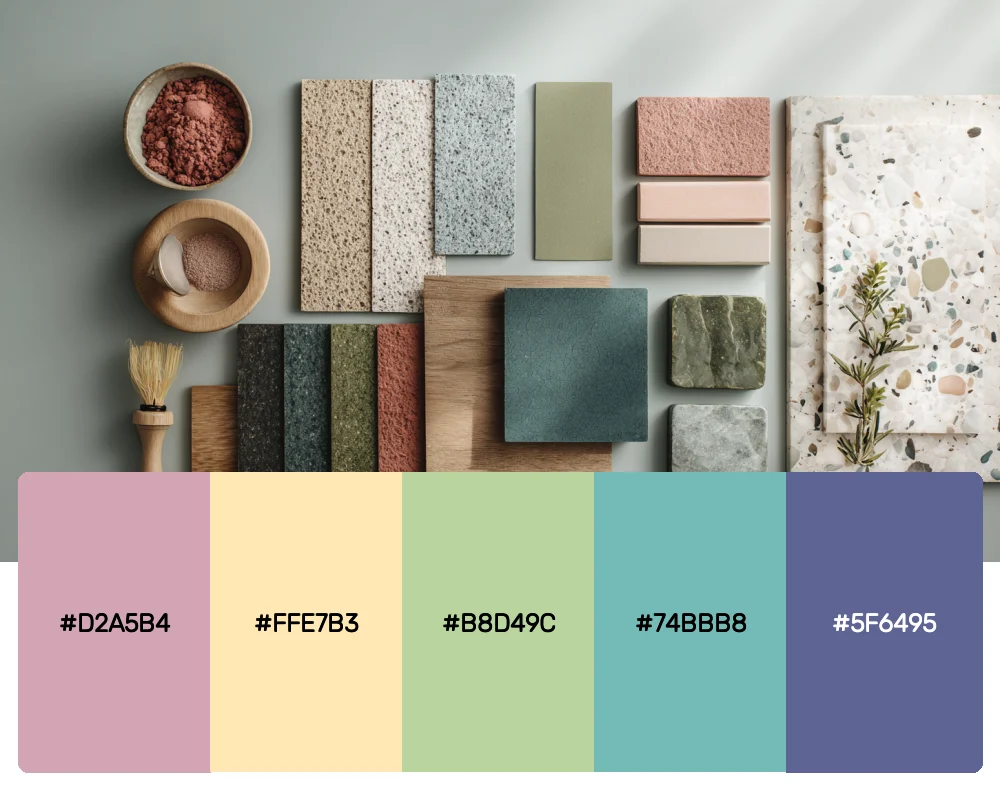
#D2A5B4
-
#FFE7B3
-
#B8D49C
-
#74BBB8
-
#5F6495
Download this color palette

Get 300+ Fonts for FREE
Enter your email to download our 100% free "Font Lover's Bundle". For commercial & personal use. No royalties. No fees. No attribution. 100% free to use anywhere.
There’s something effortlessly chic about this palette that reminds me of a perfectly curated vintage wardrobe. The muted rose, soft butter yellow, and sage green feel both nostalgic and thoroughly modern. I love using this combination for fashion brands, lifestyle blogs, or any project that needs to feel approachable yet refined.
3. Muted Essence
-
#9D9F95
-
#575C51
-
#E6D9CC
-
#6D6E5B
-
#6C6458
Download this color palette
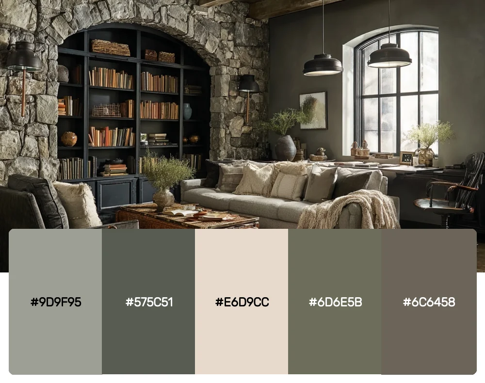
This earthy, grounded palette speaks to our connection with nature while maintaining a distinctly contemporary feel. The range of warm grays and muted greens creates depth without drama—perfect for architectural projects, sustainable brands, or designs that need to feel both organic and sophisticated.
4. Muted Tones
-
#C08283
-
#DCD0C0
-
#F4F4F4
-
#373737
-
#A8A3A3
Download this color palette
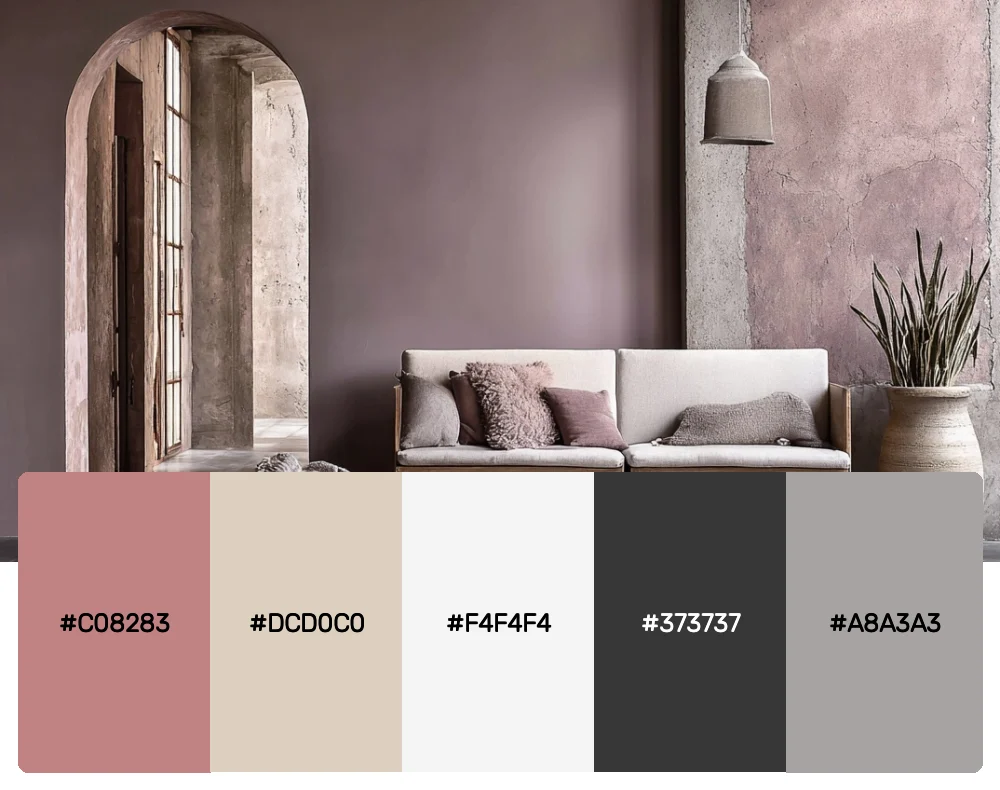
Sometimes the most powerful statements come from the quietest palettes. This combination of dusty rose, warm beige, and soft grays creates an atmosphere of understated luxury. I often turn to this palette for high-end branding projects or interior designs that need to feel both welcoming and elevated.
5. Brightly Muted
-
#85A4B9
-
#8BBFBC
-
#CCE2BA
-
#EFEDC6
-
#D2BC99
-
#D6CBBB
Download this color palette
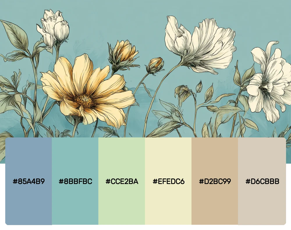
Don’t let the name fool you—this palette proves that muted doesn’t mean boring. The soft blues and greens feel like a breath of fresh air, while the warm neutrals ground the entire composition. This palette is my go-to for projects that need to feel optimistic and fresh without being overwhelming.
6. Muted Moods
-
#FFCFB9
-
#FFD9AA
-
#FBEDB3
-
#6D8371
-
#5C5660
Download this color palette
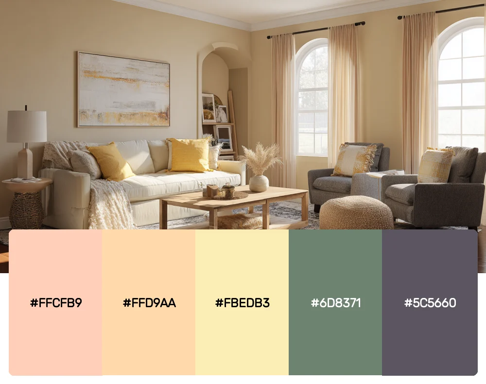
This palette tells a story of warm afternoons and cozy evenings. The peachy pinks and soft yellows pair beautifully with the deeper forest green and charcoal, creating a palette that feels both comfortable and sophisticated. It’s perfect for brands that want to convey warmth and authenticity.
7. Deeply Muted
-
#964444
-
#789044
-
#3B907C
-
#3C4C85
-
#7E5C9A
Download this color palette
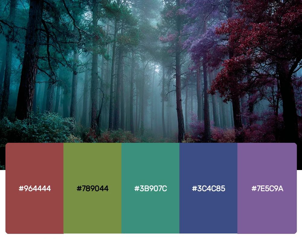
For those moments when you need more depth without sacrificing sophistication, this palette delivers. These rich, muted jewel tones feel substantial and grounded while maintaining that essential restraint that defines great muted palettes. I love using these colors for brands that need to feel both approachable and authoritative.
8. Muted Theme
-
#FEC66E
-
#F6E3CB
-
#D7CFBC
-
#AEBAB9
-
#767B8C
-
#AD9392
Download this color palette
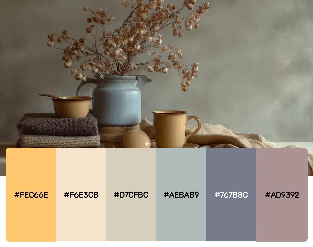
This palette feels like a perfectly curated collection of vintage finds—each color has character and depth without competing for attention. The warm golds and creams play beautifully against the cooler grays and purples, creating a palette that’s both cohesive and dynamic.
The Psychology Behind Muted Color Choices
As designers, we’re not just choosing colors—we’re crafting emotional experiences. Muted palettes tap into our psychological need for calm and clarity in an increasingly chaotic world. These colors don’t demand attention; instead, they invite contemplation and create space for other design elements to breathe.
Research shows that muted colors can reduce visual fatigue and create environments that feel more conducive to focus and creativity. This is why you’ll often see these palettes in wellness spaces, luxury brands, and minimalist designs. They communicate sophistication, maturity, and thoughtfulness—qualities that resonate deeply with today’s discerning audiences.
Mastering Muted Palettes in Different Design Contexts
Digital Design
In web and app design, muted palettes create interfaces that feel premium and easy on the eyes. I love using these colors for backgrounds and supporting elements, allowing content and calls-to-action to take center stage. The key is maintaining enough contrast for accessibility while preserving that soft, refined aesthetic.
Branding and Identity
Muted color palettes are incredibly versatile for branding because they age well and work across various applications. They’re sophisticated enough for luxury brands but approachable enough for lifestyle companies. The trick is finding the right balance of warmth and coolness to match your brand’s personality.
Interior and Product Design
In physical spaces, muted colors create environments that feel both current and timeless. They’re particularly effective in spaces where people need to focus or relax—offices, bedrooms, spas, and retail environments. These colors also photograph beautifully, which is increasingly important in our Instagram-driven world.
Print and Editorial
Muted palettes in print design create a sense of quality and thoughtfulness. They work particularly well for publications, packaging, and marketing materials where you want to convey sophistication without being flashy. The subtle nature of these colors allows typography and imagery to truly shine.
Creating Harmony with Muted Colors
Working with muted palettes requires a different approach than working with bold, saturated colors. Here are some techniques I’ve developed over the years:
Layer with intention. Muted colors reveal their complexity when layered thoughtfully. Don’t be afraid to use multiple colors from your palette in close proximity—their subtle nature allows for rich, nuanced compositions.
Pay attention to undertones. Muted colors often have complex undertones that can either harmonize beautifully or clash subtly. Spend time understanding the underlying warmth or coolness of each color in your palette.
Use texture strategically. Muted colors and interesting textures are natural partners. The subdued colors allow textures to take on more importance, creating visual interest without relying on color contrast alone.
Balance with strategic pops. While muted palettes are beautiful on their own, sometimes a single, more saturated accent can elevate the entire composition. Use this technique sparingly and with intention.
The Future of Muted Color Design
As we move further into 2025, I see muted color palettes becoming even more relevant. In a world saturated with digital noise and visual overstimulation, these sophisticated, calming colors offer a welcome respite. They align perfectly with growing trends toward wellness, sustainability, and mindful living.
The beauty of muted palettes lies in their ability to feel both contemporary and timeless. While trend-driven colors come and go, well-crafted muted palettes have staying power. They’re an investment in design longevity—something increasingly valuable in our fast-paced world.
Embracing the Art of Subtlety
Muted color palettes teach us that sometimes the most powerful design statements come from restraint rather than excess. These eight palettes offer a masterclass in sophisticated color use, proving that you don’t need to shout to be heard.
Whether you’re creating a calming digital interface, developing a timeless brand identity, or simply want to explore the quieter side of color theory, these muted palettes provide endless inspiration. They remind us that in a world full of visual noise, there’s profound beauty in choosing to whisper instead of scream.
The next time you’re tempted to reach for the boldest, brightest colors in your arsenal, consider the sophisticated alternative that muted palettes offer. Your designs—and your audience—will thank you for the breathing room.

