In this article:
- The 10 Most Captivating Coral Color Palettes
- Why Coral Color Palettes Are Having a Major Moment
- Mastering Coral Palettes in Contemporary Design
- The Cultural Impact of Coral in Design
- Applying Coral Palettes Across Design Disciplines
- The Future of Coral in Design
- Conclusion: Embracing Coral's Endless Possibilities
Coral’s magic lies in its perfect balance—vibrant yet sophisticated, warm yet refined. This versatile hue elevates everything from brand identities to interiors with its timeless appeal. Here are 9 carefully curated coral palettes to bring that essential warmth and elegance to your next creative project.
The 10 Most Captivating Coral Color Palettes
1. Sunset Glow
-
 #FF6B6B


-
#FFE66D
-
#FF8E53
-
#4ECDC4
Download this color palette
 735×1102
Pinterest image

 2160×3840
Vertical wallpaper

 900×900
Square

 3840×2160
4K Wallpaper

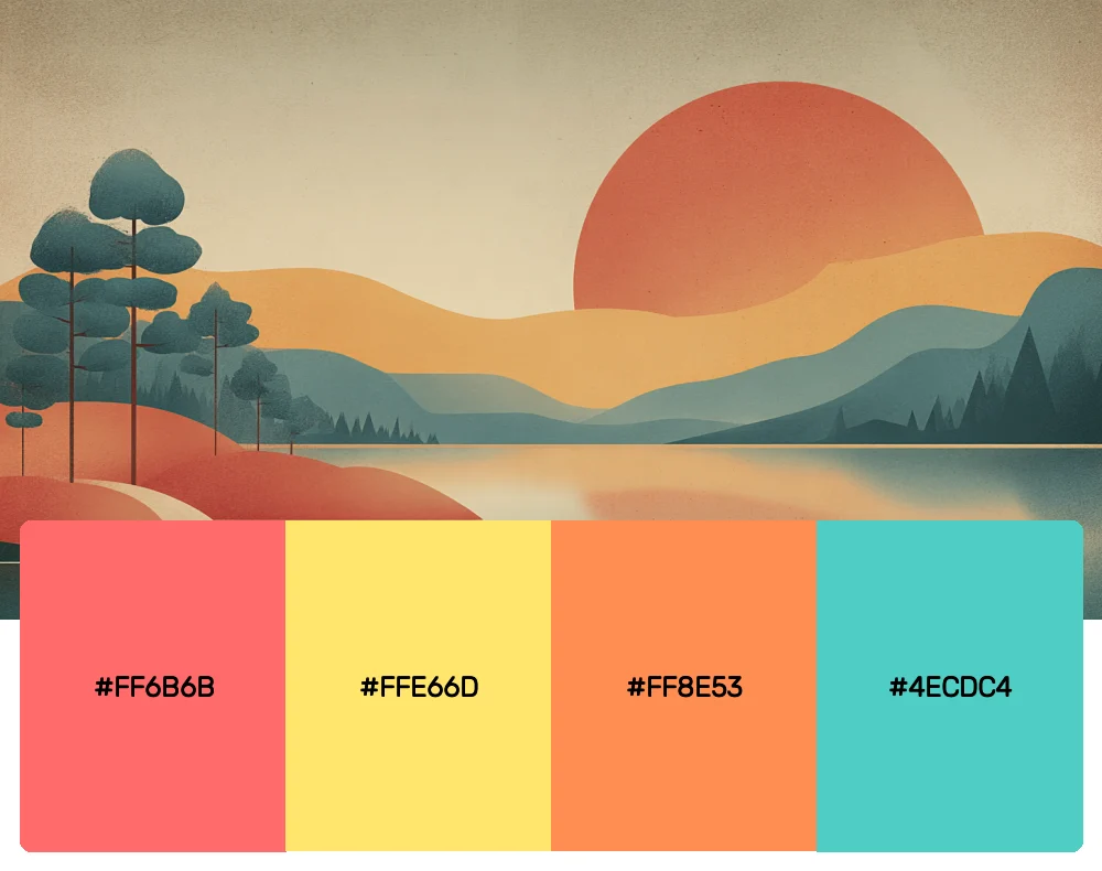
This palette captures the magic of those perfect golden hour moments when the sky blushes with coral tones. I absolutely love how these colors work together to create designs that feel both energetic and serene. It’s my go-to choice for wellness brands or any project that needs to evoke feelings of warmth and optimism.
2. Ocean Breeze
-
#FA7268
-
#A8E6CF
-
#88D8C0
-
#FFEAA7
Download this color palette
 735×1102
Pinterest image

 2160×3840
Vertical wallpaper

 900×900
Square

 3840×2160
4K Wallpaper

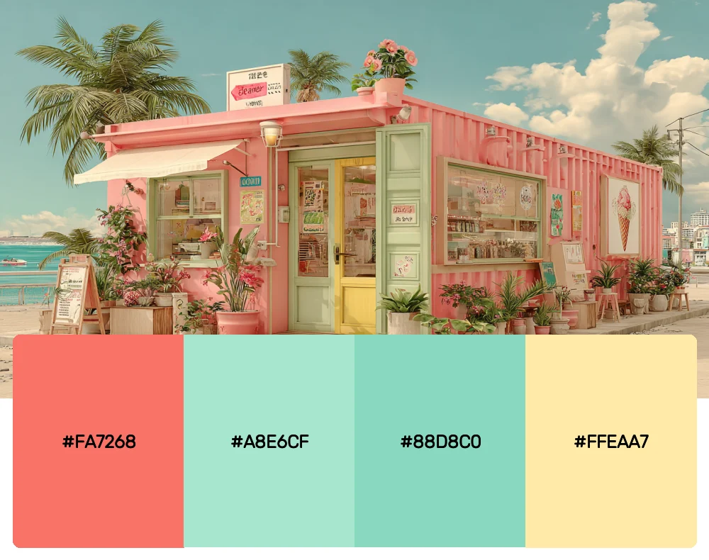
There’s something incredibly refreshing about pairing coral with soft seafoam tones. This combination reminds me of tropical getaways and brings an immediate sense of calm sophistication to any design. I find it works beautifully for lifestyle brands that want to convey both luxury and relaxation.
3. Modern Minimalist
-
#FF7F7F
-
#F8F8FF
-
#E6E6FA
-
#D3D3D3
Download this color palette
 735×1102
Pinterest image

 2160×3840
Vertical wallpaper

 900×900
Square

 3840×2160
4K Wallpaper

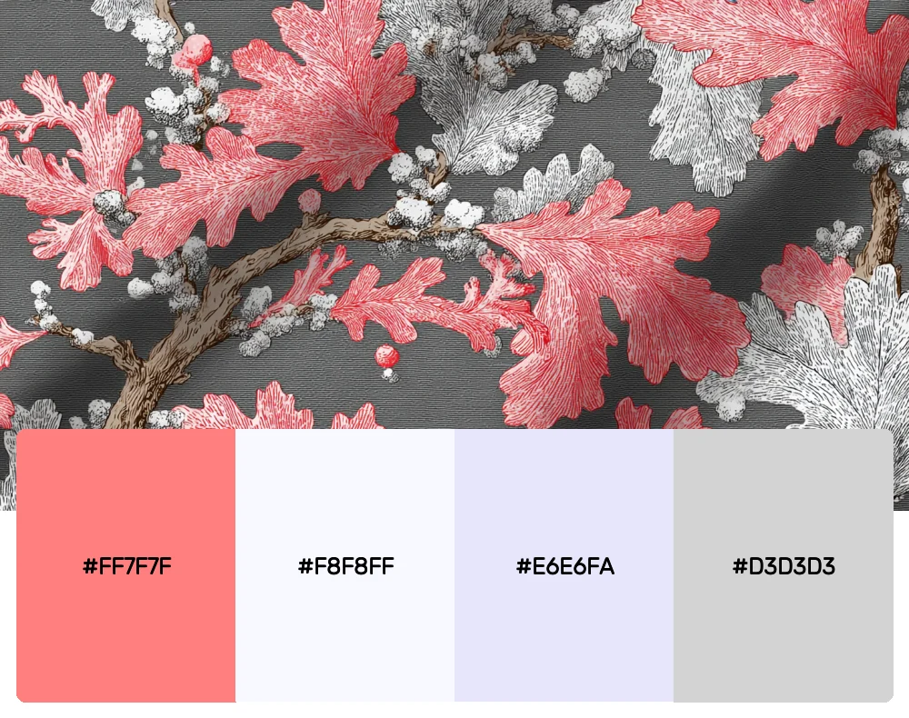
Sometimes the most powerful statements come from restraint. This palette proves that coral doesn’t always need to shout to be heard. The soft coral against clean whites and subtle grays creates an effortlessly chic aesthetic that’s perfect for contemporary branding or clean web designs.

Get 300+ Fonts for FREE
Enter your email to download our 100% free "Font Lover's Bundle". For commercial & personal use. No royalties. No fees. No attribution. 100% free to use anywhere.
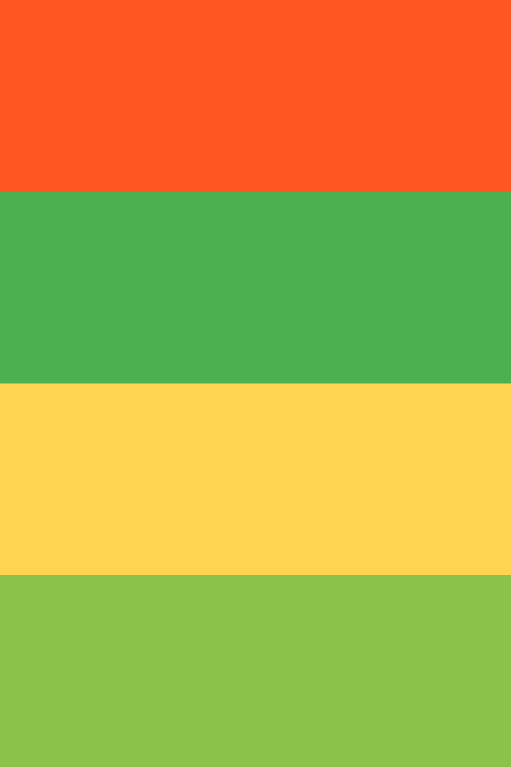
4. Tropical Paradise
-
#FF5722
-
#4CAF50
-
#FFD54F
-
#8BC34A
Download this color palette
 735×1102
Pinterest image
 2160×3840
Vertical wallpaper

 900×900
Square

 3840×2160
4K Wallpaper

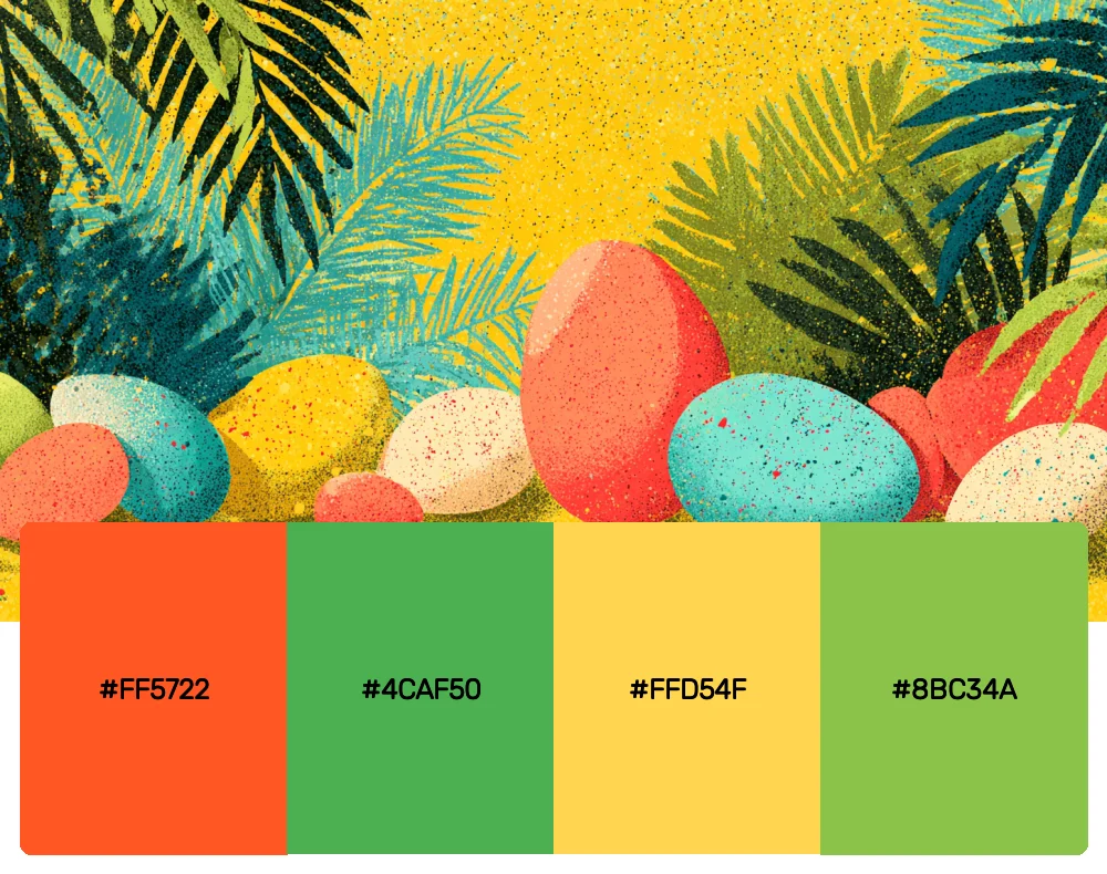
When I want to transport viewers straight to a tropical paradise, this is the palette I reach for. The vibrant coral paired with lush greens creates an immediate association with exotic destinations and adventure. It’s fantastic for travel brands or any project that needs that “vacation vibes” energy.
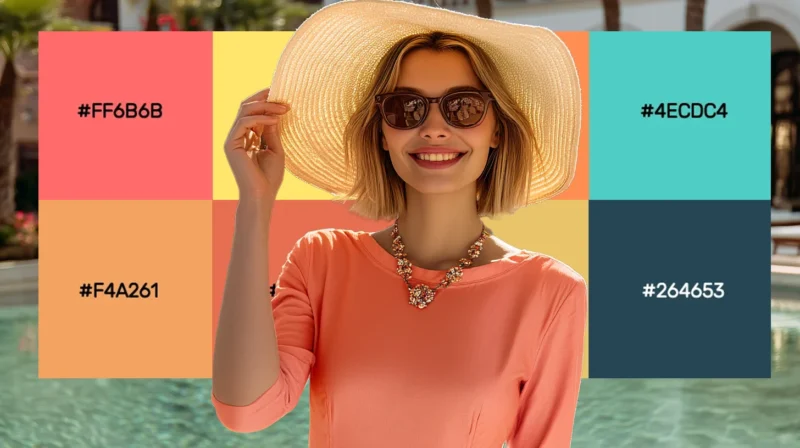
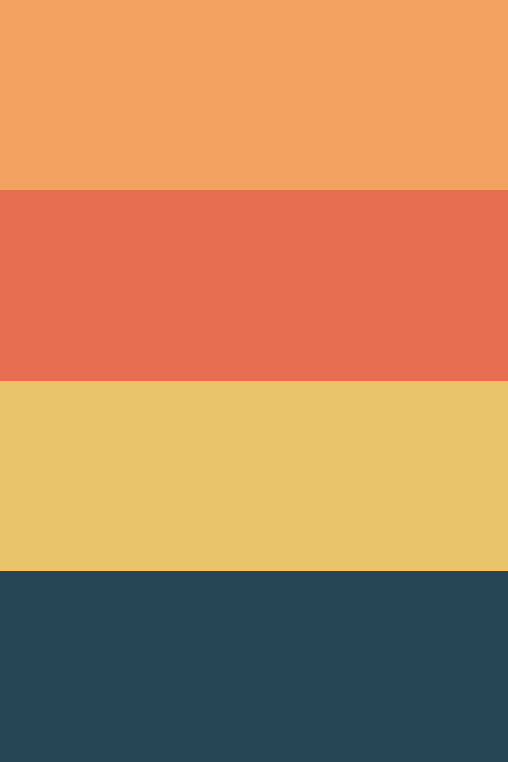
5. Desert Bloom
-
#F4A261
-
#E76F51
-
#E9C46A
-
#264653
Download this color palette
 735×1102
Pinterest image
 2160×3840
Vertical wallpaper

 900×900
Square

 3840×2160
4K Wallpaper

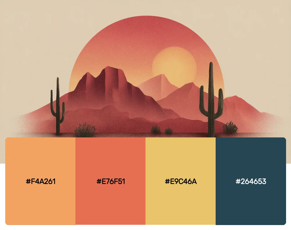
Inspired by the stunning blooms that emerge in desert landscapes, this palette combines coral with earthy terracotta and sage. I love using these colors for projects that need to feel grounded yet vibrant, like artisanal brands or boutique hospitality businesses.
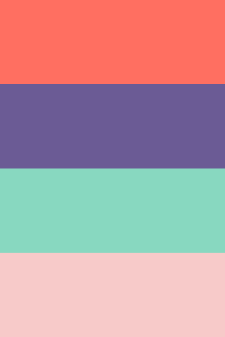
6. Coral Reef
-
#FF6F61
-
#6B5B95
-
#88D8C0
-
#F7CAC9
Download this color palette
 735×1102
Pinterest image
 2160×3840
Vertical wallpaper

 900×900
Square

 3840×2160
4K Wallpaper

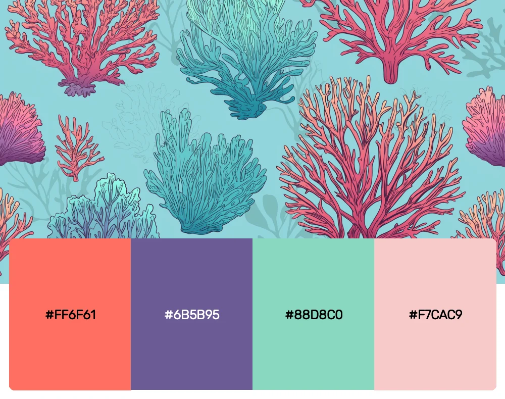
This palette celebrates the incredible diversity of an underwater coral reef. The interplay between warm coral tones and cool purples creates a sophisticated tension that’s absolutely mesmerizing. I find it works exceptionally well for creative agencies or any brand wanting to showcase innovation and depth.
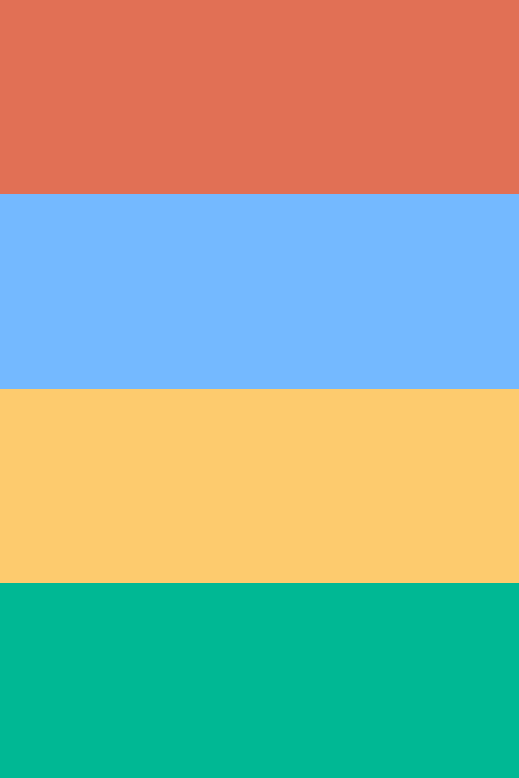
7. Mediterranean Summer
-
#E17055
-
#74B9FF
-
#FDCB6E
-
#00B894
Download this color palette
 735×1102
Pinterest image
 2160×3840
Vertical wallpaper

 900×900
Square

 3840×2160
4K Wallpaper

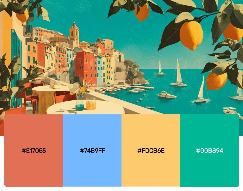
Nothing captures the essence of a Mediterranean summer quite like this vibrant combination. The coral serves as a perfect bridge between the sunny yellows and ocean blues. I often recommend this palette for hospitality brands or any project that needs to evoke that effortless European elegance.
8. Contemporary Chic
-
#FF7675
-
#636E72
-
#2D3436
-
#DDDDDD
Download this color palette
 735×1102
Pinterest image

 2160×3840
Vertical wallpaper

 900×900
Square

 3840×2160
4K Wallpaper

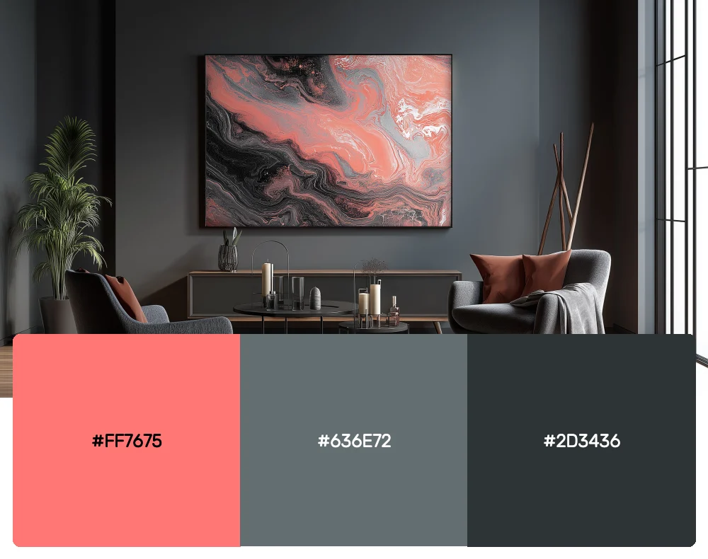
Sometimes you need coral to play well with industrial tones, and this palette does exactly that. The vibrant coral becomes even more striking when contrasted against charcoal and steel grays. It’s perfect for modern tech companies or architectural firms that want to add warmth without sacrificing sophistication.
9. Garden Party
-
#FD79A8
-
#FDCB6E
-
#6C5CE7
-
#A29BFE
Download this color palette
 735×1102
Pinterest image

 2160×3840
Vertical wallpaper

 900×900
Square

 3840×2160
4K Wallpaper

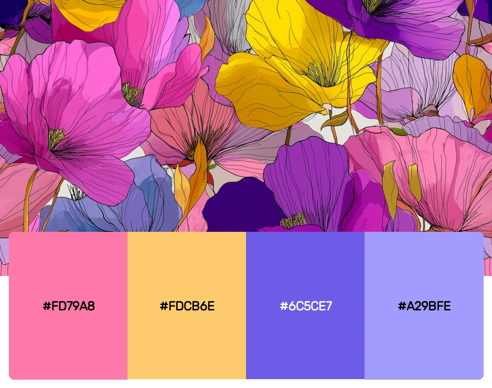
This playful palette brings together coral’s cousin, pink-coral, with unexpected purple accents. The result is fresh, contemporary, and utterly delightful. I love using this combination for creative projects that need to feel both professional and approachable.
Why Coral Color Palettes Are Having a Major Moment
Before we explore how to use these palettes effectively, let’s talk about why coral has become such a design darling. Coral occupies this incredible sweet spot in the color spectrum – it’s warm enough to feel inviting and energizing, yet sophisticated enough to work in premium brand contexts. Unlike some trendy colors that feel fleeting, coral has this timeless quality that transcends seasonal fads.
From a psychological standpoint, coral evokes feelings of comfort, creativity, and confidence. It’s approachable without being childish, bold without being aggressive. In our increasingly digital world, coral brings that human touch that brands desperately need to connect with their audiences on an emotional level.
Mastering Coral Palettes in Contemporary Design
Now that we’ve explored these gorgeous coral combinations, you might be wondering how to implement them effectively without overwhelming your audience. Here are the strategies I’ve developed through years of working with coral:
Start Small, Think Big
If you’re new to working with coral, begin by using it as an accent color. A coral call-to-action button or a coral header can add just the right amount of warmth without dominating the entire design. Once you’re comfortable, you can gradually expand its presence.
Consider Your Context
Coral behaves differently depending on its surroundings. Against white backgrounds, it appears more vibrant and energetic. Paired with darker tones, it becomes more sophisticated and grounded. Always test your coral palette in the actual context where it will live.
Balance Warmth with Cool
One of coral’s superpowers is its ability to work harmoniously with cool tones. Don’t be afraid to pair your coral with blues, greens, or purples. These combinations create visual interest and prevent the palette from feeling monotonous.
Typography Matters
Coral can be challenging to read when used for body text, so I typically reserve it for headlines, accents, or decorative elements. When coral is your primary brand color, ensure you have strong neutral alternatives for text-heavy applications.
The Cultural Impact of Coral in Design
As someone deeply interested in design history, I find coral’s journey fascinating. This color has roots in both natural coral formations and the synthetic pigments that became popular in mid-century design. Today, coral represents a return to organic inspiration while maintaining contemporary relevance.
The rise of coral in modern design coincides with several cultural shifts. There’s a growing desire for colors that feel authentic and connected to nature, yet coral also satisfies our need for digital-friendly hues that photograph beautifully and reproduce well across screens.
Applying Coral Palettes Across Design Disciplines
Digital Design and User Experience
In web and app design, coral excels as an accent color that draws attention without being jarring. I’ve found it particularly effective for conversion-focused elements like buttons and form highlights. The key is using coral strategically – too much can be overwhelming, but the right amount creates perfect visual hierarchy.
Brand Identity and Logo Design
Coral works wonderfully for brands that want to convey approachability and innovation simultaneously. I’ve successfully used coral palettes for everything from tech startups to wellness practitioners. The color’s versatility allows it to adapt to different brand personalities while maintaining its distinctive warmth.
Interior and Environmental Design
In physical spaces, coral can transform the entire mood of a room. I love using coral as an accent wall color or in textile choices. It pairs beautifully with natural materials like wood and stone, creating spaces that feel both contemporary and timeless.
Print and Packaging Design
Coral has excellent shelf appeal in retail environments. It stands out without being aggressive, and it photographs beautifully for social media. I often recommend coral palettes for lifestyle products, beauty brands, and artisanal goods where the packaging needs to convey quality and approachability.
The Future of Coral in Design
Looking ahead, I believe coral will continue evolving as designers discover new ways to incorporate this versatile hue. We’re seeing interesting developments in coral’s digital applications, particularly as screen technology improves and allows for more nuanced color reproduction.
The sustainability movement is also influencing how we think about coral. As designers become more conscious of environmental impact, coral’s connection to natural coral reefs adds layers of meaning to design choices. Some brands are using coral palettes specifically to raise awareness about ocean conservation.
Conclusion: Embracing Coral’s Endless Possibilities
These 10 coral color palettes represent just the beginning of what’s possible when you embrace this remarkable hue. Whether you’re crafting a brand identity that needs to feel both professional and warm, designing a website that converts visitors into customers, or creating spaces that inspire creativity and collaboration, coral offers endless possibilities.
The secret to working successfully with coral lies in understanding its dual nature – it’s simultaneously bold and gentle, contemporary and timeless, energizing and soothing. This complexity is what makes coral such a powerful tool in a designer’s palette.
Remember, the best color choices are the ones that serve your specific project goals and resonate with your intended audience. Use these palettes as starting points, but don’t hesitate to adjust and experiment. After all, design is about problem-solving, and sometimes the perfect solution requires a custom approach.
So go ahead and embrace coral’s warmth and versatility. Whether you’re a seasoned professional or just beginning your design journey, these coral palettes will add depth, personality, and that essential human touch to your creative work. The world needs more thoughtful, beautiful design – and coral might just be the perfect tool to help you deliver it.