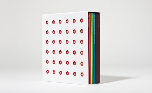
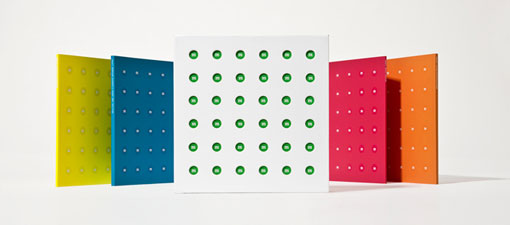
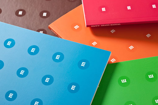
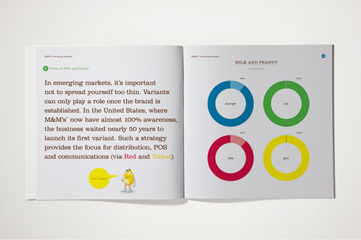
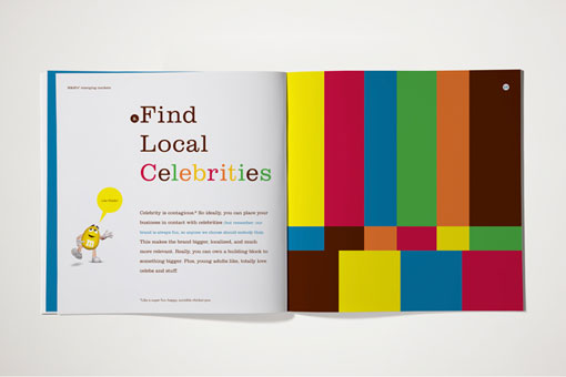
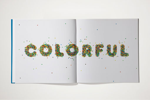
It seems that it’s getting more popular for big name brands to put more time and money into design, which is a great thing. But for the most part when it comes to design for food brands (if we’re talking about a typical trip to the grocery store), the general goal still seems to be to scream for attention. So I was pleasantly surprised to come across this brand book for M&Ms designed by George Katz. It’s definitely playful and colorful, but at the same time elegant and sophisticated. I’d definitely love to see more of this type of work for other well-known brands.

Get 300+ Fonts for FREE
Enter your email to download our 100% free "Font Lover's Bundle". For commercial & personal use. No royalties. No fees. No attribution. 100% free to use anywhere.

