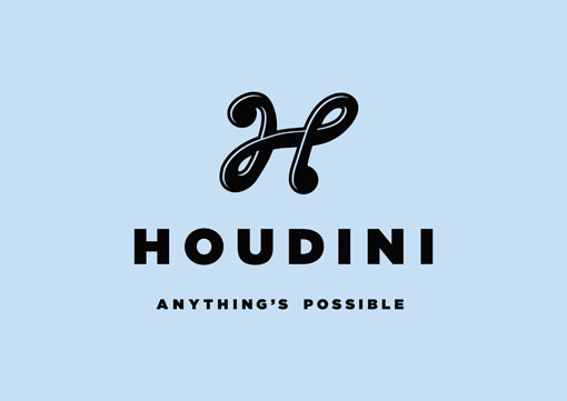
Here is a great identity for Houdini, a newly formed creative agency in Australia. My posts are usually short, but Head of Design Darren Cole sent over an article about the process of designing their identity that is too great not to share. This predicament is certainly relatable; and I think it speaks to any designer who is faced with a similar challenge:
Have no doubt.
Designing your own identity can be one of the hardest things in the world.
You have to be delighted with it because you’ll need to work with it every day. You have to create something that will make your fellow employees proud. You want them to be excited and inspired. And you want them showing it off to their friends. You also want your peers to envy it. No one wants to hear “yeah, it’s good but it reminds me of something I saw….”
No pressure then…
The brief came about when Euro RSCG and The Furnace established an amalgamated Creative Services company. The change provided an ideal opportunity to expand our Design department, and seek out our own clients. For which we needed our own brand.
The name was always going to be a hot issue. Pages of potential monikers were considered, and a shortlist was finally chosen for availability checking. At which point the extent of our misplaced optimism became clear (how dare so many businesses have similar names to our favourites!). Umpteen more names were considered until we arrived at ‘Houdini’.

Get 300+ Fonts for FREE
Enter your email to download our 100% free "Font Lover's Bundle". For commercial & personal use. No royalties. No fees. No attribution. 100% free to use anywhere.
Why? A gut (which I’m trying to lose) feel initially. But after reading up on the little guy we found many similarities between Houdini’s life and what we, an ambitious little company in North Sydney, were striving for.
Once the name was registered and URL purchased, we started designing with a blank canvas and bags of enthusiasm. First stop was vintage Houdini documents and posters. They were great stimulus, but ultimately we felt it important to tip our hat to the past whilst making a conscious effort not to go down the ‘white rabbit in a top hat’ look. Instead we aimed for something fresh — not too serious, but showcasing our broad range of talents.
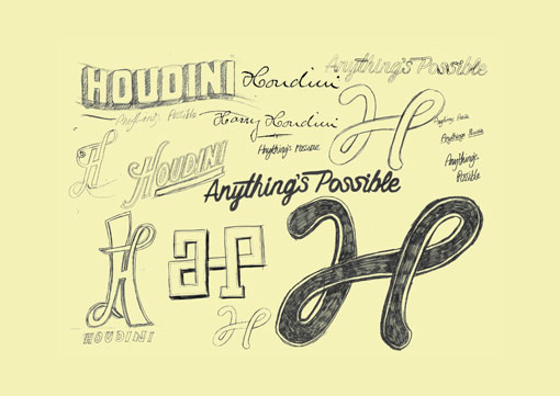
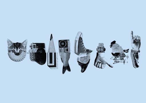
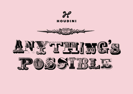
We also came up with the tagline ‘Anything’s Possible’. So logo sketches and initial designs were developed to incorporate this thought.
When researching Harry Houdini we found examples of his signature. We really appreciated its typographical flow so we started playing around with this as a design feature. Then something ‘magic’ (geddit?) happened. We found the ‘H’ could be fashioned from the lower case ‘a’ and lower case ‘p’ – aptly reflecting our tagline and philosophy.
With great fanfare and backslapping we decided to embrace it as a mark. We particularly enjoyed its subtlety, for unless it was pointed out you probably wouldn’t even know the methodology behind it. Just as a true magician would never volunteer the secrets of their amazing feats.
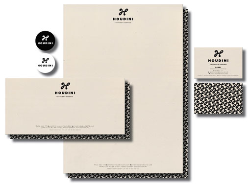
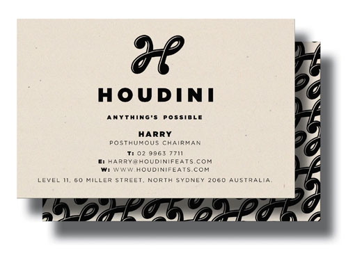
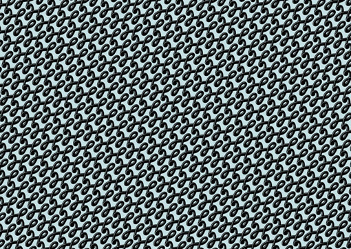
Since establishing the mark we’ve created stationery which incorporates our Houdini wallpaper pattern on the reverse, a holding page for our website and a growing library of ‘Anything’s Possible’ images, with many more elements in the pipeline.
We’re incredibly happy with the result. As challenging as it was, we really did enjoy answering our own brief and creating something fun that we can use tirelessly for years to come.
