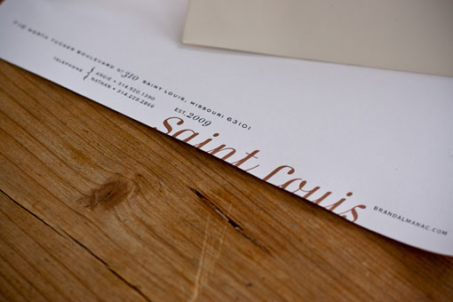
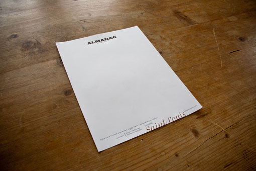
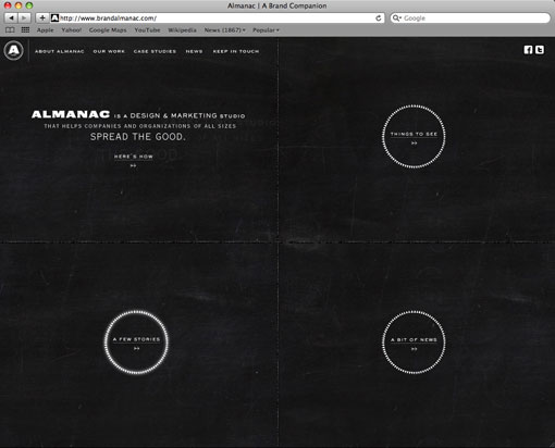
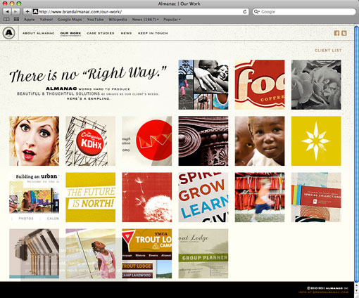
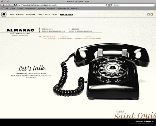
I’m completely enamored with the the identity of St. Louis-based studio, Almanac. The concept and details are carried out beautifully across all of the print materials and through to the website, which was just recently launched. For the story behind the visuals, I’m handing you off to the Proprietor and Creative Director, Nathan Sprehe:
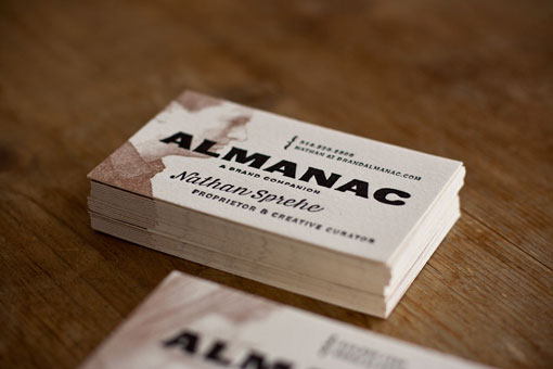
Almanac is a design & marketing studio working to help companies and organizations of all sizes tell their stories in original and compelling ways. As we developed the Almanac identity, we chose to focus on our genuine, straightforward approach — “good work is meaningful and gets results.” Our name and tagline draw inspiration from traditional farmers’ almanacs, reflecting the relationships we forge with our clients, guiding them through the many decisions that affect their brands.
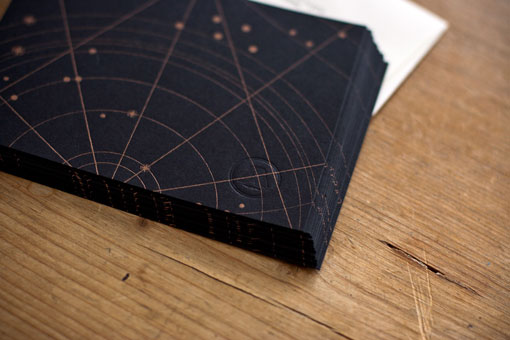
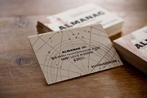
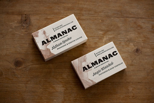
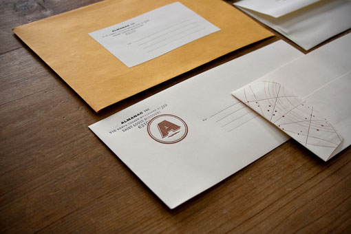
We chose to keep the color palette and typography understated but eclectic. The materials are hand printed on a Chandler & Price letterpress (special thanks to Kirsten of Sensura Studio for letting us use her amazing space!). Reinforcing our straightforward approach, our business cards—printed on heavy rag art paper—include engraving illustrations of our profiles, making it easy to put a face to a name. Note cards are printed on heavy weight, jet black paper with notes then written in copper ink.

Get 300+ Fonts for FREE
Enter your email to download our 100% free "Font Lover's Bundle". For commercial & personal use. No royalties. No fees. No attribution. 100% free to use anywhere.
