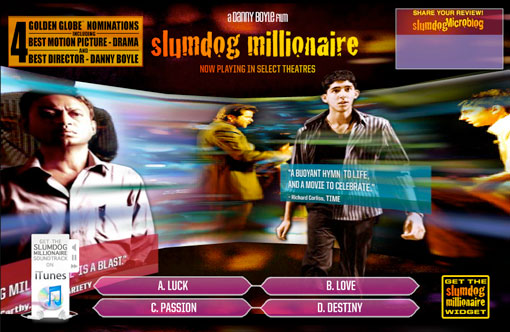
Speaking of Slumdog Millionaire, one thing that really struck me is the way they dealt with the subtitles. They were treated in a way I’ve never seen before. Rather than just be the default (and boring) white sans serif type in the bottom center of the screen, the white text was layered on top of a transparent colored box. And rather than remain static, they bounced around the screen to complement the action taking place at the time. It’s a very colorful movie, and this treatment just fit perfectly. It made me want to read them instead of it being a chore. Director Danny Boyle was inspired by comic book dialogue and worked with title designer Matthew Curtis to bring his vision to life.
I have found a couple of articles that mention this (here and here), but I cannot for the life of me find a screen capture of the movie that includes the subtitles. Which is disappointing, because I would really like to show you an example. I’m going to keep looking, but if anyone happens to come across one please let me know!

They’re kind of similar to the quote blocks in this image. It’s the closest thing I could find.
