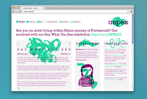
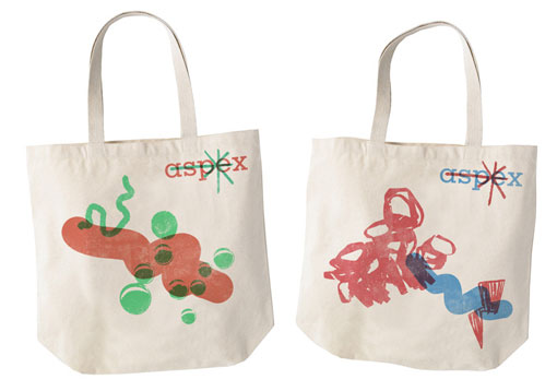
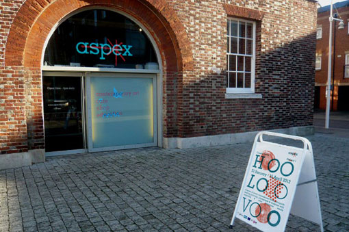
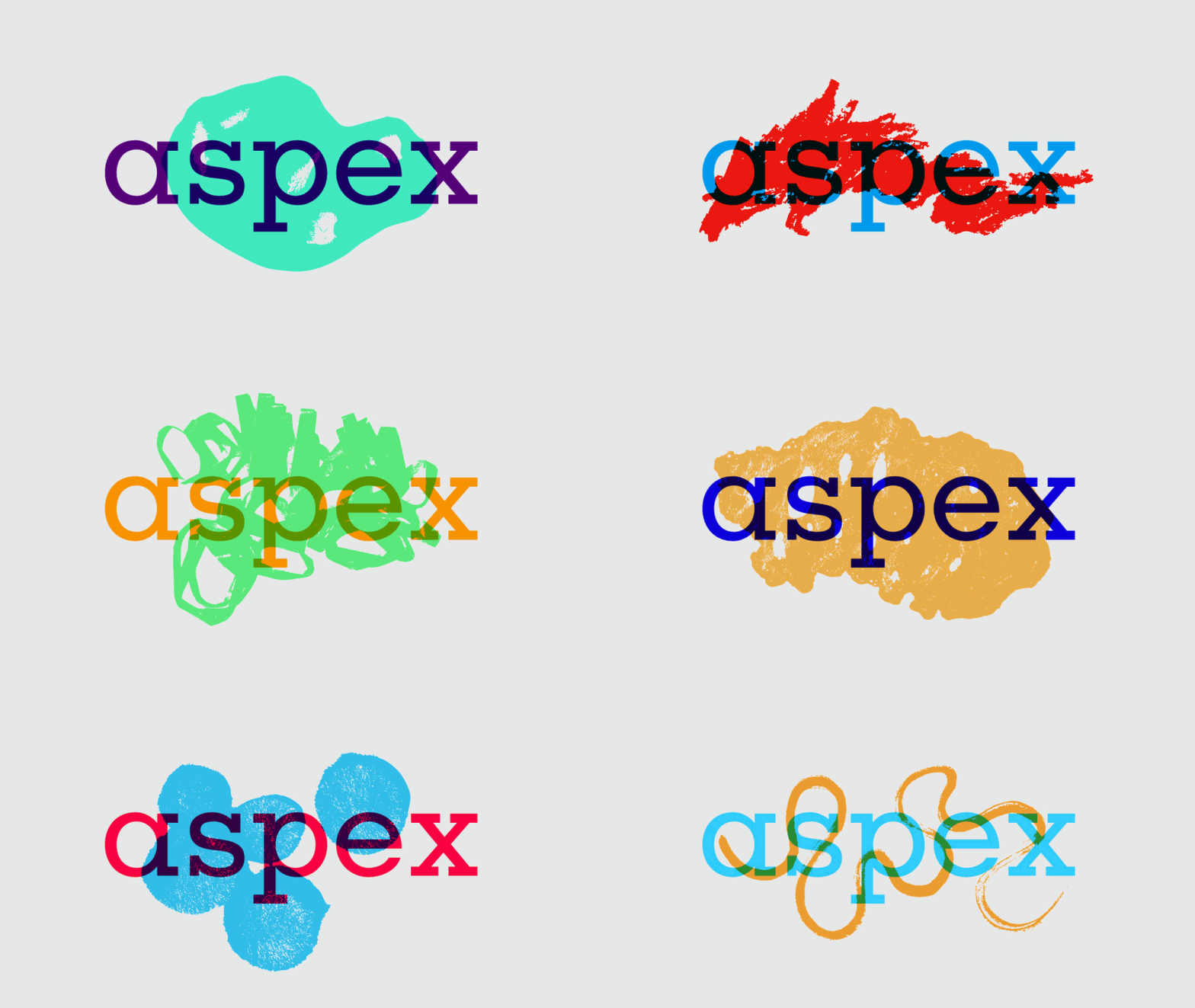
I’m incredibly intrigued by this branding project from new-to-me studio Red Design…
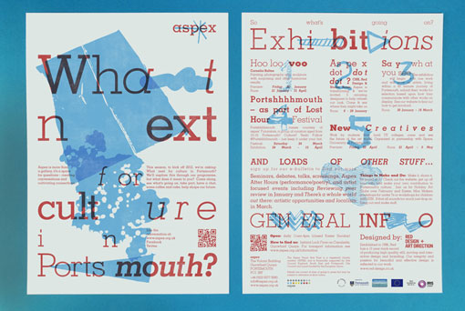
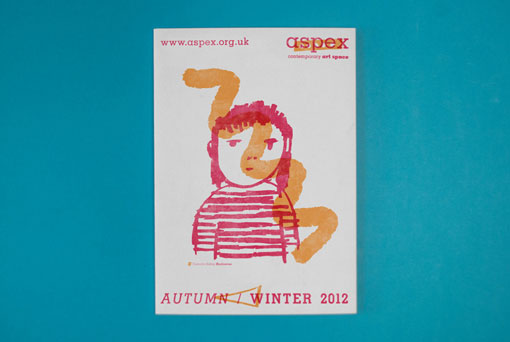
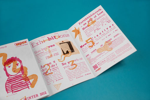
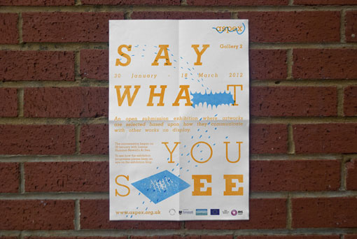
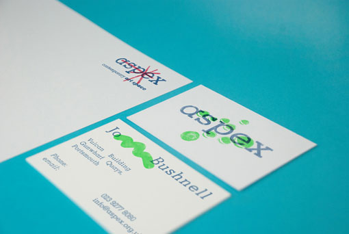
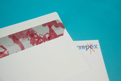
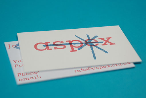
Red Design were invited by Aspex Gallery in Portsmouth, UK along with 2 other agencies CHK & Studio Baum, to be part of a unique exhibition that exposes the process behind re-designing the galleries’ identity. Each agency were commissioned to develop brand proposals that would coincide with the galleries’ shift in direction to become a “space for questions, creating conversations and cultivating connections,” where public engagement would drive the future direction of the galleries’ programme. Part of Aspex’s brief outlined the role of it’s previous identity as a means to “provide a clean, almost blank canvas” and they stressed a need for their new identity to “project more of a ‘personality’ of it’s own.” The brief also specified that the proposals should not be a wholesale redesign but should retain the logo and some elements of their current visual identity. For the exhibition we had to deliver 4 A2 boards explaining & visualising the concept as well as design an A4 double sided programme leaflet that would be distributed to promote the exhibition and upcoming events.
Take a look at a few more visual details right here.

Get 300+ Fonts for FREE
Enter your email to download our 100% free "Font Lover's Bundle". For commercial & personal use. No royalties. No fees. No attribution. 100% free to use anywhere.
