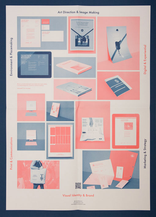
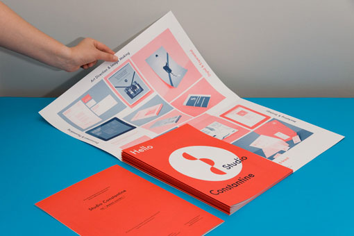
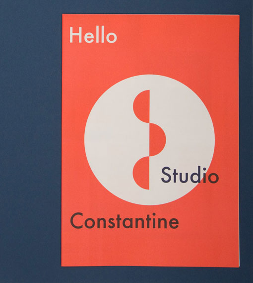
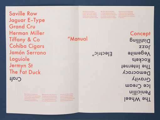
Studio Constantine recently revamped their printed materials. Here’s a bit about how they arrived at this solution:
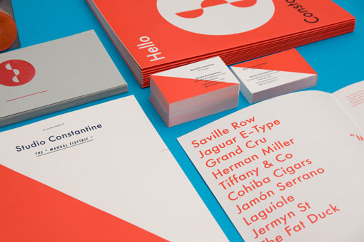
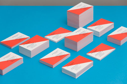
We wanted our own printed materials to demonstrate the best-case impact achieved by intelligent and strategic use of a two colour production process on both premium and commodity stocks.
By using our visual mnemonics of geometry and colour, beyond the normal containment of a marque or icon and type lockup, we define the aesthetic and layout of each piece as a whole. The result; a breadth of organic brand expressions.

Get 300+ Fonts for FREE
Enter your email to download our 100% free "Font Lover's Bundle". For commercial & personal use. No royalties. No fees. No attribution. 100% free to use anywhere.
