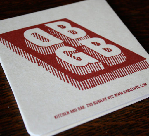
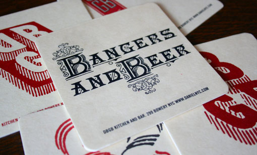
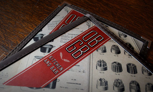
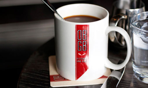
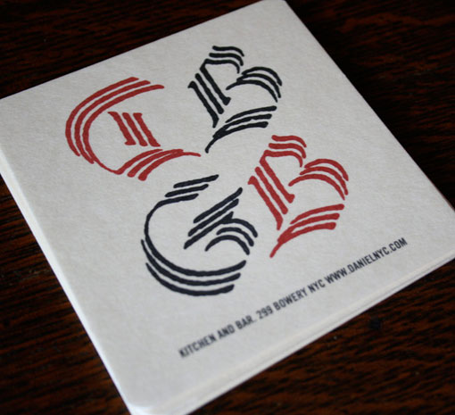
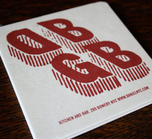
Ben Whitla recently launched a newly designed—and entirely responsive—site. When looking around, I was most excited to get a new, closer look at the identity development he did for DBGB Kitchen and Bar (completed while at Korn Design). The design references vintage beer labels and machinery used in the open kitchen in the space, and includes a primary banner mark (shown on the menu and mug) plus a series of secondary supporting logos.

Get 300+ Fonts for FREE
Enter your email to download our 100% free "Font Lover's Bundle". For commercial & personal use. No royalties. No fees. No attribution. 100% free to use anywhere.
