Andy Tran is a West Coast designer who mainly focuses on print-based work. When browsing his portfolio, I was particularly intrigued in his poster designs, essentially because they embody a style so different from my own. I’ve shown a few of them below, for which Andy was kind enough to provide us with some background information.

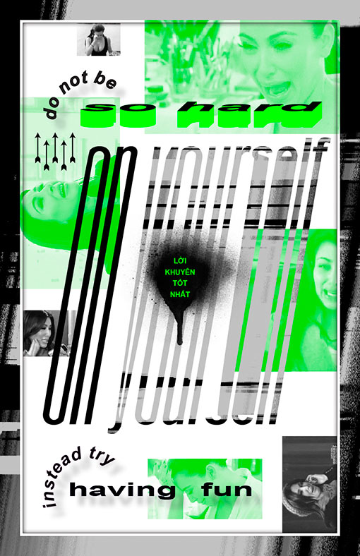
“The Best Advice”
The idea behind this saying encourages people not to focus on things keeping them from working, learning and progressing. Doing things such as comparing yourself to other designers is pointless; it’s like fighting the ocean: you’re never going to win. Someone will always be better than you, and someone else will be better than that said person. The ability to have fun means you can endure all the time, energy, money, etc. you put into your work. It’s all good, though, because you’re having fun.

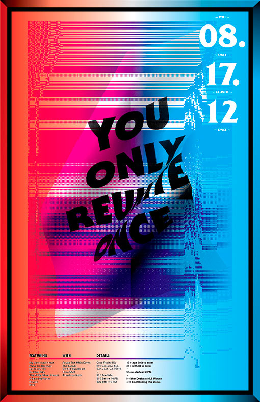
“#YORO”
I really wanted to explore visualizing movement and the act of reuniting. The mixing of the lines and colors was done to express how all of us musicians have grown up and relocated, started families, etc. but for one night would get back together, just like the early 2000s.

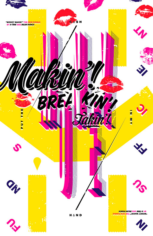
“Money Makin'”
This poster is currently running in a design contest held by A-Trak and Dillon Francis. The duo recently released a music video for their nu-disco/electro-house song “Money Makin'” where they dressed up as repair men who brought a broken ATM to life. This dancing robot traveled throughout NYC alongside beautiful women to jam-packed parties. I decided early I wanted to draw influence from the music video. The idea to have the poster “flip” came from wanting to reflect the danceable nature of the tune. The story of the robot began with it having a big smile on its face and eventually “flipped” to a sad one by the end.

Get 300+ Fonts for FREE
Enter your email to download our 100% free "Font Lover's Bundle". For commercial & personal use. No royalties. No fees. No attribution. 100% free to use anywhere.

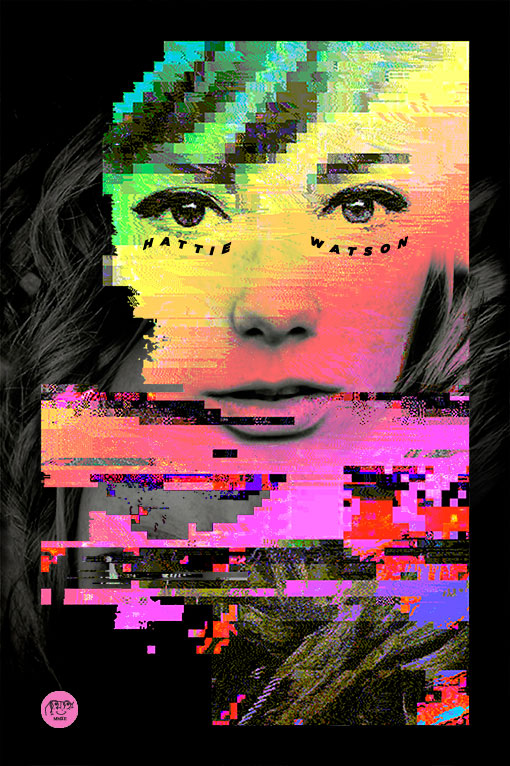
“Malibu Melon Ice Cream”
I was immediately intrigued by Hattie Watson. I felt she had a very unique look in the world of street-wear fashion models. The majority of this piece was based on experimentation. Since I was interpreting someone else’s photographic work, I thought it would be fun to have other designers and artists do the same with my design. I contacted some friends as well as strangers and received five very interesting takes on this piece.
