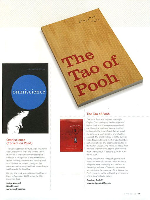
A couple of months ago I was asked to participate in a book redesign article for the new Uppercase Magazine, and my printed copy has finally arrived! The magazine itself is gorgeous, and packed with creative content. And I have to admit, it’s pretty exciting to see something I created in print.

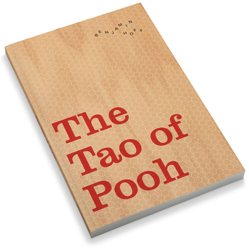
A larger view:

And in case you don’t have a copy in front of you (which you should, the subscription completely worth it), here is the written description:
The Tao of Pooh was required reading in English Class during my freshman year of high school, and it always resonated with me. Using the stories of Winnie the Pooh to illustrate the principles of Taoism struck me as being a really creative and effective concept.The problem I see with the current book design is twofold. First, it’s packaged as a children’s book, and second, it’s located in the humor section. And while The Tao of Pooh employs the humorous stories of children’s book characters; it is actually quite an academic book.
So my thought was to repackage the book to attract more of a serious, adult audience. My goals were to simplify and modernize the design, reference Taoism in some way, and minimize the presence of the Winnie the Pooh character, while still holding on to some of the story’s playful nature.

Get 300+ Fonts for FREE
Enter your email to download our 100% free "Font Lover's Bundle". For commercial & personal use. No royalties. No fees. No attribution. 100% free to use anywhere.
