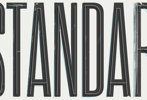
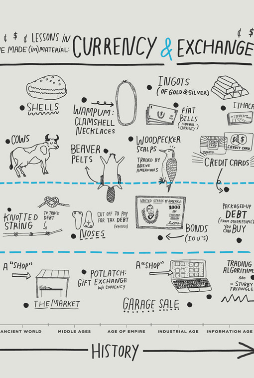
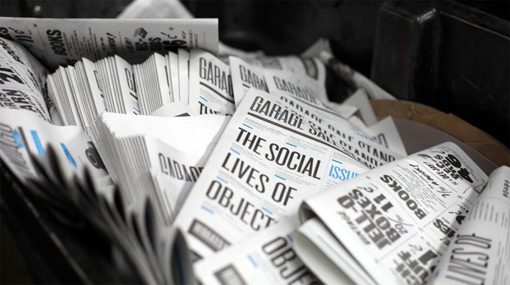
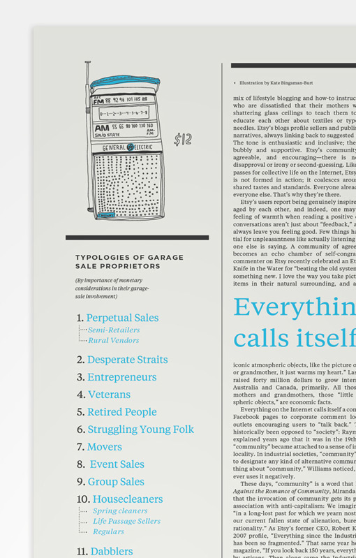
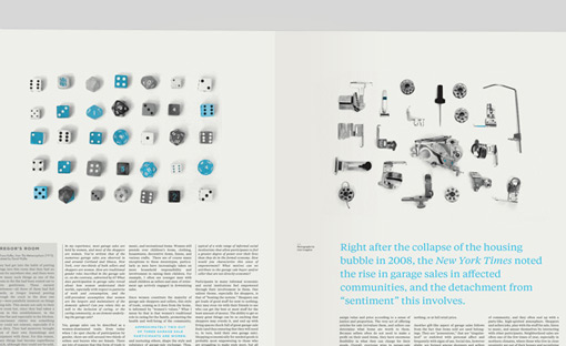
If you follow Kelli Anderson on Dribbble, as I do, you may have also been anxiously anticipating the launch of her latest project, a pair of newspapers to accompany Martha Rosler’s recent Meta Monumental Garage Sale Exhibition at MoMA here in New York. After catching small snippets of the work for the last couple of months, I was excited to get a closer look and learn more about the final product.
At a basic level, the design is beautiful—incredibly pleasant to read, and by far the most interesting and engaging newspaper design I’ve seen. But it would be remiss of me to fail to mention the incredible complexity, of both thought and execution, that went into this project—complexity that Kelli can best describe in her own words. She’s written an insightful post about her thinking and process over on her blog; so be sure to head over there for quite a lot more.



Get 300+ Fonts for FREE
Enter your email to download our 100% free "Font Lover's Bundle". For commercial & personal use. No royalties. No fees. No attribution. 100% free to use anywhere.
