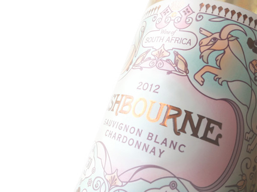
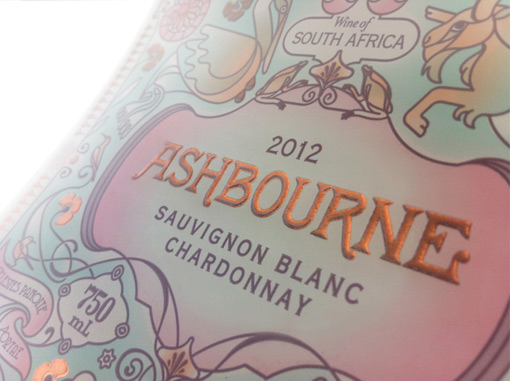
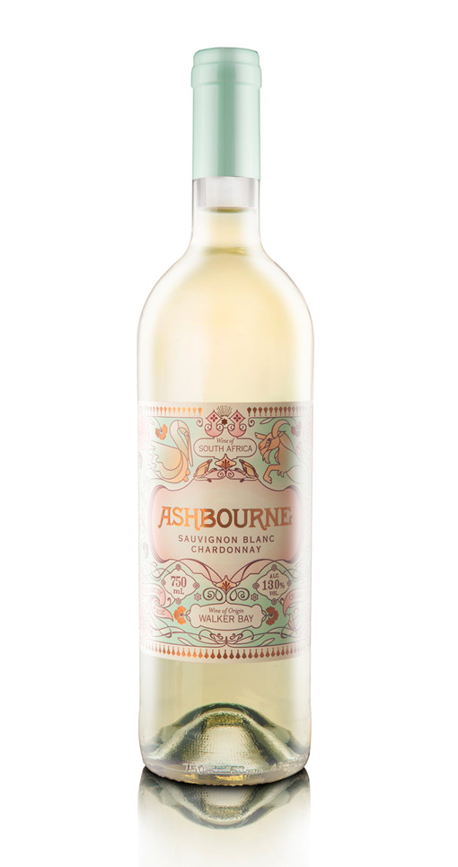
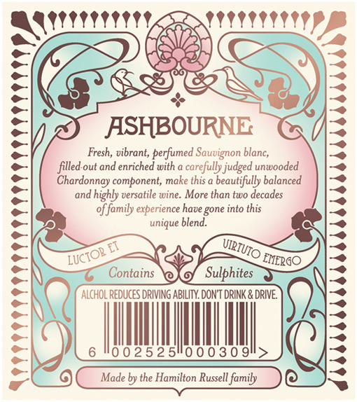
This gorgeous wine label was designed and illustrated by Pearly Yon for the Ashbourne Sauvignon Blanc.
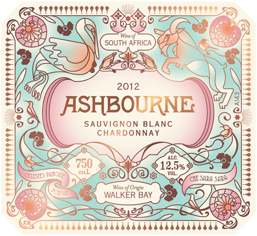
Here’s a bit about her process:
I was briefed to design a label that incorporated elements from the flora and fauna of the Hemel-en-Aarde Valley (where the wine is made) and aspects of both the family crests, but I had to bring them together in a Belle Époque style.
The colours were inspired by the farm and it’s surroundings. The blue/green came from the faded inside wall paint of an old abandoned farm cottage in the valley. The vivid and more faded pink came from the inside colour of a certain type of mussel shell that’s found on the beaches of Walker Bay. The orange came from the small, rare Arum Lily frog that is found on the property.
Every element on the label was considered by the Hamilton Russel family who, pride themselves on family ownership and hands-on involvement.

Get 300+ Fonts for FREE
Enter your email to download our 100% free "Font Lover's Bundle". For commercial & personal use. No royalties. No fees. No attribution. 100% free to use anywhere.
