For the month of August, a series of guest posters will be filling in on DWL with daily posts. Today’s posts come to you from Margot Harrington of Pitch Design Union. For more from Margot, be sure to check out her blog and follow her on Twitter. Enjoy!
Since I wrote about WMC Fest here last week I’ve been thinking about what my work is about, and what my answer is if someone asks me what my style is. I decided to give myself the same assignment that Kate Bingaman-Burt gives to her students shortly before they graduate from PSU: pick 5 reference images to use in your work, and explain why you chose them. Just 5. It’s hard. Really, super hard. But there’s something essential in the practice, to distill one’s entire visual frame of reference into such essentials, and then to explain what it is about them that grabs you so. And then decide what the images say about you, collectively. Given the amount of imagery that is milliseconds of clicks away, the binge amounts we consume daily, it’s a perfect exercise to define your visual voice in all that clutter.*

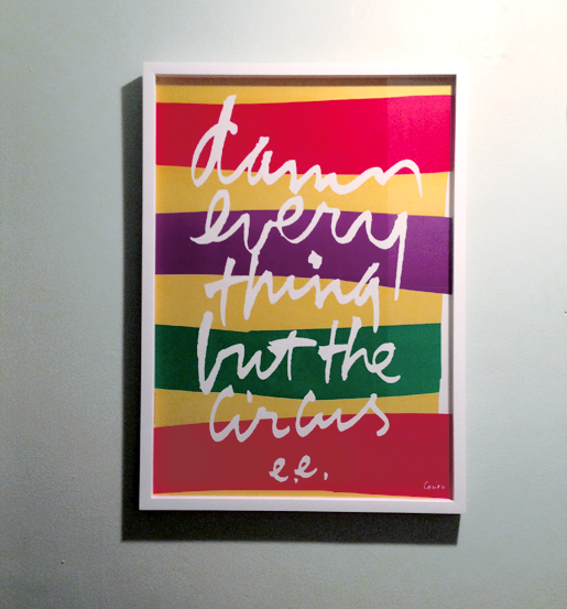
Damn everything but the circus, illustrated and screen printed by Sister Corita Kent, 1978.
The line is from this e.e. cummings quote. It’s rare I connect with a poem, but the ones that do, oh, wow. Poetry friends, you understand this. More specifically, what I like about this piece is the joyful haphazardness of the calligraphy, color that feels unplanned, a texture that reminds me of torn paper. There’s a certain fearlessness to it, something I want more of in my work.
Something about this style is nostalgic for my childhood too. I noticed Sister Corita’s love stamps (they should re-issue these, btw), probably around the same time I learned what a stamp did. The concept of a sticker that was money, and it sent someone a letter… What a concept! And still it’s a prize to get mail that’s not a bill or a throwaway catalog.

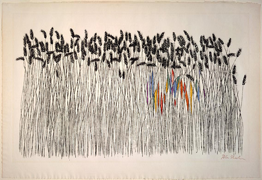
Wheat Fields, hand-colored screenprint by Ben Shahn, 1958.
Known for beautiful, socially progressive artwork, Ben Shahn has an incredible way of conveying perspective and the feeling of otherness through the simplest line work and color in negative spaces. It’s critical to me that my work comes from a similar place, has a deeper message, or a purpose for good in the greater world. It’s also for this reason that I love vintage propaganda posters, but so far I haven’t been able to pick a single favorite of those, so Ben wins this for now.

Tangrams
Despite the loose confidence of my images, the tightness of simple geometry is also endlessly appealing. The perfection of hard edges, flat color. Tangrams were introduced to me early in life as well, the idea that simple shapes can become a whole other shape entirely is still supremely cool. The sense of proportion that comes from the concept reminds me of the golden ratio and sacred geometry, both tried-and true layout principles. Why this image? It’s ultimate; a tangram of a tangram! Conceptually it’s a great metaphor for the fragmentation that is America today, even though we’re trying so hard to come together as one united thing we aren’t quiiiite there yet. Illustration by Midnight Umbrella.

Get 300+ Fonts for FREE
Enter your email to download our 100% free "Font Lover's Bundle". For commercial & personal use. No royalties. No fees. No attribution. 100% free to use anywhere.
Where’s the other two images you’re thinking? I, uh, don’t know what they are yet. If this were school I would have to settle with a C grade, but since it’s not, I will revisit and finish the assignment in my newsletter next week. I suspect this is the hardest part of the exercise, the last two. I’m sure I could research for weeks and I would still have trouble picking. But for the purposes of editorial deadlines, and the client work that is also due today, I’m gonna give myself an extension (thanks, me!). If you’re itchy for the answer you can sign up for my new newsletter to see if I can turn my C into an A!
Thanks for having me, DWL readers! You are a lovely bunch of people with *incredible* tastes, I’m happy to share even this tiny slice of the day with you.
*One important note, your images can change overtime as well. It doesn’t have to be forever, since tastes and ideas are always evolving. Phew!
