In the immortal words from the poet of our generation, Beyonce, “I don’t think you ready for this jelly.” Turns out, 13 years later perhaps Mrs. Jay Z was wrong—seems like we might be ready for some sort of jelly after all.
For the record, Jack Dorsey beat us to this logical conclusion, but how many times are we going to be able to link to a Destiny’s Child video? And in fact what we’re talking about this week is the new app Jelly—a new search engine for humans created by Biz Stone, the co-founder of Twitter and also creator of Blogger.
The idea behind the name according to the company is the jellyfish “because it has a loose network of nerves that act as a ‘brain’ similar to the way we envision loosely distributed networks of people coordinating via Jelly to help each other.” And if that plus the pedigree isn’t enough, learning that the Jelly office is themed after Wes Anderson’s The Life Aquatic could seal the deal, at least for us.
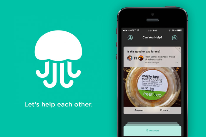
Put simply, Jelly is “a new way to search with pictures and people from your social networks.” Basically you ask a visual question—perhaps as simple as “what is this” and your friends and their friends help answer it. The idea is that this human powered app makes searching for answers a much more personal, and dare they say it, fun adventure.

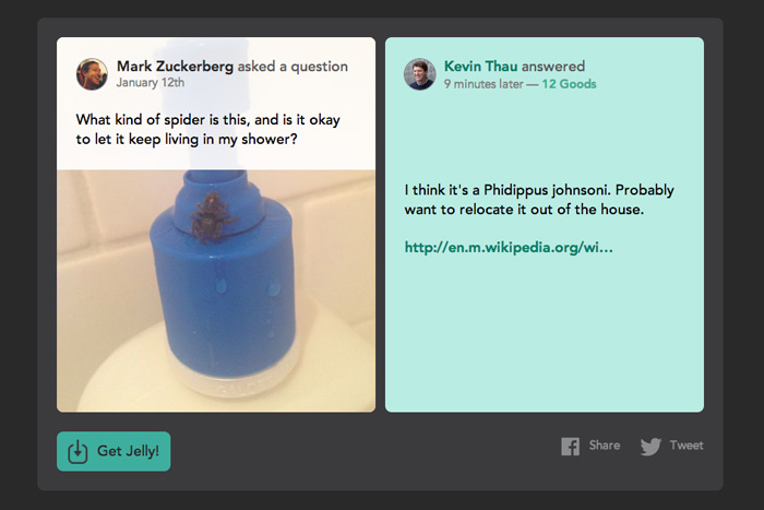
In its first week the app featured over 100,000 questions and about 25,000 answers, including some pretty funny made-for-social questions and answers about spiders and saving a life. Because of this buzz, entrepreneur pedigree and high profile investors it didn’t take brands very long before jumping in, as Nando’s, Travelocity, General Electric, and Lowes started experimenting with the new platform.

Get 300+ Fonts for FREE
Enter your email to download our 100% free "Font Lover's Bundle". For commercial & personal use. No royalties. No fees. No attribution. 100% free to use anywhere.
Its power as a brand-building tool lies in it being completely driven by users, and brands will have to remain useful and helpful if they want to play here. Jelly uses people’s core characteristic of wanting to tell people what they know, and the key will be for brands to solve problems for other people.
At its core, the app is as dead simple as it gets. A great example of the kind of lean user interface design and MVP sprint to market that you’d expect. The experience is so utilitarian, that you’re not trying to do a bunch of things—but simply asking and answering questions with people you know. As Jon Steinberg of Buzzfeed noted at CNBC, “It’s almost like an Instagram of Questions or the baby that photo-sharing app Instagram and question-and-answer app Quora would have.”
What’s most interesting for designers is the interface’s decidedly un-feed nature. Unlike Twitter, or other second-generation social platforms, this isn’t a scan and consume app. It simply focuses you on the task at hand, using social networks to power your Q&A’s. An additional thing that’s unique about the experience is that rather than generating likes there is a tally of simple, and nicely designed thank you messages you get and collect.
Will we be talking about Jelly once the buzz dies down? I guess we’ll have to ask the app.
