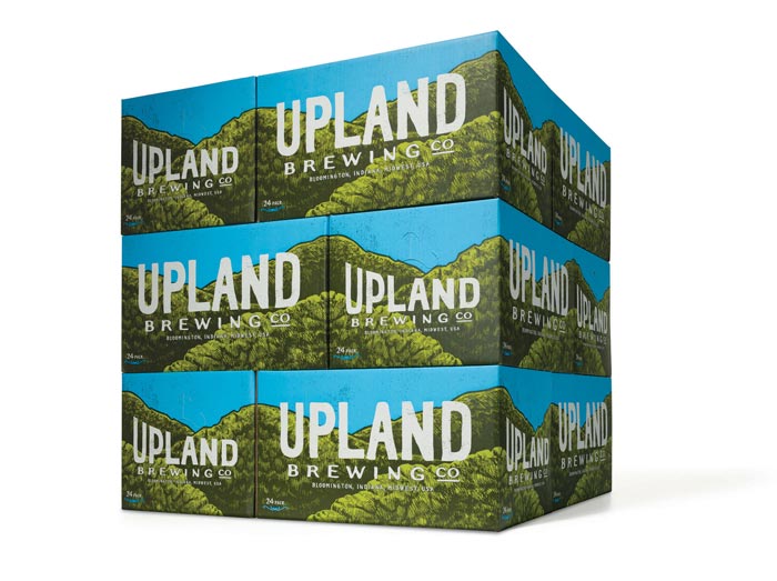
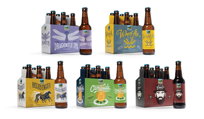
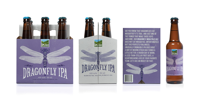
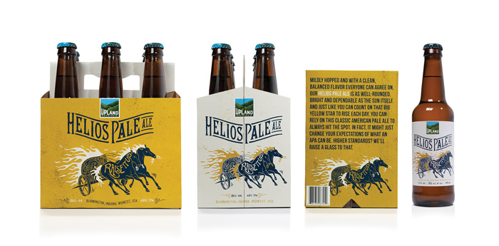
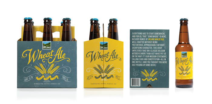
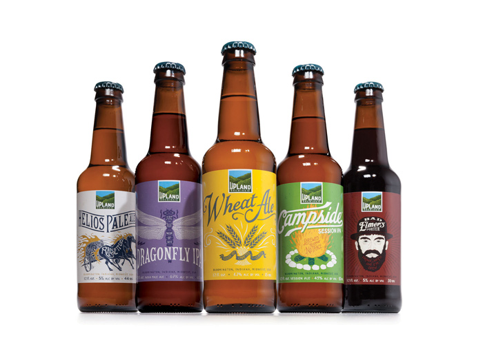
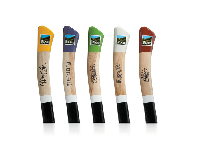
Young & Laramore recently completed a solid rebrand for Bloomington, Indiana’s Upland Brewing Co., including some nifty new packaging for several of Upland’s most popular beers.
For more on the goals and process of the rebrand, dive into Upland’s client-side account of the project here, and read the details of Young & Laramore’s work below:
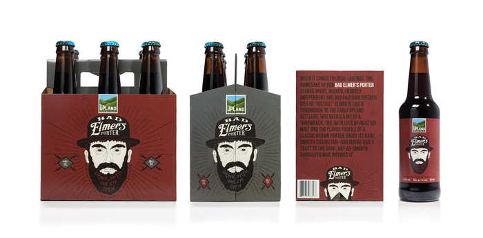
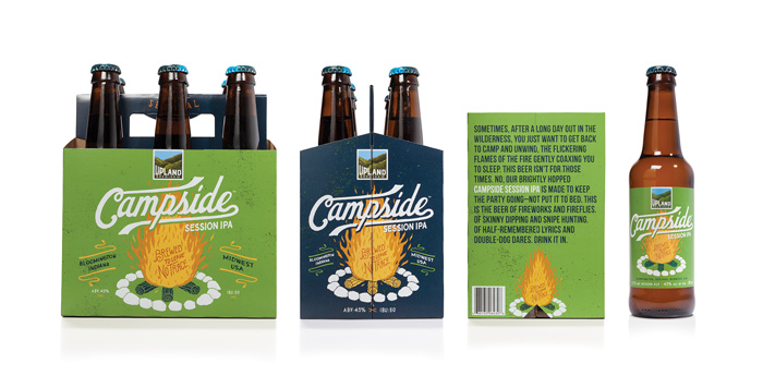
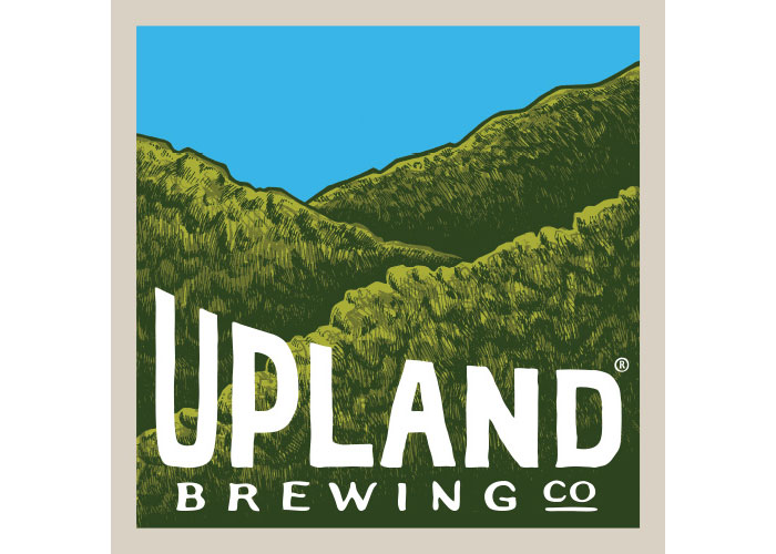
The goal of the new look was simple: to capture the quality, culture and spirit that make Upland—and its community—unique. The hand-crafted nature of the beer is reflected in the extensive use of hand-lettered type and illustrations, whether in the distinctive hills logo, or in the packaging and related materials.
The personality of the company, meanwhile, comes through in the descriptions of each beer that accompany the illustrations (Dragonfly IPA: “Just the right amount of bite”), as well as a longer story about each beer on the bottom of its carrier.

Get 300+ Fonts for FREE
Enter your email to download our 100% free "Font Lover's Bundle". For commercial & personal use. No royalties. No fees. No attribution. 100% free to use anywhere.
Creative Credits:
Executive Creative Director: Carolyn Hadlock
Creative Directors: Bryan Judkins / Trevor Williams
Art Director: Zac Neulieb
Senior Writer: Scott King
Illustrator: BMD Design
Illustrator: The Bungaloo!
Photographer: Gary Sparks
